Alabaster is one of Sherwin Williams most popular colors of all time. There is good and bad to be said for that:
- It is tried and true
- It can be overdone
Alabaster is the color that I most hate to love. I don’t want to have the same favorites as the rest of the planet, but you can’t deny that it’s just a really good color.
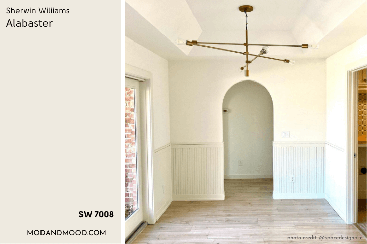
Let’s take a look at all things Alabaster, including real life examples, undertones, and dupes!
What Color is Sherwin Williams Alabaster (SW 7008)
Alabaster is a subtle creamy white by Sherwin Williams, and one of their most popular shades. It is best described as a “Farmhouse White.”

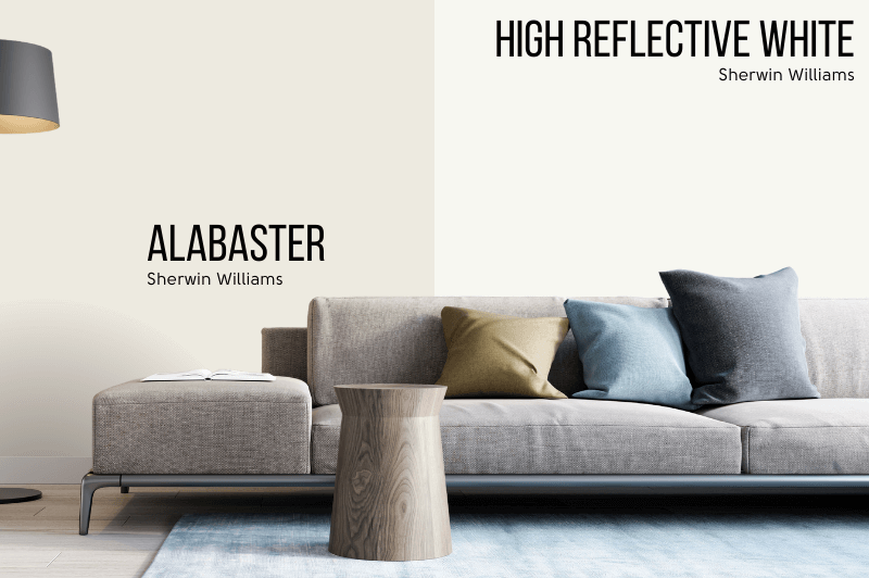
When paired with cleaner, brighter whites, Alabaster will look obviously creamy. When used as the sole white in a color scheme, it can give the illusion of a true white.
LRV of Sherwin Williams Alabaster
What is an LRV anyway?
The LRV (Light Reflectance Value) of a color indicates on a scale of 0 – 100 how much light a color reflects (or doesn’t reflect). True black has an LRV of 0 and pure white has an LRV of 100.
In the paint world, we are working in a range of about 3 – 93 because no paint color is purely black or completely white.

The LRV of Alabaster is 82. That puts it pretty close to what we would consider an off-white, which is the 70-80 range, but it is still technically a white.
Alabaster vs Bright White
In comparison to the lightest and brightest white that Sherwin Williams offers, you can clearly see just how creamy Alabaster is.
What Are the Undertones of Alabaster
I did just look at this in depth in my post: Sherwin Williams Alabaster Undertones Explained! (Why Do We See Yellow?) So I really recommend going there if you want to know why Alabaster could look yellow, pink, green, etc!
To be brief: In my opinion Alabaster manages to be fairly neutral in it’s creamy-ness, but some may find it to be too yellow for their taste.
Technically, Alabaster is not yellow at all. It’s in the orange color family, hanging out where we tend to find beiges and greiges.
Alabaster will look significantly more creamy with a brighter or cooler trim color:

If you are looking for a creamy white, Alabaster is not a yellowy option, and you are safe to proceed. However if you HATE yellow, you probably won’t like Alabaster.
I hope that all made sense! If not, you can judge for yourself by the end of this post, because I have lots of real homes to show you! (Better yet, go read that undertones post I linked above!)
Is Alabaster Warm or Cool
Alabaster is a warm white. You can use it like a neutral, but be mindful that pairing it with cool colors will make it look even creamier.
Pairing Alabaster with warm colors will keep it looking neutral.
Alabaster Color Strip
Sherwin Williams does not often put their whites into a typical light-to-dark color strip, but they sort of do for Alabaster.
I say “sort of” because these are loosely related colors placed in order from lightest to darkest, and not really lighter and darker versions of the same color.
Anyways, here is the color strip as imagined by Sherwin Williams:

Lighter Version of Alabaster
Sherwin Williams has Pure White as the lightest color on this strip. Pure White is lighter than Alabaster, but it is also more neutral. It will work as a lighter alternative if you are finding Alabaster just a bit too creamy.
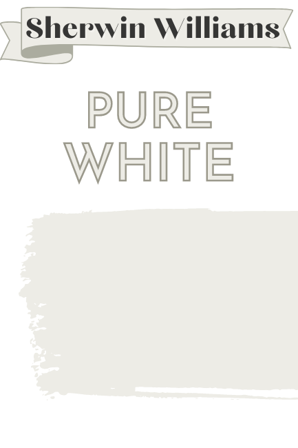
Check out my Pure White deep dive here.
Darker Version of Alabaster
If you are looking for a darker version of Alabaster, I would make a bet on Shoji White. It’s a creamy off white.
I’ve actually written a post comparing the two: Sherwin Williams Shoji White vs Alabaster (Which is Best?)

Westhighland White is one color down from Alabaster on the same strip, but it’s pretty obvious that the tone is not the same. The next darkest color is Egret White, which you may also like.
Sherwin Williams Alabaster Color Palette
Here is Alabaster in a palette with other popular Sherwin Williams colors:

For this palette I thought I would keep things neutral.
The background photo is from Allison of @webbstead She used Alabaster in her whole home. (Although she has since moved to Webbstead 3.0)
Coordinating Colors for Sherwin Williams Alabaster
Agreeable Gray and/or Accessible Beige with Alabaster
Agreeable Gray and Accessible Beige are pretty similar colors, and either looks great with Alabaster.
Lindsay from @silo.hill used both Agreeable Gray and Accessible Beige in different areas of her home with soft white walls.

The color here is Pure White, so Alabaster would be just a bit creamier.
You can see more of the comparison between these two colors here: Accessible Beige vs Agreeable Gray (How to Choose!)
Alabaster with Iron Ore
Iron Ore is a deep charcoal color that is pretty chameleon-esque. Iron Ore works with just about anything, but so does Alabaster. A warm white is perfect to soften the look of Iron Ore.

Like the look of this pairing? Check out my post: Do Alabaster and Iron Ore Go Together? Pairing These Sherwin Williams Favorites
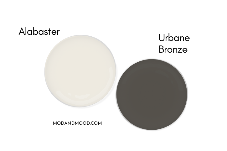
Urbane Bronze and Alabaster
Urbane Bronze is a rich, dark, brown-gray color. It’s a nice accent color for pairing with the softness of Alabaster.
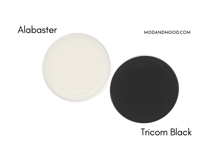
Tricorn Black and Alabaster
I don’t need to say too much about Tricorn Black and Alabaster together. Tricorn Black is a classic black, and the blackest one that Sherwin Williams offers. If you’re looking for a black and white modern farmhouse look, you will definitely want to take a look at Tricorn Black!
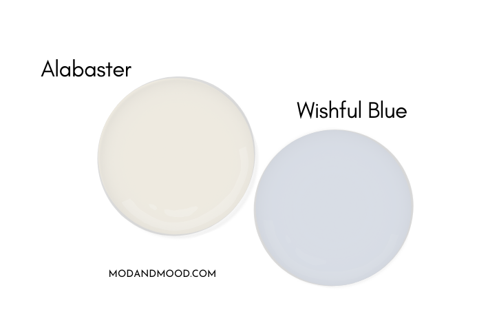
Complementary Color for SW Alabaster
The official complementary color for any paint is the color directly across the color wheel. For Alabaster, that is a soft blue. Sherwin Williams Wishful Blue is a pretty close match.
The color of the year that Sherwin Williams chose for 2024: Upward, is also a great match.
What Trim Colors Go With Sherwin Williams Alabaster?
So you’ve already chosen Alabaster for your walls. Now what?
Let’s take a look at a few different trim options, starting with white.
White Paint that Goes with Alabaster
The first white trim color you should consider is Alabaster itself!
When should you choose Alabaster for your walls and trim?
When you want it to look white white white!
Using any cooler or lighter white will accentuate Alabaster’s creaminess, which is totally fine if that is your goal. If not, I would definitely suggest going with Alabaster. (You can always use a different sheen to give some contrast!)
Here is a graphic to show you how Alabaster will look with a different white on the trim:

Alabaster with Pure White or Extra White Trim
You can see that Extra White, and to a lesser extent Pure White, will both make Alabaster look like an off-white. I would say that the difference is a little more obvious in person. Here is a quick look at Alabaster with Pure White trim:

Extra White trim will provide a bit more contrast than this combo as we saw earlier when we were talking undertones.

Alabaster Walls with Snowbound Trim
Snowbound is a soft white with a warm undertone that leans more red than yellow. As a result it can have a slightly pink undertone. It has an LRV of 83, so even though it reads “true white” more often than Alabaster, it isn’t a whole lot lighter.
Full disclosure: I have not actually seen this combo in real life. I suspect the contrast is quite subtle, but if you just have to have a different white on your trim and you still want to keep Alabaster looking white, Snowbound might be a very good option.
For more about different white on white combinations, check out this post: White Walls with White Trim? (Alabaster with Pure White & More!)
Alabaster with Oak or Dark Wood Trim
If you are curious about Alabaster with oak trim or traditional dark Victorian trim, I think it’s a nice choice if you are looking for something soft rather than crisp. (You might find my post 9 Gorgeous Wall Colors that Match Wood Trim even more helpful than this one!)
Alabaster is certainly a more antique/vintage white than a clean bright white.
I was surprised that in all of my collecting I did not have a photo of Alabaster with dark wood, so here is a different creamy white – Sherwin Williams Ethereal White:

Okay, so the wood isn’t on the trim, and it’s not the right wall color, but hopefully this helps you picture it.
Sherwin Williams Alabaster on the Interior of Your Home
Let’s see more of Alabaster in real life!
I do really try not to bounce around too much, so these examples are organized room-by-room. You will see some of the same people mentioned throughout, but I find this is the simplest way to do things.
Alabaster on Kitchen Walls and Cabinets
Today let’s begin in the hub of the home: The kitchen!
I’ll waste no time and get to the good stuff that everybody wants, aka Alabaster cabinets.
SW Alabaster White Kitchen Cabinets
This first kitchen is by Space Design (@spacedesignokc), who used Alabaster literally everyyywhere in this home:

You can see that Alabaster looks pretty white, since it is the primary white in the design (besides tile and countertops, which are often not as white as you think).
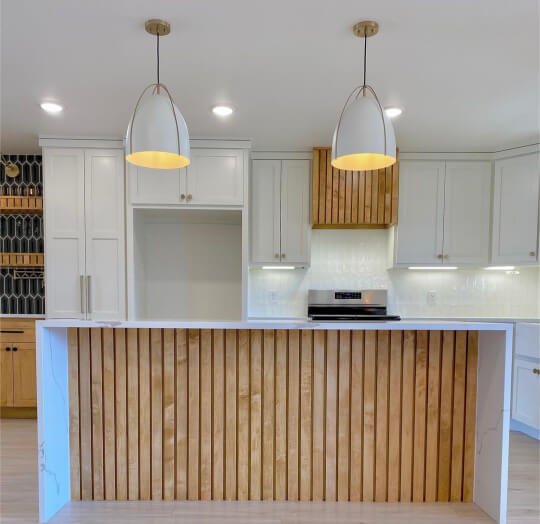
The pops of wood tones, gold, and then the dark picket tile, prevent the space from becoming too monochromatic.

It was really hard to pair down cabinets to just my favorite, but in the end, this kitchen by the team at ML Designs (@mldesignskc) just had to make the cut.

Now that you’ve revelled in just how amazingly creamy these cabinets are, I am forced to burst your bubble with this less filtered shot:
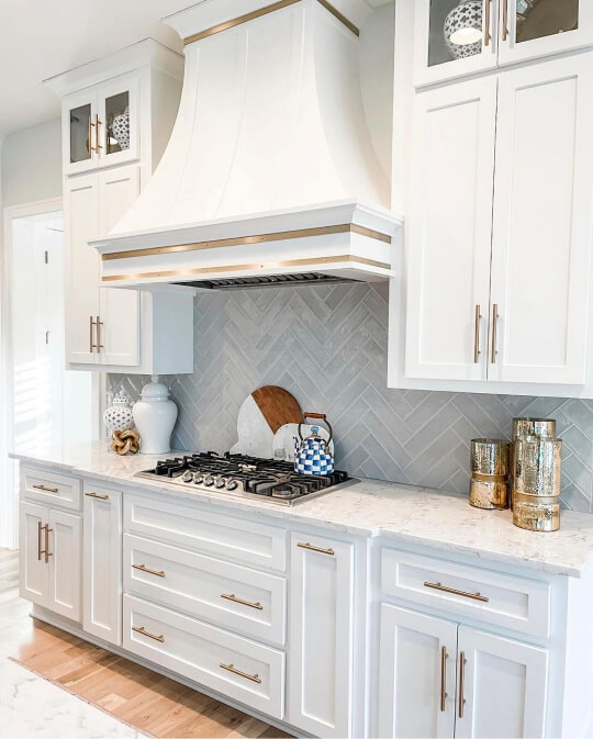
Still a nice warm white, but this is a bit more accurate. I do think gold hardware is the way to go with Alabaster! It looks sooo good.
Here is one final further away shot:

Here is a two-toned kitchen example by the team at Very Good Painting (@verygoodpaintingllc):
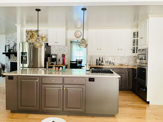
The island and lowers are in Valspar Swiss Chocolate, and the trim is Wool Skein.
Finally, you may be thinking that it’s easy to make brand new cabinets look nice, but what about refinishing cabinets with Alabaster?
Here is a kitchen by GR Fine Finishes that features older style cabinets painted in Alabaster:

This kitchen looks good as new! I really like Alabaster with the neutral wall color.
Alabaster on Kitchen Walls
If you’ve been digging into moody shades around here, you might have already seen Julia’s home (@bigmamashousereno) in my Homburg Gray post.
She’s not afraid of color, but she went with the subtlety of Alabaster for many of her spaces. Here it is in her kitchen:
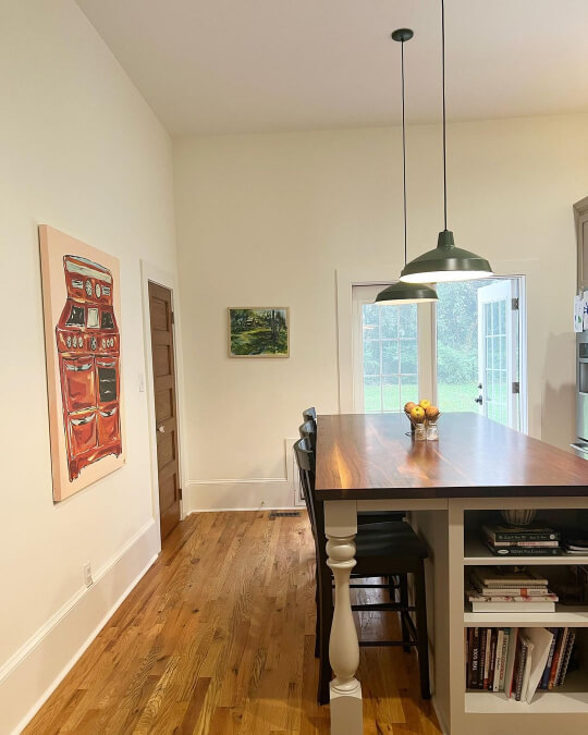
Julia’s cabinets show off her signature color sense, as she went with the unexpected choice of Sherwin Williams Anew Gray.

I love the taupey tone of Anew Gray, and I can honestly say that I’ve never seen it on cabinets before. This would be a great alternative to the slightly more popular Dorian Gray.
Over at the Red-E-Framhouse (@redefarmhouse), a pop of green on the island is a perfect statement against the white cabinets and creamy white Alabaster walls.

For trim, the homeowners chose SW Pure White. You can see more of the trim in their eat-in kitchen/dining area.

Alabaster in the Living Room
If the kitchen is the new hub of the home, what does that make the living room?
I don’t know, but here are some ultra-glam Alabaster living spaces:
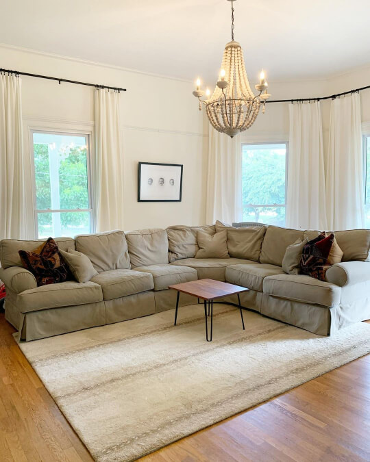
This first one is back at Julie’s place, where we first saw her Alabaster kitchen. In her living room she also used Alabaster on both the walls and the trim.
Moving to the home of Ashley (@ludic_living), we find another all-Alabaster living room:
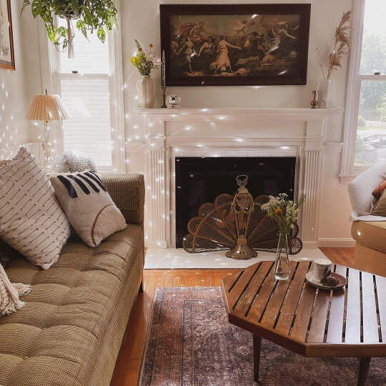
Ashley’s whole home has a quirky, vintage, thrifted aesthetic.
I could never curate the oddball finds that Ashley does. She just has *it*.

Ashley has a lot of Alabaster in her home, so more from her in just a moment!
Here is one more shot of Alabaster walls and Extra White trim in the home we saw earlier by S&L Painting:

I feel like in that shot Alabaster looks a little more neutral.
On to the home of Allison, whose “Webbstead” is featured in the neutral color palette form earlier.
This new build really is spectacular! It was hard to narrow down to just my favorite few photos:

Amazing right? I feel like this great room could just as easily be in a winery.
Webbstead is all things bad and bougie.

Yes, you’ve seen this one already, but I thought it was worth showing when it wasn’t hidden behind a color palette:
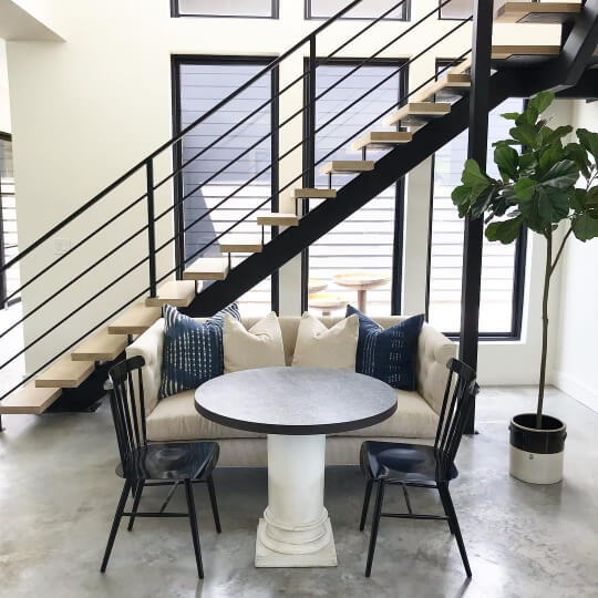
Delightful! Never fear, more Webbstead coming at you further down.
Back in this open plan home, Space Design used Alabaster everywhere, from the trim, ceiling, and walls, to the fireplace and cabinets.
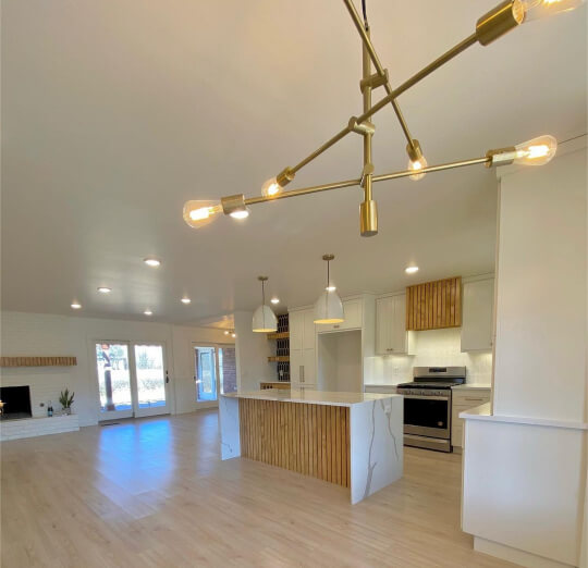
Alabaster Painted Brick Fireplace
Speaking of fireplaces, Alabaster is a great option for a luxurious white finish.
Here is a closeup of the one by Space Designs:

I have one more Alabaster fireplace to show you while we are at it, this one is in Ben and Elenie’s @annacreekcottage.

In this living room the walls are also Alabaster, but the trim and doors are painted out in Sherwin Williams Dorian Gray.
Here’s a closer picture in warmer light:

So pretty!
I really admire people who can get behind seasonal decor like this. I would like to get my act together, but I’m really starting to think that this is “the act.”
Alabaster in the Dining Room
I did already cover a lot of Kristin’s home (@kristinmacchia_homeinprogress) in my White Walls with White Trim post, so I won’t overdo it, but here is her Alabaster dining room, with Pure White trim.

So…restful.
If you love the look of that door, I’ve got lots more in my post 39 Spicy Black Interior Doors (How to DIY & Paint Colors to Use!).
Back at Anna Creek Cottage, we see the Alabaster and Dorian Gray theme carried into the country-chic dining room.


I think contrasting trim is an easy way to add interest while staying pretty classic. If you like this particular look, you will like my post: White Walls with Sherwin Williams Accessible Beige Trim (Alabaster and More!)
Now for one final Alabaster dining room. This one is by the team at ML Designs again.

I can see why people love Alabaster. I have to say that it does “luxury” extremely well.
Alabaster in the Bedroom
Moving on to the bedroom, I have a couple of all-Alabaster rooms to show you, the first being back at Julia’s:

Just like in her living room, she used Alabaster for both the walls and trim.
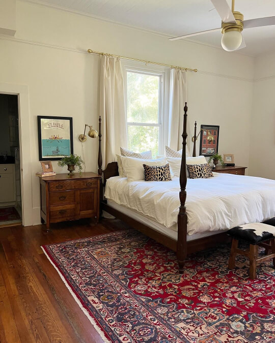
Next is the bedroom at Webbstead:

I love the modern black windows throughout the home.
The Bathroom in Sherwin Williams Alabaster
Marissa from @in_vest_homes has one of the funnest house flipping IG accounts that you will find. Her flips are timeless but also offer something a little unexpected.
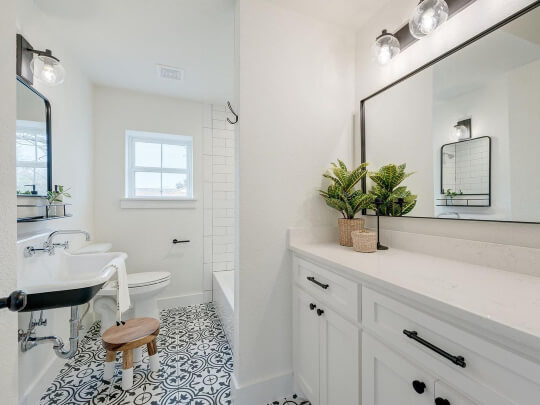
In this bathroom she used all Alabaster, and it actually looks pretty white, even alongside all the subway tile.

Still at Allison’s, she also used Alabaster in the bathroom.

The vanity is Sherwin Williams Acier. I do find that the cooler tones of Acier make Alabaster look that little bit creamier.

Alabaster in a Home Office
In an office with a bold warm color, Alabaster looks very neutral. Here we are back at Ashley’s place, where she used Cavern Clay and Sandbank to create a focal point on the wall.
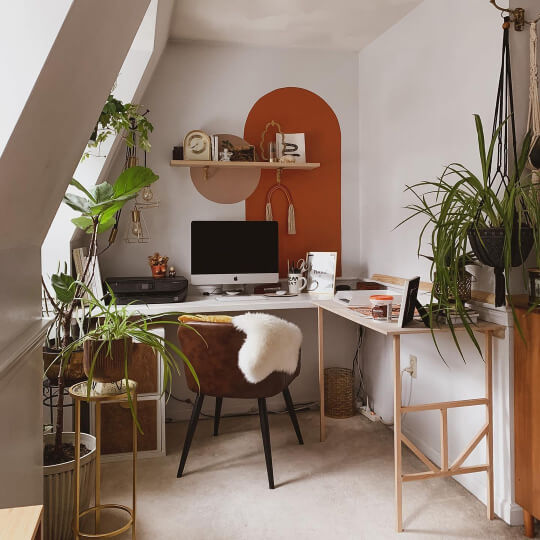
How cozy is this space?
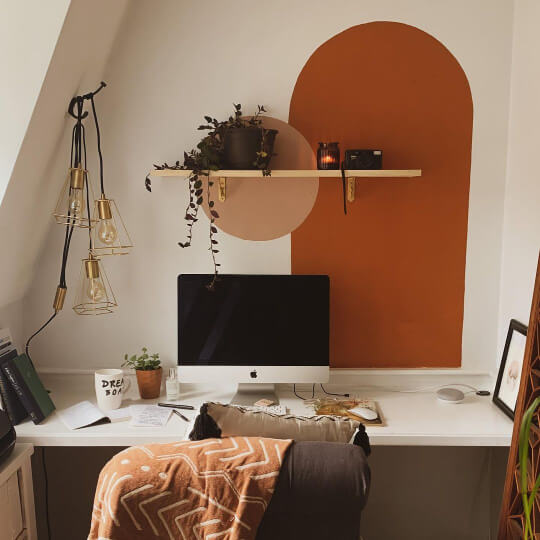
Now for something cool-toned with Alabaster, we move to an office by @diy.design.dmv.

She used Benjamin Moore Aegean Teal as the focal point, but kept the space mellow with Alabaster on the other walls.
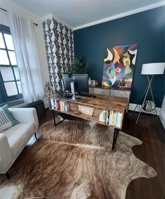
I love this color palette! It reads very Mid-Century Modern.
Sherwin Williams Alabaster for Your Home’s Exterior
Alabaster might just be the most popular white exterior color on the market! I got to be a little choosy and pick the very best Alabaster examples.
Alabaster on Traditional Siding
Beginning with something standard, here is how Alabaster looks on exterior siding.

You can see how if we’re being choosy, we would choose the amazing drone shots of the house on Humble Hill (@humblehilltn)!

Of course, this new build in East Tennessee looks good close up too:

For the porch ceiling, the homeowners chose Sherwin Williams Rainwashed.

I was trying to figure out what color Alabaster was reminding me of on this exterior, and I realized it’s Sherwin Williams White Flour. You might also like that one if you are looking for an exterior white.
Alabaster on White Brick
Lily (@thehybridhome) has her beautiful brick home painted in Alabaster:

Shutters are Sherwin Williams Rock Bottom, and the front door is Rookwood Dark Green.
Want more like this? Check out my post: Stunning White Paint Colors for Classic Brick Exteriors
Alabaster on a Stucco Exterior
Stucco is really coming back! Here we see a brand new stucco exterior in Alabaster courtesy of Prodigious Painting (@prodigiouspainting) :

The dark gray color is SW Porpoise (one of my favorite Dark and Moody Exterior Colors From Sherwin Williams!). In the next shot you can see both colors looking a little cooler:

Alabster for Exterior Trim
Alabaster isn’t the most common exterior trim choice, but here it is on a stately Victorian rehab project:

For the siding, the homeowners of the Powell Victorian Revival (@powell_victorian_revival) chose two different blues: Slate Tile and Colonial Gray.

The hints of Alabaster are sooo soft and subtle with the two blue tones.
Sherwin Williams Alabaster Compared to Alabaster From Other Brands
Before we get into dupes, you may have seen that some other brands also carry a shade named Alabaster, so are they all the same?
Sherwin Williams Alabaster vs Benjamin Moore Alabaster (OC-129)
Benjamin Moore’s take on Alabaster is lighter than Sherwin Williams, but in general tone these two are pretty similar.

Sherwin Williams Alabaster vs Behr Alabaster (BXC-62)
Behr Alabaster is darker than Sherwin Williams Alabaster, and a little more beige.
Sherwin Williams Alabaster vs Valspar Alabaster (HGSW4031)
Lowe’s sells the HGTV x Sherwin Williams line of colors, including the color HGSW4031 “Alabaster.”
This color is actually the same as the regular Sherwin Williams Alabaster.
Alabaster Dupes
Forget about the other colors named Alabaster, what colors are actually good alternatives?
Here are the best dupes and doubles that I could find for SW Alabaster:

Benjamin Moore Alabaster Equivalent
The closest equivalent to Sherwin Williams Alabaster that Benjamin Moore offers, is the color Dune White.
Benjamin Moore Dune White (968 or CC-70)
Dune White was formerly known as Glacier White, and it is so close to Sherwin Williams Alabaster that I don’t think you could tell these two apart!

Technically Dune White is the tiniest bit warmer than SW Alabaster.
Valspar (Lowe’s) Equivalent to Alabaster
(Excluding the HGSW Alabaster color, which is the same.)
I really like Valspar for neutral white options, but they have a great dupe for the warm white of SW Alabaster with their shade Shell White.
Valspar Shell White (7007-12)

Shell White is actually a touch warmer and darker than Alabaster, but it’s very very close.
Alabaster Behr Equivalent (Home Depot)
There are a few Behr whites that would make good alternatives for Alabaster, but the best match is Silky White.
Behr Silky White (PPU7-12)
Silky White is just the tiniest bit lighter than Alabaster, but it makes a great dupe!

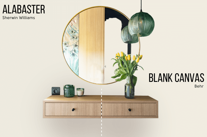
Honorable Mention: Behr Blank Canvas (DC-003)
Blank Canvas was the Behr Color of the Year for 2023. I wanted to mention it because it is very similar to Alabaster too, but a little less muted:
Alabaster Pros and Cons
Let’s take a ten second recap!
Pros for Using Sherwin Williams Alabaster
- It’s soft, versatile, and still pretty neutral
- Perfect for a Modern Farmhouse look
- Can look white or creamy depending on your trim choices
- A great white choice for exteriors
- Looks amazing with all colors of cabinet hardware
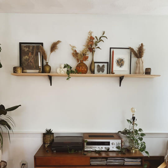
Cons for Using Sherwin Williams Alabaster
- It is definitely creamy! If you want a true white, this isn’t it
- Can look a little more yellow than other soft whites
- Not well suited as a crisp white
- A little too popular (in my opinion–I’m a paint hipster)
I hope this helped you decide if Sherwin Williams take on Alabaster is the perfect white for you! If it’s not the one, check out these other whites:
