Terracotta is a versatile color that looks bold, but is actually quite neutral.
Terracotta and clay colors are very of-the-moment, and coordinate well with many new colors, particularly as home trends shift slightly away from grays.
This post may contain affiliate links. Should you choose to make a purchase through one of my links, I may receive a small commission at no cost to you. I only recommend products that I use.
What Color is Terracotta?
Terracotta is a warm orange-red color with subtle earthy undertones. Think of the color of a terracotta pot. Terracotta pairs well with other natural colors and earthy shades.
Is Terracotta Color in Style?
Terracotta started trending upward in the Spring of 2020. As far as paint color trends are concerned, that means we are still in the early stages of clay pot couture.
The good news is that terracotta doesn’t really go out of style, it has been fairly stable in “trendy-ness” during the 5 years prior to 2020 too.
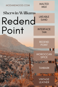
It isn’t on this list, but Sherwin Williams chose a terracotta as their Color of the Year in 2023!
Read all about it here:Redend Point: Sherwin Williams 2023 Color of the Year (Plus Dupes!)
Terracotta Color FAQ’s
Is Terracotta the Same as Burnt Orange?
Burnt orange tends to be brighter and more orange than terracotta, and doesn’t have the same earthy or muted qualities. Having said that, there are certainly shades or burnt orange that intersect with colors in the terracotta family.
Is Terracotta Brown or Red?
Terracotta is both red and brown. Shades can range, as you will see, from quite red (or even pinkish) to quite brown.

Is Terracotta Orange or Red?
On the color wheel, a typical terracotta color is squarely between red and orange. You could say something is “terracotta orange” or “terracotta red” and both would be correct. It’s like the color coral, which is both pink and orange.
What Color Family is Terracotta?
If we’re talking about the warm, cool, or neutral color families, than terracotta is warm. However many shades of terracotta can be neutral.
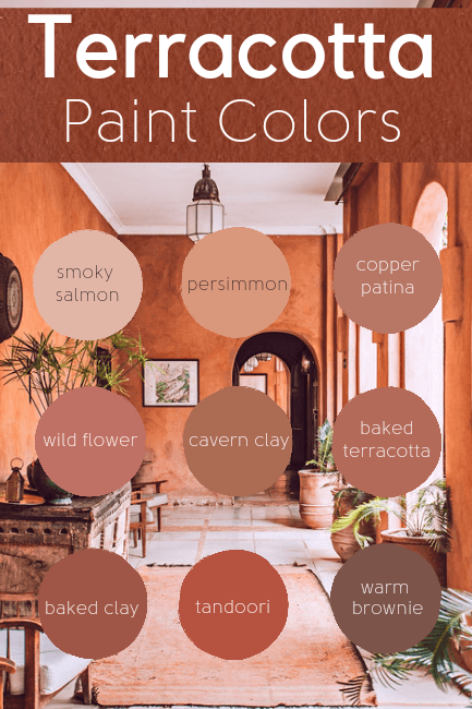
Best Terracotta Paint Colors
Okay, let’s hop into the best terracotta paint colors!
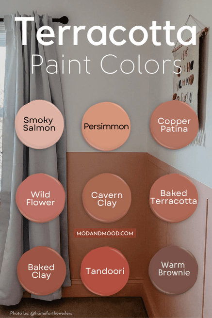
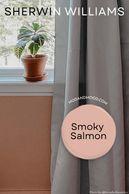
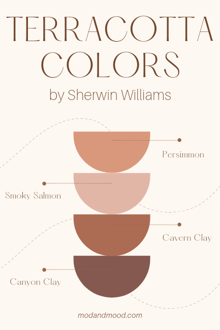
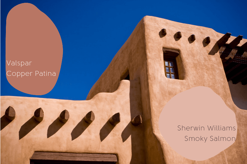
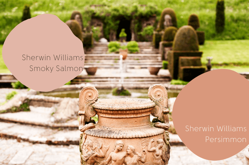
Sherwin Williams Smoky Salmon (6331)
Sherwin Williams Smoky Salmon is a light pinky-nude color that is in the terracotta family.
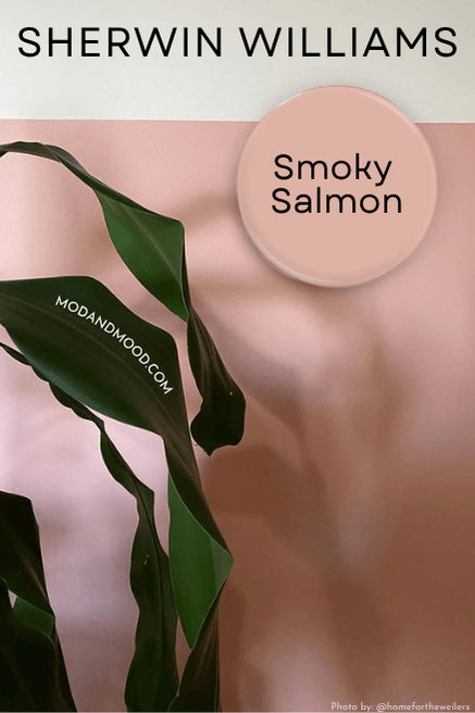
I wanted to include one color that is actually light, for anyone who didn’t want to fully commit to terracotta, or was just looking for something like terracotta, but not quite.
Sherwin Williams Persimmon (6339)
Sherwin Williams Persimmon is such a pretty color, and the perfect terracotta shade if you are worried about going too dark.
I wouldn’t use Persimmon in a big room that gets a lot of light, because I think that it would read peach instead of terracotta.
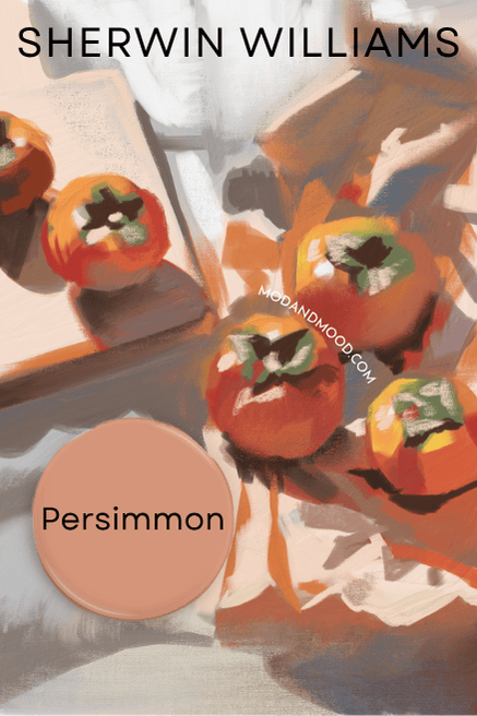
I actually painted our daughter’s room a color close to Persimmon, because I chickened out of a darker terracotta. Unfortunately I also went too pink, so the chic, clay-colored girls bedroom I had envisioned just looked…well, slightly darker than baby pink.
Don’t make my mistake. If you want your room to be a true terracotta, choose a true terracotta!
That being said, Persimmon is still a really-nice faded sort of terracotta. It would be great in a bathroom or another small space. (Or if you love the color! Also totally fine.)
Persimmon vs Sherwin Williams Sockeye (6619)
Sherman Williams Sockeye is more of a coral color than a terracotta. It is more pink than Persimmon and has basically no neutral or earthy undertones.
If you are wanting more of a melon color than terracotta, you might like Sockeye.
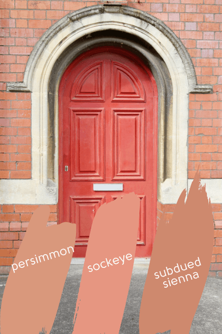
Persimmon vs Sherwin Williams Subdued Sienna (9009)
Sherwin Williams Subdued Sienna is a gorgeous color! It’s very similar to Persimmon but slightly darker and a little more earthy. If you wanted a lighter terracotta color, but you aren’t sold on Persimmon, bring home some color strips for Subdued Sienna.
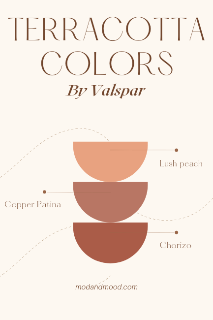
Valspar Copper Patina (R109D)
Valspar’s Copper Patina is another favorite of mine, probably because it is a more pink/red terracotta again, rather than orange.
Here is a terracotta living room in Copper Patina:
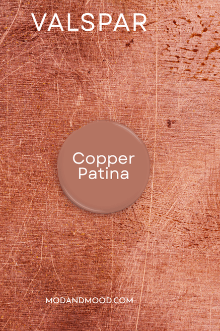
I feel like Copper Patina is a muted terracotta, but still bold enough.
(Copper Patina has been discontinued, so it is no longer listed on the website, but they should still be able to mix it. The hex code is #b87664)
Copper Patina vs Valspar Chorizo (303Q)
Besides being named after a sausage, Valspar’s Chorizo is a nice color. It actually fits in well with the Behr terracottas, because it’s more of a bolder, redder color.
(More on Behr terracottas in a minute!)
Chorizo does still have a more muted quality, like Copper Patina, which I think makes for a good terracotta.

Compared to Copper Patina, Chorizo is darker, slightly redder, and a little more vibrant.
Copper Patina vs Valspar Lush Peach (X51R124C)
Lush Peach isn’t really a terracotta color at all, it’s more of a true peach. It’s a nice soft color if you want something in the coral/terracotta family but don’t want deep brown tones.
Compared to Copper Patina, Lush Peach is significantly lighter and has no brown tones.
Benjamin Moore Wild Flower (2090-40)
Be careful with this one! Benjamin Moore wildflowers (plural, and all one word) is a pale shade of yellow.
Wild Flower is a newer color from Benjamin Moore’s 2022 collection. It looks great with their Color of the Year from 2022: October Mist, or traditional shades like Hale Navy.
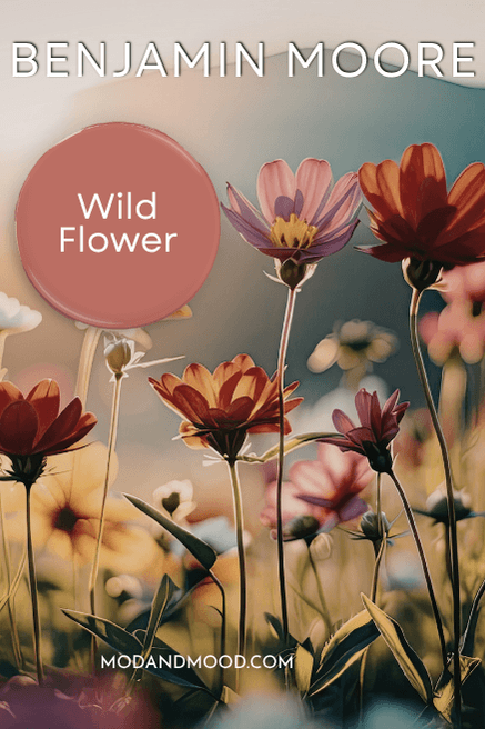
Wild Flower is one of my very favorites to look at. I prefer a pinker terracotta to one that is more orange.
Wild Flower vs Benjamin Moore Venetian Portico (AF-185)
Venetian Portico is another newer release from Benjamin Moore’s palette from Benjamin Moore. Venetian Portico is not a bad compromise for someone who would like some clay or terracotta color in their homes, but are nervous to go all the way.
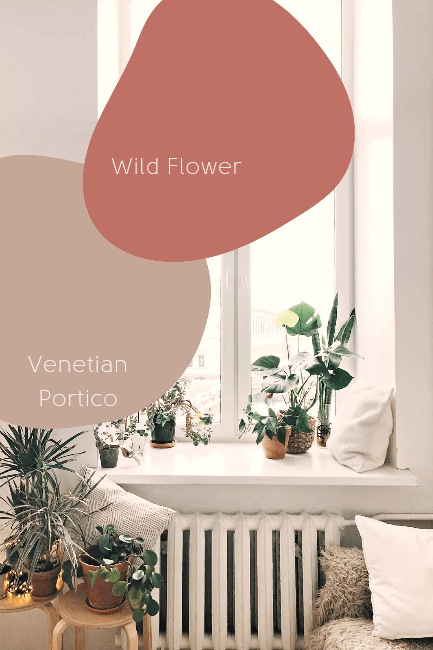
It is significantly lighter and more beige than Wild Flower, and definitely more beige than anything on my “Best Terracottas” palette.
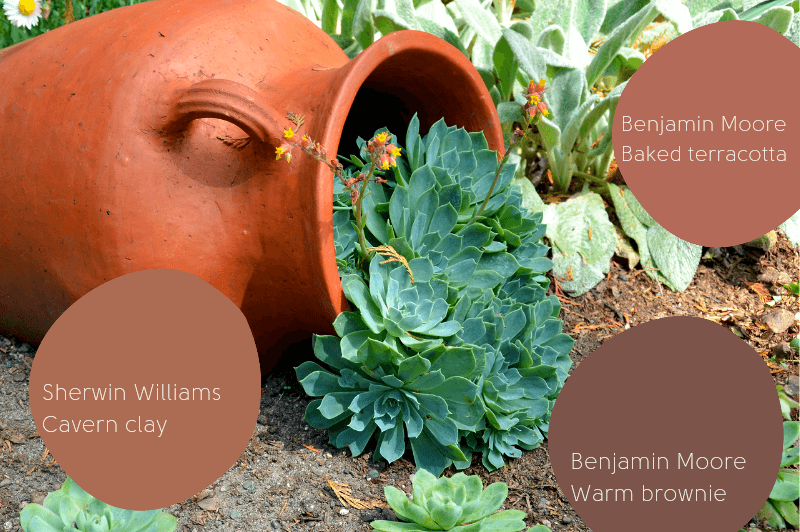
Sherwin Williams Cavern Clay (7701)
Sherwin Williams Cavern Clay is a favorite around here! It’s a fairly bold, saturated color, but somehow an easygoing neutral at the same time.
Here is a home office using Cavern Clay:
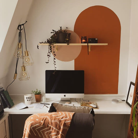
Cavern Clay goes great with all the of-the-moment colors like sage greens, new beiges, and rich blues. Of all the light to medium colors on my “best terracotta paint colors” palette, Cavern Clay is the most brown.
Pssst!
Cavern Clay is the most popular color featured in this post. Samplize makes it easy to cut down your short list with peel and stick samples that you can stick and reposition all over your home! Grab your sample of Cavern Clay and the next most popular color Benjamin Moore Baked Terra Cotta, and get to sticking!
Cavern Clay vs Sherwin Williams Canyon Clay (6054)
Canyon Clay is another popular Sherwin Williams terracotta clay color.
Honestly Canyon Clay is a fabulous color too! It’s a darker, more earthy brown color, but could still be considered a deep terracotta.

The names are funny to me, because surely a cavern is darker than a canyon? But oh well, there are a lot of colors to name!
Benjamin Moore Baked Terracotta (1202)
Benjamin Moore Baked Terracotta might just be the perfect shade of terracotta. In my mind it’s the most accurate for what I think of when I picture a terracotta pot.

It’s a nice medium shade of terracotta, not obviously more red or orange. It’s also not a punch-you-in-the-face saturated color.
I think any room painted in Baked Terracotta would be cozy warm, colorful, and neutral, all at the same time.
Baked Terracotta vs Benjamin Moore Potter’s Clay (1221)
I don’t personally like Potter’s Clay by Benjamin Moore, but it is a decently popular color so I thought it was worth throwing in the mix.
Potter’s Clay is more orange-tan than pink or red, and isn’t truly a terracotta color (in my mind). However, if you are looking for a terracotta paint color without even a hint of pink, this could be the one for you!

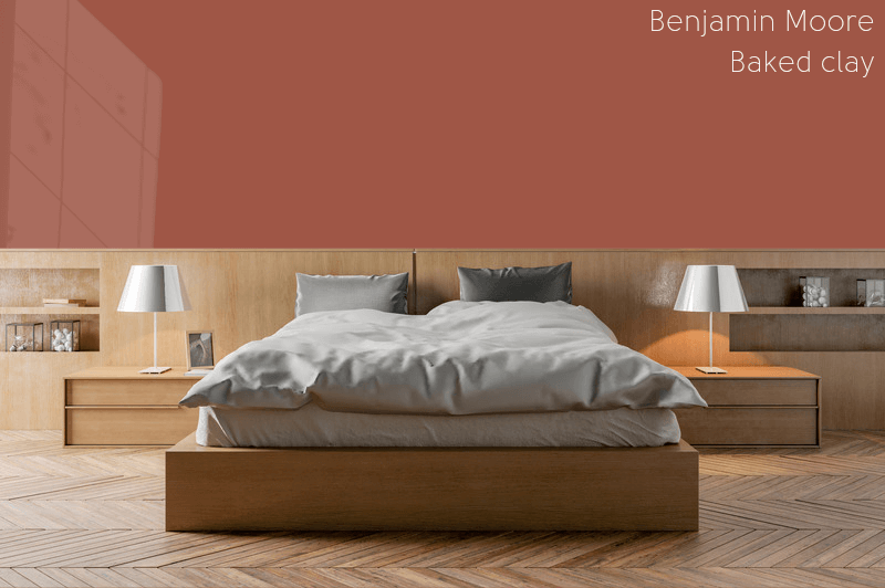
Benjamin Moore Baked Clay (035)
I added Benjamin Moore’s Baked Clay to my list at the last minute. It’s another true terracotta color, and I just couldn’t decide what I liked best!
Baked Terracotta vs Baked Clay (035)
Baked Terracotta and Baked Clay are fairly similar colors. Placed next to each other, you can clearly see that Baked Clay is darker and more red toned.
Either of these are a great medium terracotta color. In my opinion these would both be perfect in a southwest style, with a bright or creamy white, and rich wood accents.
Benjamin Moore Baked Clay vs Sherwin Williams Baked Clay (63040)
I just wanted to toss Sherwin Williams Baked Clay in here, because I like to do that whenever they have a color with the same name as Benjamin Moore.
The Sherwin Williams version of Baked Clay is more orange than both Benjamin Moore’s Baked Terracotta and Baked Clay.
Next to the clay pots I would say that the Sherwin Williams color is also a pretty accurate terracotta color, but it’s not my favorite. I think it’s neither the nicest of this group of colors, nor the nicest terracotta that Sherwin Williams has.
It doesn’t quite have the richness that I would like from a terracotta clay color.
Here’s another terracotta bedroom, this one in Baked Clay. A bedroom is the perfect place to dip your toes into a bolder color like terracotta.
Benjamin Moore Baked Clay vs. Benjamin Moore Terracotta Tile (2090-30)
I eliminated Benjamin Moore’s Terracotta Tile from my short list at the last minute in favor of Baked Clay.
This color is darker still, and more red than Baked Clay. It’s similar to the Behr color Tandoori.
For myself Terracotta Tile was getting too close to burgundy (I know it’s not really) so I wouldn’t choose it, but if you want a rich terracotta that is a brighter rusty shade, you might like Terracotta Tile.
Behr Tandoori (M170-7)
Behr’s Tandoori is everything I wish I was: Committed to being bold.

In all seriousness it would take some guts to put Tandoori on your walls, but if you trust the process, it will look so good! I have seen where people used Tandoori and it looks amazing.
From just a little swatch, Tandoori looks too red to be terracotta, but on the wall this spicy red-orange color fits the brief perfectly.
Tandoori vs Behr Deep Fire (M180-7)
Behr Deep Fire is another bold terracotta color. Deep Fire leans more orange than Tandoori’s red.
Deep Fire is a great color! At this point I am just splitting hairs, but I didn’t choose Deep Fire for my favourites because I like the muted earthy undertones of some of the other terracottas better.
If you are committed to the statement, than Deep Fire may be for you!
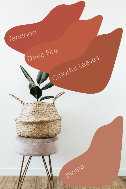
Tandoori vs Behr Colorful Leaves (190-7)
Behr Colorful Leaves is another solid terracotta choice.
I’m not surprised that I like all three of these colors because they are numbered 170-7, 180-7, and 190-7, so clearly all related!
Compared to Tandoori, Colorful Leaves is decidedly more rusty. I very much like colorful leaves and can really picture it in a cool living room with lots of natural textures and colors.
Tandoori vs Behr Pinata (MQ1-26)
Pinata by Behr is another option for someone looking for a more subdued terracotta color. It’s actually pretty similar to Cavern Clay by Sherwin Williams.
Compared to Tandoori it is significantly more muted and tan, and quite a lot lighter. Compared to Cavern Clay, Pinata is slightly lighter, and a bit more pink.
The only reason I didn’t put Pinata on my short list, was due to a lack of space, and it’s not a very popular color. I prefer underrated colors, but a lot of people like the tried and true tones.
Benjamin Moore Warm Brownie (2101-30)
I know the haters will say that Benjamin Moore’s Warm Brownie is not a terracotta, and from just a swatch I would agree. However, I first discovered Warm Brownie while scrolling Instagram, and it looked so cozy and nice that I wrote it down.
You know what I wrote so that I would remember what color it was?
“Clay.”
Therefore, Warm Brownie shall hereby be known as a terracotta clay color, or at least terracotta adjacent.
It typically looks a little less orange than it does in that pic.
I shocked myself with this one because I am just not a brown person. Never in my life have I staggered over to the medium and dark brown paint chips in the store and looked for something to put on my walls.
Warm Brownie. I love it.
You will too, just give it a minute!
Dulux Tuscan Terracotta
An honorable mention in my list of favorite terracotta paint colors, goes to Dulux Tuscan Terracotta. I feel like I have to include this one because it is very popular.

Tuscan Terracotta is a nice shade of terracotta, more to the light side. If it was on the favorites palette, it would fit between Persimmon and Smoky Salmon. It’s actually very similar to Persimmon, as in the difference is almost imperceptible. I’m not convinced that you would notice a difference if you chose one over the other.
Persimmon is a sliver darker than Tuscan Terracotta.
Terracotta Coordinating Colors
Just in case you are wondering “What colors does terracotta go with?” I have put together a few palettes!
Southwest Color Palette
Terracotta goes great with the Southwest interior design style of white, rich browns like cognac and camel, and natural greens like sage.

This color palette would look great with wicker, macrame, and of course, all your plants!
Here are all the colors from this palette:
Benjamin Moore Baked Terracotta & Warm Brownie
I chose Baked Terracotta for this palette for no particular reason. I just thought it was probably one of the universally accepted as terracotta colors, so it would be a good placeholder. You could use any terracotta here and have a solid “Southwest” feel.
In a two for one, Warm Brownie looks great with all other shades of terracotta!
Benjamin Moore Sage Wisdom (CSP-775)
Sage Wisdom is a nice true sage color, it goes well with many other colors.
Benjamin Moore Chantilly Lace (OC-75)
You know I love to sneak Chantilly Lace into my palettes! It’s such a versatile true white. I love it! It really goes with anything, and it would look amazing with terracotta and sage.
Sherwin Williams White Flour (7102)
White Flour is not a color you would use if you wanted a true white, but it is a warm creamy white that compliments a lot of colors. Here it adds some warmth to the “Southwest Palette” but still keeping it light and bright.
Warm Terracotta Palette
Because terracotta is such a warm color, it coordinates well with many other warm colors. This palette is inspired by the recent return to warmer paint colors like beige, warm greens, and earthy tones.

Sherwin Williams White Flour (7102)
Benjamin Moore Manchester Tan (HC-81)
Manchester Tan is a great neutral beige-tan without being too warm and brassy.
Benjamin Moore Peale Green (HC-121)
I struggle to describe Peale Green, it’s almost an emerald color, with just a hint of sage. It’s still a nice warm green, and looks great with all kinds of neutrals.
Baked Terracotta and Warm Brownie
Of course I love how these two look together, so I just left them alone for this palette!
Bold Terracotta Color Palette
Finally, terracotta plays off of other bold colors well.

Sherwin Williams White Flour (7102)
Benjamin Moore Manchester Tan (HC-81)
Benjamin Moore Palace Green (CW-520)
Palace Green is a warm true green, with just a hint of an earthy tone to mellow it out.
For more choices like Palace Green and Peale Green, check out my top color choices for Warm Greens.
Behr Tandoori (M170-7)
I put Tandoori in this palette because it is a bolder, richer terracotta.
Sherwin Williams Smoky Blue (7604)
This warm cyan-blue is across the color wheel from terracotta, and thus they coordinate well.
If you want more smoky blue-gray color options, check out my article on Warm Blue Gray Paint Colors.
Colors that Go With Terracotta
It’s surprising just how many colors look great with terracotta.
Most of the versatile paint colors that have gained a cult following, like Hale Navy and Revere Pewter, will still look great in your home if you add a splash of terracotta!
Terracotta pairs great with blues and greens across the color wheel, like sage and cyan-navy. It also coordinates well with adjoining colors like mustard and brown.
If you aren’t sure if terracotta goes well with another color, remember that terracotta can work as a neutral, and pick a more neutral or faded shade.
Benjamin Moore Terracotta Paint Colors
In case you missed it, here are all of my top picks for Benjamin Moore terracotta paint colors:

- Wild Flower (2090-40)
- Baked Terracotta (1202)
- Warm Brownie (2101-30)
- Baked Clay (035)
Sherwin Williams Terracotta Paint Colors
Here is the round up of all the best Sherwin Williams terracotta paint colors:
- Persimmon (6339)
- Smoky Salmon (6331)
- Cavern Clay (7701)
- Canyon Clay (6054)
Behr Terracotta Paint Colors (Home Depot)
Here are the best terracotta paint colors by Behr:
- Tandoori (M170-7)
- Colorful Leaves (190-7)
- Deep Fire (M180-7)
- Pinata (MQ1-26)
Behr really does the vibrant and saturated terracottas well!
Valspar Terracotta Paint Colors (Lowe’s)
Here are all the best terracotta colors from Valspar:
- Lush Peach (X51R124C)
- Copper Patina (R109D)
- Chorizo (303Q)
Pink Terracotta Paint Colors
Here are my favorite pink terracotta paint colors:

- Sherwin Williams Smoky Salmon (6331)
- Benjamin Moore Wild Flower (2090-40)
Isn’t this Venice inspo great? I think Wild Flower might be my all time favorite terracotta. Just don’t tell Baked Terracotta!
Soft Terracotta Paint Colors
Here are some terracotta colors that are softer and more muted:
- Valspar Copper Patina (R109D)
GOAT? I can’t decide!
- Sherwin Williams Smoky Salmon (6331)
Smoky Salmon is a chameleon!
It looks so neutral here, and yet it can also look very pink. I love colors that look different in different spaces, but if you don’t want an all-pink home, definitely test Smoky Salmon in your own house before you commit!
Faded Terracotta Paint Colors
Here are some colors inspired by classic faded terricotta. The kind of terracotta color you see all over Europe on old buildings.
- Sherwin Williams Smoky Salmon (6331)
I honestly didn’t realize that I had used Smoky Salmon in so many categories until right now. I guess I’ll allow it!
- Sherwin Williams Persimmon (6339)
Persimmon is kind of the perfect “faded terracotta” color.
Earthy Terracotta Paint Colors
Here are the best rich and earthy terracotta paint colors:
- Benjamin Moore Baked Terracotta (1202)
- Sherwin Williams Cavern Clay (7701)
- Benjamin Moore Warm Brownie (2101-30)
Dark Terracotta Paint Colors
Here are the best terracotta colors that are darker and more rich than a simple terracotta pot:

- Benjamin Moore Warm Brownie (2101-30)
Tandoori vs Behr Colorful Leaves (190-7)
You can see the difference between these two colors in the photo above. Tandoori is a little more pink-red and Colorful Leaves leans a little bit more rusty.
Behr Tandoori (M170-7)
I love that picture because the wall is basically the same color as Tandoori, which I would be nervous to choose, but doesn’t it look fabulous?
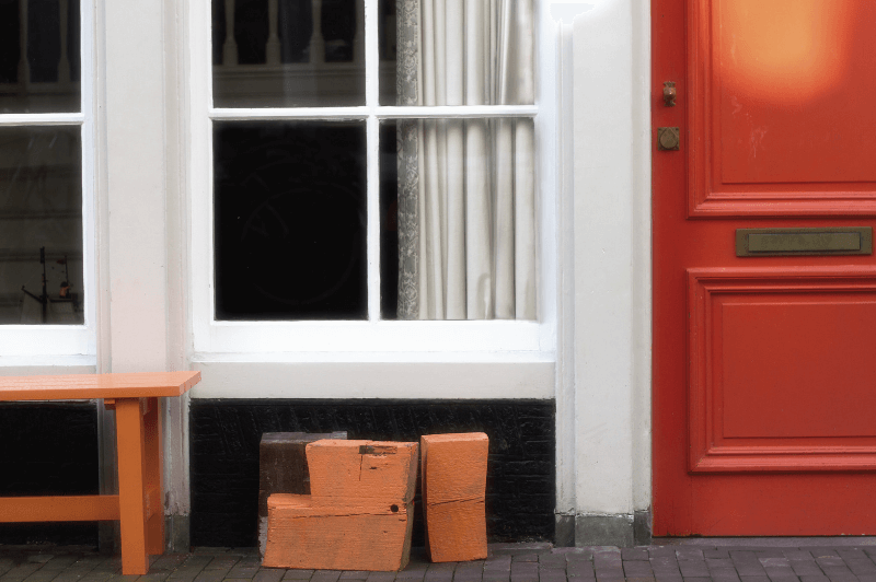
Terracotta Front Door Inspiration
Of course like any bold color, you might want to experiment with a small project, like your front door. Here is some terracotta front door inspo for you:

Terracotta would look amazing on a brick house!
Terracotta would also really pop against dark or neutral exterior colors.
If you were thinking about choosing a red door, maybe try terracotta instead!
Terracotta Exterior Ideas
If you weren’t thinking about the fact that brick is really just another form of terracotta, it might seem like too bold of a choice for your exterior.
There are ways to use this color on exteriors that are actually quite natural. Here is one example:

This home is still quite a bright color, but you would never look at that and say “Wow! What a garish orange house!”
Or maybe you would…but I wouldn’t.
Something like Valspar’s Copper Patina would be great on an exterior, particularly on stucco.
Terracotta Pros and Cons
Thank you so much for reading to the end. That really helps my blog!
Let’s recap with a few pros and cons:
Pros
- A bold and unexpected shade that is still found in nature
- Looks amazing with a surprisingly wide variety of colors such as sage, navy, and white
- Perfect for a pop of color
Cons
- If you hate pink, certain shades of terracotta won’t work for you
- Can be brighter than you expect
- You do need to commit or the result might read peach rather than terracotta
Here are some more great posts that you will love! :


