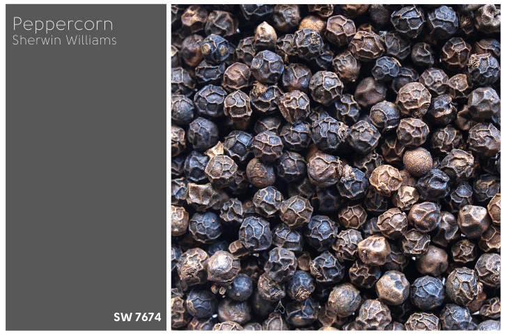
Peppercorn and Iron Ore are often compared as “black” paint colors from Sherwin Williams, but are they actually black, and which one is best?

Here we will take a good look at both colors, and spot the differences. I have also curated some photos to give you a better idea of how they look in real life.
Let’s go!
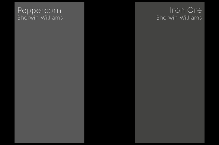
Sherwin Williams Iron Ore and Peppercorn Swatches
First lets take a look at the colors individually. Here is a swatch of Iron Ore:

And Peppercorn:
Iron Ore vs Peppercorn Properties
Here is a handy dandy graphic that I whipped up to help you visualize the differences that we are going to talk about:

Iron Ore vs Peppercorn LRV
The LRV of a color indicates on a scale of 0 – 100 how much light a color reflects (or doesn’t reflect). True black has an LRV of 0 and pure white has an LRV of 100.
In the paint world, we are working in a range of 3 – 93 because no paint color is purely black or completely white.
Peppercorn has an LRV of 10.
Iron Ore has an LRV of 7.
Iron Ore vs Peppercorn Undertones
The easiest way to spot the undertone of a color is in comparison to other colors. Here are Peppercorn and Iron Ore compared to true black:
They both look pretty gray!
On the swatch, Iron Ore has no obvious undertone. Technically it is a charcoal in the yellow color family. On the wall, it ranges in appearance from a dark blue-ish charcoal color to an actual black. In some circumstances it can even have a slight olivey tone, but that is less common.
Here is Iron Ore looking as black as it ever looks:

Thanks so much to Rebuild Fabricators for the photo!
Loving the black door look? Check out this post:

I would say that most often, Iron Ore looks pretty much like it does here:

See just the hint of blue? When I see that (particularly on exteriors) I know the color is most likely Iron Ore. This makes no sense, because there is no actual blue in the formulation, and yet here we are.
Although in the comparison graphic it shows that Peppercorn is in the red family, it is actually purely gray. The RGB (Red, Green, Blue) of Peppercorn is 88, 88, 88, meaning that it is gray and only gray.
That was hard for me to grasp, because Peppercorn is a true chameleon. I find that most often, Peppercorn looks like a mid-charcoal, or a blueish-gray. In some cases it can even look a bit green.
Here is Peppercorn showing a hint of green. I think it is due to the warm lighting in this room, but I have seen it in several houses:

Thanks so much to Jenelle of @stlsweets for the photo.
Peppercorn doesn’t ever look truly black. (If you like the green-gray effect, consider Sherwin Williams Pewter Green.)
Here is Peppercorn on an exterior by Stoeck Interiors, showing off more of its blue undertone:

The color on the garage doors is Sherwin Williams Sea Serpent.
Iron Ore vs Peppercorn – Are They Warm or Cool?
Iron Ore most often looks like a cool color. It looks dark gray, and never the least bit brown despite the formulation. I would say that when it takes on an olivey tone in the odd circumstance, it can look slightly warm.
Peppercorn has sooo many faces, it can look like a gray-blue, gray-green, or even a brownish-gray (like a deep greige – but that’s very rare!).
Both of these shades have elements of cool and warm colors. I would say that Iron Ore leans cool most often and Peppercorn is about 50/50.
Iron Ore and Peppercorn Color Palette
Because Iron Ore and Peppercorn are technically grays without much real color to them, there aren’t really complementary colors for either.
(Complementary colors are the colors across the color wheel.)
Here I made a loosely monochromatic color scheme of coordinating and similar colors.
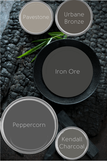
Sherwin Williams Pavestone
Pavestone is a really nice taupey color that goes with a LOT of other colors.
Sherwin Williams Urbane Bronze
Urbane Bronze is a former color of the year for Sherwin Williams and is really popular for exterior trim and doors. Urbane Bronze would look very luxurious with either dark charcoal, but it can sometimes look too similar to Iron Ore.
Benjamin Moore Kendall Charcoal
Kendall Charcoal is a warm charcoal that is closer to being a really dark greige than a black. I don’t know that I would put it with Peppercorn, but it could be another charcoal option, or it could work with Iron Ore.
Iron Ore or Peppercorn Accent Wall
Either Iron Ore or Peppercorn works well as an accent wall. I have seen many instances of both.
The major difference is that Peppercorn will not look black. If you want an accent wall that is definitely mid to dark gray, and not black, then choose Peppercorn.
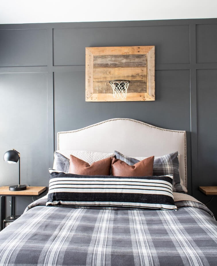
Thanks so much to Martina of @thelivedinlook for the photo!
If you want your accent wall to look black or close to it, then choose Iron Ore:
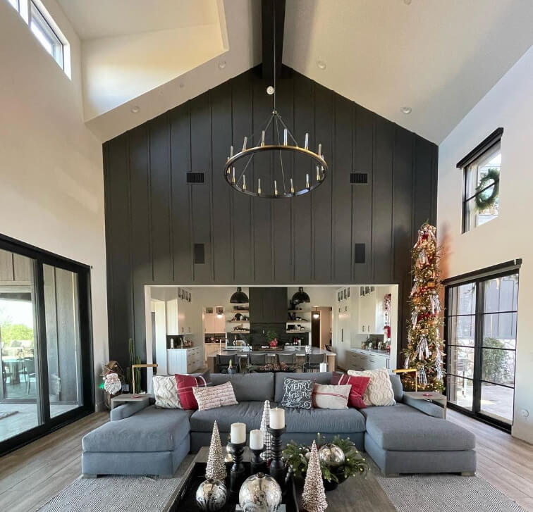

Thanks so much to Tara of @tararowemckenna for the photos!
I still wouldn’t say that Iron Ore is truly black. For a real black paint color, check out: Sherwin Williams Tricorn Black (Is it the Best Black? Plus Dupes!)
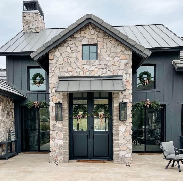
Iron Ore vs Peppercorn Exterior
Here are a couple of photos of Iron Ore on a home’s exterior in different lighting.
(I do think the contrast is dialled up a little in the darker photo, but you get the idea!)

Next up, here is Peppercorn on an exterior:
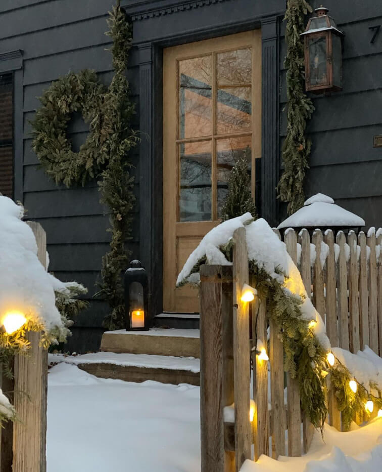

You can see in the lighter photo how Peppercorn can look a little blue.
Thanks so much to Kelly of @thetatteredpew for the photos!
When to Choose Peppercorn or Iron Ore?
I hope this gave you a better idea of each of these colors! Once you have seen them in real homes you can really see how different they are.
In conclusion, choose Peppercorn for a mid to dark charcoal color that can have a hint of blue, green, or even brown.
Choose Iron Ore for a rich off-black that stays a bit more predictable in most lighting and decor scenarios.
As always, but especially with these two(!), be sure to bring swatches into your house and keep them up at different times of the day.
Need more time? I’ve got more inspo! :


