It’s difficult but I’ll refrain from the “Ahoy, maties” and “Aye, Captains” because Naval is so much more than a nautical paint color.
This vibrant navy does “coastal” or “Victorian” equally well, and you don’t have to pair it with crisp whites (although you might want to!).
In this article we will take a look at Naval in real homes, match it up with some fun colors, and finally, peruse the dupes!
What Color is Sherwin Williams Naval? (SW 6244) Undertones and Overall Look
Sherwin Williams Naval is a deep navy blue with a rich saturated quality. It is technically as dark as some black paint colors, but it reads brighter.
You will see a lot of Naval with gold, because the two together is just *chef’s kiss*.
LRV of Sherwin Williams Naval
The LRV of Naval is 4.
What does that tell us?
The LRV (Light Reflectance Value) of a color indicates on a scale of 0 – 100 how much light a color reflects (or doesn’t reflect). True black has an LRV of 0 and pure white has an LRV of 100.
In the paint world, we are working in a range of about 3 – 93 because no paint color is purely black or completely white.

This is what I meant by “technically as dark as some black paint colors.” At 4, Naval has an LRV on par with several true black paints. It just has more actual color in it.
What Are the Undertones of Naval?
Naval is about as deep navy and indigo as you can get without actually being purple.
Some might say that it has a purple undertone, and while on a scale of blues, it is definitely closer to purple than green, it doesn’t look purple.
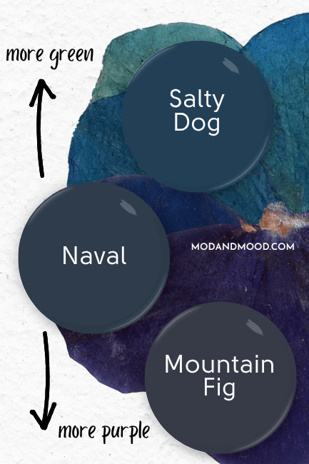
(For reference, Sherwin Williams classes Mountain Fig as a purple paint color.)
I don’t personally find Naval to be one of those chameleon colors, it usually looks exactly how you would expect.
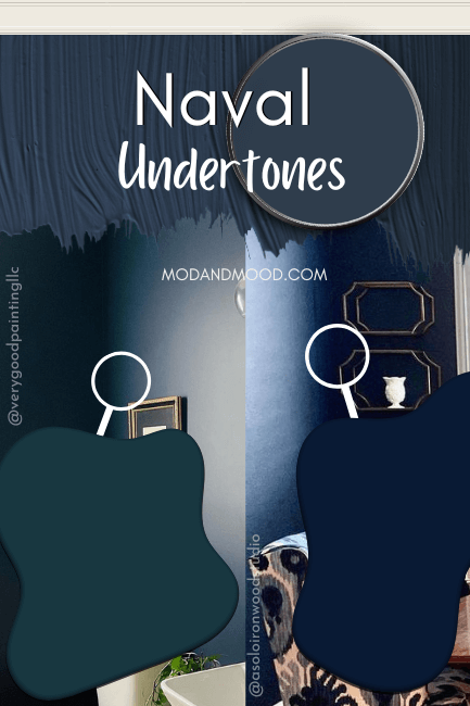
Zoomed in you can see that Naval ranges in appearance from something with an ever-so-slightly teal undertone, to more of a royal navy. However if you were to compare each room as a whole, the color doesn’t vary that much.
If you are after a predictable navy, this could be the one!
Is Naval Warm or Cool?
Naval is a true blue paint color, and therefore a cool toned color.
The Naval Color Strip from Sherwin Williams
Naval doesn’t technically have its own color strip. Sherwin Williams placed it in a collection of similar dark one-off colors.
I went through the options myself, and found that the color strip from Upward to Indigo Batik is the closest possible continuation of Naval:

Is There a Lighter Version of Naval?
Indigo Batik is the darkest color that Sherwin Williams places on the color strip, but as you can see Naval is a bit darker and fits in nicely.
If you are looking for something like Naval but lighter, Indigo Batik should be on your list!
Sherwin Williams Naval vs Indigo Batik (SW 7602)

Indigo Batik has an LRV of 8. Because it is lighter, it can also read a bit “brighter” than Naval, but it is pretty much like a lighter version.
Darker Version of Naval
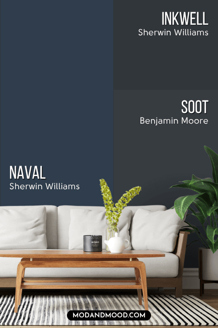
Since Naval does have a very deep LRV at 4, what you might actually want is a less saturated color. You might like Sherwin Williams Inkwell or Benjamin Moore Soot.
Sherwin Williams Naval in a Color Palette
Here is Naval with a few popular paint colors, and a couple of my favorite pairings:
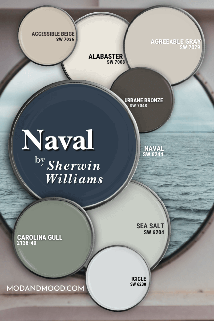
I’d like to break this down further into a cool color palette and a warm color palette.
First let’s take a look at Naval in the cool toned color palette:
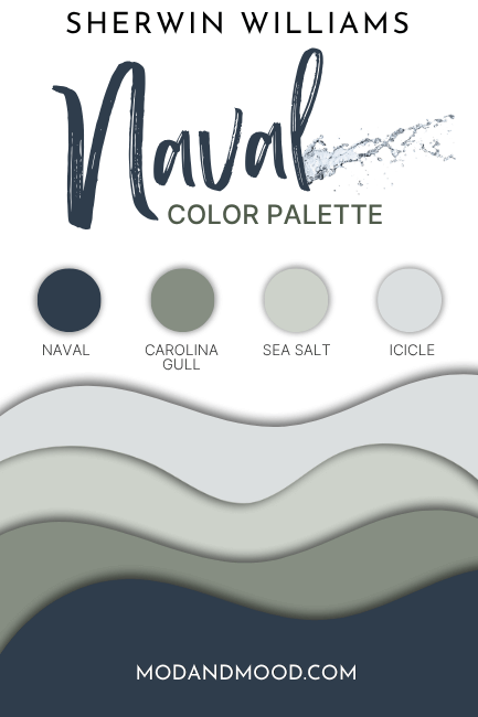
Cool Coordinating Colors for Sherwin Williams Naval
Try Sherwin Williams Sea Salt with Naval
Sea Salt is a beautiful, light and airy, gray-green. It is an unexpected favorite alternative to a whole home neutral.
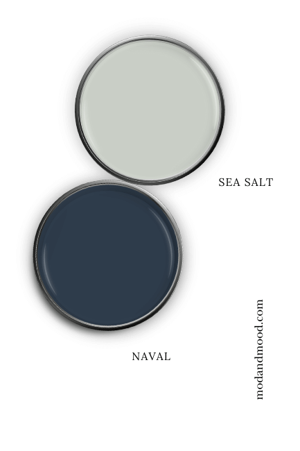
Sea Salt pairs easily with most whites and neutrals, and looks great with other cool tones like Naval. These two together would make a great jumping off point for any coastal decor theme.
Pair Naval with Benjamin Moore Carolina Gull
Carolina Gull is a beautiful sage green that loves a good navy!
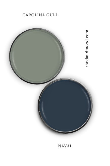
Here is Carolina Gull paired with a similar navy shade by Benjamin Moore called Evening Dove:

Evening Dove is just a bit lighter and more gray, but you can see how good Carolina Gull would look with Naval! It’s giving old world sophistication.
For a Sherwin Williams option, you might like Retreat.
Use Naval with Sherwin Williams Icicle
Icicle is the lone color I included that was recommended by Sherwin Williams to go with Naval. It is a soft gray-blue.
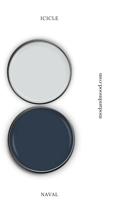
You could potentially use Icicle as a trim color if you wanted a cool, lower-contrast option, but you would have to really commit and keep it as your only “white.”
Heather (@hethlee123) did just that with the exterior of her 107 year old home:

She used Icicle for the trim on all of the windows of her Naval home, and you can see that against the darker blue of Naval, Icicle does look pretty white.
More on her exterior when we look at real life photos!
Warm Coordinating Colors to Use With Naval
Here is the warm color palette that I came up with for Naval. These colors are all neutrals, so you could also mix and match with the cool toned colors.
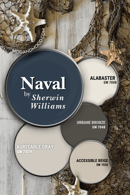
Try Naval with Agreeable Gray or Accessible Beige
Agreeable Gray and Accessible Beige are Sherwin Williams tried and true flagship greiges. Accessible Beige leans a little more true beige, and Agreeable Gray leans more gray, but both are pretty similar:
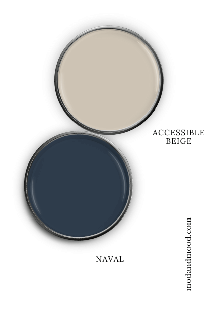
Either of these colors are a nice sandy neutral choice that can flex Naval anywhere from “coastal” to “classic Victorian.”
Agreeable Gray would be my personal recommendation if anyone is working with a hard to coordinate color, but for Naval, it’s 100% up to you!
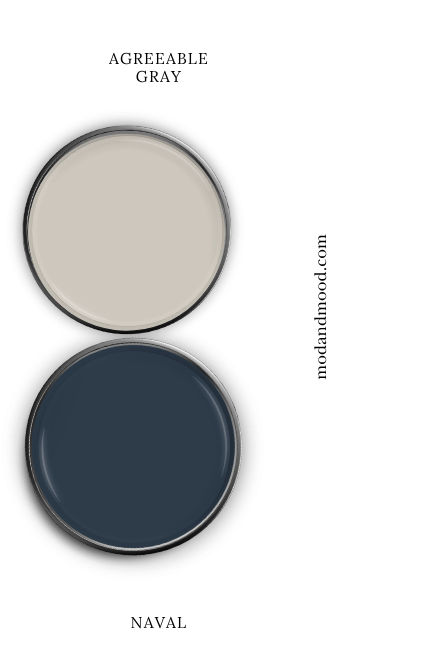
For a complete look at the differences, check out my post: Accessible Beige vs Agreeable Gray (How to Choose!)
This post has been updated, but I originally had Benjamin Moore Manchester Tan in this palette instead of Accessible Beige. I do still like that combo today, so you may also want to check out that color: 14 Coordinating Colors that Will Make Manchester Tan Glow (See the Palettes!)
Pair Sherwin Williams Urbane Bronze and Naval
Urbane Bronze is very close to being directly across the color wheel from Naval, which means it is a good complementary color.
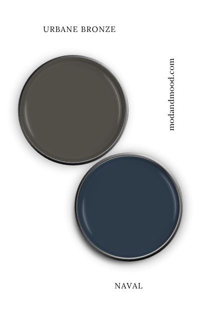
This former Sherwin Williams “Color of the Year” is every bit as versatile as Naval. It would make a particularly nice trim choice for a Naval exterior.
Read more about this color in my post: Urbane Bronze Review and Dupes (It Goes With Literally Everything!)
Use Naval with Sherwin Williams Alabaster
You do need a white choice if you are going for coastal vibes, and Sherwin Williams Alabaster is an age old favorite! It is not a crisp white however, so this would create a more subtle contrast.
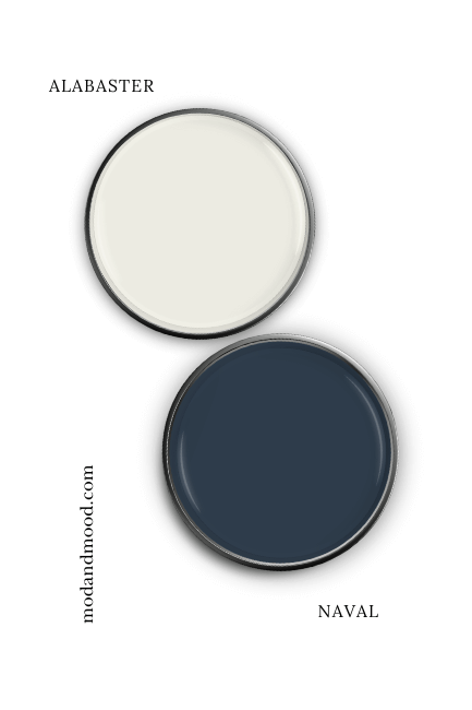
Alabaster is a creamy white that isn’t quite an off white. Its beige undertone is a favorite with both designers and homeowners. You should expect that the warmer undertone of Alabaster will emphasize the blue in Naval.
What Trim Colors Go With Sherwin Williams Naval?
Besides Icicle, what trim colors are going to work with SW Naval?
Let’s take a look at different white options, and then wood trim.
White Paint that Goes with Naval

Sherwin Williams Pure White
Pure White is a popular white by Sherwin Williams. It is a pretty true white, but not overly bright. It has a hint of warmth that is balanced by a whisper of gray, so it reads “pure white” but it has depth.
This color is a great trim option no matter your walls, but it definitely works with Naval.

Sherwin Williams Extra White
Extra White is a bit cleaner and cooler than Pure White. It doesn’t have an obvious undertone, which makes it a popular trim choice.
You should expect that this white will look crisp, clean, and navy-themed against Naval.
Sherwin Williams Alabaster
Alabaster is of course, the OG fan-favorite creamy white.
I actually have pictures of Naval with all three of these whites (Pure White, Extra White, and Alabaster) when you get to real life photos below!
Sherwin Williams Greek Villa
Greek Villa is a creamy white without being yellowy or too dark. It’s not the first color that comes to mind for trim, but it is soft and versatile.

Pairing Naval with Wood Trim
I find that most navy paint colors like all different tones of wood.
Seeing as the official complementary color for Naval is a deep brown, it especially makes sense in this case!
Here is how Naval will look with a variety of different wood trim shades:

I also tossed in Tricorn Black, because why not? Black is getting very popular for interior doors, so someone may be curious!
See Sherwin Williams Naval in Real Homes
Ready for the fun part? It’s Naval in real life!
Sherwin Williams Naval on Kitchen Cabinets
Let’s get straight to the good stuff and see Naval on cabinets!
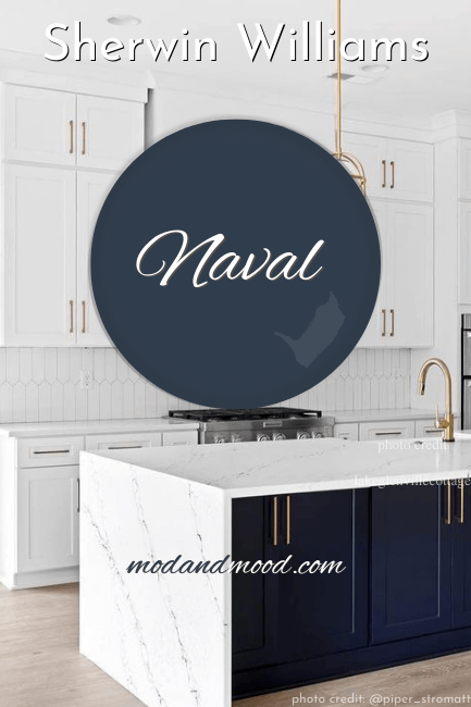
You probably noticed this swoon-worthy kitchen on one of my swatches earlier:
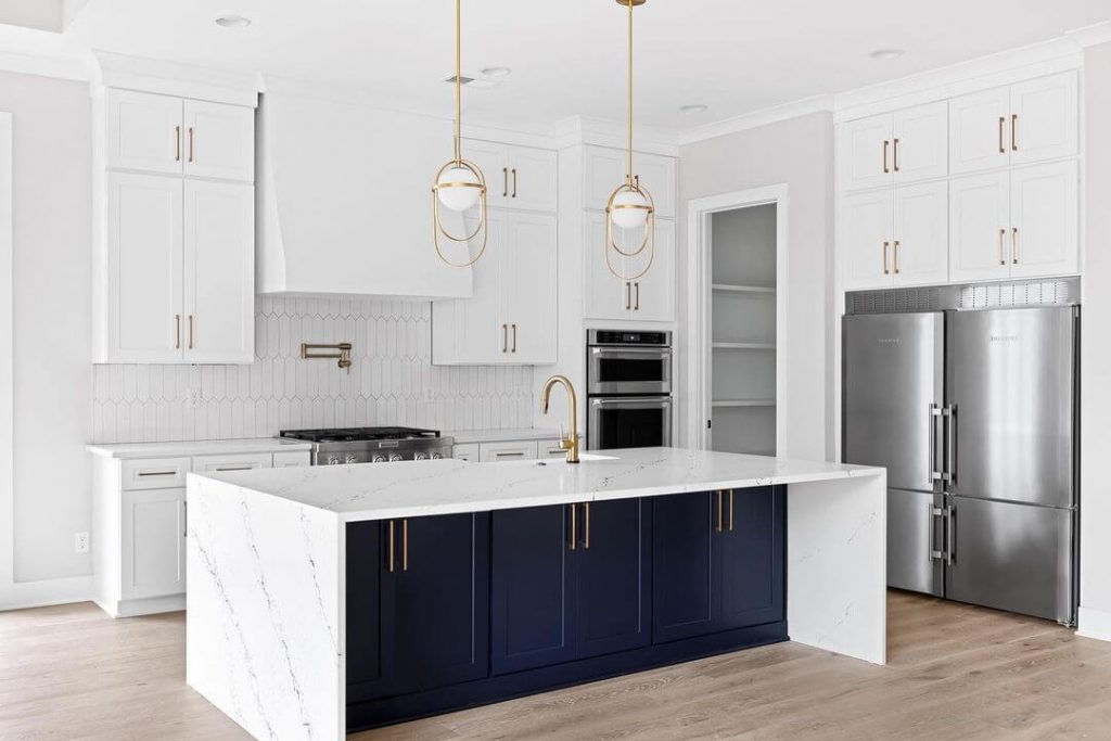
This kitchen is by designer Piper Stromatt (@piper_thebuildingblonde). She used Sherwin Williams Pure White on the perimeter cabinets and Naval on the island.
The waterfall island and touches of gold add to the luxurious vibe. Piper didn’t list the wall color, but it looks pretty close to Sherwin Williams First Star.
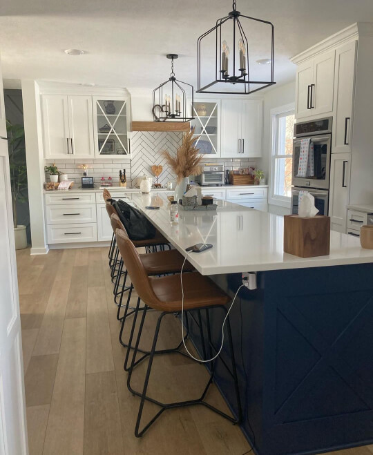
This next kitchen also features Naval on an island in an otherwise white kitchen:

Stacey (@turquoisebydesign) chose Sherwin Williams Nebulous White for the perimeter cabinets, and used consistent black hardware throughout.

(Did you peep that feature wall in the background? It looks like Sherwin Williams former Color of the Year: Evergreen Fog.)
I love the timeless mid-toned wood that the homeowners chose for the flooring and accents!
Using Naval with Oak Cabinets
Wondering if Naval could work with existing oak cabinets?
Here’s a graphic to help you visualize:
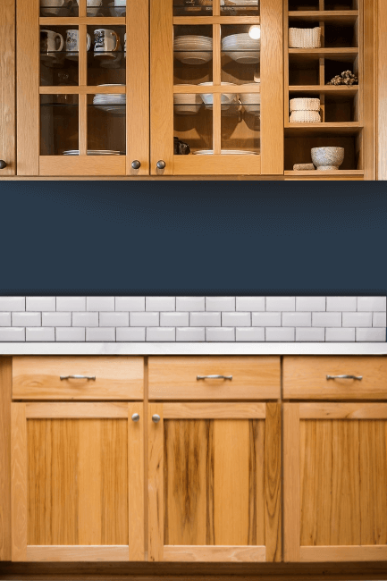
I do think Naval looks good with most wood tones. If you are unsure you can always order stick on samples to move around your kitchen.
I don’t really have pictures of Naval with a lot of wood, but here is a similar color – Benjamin Moore Hale Navy:

Naval should look pretty similar to this.
Here is a wood closer to honey oak, but in artificial light:
Hopefully that helps you picture it a bit better!
Sherwin Williams Naval in the Living Room
This living room is fun because Megan (@creationsbymegans) chose to use Naval on all of the walls instead of just a feature wall:

Sherwin Williams Naval in the Dining Room
This design by Ironwood Studio (@asoloironwoodstudio) also made the most of Naval, and used it on every wall.
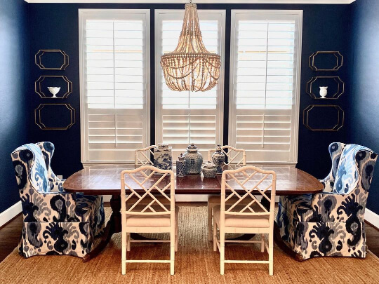
The retro chandelier and custom covered chairs complete the look in this dining room.
Naval in the Bathroom
I actually have two powder rooms to show you in Naval.
This first one is by the team at Very Good Painting:
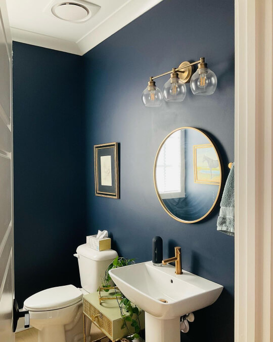
The homeowners chose gold hardware, fixtures, and even picture frames. The gold is fabulous with Naval!
You might have noticed that the white on the ceiling and door is very soft and creamy. My guess would be that it is SW Alabaster, but if they get back to me I will update!
The next bath is by Piper again!
(Remember that drop dead delicious kitchen earlier?)

The navy blue in the wave themed wallpaper accent wall is a perfect match for Naval! If you take a look in the mirror you can see that Naval graces the tall ceilings as well!
(I think the color in the hallway looks like Sherwin Williams Shoji White, which I happen to know that Piper loves!)
Choose Sherwin Williams Naval for Your Home’s Exterior
In terms of a full exterior I was surprised to not find Naval on many houses.
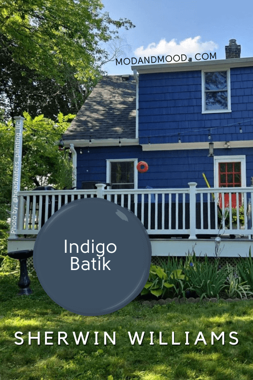
Here is the one belonging to Heather that I showed briefly when we were talking about Icicle:

Speaking of icicles:

Naval looks so pretty in the snow! The cedar shutters are a nice additional pop of color.
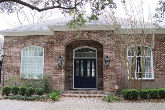
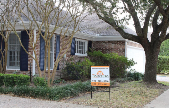
That’s it for actual Naval exteriors. I did find something very similar however:

The homeowners working with Headwaters Painting (@headwaters_painting_llc) chose to use a 50/50 mix of Sherwin Williams Anchors Aweigh (a similiar navy), and Inkwell (an almost black navy).
I’m no mathematician but I calculated the RGB of this particular blend, and as far as I can tell it would be just a bit more gray than Naval.

Having actually seen Naval on an exterior, I would say it’s pretty darn close. Perhaps just a bit more vibrant.
The color on the shakes is Benjamin Moore Abingdon Putty.
This next navy is also similar but a bit more charcoal:

More about Cyberspace and Anchors Aweigh in just a minute!
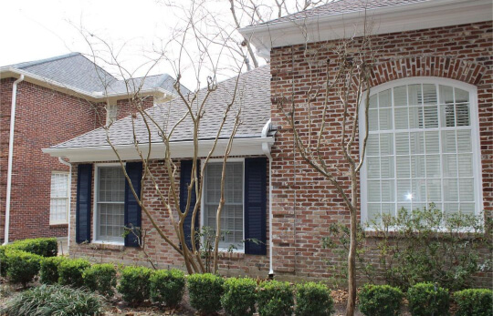
Naval on a Front Door and Matching Shutters
I do actually have the real deal Naval on a front door, as well as shutters!
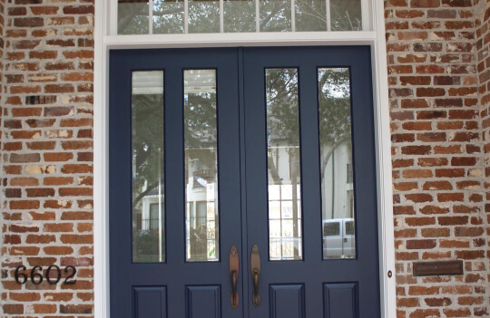
Doesn’t Naval look amazing with brick?
S&L Painting (@slpaintingsf) used Sherwin Williams Extra White on the trim for this home.
Naval Compared to Other Navy Blue Paint Colors
Now we enter the baffling blue world of navy paint colors! I mean seriously, how can there be so many??
(Although, according to the Inkwell/Anchors Aweigh exterior people, there still weren’t enough!)
Let’s compare some navy blues, shall we?
Sherwin Williams Naval vs Anchors Aweigh (SW 9179)
Anchors Aweigh is just a bit darker, a touch more gray, and a touch closer to violet than Naval.
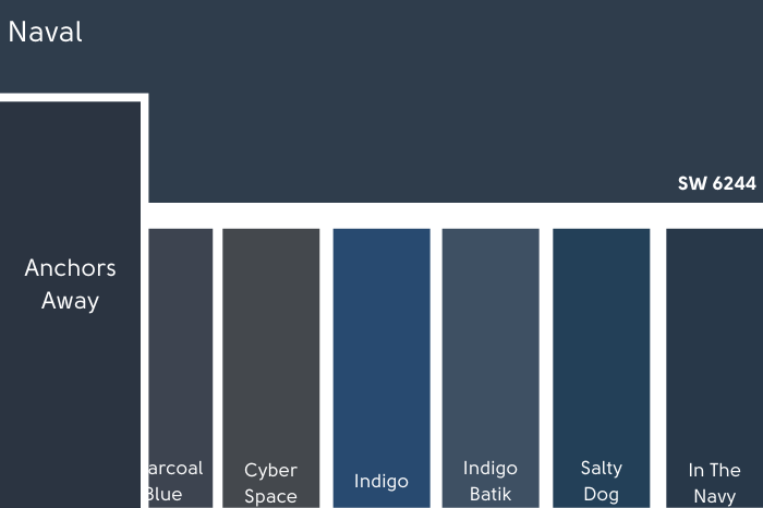
The LRV of Anchors Aweigh is 3.
*I apologize profusely that I autocorrected the spelling from Anchors “Aweigh” to Anchors “Away” on the graphic, but not profusely enough to start it all over. Sorry ’bout it!*
Sherwin Williams Naval vs In the Navy (SW 9178)
I love a good navy, I do… but are we 100% sure that even the people at Sherwin Williams could tell Naval from In the Navy?

I feel like if I need to punch the color codes in repeatedly to figure out the difference, one of these might be superfluous.
Then again, I can tell almost all white paint colors apart now, so maybe I just need more time with navies!
Anyways, “In the Navy” is the same color as Naval, but just a little less saturated (meaning a touch more gray).
The LRV of both colors is 4.
Sherwin Williams Naval vs Charcoal Blue (SW 2739)
Hooray for colors that are easily differentiated!
Charcoal Blue is how it sounds: A more charcoal navy. It’s also a bit closer to violet than Naval is, and a touch lighter, with an LRV of 6.

Sherwin Williams Naval vs Cyberspace (SW 7076)
I have actually written a whole post about Cyberspace: Sherwin Williams Cyberspace (The Moodiest Charcoal Blue!)
I really love Cyberspace! It’s more gray than Charcoal Blue even, so it can sometimes look almost black.
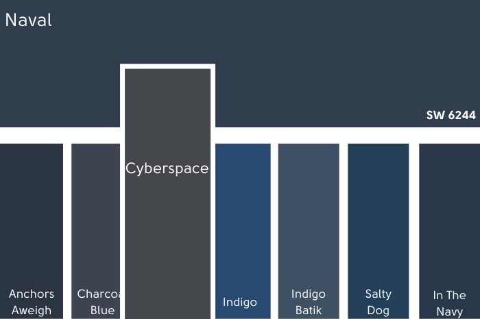
As you saw from that exterior earlier, it is still navy, but looks less so beside bolder blues.
Cyberspace, believe it or not, is in the exact same blue area as Naval, it just has way less color in it!
Cyberspace is also a bit lighter than Naval, with an LRV of 6.
Sherwin Williams Naval vs Indigo (SW 6531)
If Naval is the same color blue as Cyberspace, but more saturated, then Indigo continues the trend. It is also in the same space on the color wheel as Naval and Cyberspace, but waaay more saturated.
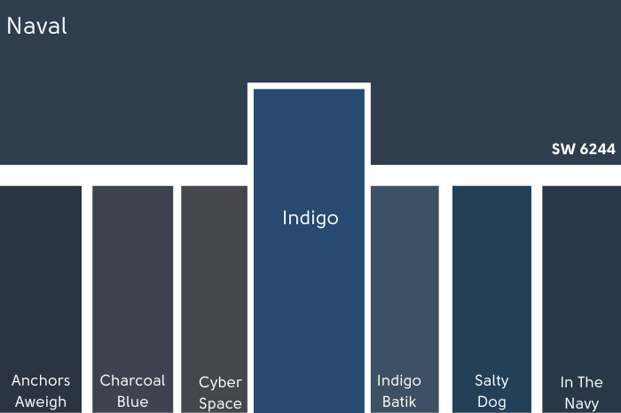
Indigo actually has an LRV of 6, it just reads lighter because it is so bright.
Sherwin Williams Naval vs Benjamin Moore Hale Navy (HC-154)
I interrupt this parade of Sherwin Williams navies to bring you one by Benjamin Moore.
We saw a little bit from Hale Navy earlier, so let’s compare!
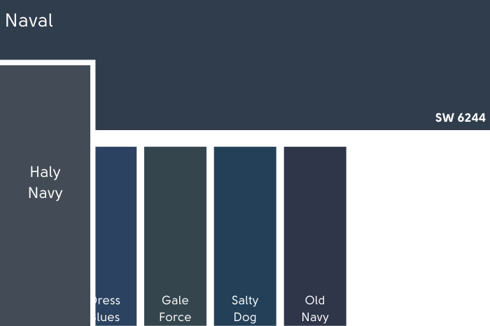
You can see that Hale Navy is just a bit more muted than Naval. It is not only more gray, but lighter too, with an LRV of 8.36.
For the true Sherwin Williams version of Hale Navy, check our my Hale Navy dupes post.
Sherwin Williams Naval vs Dress Blues (SW 9176)
Back to the SW navies we go!
Dress Blues kind of splits the difference between the ultra-saturated Indigo and the more tame Naval. It’s still in the same color area, and has an LRV of 5.

Sherwin Williams Naval vs Gale Force (SW 7605)
Gale Force is more green and more gray than Naval. It has an LRV of 6.
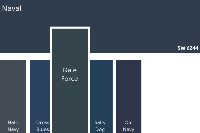
If you like Gale Force, you might like Cascades, which is from the same Sherwin Williams collection.
Sherwin Williams Naval vs Salty Dog (SW 9177)
Salty Dog is one of Sherwin Williams more popular navy paint colors.

It has an LRV of 5, so it’s not significantly lighter than Naval, but it’s a much brighter, in-your-face color.
Some of that brightness is from a bit of extra yellow rather than violet.
Sherwin Williams Naval vs Benjamin Moore Old Navy (2063-10)
Back to our friend Benny for this last FAQ on navy vs navy, with the color Old Navy.

Old Navy is darker than Naval with an LRV of just 3.11. It is also so much closer to violet that it makes Naval look almost teal in comparison.
Dupes for Sherwin Williams Naval from Other Brands
If you’re here for the copycat colors, I’ve got them here! I found one pretty good dupe for Naval from each major paint brand:
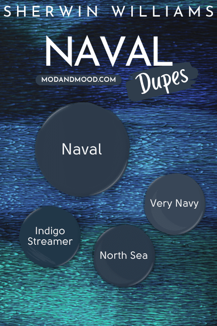
Benjamin Moore Naval Equivalent
The Benjamin Moore dupe for Naval is the closest color match that I found from any other brand. It is the color North Sea.
Benjamin Moore North Sea (CC-932)
Take a look at these two and see if you can spot the difference!
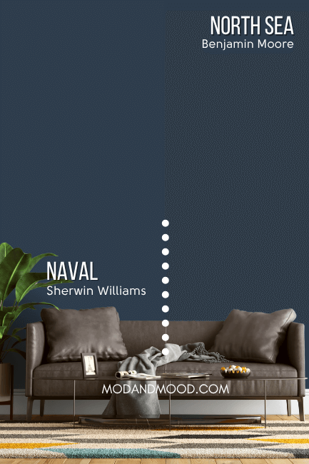
Me neither. I mean, I can see the line a little bit, but I couldn’t put my finger on what changed.
Apparently North Sea is just a tiny bit more gray than Naval. Other than that, these colors are twinsies!
Valspar (Lowe’s) Equivalent to Naval
The closest equivalent for Sherwin Williams Naval in Valspar paint, is the color Indigo Streamer.
Valspar Indigo Streamer (4010-4)
I’ve reviewed quite a lot of dark colors, and Valspar consistently has fewer deep dark options than Benjamin Moore or Sherwin Williams.
I did get reasonably close with Indigo Streamer. It’s pretty similar to Naval, but a little more saturated and slightly more teal in undertone.
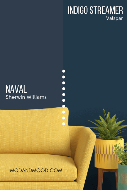
I will say that in real life the color looks more similar than it does in this side by side comparison.
Naval Behr Equivalent (Home Depot)
Behr’s version of Naval is their popular shade Very Navy.
Behr Very Navy (M500-7)
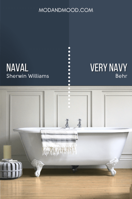
Very Navy is a bit lighter and grayer than Naval, but it is the closest overall tone match. Again, these two look more similar when they aren’t directly beside each other.
Naval Final Moody Musings
- Naval is a deep navy, but a bright one, so it won’t ever look black
- Naval is a classic choice for an exterior. Pair with Urbane Bronze for something different, or a timeless white
- Go for gold with fixtures, hardware, and accessories
I hope this helped you decide if Naval was the one for you!
Not it? Check out these other great posts:


Don’t Forget Your Supplies!
This little brush might look funny, but it’s my absolute ride or die!
Rollers like these hold the most paint and make the job faster. Get a metal roller cage for easy on and off.
DryDex is the fastest (and funnest!) way to make chips and dents disappear. (Make sure you get a small spackling tool that actually fits in the container, and a sanding sponge.)
This tool will save your back and limit time on a ladder.