Sherwin Williams Retreat is one of my all time favorite accent colors. This sagey-green really goes with anything!
If you have any dated browns, grays, or wood in your home, Retreat is my go-to for freshening up without clashing.

Today we will look at Retreat in real homes, see it in a color palette, and of course, track down some dupes.
Let’s get into it!
What Color is Sherwin Williams Retreat (SW 6207)
Retreat is a medium-dark shade of sage green. It’s a bit too dark to use in your whole home, but it’s great for accents or small rooms.

LRV and RBG of Sherwin Williams Retreat
The LRV (Light Reflectance Value) of a color indicates on a scale of 0 – 100 how much light a color reflects (or doesn’t reflect). True black has an LRV of 0 and pure white has an LRV of 100.
In the paint world, we are working in a range of about 3 – 93 because no paint color is purely black or completely white.
The LRV of Retreat is 21.
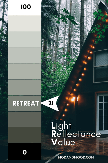
At 21, Retreat is much darker than most whole-home colors (which will fall into the 50-60 range) but it isn’t really dark either.
Truly dark paint colors have an LRV of around 10 or less. Basically, Retreat is a nice darker green that won’t ever look black, or close to it.
The RGB for Retreat is: Red 122, Green 128, Blue 118.
What Are the Undertones of Retreat
I have actually studied Retreat a decent amount in real life, and I don’t find that it does anything unpredictable. Compared to the swatch it can have slightly more blue-ish gray undertones, but most sage greens tend to.

Is Retreat Warm or Cool
Technically Retreat is a cool color because it is green and can have slightly more cool blue undertones. However it is warmer than plenty of other gray greens.
Personally, I would use it like a neutral. It does not ever look olive, nor does it look blue. Just a nice predictable sage color.
Sherwin Williams Retreat Color Strip
The color strip that Retreat belongs to, is full of Sherwin Williams bangers! Sea Salt, Oyster Bay, Acacia Haze, Pewter Green, and Ripe Olive are all decently popular colors.
Here is the full list:

Spare White (SW 6203)
Spare White is the lightest shade on the color strip. It’s a cool toned off-white that looks just a bit gray.
(It has an LRV of 77, so it’s not actually white.)
Sea Salt (SW 6204)
Sea Salt is a soft gray green with undertones ranging from aquatic to almost beige. This is a favorite whole-home color for those that want a neutral other than a simple gray or beige.
Read all about Sea Salt: Sherwin Williams Sea Salt (Plus Color Matches!)
Comfort Gray (SW 6205)
Comfort Gray is a light gray with undertones that can be either blue or green. This is the only shade on this color strip that I would say ever looks more blue than green. It is also the “mintiest” of the bunch.
Oyster Bay (SW 6206)
Oyster Bay is a light to mid-toned gray green that has an aqua or seafoam undertone. The gray helps it to stay fairly muted and neutral in its look.
Acacia Haze (SW 9132)
Along with Retreat, Acacia Haze is my favorite predictable sage! I find both of these colors to be perfectly mid-toned, and they go with everything. (Which you will soon see!)
Read all about Acacia Haze here: Sherwin Williams Acacia Haze: A Delicious Gray Green (Deep Dive & Dupes!)

Retreat (SW 6207)
(Of course!)
Pewter Green (SW 6208)
Pewter Green is a dark gray green that can range in appearance from a sage color to something like a muted emerald green.
Read all about it in my post: Don’t Choose Sherwin Williams Pewter Green Before Reading! (Plus Dupes)
Ripe Olive (SW 6209)
Ripe Olive is the only shade other than Sea Salt that can have a bit of a warmer undertone. It is still pretty gray, but out of sage territory.
You can see more in my post: A Ripe Olive May Not be for Everyone, but this Sherwin Williams Color is!
Lighter Version of Retreat
While Acacia Haze is one shade lighter than Retreat on the same color strip, you may find that the LRV is actually quite close still. Try Oyster Bay for a noticeably lighter alternative.
For a whole home color, I would recommend Sea Salt.
Darker Version of Retreat
Pewter Green is one shade darker than Retreat, but noticeably so.
Sherwin Williams Retreat Color Palette
Here is a Retreat inspired color palette for you to ponder:
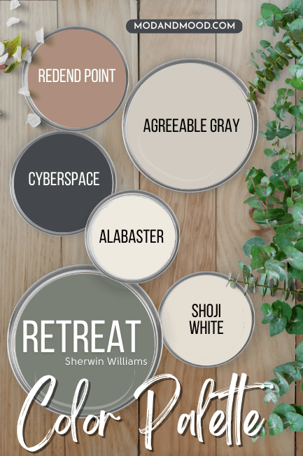
Coordinating Colors for Retreat
Retreat with Agreeable Gray
Why not pair Retreat with another go-with-anything neutral: Agreeable Gray!
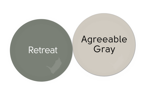
Agreeable Gray is actually a greige paint color, so it’s warm and comfy as far as “grays” go. I think these two look classic and neutral together.
Alabaster and Retreat
Speaking of classic and neutral, Sherwin Williams most famous white Alabaster, would make a great companion for Retreat. This one is soft and warm without being off-white.
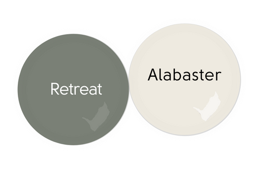
Browse through more about Alabaster here.
Retreat with Cyberspace
Cyberspace is a beautiful charcoal blue color, and it looks amazing with most shades of green, including Retreat!

Read more about this color here: Sherwin Williams Cyberspace (The Moodiest Charcoal Blue!)
Retreat and Redend Point
I’m a pretty big fan of sage greens with terracotta, so why not go with the soft clay of Redend Point with Retreat?

Why Redend Point?
It was the Color of the Year for 2023, and I find it to be an unusual but very usable neutral. I really think we’re going to see a lot more reddy-brown neutrals come into favor over the next few years.
Shoji White and Retreat
Looking for an off-white instead of gray or beige? Try the delectable Shoji White with Retreat:

Read all about Sherwin Williams Shoji White (It’s not greige!)
Complementary Color for SW Retreat
The “official” complementary color for Retreat (the color directly across the wheel) would be a dark purple-gray.
I think that Cyberspace fits the bill reasonably well without actually being purple, but if you want to dive right in, try Sherwin Williams Cloak Gray.
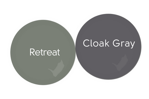
This charcoal purple is on the same color strip as the oh-so-palatable purple of Perle Noir.
What Trim Colors Go With Sherwin Williams Retreat?
Retreat is a great color to use if you have existing honey oak, dark wood, or other wood-toned trim. Really any sagey green will work in this scenario. Sage is a great natural color that complements wood super well!

In fact Retreat is on my list of 9 Gorgeous Wall Colors that Match Wood Trim.
Here is another example using a similar color: SW Rosemary.

(I will compare these two colors in just a minute!)
White Paint that Goes with Retreat
If you are looking for the perfect white trim paint for Retreat, here are some popular colors paired with Retreat walls:
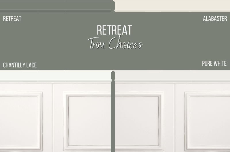
Sherwin Williams Alabaster
We already talked about Alabaster in the color palette, but most likely you would be considering it because you are looking for a trim white.
Alabaster is a darker white, so it will make Retreat look a little bit lighter, and its warmth will emphasize Retreat’s cool undertones.
Benjamin Moore Chantilly Lace
Chantilly Lace is just my favorite white ever. It’s nice and bright but not stark at all. It will look quite crisp with Retreat.
Sherwin Williams Pure White
Pure White splits the difference between Alabaster and Chantilly Lace. It’s a soft white with more gray than Chantilly Lace, but it’s not as soft and warm as Alabaster.
Can You Use Retreat on Walls and Trim?
You might have peeped in that graphic that I had the audacity to suggest Retreat as a trim color for Retreat walls. This is a relatively trendy concept called color drenching that I have seen executed very well with darker greens.
Here is an example using Behr Heritage Park:
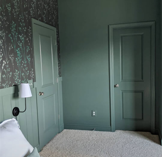
It’s not for everybody, but it’s definitely a look!
If you’re interested in trendy trim, you will love my post: Fabulous Sage Green Trim Colors to Uplevel Your Aesthetic
Sherwin Williams Retreat for the Inside of Your Home
Let’s get to seeing Retreat in real life!
Sherwin Williams Retreat in a Living Room
Laley (@laley.freeman) used SW Retreat in her living room makeover.
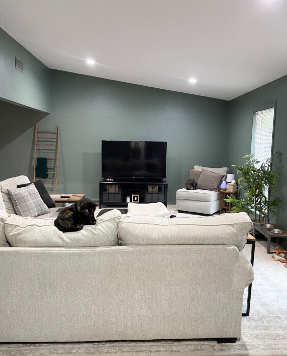
With the light furniture, carpet, and good lighting, the room is still surprisingly bright, despite using Retreat on all of the walls.

You can see how great this color looks with neutrals like gray, cream, and beige.

Sherwin Williams Retreat in the Dining Room
I just have one shot of Retreat in a dining room, but boy oh boy is it a baddy!

Lisa from DeBoever Interiors styled this chic space. Am I the only one getting Mad Men and Boho at the same time?
Sherwin Williams Retreat on an Accent Wall
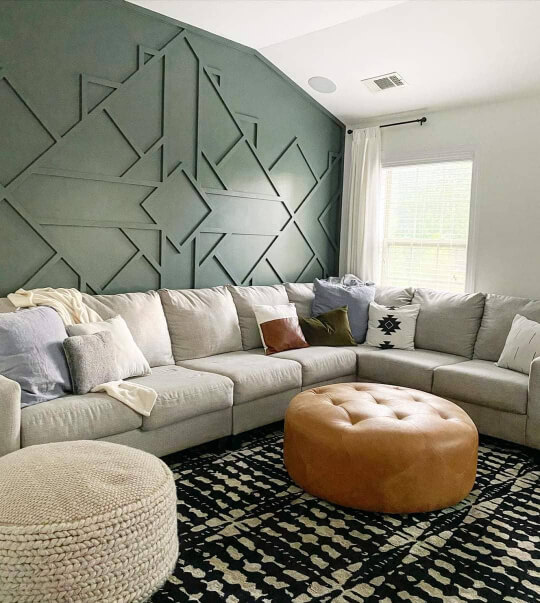
I’m a bit surprised that Retreat is harder to find on accent walls than it is to find on every wall! That last photo in the dining room was a pretty good feature wall example, but still the whole room is the same color.
Here is the slightly darker Pewter Green on a gorgeous feature wall:
Sherwin Williams Retreat in a Bedroom
Jill from @RavishingRooms used Retreat in this bedroom makeover.
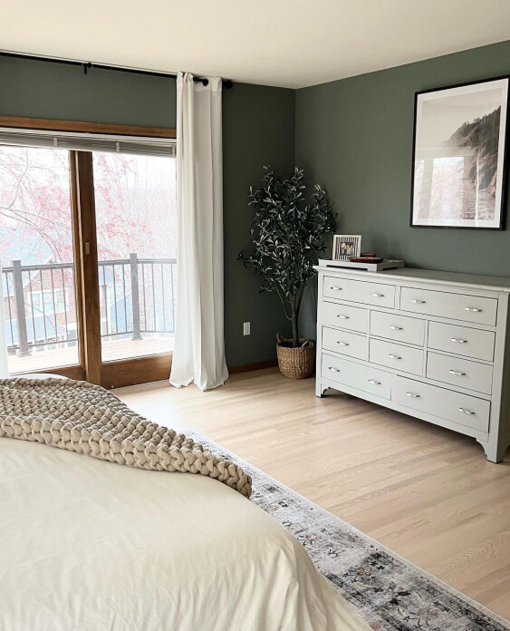
By most people’s standards the color shift in here is somewhat subtle. The room went from a sort of turquoise color to Retreat.

It’s amazing how much more sophisticated the room looks now!

This is another look at just how great retreat looks with that wood trim!
Sherwin Williams Retreat in a Nursery
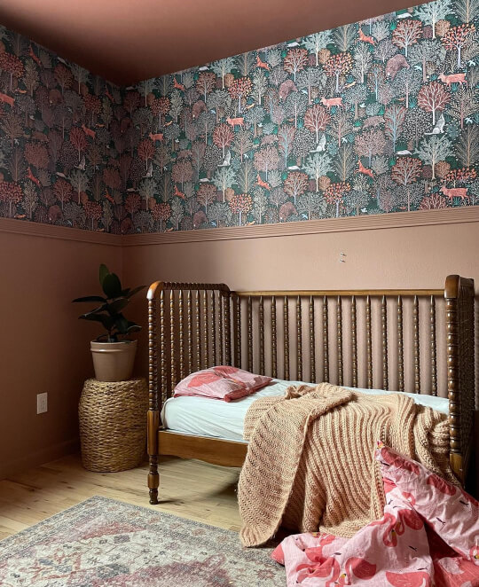
Retreat would make for a beautiful gender-neutral nursery color. Here is the similar color Benjamin Moore Vintage Vogue in a nursery:

The lighting isn’t great in this shot, but you get the idea!
Using your imagination a little, I could see this design also looking beautiful in Retreat:
Sherwin Williams Retreat in a Bathroom
Celine (@celine.jenn) decided to use Sherwin Williams Retreat on her bathroom vanity.

The walls here are Sherwin Williams Spare White, which you may remember is the lightest color on the same strip.
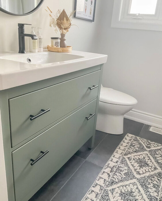
Retreat looks beautiful and calm in this space!
Sherwin Williams Retreat on Kitchen Cabinets
Green is big big BIG for cabinets right now. I think this color is going to have all the staying power of navy blue, which still hasn’t really died.
Here is Retreat on the kitchen cabinets from @hottohouse:

You might have seen these before, because I also share them in my Trend-Setting Green Kitchen Cabinet Ideas post.

I’m not sure what else to say about this kitchen. I love everything about it! The white countertops and tile are a great choice with the darker green cabinets, and the walnut color on the floor is just *chef’s kiss*.
(But of course I love the tile, I’ve literally used it before!)
Retreat on an Island
If you don’t want to commit to an all-over Retreat look in your kitchen, try painting just your island!
This is what Amber (@amlopo1) did!

I know I’ve already said it, but the big draw to Retreat is that it works so well with any and all shades of wood. You can see that it looks great with the warm floors in that last picture, as well as with the cabinets.
Here is a quick mock up of how Retreat would look with existing honey oak cabinets:

Not bad at all!
Sherwin Williams Retreat for Your Exterior
Here is Retreat on an exterior with vinyl siding:
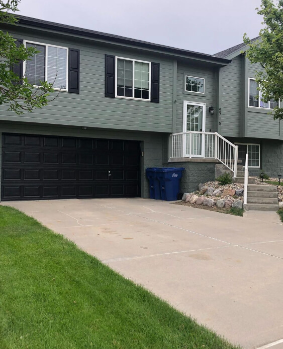
Riley (@_rileydevney) totally committed to the look and went dark with the shutters and garage door too. For those she chose Sherwin Williams Tricorn Black.

If you didn’t want to go quite so dark, either Shoji White or Agreeable Gray would also have looked beautiful on the shutters and garage.
You can see that the texture on the bricks makes Retreat look a tiny bit darker on the lower part of the house.
Retreat on a Front Door
You might have noticed that Riley’s front door looks almost like the rest of the house. At first I thought it was also Retreat, but it’s actually the lighter shade Oyster Bay.
Either way, that should give you a decent idea of how Retreat would look on a front door.
As another example, here is the Sherwin Williams Color Rookwood Blue Green:

This color is a little bit brighter and less gray than Retreat, but a good example. The exterior brick is painted in Alabaster, and the shutters are Sherwin Williams Rock Bottom.
Love this look? Check out my post: Stunning White Paint Colors for Classic Brick Exteriors for more!
Retreat Compared to Other Dark Green Paint Colors
Let’s take a look at how Retreat stacks up against similar paint colors that you may also be considering.
Sherwin Williams Retreat vs Pewter Green
As you already know, Pewter Green is one shade darker than Retreat on the same color strip.
Here is a side by side:
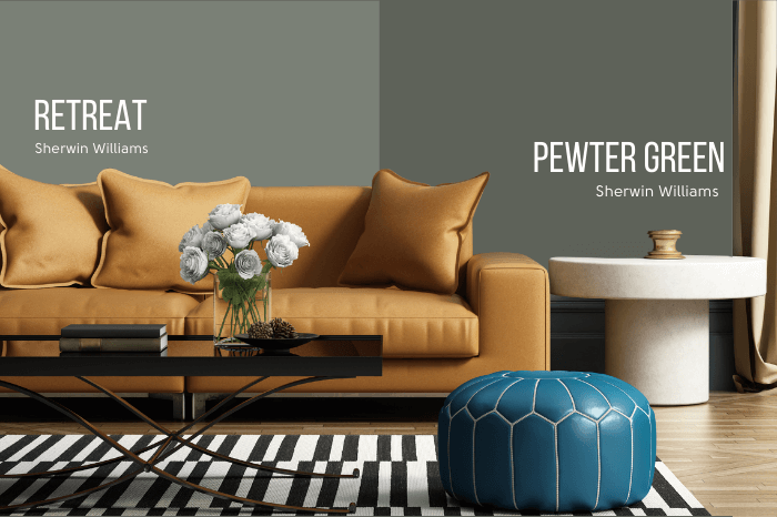
You can see how Pewter Green might go in and out of sage green territory.
Sherwin Williams Retreat vs Acacia Haze
Acacia Haze is the shade lighter than Retreat on the same color strip:
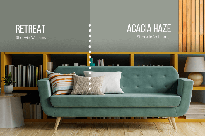
This is actually a color that Sherwin Williams added to the color strip after the fact, to make the jump from Retreat to the much lighter Oyster Bay, more subtle.
Sherwin Williams Retreat vs Succulent
To be honest, Succulent looks like a color that could also be from the same strip as Retreat, but it isn’t.
Sherwin Williams Succulent is darker than Retreat, and cooler (much more blue).

That being said, I feel like they are comparable in real life. I have been tricked before!
Sherwin Williams Retreat vs Evergreen Fog
Evergreen Fog was the 2022 Color of the Year from Sherwin Williams, and it sure does have a lot in common with Retreat!
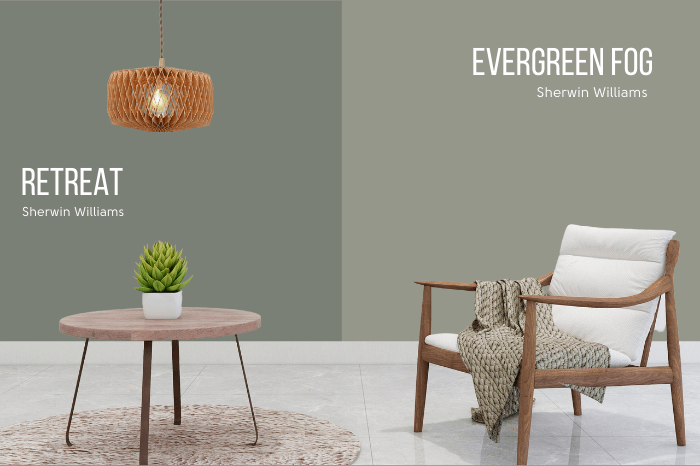
Evergreen Fog is lighter and a bit warmer than Retreat. Here is a look at the dueling color strips:

Super similar! You can see that Evergreen Fog is one shade lighter on the opposing color strip.
Sherwin Williams Retreat vs Rosemary
Another shade from the Evergreen Fog color strip, is the color Rosemary. Here is a side by side of Rosemary compared to Retreat.

Rosemary is warmer and darker.
You can see more from this alternative gray green here: Sherwin Williams Rosemary (The Unofficial Color of the Year?)
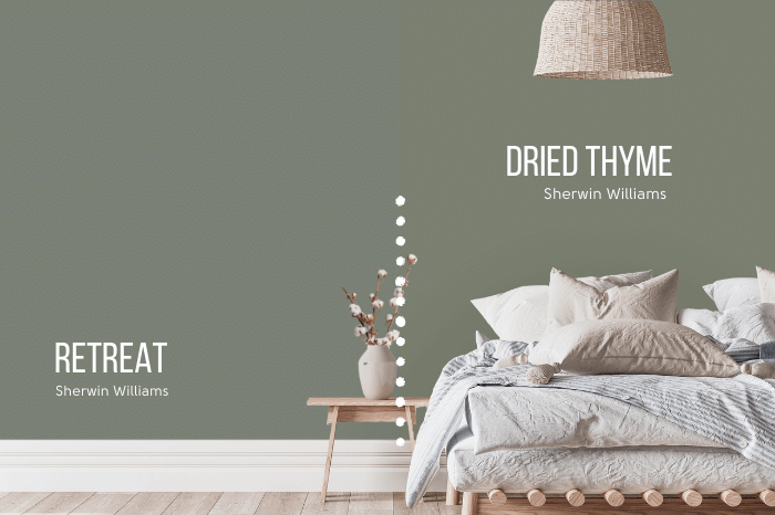
Sherwin Williams Retreat vs Dried Thyme
Dried Thyme also appears on the Evergreen Fog color strip and is the comparable LRV for Retreat. You can see here that Dried Thyme is a little warmer and more olivey than Retreat.
Sherwin Williams Retreat vs Benjamin Moore Carolina Gull
Honestly, Retreat and Benjamin Moore’s Carolina Gull are so similar that Carolina Gull could have been my choice as a dupe for Retreat.

Carolina Gull is just a little bit lighter, but the tones are very similar.
I have a whole post where you can get a good look at this sage shade: Benjamin Moore Carolina Gull Deep Dive
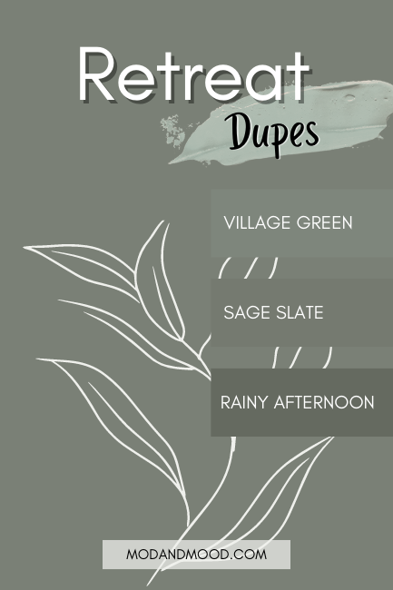
Dupes for Sherwin Williams Retreat
Well now that we’ve covered some colors that are different from Retreat, let’s take a look at some that are virtually the same!

Benjamin Moore Retreat Equivalent
I wasn’t able to find as close a match from Benjamin Moore for Retreat as I would have liked to. There seems to be a pretty big gap with their gray greens where they are either significantly lighter or darker than Retreat.
(As you saw, Carolina Gull is also very similar, but quite a bit lighter.)
In the end the closest color match that I found was Rainy Afternoon.
Benjamin Moore Rainy Afternoon (1575)
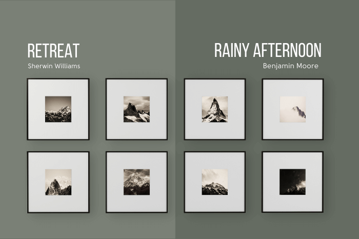
Rainy Afternoon is a bit darker than Retreat, and also a touch warmer.
If you want to use this color, I do have some coordinating colors for Rainy Afternoon.
Valspar (Lowe’s) Equivalent to Retreat
The closest color match that Valspar offers for Retreat, is the color Sage Slate.
Valspar Sage Slate (8004-32F)
Sage Slate is a little bit warmer (more yellow) and darker than Retreat.

Retreat Behr Equivalent (Home Depot)
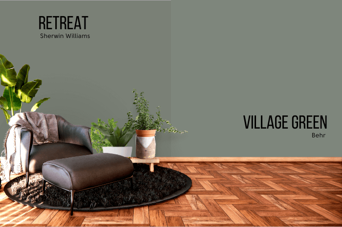
From Behr the closest alternative for Retreat is the shade Village Green.
Behr Village Green (N410-5)
Village Green is a little bit cooler (more blue) and lighter than Retreat.
Retreat Pros & Cons
Thank you so much for reading to the end of this post! That really helps my blog to grow. If you want to support this site for free, please share with your friends on any social media platform! 🙂
Let’s talk pros and cons for Retreat real quick:
Pros
- Goes with anything!
- The perfect color to refresh spaces with dated wood
- Dark enough to make a statement, but not super dark
Cons
- Shan’t.
If this wasn’t the one for you, I should have a degree in green! (A de-green?) Here are some more fab colors:

