Today we are taking a look at a reader submitted design dilemma. I thought it sounded like a semi-common problem, so why not dedicate a post to it?
Here’s the question in full:
I bought a house and have Colorado Gray as an accent in the office (they used Sherwin Williams). I love it so had Home Depot make it for me in Behr Marquee. There aren’t any Benjamin Moore stores near me and those who carry it don’t have the codes or anything. The paint on one wall in my kitchen looks so much darker and brighter than in the office. The kitchen is basically northern windows (one western but sheltered) and the office is southern but sheltered. I tried Smoke, which is in the master, and it’s too light and blah. I’m just at a loss as to what to do next. I’ve tried looking for dupes myself, but it’s rough online. I brought home Sherwin Williams Rain and Interesting Aqua, but neither is great. In the office the color is a bit more muted and maybe a little more green and gray than in the kitchen, but still much more blue than Smoke or Comfort Gray (which I called Pepto Bismol green in this light and quickly replaced). Do you have any recommendations? I thought about trying to lighten it, but no clue if that’s the answer. I did find Behr Ovation online, which looks close on my iPad. Thanks for reading this and I hope you don’t mind my reaching out.
Working with a Color Matched Blue Gray
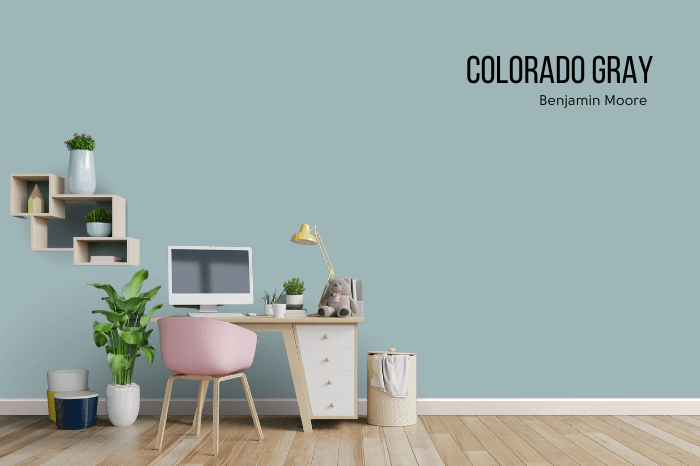
Let’s break it down so my brain can understand!
“I bought a house and have Colorado Gray as an accent in the office (they used Sherwin Williams). “
Let’s visualize:
“I love it so had Home Depot make it for me in Behr Marquee. There aren’t any Benjamin Moore stores near me and those who carry it don’t have the codes or anything.“
Color matched. Got it!
“The paint on one wall in my kitchen looks so much darker and brighter than in the office.”
The difference in appearance could be attributed to a color match in a different brand. If you notice she mentioned that the color was matched the first time by Sherwin Williams, and then she got it tinted at Home Depot for the rest of the house.
Even matching on different occasions at the same store can result in slight differences, because sometimes their program has multiple formulas for the same color match. It can be down to whatever formula the color tech picks.
Likewise if you are matching a physical chip, it could be different than their saved formulas for that color.
Anyway, let’s add a kitchen, and make it a touch darker and a touch brighter, as described:
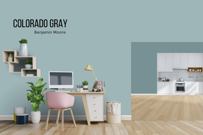
Let’s assume the tint is the exact same or microscopically different:
Accounting for Lighting with Blue Gray Paints
North-facing rooms will look cooler than their counterparts. Since blue grays are cool paint colors you are even more likely to notice a difference in the color. Your walls will look brighter and more blue in very cool lighting.
In warm lighting (such as the sunset golden hour) the yellow tones will combine with the blue and make a color look more green.
In addition to a possible difference in the color match, she mentions the lighting difference here:
“The kitchen is basically northern windows (one western but sheltered) and the office is southern but sheltered.“
Let’s add warm light to the office and cool to the kitchen:
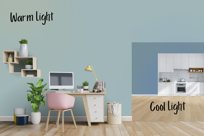
This might be a touch overboard. I’m no photoshop expert.
Now these colors are looking very different indeed!
Testing Different Blue Grays in the Kitchen
“I tried Smoke, which is in the master, and it’s too light and blah. “
Originally I though that she meant Behr Smoke, but that color seems to be discontinued, so I’m realizing she may have meant Benjamin Moore Smoke color matched. Just in case, let’s see both:
Colorado Gray vs Benjamin Moore and Behr Smoke

I did take the lighting shadows off, because I don’t know that it was helping accuracy-wise.
I can see how both versions of Smoke read “blah” in comparison to Colorado Gray, which is a nice saturated color.
“I brought home Sherwin Williams Rain and Interesting Aqua, but neither is great. “
Benjamin Moore Colorado Gray vs Sherwin Williams Interesting Aqua and Sherwin Williams Rain

Both Sherwin Williams colors Interesting Aqua and Rain are approximately the same tone as Colorado Gray. Assuming that the paint color was accurate, these will have the same problem in the kitchen. Smart choice not to go with either!
“In the office the color is a bit more muted and maybe a little more green and gray than in the kitchen, but still much more blue than Smoke or Comfort Gray (which I called Pepto Bismol green in this light and quickly replaced).“
Benjamin Moore Colorado Gray vs Sherwin Williams Comfort Gray
I’m a big fan of Comfort Gray, but I can see how it clashes terribly with the truer blue of Colorado Gray.

Comfort Gray is very much a gray green, and is on the same color strip as many popular such colors by Sherwin Williams:

It is much more gray AND much more green than Colorado Gray, in addition to being lighter.
“I did find Behr Ovation online, which looks close on my iPad. “
Let’s take a look:
Benjamin Moore Colorado Gray vs Behr Ovation
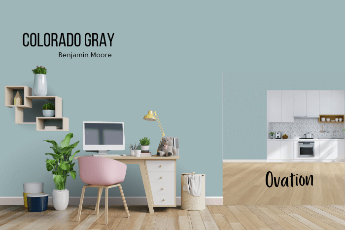
Ovation is super close to Colorado Gray, but not likely to be closer than the color match she already has. Depending on your screen, you might be able to see that it’s also a little more blue.
Selecting the Perfect Blue Gray for Your Kitchen
So what’s the recommendation?
I think she was on the right track with looking for a color that’s a little lighter and more green, but Comfort Gray was just way too much of both.
My first thought was a darker version of Behr Light French Gray, which is like a super soft Tiffany Blue. However when I looked at my first pick, Half Sea Fog, it just wasn’t quite green enough.
I used the RBG of Colorado Gray to pull up a little swatch on HTMLcolorcodes.com and compare it to Behr grays:
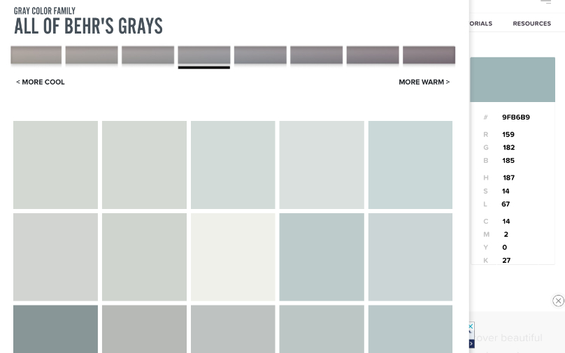
I think it’s definitely a good idea to choose a Behr color. It’s so much easier than trying to match something when we don’t need to.
I’m going to look for a blue gray that has a hint more green than my swatch of Colorado Gray. That should counteract the warmth in the office by replicating it in the kitchen.
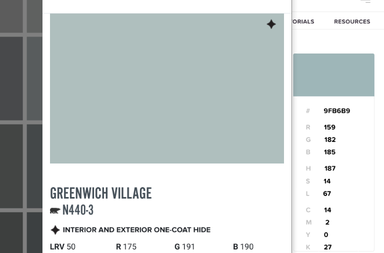
You can see that Greenwich Village is a little bit lighter than Colorado Gray, and the “Green” number is higher than the “Blue.”
I think this color ticks all the boxes!
Let’s take a look at it:
I’ll add back in the warm and cool lights:

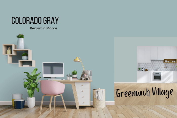
This color *should* read very similar to Colorado Gray given the conditions.
This is the color suggestion that I went with. I think it’s perfect! If I get some kind of update I will let you all know! Potentially Behr Watery could also work. It is a touch lighter, but also a bit more green.
Here are all of the blue grays together:

What would your suggestion be in this scenario? Do you have the BEST blue gray ever to recommend?
In case you missed it:
I recommend Behr Greenwich Village for this kitchen
Given all these specifics it is the perfect blue gray with just a whiff of green.
Ready for more posts? :


