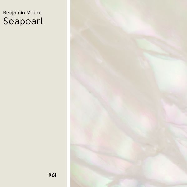
Listen, when you stare at paint all day long, one white color starts to melt into another. At first glance Benjamin Moore Seapearl is a creamy off-white like many others. Only once you see it in action, will you understand why this is one for the must-have list.

Don’t just take my word for it! Here we will look at Seapearl in depth. We will look at interiors and exteriors of real homes, coordinating colors, and of course: Dupes!
What Color is Benjamin Moore Seapearl (961 or OC-19)
Seapearl is a beautiful neutral off white with perfectly balanced cream and gray tones.
Is Seapearl a greige?
You could say that Seapearl is a greigey off-white. It isn’t dark enough to be considered a neutral paint color alongside favorites like SW Accessible Beige. I don’t personally find it to be very gray looking, but it is a very neutral off-white.
Does Seapearl look yellow?
Seapearl does not have a yellowy undertone, but it doesn’t read “true white” either.
This is about as “yellow” as it looks:

Again, the undertone is not yellow, but some people do equate yellow with cream. The fact that Seapearl is not yellow, is one of the reasons that it is such a great off white choice!
I would say that the VAST majority of people who are looking for a creamy color these days, specify “not yellow, green, or any other color.” Just creamy. I think that Seapearl does this well.
What Are the Undertones of Seapearl?
If anything, Seapearl has slight beige to peach undertones. I find it to be very similar to White Dove in that respect. Side by side with very yellow creams or very cool off-whites, you might find it to look a little more red/pink.

That being said, this color is super neutral thanks to a healthy does of gray. It doesn’t actually look pink or peach on the wall.
Is Seapearl Warm or Cool?
Seapearl is a warm to neutral paint color. It won’t ever look cool or even particularly gray.
LRV and RBG of Benjamin Moore Seapearl
The LRV of Seapearl is 76.43.
What does that mean?
The LRV (Light Reflectance Value) of a color indicates on a scale of 0 – 100 how much light a color reflects (or doesn’t reflect). True black has an LRV of 0 and pure white has an LRV of 100.
In the paint world, we are working in a range of about 3 – 93 because no paint color is purely black or completely white.

At 76, Seapearl is still considered an off-white. True white paint colors typically have LRV’s of 82 or higher, but light neutrals start with LRV’s below 70.
The RGB of Seapearl is approximately Red 232, Green 229, Blue 218
The approximate hex value for Seapearl is #E8E5DA.
(I like to get these from Converting Colors. I think it’s the most accurate. Benjamin Moore doesn’t provide any of this information. Boo!)
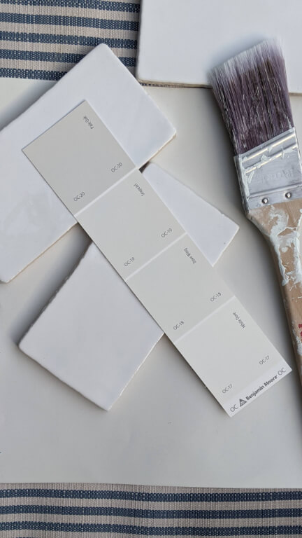
Seapearl on the Benjamin Moore Color Strip
For Seapearl, Benjamin Moore has it in a collection of similar whites and creams, rather than in a traditional light to dark color strip:

The other colors in this collection are:
- Dove Wing (960/OC-18)
- Gray Mist (962/OC-30)
- Maritime White (963)
- White Sand (964/OC-10)
- Clay Beige (aka Temporal Spirit) (965/OC-11)
- Natural Linen (966/CC-90)
On their website, they also offer these unhinged “lighter and darker variations” that I’m pretty sure must be auto-generated:

That’s an absolute no from me, so I tried to make something better.
I think that Seapearl slots quite nicely into the Smokey Taupe color strip:

Lighter Version of Seapearl
For a lighter version of Seapearl, you might like White Dove.
Depending on what color chips you grab at the store, you might even find these two together.
Darker Version of Seapearl
For a darker version of Seapearl, try Pale Oak or Cedar Key.
Benjamin Moore Seapearl in a Color Palette
I don’t often favor cool tones, but for this palette I went about half and half cool blues and neutrals:

Coordinating Colors to Use With Seapearl
Revere Pewter
Seapearl is still an off white, so you might prefer to use it alongside a slightly darker neutral like Revere Pewter.

Blue Nova
Blue Nova was named the Benjamin Moore Color of the Year for 2024. This saturated peri-leaning blue complements creams and beiges like Seapearl very nicely.

Soot
Soot is my favorite Benjamin Moore Charcoal at the moment. This saturated deep gray-blue looks great with Seapearl…along with almost anything else!

White Dove
White Dove is a solid Benjamin Moore white to pair with almost any color. It also happens to have a very similar undertone to Seapearl, which is perfect for pairing!

Complementary Color for Seapearl
The “official” complementary color for Seapearl (the color directly across the wheel) would be a dusty blue. The 2024 Color of the Year by Sherwin Williams – Upward – happens to be a pretty good match.
Sherwin Williams Upward (2024 Color of the Year)

Instinct (AF-575)
For a Benjamin Moore option, the color Instinct is also a good complementary color:

Of course you can always use Blue Nova or Soot as a complementary color since they are blues with the right undertone as well.
What Trim Colors Go With Benjamin Moore Seapearl?
Here are a few popular trim whites from Benjamin Moore that would work well with Seapearl:

White Paint that Goes with Seapearl
High Contrast Trim Colors
To get a higher contrast between your walls and trim, go with a brighter white. This will help Seapearl look deeper on the walls.
Simply White is a bright white that still has a creamy look. Chantilly Lace is a bright white with a clean “just white” look.
Low Contrast/Monochromatic Trim Colors
For a softer transition from your walls to trim, try a slightly darker and creamier white. This will help Seapearl read more “white.”
White Dove is a good option, but Benjamin Moore Swiss Coffee is also a popular creamy white for trim.
Benjamin Moore Seapearl for Your Home’s Interior
Let’s get into the fun part, and see Seapearl in real homes! Remember that an off-white can look white if it’s the only white present.
Benjamin Moore Seapearl on Kitchen Walls and Cabinets
Let’s start with this all-Seapearl look by Word of Mouth Painting (@word_of_mouth_painting):

This room features Seapearl on both the walls and cabinets. The brighter white trim is Simply White.

You can see how if it wasn’t for the trim, Seapearl would actually look quite white.
In this next kitchen by Manhattan Design Company (@manhattandesigncompany), Seapearl was used on all of the perimeter cabinets:

The island is painted in a blue gray similar to Sherwin Williams Grays Harbor.

With the white countertops and sink, Seapearl looks like a beautiful cream color, but still close to white.
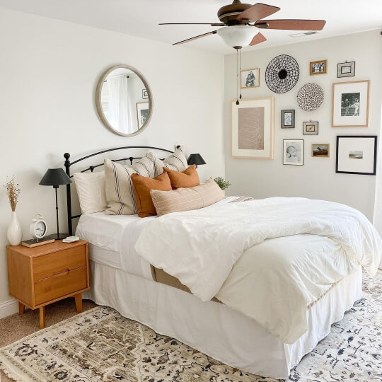
Benjamin Moore Seapearl in the Bedroom
Unfortunately I don’t have Seapearl on walls in the bedroom, but I do have examples from several furniture pieces by Worn Beautiful (@worn_beautiful) :

I’m actually 90% sure it’s the color on the wall here too.
Seapearl and White Dove are favorites of Jenn’s for rehabbing furniture pieces. These two are also Seapearl:

Here is one more dresser:

You can see that the silvery-gray wall color here made Seapearl look a bit creamier.
One final project because I couldn’t choose!

Benjamin Moore Seapearl in the Bathroom
In this bathroom by @athomedesignandstaging, Seapearl looks very white, as it is on both the walls and trim.

Benjamin Moore Seapearl in the Living Room
To picture Seapearl in a living room we will have to use our imaginations just a little bit. Here is a living room with Dove Wing walls and White Dove trim:

As a refresher, here are all 3 colors:
You can expect Seapearl to look just a little bit more beige than Dove Wing.
Benjamin Moore Seapearl on Your Home’s Exterior
Normally colors look lighter outside, but often whites tend to look creamier. Here is the whitest and brightest that Seapearl looks outside:

Kari (@kari.teel) chose Seapearl for the exterior of her modern farmhouse. From here the color looks a bit warmer:


Here is the color in darker natural light:

One more final shot:
Seapearl for Exterior Trim
Here is Seapearl dupe Sherwin Williams Origami White on exterior trim, to give you an idea of how it will look:

The exterior color here is Sherwin Williams Cyberspace. You can tell that the trim is slighly off-white.

I think Seapearl is a great choice for exterior trim, especially if you want a softer contrast with a darker color.
Seapearl Compared to Other White and Neutral Paint Colors
The world of neutrals is wildly confusing, so here are a few of the most popular colors compared to Seapearl.
Benjamin Moore Seapearl vs Classic Gray
Classic Gray is a little bit more gray than Seapearl. I also think that it reads a touch cooler/more neutral:

In terms of their appearance, I find that these two are pretty similar. I saw someone saying that Classic Gray has more of a green undertone, but that is not my experience.
Here is a pretty standard look to Classic Gray:
Classic Gray can look even warmer than this. If you really want to see the difference, scroll through my post about Classic Gray and judge for yourself.
Benjamin Moore Seapearl vs Dove Wing
Dove Wing and Seapearl are sooo similar that you might have to paint them side by side to “get it.” Unfortunately I haven’t done that, so I can only tell you the numbers.
The formula for Seapearl is Red 232, Green 229, and Blue 218. For Dove Wing it is Red 233, 230, 219. Seapearl is a hair darker than Dove Wing.

Here is a look at Dove Wing in real life:

To get an even better idea of how this color looks, check out my post: Dove Wing by Benjamin Moore (See it in Real Homes!) If I had to take a stab at the visual difference, I would say that Seapearl looks slightly creamier than Dove Wing.
Benjamin Moore Seapearl vs Balboa Mist
Technically Balboa Mist is a little bit warmer than Seapearl, but it’s also more gray, which cancels that out.
Balboa Mist is darker than Seapearl, with an LRV of 65.53.

Balboa Mist is a light greige and not an off white like Seapearl. I also find that it can look more gray than beige, where Seapearl might look neutral, but never really gray.
Benjamin Moore Seapearl vs Pale Oak
Pale Oak (aka Athena) is a little bit darker than Seapearl, and a hair warmer.
The LRV of Pale Oak is 70.

Benjamin Moore Seapearl vs Sherwin Williams Alabaster
Sherwin Williams Alabaster has an LRV of 82, so it is technically still a white paint color and not an off-white like Seapearl.
In addition to being lighter than Seapearl, Alabaster is also a little warmer and a little less gray.

I find Alabaster to be slightly “brighter” looking in its creaminess.
Dupes for Benjamin Moore Seapearl from Other Brands
Can’t make it to Benjamin Moore? Here are all of the best alternatives from Behr, Sherwin Williams, and Valspar.

Sherwin Williams Seapearl Equivalent
Sherwin Williams has a million and one shades of cream, so there are several passable alternatives for Seapearl. The closest match in my opinion is their shade Origami White.
Sherwin Williams Origami White (SW 7636)
Origami White is a little more gray than Seapearl, and just a hair lighter.

Valspar (Lowe’s) Equivalent to Seapearl
From Valspar, the best color match for Seapearl is the shade Divine Cream.
Valspar Divine Cream (7006-8)
Divine Cream is a little bit darker, a tiny bit more gray, and a hair cooler than Seapearl.

Seapearl Behr Equivalent (Home Depot)
Behr has probably the best dupe for Seapearl with their shade Weathered White.
Behr Weathered White (HDC-NT-21)
Weathered White is the slightest bit more gray than Seapearl.

Weathered White was actually my Behr dupe of choice for Benjamin Moore Classic Gray as well. It was the closest match that I could find, but it is slightly closer to Seapearl than it is to Classic Gray.
Seapearl Pros & Cons
Thank you so much for making it to the end of this post! That really helps my site grow.
Overall, Seapearl is a smooth and creamy middle ground between a classic white and greige. It would be perfect in your home if you want to have a nice neutral base while maintaining as much light as possible.
Outdoors Seapearl is a safe creamy white option, but you should expect it to look white and not beige or greige.
Still on the hunt? I’ve got sooo many more!