Sherwin Williams Sea Salt is a soft gray green that is both soothing and mellow. It works just as well on cabinets as it does on walls (or even a ceiling, as you will see).
Here we will look at the undertones of Sea Salt, scroll through some coordinating color palette ideas, see it in real homes, gather some dupes, and finish with some color comparisons.
What Color is Sherwin Williams Sea Salt? (6204)
First the big question: Is Sea Salt blue or green?
From a strictly technical perspective, Sea Salt is a gray green and not blue at all. However in real life, the coolness of the gray can make sea salt look blue green.
LRV of Sherwin Williams Sea Salt
The LRV (Light Reflectance Value) of a color indicates on a scale of 0 – 100 how much light a color reflects (or doesn’t reflect). True black has an LRV of 0 and pure white has an LRV of 100.
In the paint world, we are working in a range of about 3 – 93 because no paint color is purely black or completely white.
The LRV of Sea Salt is 63.
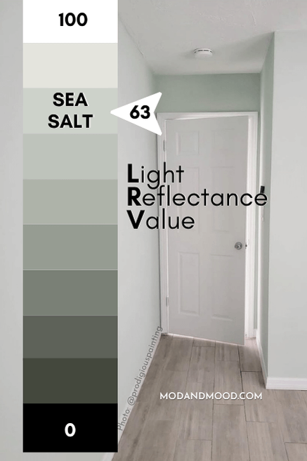
At 63, Sea Salt is at the lighter end of paint colors. It’s darker than off-white, but not mid-toned. It is in the perfect range for a whole home color (typically an LRV in the 45 to 65 range).
What Are the Undertones of Sea Salt?
Sea Salt is a complicated color because it is closer to the yellowy side of green, and quite gray.
How it usually looks however, is different!
Sea Salt has definite blue gray undertones. I would say that it most often looks like a verrry muted aqua. Here is a great example of a “typical” look for Sea Salt:

Sometimes it can look more green than this, but it almost never looks completely gray. I have seen some people mention that Sea Salt looks very blue in their homes. Personally I haven’t ever seen that, so I do think it is a matter of opinion or how a person’s eyes see color.
This is the best example of Sea Salt looking blue that I have, and I still wouldn’t say that the blue outpaces the green (at least not to my eyes) :

Is Sea Salt Warm or Cool?
Sea Salt has me going a little crazy if I’m totally honest. How it looks on paper and swatches is totally different to real life.
From the swatch and the actual formula, Sea Salt should be a little warm because it has a hint of yellow in it.
In general though, I would say that Sea Salt most often reads cool.
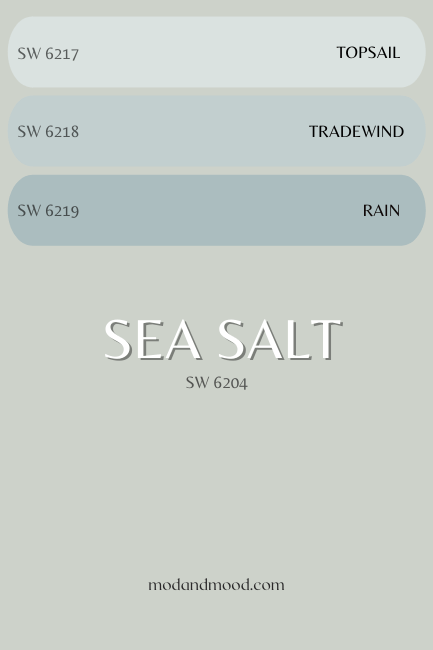
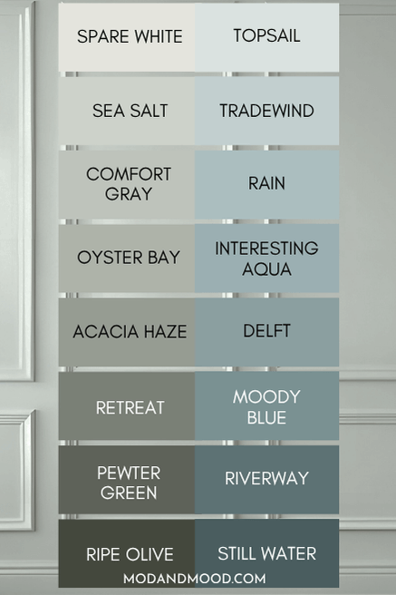
The Sherwin Williams Sea Salt Color Strip
Sea Salt has featured in a lot of my palettes because it is so versatile! Honestly though, you can’t go wrong with any of the colors from this strip – from light to dark, they are all beautiful!
Here are all of the paint shades from the same color strip as Sea Salt:
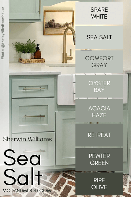
Sherwin Williams Spare White (6203)
Spare White is one shade lighter than Sea Salt on the same color strip. It’s a cool toned off-white that looks just a bit gray.
Sherwin Williams Sea Salt vs Comfort Gray (6205)
Comfort Gray is one shade darker than Sea Salt on the same color strip. It is typically what you would expect: Sea Salt, but a little darker.
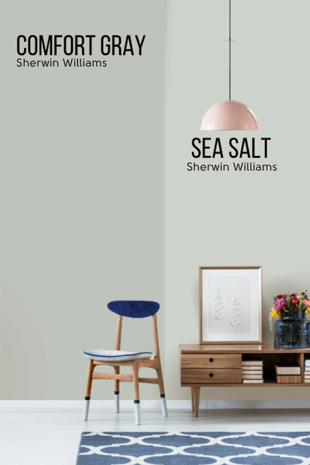
Comfort Gray most often looks like a soothing blend of gray and aquatic green. Occasionally it can look quite gray, but never like a totally plain, true gray. Where Comfort Gray differs from Sea Salt, is that it can occasionally lose the green undertone and look more blue.

Comfort Gray is the only color on this color strip that ever looks more blue than green.
Sherwin Williams Sea Salt vs Oyster Bay (6206)
Oyster Bay is two shades darker than Sea Salt, with an LRV of 44. From a technical perspective it is a little bit warmer, but it is also a little more gray, so it balances out.
I personally think that the swatch for Oyster Bay is pretty deceiving! In real life it typically reads quite a bit brighter.
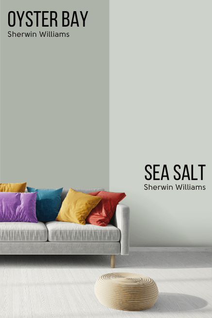
(You can see it when I talk about exteriors below!)
There is enough contrast here that you could definitely use Sea Salt and Oyster Bay together.
Sherwin Williams Acacia Haze (9132)
Acacia Haze is a nice neutral mid-toned sage:

Sherwin Williams Retreat (6207)
Retreat is another favorite of mine! Honestly this whole line is very nice!

Retreat is the shade that I recommend most often as a foolproof true sage green.
Sherwin Williams Pewter Green (6208)
Pewter Green is the last shade in the Sea Salt color strip that still reads sage most of the time:

Sherwin Williams Ripe Olive (6209)
Ripe Olive is the last color on the Sea Salt color strip and the only one that doesn’t have much of a cool undertone at all.
This deep olive color is still pretty neutral, but definitely not blue at all.
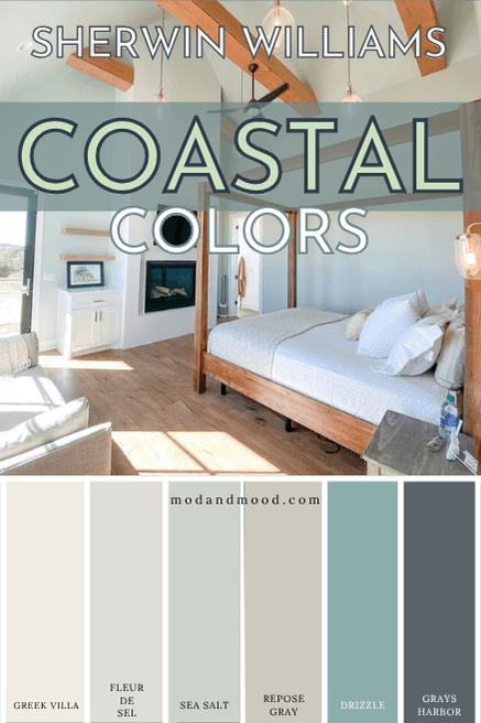
Sherwin Williams Sea Salt in a Color Palette
I made a few palettes here using Sea Salt!
For a color named Sea Salt I had to make a beachy coastal palette.
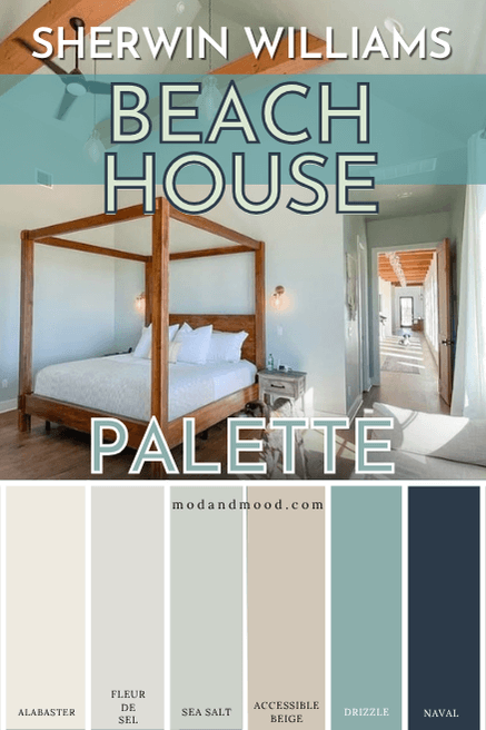
Sea Salt Coordinating Colors:
Sherwin Williams Alabaster
Alabaster I will cover in just a minute under trim choices!
Sherwin Williams Fleur de Sel
Sherwin Williams Fleur de Sel is sometimes confused with Sea Salt because the name translated into French is literally “sea salt.”
That’s pretty much where the similarities end, except that both are light paint colors that you could use in your whole home.
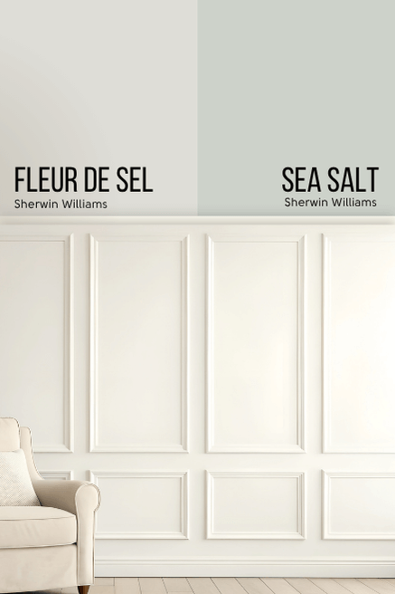
Fleur de Sel is a very pale shade of greige. It has an LRV of 72, so it is technically an off-white. Most of the time this color looks like a true light gray, but it can look warmer when paired with cool whites, or cooler shades like Sea Salt!
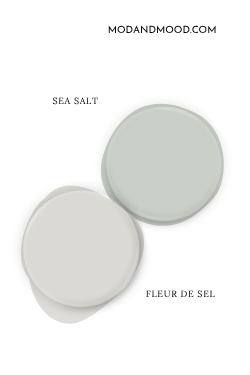
Fleur de Sel does look good with Sea Salt. It’s kind of like a pale sandy beach color.
Sherwin Williams Accessible Beige
Accessible Beige is a classic Sherwin Williams color that is a nice neutral. It works great with Sea Salt, particularly in a coastal/beachy palette.
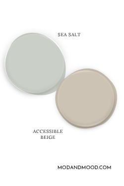
Accessible Beige toes the line of greige and beige, but you should expect it to look warmer and more beige when paired with the much cooler undertones of Sea Salt. You should expect Sea Salt to look a little more colorful.
Sherwin Williams Drizzle
Drizzle is a pretty teal color that would coordinate beautifully with Sea Salt:
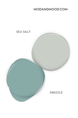
Against the true teal of Drizzle, you should expect Sea Salt to look it’s warmest and most gray/neutral in comparison.
Sherwin Williams Naval
Navy blue is a classic color to combine with the soft gray green of Sea Salt.
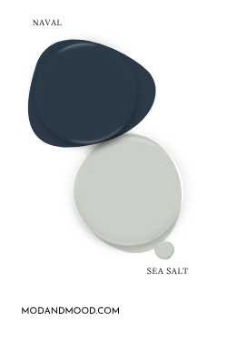
For this palette I chose the shade Naval, but “In the Navy” and Salty Dog are also good Sherwin Williams dark blues. For a more muted and complicated gray blue, you might like Gray’s Harbor:
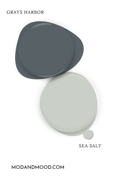
Here is another variation with Accessible Beige swapped for Repose Gray and Naval swapped with Gray’s Harbor:
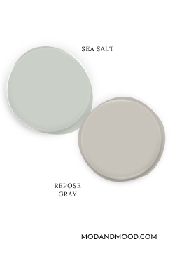
Sea Salt Complementary Color
The “official” complementary color for Sea Salt would be a soft purple color. That is the color directly across the wheel from Sea Salt. If you wanted to go that route, you could try Sherwin Williams Silver Peony.
Purples are…difficult, so you might find it easier to lean into a slightly purpley undertone. Repose Gray has a mushroom undertone that I think is quite complementary to Sea Salt.
Here are a few more super popular Sea Salt color combinations:
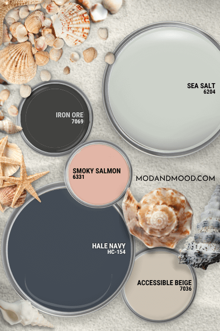
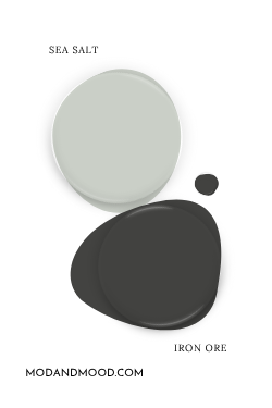
Sherwin Williams Iron Ore
Iron Ore is a deep charcoal color that coordinates beautifully with Sea Salt, it provides a contrast like black would, but softer.
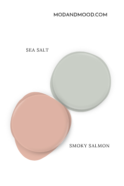
Sherwin Williams Smoky Salmon
Corals and pinks look really great with any sort of oceany blue or green color like Sea Salt.
(I have a few good examples in my Aegean Teal post.)
Benjamin Moore Hale Navy
Hale Navy is another navy blue option and a cult classic from Benjamin Moore. The soft gray green of Sea Salt and the deep blue of Hale Navy are a great combo.

What Trim Colors Go With Sherwin Williams Sea Salt?
White Trim for Sea Salt
Here is Sea Salt with a variety of different white trim colors by Sherwin Williams:
Sea Salt and Snowbound
Compared to the other whites, it’s hard to tell that Sherwin Williams Snowbound is actually a pretty true white. It does have a hint of warmth without looking yellow or creamy.
Snowbound is a good choice if you are torn between a creamy white or a stark white. It splits the difference by being white with just a bit of softness.
Sea Salt and Greek Villa
Greek Villa is a soft white with a beige undertone that is still a true white.
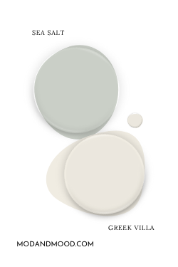
This is one of my favorite trim suggestions because it is creamy, but still true white, and pretty neutral.
Sea Salt and High Reflective White
Sherwin Williams High Reflective White is just what it sounds like: Their brightest and most reflective white!
High Reflective White is a good trim color if you want a super crisp look.
Sea Salt and Alabaster
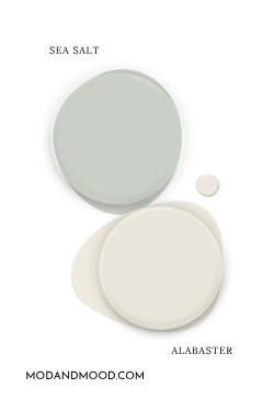
Sherwin Williams Alabaster is one of their fan favorite whites. Is it pretty? Yes. Is it overused? Also yes.
If you want a cozy, low-contrast look that emphasizes the blue undertone of Sea Salt, you will probably really like it! Alabaster does toe the line of white and off white, so you may find it to be too creamy if you are very yellow averse.
Sea Salt and Pure White
Not pictured is Sherwin Williams Pure White. This is one of those whites that has no obvious undertone. It is a pretty foolproof trim color. Technically it is a little warmer than a bright white, but the warmth is balanced by a touch of neutralizing gray.
Sea Salt with Dark Trim
I know that there are a lot of people with historical homes out there who do not want to paint their dark wood trim, and I totally hear you!
I am always cruising the internet for example photos, but I didn’t find any of Sea Salt and dark trim in time for finishing up this post.
Here is a picture of a soft sage green with dark wood trim, just to give you some idea:

The LRV of Valspar Sea Sage is only 31, so Sea Salt will be at least twice as bright. I do think it would work!
Sherwin Williams Sea Salt for a Whole Home Color
Sea Salt is light enough and subtle enough to use in your whole home. Here are a few great examples of Sea Salt in action:
Sherwin Williams Sea Salt in the Bathroom
First up is this elegant spa bathroom in the home of Vanessa from @fieldsandvalleys!

These are probably the best photos that I have in terms of showing off Sea Salt’s gray qualities.


On to the home of Lacy (@lacyleeann1), who also used Sea Salt in her bathroom.

I think Lacy is the only person that I have seen using brass with Sea Salt, and I love the antique quality the combination has. Here you can see Sea Salt looking its most blue.
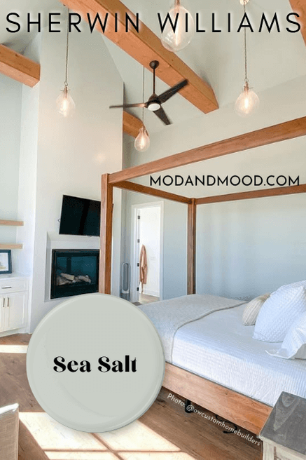
Sherwin Williams Sea Salt in the Bedroom
I hope you’re ready for bedroom goals!
Bonnie (@owcustomhomebuilders) went all out with the main bedroom in her home. It is the definition of light and airy!

Even the ceiling is Sea Salt!
Sherwin Williams Sea Salt in the Laundry Room
My own “laundry room” is a stackable washer and dryer in a hall closet, but let’s do some lusting shall we?
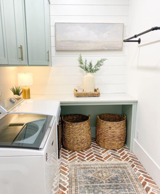
Tara from the Joy Filled Farmhouse used Sea Salt on her laundry room cabinets, and finished them off with gold hardware.
I can’t help but feel like the real story here is the brick herringbone floor!
The white in this laundry room is Sherwin Williams Pure White.
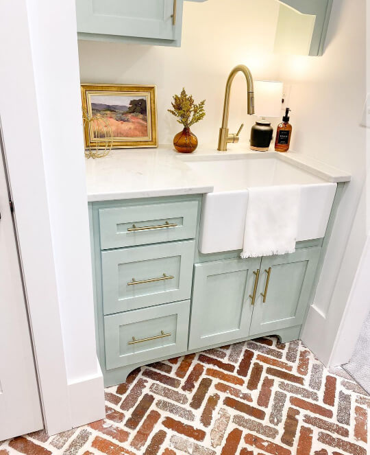
Sherwin Williams Sea Salt on Kitchen Cabinets
Remember the first bathroom we looked at?
Vanessa has actually use Sea Salt in a lot of different rooms in her house! In the kitchen she used it on her island.
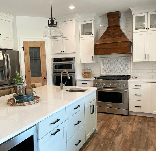
You might have noticed by now that Sea Salt seems to look great with any shade of wood!

Vanessa chose black hardware for her cabinets.

If you want to see similar shades in the kitchen, check out my Trend-Setting Green Kitchen Cabinets post. I go through more than 20 shades of green, plus hardware and countertop options!
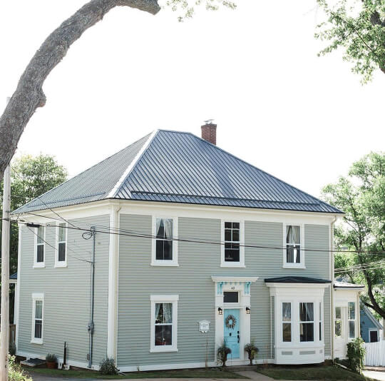
Sherwin Williams Sea Salt for Your Home’s Exterior
As far as a whole Sea Salt exterior paint job goes, I was not able to find a single person who used Sea Salt on their entire house.
I suspect this may be because Sea Salt in bright outdoor lighting could look a little washed out and/or minty.
Here are a couple of examples and alternatives for a soft gray green like Sea Salt:
Sherwin Williams Oyster Bay
As you may remember, Oyster Bay is two shades darker than Sea Salt on the same color strip. It might be exactly what you were envisioning:

I think this does the same job as Sea Salt, but it’s a deeper and more anchored color. If you are set on Sea Salt, I would expect it to look like an off-white version of this.
Benjamin Moore Saybrook Sage
Saybrook Sage also looks similar to how you might be picturing Sea Salt on an exterior. It is a perfect gray green and still nice and light.
In reality this color is quite a bit darker and warmer than Sea Salt, but the vibe is the same.
One more because I love this photo:
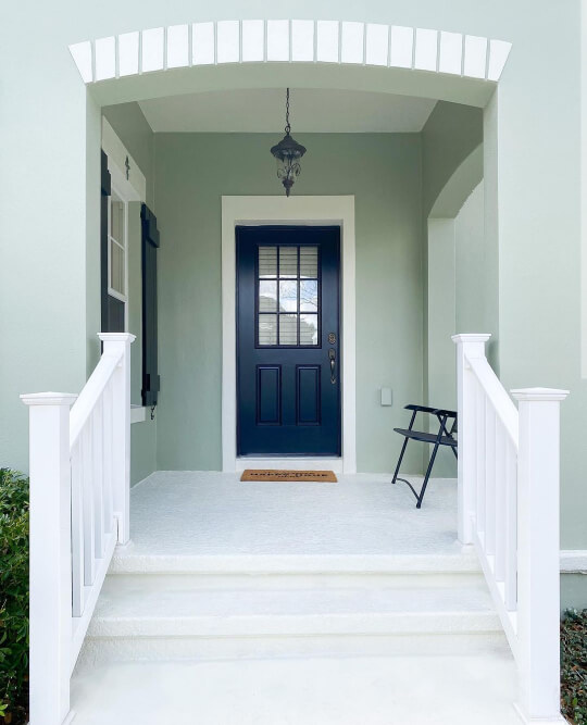
Sherwin Williams Sea Salt on the Front Door
Luckily there are plenty of people who have used Sea Salt on their front door!
Here is my favorite front door, on a house with cedar shakes:

Even in the shade, the door color is pretty subtle!
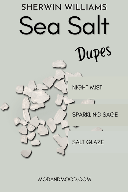
Dupes for Sea Salt from Other Brands
Whether you can’t get to Sherwin Williams, or you just prefer another kind of paint, here are some dupes for Sea Salt from each of the other major paint brands:
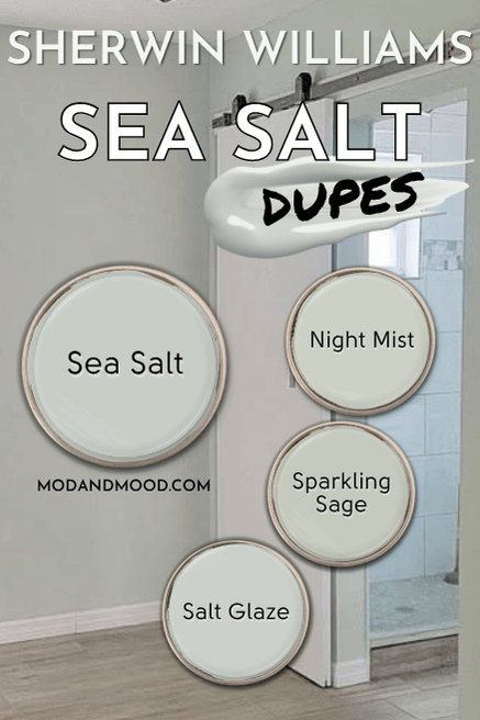
The Benjamin Moore Version of Sea Salt
The very best dupe from Benjamin Moore for Sea Salt is the color Night Mist.
Sherwin Williams Sea Salt vs Benjamin Moore Night Mist (1569)
Benjamin Moore’s Night Mist is virtually identical to Sherwin Williams Sea Salt. On paper, it is just a hair warmer.
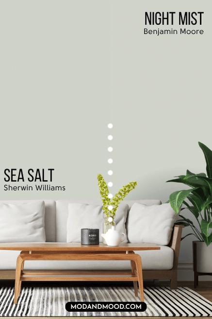
In real life, I don’t know that from one wall to another you could flag the difference. The LRV of Night Mist is 63.05 – essentially the same as Sea Salt.
Behr Equivalent for Sea Salt
I was able to come up with a really solid dupe for Sherwin Williams Sea Salt from Behr: The color Salt Glaze.
Sherwin Williams Sea Salt vs Behr Salt Glaze PPU12-11
Behr Salt Glaze is an almost perfect dupe for Sea Salt, but it is ever so slightly cooler. I actually found this color hidden away in Behr’s gray section. It doesn’t show up under green at all!
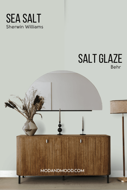
The major difference between Sea Salt and Salt Glaze, is that Salt Glaze is a little more likely to have a blue undertone on occasion. The LRV of Salt Glaze is 65.
Valspar Equivalent to Sea Salt
Valspar is ON IT with the dupes for Sea Salt. I narrowed it down to four possibilities, but that’s waaay more than I was expecting!

Well this is awkward…since first publishing this post, it seems that Valspar has discontinued all but one of my picks for a Valspar dupe. I will leave the other comparisons in this post with a note, just in case you can still get them made.
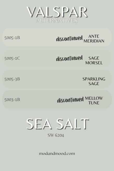
Sherwin Williams Sea Salt vs Valspar Sparkling Sage 5005-3B
Sparkling Sage is tied with Sage Morsel (up next) for the best Sea Salt color match in Valspar.
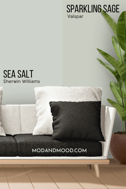
Sparkling Sage has an LRV of 60.22 so it is a little darker than Sea Salt. It is also ever so slightly warmer (more yellow). Personally I find this to look very much like Sea Salt, and it has the same range of undertones.
Sherwin Williams Sea Salt vs Valspar Sage Morsel 5005-1C
*Since this article was originally published, Sage Morsel appears to have been discontinued. It seems to have been replaced by Misty Memory 8004-29B which is a much warmer color. I thought I would leave this in, because their system may still be able to make this color.*
Valspar Sage Morsel is the closet match to Sea Salt in terms of lightness, with an LRV of 61.66.
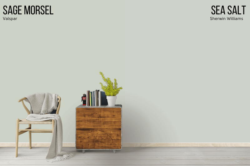
It is a little warmer than Sparkling Sage, which is already slightly warmer than Sea Salt. I do find that this color also looks very much like Sea Salt, but it has a slightly more pronounced green tone.
Here is another look at the top dupes for Sea Salt:
Sherwin Williams Sea Salt Compared to Other Light Gray Greens
The amount of colors that get compared to Sea Salt is a LOT. I have sorted them into this alphabetized list, starting with Sherwin Williams colors and then going through other brands. Click the “+” button to see the color comparison.
I was very confused when I read that Sea Salt and Ancient Marble were being compared, because at first glance, they are absolutely nothing alike:

Directly beside Sea Salt, Ancient Marble looks like a sandy beige color, with no gray to speak of. On it’s own, Ancient Marble is a neutral wheat color with a slight green undertone.
Besides that they both have green undertones, there isn’t much else in common with these two, besides their LRVs. The LRV of Ancient Marble is 60, so it is in the same lightness range as Sea Salt.
Filmy Green is actually pretty similar to Sea Salt! It has an LRV of 64 so it’s the same general lightness.
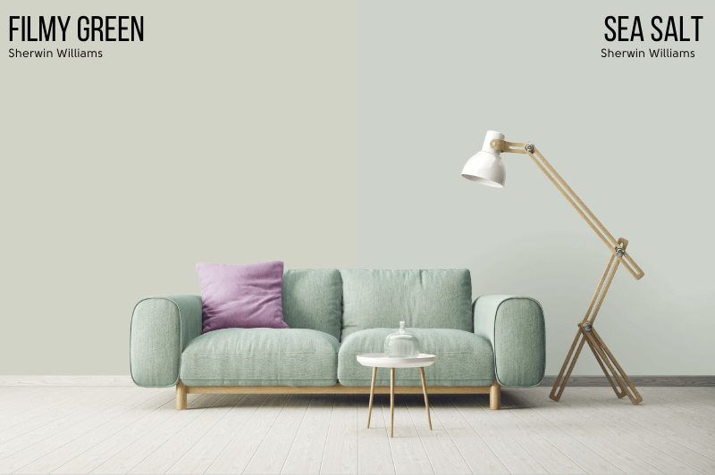
Filmy Green looks more neutral than Sea Salt thanks to a good amount of additional warmth, but it is less gray.
Sherwin Williams Opaline (6189) and Contented (6191) are on this same color strip as Filmy Green, so they are a bit lighter and darker (respectively) than Sea Salt, and a bit warmer.

The Sherwin Williams 6470 strip that starts with Glimmer is an aqua blue range that has no real gray in it.
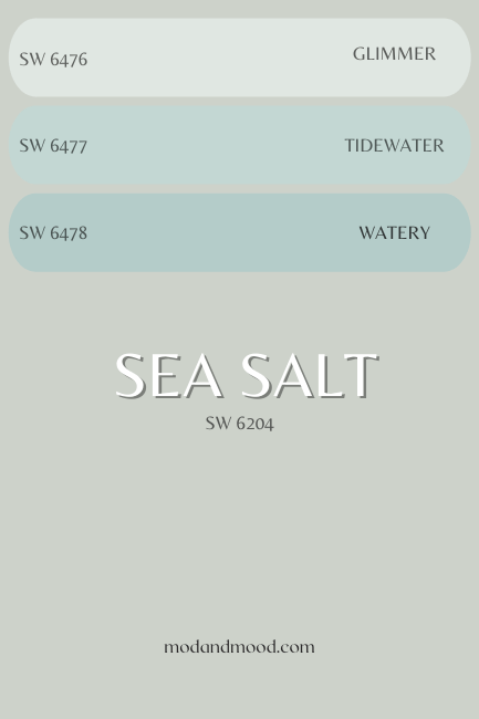
Glimmer has an LRV of 78, and can sometimes even look like a blue white.

Sherwin Williams Misty is a cool silvery gray. It can look blue on the wall, but it has none of the warmth of Sea Salt.
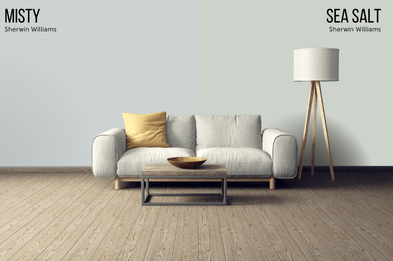
The LRV of Misty is 64.
Mountain Air is another very light color, but this one sits in the cyan range, almost perfect between blue and green.
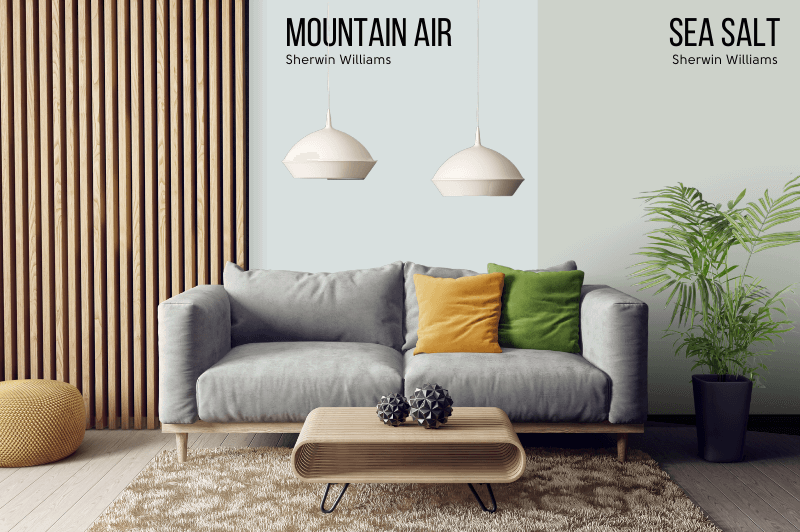
Because Mountain Air is so light (LRV of 73) and so gray, it comes off as more of a baby blue and loses pretty much any green.
I am specifying Sherwin Williams Pearl Gray, because Benjamin Moore actually has a similar color of the same name.

Pearl Gray is a tiny bit darker than Sea Salt, with an LRV of 61. (A negligible difference.) Other than that, Pearl Gray is a little warmer toned, and as the name suggests – a little more gray.
Sound familiar?
This is pretty much how I described Filmy Green! The difference between Filmy Green and Pearl Gray is that Filmy Green is even a bit warmer than Pearl Gray. Filmy Green is also less gray.
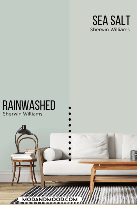
Sherwin Williams Quietude is one shade darker than the much closer shade to Sea Salt – Rainwashed – and two shades darker than Window Pane.

You will see the other shades in just a minute, but basically this whole color strip is brighter and cooler than Sea Salt.

The LRV of Quietude is 48.
Rainwashed is the equivalent shade to Sea Salt on the Window Pane to Jasper color strip. It is a little darker than Sea Salt, but it reads a bit brighter because it’s more saturated.

Rainwashed has an LRV of 59.
Sea Spray is ever so slightly darker than Sea Salt, and a little bit cooler toned.
I’ll be honest, I’m not confident at all that I could tell you from one home to another which color is which.

In my opinion, the major difference between these colors is that the undertone of Sea Spray varies a little bit more than Sea Salt. Sea Spray is slightly more likely to appear like a true gray, but at its brightest and most colorful it is a bit more intense than Sea Salt.
The LRV of Sea Spray is 61.
Besides obviously being darker, the tone difference between Silvermist and Sea Salt can be a little hard to put your finger on.
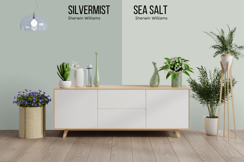
Turns out that Silvermist is cooler and more gray than Sea Salt. While Silvermist is technically in a much greener area of the color wheel, it is so gray that the resulting gray-green appears to be approximately the same tone as Sea Salt.
In a nutshell, Silvermist is a darker and cooler alternative to Sea Salt.
The LRV of Silvermist is 47, so it is around the same level as Oyster Bay.
I was not expecting Silver Strand and Sea Salt to be as similar as they are!
Silver Strand is closer to a true neutral/gray than Sea Salt. Not only is it more gray, its color family leans more to the yellow side of green.

The LRV of Silver Strand is 59, so it is also a little darker than Sea Salt.
You can see that next to Tidewater, Sea Salt almost looks completely gray.
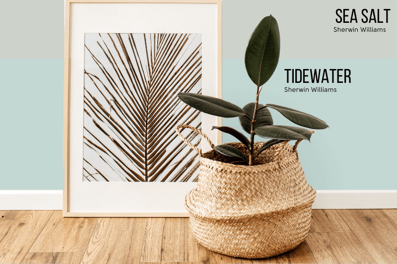
I would describe Tidewater as a Tiffany Blue. It does have an LRV of 65, so it is similar in that way to Sea Salt.
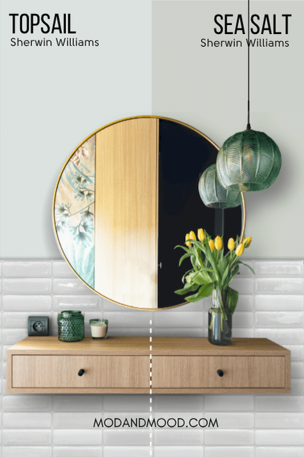
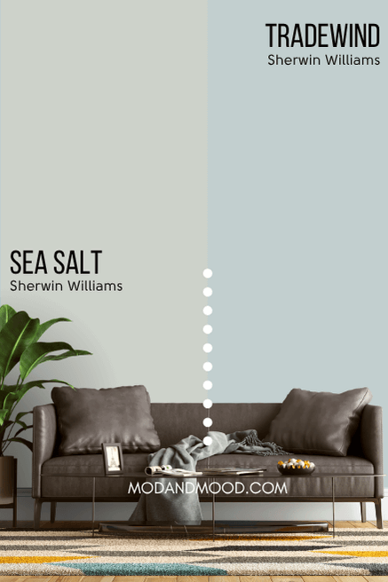
The Sherwin Williams color strip that contains Topsail and Tradewind is waaaay on the opposite side of green compared to Sea Salt.
Sea Salt is closer to the green, transitioning to yellow, part of the color wheel, and these colors are almost completely blue.
The LRV of Topsail is 75. It is the equivalent shade to Spare White on the color strip that runs from Topsail to Still Water.
Topsail is an off-white baby blue, and not a gray green like Sea Salt. The only thing these two colors have in common, is that they can both read a little “aquatic.”
Tradewind is like a light french blue and not that much like Sea Salt. It does have an LRV of 61, so it is this color strip’s “equivalent” shade.
Tradewind is just a darker version of Topsail, so it is also a blue that leans just a touch green.
If you like this color, you will probably like Behr Light French Gray. (Not the same color as Sherwin Williams Light French Gray.)
Watery is one shade darker than the color Tidewater. It has an LRV of 57.

If you were to look at Sherwin Willams Window Pane in one room and then Sea Salt in another, it might be hard to tell the difference.
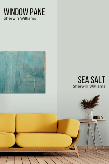
Side by side, you can see that Window Pane reads a lot “brighter” than Sea Salt, even though it’s just a smidgen lighter. This is mostly thanks to Window Pane being less muted.
The LRV of Window Pane is 72.
Lullaby is a soft gray blue with an LRV of 65. That puts it in the same lightness range as Sea Salt, but that’s really the only thing these two have in common.
On the wall, Lullaby is a subtle icy blue.

Something I didn’t know about paint before I started working with it a lot, is that the color strip usually follows a trend, and is not just lighter or darker shades of the same thing.

Benjamin Moore Beach Glass is a perfect example of this.
Healing Aloe is two shades lighter than Beach Glass on the same color strip, and it’s almost the same color as Sea Salt, but lighter (more on this color in just a minute!).
Quiet Moments is one shade darker than Healing Aloe, and close to the right LRV, so it should match Sea Salt, but it actually has more green.
Beach Glass is the next color on the same strip, and it is not only darker, but it is even more green. So much so, that it is approaching cyan/blue.

As a result, Beach Glass is not just darker than Sea Salt, it is also completely cool-toned.
Anyways, pardon the interlude, the LRV of Beach Glass is 50.3.

Benjamin Moore Gray Wisp is one shade down from Night Mist (my dupe for Sea Salt) on the same color strip. If there was a color exactly like Gray Wisp, but lighter, it would be a near perfect dupe for Sea Salt.
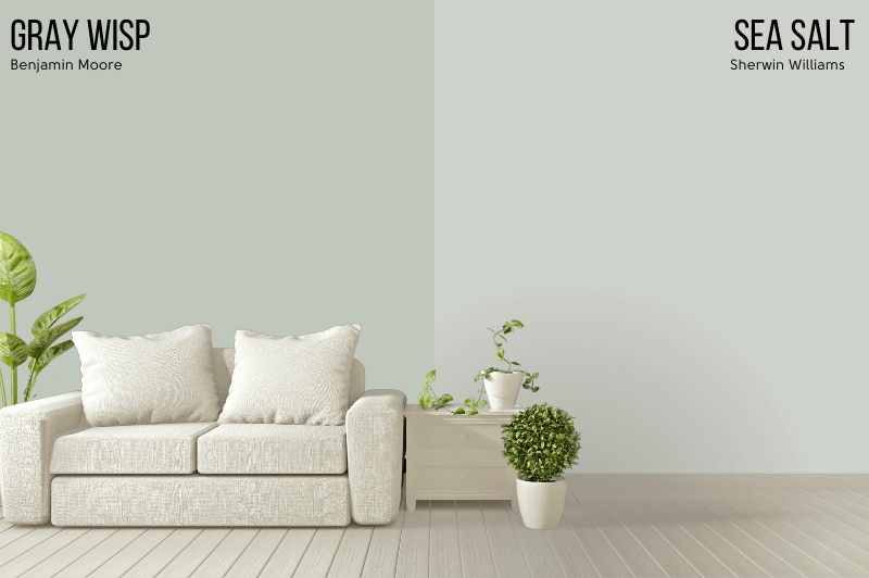
As it is, Night Mist is a touch warmer than both Gray Wisp and Sea Salt.
The LRV of Gray Wisp is 54.85. Beyond that, Sea Salt and Gray Wisp are the same.
Benjamin Moore Healing Aloe is almost the exact same tone of gray green as Sea Salt, but just a little lighter.

This is interesting because Quiet Moments (which we will see in just one second) is one shade darker than Healing Aloe on the same color strip, but it is considerably more green.
If there was a true darker version of Healing Aloe, it would be nearly identical to Sea Salt.
The LRV of Healing Aloe is 69.66.
All in all, Healing Aloe is actually very close:
Palladian Blue is actually very much a green still, at least from a technical perspective. It is a bit lighter than Sea Salt and less gray.
The biggest difference between the two, is that Palladian Blue is completely green gray and has none of the yellow that Sea Salt does.
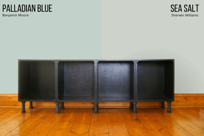
Palladian Blue is probably best described as a soft robin’s egg blue.
It’s LRV is 61.17.
Benjamin Moore Quiet Moments is also a pretty good dupe for Sherwin Williams Sea Salt, but on the opposite side of Night Mist. It is just a little bit cooler and more green than Sea Salt.
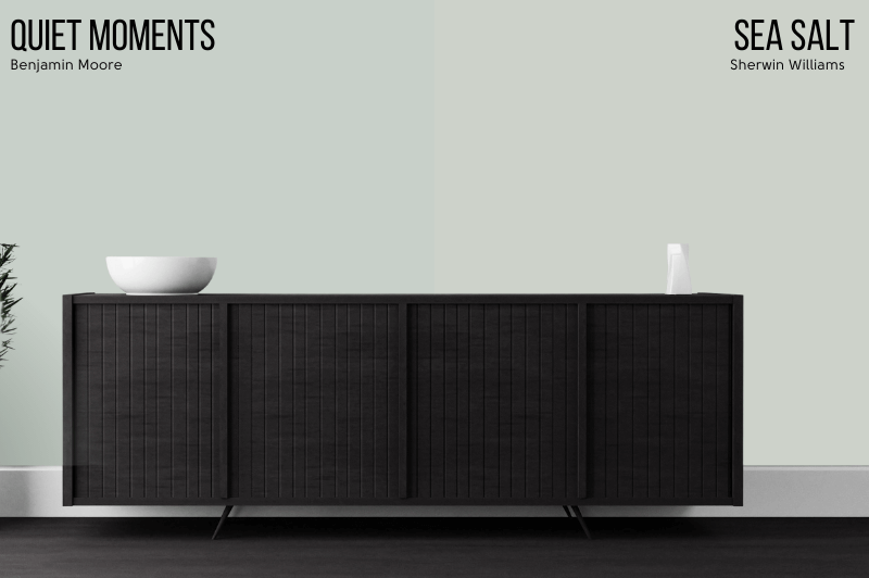
Formerly known as “Smoky Green” (CC-700), it is on the same strip as Healing Aloe and Beach Glass.
The LRV of Quiet Moments is 61.87, and you can see that it is a hint darker than Sea Salt.
Benjamin Moore’s color named Sea Salt is much closer to Sherwin Williams Fleur de Sel. It is a sandy color, and not green at all.

The LRV of Benjamin Moore Sea Salt is 62.93.
Benjamin Moore Tranquility is also known as Picnic Basket (CSP-730).

Tranquility is quite a bit cooler than Sea Salt, and darker.
The LRV of Tranquility is 53.9.
Not a dupe, but I thought we should look at Behr Breezeway because it is similar to Sherwin Williams Sea Salt, and it was their “Color of the Year” in 2022.
Breezeway lacks the same muted subtlety of Sea Salt. You can see that Breezeway is a much “brighter” color, and it makes Sea Salt look almost completely gray beside it.

In real life and on the wall, the difference seems to be a lot more subtle, but Breezeway isn’t in a heck of a lot of homes yet.
I don’t really like to take the official Behr literature and photos as gospel.
I suspect that Breezeway is quite aqua once it’s on the wall. I guess we will have to wait and see as more people use it!
The LRV of Breezeway is similar to Sea Salt, at 66.
This is the first time that I have ever written about a Restoration Hardware paint color!
I read a blog post from someone who wanted Restoration Harware’s Silver Sage, but in the end they chose Sherwin Williams Sea Salt.

I have to say that while on paper the colors aren’t so very different, in real life on the wall, Silver Sage looks nothing like Sea Salt.
Silver Sage tends to look like a sage color, or even gray, whereas Sea Salt usually reads brighter, or even blueish green at times, but never gray.
From first glance, RH Silver Sage is much more similar to Sherwin Williams Contented, but I would have to do some further investigation.
The LRV of Silver Sage is approximately 53.14.
Ante Meridian has now been discontinued. Valspar has replaced it with the existing color Luna 5005-3A, which is a bit lighter. You may still be able to get this color made, but I’m not 100% sure.
Valspar’s Ante Meridian is lighter than the dupe Valspar Sparkling Sage, so it is close to Sherwin Williams Sea Salt, but lighter instead of that little bit darker.

The LRV of Ante Meridian is 66.34.
Mellow Tune has now been discontinued. There isn’t really a replacement for it. It would currently exist between the darker shade Garden Flower 5004-3B and the lighter shade Quiet Mint 5003-1A.
Mellow Tune is the darkest of the Valspar alternatives that I had picked out for Sea Salt, with an LRV of 57.45. It is ever so slightly warmer than Sea Salt, but another very close color match!

Valspar Sea Salt Blue has now been discontinued. Try their shade Opal Fire 8003-34B for a very close match.
When Valspar Sea Salt Blue did exist, it wasn’t terribly different from Sea Salt, but it is a more cool-toned shade of green, and a little brighter.
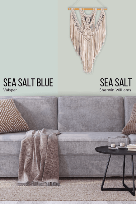
Even though it was technically still a green, it had a more blue-leaning undertone.
The LRV of Sea Salt Blue was approx 61.
Final Thoughts on Sea Salt
Well if this hasn’t made up your mind about Sherwin Williams Sea Salt, I don’t think anything will, but here’s a quick recap:
- Sea Salt is a subtle gray green-blue
- Sea Salt is light enough and neutral enough to use in your whole home
- Sea Salt likes to be matched with neutral colors, other greens, and blues
- This color is probably not for exteriors
- In north facing rooms, Sea Salt might look more blue
Not sold? Never fear! I seem to have really gone down a rabbit hole with greens. Here are many more:


