Sherwin Williams Thunderous is a great neutral color that works particularly well on cabinetry. Thunderous is a great choice for anyone who loves bold greens, but doesn’t want to commit to one on the wall.
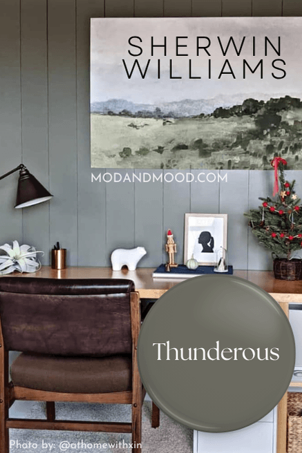
One thing is for sure about Thunderous, if you choose to use it, you will constantly be answering the question on insta: “What is that paint color?”
This post may contain affiliate links. Should you choose to make a purchase through one of my links, I may receive a small commission at no cost to you. I only recommend products that I use.
What Color is Sherwin Williams Thunderous? (6201)
What a great question. If only I could answer it! (Well you know me, I’ll try.)
Sherwin Williams Thunderous is a dark color that looks like equal parts gray, green, and brown. It is probably best describes as a very dark greige, with a hunter green undertone.
Sherwin Williams classifies Thunderous as a green, but it is just as much a gray.
Thunderous LRV
The LRV (Light Reflectance Value) of a color indicates on a scale of 0 – 100 how much light a color reflects (or doesn’t reflect). True black has an LRV of 0 and pure white has an LRV of 100.
In the paint world, we are working in a range of about 3 – 93 because no paint color is purely black or completely white.
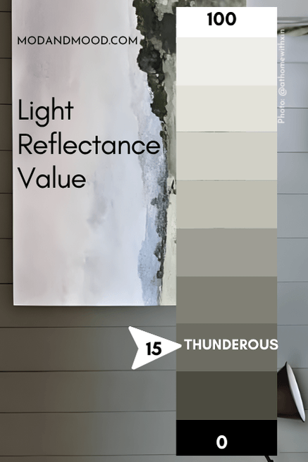
The LRV of Thunderous is 15. I normally consider truly dark colors to have an LRV of 10 or less, but Thunderous does appear pretty dark.
Sherwin Williams Thunderous Undertones – Warm or Cool?
As I mentioned earlier, Thunderous has a definite green undertone. Because Thunderous is so yellow on the color wheel (and trust me, it’s technically really yellow) it should be warm. However, it is also very gray, which cools it down.
I think Thunderous is a real chameleon and has the qualities of a true neutral.
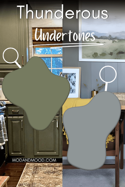
It most often looks like a muted version of hunter green, but it can also have steely gray undertones where there is just a hint of green.
If you need an accurate idea of what Thunderous will do in your home, get the peel and stick sample from Samplize! These are great because you can move them to different locations (even corners!) to see how a color reacts in your unique scenario.
Thunderous is kind of like taupe, it has a quality that can’t be described. Thunderous is too green to really be considered a taupe, but if you are searching for a taupe, you might like Thunderous!
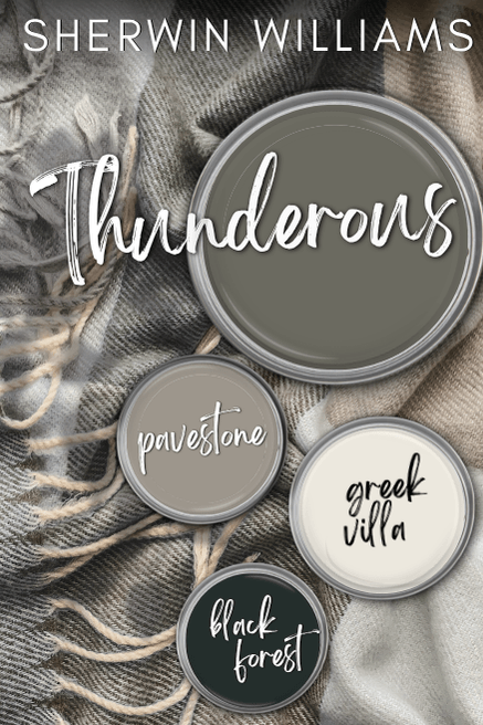
Thunderous Complementary and Coordinating Colors
The technical complementary color for Thunderous, would be a deep blue-gray. I decided to choose Sherwin Williams Mineral Gray for this palette.
Of course most people are using Thunderous as their bold color, and they wouldn’t be looking to mix it with another dark shade like navy.
I kept the rest of the palette in soft coordinating tones:
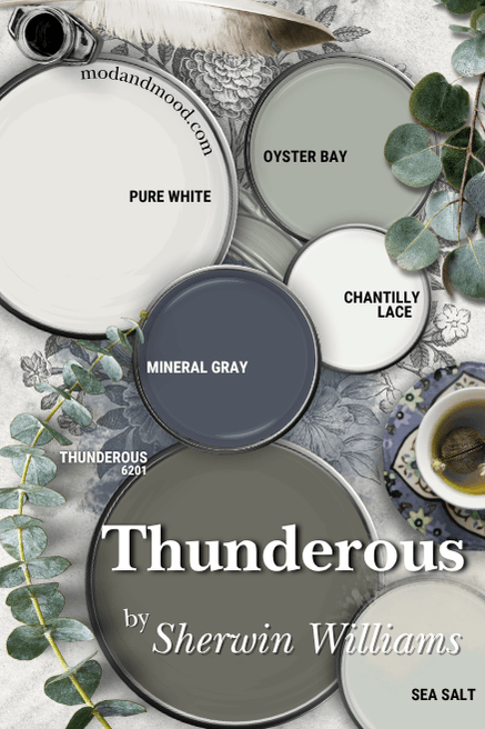
Here are all of the coordinating colors from this palette:
Benjamin Moore Chantilly Lace
Chantilly Lace is the perfect white-white. It is technically in the green family, so it does work exceptionally well with other greens, but it doesn’t have any noticeable color to it.
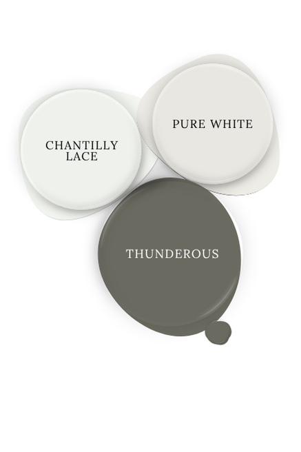
Sherwin Williams Pure White
Sherwin Williams Pure White is an uber popular white! It has a tiny bit of a warm tone to it, but it is still very light and bright. Compared to other whites it can look a touch gray, but again, that would be side by side, and in real life, it’s pretty darn white.
Sherwin Williams Sea Salt
Sea Salt is the ultimate soft green that you can use in your whole home as a neutral. It’s like “builder beige”…except green…and pretty.
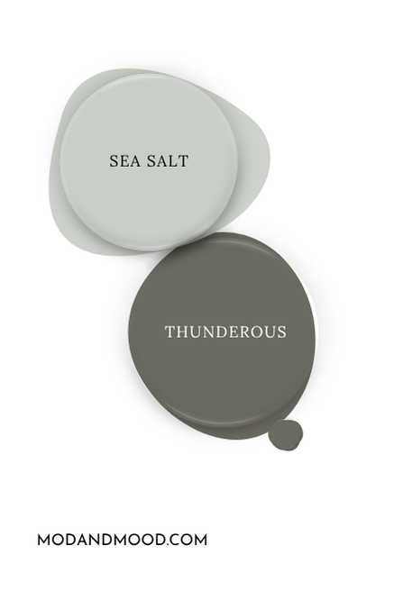
It looks really nice with Thunderous, but it will also really show off the green tones, so make sure that is your goal before going this route!
Sherwin Williams Oyster Bay
I chose Oyster Bay for this palette because it’s a nice middle ground between Thunderous and Sea Salt. If you want a coordinating lighter green, you might really like Oyster Bay.
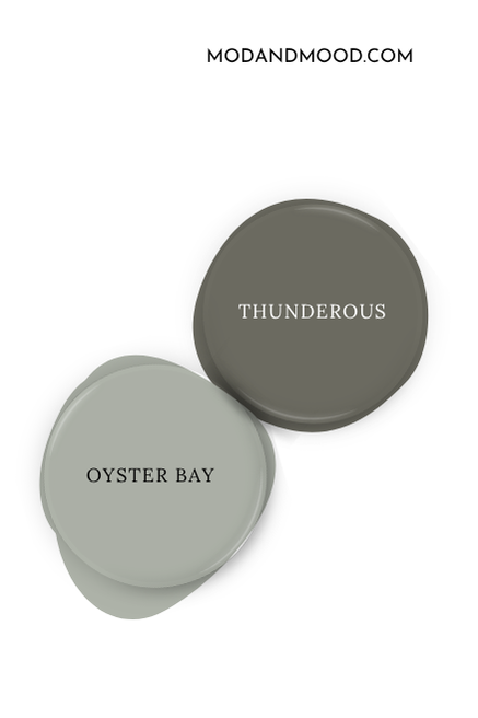
Some other greens can be hard with Thunderous, because they make it look more olivey or muddy. Oyster Bay has enough warmth to keep Thunderous looking fresh and neutral, but it can also have the same cool undertone.
Sherwin Williams Mineral Gray
As I mentioned, Mineral Gray is technically the type of color that complements Thunderous. I can see how they work well together, and would potentially look amazing on an exterior, or perhaps in a study.
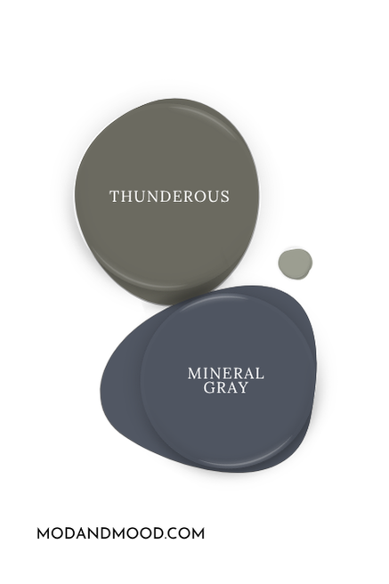
For regular use though, that would be a pretty dark color scheme.
You could also consider a blue-white to coordinate with Thunderous, but I didn’t find one that I liked with it.
More Coordinating Colors for Thunderous:
I never do anything halfway. I actually wish I could once in a while, because these posts take a lot of blood, sweat, and tears!
What I’m trying to say is: Here’s another palette.
For this one I went a little warmer with the coordinating colors.
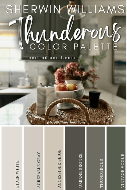
Sherwin Williams Eider White
Eider White is another really popular white from Sherwin Williams. It is a soft off-white that has a hint of super pale greige.
If you’re interested, I have covered what feels like a million and one whites, but many are in this one mega post about Snowbound.
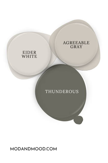
Sherwin Williams Agreeable Gray
I have covered both Agreeable Gray and Accessible Beige pretty thoroughly in this post: Accessible Beige vs Agreeable Gray.
I think either of these neutrals would work really well with Thunderous!
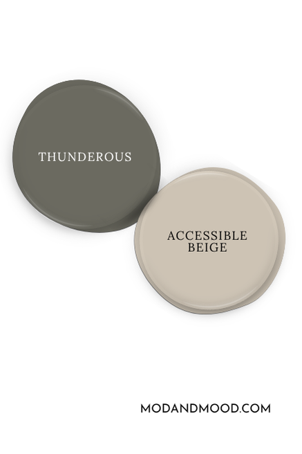
Sherwin Williams Accessible Beige
Beige is back baby! Accessible Beige is usually classified as a greige. It does have a good dose of balancing gray, so it isn’t an overly warm or orangey beige.
Thunderous really likes neutral taupes, beiges, and mushroom colors.
Sherwin Williams Urbane Bronze
Urbane Bronze has an actual bronzey quality to it that I really like. It would be an amazing choice on an exterior with Thunderous!
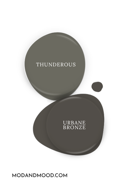
(Actually both are are on my list of 8 Dark and Moody Exterior Colors From Sherwin Williams)
Benjamin Moore Vintage Vogue
Vintage Vogue has some of the same chameleon-like qualities of Thunderous, but instead of ever looking gray, it tends to lean more warm. It looks quite green against Thunderous, but looks more neutral when it’s with other greens.
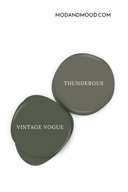
I would love to see someone use these two together. I think that could look really nice. (It also might not contrast enough. Give it a shot and let me know?)
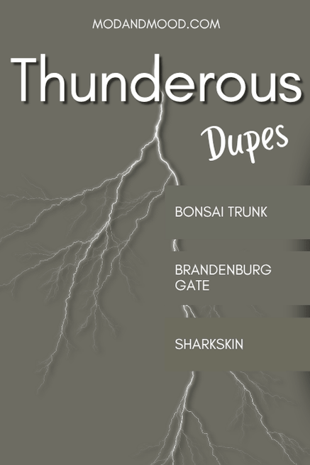
Dupes for Thunderous from Other Paint Brands
It’s my favorite time: Dupe time! I recently updated this section and was able to come up with even closer matches than when I first wrote this post. Yay!
Benjamin Moore Thunderous Equivalent
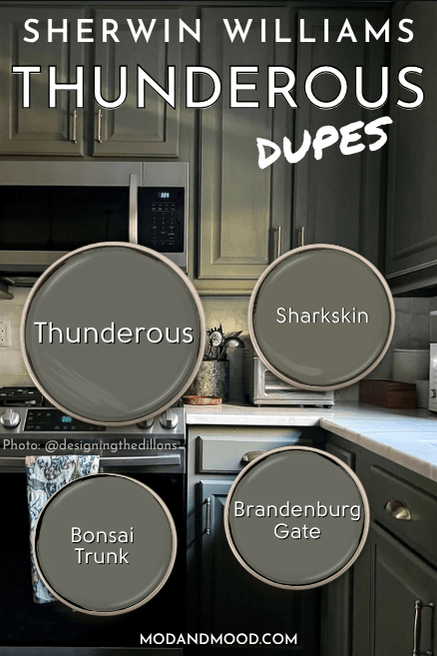
Sharkskin 2139-30
I think it speaks to the uniqueness of Thunderous that I was not able to find a whole bunch of similar colors. I was able to find a solid choice from each competitor that would work well, but not 5 or 6.
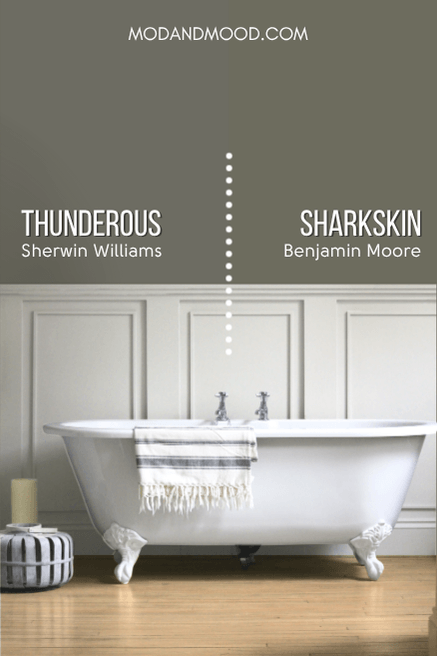
Sharkskin by Benjamin Moore, is a little bit more green than Thunderous, and a little warmer (less gray). By a “little bit more green,” I truly mean a teeny tiny bit, because it is still very much in the same area of the color wheel.
You can see that Sharkskin looks slightly more olive-toned than Thunderous, but it would be even less pronounced if they weren’t side by side.
Valspar Thunderous Equivalent (Lowe’s)
Brandenburg Gate 8004-27F
Originally the closest Valspar color I could find to Thunderous was the color Night Safari:

This color has now been discontinued, but we have a much better color match in its place.
Valspar Brandenburg Gate is a virtually perfect dupe for Thunderous:
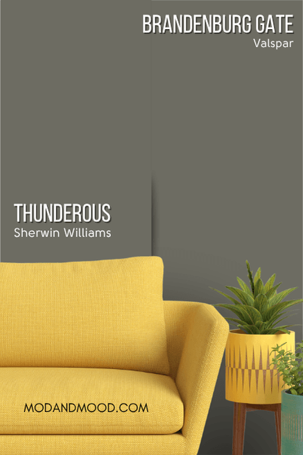
The hex codes for these colors are actually identical, so it doesn’t get much closer than that!
Behr Thunderous Equivalent Bonsai Trunk (N380-6)
Originally I didn’t find a Behr color as close as I would like to Thunderous. The one I ended up choosing was Shadows:

…But we have now a much better option in the color Bonsai Trunk!
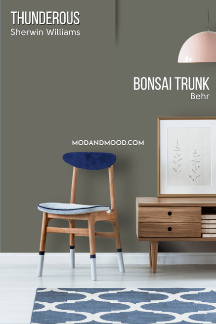
Bonsai Trunk has the same LRV as Thunderous, and has the same amount of gray in it. On paper it looks nearly identical, but Bonsai Trunk is technically from a slightly more green color family than Thunderous is.
Here is another look at each of these dupes:
Check Out Thunderous in These Home Interiors!
Now it’s time for the good stuff! Let’s see Thunderous in more real-life homes.
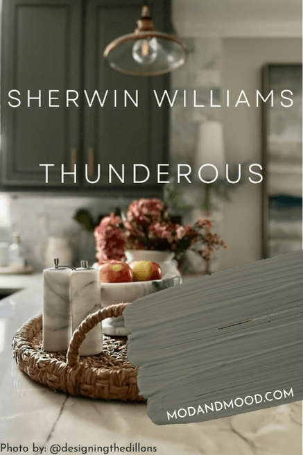
Sherwin Williams Thunderous on Kitchen Cabinets
Ashley from Designing the Dillons used Thunderous on her kitchen cabinets, and it looks amazing!
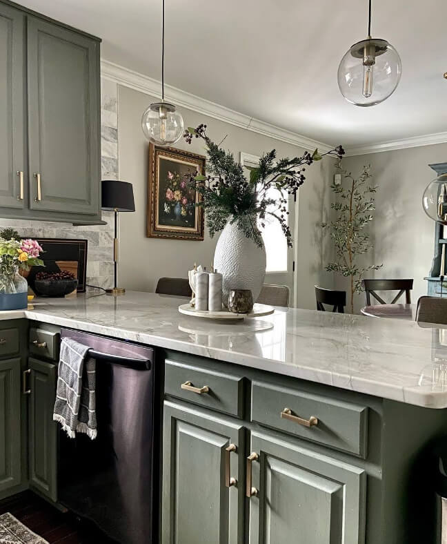
The color on her walls is Agreeable Gray. You can see from the countertops that Thunderous looks great with both cream and gray!
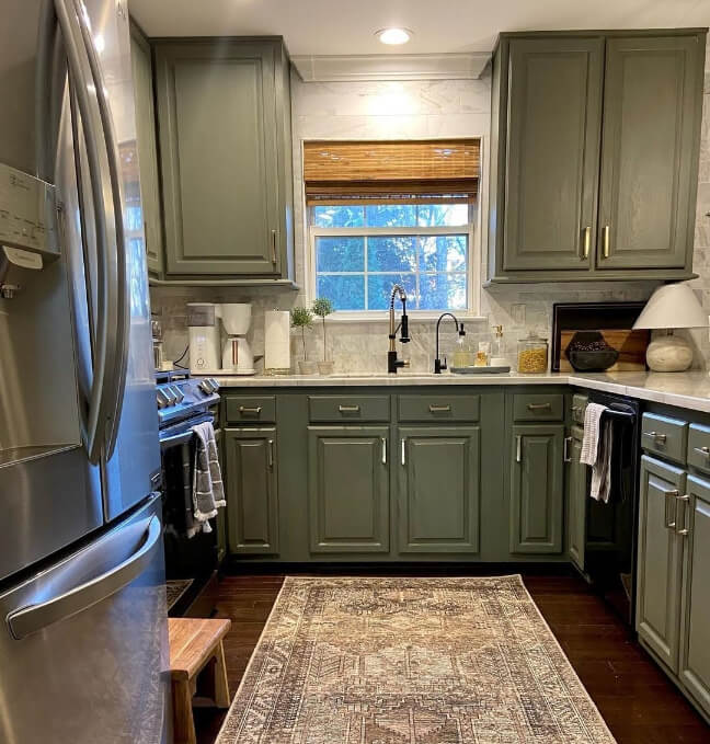
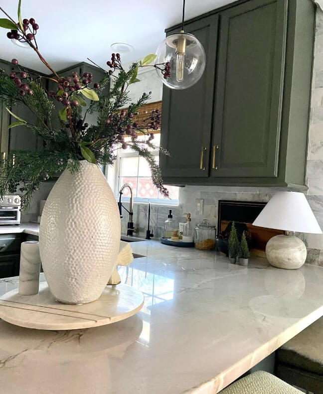
I really can’t get enough of Ashley’s kitchen!
If you can’t get enough either, check out my Trend-Setting Green Kitchen Cabinet Ideas.
Sherwin Williams Thunderous in a Bathroom
Now let’s take a look at Thunderous in the bathroom.
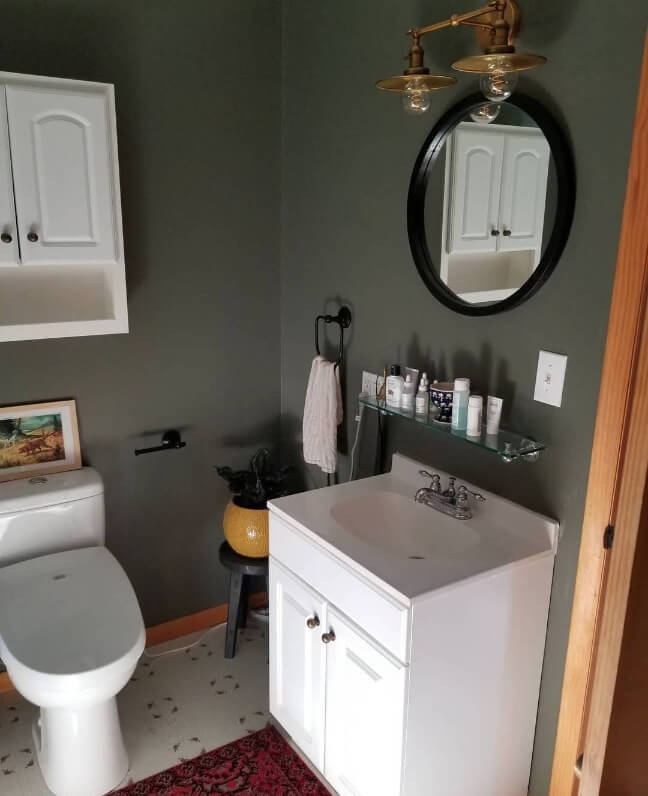
In this smaller bathroom, Thunderous looks cozy and rustic.
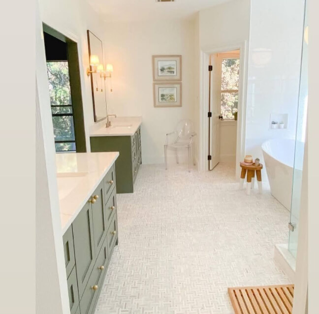
In this super clean and modern bathroom, Thunderous provides a nice pop of color.
Did you notice from the kitchen and the bathrooms that Thunderous looks great with all different hardware colors?
Thunderous on an Exterior
Thunderous isn’t the most popular exterior choice, but it should be! This moody shade is very flattering to all different styles of homes and materials.
Here we see it on a project by the team at Headwaters Painting:

The color looks pretty green on the main part of the house…
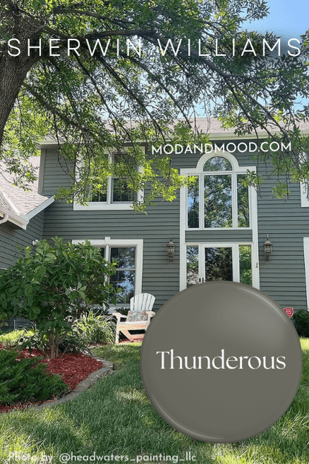
…but we can also see it looking more steely-gray on the garage:

Thunderous Final Thoughts
The best thing about Thunderous isn’t its versatility, its nod to green, or its general moodiness, it’s the fact that not everybody is using it!

If you’re looking for a unique color for your home that isn’t polarizing, Thunderous might just be the one!
I mean I love Urbane Bronze and Tricorn Black as much as the next girl, but I love having to ask what a color is, even more!
Not the one for you? That’s fine. I have way more colors for you to peruse!


