If you can’t quite find the perfect greige, beige, cream, or tan for your home, you might love the subtle taupe of Sherwin Williams Taupe of the Morning!
Let’s review this color in real homes, take a look at a color palette, and compare it to similar shades (plus see some dupes from other brands)!
This post may contain affiliate links. Should you choose to make a purchase through one of my links, I may receive a small commission at no cost to you. I only recommend products that I use.
What Color is Sherwin Williams Taupe of the Morning? (9590)
Most taupes tend to have a bit of a purple undertone, but I find Taupe of the Morning to be VERY subtle.
Think mushroom, putty, or cool beige. It’s a light and versatile neutral.
Taupe of the Morning LRV
The LRV of Taupe of the Morning is 65, which puts it into the magic whole-home LRV range. It won’t look white or off-white, but it’s not dark by any means.
How do we know this?
The LRV (Light Reflectance Value) of a color indicates on a scale of 0 – 100 how much light a color reflects (or doesn’t reflect). True black has an LRV of 0 and pure white has an LRV of 100.
In the paint world, we are working in a range of about 3 – 93 because no paint color is purely black or completely white.

At 65, Taupe of the Morning still reflects a good amount of light.
What Are the Undertones of Taupe of the Morning?
While subtle, Taupe of the Morning can still have a purple undertone like many other taupe colors. However a pink undertone is actually more common. I will point out both when we get to real homes.
I suspect that this is more of a problem when paired with yellow or green-based whites, because those are more likely to make the opposite undertones pop. (Purple and pink.)
I would say that Taupe of the Morning ranges in appearance from a true beige to a creamy mushroom color with pinky purple undertones.
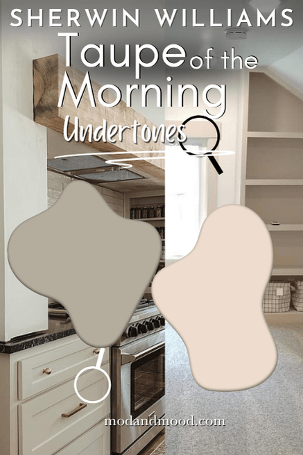
If you hate pink or purple, I really wouldn’t suggest Taupe of the Morning. You don’t always see the undertone, but why take the chance?
You might prefer a more traditional beige, like Manchester Tan, or a truer greige like Agreeable Gray.
It’s a bit crazy that a neutral can go from creamy beige to stony purple, so it’s always a good idea to test your colors!
Samplize makes it easy to get an accurate look at your top picks, with their peel and stick samples made with two coats of real paint. Grab your sample of Taupe of the Morning and get to sticking it anywhere from cabinets to corners!
Is Taupe of the Morning Warm or Cool?
I would say that Taupe of the Morning is warm to neutral. Most taupe and greige paint colors are true neutrals, with equal chance of looking warm, cool, or something right in between.
I do find that Taupe of the Morning tends to be warm most of the time. Whether the undertone is true tan or pinky purple, both are technically warm.
I would not say that Taupe of the Morning ever looks 100% gray, nor does it do anything weird and blue (side eye at Dolphin Fin and Repose Gray).
Taupe of the Morning Color Strip
Taupe of the Morning is from the Sherwin Williams Designer Collection. These are typically individual colors that don’t have a color strip…but luckily I always go the extra mile!
I have since updated this post, but originally this is how I came up with a color strip:
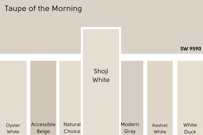
Taupe of the Morning is color number 9590. Shades 9589 through 9595 are kind of a light to dark progression, but you may notice that they have slight variations in tone:

I have since come up with this one, which I think is much better:
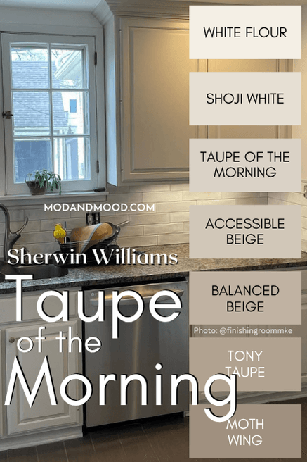
The other colors in my version of this collection are:
- White Flour
- Shoji White
- Accessible Beige
- Balanced Beige
- Tony Taupe
- Moth Wing
Lighter Version of Taupe of the Morning
Sherwin Williams Limewash (9589) is one shade lighter than Taupe of the Morning if you go off of color number. It has an LRV of 67, so it really is just a touch lighter.
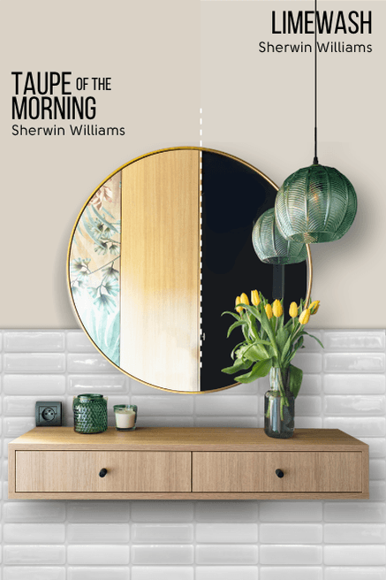
Limewash is also a tiny bit more gray.
For a better lighter alternative, I recommend Shoji White!
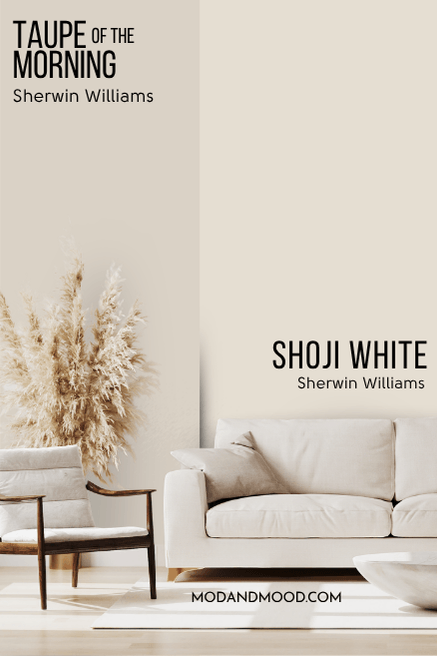
Shoji White is a nearly perfect lighter version of Taupe of the Morning.
Darker Version of Taupe of the Morning
Having loved and studied Taupe of the Morning for a while now, I came to the realization that it is a super good lighter alternative to Accessible Beige.
Likewise, Accessible Beige is a fabulous darker version of Taupe of the Morning. I’ll show you the full comparison in just a minute when we see a few other similar colors.
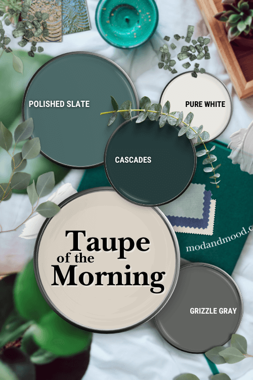
Sherwin Williams Taupe of the Morning in a Color Palette
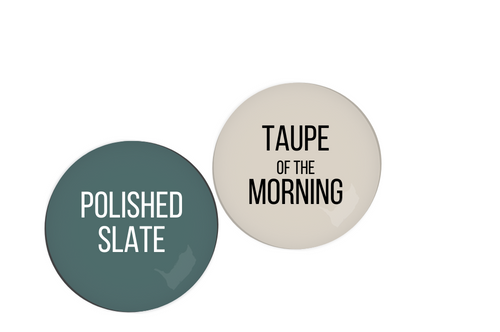
I was feeling Taupe of the Morning with smokey teals and a couple of neutral shades:
Taupe of the Morning Coordinating Colors
Benjamin Moore Polished Slate
Polished Slate is a nice muted teal color that I think works great with Taupe of the Morning.
You could easily go with something of a more true green nature instead of a teal, such as Sherwin Williams Rosemary.
Sherwin Williams Cascades
Cascades is a very deep teal that is as dark as some black paint colors. If you want a moody shade to complement the lightness of Taupe of the Morning, this could be the one!

Sherwin Williams Grizzle Gray
Grizzle Gray is a fairly taupey-gray in its own right, but less beige than Taupe of the Morning. It would be a great choice for a coordinating dark neutral.

Sherwin Williams Pure White
Pure White is my safest choice for a white with Taupe of the Morning. It is super neutral, and should work well with those tricky purple undertones.

Update: Based on that color strip I compiled, I also think White Flour would be great!
Complementary Color for Taupe of the Morning
The “official” complementary color for Taupe of the Morning (the color directly across the color wheel) would be a light gray-blue, similar to Sherwin Williams Upward:

What Trim Colors Go With Sherwin Williams Taupe of the Morning?
If you want to minimize purple or pink tones with Taupe of the Morning, steer clear of warm yellow-based creamy whites.
A creamy yellow white will make Taupe of the Morning look more purple, as you can see in this bathroom:

A soft white that has a touch of gray, like Sherwin Williams Pure White is a solid choice. My other top pick would be Sherwin Williams Snowbound which can have similar undertones to Taupe of the Morning.
Sherwin Williams Taupe of the Morning for your Home’s Interior
Taupe of the Morning is a super underrated color in my opinion!
I really haven’t seen it used a whole lot, and unfortunately that means I don’t have a ton of photos to share.
I was able to scrounge up a few however:
Taupe of the Morning in the Bedroom
I mentioned earlier that I had received feedback that Taupe of the Morning sometimes gives a pink undertone. One of the people to mention it was Kelly (@therozyhomebykelly).

She used Taupe of the Morning for the trim in her kids’ bedroom, with Oxford White walls. I’m not especially getting pink here. Maybe just a touch on the trim above the window?

I think it could be a bit like Sherwin Williams Snowbound, where once you see the pink you can’t unsee it. The color isn’t pink, but the hint may drive you crazy.
Oxford White is a yellowy-green based white, so the green theory I suggested earlier may have some legs.
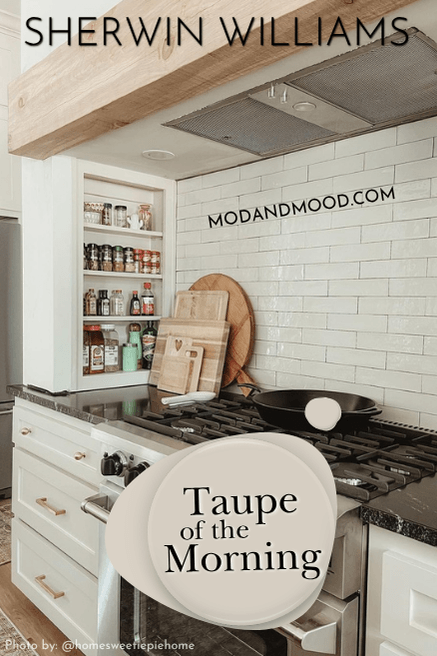
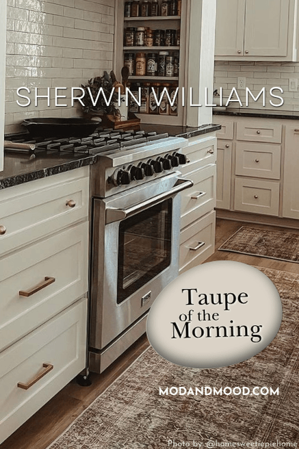
Taupe of the Morning on Kitchen Cabinets
Ashley and Matt from @homesweetiepiehome, chose Taupe of the Morning for the kitchen cabinets in their new build:

Here it’s not quite finished yet, but you get the idea!

The white is Sherwin Williams Pure White, and you can see that it doesn’t make Taupe of the Morning look purple. The pantry is Sherwin Williams Succulent.
I’m a big fan of this soft shade on cabinets. It’s unexpected, but still on trend with beige and gray cabinets.
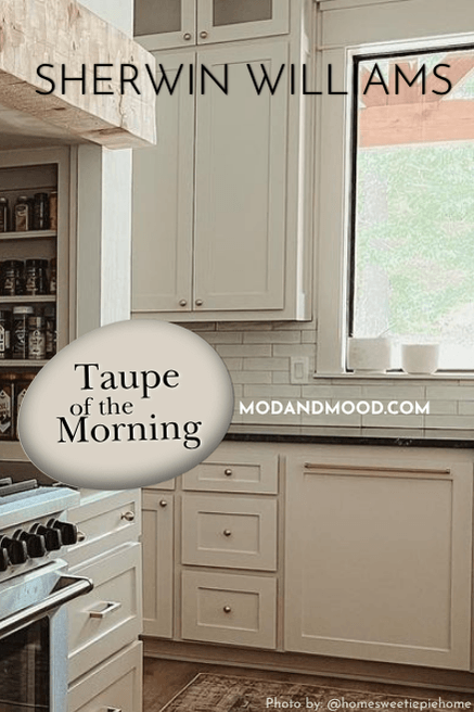
Here is the finished result:

I have one more set of kitchen cabinets to show you, this time by The Finishing Room (@thefinishingroommke):

In this kitchen, Taupe of the Morning looks much more beige. Definitely no purple here either. It actually looks very similar to Benjamin Moore Revere Pewter.
Sherwin Williams Taupe of the Morning on an Exterior
Unfortunately I was not able to find Taupe of the Morning on an exterior, but I do have Shoji White, and it is pretty similar as mentioned earlier.

All colors will look lighter on an exterior, so while Taupe of the Morning will be darker than these exteriors, only by about 10%.

Taupe of the Morning Compared to Other Sherwin Williams Paint Colors
Feeling a little muddled with all of your neutral paint swatches? Allow me to share the difference between Taupe of the Morning and other colors you might be considering.
Sherwin Williams Taupe of the Morning vs Oyster White (7637)
Oyster White is not as similar to Taupe of the Morning as I expected. It is not only lighter (LRV of 72) it is cleaner and more yellow.
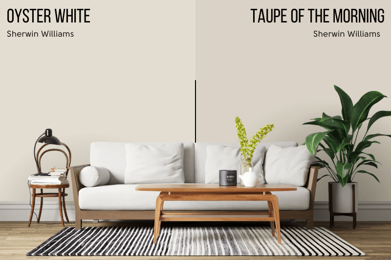
Read more about this color in my post: Sherwin Williams Oyster White (Review and Dupes!)
Sherwin Williams Taupe of the Morning vs Accessible Beige (7036)
Accessible Beige is darker than Taupe of the Morning, with an LRV of 58. It is also just a little less gray.
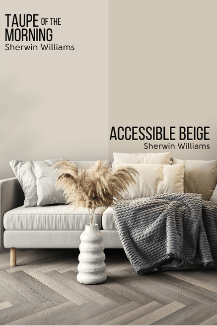
While Taupe of the Morning is a fabulous lighter alternative to Accessible Beige, I will say that Accessible Beige doesn’t ever have a violet undertone (that I have seen).
Sherwin Williams Taupe of the Morning vs Natural Choice (7011)
Natural Choice is a popular off-white from Sherwin Williams that also looks much more beige than taupe.

You can see that it has a lot more yellow in it, so much so that it almost looks green in comparison. (But not in real life!)
Natural Choice has an LRV of 74.
Sherwin Williams Taupe of the Morning vs Shoji White (7042)
Shoji White is more red than Oyster White and Natural Choice, so it is similar to Taupe of the Morning that way.
It is still lighter, with an LRV of 74.
In terms of “darker whites” (off-whites), Shoji is one of my faves! Read more here: Sherwin Williams Shoji White Review and Alternatives (It’s not greige!)
Sherwin Williams Taupe of the Morning vs Modern Gray (7632)
The waters start to get a little muddy between Modern Gray and Taupe of the Morning.
Modern Gray is a bit darker, with an LRV of 62.

I would say that Modern Gray is also a taupe. It is a little more gray than Taupe of the Morning, but it is also more red, so it too has that purpley-gray-beige quality of many taupes.
Sherwin Williams Taupe of the Morning vs Kestrel White (7516)
Kestrel White is just a bit lighter than Taupe of the Morning, with an LRV of 68. It is also a little less gray, and a little more red.

Kestrel White is a bit more likely to have a peachy undertone.
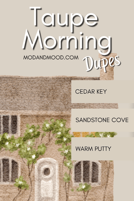
Taupe of the Morning Dupes
Time for the fun part! Dupes!
Where else can you get a color like Taupe of the Morning, you ask?
Well I’ll tell you!
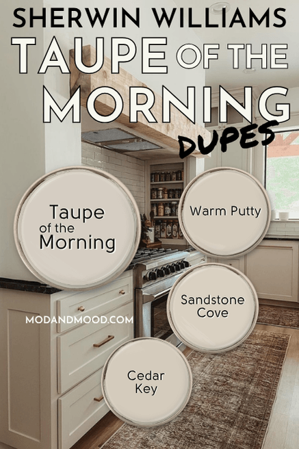
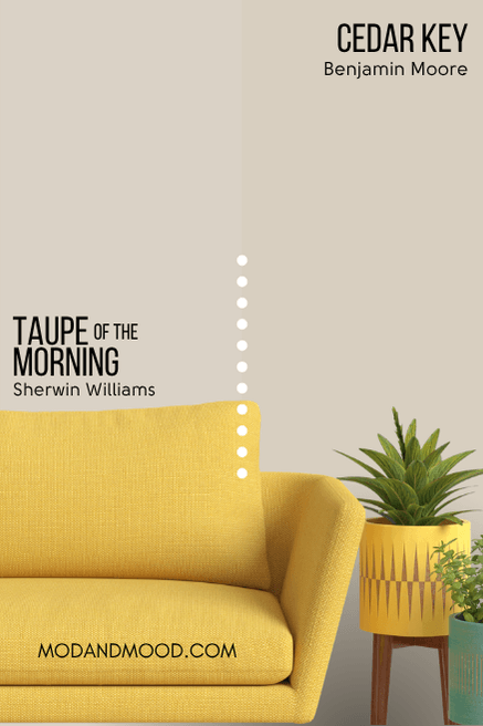
Benjamin Moore Taupe of the Morning Equivalent
I found two pretty good dupes for Taupe of the Morning from Benjamin Moore. From a technical perspective, Kitten Whiskers is the closest match, but I personally like Cedar Key a bit better.
Benjamin Moore Cedar Key (982)
Cedar Key is a soft beigey-taupe like Taupe of the Morning. It is just a touch darker, and a bit more beige, but I feel like it’s a great dupe in person.
Benjamin Moore Kitten Whiskers/Bone China (1003 or CC-426)
The LRV of Bone China aka Kitten Whiskers is very close to that of Taupe of the Morning, and on paper it looks more similar than Cedar Key:

However, Bone China is actually a fair bit more red, and in real life it can look quite pinky, where Taupe of the Morning does not.
Valspar (Lowe’s) Equivalent to Taupe of the Morning
From Valspar the best color match for Taupe of the Morning is the shade Warm Putty.
Valspar Warm Putty (6006-1A)
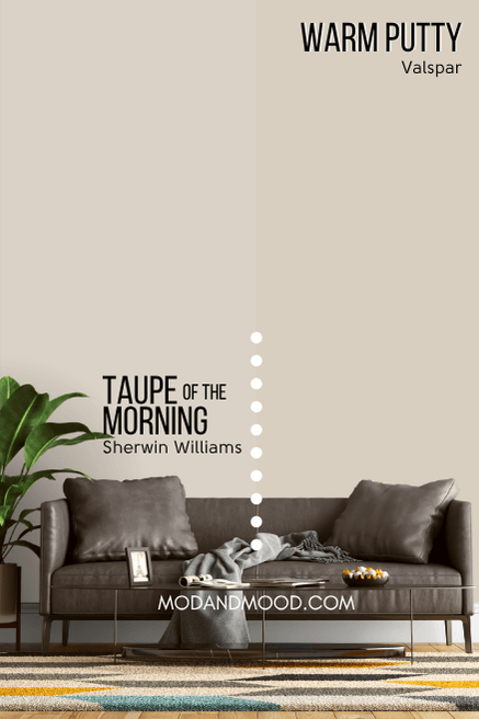
Warm Putty is a touch more yellow (vs red), and less gray than Taupe of the Morning. It is also supposed to be a touch lighter, but Valspar measures LRVs differently. This dupe is pretty perfect!
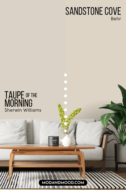
Taupe of the Morning Behr Equivalent (Home Depot)
Behr Sandstone Cove (730C-2)
Sandstone Cove is the Behr version of Taupe of the Morning.
It is just a tiny bit more beige, and a wisp lighter.
Here is another look at each of these dupes:
Taupe of the Morning Final Moody Musings
That’s about it for Taupe of the Morning! If you have used it I would love to hear all about it.
If you haven’t, let’s recap:
- Taupe of the Morning is most popular for cabinets, but it would make a nice neutral whole home color
- Use it with a pure white (like Pure White) to keep the purple undertone in check
- It is similar to some super popular off-whites, but it is a touch darker
Not the one?
Allow me! :


