Why have just one color in your bedroom when you could have two?
Half and half paint, color blocking, accent walls, whatever you call it, here is some killer inspiration for your next bedroom project!

I did try to keep the color combinations involving white and cream to a minimum, but those are obviously some of the more popular ones, so there is still a lot.
Clay and Dark Green
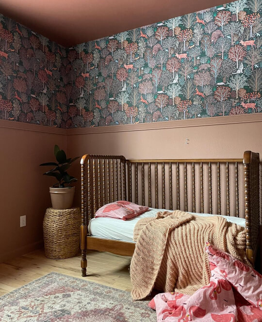
I led with one of my favourite of all the combinations I saw. Okay, so technically that wallpaper is not a solid color, but I LOVE how these two go together.
If you want to recreate the look, I happen to know that Maria used the Sherwin Williams color Hushed Auburn. To get the same vibe as the wallpaper in a solid color, try a dark green like Benjamin Moore Tarrytown Green.
Just for fun, because Hushed Auburn is so scrumptious, here it is with cream, before Maria put up the wallpaper:

Pale Pink and Light Sage
This could just as easily be inspiration to pair a light sage with coral, because the coral accents in this room also work incredibly well with the board and batten.
This combo is a perfect pastel duo that doesn’t read “baby room.”
To recreate this look, try Benjamin Moore October Mist with Sherwin Williams Abalone Shell:

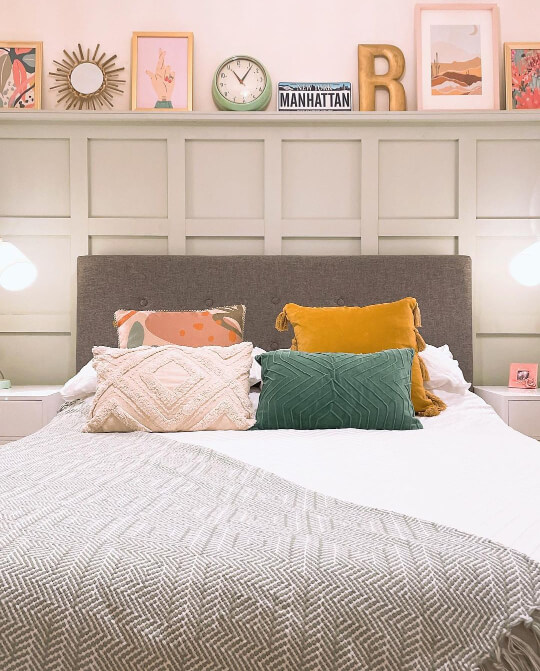
Lavender and White

Lavender is a classic bedroom choice because it’s soft and soothing. Paired with white and natural wood tones, this room reads restful.
Get the look with Sherwin Williams Pure White and Sherwin Williams Silver Peony.
Let me tell you, it is hard to find a lavender color that is subtle enough! It took me a while, but Silver Peony is a winner!
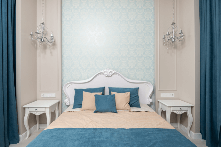
Light Blue-Green and White

I didn’t really know what to call this color because it’s almost mint, but a little more blue. It’s like a subdued aqua.
I wish the lighting was a bit better in that picture, but you get the idea! This is another classic soothing bedroom combo.
Dupe this room with Benjamin Moore Chantilly Lace and Sherwin Williams Rainwashed.
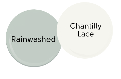
(Rainwashed is definitely brighter and a little more blue in real life than it looks here.)
Soft Aqua and Greige
Keeping that soft aqua color in mind, here is a room where it’s paired with a greige:
The wall color is borderline just beige and not greige, but so is Sherwin Williams Agreeable Gray!

That bedroom inspo also shows how a peacock blue and greige would work well together.
Yellow and Gray
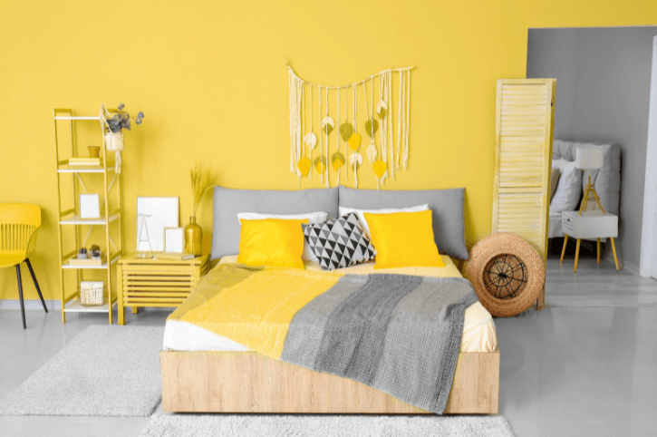
This bold combo isn’t for everyone, but for those that like it, it’s bound to have them waking up cheery every day!
Try the rich yellow of Behr Buzz In with Sherwin Williams Peppercorn.
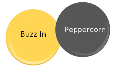
Peppercorn isn’t actually as dark as it looks here. In a bright room it appears more like a mid-gray.
Aqua and Coral

Should we call this a coral reef color scheme? This bright aqua color looks amazing with calming coral.
This is the kind of color scheme that I wish I had the guts for!
If you have the courage, try Sherwin Williams Calypso with Sherwin Williams Sockeye:

Help! Why does this combo make me want ice cream?
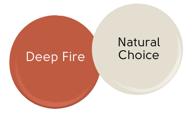
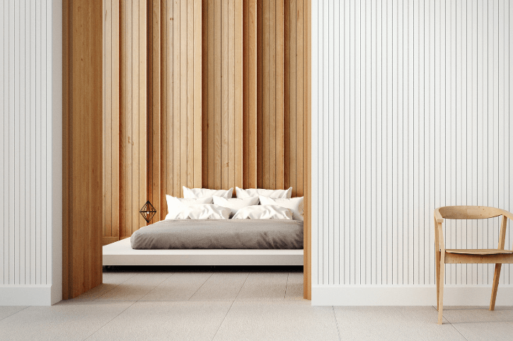
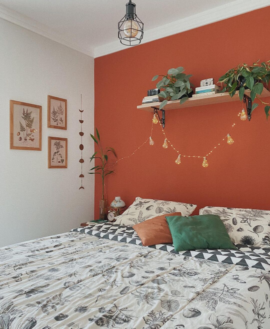
Terracotta and Cream

Tell me that Hayley from @two_priors_in_a_pod, isn’t the boldest. Go ahead, try! Her fiery choice for the ceiling is mellowed by the soft and creamy wall color.
Here her ceiling is color matched to Lick Paint Terracotta Red. I wasn’t able to find enough info to color match it myself, but you can replicate the look with Behr Deep Fire and Sherwin Williams Natural Choice.
If you want a terracotta color that is a touch more subtle, check out my post of all the best terracotta paint colors!
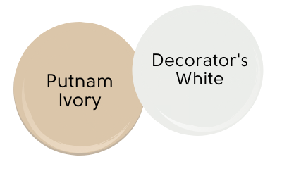
White and Natural
Okay, so it’s not a paint combo, but white and natural wood is a classic Scandinavian combo that can’t be overlooked!
If you don’t have it in you to create an accent wall, consider filling your room with natural wood toned furniture and accessories.
If you like this as a color combo, try Benjamin Moore Putnam Ivory to mimic the color of blonde wood. Decorator’s White by Benjamin Moore is a cool-toned grayish white.
Silver and Blush
To mimic this chic combo, get the silvery gray in a satin or semi-gloss finish instead of eggshell.
Love these two colors together!
For the perfect not-too-pink blush, choose Benjamin Moore Venetian Portico. For a silver, try Behr White Metal.

Cream and Beige
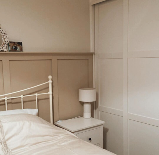
Create a soothing room of neutrals by using a creamy white and a soft beige.
In the photo are Farrow & Ball’s Oxford Stone and Little Green Paint Company Portland Stone Light.
If you need an easier to find brand, try Benjamin Moore Soft Chamois with Benjamin Moore Manchester Tan.

In that first photo, cream and beige looks cozy and comforting, but this color scheme can also look expensive:

Here the wall color might be a bit closer to greige, but you get the idea!
Gray and Peach
Despite the fact that terracotta and gray go very well together, I never would have thought to do gray and peach!
This happy two color combo makes me think of summer time.
Dana used Valspar Mojave Sunset for the peach. For the gray, try Valspar Filtered Shade.

Robin’s Egg Blue and Cream
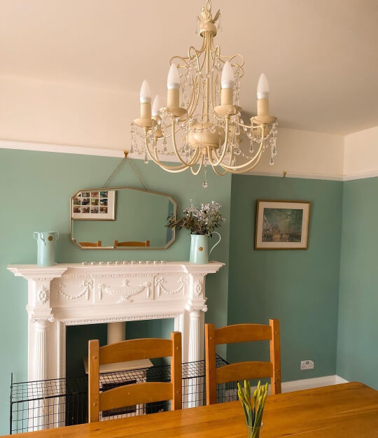
This two color combo is in a living room and dining room, but there is no reason this wouldn’t work in a bedroom.
I had the hardest time trying to decide what this greeny-blue color should be called, but I settled on robin’s egg because that seemed the closest.
The actual color is Dix Blue by Farrow and Ball.
Dupe the look with Sherwin Williams White Flour and SW Kind Green.

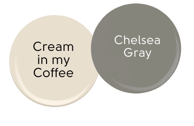
Gray and Cream
This is the second of three rooms where Sarah from @radsandrafters has combined creamy white with another color.
In this room she has used Farrow & Ball Lamp Room Gray, which you can see has a little warmth to it.
Copy Sarah’s style with Valspar Cream in my Coffee and Behr Chelsea Gray.
Soft Sage and Creamy White
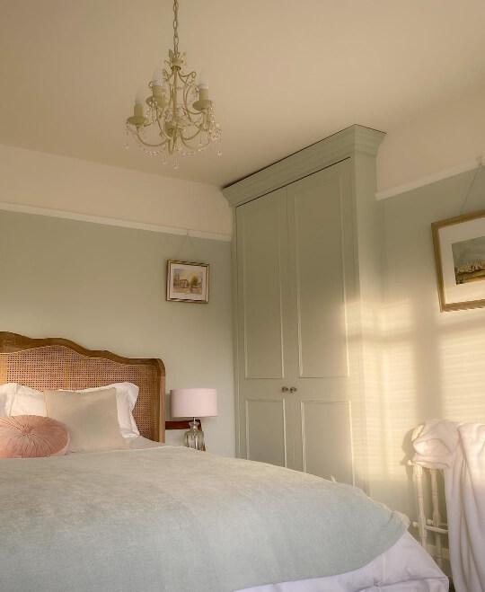
Between Sarah and Hayley, do you want to find a Victorian home yet?
These gorgeous curved ceilings in a creamy white look amazing with Farrow and Ball Pale Powder.
Sherwin Williams Wavecrest is a near perfect dupe for Pale Powder, and Sherwin Williams Whitetail is a classic creamy white.

Dark Blue-Green and White
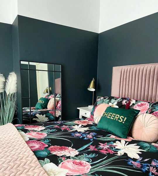
The use of white in this room helps to keep the dark color from swallowing up everything else. This could just as easily be an example of rose and dark blue-green, because the pink accents look beautiful in this bedroom.
Achieve this look by using Benjamin Moore Salamander with Behr Diamonds Therapy.

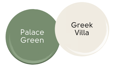
Sage Green and White
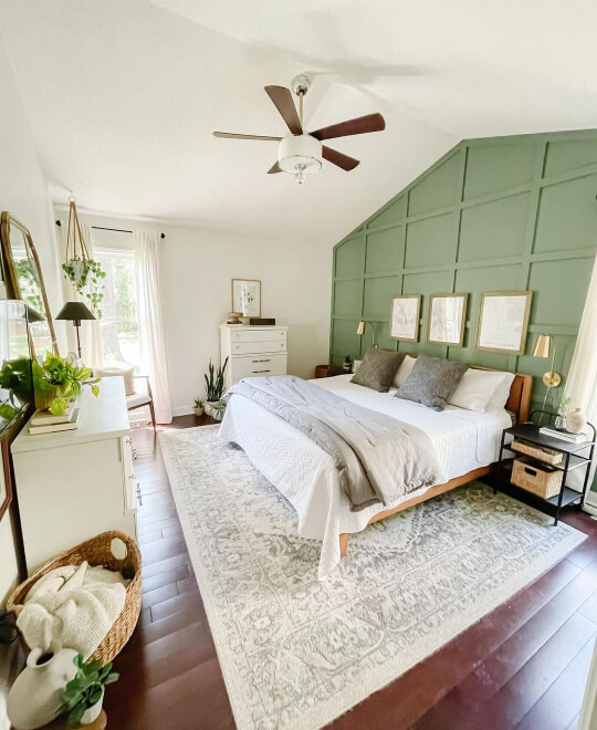
Sage greens are the “it” color right now, so it’s fitting that they pop up a few times in our favourite two color combinations!
This is an interesting one, because the color that Megan from @callenderhome actually used is Valspar Belmont Green, but that color in real life is significantly darker and more grayish than it looks here.
To recreate the look as it appears in the photo, try Benjamin Moore Palace Green and Sherwin Williams Greek Villa.
I have actually covered a whole host of similar greens in this post: Warm Green Paint Colors, so head there to find the perfect one for your bedroom!
Pink and Tangerine

How fun is this landscape and color combo from the @deltalash studio?

DIY your own cotton candy and tangerine bedroom with Benjamin Moore New Dawn and Benjamin Moore Salmon Peach.

Navy Blue and Gray

Back to the classics with this navy blue and gray color scheme. The colorful pops of pink and turquoise keep the room young and fun.
Get this look with Benjamin Moore Hale Navy and Sherwin Williams Knitting Needles.

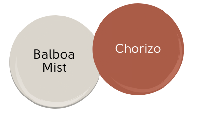
Gray and Terracotta
The bold color of this terracotta wall is mellowed with a warm gray and neutral accessories.
Want to try this two color combo in your bedroom? Try Benjamin Moore Balboa Mist and Valspar Chorizo.
Black and White
Of course we wouldn’t be going anywhere without this absolute classic combination of black and white!
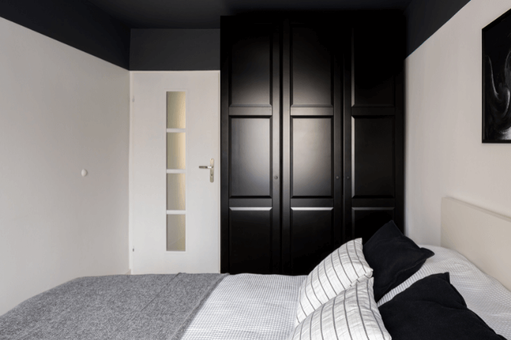
Black looks great with all shades of white, from creamy and natural, to cool and bright.
How amazing does that black ceiling look?

Probably the most popular black paint color on the planet earth is Sherwin Williams Tricorn Black. Pair it with one of their classic cozy whites: Snowbound.

Black and Pink (or Mauve!)

I love black with this rosy mauvey pink color! Super cozy.
Bring this two color combination into your bedroom with Farrow & Ball Sulking Room Pink, and Behr Cracked Pepper.
How to Use Two Colors in a Bedroom
You aren’t limited to putting one color on an accent wall and having a second color on the rest!
- Try painting a bold shade on your ceiling and partway down the wall like some of our inspiration photos
- Color blocking is a great way to combine two bold shades on the same wall
- Consider adding wainscoting or board and batten to be painted a different color than the rest of the wall
- Paint your trim and doors a color other than white
- Paint the top and bottom half of your walls different colors
I don’t know what’s going on with me, but I am really digging all of those orange combos!
Anyways, I have plenty more paint color ideas for you to peruse! Here is a selection:


