Sherwin Williams Drift of Mist is a beautiful (and popular!) soft greige wall color, but is it right for your living room?
Here we will talk about the various looks that Drift of Mist can have (hello, undertones!), and also discuss trim and furniture to consider, if you are using this color in your living room.
What Does Drift of Mist Look Like?
Before we get into deciding whether or not Drift of Mist is the perfect shade for your living room, let’s see what to expect!
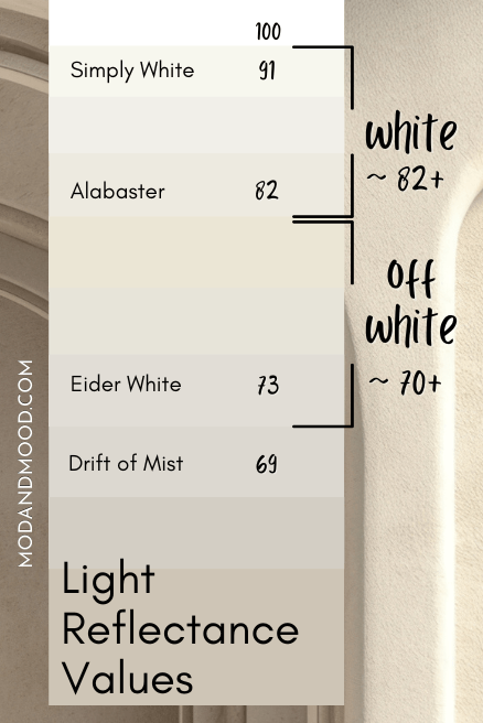
Drift of Mist is a very light greige paint color. It is so light that it is technically only a hair darker than off-white, and it can still look like one!
Drift of Mist ranges in appearance from silvery gray to light beige, but it does most often sit right in the middle.
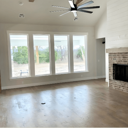
Here is a good example of a “typical” look for Drift of Mist that is more on the gray side, but still greige (it is the wall color in the background) :

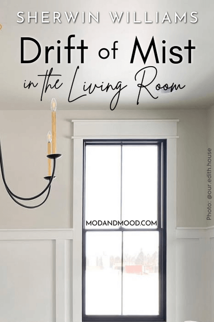
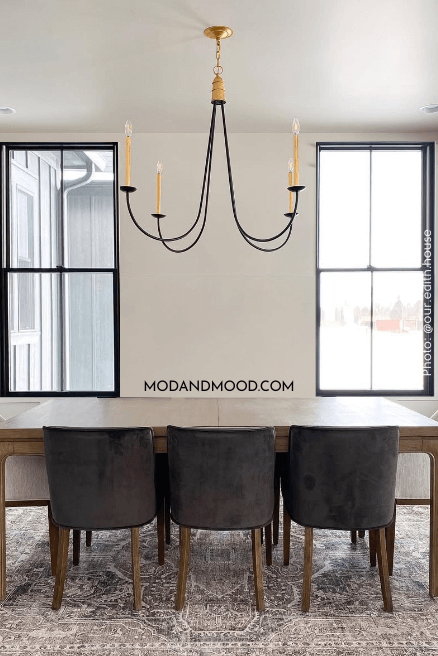
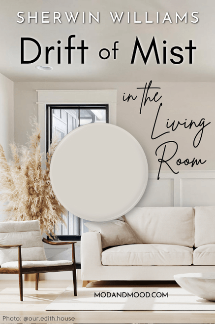
On the warmer end of things, here is a typical look for Drift of Mist when it is leaning more beige:
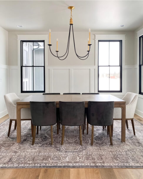
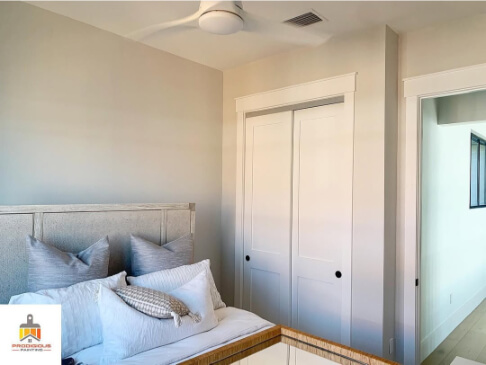
Drift of Mist is on the upper part of the walls and on the ceiling. The wainscoting is Sherwin Williams Pure White.
Choosing a White Trim or Cabinet Color for Drift of Mist
You can see that Drift of Mist looks darker and more obviously neutral, when more white is present. This brings up an important note: Drift of Mist needs white or it will look white.
If we hide the wainscoting and window trim, you can see that Drift of Mist would easily be mistaken for a creamy white.
Honestly this isn’t the worst thing ever, the color looks quite nice like that! However if you don’t want walls that look white, make sure you use a true white for your trim. The whiter and brighter your trim, the more saturated Drift of Mist will look.
For the warmest side of Drift of Mist, use a bright white with a cooler undertone.
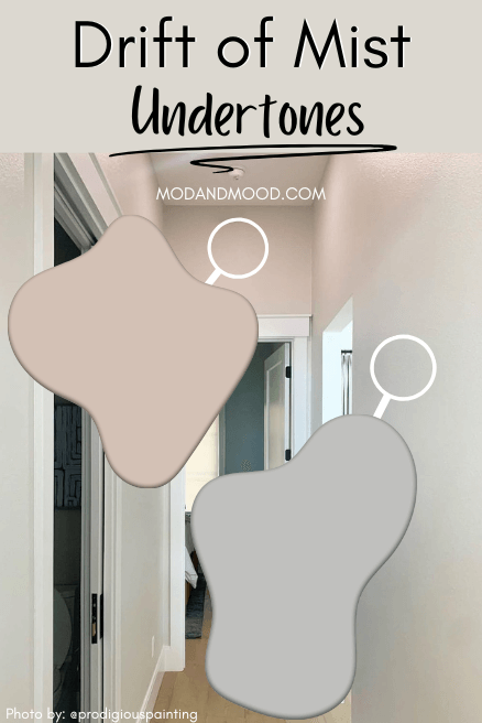
What Undertones does Drift of Mist Have?
In bright and cool daylight, you may find that this color has an almost blue undertone. This is mostly because the color is so light. It will reflect any other strong color around it, including cool daylight.
Here is a great example:
You can see that the color looks silvery gray-blue at the bottom of the wall.
In fact if you Google: “Drift of Mist looks ___,” you will see suggested searches for just about any color! “Drift of Mist looks” pink, blue, yellow, purple, green, etc.
Most commonly, people complain about a blue or pink undertone, which I think is valid. You can see both at play here:
The artificial light in that hallway makes the top of the walls look pink, and the shadows are reading more blue. This is a pretty extreme example, but I just wanted to show you what can happen.
Here is an example that is more realistic:
In different parts of the room you still get a subtle version of those undertones, but it doesn’t overpower the color.
I have heard rumblings of Drift of Mist having yellow or green undertones, but I haven’t personally seen it, and I wouldn’t say it’s common.
Drift of Mist in Real Living Rooms
Now that we have covered undertones, let’s see Drift of Mist in some real life living rooms!
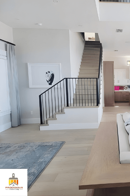
First up we have this beautiful vaulted living room:
I had to include this one because you can see the undertones again, and how the left wall and fireplace wall look quite different.
Here is an open plan living room, dining room, and kitchen in Drift of Mist:
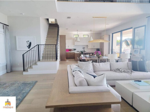
The color in here looks very light and white-adjacent. This is what I would expect of Drift of Mist, if you choose a white on the darker and creamier side for trim.
Here is another living room by the team at Prodigious Painting, but the color looks very typical here:
You can see where the light is brightest, the color gets a little bit washed out, and also looks very cool toned.
Here is Drift of Mist in a new build with Pure White trim:
Again the color looks pretty typical here. It’s a nice light greige.
I surprised myself by having lots of Drift of Mist photos, but not very many in the living room. For my next example, I stuffed a couch into that dining room we saw earlier:
It’s worth noting that your living room furniture can also really influence the color of Drift of Mist.
- If you have very light furniture, the color will look a little bolder
- Dark furniture will make your walls look lighter and closer to white
- Blue or cool-toned gray furniture will make Drift of Mist look more beige
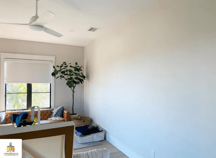
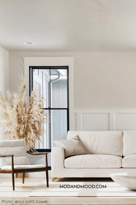
Here is one more picture I found of Drift of Mist in a living room:
Sherwin Williams Drift of Mist vs Agreeable Gray in the Living Room
Agreeable Gray and Drift of Mist are both greige paint colors, and I would say that they do look pretty similar:

Agreeable Gray doesn’t ever look white because it is darker than Drift of Mist. If white or off-white is a look that you are looking to avoid, you might prefer Agreeable Gray.
That’s the only major difference between these two. Both can run the full spectrum from looking quite gray to almost completely beige. I do think Agreeable Gray is maybe a tiny bit less likely to have that blue undertone.
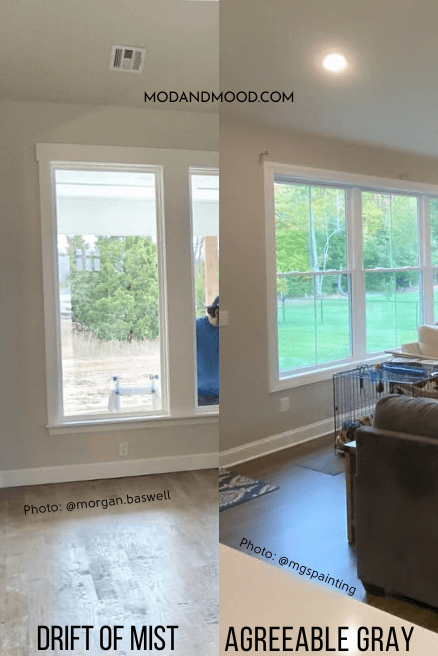
You can see in the side by side photo, that there is more contrast between walls and trim on the Agreeable Gray side, than there is on the Drift of Mist side.
Thank you so much for reading until the end! That really helps my blog. If you still aren’t sure about your color choice, here are more to mull over: