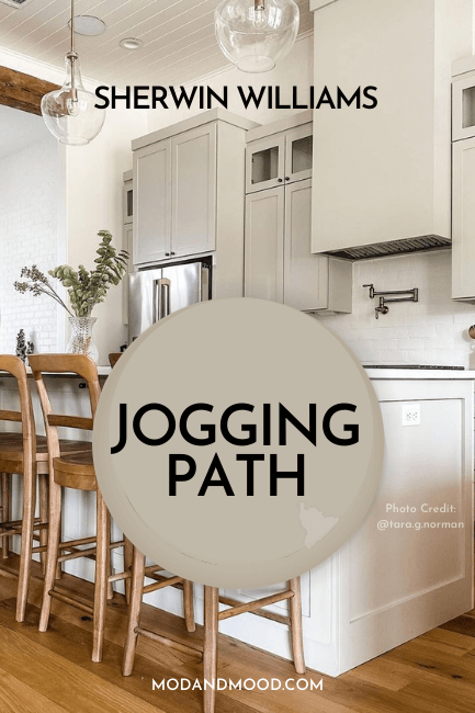
Sherwin Williams Drift of Mist is a beautiful whisper of color for your walls, but what to do about cabinets? When white is feeling a little washed out (or washed up!) a neutral kitchen cabinet color might be the perfect option you are looking for.
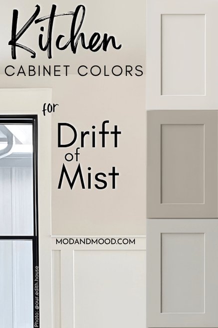
Here are my top picks for neutral paint colors to use on cabinets when Drift of Mist is on the walls!
How to Choose a Neutral Cabinet Color that Goes with Drift of Mist
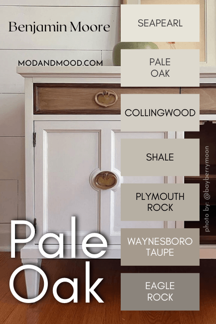
Drift of Mist is a light greige paint color that ranges in appearance from silvery gray to light beige, but it does most often sit right in the middle.
With these kitchen cabinet choices, I have made the assumption that we want to keep Drift of Mist looking neutral to warm, and not silvery gray. I have chosen neutral colors that have similar undertones.
Drift of Mist has an LRV of 69, so it is just darker than an off-white. If you want your cabinets to contrast your walls, you should choose a neutral with an LRV of around 60 or less.
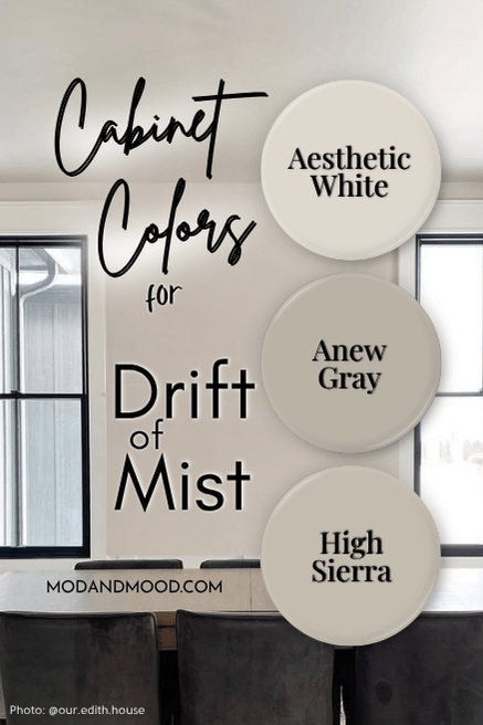
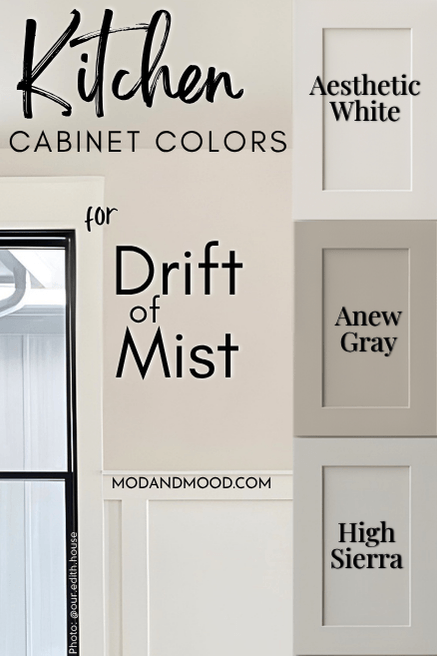
Sherwin Williams Aesthetic White
For a monochromatic look with Drift of Mist (that isn’t using the exact same color on cabinets) I chose Aesthetic White.
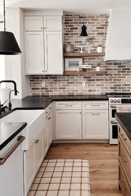
Aesthetic White is an off-white with similar undertones to Drift of Mist, but it is a bit creamier. These colors work well together, but still have a little bit of contrast, without your cabinets being a basic builder white.
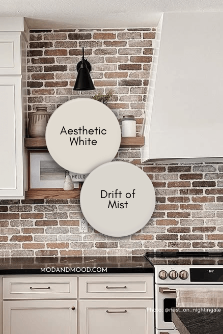
You should know that in the absence of a good amount of true white, your walls and cabinets will probably look like different shades of white. If a soft and creamy look is what you’re going for: Great!
If not: Incorporate a crisp white tile or white countertops to keep things looking off-white to neutral. (White trim could do the trick, but it may not be enough.)
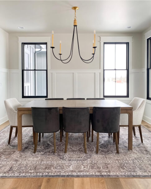
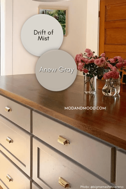
Sherwin Williams Anew Gray
Anew Gray is a stony taupe color that has the same general range of undertones as Drift of Mist does. It can look quite gray, quite beige, or something in between.
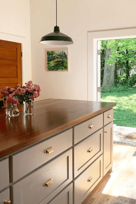
This is a beautiful choice for cabinets no matter what your wall color is (pictured is Sherwin Williams Alabaster), but I find this combo to be super complementary:
Sherwin Williams High Sierra
High Sierra is a mid-toned greige with shifting undertones, from creamy beige to cool (almost blue) gray. Against the very similar tones of Drift of Mist, both colors should stay neutral and true greige.
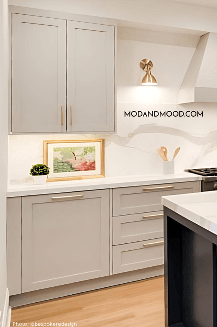
I did have to use Repose Gray for this example, but where it looks very much like High Sierra. (In real life Repose Gray is more gray than High Sierra is.)
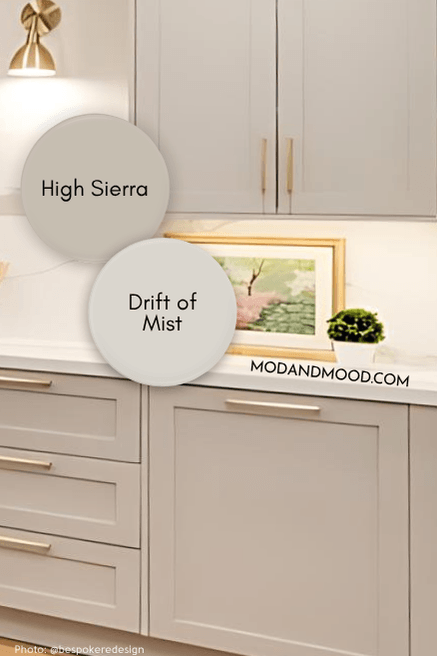
The interesting thing is that both of these colors can have a surprise cool blue undertone. Using them together should prevent them from doing anything crazy, but just in case, you can decorate with true cool tones to help influence them!
Here is another look at each of these colors:
Thank you so much for being here! I’ve got lots more colors that you are sure to love: