Sherwin Williams High Sierra is a versatile but slightly unpredictable greige. If you like a color that looks different from room to room, or maybe even wall to wall, High Sierra should definitely be in the conversation!

Here we will look at all things High Sierra. We will talk undertones, see it in real life, compare it to other popular neutrals, and get some dupes from other brands.
What Color is Sherwin Williams High Sierra?
High Sierra is a mid-toned taupe paint color that can range in appearance from quite beige to quite gray. It is also quite a chameleon and can have a lot of different undertones.
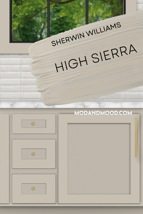
I would say that High Sierra is somewhere in between a biscuit color and a cool-toned mushroom.
I will compare them properly in a minute, but High Sierra hits a few more notes than Agreeable Gray does. It is kind of like an updated, slightly warmer, and more complicated version.
What Are the Undertones of Sherwin Williams High Sierra?
The most common undertone for High Sierra is a hint of violet or pink. It can also look silvery gray or have a whisper of blue.
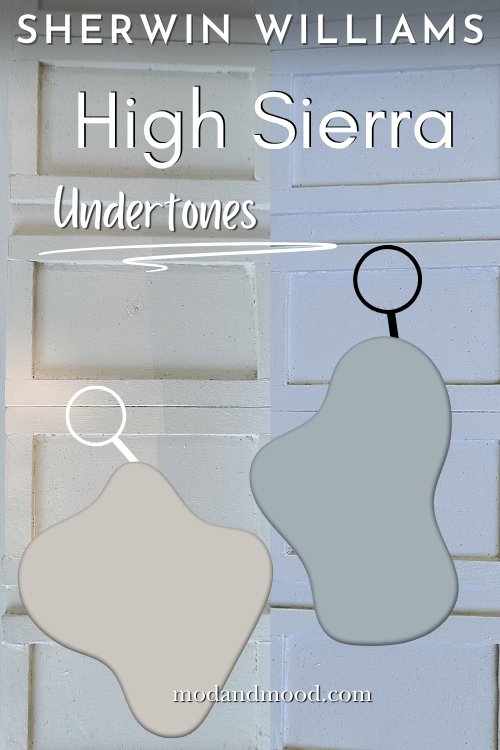
The one common undertone for greige that High Sierra does NOT seem to have, is green. I will point out more of High Sierra’s undertones when we get to real life examples.
High Sierra Light Reflectance Value (LRV)
The LRV of High Sierra is 53.
The LRV (Light Reflectance Value) of a color indicates on a scale of 0 – 100 how much light a color reflects (or doesn’t reflect). True black has an LRV of 0 and pure white has an LRV of 100.
In the paint world, we are working in a range of about 3 – 93 because no paint color is purely black or completely white.
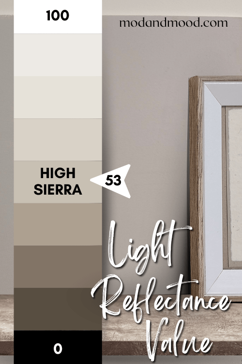
An LRV of 53 puts High Sierra towards the lighter end of mid-toned paint colors, but I would say it definitely reads mid-toned and not what I would call “light” most of the time.
High Sierra in the Sherwin Williams Color Strip
High Sierra is from the Sherwin Williams Designer Color Collection, so it is a one-off shade and technically does not have a color strip.
I have built out my own color strip for High Sierra using shades that are very close to lighter and darker versions of this color:
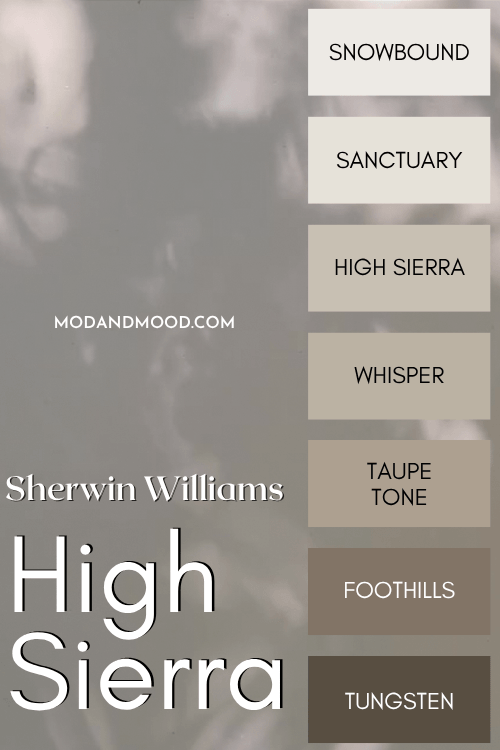
The other colors are:
- Snowbound
- Sanctuary
- Whisper
- Taupe Tone
- Foothills
- Tungsten
Sherwin Williams High Sierra in a Color Palette
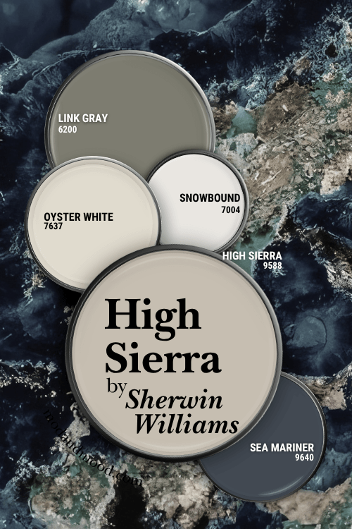
With most neutral paint colors we are spoiled for choice when it comes to coordinating colors, but here is one option for a color palette that I put together:
Coordinating White Paint Color for High Sierra
Snowbound is quite close to a white version of High Sierra, so that’s why I went that direction in this color palette.
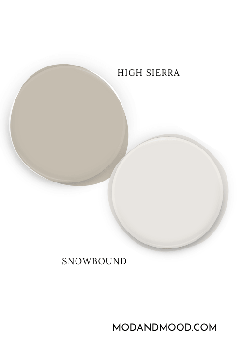
Snowbound most often reads like a true white, but it does have a hint of warmth and a touch of gray to soften it up.
Oyster White is an off-white paint color, and I really like how it works with High Sierra.

These colors are similar in tone, but Oyster White tends to stick to a neutral beige undertone.

Try High Sierra with Sea Mariner
The official complementary color (the color across the wheel) for High Sierra would be a blue. I went with the Sherwin Williams recommendation of Sea Mariner:
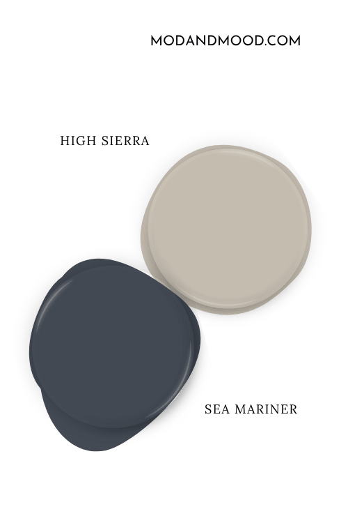
Sea Mariner is a deep true navy with a subtle hint of balancing gray. It will help High Sierra to avoid those blue undertones, and instead emphasize the beige.
Neutral Paint Color to Use with High Sierra
Sherwin Williams Link Gray is a sort-of neutral, sort-of green coordinating color to try with High Sierra.
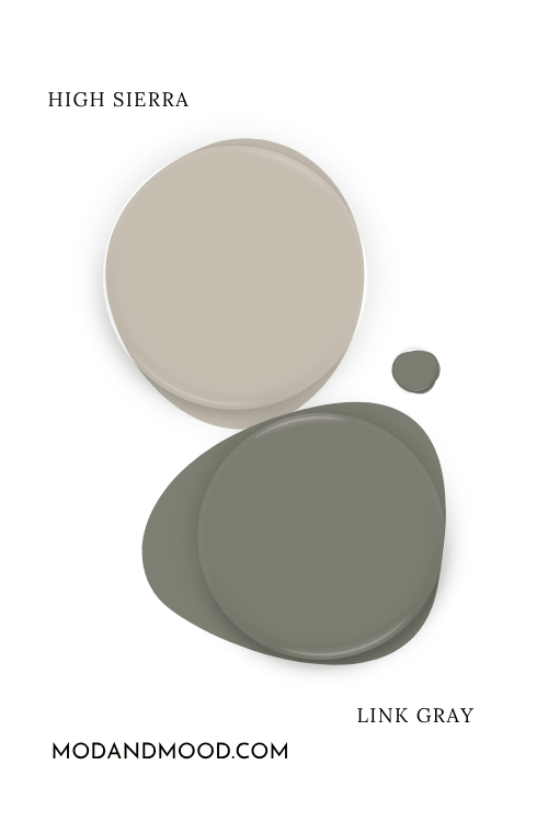
This gray green is complementary to the violet undertone in High Sierra, so if you don’t love that look, don’t go with this coordinating color!
I kind of like the subtle purple undertones of taupe, so I am all for a Link Gray and High Sierra combo!
Sherwin Williams High Sierra for Your Home’s Interior
I am pretty sure that High Sierra is a newer color, because I hadn’t heard of it before this year! Considering it is super neutral and quite similar to other popular Sherwin Williams colors, I just don’t think that would be the case if it has been around for a long time.
As such, it was hard to find good examples of High Sierra, so I decided to make my own…with mixed results. Before I get into that, here is real-deal High Sierra in a kitchen:
Nancy did say that she finds it has blue undertones, and you can see them a little bit here:
Here is another shot from the same home, where you can see the undertone that is a bit more biscuit colored, leaning towards almost pink.
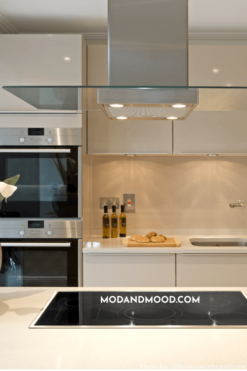
This look brings me to a stock photo that I found, which is also very close to High Sierra:
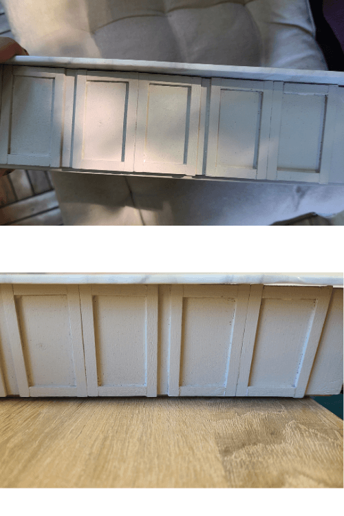
On to my own adventures with High Sierra! The more helpful experiment of two, was painting a foam board that was roughly the texture of a wall and moving it around.
Unfortunately for all of us, I decided to do this the day before a trip, so I chucked it in my suitcase and it got a bit beat up along the way! (I took “moving it around” a little too literally.) This color is hard to photograph, but here is a pretty accurate example of how the color looked to me most of the time:
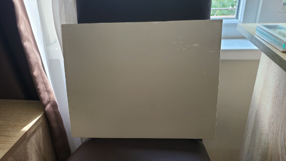
Every time I looked in on my traveling paint board, it looked like a true greige most of the time, leaning a little more towards beige. Imagine my surprise when we settled somewhere and I took it out for pictures and it nearly always looked more gray, and had a taupey violet undertone.
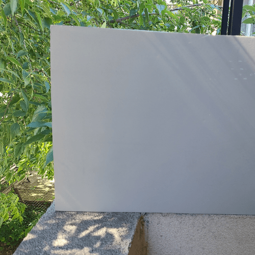
Both of these pictures are outside, and the color didn’t look quite this cool in real life.
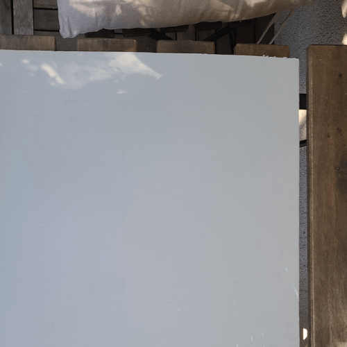
The direction of the light didn’t seem to make a whole lot of difference.
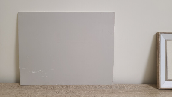
Here is a warmer look for High Sierra (where you can really see the time spent getting smudged in my suitcase):
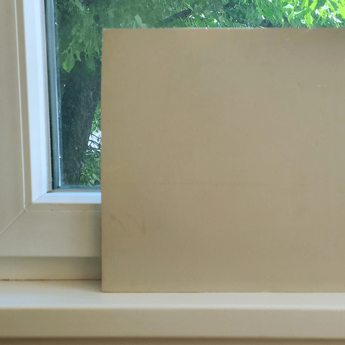
For my second experiment, I had tried to make a fake little kitchen. Execution wasn’t what I hoped, but you can see more looks from High Sierra in the result.
Finally I used a couple of my foam board pictures as a background for this living room:
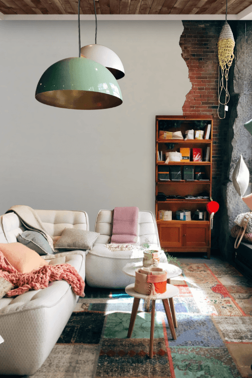
This first one is on the cooler side, but not too extreme.
Next we have a warmer look, where I probably overdid tweaking the rest of the lighting in the room.

What Does High Sierra Look Like on an Exterior?
Normally I would take a stab at showing you a few example exteriors that I think are quite close to how a color will look outside. In this case I don’t feel super confident about that, because the color changes so much.
If I had to guess, I think High Sierra will look somewhere in between Shiitake and Repose Gray on an exterior.
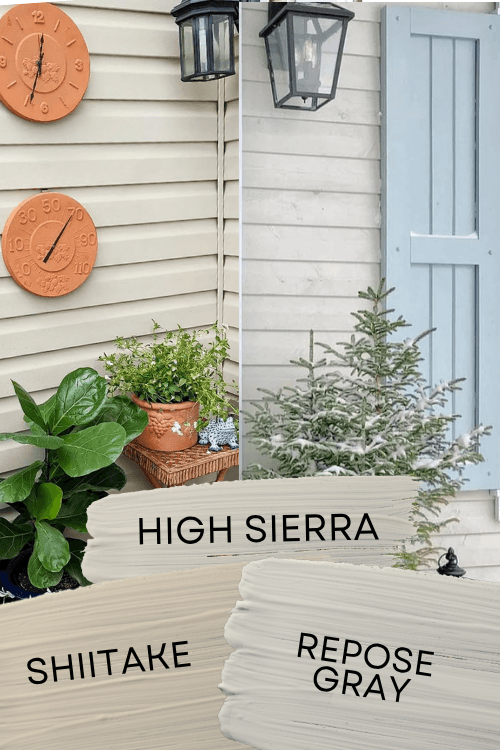
That does narrow it down quite a bit, but again, it is just an educated guess. I wasn’t able to find any exteriors in this color.
Sherwin Williams High Sierra Compared to Other Neutral Paint Colors
At first glance, High Sierra is quite similar to a lot of other neutral paint colors, so let’s take a look at the differences.
On paper, High Sierra looks close to a darker version of Agreeable Gray:
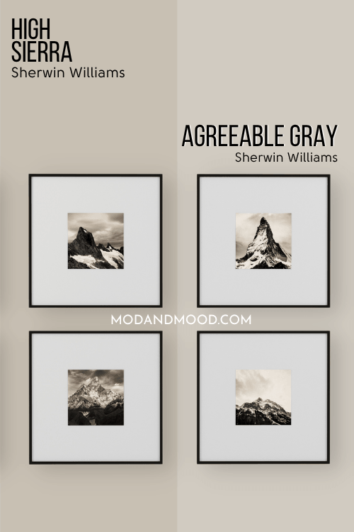
I don’t find these colors to be as similar in real life as you might expect. While it is a pleasant greige color, Agreeable Gray is less of a chameleon than High Sierra is. It is a little bit more predictable.
At its warmest, High Sierra looks more beige than Agreeable Gray does, and at its coolest the tone is just…different. I am having trouble putting my finger on the difference to be honest. High Sierra is just a little more extreme, where Agreeable Gray sits nicely into that greige category.
The best thing going for High Sierra, is that it hasn’t been used to death like Agreeable Gray has (although we still love her!) and it is a bit more cohesive with the warmer tones that are in style right now.
High Sierra is darker and cooler than Accessible Beige. It looks more blue or violet in comparison:
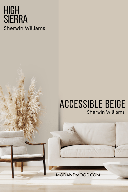
Accessible Beige can have a taupey mushroom undertone, but it is never as violet as High Sierra. It also never really looks all the way gray. When High Sierra looks its lightest and most beige, it can look quite a lot like Accessible Beige.
Again, High Sierra is just a bit more wild in its variations than Accessible Beige is.
High Sierra and Repose Gray are much more similar in real life than they are on paper. They are both chameleon greige colors with a large range of undertones.
On paper, you can see that Repose Gray is cooler and much more gray than High Sierra is:
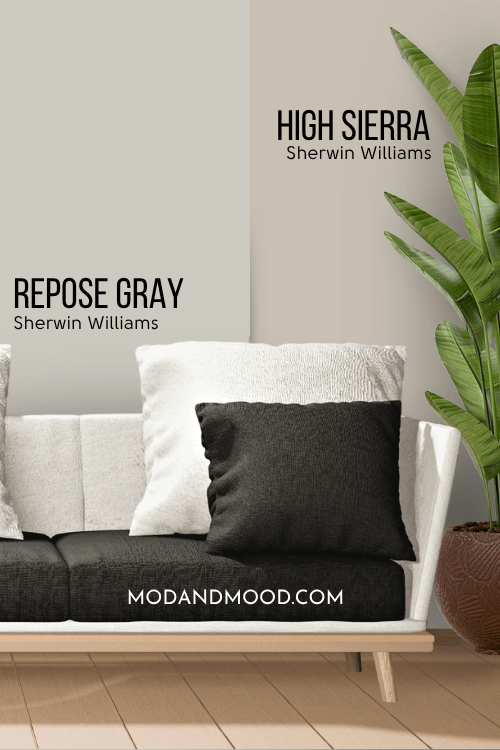
This is also true in real life. When it looks blue, Repose Gray looks much more blue than the hint of blue that High Sierra can have. When each color looks its most taupe, they can look quite similar.
High Sierra can have a biscuity-beige look, but Repose Gray rarely looks all the way beige. Repose Gray also does not have that almost pink undertone that High Sierra can.
Sherwin Williams High Sierra is actually pretty similar to Benjamin Moore Revere Pewter in terms of undertones. They share a lot of the same looks, apart from the fact that Revere Pewter can look green but High Sierra does not.
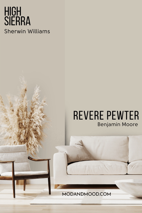
Revere Pewter does sometimes look quite gray, violet, blue, beige, and even pink. You can see that it is lighter than High Sierra, and on paper it is a little cooler.
Dupes for Sherwin Williams High Sierra from Other Brands
Can’t get yourself to a Sherwin Williams store? Here are some paint colors that will get you the same look in other brands!
Benjamin Moore Version of High Sierra
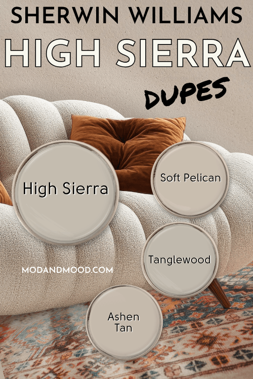
There are several Benjamin Moore colors that are close to High Sierra, but in the end Ashen Tan was the best dupe:
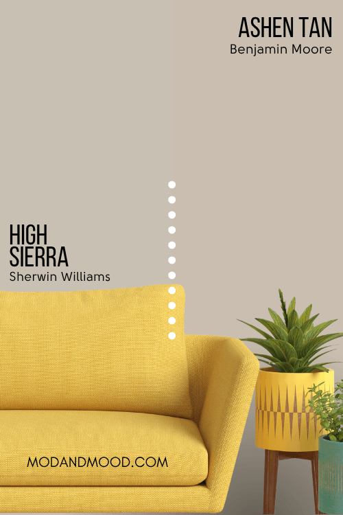
Ashen Tan is a little warmer than High Sierra, so it is just a little bit more likely to have the beige/pink undertone. It should also look silvery or blue a little less often.
High Sierra Equivalent in Valspar (Lowe’s)
The best dupes that Valspar offers for High Sierra, is the shade Soft Pelican.

Soft Pelican is actually the closest match that Valspar offers for Accessible Beige and Shiitake too, so if you are torn between these three Sherwin Williams colors, Soft Pelican MUST BE the color for you!
You can see that this dupe isn’t perfect. Soft Pelican has roughly the same LRV as High Sierra, but it is more beige and has less of the violet undertone.
Best Behr Color Match for High Sierra (Home Depot)
At Home Depot, the best dupe for High Sierra is Behr Tanglewood.
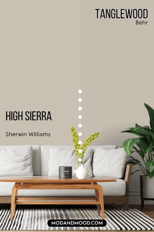
Behr actually had 4 shades that were all pretty close to High Sierra, but Tanglewood was the best match overall. Tanglewood is just a hair cooler and more gray than High Sierra.
Here is another look at all of the dupes:
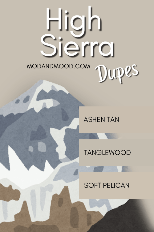
Thank you so much for reading until the end of this post! That really helps my blog. I hope this helped you decide if Sherwin Williams High Sierra was the perfect neutral for you. Still not sure? No problem!