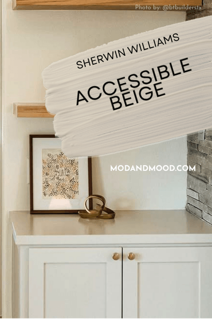
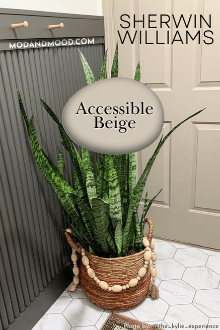
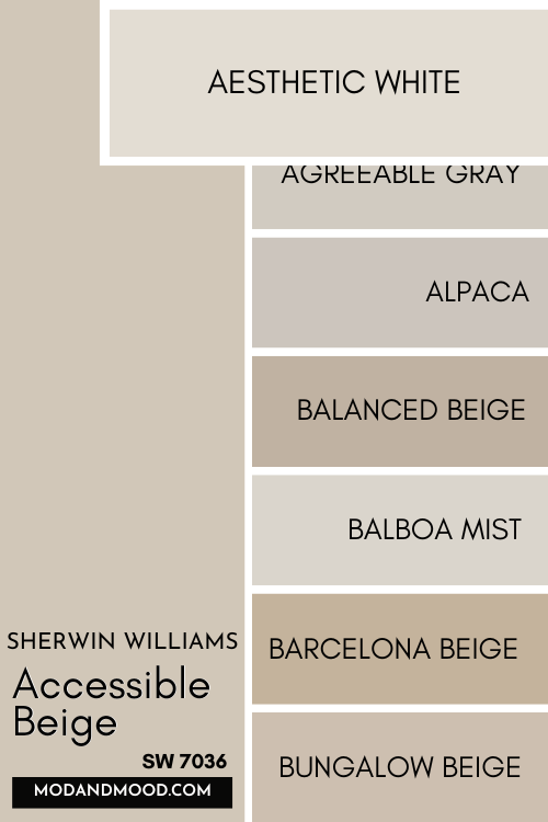
Accessible Beige is famous for being a go-with-everything neutral by Sherwin Williams.
Funny enough Accessible Beige isn’t just in style for 2026, it’s back in style. (Can we say that if it never truly left?) Popular wall colors swung from all-beige ere’thing, to a million shades of gray, and back again!
You will see in this post that even though Accessible Beige is back, people are using it in a bunch of fresh new ways. I’ll also show you some alternatives!
This post may contain affiliate links. Should you choose to make a purchase through one of my links, I may receive a small commission at no cost to you. I only recommend products that I use.
What Color is Sherwin Williams Accessible Beige? (7036)
Accessible Beige should actually be called “Accessible Greige” because that’s more what it is.
It does lean more beige than gray however, especially when compared to other greige paint colors. I would describe it as a slightly more beige version of mushroom.

LRV of Sherwin Williams Accessible Beige
Accessible Beige has an LRV of 58.
What is an LRV anyways?
The LRV (Light Reflectance Value) of a color indicates on a scale of 0 – 100 how much light a color reflects (or doesn’t reflect). True black has an LRV of 0 and pure white has an LRV of 100.
In the paint world, we are working in a range of about 3 – 93 because no paint color is purely black or completely white.
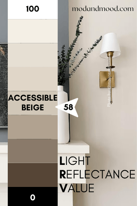
At 58, Accessible Beige still reflects more light than it absorbs. I would describe it as a lighter mid-toned color.
What Are the Undertones of Accessible Beige?
Accessible Beige is a creamy beige with gray undertones. I don’t know that I would say “undertones” necessarily, because it has very obvious gray tones.
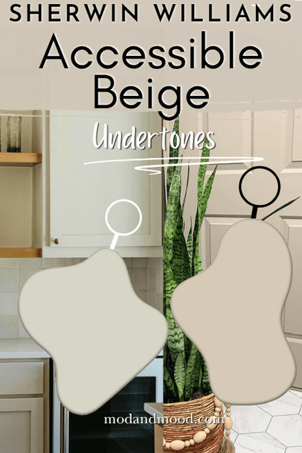
I find that Accessible Beige can look more yellow or peach than other greige paint colors when compared side by side, but on the wall it isn’t a buttery or pink beige.
Don’t take my word for it! Grab yourself a peel and stick sample from Samplize to see what Accessible Beige does in your home! These samples are color accurate, made from two coats of genuine manufacturer paint. You can stick and reposition anywhere from cabinets to corners. Happy testing!
Is Accessible Beige Warm or Cool?
I would classify Accessible Beige as a warmer neutral. It is technically on the warm side of the color wheel, but it has enough gray to keep it really neutral.
Despite the gray, it never reads cool.
Of course within the category of neutrals, there will always be colors that are warmer or cooler than others.
Here you can see that Accessible Beige is much warmer than fellow greige Repose Gray, but cooler than the warm traditional beige of Kilim Beige:

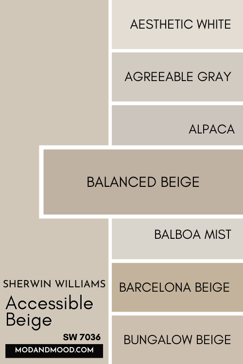
The Accessible Beige Color Strip by Sherwin Williams
Accessible Beige is technically the lightest color on it’s color strip, which contains a nice shade range of neutral beiges.
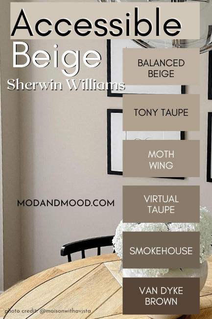
To my eyes, Virtual Taupe and Van Dyke Brown appear a little warmer than the other shades, which could mostly be classified as greige.
I have however, built my own color strip:
Lighter Version of Accessible Beige
Since Accessible Beige is already the lightest color on the strip, we will have to look elsewhere for a lighter version!
Accessible Beige at 50%
When lightened by half, Accessible Beige would be a darker off-white. Try Shoji White to get the look.
(Shoji is quickly becoming a very popular color!)
I will say that Shoji White is a creamy to neutral off-white, but it really doesn’t look greige.
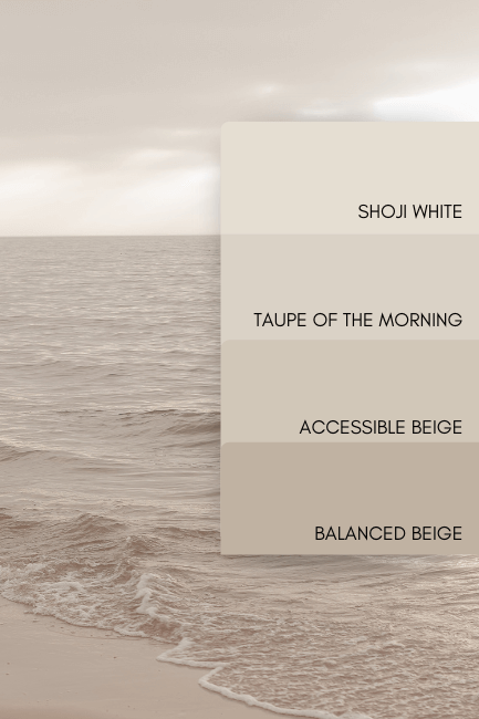
Accessible Beige at 25%
When lightened by just 25% Accessible Beige should have an LRV around 66. Try Taupe of the Morning for an excellent match.
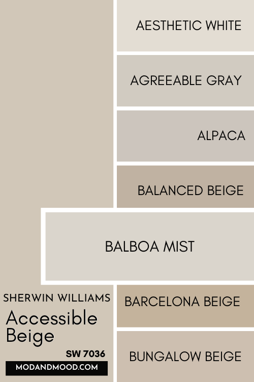
Darker Version of Accessible Beige
One shade darker than Accessible Beige on the same color strip, is Sherwin Williams Balanced Beige.
Sherwin Williams Accessible Beige in a Color Palette
Honestly Accessible Beige and Agreeable Gray are both rockstar colors that hold down a lot of my palettes. When nothing else works, these two have you covered!
Let’s take a look at the most popular colors that people like to pair with Accessible Beige:
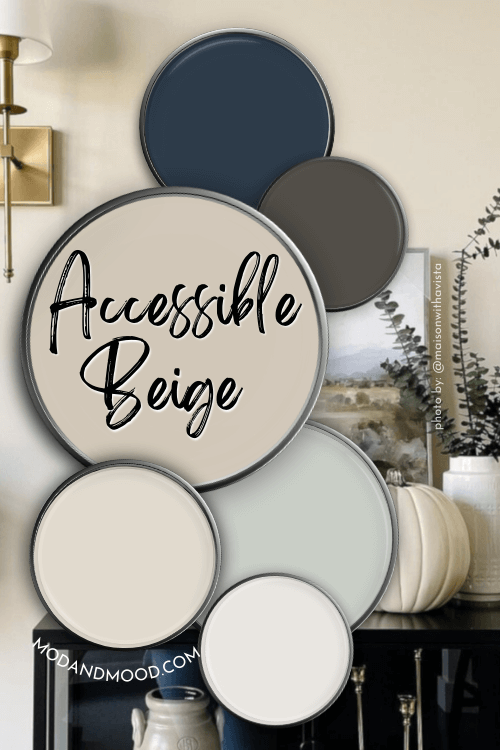
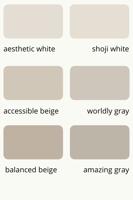
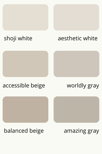
Coordinating Colors to Use with Accessible Beige?
We’ve already talked about Shoji White a little bit, it’s a great white if you want to do a soft monochromatic color scheme.
Sherwin Williams Sea Salt with Accessible Beige
Sea Salt is an unlikely neutral hero. This go-with-anything gray green keeps Accessible Beige looking fresh and modern.
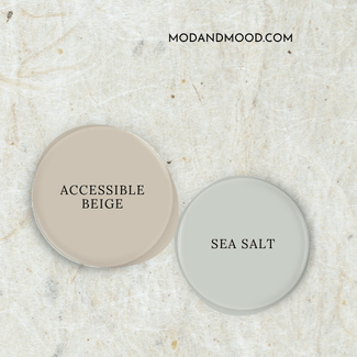
This pairing is a favorite of mine for any coastal or beachy color palettes, but these two can just as easily do farmhouse.

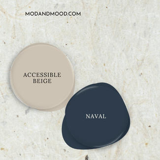
Accessible Beige with Sherwin Williams Naval
Navy and beige is a classic combo, and Naval complements Accessible Beige so well. I would recommend using a brighter white with this pairing, as a very creamy or off-white might look less updated.
Urbane Bronze and Accessible Beige
Urbane Bronze and Accessible Beige are a match made in neutral heaven! This is a particularly good combo for exteriors
I’m not always a fan of really dark browns, but Urbane Bronze is one of the exceptions. (Although, it’s got quite a bit of gray in it too, so I don’t know if that counts.)
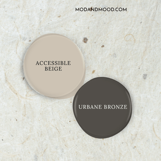
I love love LOVE this former color of the year.
I actually do have an example of this combo here:
Complementary Color for Accessible Beige – Sherwin Williams Upward (6239)
The “official” complementary color (the color directly across the wheel) for Accessible Beige is a smoky blue-purple.
Sherwin Williams Upward is a very close match, but slightly less purple, which is more versatile anyways. It’s actually on the same strip as Naval.

Upward was actually chosen as the Sherwin Williams Color of the Year in 2024! (Here are the rest of the throwback color trends from 2024.)
What Trim Colors Go With Sherwin Williams Accessible Beige?
Let’s take a look at white, off white, and other trim options for Accessible Beige:
White Paint that Goes with Accessible Beige
If you’ve been looking at Accessible Beige inspiration, you will be seeing it paired with lots of soft white paint colors, but I think crisp whites can be really beautiful too. It really depends on what your goal is.
Here is a mock up of how Accessible Beige will look with some of the most popular white trim paints:
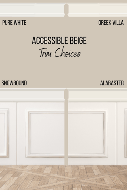
Pure White is a good true white option that will give you more contrast between your walls and trim.
Snowbound is one of my favorite whites for trim because it’s a true white, but warmer and calmer than something like High Reflective White.
This is probably my top choice for Accessible Beige, because it’s right in the same color family. It works really well with beiges and taupes.
Curious about the difference? Check out this post: Sherwin Williams White Battle: Snowbound vs Pure White
Alabaster and Greek Villa are both softer white options, without actually being off-white.
Alabaster is a soft, creamy, everybody-loves-it, white. If you want Accessible Beige to look a little lighter and creamier than it does with a brighter white, try Alabaster.
Greek Villa is pretty similar to Alabaster, but it’s undertone is a little more boldly beige than Alabaster.
I won’t lie to you, it’s a bit difficult for me to have an opinion on this one, because I really think you can make any white work.
Of course we can’t be done there, because there are also off-whites that are vying for attention:
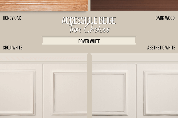
Shoji White or Aesthetic White with Accessible Beige
Shoji White as we discussed, is a good lighter version of Accessible Beige, and therefore makes for a great monochromatic trim choice.
Aesthetic White is very very similar, just a little cooler. There is a color strip from Sherwin Williams floating around that has Aesthetic White on the same card as Accessible Beige, but I really think Shoji is a better fit:
Here they are swapped:
You could use either of these off whites for trim! Aesthetic White would give you slightly more contrast.
Dover White
Dover White is a good compromise between a darker off white like Shoji White and a true white like Alabaster. It’s a warm off white, but a bit brighter.
Dover White is potentially a bit more likely to bring out the taupey undertone of Accessible Beige, so keep that in mind!
Can you use Accessible Beige with wood trim?
I would not personally go anywhere near wood trim with Accessible Beige.
Unfortunately I think it will be hard to make Accessible Beige look fresh and modern when paired with honey oak or dark wood trim.
Here is my list of 9 Gorgeous Wall Colors that Match Wood Trim (Yes, Even Honey Oak!)
Can You Use Accessible Beige for Trim?
One fresh way that I’ve been seeing Accessible Beige used is on trim and wainscoting with white walls. I personally love the trend, and I think it looks delectable!
Here is one great example by Lara of @Nest_on_nightingale:

Lara used Behr’s version of Swiss Coffee for her walls, and Accessible Beige on her trim. Here you can see that it looks as greige as possible.
For a softer looking example, Samantha (@oliveandoakhome) also used Accessible Beige on her trim, and Sherwin Williams Pure White on the walls:

You can see more of this look in my post: White Walls with Sherwin Williams Accessible Beige Trim (Alabaster and More!)
Sherwin Williams Accessible Beige for Your Home’s Interior
Finally what everyone wants to see: Accessible Beige in real life!
Accessible Beige in a Living Room
You are going to see lots of Shal’s house today, from @Maisonwithavista. She used Accessible Beige on most of her walls, and accented it with pops of Sherwin Williams Peppercorn.
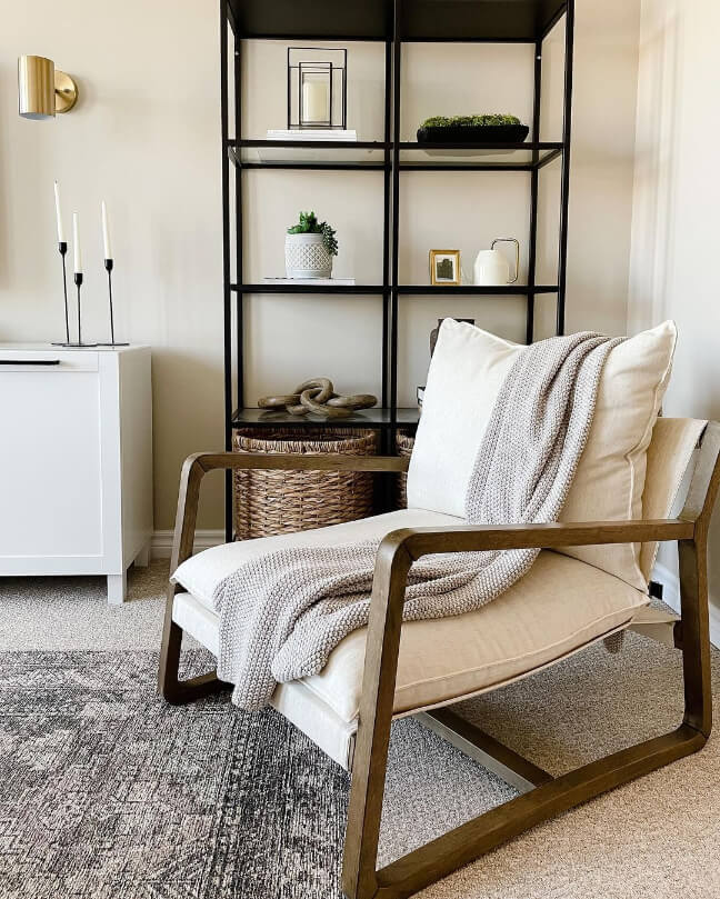
In her living room and media room the rest of her decor is super neutral, and Accessible Beige is the perfect mellow base.
The textures in this room keep the simplicity of the neutrals interesting:

How about a transition into the dining room with this next shot? :

The Dining Room in Sherwin Williams Accessible Beige

Shal used white and black in her dining room to add some crisp contrast to the space.
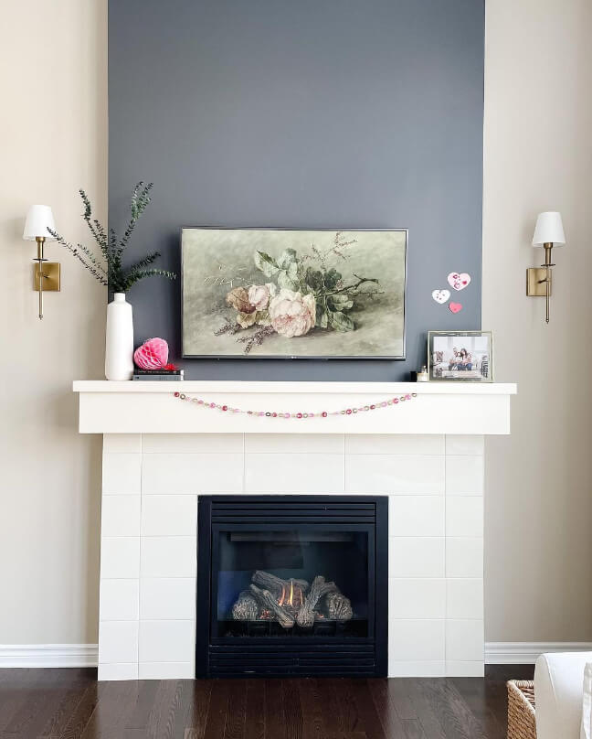
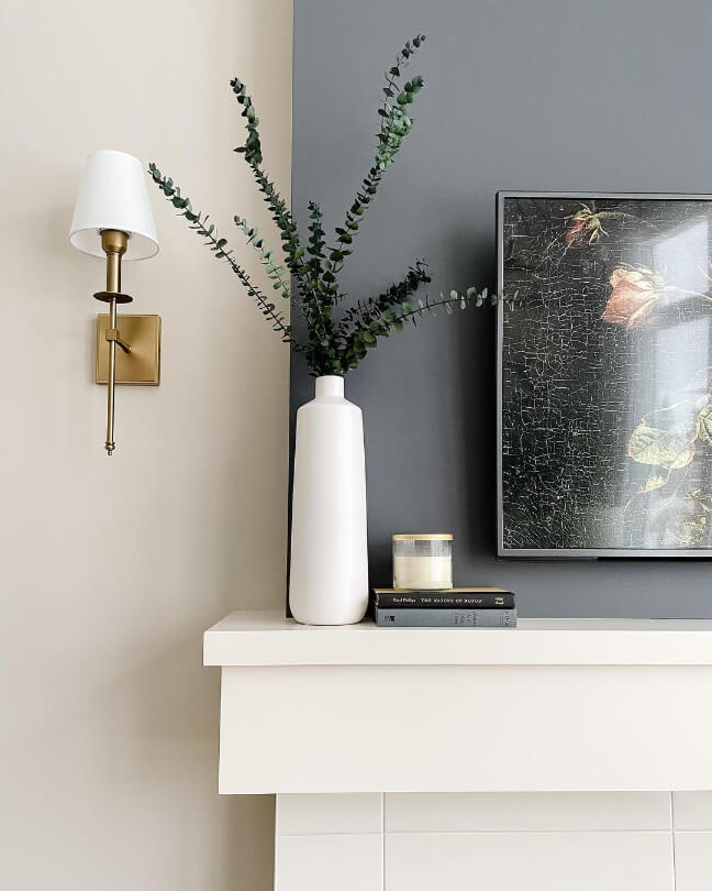
Accessible Beige with an Accent Wall
The good thing about Accessible Beige is that you can kind of go wild with your accent colors. It really does go with anything! I particularly like the idea of Sherwin Williams Iron Ore, or the less popular Thunderous.
Here are a few more pics of Shal’s Peppercorn accents throughout her home:
In her Accessible Beige hallway, Shal also painted her alcoves in Peppercorn:
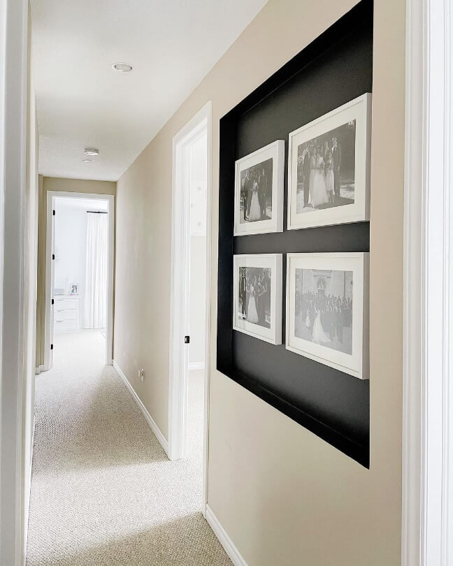
This reading nook also got the Peppercorn and Accessible Beige treatment:

Sherwin Williams Accessible Beige in the Bathroom
First up at Shal’s house is not exactly Accessible Beige in a bathroom, as it is bathroom-adjacent:

To be honest, this is one of my favorite pictures of this color. It looks clean and soft at the same time.
At Lindsay and Dustin’s (@silo.hill), Accessible Beige graces the board and batten in the bathroom:
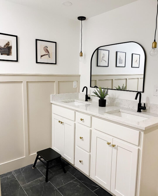
They used a similar black, white, and beige theme to Shal’s dining room.

The walls are Sherwin Williams Pure White.
Accessible Beige in the Bedroom
If you want to use Accessible Beige in the bedroom, consider Lara’s strategy of doing 2/3 of the wall. I love how this came out!
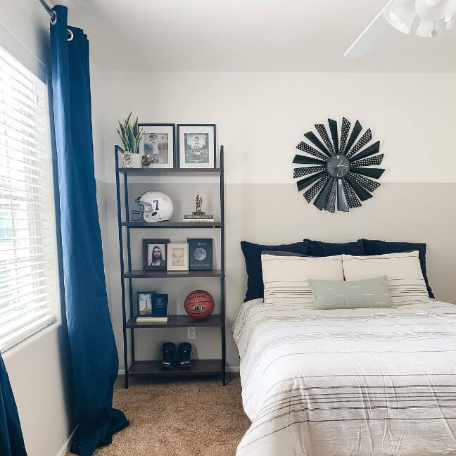
I believe the white in here is Behr Swiss Coffee, since that is the white in the rest of her home.
Accessible Beige Nursery
For bedroom inspo for the smallest of us, let’s pop back to Shal’s and take a look at her nursery:
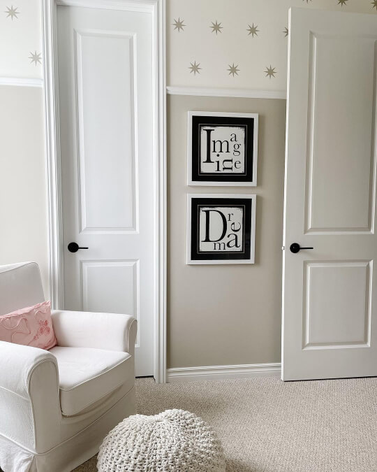
Isn’t it funny that she also chose to use Accessible Beige for only 2/3 of the wall?
I’m telling you, it’s a vibe.
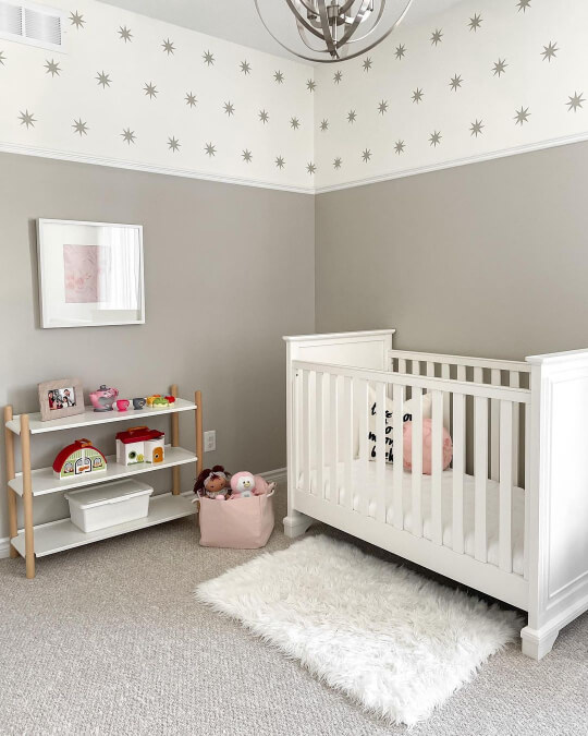
The stars on the upper 1/3 are decals from Urban Walls.
Sherwin Williams Accessible Beige on Kitchen Cabinets and Walls
First let’s finish strong with the kitchen at Shal’s place:
Accessible Beige Walls with White Cabinets
The cabinets here are not so much a true white as a very creamy off white: Benjamin Moore Linen.
The color looks similar here to Sherwin Wiliams Dover White.
The contrast is definitely a LOT more subtle than it would be if you used a true white, but it also makes Accessible Beige look lighter.

We saw a lot of Pure White with Accessible Beige earlier, so that would be a great cabinet color idea.
If you are looking to pair stock white cabinets with Accessible Beige, test the color first, but there’s no reason that couldn’t work.

Can you use Accessible Beige on the walls with oak cabinets?
Simply put, I just wouldn’t go there. Similar to the issue with trim, it’s so hard to use Accessible beige with lots of wood tones and have it look modern.
Here I tried to put an example together for you:

There’s nothing inherently wrong with this combo, it’s just difficult to make it look fresh.
If you use brand new oak cabinets in a more natural finish with clean square lines, you might be able to get away with it. Personally I like Accessible Beige on the cabinets.
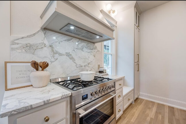
Accessible Beige on Kitchen Cabinets
I happen to LOVE a beige or taupe cabinet. I really think it’s one of the freshest ways to use these colors. (If you agree, you might be interested in The Best Mushroom Paint Colors for Kitchen Cabinets)
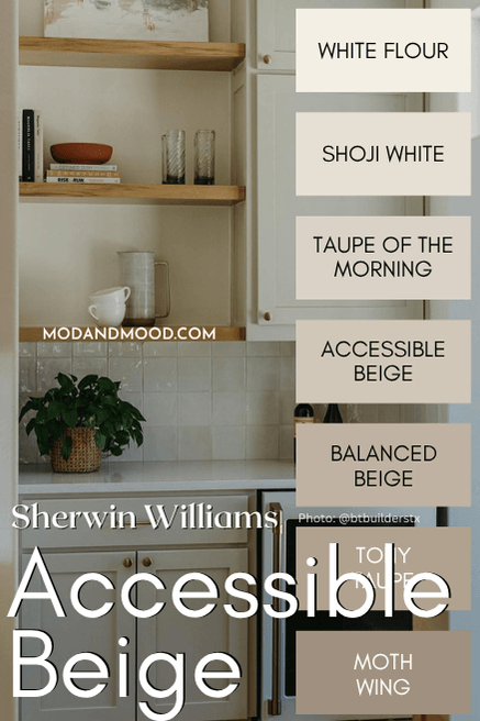
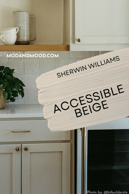
Here is a glimpse of Accessible Beige on cabinets, in the butler’s pantry of a project by @btbuilderstx.
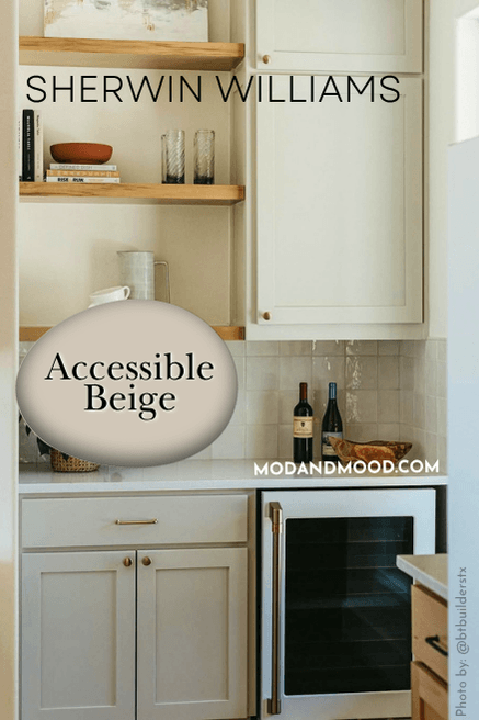
It looks a little yellow here, but I think that is a little bit editing and a little bit lighting, because everything in the photo has a warm tint (even the white countertops).
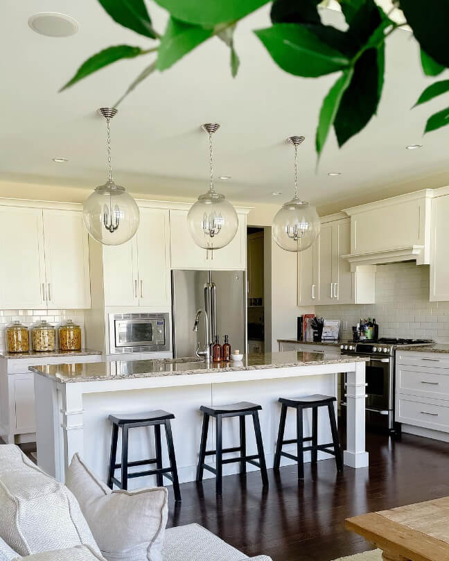
My favorite house flipper Marissa, from @in_vest_homes, recently put together this luxurious Accessible Beige custom kitchen:

I believe this is Pure White on the walls again. The charcoal in the background is Peppercorn.

Marissa’s homes are always ridiculous. I have another great one in my Cyberspace post.
They make me feel entirely…inadequate. Ha ha!
*crying softly*

Accessible Beige on these cabinets literally makes me feel hungry.
I know, right?
Accessible Beige Cabinets at 200% (double strength)
Should you be wanting to see Accessible Beige times two, I happen to have that on cabinets, thanks to Kim (@kiminthecove)!
I was quite surprised at how light these still look.

Sherwin Williams Accessible Beige on an Exterior
Accessible Beige isn’t a super popular choice for exteriors, and this is most likely because it will look much lighter outside, and a light beige doesn’t make much of a statement.
When I first wrote this post, I didn’t have any exteriors to show you that were actually Accessible Beige, so I just did my best to show you similar. (I always try to do that!)
As luck would have it, I finally have some images! I thought it would be fun to leave my guesstimates in, so we can see how I did!
Original guess: Our friend @peanutbuttertoast always comes through with the exterior inspo, so here are a couple of homes that give you an idea of how Accessible Beige could look.
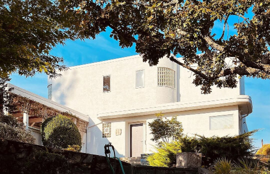
I know this first home is lighter than you might expect, but this is about how Accessible Beige would look on an exterior in direct sunlight, particularly when there is no true white in sight (like there isn’t here).
To prove the point, here is Shoji White on an exterior not in direct sunlight.

You can see that Shoji looks lighter than the first stucco house.
Now for the reveal! Here is Accessible Beige for real, where it looks quite light:
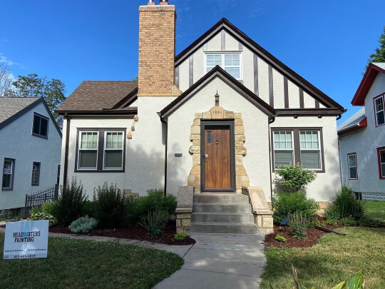
As predicted, in bright natural light, Accessible Beige looks more like an off-white than a true beige. Here the homeowners went with the warm dark brown of Sherwin Williams Black Bean for the trim.

With white trim, this would definitely look more beige than it does here. I happen to really like the creamy look of this!
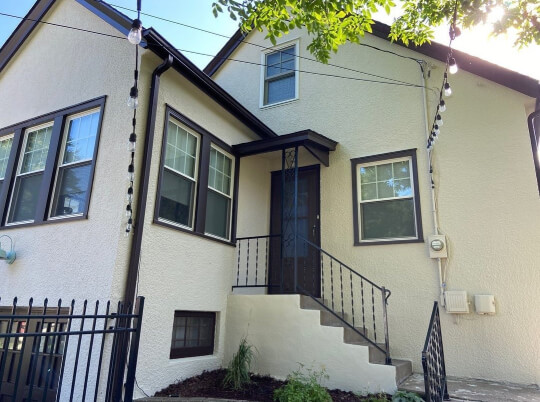
In these last two photos away from the sun, the color does finally look more beige.

Consider using a dark trim like Urbane Bronze if you want to use Accessible Beige on your exterior. (Of course Black Bean is also working!)
Here was my next guess: In lower lighting with white trim, Accessible Beige will look similar to this home, but a little less yellow and more gray:

Let’s see it!
Pretty close again! This home is the opposite of the one with dark trim: Accessible Beige looks as warm and beige as it ever will.
What’s going on here?

Blue and orange are opposites on the color wheel, and really enhance each other. Beiges are all somewhere in the orange area of the color wheel, so the saturated tones of Sherwin Williams Honorable Blue are emphasizing the color in Accessible Beige.

Here are a couple of photos where Accessible Beige looks a bit more neutral:

Original thoughts: For myself, I don’t love or hate Accessible on an exterior. I nothing it. Which isn’t the best when choosing an exterior color.
Today I still tend to agree. I like the softness of Accessible Beige, but exteriors are a great place for a bolder color.
It was me, I would go either lighter or darker. Oyster White is a favorite of mine for painted brick. Urbane Bronze makes a statement. Jasper looks drop dead gorgeous.
For more exterior colors that I like better, check out my post: 8 Dark and Moody Exterior Colors From Sherwin Williams
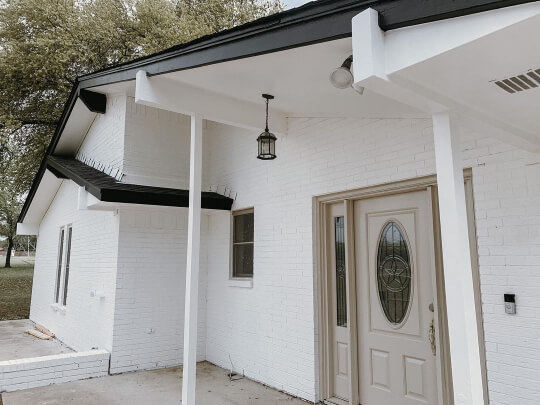
Accessible Beige on a Front Door
I do actually have an example of Accessible Beige on a front door, again paired with Sherwin Williams Pure White, like so many of these examples!
Accessible Beige Compared to Other Neutral Paint Colors
I do love to give you allll the information, but my goodness was there a lot of comparisons to cover! I tried to get all the big ones, and you can expand the handy dandy drop downs to see the differences.
Aesthetic White is lighter than Accessible Beige, and a tiny bit cooler. It is very similar to Shoji White.
Agreeable Gray is more gray than Accessible Beige (go figure). It is also technically a little lighter, but because it’s sooo much more gray I think the difference is negligible.
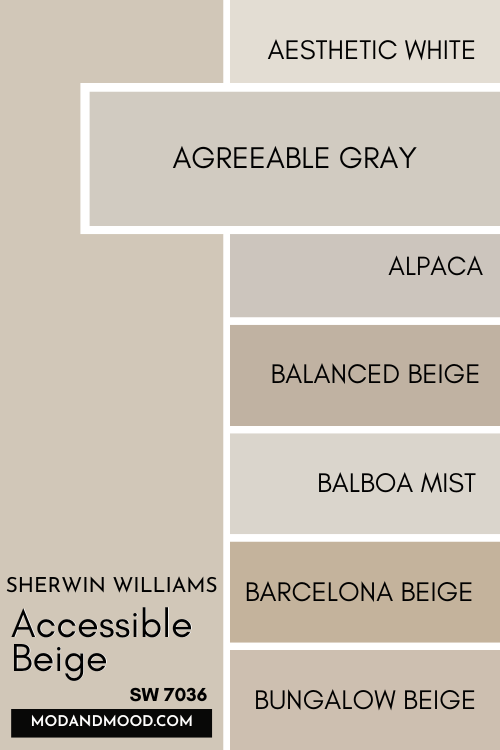
I wrote a whole post on this comparison, so definitely check out: Accessible Beige vs Agreeable Gray (How to Choose!)
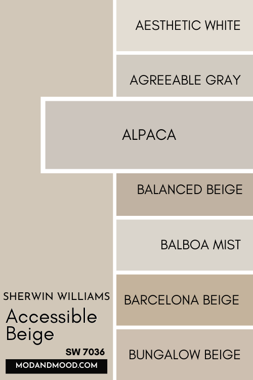
Sherwin Williams Alpaca is more gray and more red than Accessible Beige. This means that it looks more taupe than beige.
As you saw earlier, Balanced Beige is one shade darker than Accessible on the same strip. However, these color strips are never a perfect light to dark shade range of the exact same color, and Balanced Beige is a bit warmer than Accessible.
Balboa Mist is lighter, more gray, and a touch cooler than Accessible Beige. You will probably find these two in the same conversation often, because they are both go-with-anything greiges.
Barcelona Beige is a true beige, and not greige like Accessible. It’s also a little darker.
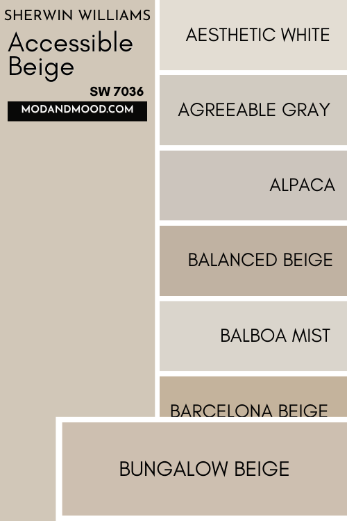
Bungalow Beige is warmer and less gray than Accessible Beige. It’s approaching a pink-beige. It’s also a little bit darker.
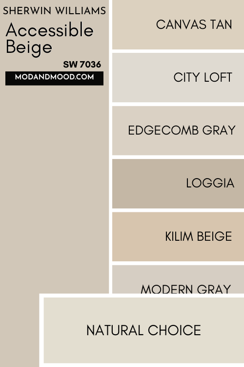
Canvas Tan is a sandy tan color, rather than a greige. It’s lighter and more yellow than Accessible Beige.
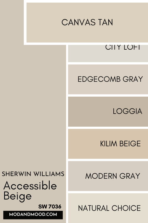
City Loft is similar to Accessible Beige in overall feel, but it is lighter (much closer to off-white) a little more gray, and a little cooler.
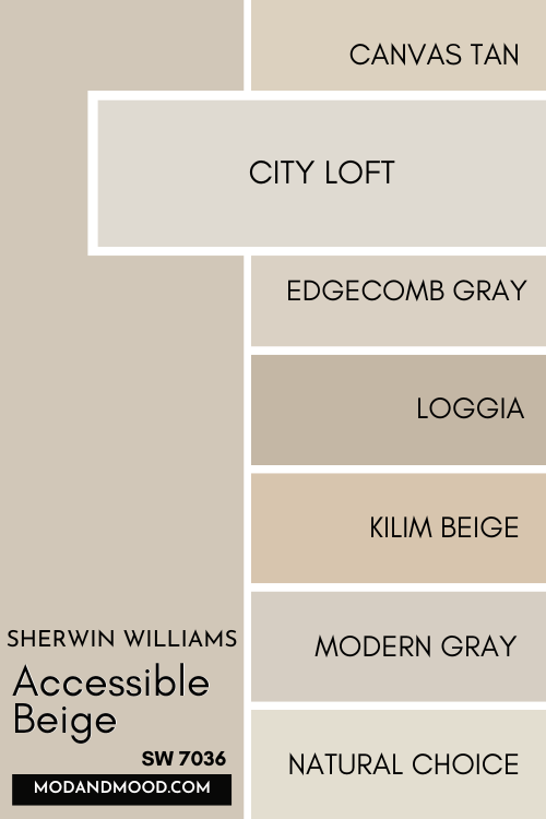
Benjamin Moore Edgecomb Gray is very very similar to Accessible Beige, and you could consider it a slightly lighter alternative.
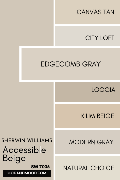
Loggia is a bit darker than Accessible Beige. It’s also a tiny bit warmer and a tiny bit less gray.
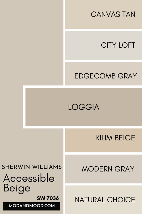
Kilim Beige is a very warm beige color, and not greige at all like Accessible Beige. It’s more “camel” than “mushroom.”
It does have a similar LRV.
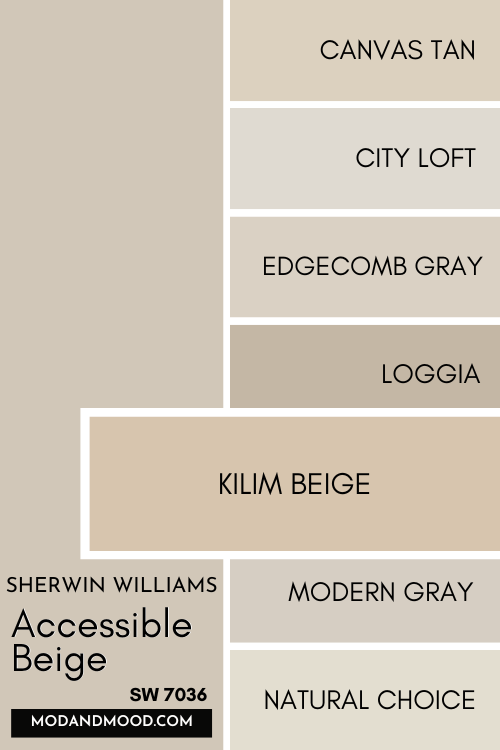
Modern Gray is more gray than Accessible Beige, and a bit lighter, but it’s warmer than Agreeable Gray.
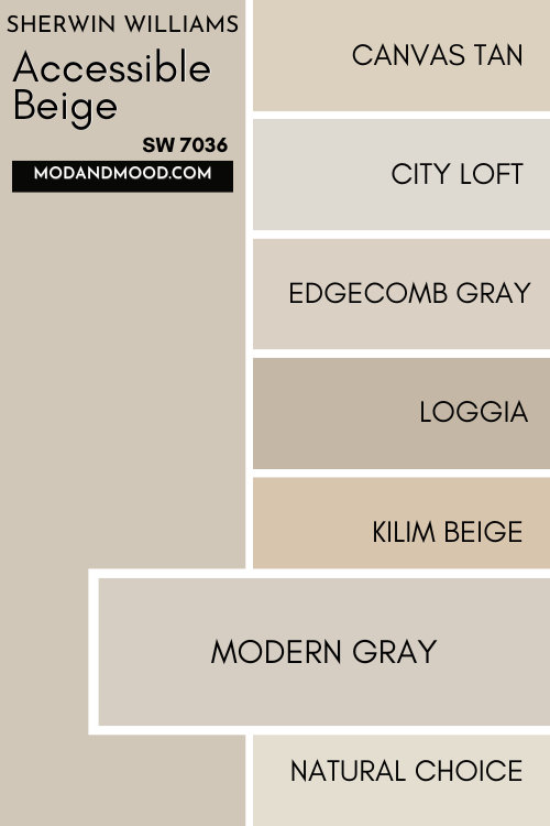
Natural Choice is an off-white, unlike Accessible Beige. It is also in the yellow/mustard family rather than the orange/beige family.
Benjamin Moore Natural Linen is cooler and less gray than Accessible Beige. I wouldn’t classify it as a greige.
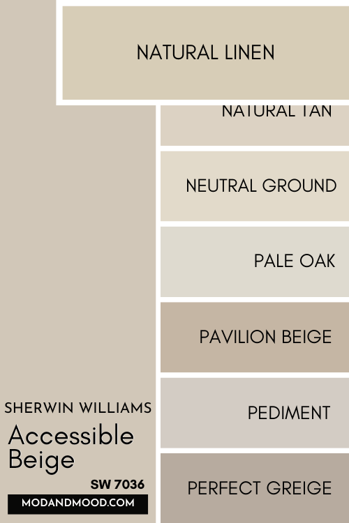
Natural Tan is lighter and less gray than Accessible Beige, but in the exact same color family.
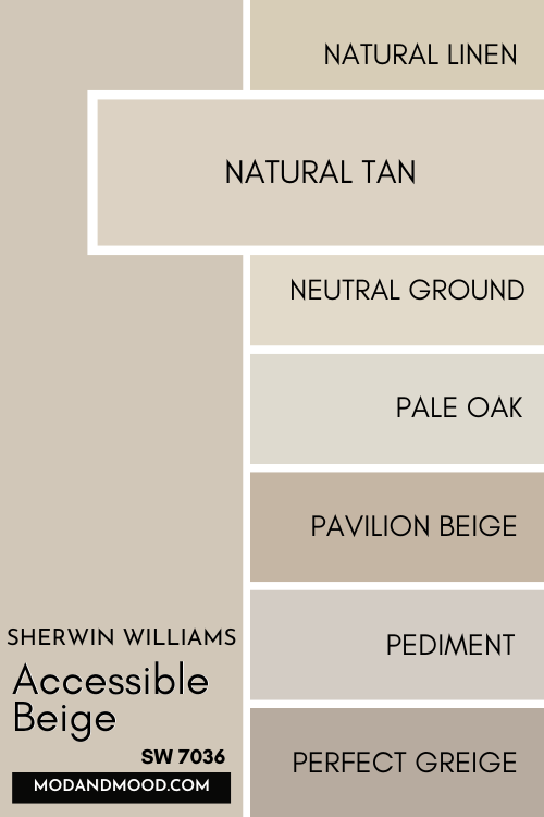
Neutral Ground is lighter, cooler, and less gray than Accessible Beige. The result is still a pretty greigey color, but closer to an oatmeal shade.
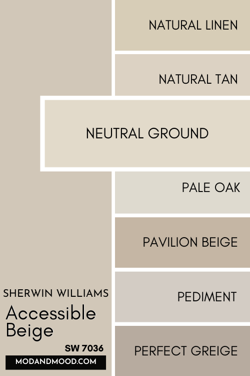
Benjamin Moore Pale Oak is quite a lot cooler than Accessible Beige. It’s also lighter.
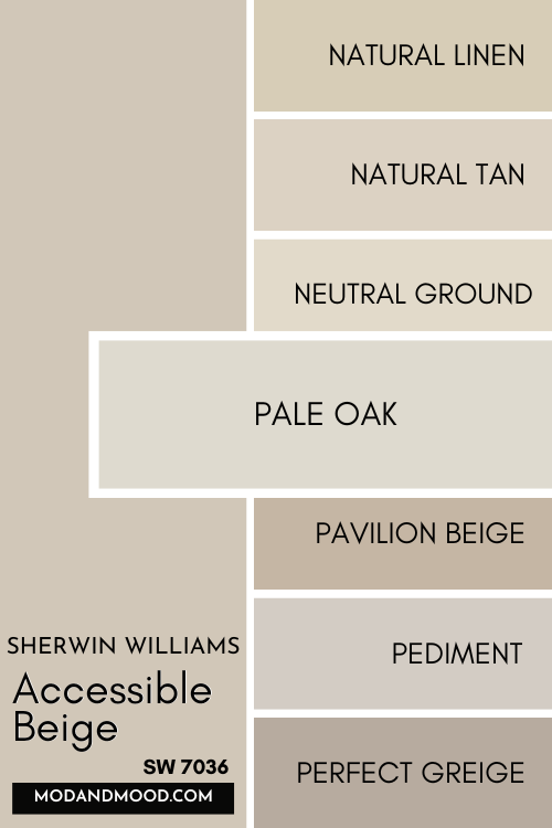
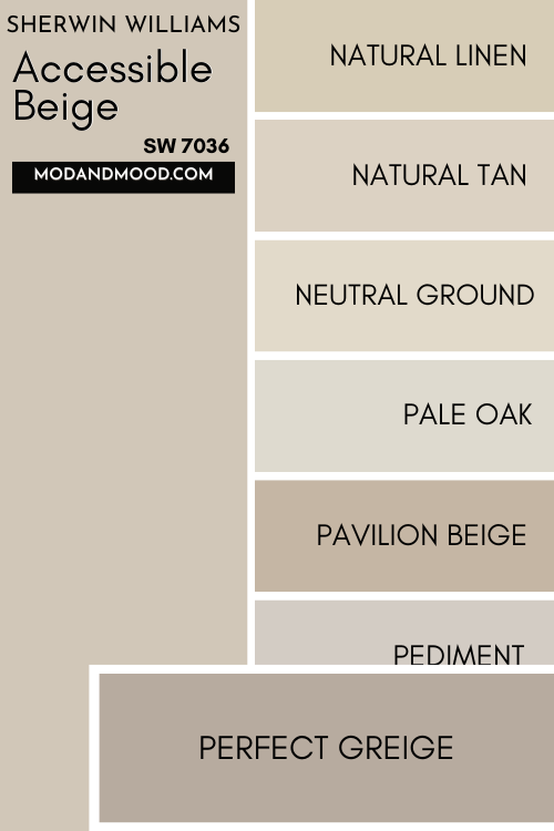
Pavilion Beige is darker and much more taupe than Accessible Beige.
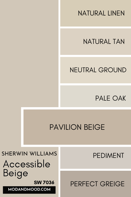
Pediment is a cooler taupe color compared to Accessible Beige. It’s also a tough lighter.
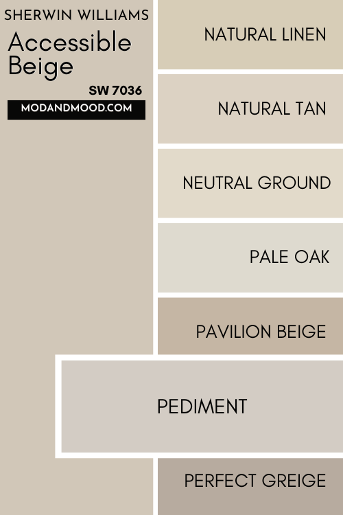
Perfect Greige is darker and warmer than Accessible Beige.
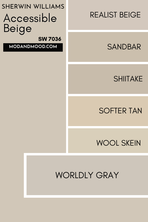
Realist Beige is a bit more “pink beige” than Accessible Beige.
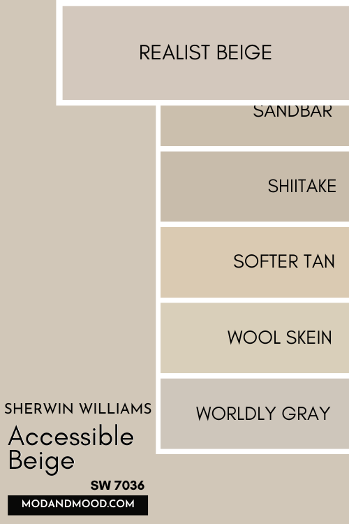
Sandbar is a teeny tiny bit more gray than Accessible Beige, and a teeny tiny bit darker.
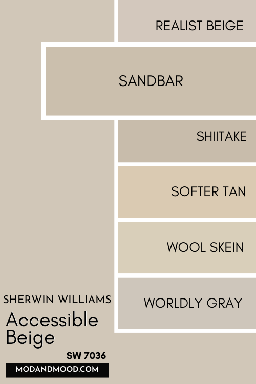
Shiitake is a little bit darker than Accessible Beige, but very similar.
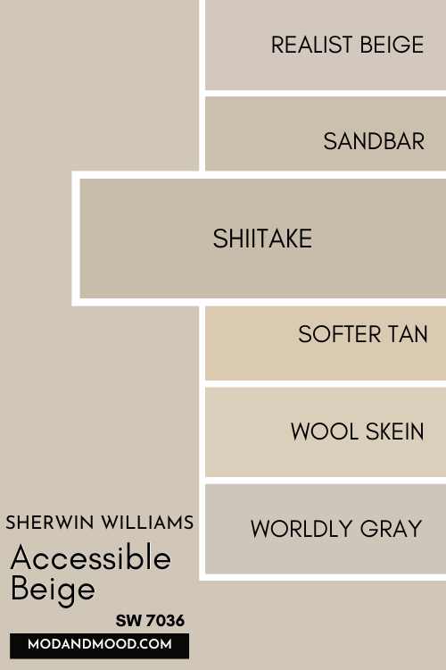
Softer Tan is a warm beige tan color, and not greige at all, like Accessible Beige. It’s also just a hair lighter.
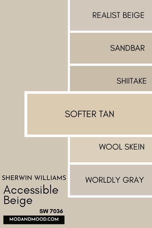
Wool Skein is a cooler beige, and it doesn’t have the gray that Accessible Beige does. It is also a little bit lighter.
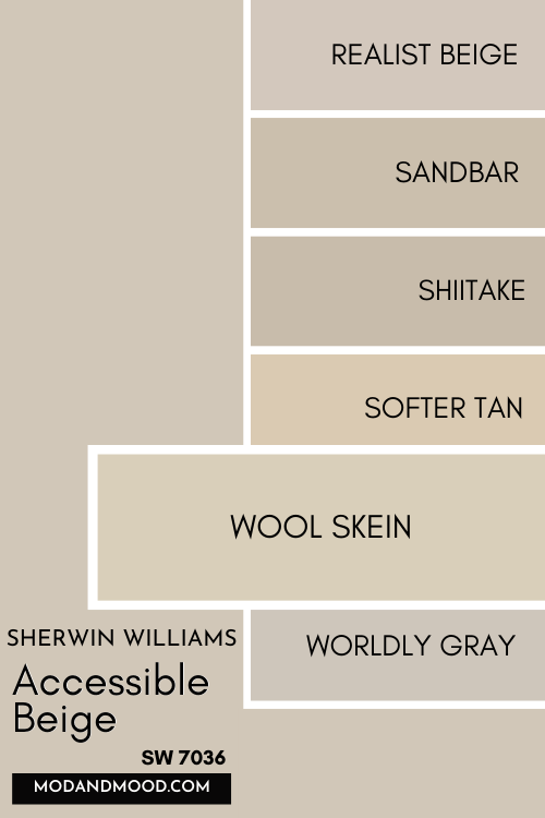
Worldly Gray is warmer and more gray than Accessible Beige. It’s generally pretty similar, but a bit closer to taupe.
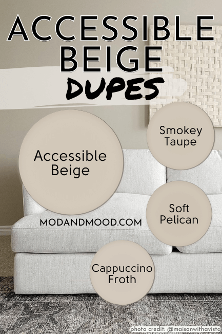
Dupes for Sherwin Williams Accessible Beige
Now that we know what colors are different from Accessible Beige, what colors are decent dupes?
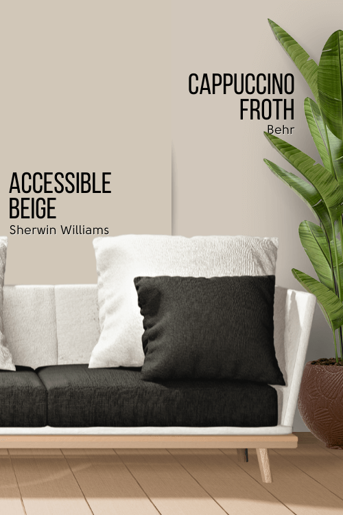
Accessible Beige Behr Equivalent (Home Depot)
Out of all the dupes, Behr has the best color match to Sherwin Williams Accessible Beige with their shade Cappuccino Froth.
Behr Cappuccino Froth (N210-2)
Cappuccino Froth is an excellent dupe for Accessible Beige! It’s just a teeny tiny bit cooler.
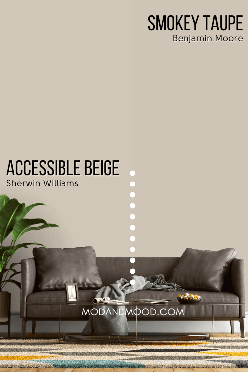
Benjamin Moore Accessible Beige Equivalent
Benjamin Moore actually has a lot of beige and greige options, but in my opinion the best alternative to Accessible Beige is the shade Smokey Taupe.
Benjamin Moore Smokey Taupe (983)
Smokey Taupe is just the tiniest bit darker and more gray than Accessible Beige.
I explored this color on cabinets here: The 3 Faces of Smokey Taupe on Kitchen Cabinets (Plus Alternatives!)
The Benjamin Moore color Desert Light is also a pretty good color match, but it’s slightly more pink than Accessible Beige, so I think Smokey Taupe has more appeal.
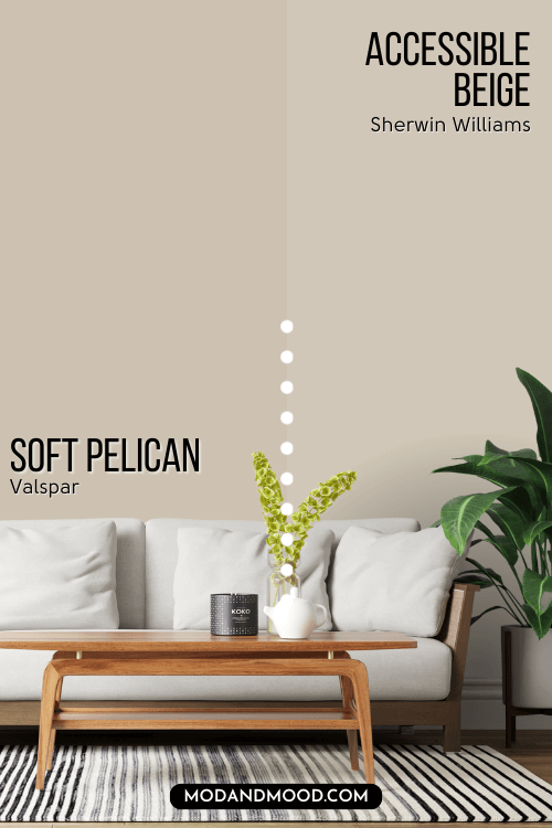
Valspar (Lowe’s) Equivalent to Accessible Beige
Valspar also carries a large selection of neutral beige and greige colors, but most of theirs lean either more pink or more yellow than Accessible Beige.
The best color match from Valspar for Accessible Beige is the color Soft Pelican.
Valspar Soft Pelican (8005-5BA)
Soft Pelican is slightly darker than Accessible Beige, but otherwise it is exactly in the same area of the color wheel.
You might also like Valspar’s Sand Storm. It’s the same lightness as Accessible Beige, but it’s a bit more pink.

Accessible Beige Pros & Cons
We’ve reached the end of this mega Accessible Beige review! Let’s summarize with a few pros and cons:
Pros
- Goes with everything
- Warm but not too warm
- Gray but not too gray
- A sophisticated choice for cabinets and trim
Cons
- Can look dated if you don’t have/choose the right finishes
- Not super exciting
Accessible Beige a bit too pedestrian for you? How bougie!
Check out these other neutrals:


