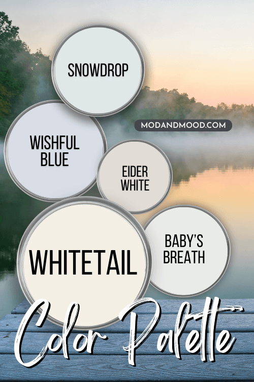
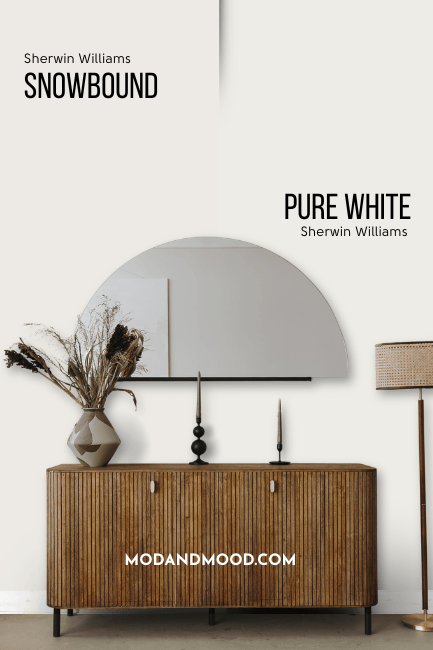
Snowbound and Pure White are two of my favorite whites! Neither is super creamy or stark, and both are extremely versatile. So what is the difference, and which should you choose?
By the end of this article, you will know which one is right for you!
The main difference between Pure White and Snowbound, is that Snowbound is a touch warmer and closer to red.
That’s it in a nutshell, but I have a lot of great examples and photos here.
Missed the full posts? :
Sherwin Williams Snowbound (in Real Homes!)
The Best of Sherwin Williams Pure White
This post may contain affiliate links. Should you choose to make a purchase through one of my links, I may receive a small commission at no cost to you. I only recommend products that I use.
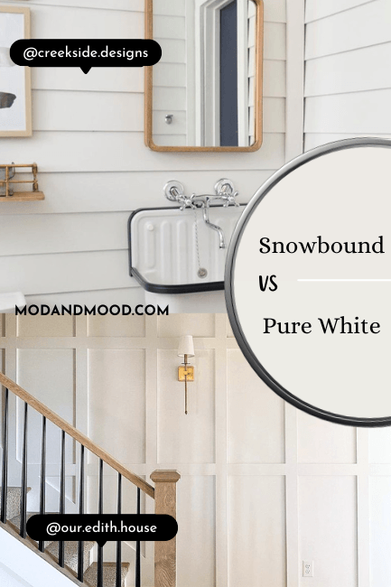
What Does Snowbound Look Like Compared to Pure White?
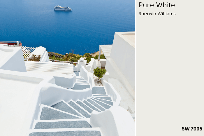
Before we talk undertones, here’s a picture of each, so that you can see how truly white they both are before your judgement gets clouded.
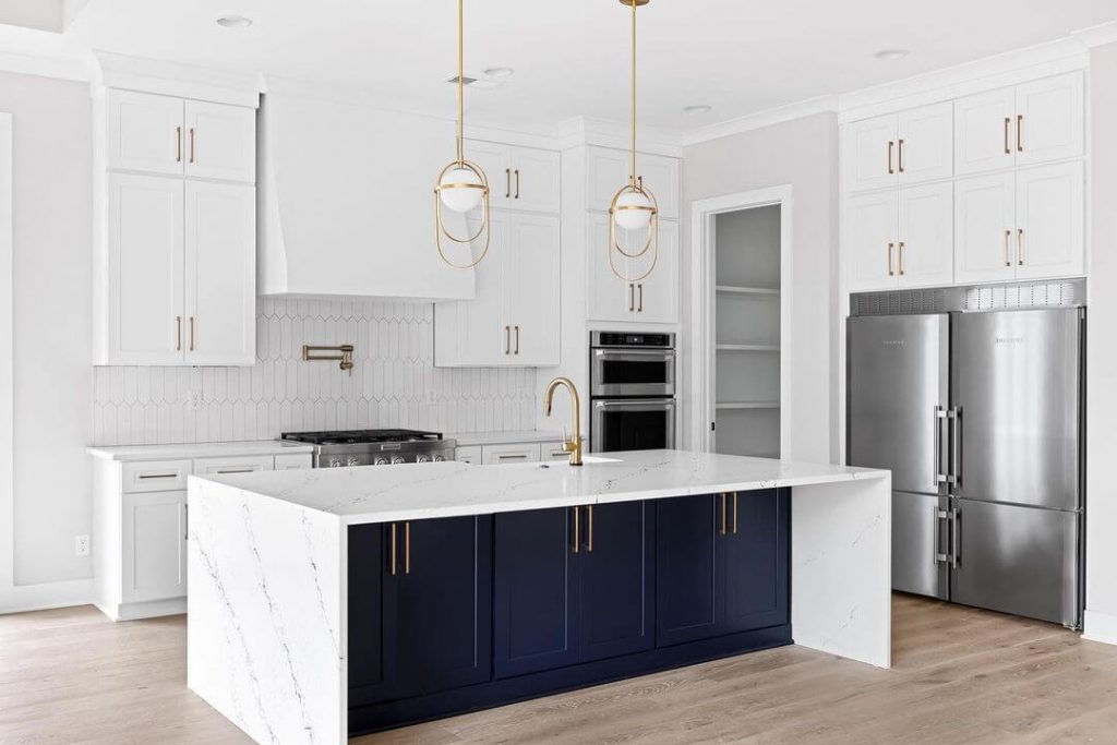
This open plan new build is painted in Sherwin Williams Snowbound:

The house at Bridlewood Acres is Sherwin Williams Pure White:
Both are nice true whites. Aren’t they?
Could you spot the difference in those rooms?
This isn’t a totally fair comparison because Snowbound was in artificial light and Pure White in natural, but the point was this: Both look white.
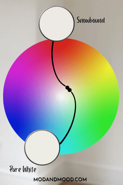
Snowbound vs Pure White Undertones
Both Snowbound and Pure White are warm whites. Pure White has more yellow-leaning undertones, and Snowbound has pink.
Here they are plotted on hex charts:

Spotting Pure White’s Undertones
Pure White doesn’t ever look yellow because it has a bit of gray to it, making it fairly neutral.
It will look a little creamier and more gray than a bright clean white like Benjamin Moore Chantilly Lace. It is nowhere near being a farmhouse white like Shoji White or Alabaster.
Here is a picture of Pure White with maximum yellow undertones:
Yes, the lights are warm so there is more going on than just Pure White in natural light, but I wanted to show you the most yellow undertone that I could find.
Spotting Snowbound’s Undertones

Here’s the thing about Snowbound: I wouldn’t say that it looks pink, but knowing that the undertone is there, makes it easier to spot. Next to a bright clean white, it might look a little more muted and have a whiff of pink.
You can kind of spot it here, next to trim in Extra White:

At the bottom of the wall between the shower and the door, both look very white.
It’s clear from the trim on the right side of the photo that there is something red or orange reflecting off the walls. (Remember white is very reflective!) Notice above the door how Snowbound picks it up more? All of a sudden it looks quite pink beside Extra White.
I don’t want to spend too much time convincing you that Snowbound isn’t actually pink, but I didn’t want you to run away screaming because you heard “pink undertone.”
All that being said, here is Snowbound with maximum pink undertones:
Don’t take my word for the difference! Get yourself a color-accurate peel and stick sample from Samplize for both Pure White and Snowbound to help you decide! Samplize makes their samples with two coats of authentic paint, and they can be repositioned anywhere from cabinets to corners.
LRV of Snowbound vs Pure White
L-R-Whatnow?
The LRV (Light Reflectance Value) of a color indicates on a scale of 0 – 100 how much light a color reflects (or doesn’t reflect). True black has an LRV of 0 and pure white has an LRV of 100.
In the paint world, we are working in a range of about 3 – 93 because no paint color is purely black or completely white.
Snowbound is the tiniest bit darker than Pure White, with an LRV of 83. Pure White has an LRV of 84. I think the difference is negligible. They look about equal on the wall.
Snowbound vs Pure White vs Alabaster
To illustrate just how similar Snowbound and Pure White are, here is how they compare the the much creamier Sherwin Williams Alabaster:
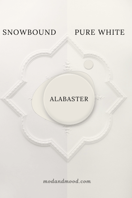
Alabaster is much more yellow/beige than either Pure White or Snowbound. Because Pure White is a yellow-based white, the difference is a little less obvious than the redder white of Snowbound.

Want more Alabaster? Here you go: Is Sherwin Williams Alabaster a Classic White or Overrated? (Plus Dupes!)
Can You Use Snowbound with Pure White?
I would not recommend pairing Snowbound with Pure White. There is just not enough contrast. Especially when one is on trim, the difference will get lost.

If you plan to use either Snowbound or Pure White for the walls, you should first consider using the same color for trim in a different sheen.
That will provide some contrast without having to worry about clashing whites.
Looking for white-on-white combinations that work? Check out this post: White Walls with White Trim? (Alabaster with Pure White & More!)
What Color Trim Goes With Pure White and Snowbound on the Walls?
If you don’t like the idea of using all one white, Pure White can be paired with most lighter whites for trim. Just don’t go too cool or it will look yellow.
Snowbound is a bit pickier because we don’t want to highlight any of the pink undertones, and most other whites are more yellow.
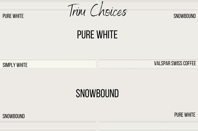
Two whites that I think will work well with either Pure White or Snowbound, are Benjamin Moore Simply White, or Valspar’s version of Swiss Coffee.
Simply White is a bright white with a touch of creaminess. Valspar Swiss Coffee is a light white that leans just a bit more red than others.
Pure White vs Snowbound on Trim
We’ve already talked about white trim colors that go with Snowbound and/or Pure White, but is Pure White or Snowbound better for trim?
Both Snowbound and Pure White can be used for trim with almost any wall color.
I recommend Snowbound for trim all the time. It’s one of the most perfect whites for a compromise between a super creamy color like Alabaster, or a clean bright white like Chantilly Lace.

You can also use Snowbound for trim with darker whites. Here it is with Sherwin Williams Aesthetic White:
With trim, you don’t have to worry about the pink undertone in Snowbound at all. It’s too little to ever spot it.
Could Pure White work just as well? Probably, but I have a love affair with Snowbound.
Here is Pure White on Alabaster walls:

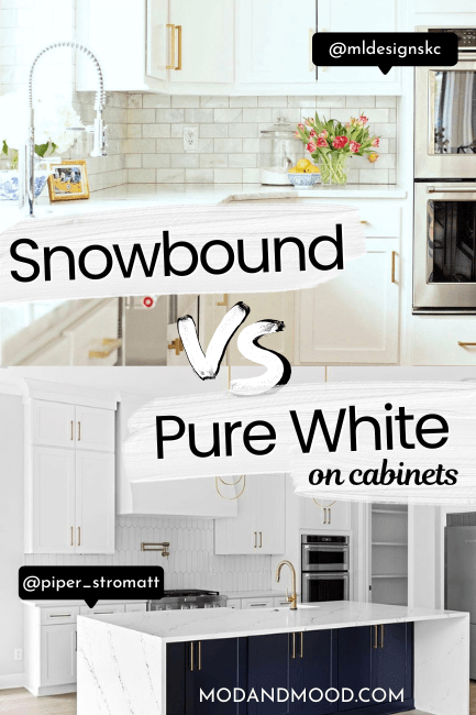
Snowbound vs Pure White on Cabinets
White is always a kitchen cabinet classic, but also a big decision! After all, refinishing cabinets can be expensive and/or time consuming, and you are less likely to change it for years.
Luckily I have some Snowbound and Pure White cabinets to compare and help you decide.
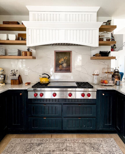
Snowbound on Cabinets
I have a few photos of light and airy kitchens with Snowbound on the cabinets.
This first one is by The Finishing Room (@thefinishingroommke), and it’s actually the same one that I showed earlier for maximum pink undertone.
In this shot it is definitely not as obvious:

Here are two different kitchens by GR Fine Finishes (@grcabinetpainting) that have Snowbound cabinets:

Both of these look pretty white, but if you’re anything like me, I can still spy the undertone in this next one:

Need to know that pantry door color? It’s Sherwin Williams Iron Ore.
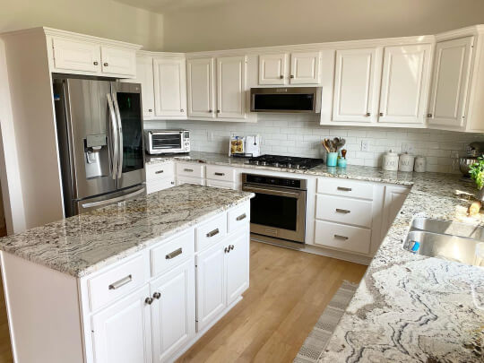
Pure White on Cabinets
Try not to let the complete gorgeousness of this kitchen by Piper Stromatt (@piper_stromatt) bias you!
I’m not seeing anything but pure white on these Pure White cabinets!
The island is Sherwin Williams Naval.
It’s Pure White in the kitchen at Bridlewood Acres (@bridlewoodacres) too!
The range fan is Pure White and the lower cabinets are Sherwin Williams Greenblack.
Here are a few more cabinets from this kitchen, where Pure White is the wall color as well.

Again, I’m not getting anything but white from these cabinets. If you are looking for a warm white, you may find Pure White a little lacking.
Snowbound Compared to Pure White on Kitchen Cabinets
Before I started writing this post, I didn’t find Snowbound and Pure White to be especially different, but cabinets might be where we see the biggest contrast.
After scrolling through the Snowbound cabinets and then the Pure White cabinets immediately after, here are some differences and similarities that I noticed:
- Both Pure White and Snowbound are soft whites, but Snowbound looks warmer.
- Neither white looks particularly creamy
- Both whites look especially good with gold hardware
- Both colors look like true whites at first glance, but Snowbound’s undertone is easier to pick out
With Snowbound it is one of those things where once you see the pink, you can’t unsee it.
Will your guests know that your cabinets have a pink undertone? Unlikely.
Will it be obvious on the ‘gram? Probably not.
Will it drive you insane if you hate pink? Unfortunately, it might.

Snowbound vs Pure White on Exteriors
With exteriors, any paint color will look lighter and brighter outside. Whites are a little bit different, because they can look brighter, but often times their undertones are more obvious.
Let’s take a look at Snowbound compared to Pure White on exteriors.
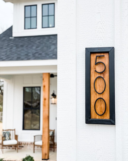
Snowbound on an Exterior
You might recognize Amy and Ryan’s Rock Creek Farmhouse (@rockcreekfarmhouse) from other posts I have kicking around here.
(And from earlier in this post of course.)
They used Snowbound inside and out, so their home is the perfect example for this article!

Outside in natural light, I would not say that Snowbound ever looks pink. It can look a bit warmer and creamier than it appears inside, but not pink.
In that first photo, you can see how it will look on painted brick.

The ultimate test: How does Snowbound look compared to the bright white of a fresh snowfall?
Well, it’s creamy, but as far as white paint colors go, it’s not crazy warm.
Pure White on an Exterior
Pure White is a great choice for your exterior, if you want a pure white!
The warmth and touch of gray in Pure White, will help your house not look washed out.
Bailey (@clarkkansaslove) used Pure White for her beautiful modern exterior:

I think the brightness is turned up in these photos – just to warn you – but it’s not super far off.
Angela (@heyangelafranklin) used Pure White on her exterior to paint over existing brick:
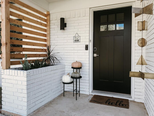
Her front door is none other than Sherwin Williams Tricorn Black.
Have a thing for black doors? You will love this post: 39 Spicy Black Interior Doors (How to DIY & Paint Colors to Use!)
Snowbound Compared to Pure White on an Exterior
How do these colors stack up on an exterior?
- Snowbound and Pure White are both great choices for an exterior. Snowbound will still look at least a little warm, but Pure White tends to look true white.
- If you are looking for a crisp black and white for your exterior, you will probably prefer Pure White.
- If you are going for the “modern farmhouse” aesthetic, Snowbound suits a little better.
- Pure White is a fail proof white for any exterior, but you may feel it is a bit plain.
- If neither of these are what you are looking for, check out Greek Villa:

Snowbound vs Pure White Walls
Let’s get back to the basics and look at some walls shall we?
An important thing to note, is that when a white is your only white, it will always look its very whitest. That’s why you should definitely consider using the same color on your walls and trim, if you don’t want to worry about undertones as much.
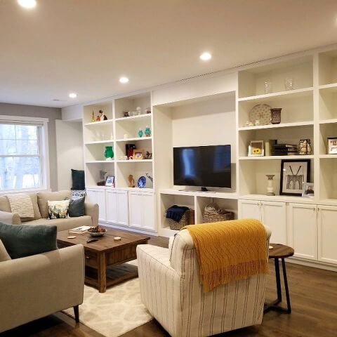
How Does Snowbound Look as a Wall Color?
In the Rock Creek Farmhouse, Amy and Ryan used Snowbound for their ceilings, walls, and trim, and it looks fabulous (and white!) :

Their cabinets are Dorian Gray.
I am not getting even a hint of pink here, and I think it is down to not having another white in the space to compare to.

Snowbound looks very pretty and soft.
Here is Snowbound in a bedroom by @built_frm_scratch :

The feature wall here is Sherwin Williams Ripe Olive.
Again I am finding Snowbound to be pretty darn white!

How Does Pure White Look as a Wall Color?
We saw Angela’s house already from the exterior, but she also used Pure White inside her home:

Her 5/8 feature wall is Sherwin Williams Urbane Bronze.
Let’s head back to Jake and Candi’s home at Bridlewood Acres, where we saw Pure White cabinets.
They used Pure White as their whole home wall and trim color, and it looks delectable!

Their artwork is a custom piece by @thatblonde.art.

What a beautiful white space!
I will say that there is a shadow in that last photo that is leaving a pinkish cast on the walls. I wanted to point it out, because had that room been Snowbound, we might blame the undertone!
Again, white is reflective, which means it will always pick up shadows if you look for it.
How Does Snowbound Compare to Pure White on Walls?
- Snowbound and Pure White when used on both walls and trim, look very white.
- Choose your favorite, because they can be used interchangeably
- Pure White may appear just a hair brighter than Snowbound
Pure White or Snowbound on Woodwork
We already talked about trim, but what about shiplap, board and batten, or other wood features?
Here is Snowbound on a geometric feature wall by @wood_visions:

The ceiling is a different white, so you can pick out the color of Snowbound at the roofline.

Snowbound does look creamier here, but if you were to crop the photo it would probably look white again.
Here is a wall also by Wood Visions, but this time in SW Pure White:
Pure White is looking a bit creamier here too, and actually very similar to Snowbound.
This one comes down to personal preference. I think they look about the same.
When to Choose Snowbound or Pure White?
We have looked at Snowbound and Pure White quite literally inside and out, so how do they stack up?
- Pure White and Snowbound can both look true white or creamy depending on the environment and other colors
- Snowbound is ever so slightly softer than Pure White
- Pure White is the better choice for cabinets
- Both will look their whitest as the only white in the room
- Pure White is an easier white to choose a contrasting trim color for
- If you hate pink, choose Pure White. If you hate yellowy creams, choose Snowbound
- If you are stuck deciding between a bright white and cream, both Snowbound and Pure White are great options
- Pure White is the more popular color by a long shot! For a tried and true white, go with Pure White. If being original matters to you, go with Snowbound
I’m being totally honest when I say that I came into this post being a die hard Snowbound babe, but I have come out of it torn!
Cabinets surprised me the most, because Snowbound seems a bit unpredictable.
If neither of these are for you, whites are what I do best! Check out these other posts: