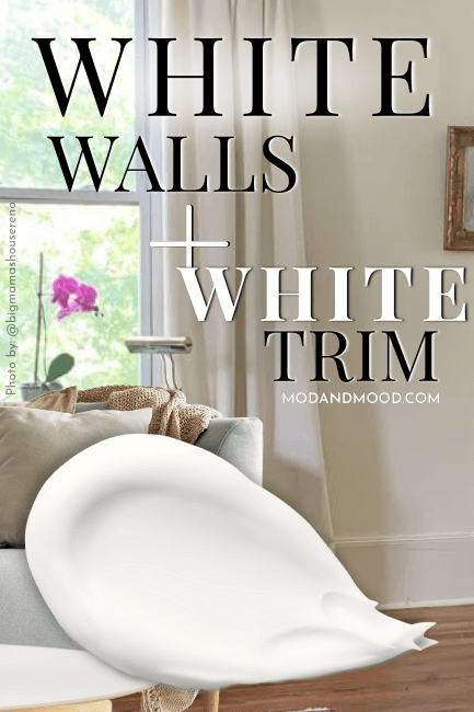
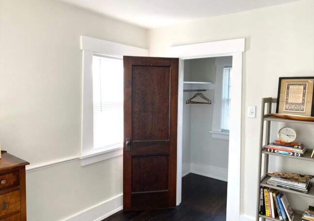
White is a tricky beast! Will the color you like for the walls also work on trim? Will it suddenly look yucky with your existing trim and doors?
Today you will answer the question for yourself! I’ve got a whole bunch of examples to help you decide on the perfect single white, or white combination, for your walls, trim, ceilings, doors, and even cabinets if you like!
Let’s go!
Should I Paint My Trim the Same White as My Walls?

If you know that you want white trim to go with your white walls, you have three basic options:
- Use the exact same paint
- Use the same white in a different finish
- Choose a different white paint color
Here are some pros and cons to each:
Using the Exact Same Paint
If you are painting your walls white, and you want them to continue to look white, then sticking to the same color is the best option.
Choosing another white provides contrast, but that contrast can you make you notice tones in your wall color that you would not otherwise see.
When your wall color is the only white, it looks the whitest possible.

I have painted my walls and trim in the same white before, and let me tell you, it is very satisfying.
After a long time in renovations, I don’t know if anything beats lazily dragging the brush across the top of your trim, not caring if it gets on the walls.
Speed and ease are the major pros here!
Using the same color and same finish will also give you a more seamless look. Think Victorian curved ceilings, where you don’t know where the walls end and the ceiling begins.
The con here, is that you don’t get the traditional contrast of trim.
Using the Same Color in a Different Sheen
If you still want contrast, choosing a different finish in the same white will give you that.

In some cases you will even swear it is a different color.
That is the pro!
I don’t think there are very many cons to this approach honestly.
Choosing the same white in a different sheen will give you the best of both: Walls look white, trim looks trimmy.
Choosing a Different White Paint Color
Pros to choosing a different white are:
- Maximum contrast
- Highlight wall color

Cons:
- Emphasizes off-white tones. Warm whites will appear even creamier (can look yellow in comparison)
Now that’s all out of the way, let’s see some examples!
Examples of The Same White on Trim and Walls
I have collected some great examples of the same white being used on both walls and trim!
For simplicity’s sake, I have organized them by paint color.
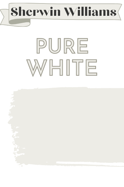
Sherwin Williams Pure White on Walls, Trim, and Cabinets
Bridlewood Acres is one of my favorite homes that I have covered. You can see more of it in my Dark Green Paint Colors post.
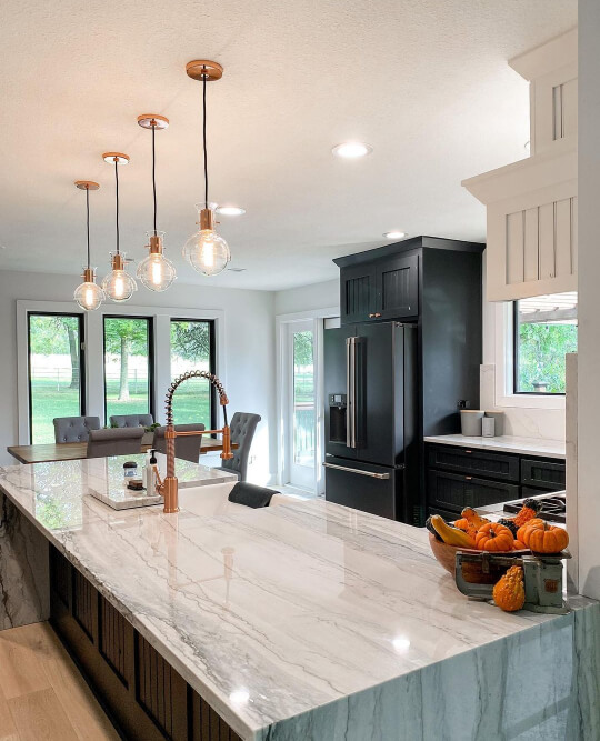
Jake and Candi used Pure White throughout their house, including on the trim.
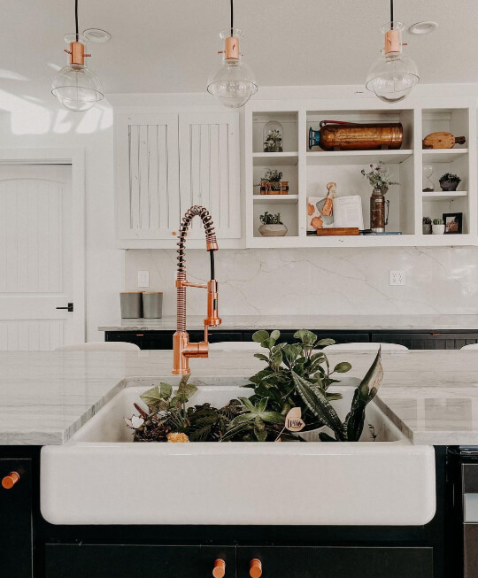
Their upper cabinets are also SW Pure White, and the lowers are Sherwin Williams Greenblack. The copper finishes are to die for!
Disclaimer: I do not know for every one of these photos whether a different sheen was used or not. When I do know for sure, I will let you know, and otherwise we can speculate together.
For Bridlewood Acres, I’m pretty sure it is all the exact same paint. I haven’t detected a difference in sheen in any of their photos.
This main bedroom by Marissa Vest (@in_vest_homes) features a bold shiplap and beam ceiling, but the walls, trim, and doors provide some white space, with SW Pure White on all.
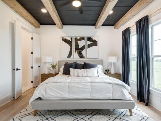
The color on the ceiling is SW Cyberspace.
You can see more of this home in my post: Sherwin Williams Cyberspace (The Moodiest Charcoal Blue!)
Benjamin Moore Simply White on Walls and Trim

This next home was shared by Word of Mouth Painting, who used Benjamin Moore Simply White on the walls and trim.

I believe the trim here has been painted in a different finish, because you can catch a glint off the baseboards in this next photo:

If you want to see more of this color, check out my post: Simply White – A Benjamin Moore Classic
A classic white walls and white trim combo.

Simply White is worth considering if you are looking for a bright white. It is one of the lightest you can get!
Benjamin Moore Decorator’s White on Walls and Trim

Get ready for some flawless white work! :

Talk about crisp!
This one is Decorator’s White by Benjamin Moore, which is decidedly cooler than most of the whites I cover.
It looks to me like the doors were left in a glossy factory white.
I don’t see much sheen on the baseboards, so I think the walls and trim are done in the same paint.

Sherwin Williams Shoji White on Trim, Walls, Ceiling, and Doors (Different Finishes)

When I tell you how “dark” this next white is, you won’t even believe me!

Piper (@piper_stromatt) used Sherwin Williams Shoji White on the walls, trim, and ceiling in this living room.
Shoji White has an LRV of 74, which means it is decidedly off-white!
On her Instagram, Piper answers the question that you might be asking right now:
“I didnt know if shoji white was white enough to use on the ceiling also, or if i should use a pure white on ceiling and shoji on the walls?”
“Don’t mix shoji with bright white!” she says.
The trim and doors have been painted in a semi-gloss, and it looks good enough to eat! :

If you’re tempted to ignore Piper’s advice, there is nothing wrong with that, but your walls will not look white.
Here is an example in a different living room:

Shoji White still looks beautiful, but definitely off-white.
For more of this color, check out my post: Sherwin Williams Shoji White Undertones and Alternatives (It’s not greige!)
Benjamin Moore Chantilly Lace on Walls and Trim
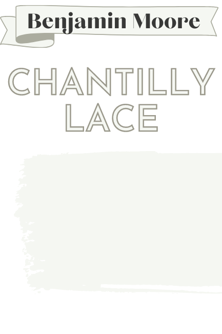
This white is my own personal favorite, and one that I’ve used before in my own house: Benjamin Moore Chantilly Lace!

If you stick around, you might recognize Alishya’s (@greenpaintandlove) house from a few of my posts.
Her Essex Green walls and cabinets appear in my dark greens post, and in my post: Trend-Setting Green Kitchen Cabinet Ideas
But today, it’s allll about the white!
Alishya used Chantilly Lace on her walls, and then painted the trim and doors in a different sheen.
Chantilly Lace is a clean white with just a hint of warmth, but here on a snowy day in natural light, it looks quite frosty:

I haven’t seen Chantilly Lace ever looking that cool before, but the shot is pretty perfect, so I wanted to show you anyway!
Chantilly Lace is a gorgeous white to use for trim with almost any wall color, white or otherwise.
Sherwin Williams Extra White Walls, Ceiling, and Trim

This next house belongs to Jessica from @thehouse_on2060, and you can see a lot more of it in my post: Sherwin Williams Tricorn Black (Is it the Best Black?)

Jessica used Sherwin Williams Extra White on her walls and trim, but went with Tricorn Black on her interior doors.
(A popular trend! See more here: 39 Spicy Black Interior Doors)
It’s easy to see in that first photo that the trim is in a different sheen. Just check out the glint in the door frame!
Here is one more in the bathroom:

Sherwin Williams Alabaster on Walls and Trim

This next gorgeous home is a rehab project on a family heirloom that belongs to Julia (@bigmamashousereno).
Julia chose Sherwin Williams Alabaster for both her walls and trim throughout most of her house.
Here is her foyer:

Next we move into the main bedroom.

I love an extra wide baseboard!
Finally let’s take a look at her kitchen:
I can’t tell for sure if the trim is a different sheen or not. I want to say that it is, because in some shots it looks slightly different from the walls, but not 100% on that.
I have one more Alabaster walls and matching trim living room to show you, but this one belongs to Samantha from Olive & Oak Home.

Samantha chose to use Sherwin Williams Alabaster on the walls, ceilings, crown mouldings, and baseboards, but in the doorway and halls she added pops of Sherwin Williams Accessible Beige.
I loooove this look. It brings the word “expensive” to mind.
If you like it too, check out: White Walls with Sherwin Williams Accessible Beige Trim (Alabaster and More!)
Benjamin Moore Swiss Coffee on Walls and Trim

There are a LOT of white paint colors named “Swiss Coffee,” but just to be clear, this is the Benjamin Moore version!
Laura (@la_chaffin) used Swiss Coffee on the walls, ceilings, and trim throughout her home.
This is a bit of a cheat to have in the “same color white” section of this article, because the trim and ceilings are actually Swiss Coffee at 75% strength.
Here in the dining room, the wood ceiling is finished in semi-gloss:

So pretty! Swiss Coffee is another of those creamy whites that will only look white white when they are the only white.
Sherwin Williams Ibis White on Walls, Trim, and Doors

Designer Iman Stewart used Sherwin Williams Ibis White everywhere in this home.

I was fully expecting Ibis white to be a cool blue or purple white, but it’s actually in the red/pink family!
Not a super popular color, but it should be!
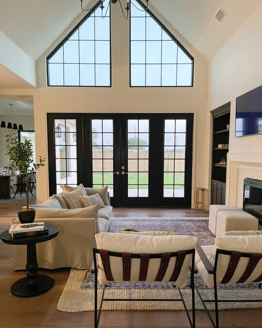
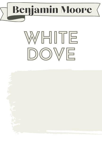
Benjamin Moore White Dove on Walls, Built-Ins, and Trim
Let me tell you, these next rooms spark joy!
First up is a bedroom designed by Christina (@ourbouldlife). She used Benjamin Moore White Dove on the walls and trim in this darling bedroom:

It’s pretty clear that the finish on the trim is a gloss or semi-gloss.
White Dove was also Christina’s color of choice for the built-ins and trim in this office:
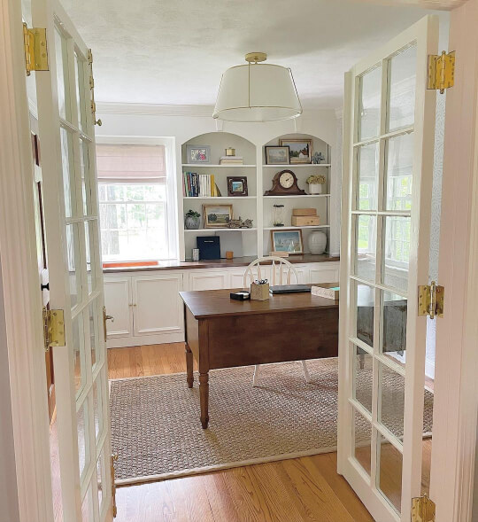
Love it!
After choosing White Dove for her laundry room too, Christina said:
“It was super cute and adorable, really, of me to get these white paint swatches thinking that I was going to pick a color that wasn’t White Dove. ITS JUST SO PERFECT EVERYWHERE.”
I couldn’t resist including one more White Dove inspo photo, this one is from Word of Mouth Painting. They used White Dove on the walls, trim, ceilings, and banister in this gorgeous two storey:

Yum!
That’s about it for using the same white on walls and trim, so now let’s take a look at different white wall and trim combinations.
White, Off-White, and Cream Walls with Whiter Trim
I had a heck of a time trying to figure out how to organize this post, so here is a section of various shades of white, off-white, and cream walls with truer white trim.
I’m actually not sure what to call it, because these trim colors aren’t all bright, cool, or clean white necessarily, but hopefully you get the idea!
Sherwin Williams Alabaster with Pure White Trim

Without further delay, here is the combo that everybody wants to know about: Can you use Sherwin Williams Alabaster on the walls and Pure White on the trim? Or will that clash?
Thankfully I managed to find a great example, in the home of Kristin Macchia (@kristinmacchia_homeinprogress).

Sherwin Williams Alabaster and Pure White is actually quite a nice combo.
You might expect that Pure White would make Alabaster look slightly yellow or too creamy, but the contrast is subtle.

Kristin used this combination throughout her home, very successfully!
Pure White itself is far from a bright cool white, and it’s own hint of warmth let’s Alabaster shine, without being too warm.

Make no mistake, Alabaster is definitely creamy in comparison, so it’s still won’t look quite like a true white next to Pure White.
See also:
Benjamin Moore Simply White Walls with Cool White Trim
This next combination is interesting because the wall color, Simply White, is actually quite a light white, but it does have a yellow tone to it.
Paired with a cooler white, it looks much creamier:

I’m actually not sure what the tint is on the trim, and neither is the homeowner, so sorry about that!
If I had to guess, it might be out of the can white, as few colors are as light as Simply White.
Sherwin Williams Ethereal White Walls with Extra White Trim

Here is another white that on it’s own, is not overtly creamy: Sherwin Williams Ethereal White.
What I meant by “not overtly creamy” is that Ethereal White, while darker, is actually a pretty neutral white, but the cooler tones of Sherwin Williams Extra White pull out the warmth.
Benjamin Moore Swiss Coffee Walls with Simply White Trim

Swiss Coffee is not my favorite white, because it tends to have a buttery tone that would not be my personal preference. That being said, it has a lot of fans! I just prefer cooler neutrals.
(Which is probably very dated of me, to be honest.)
Earlier we saw Swiss Coffee with Swiss Coffee trim, and you will notice that it didn’t look nearly this creamy:

Paired with a brighter white on the trim (Simply White) it looks much more yellow.
Simply White is actually a yellowy white too, so a neutral or cool white would emphasize the yellow in Swiss Coffee even more.

If you want your walls to look creamy then this is a great combination. If you prefer the look of a “farmhouse white” then this contrast will be too much.
Sherwin Williams Natural Choice Walls with Alabaster Trim

If you want to know more about either of these colors, check out my post: Sherwin Williams Natural Choice vs Alabaster
Both of these photos are pretty filtered, but I wanted to show this combination anyways:

SW Natural Choice is a very light beige. It’s borderline too dark to be classed as an off-white, but it’s close.
Benjamin Moore Swiss Coffee Walls with White Dove Trim

This is the lowest contrast pairing that I have to show you, and it comes from Chrissie of @simplyslade.

She has used Benjamin Moore Swiss Coffee on the Walls and White Dove on the trim.
Technically Swiss Coffee is a little more yellow, and White Dove is more neutral.
I think you may need to see it in person to appreciate the difference. Below the dining room window is the only place that I think I can see it.

The trim is in a glossier finish than the walls. Contrast or not, this home is super chic!
Benjamin Moore Dove Wing Walls with Benjamin Moore Alabaster Trim

Dove Wing is another off-white that could either be treated like the only white (as we saw with Shoji White earlier) or made to look darker and creamier when paired with a lighter white.
This is another design by Iman Stewart. This time she used Dove Wing on the walls, and the Benjamin Moore version of Alabaster on the ceiling, trim, fireplace, and built-ins.
White Walls with Cream Trim
Finally, why not a little contrast the other way? I thought I would show you white walls with creamy off-white trim.

The Noble Home features Benjamin Moore Wind’s Breath trim, with Dove Wing walls.

Wind’s Breath is just the right amount of gray/cream/beige to contrast with Dove Wing.
You could also get the look with Benjamin Moore Edgecomb Gray, or Balboa Mist.
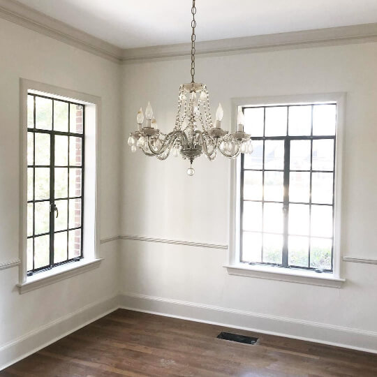
For this hallway, I believe the walls are straight from the can white, and the trim and doors are Sherwin Williams Pure White.
This is the only photo I have unfortunately, but I really love this look!
I don’t have the colors for this next photo, but I will update if I hear back.

This looks similar to a Sherwin Williams Alabaster and Natural Choice combo, or possibly Accessible Beige.
Pin it!
Finding the Best White for You
I hope you found the combination you were looking for, or got the inspiration you needed!
Things to remember:
- When choosing a creamy white, use the same color for trim and doors to keep it looking white
- Use a different sheen in the same color to create contrast on trim
- Consider using the same color at 75% for a little more contrast
- Emphasize cream tones with a brighter white on trim
Check out these amazing whites! :


