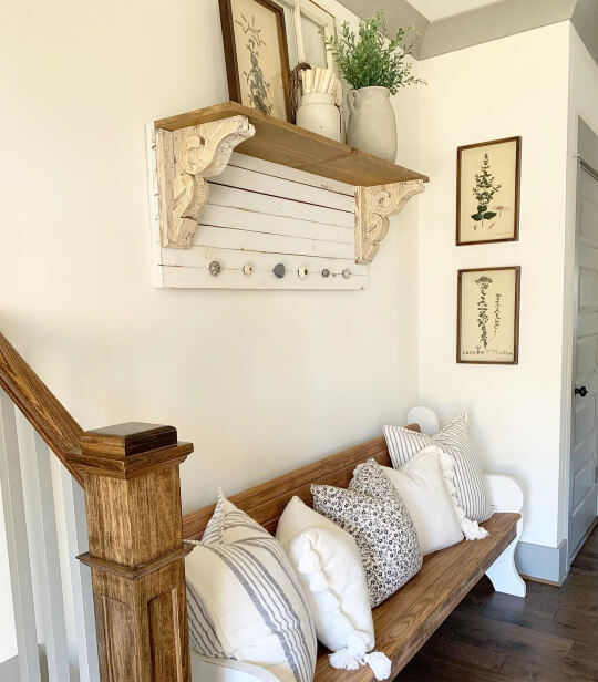
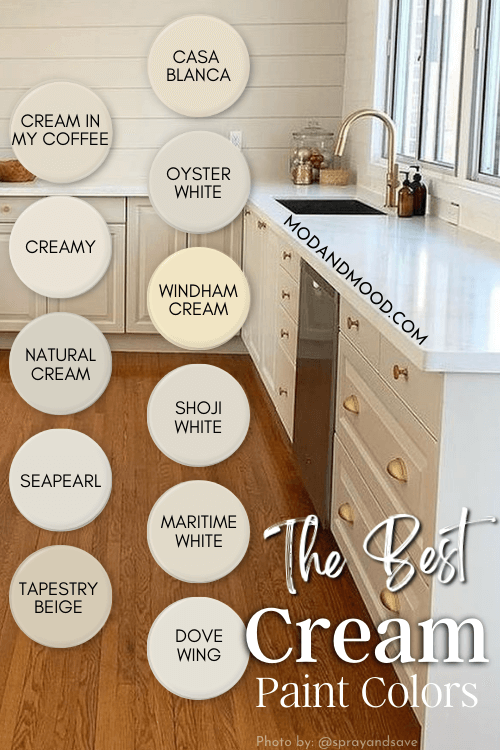
Creamy white and off-white paint colors are still the canvas of choice for walls in 2026. While beige is also experiencing a renaissance, warm white is a safe bet!
When I was looking around at favorite colors, I found that many people just don’t “get it” when it comes to cream. You probably aren’t looking for a sunshine yellow, you want cream.

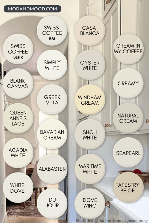
Here are all of the best cream paint colors, from creamy white to nearly biscuit. Most of these do not have a yellow undertone, but I do have a couple of those if that’s what you’re looking for.
#1 Tip for Choosing a Cream Color Paint
Trim options are make-or-break when it comes to painting with cream colors. Choosing the right cream for your walls is actually less important than what trim color you choose.
Sounds insane, I know.
Your paint color can be easily manipulated by the other colors around it. White is just especially bad for that.
For example, here is a creamy white (Sherwin Williams Alabaster) with a slightly more neutral trim (Pure White):

Subtle difference. Alabaster looks just a little darker and creamier than the trim.
Here is that same wall color with a much cooler trim:

So different! I get into this a lot more in my post White Walls with White Trim?
To summarize: If you find the perfect cream color for your walls, do NOT slap any old white paint on your trim.
Tips to Remember!
- Consider using the same cream paint color for walls and trim
- Use a cool white to maximize creamy yellow and beige tones
- Use a warm toned white to compliment and soften creamy tones
What is the LRV Range of the Perfect Cream Paint Color?
The LRV (Light Reflectance Value) of a color indicates on a scale of 0 – 100 how much light a color reflects (or doesn’t reflect). True black has an LRV of 0 and pure white has an LRV of 100.
In the paint world, we are working in a range of about 3 – 93 because no paint color is purely black or completely white.
You might not know where the line is when it comes to choosing either a cream or white paint color.
A good rule of thumb, is that most paints with an LRV higher than 82 will look white at least some of the time.
Paint Colors with LRVs from about 70 to 82 are off-whites. They will not typically look like a true white, and definitely will not in the presence of true whites.

Cream paints with LRVs below 70 are considered neutral colors, and not off-whites. These guys are best used on exteriors (where all colors look lighter), or for trim with very dark colors. In the presence of any other whites or off-whites, they will look beige and not cream.
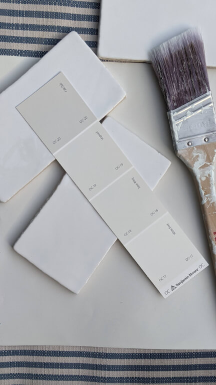
Creamy White Paints to Love
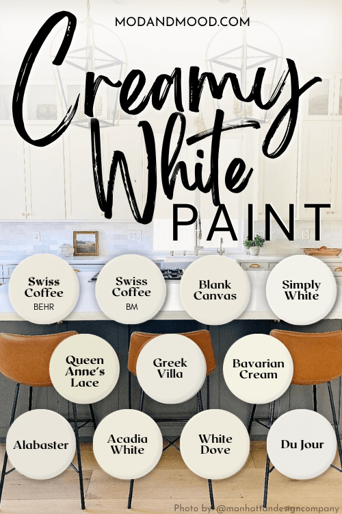
These first paints are all classified as white paint colors still. They have LRV’s of 82+.
Benjamin Moore Simply White
Simply White is the lightest of the cream paints we will look at today. It is also one of the lightest whites that Benjamin Moore carries!
Simply White has an LRV of 91.
You may be wondering how it’s even a cream paint then, but I promise it delivers!
Despite how light it is, Simply White is really saturated with lots of creamy undertones and none of that pesky gray to tone it down.

Just to prove that it is quite warm, here it is on the walls with cooler trim:

That is a pretty good look at the undertone, but here is one more:

The exterior color is Benjamin Moore Storm Cloud Gray, but it almost looks closer to Dry Sage here. The trim is Simply White (as I’m sure you guessed), and I feel like it’s a great representation of the color. On the pillar it looks truly white, but inexplicably creamy at the same time.
I find the undertone of Simply White to be hard to pinpoint. It’s too bright to have a strong one most of the time. I wouldn’t say it’s especially yellow, but it’s not beige or peach either.
Don’t get me wrong, this one is warm but it can still read totally white. If that’s not the outcome you want, don’t go with Simply White.
See lots more of this one here – Simply White: A Benjamin Moore Classic (Plus Alternatives!)
Sherwin Williams Greek Villa (7551)
Greek Villa is another technically-white paint that has definite creamy tones:

Greek Villa has an LRV of 84. Its creaminess tends to be quite neutral and beige, rather than yellow.
The dark color in this bathroom is actually a deep green: Sherwin Williams Jasper.
Here is Greek Villa on an exterior where it also looks very cream:

This is one of my favorite cream paint colors for trim, because it is warmer than a bright white, but not as creamy as some other options (like Alabaster).
Read all about this color here: Sherwin Williams Greek Villa Review (and Dupes!)
Sherwin Williams Queen Anne’s Lace (6420)
Queen Anne’s Lace is a creamy white that is riiight on the edge of white/off-white in terms of its LRV.

Queen Anne’s Lace has an LRV of 82.
Let’s take a look at this one on cabinets:

As I always say, cream colors will look whitest in a space without other white colors present. On the far side of this kitchen where the cabinets are out of direct light, you can see the creamy undertone a bit better.
Here though, they look pretty much like a true white:

I’m fairly certain the stairs, trim, pillar, and ceiling, are all in this same white. Should you use Queen Anne’s Lace on your walls and another cooler white on trim, you would see the creamy tones much more.
Benjamin Moore Bavarian Cream
Bavarian Cream is also a very light cream paint color. The LRV is high enough for this one to be classed as a white, but I would not say that it looks white.
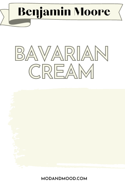
Bavarian Cream has an LRV of 89.
Here is a shot of Bavarian Cream in a bedroom, with Chantilly Lace on the ceiling:

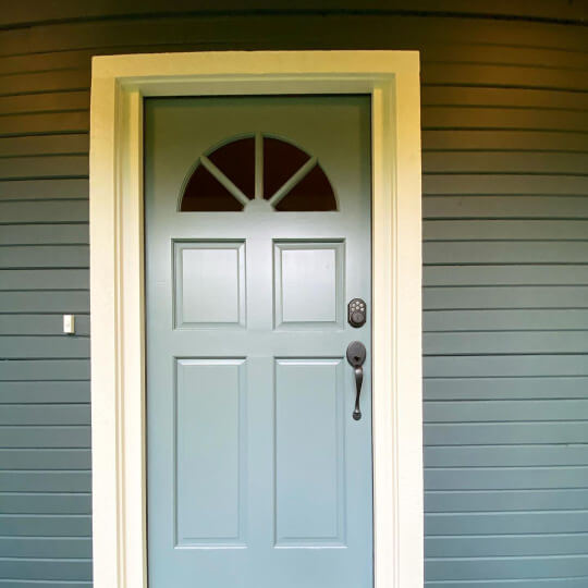
Ready for a little surprise? Here is Bavarian Cream on an exterior:
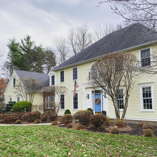
Brighter than you thought? Me too! The blue door and cooler white trim definitely emphasizes the buttery yellow undertone in Bavarian Cream.
Sherwin Williams Alabaster
Alabaster is the OG creamy white by Sherwin Williams. I’m not an insider, but I suspect it’s their best selling white.
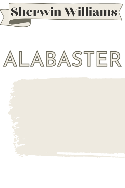
Alabaster has an LRV of 82.
Alabaster toes the line of white and off-white, but it often reads on the lighter side thanks to a little extra gray.
If you want a cream color that is still pretty white, and doesn’t often read yellow, Alabaster is a pretty safe bet.
You also saw a little of Alabaster earlier when we talked about trim.
You know I have a post for this one! Alabaster by Sherwin Williams a Classic White Review (and Dupes!)
Benjamin Moore White Dove
White Dove is basically Benjamin Moore’s answer to Alabaster. (Although I don’t know which came first, the Dove or the…Alabaster egg?)
The touch of gray makes it super neutral, and it varies in appearance from white to cream.

White Dove has an LRV of 85.
Having used both myself, I find that White Dove is slightly more likely to have a beige (peach) undertone and Alabaster might be a touch more yellow. (But you can see a full comparison here: Alabaster vs White Dove: What’s the Right White?)
Here is a good example of White Dove where the blue trim brings out the undertones:
This is another of my favorite creams, because I personally prefer a very subtle one.

Here it is where it looks pretty “true white”:
See my complete review here: White Dove by Benjamin Moore Complete Review (and Dupes!)
Benjamin Moore Acadia White
Acadia White is a more obviously creamy color than a lot of these other creamy white options, while still light enough to be considered white.

Acadia White has an LRV of 83.
Of this color, Benjamin Moore says:
“Crisp cream undertones warm up this clean shade of white.”
Pardon the language, but what in the fudgernickels does that mean?? “Crisp cream”? The only time I’ve heard something similar is on a particular brand of donuts.
Here it is on an exterior with Simply White for the trim:

You can see that this is definitely a cream color. With a cool white trim it would certainly read off-white.
Behr Blank Canvas
Blank Canvas was named the Behr Color of the Year back in 2023! (See the new ones here.) This creamy white paint color is quite similar in tone to Benjamin Moore White Dove.
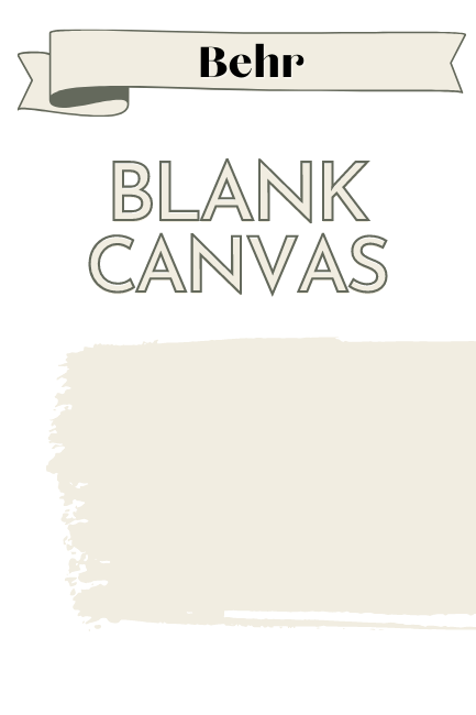
Blank Canvas has an LRV of 84.
I find that Blank Canvas is creamy in a beige way, rather than a yellow way.

Valspar Du Jour
Du Jour looks much lighter and whiter on the swatch than it does in real life.
Du Jour has an LRV of 86.
It is quite light, but it is definitely a creamy color and not a bright white:
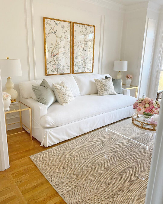
The bright white of the furniture in this space highlights the cream color of Du Jour without relying on a different tone of trim to do that. You can imagine if the furnishings were dark, Du Jour might look much more white.
Swiss Coffee
You’ve probably heard of Swiss Coffee, but which one?

If you aren’t sure, check out my post: Swiss Coffee Colors demystified
Every Swiss Coffee is a cream color anyway, but the most popular options are the ones from Behr and Benjamin Moore:
Behr Swiss Coffee
The Behr version of Swiss Coffee is the creamier of the two, and therefore has the more obvious undertone:
Swiss Coffee has an LRV 84.
Even with a black ceiling and tone-on-tone trim, you can clearly see the cream color of Behr Swiss Coffee:

If I had to guess based on internet chatter, this is Behr’s most popular “white.”
Benjamin Moore Swiss Coffee
Benjamin Moore’s version of Swiss Coffee is also one of their most popular “white” paint colors.

Swiss Coffee has an LRV 82.
I have got a lot of this cream color on walls, but here is a favorite:

So soft!
To illustrate the color a bit more, here is Swiss Coffee with Simply White on the trim:

It’s interesting that the artificial light is where the contrast is most obvious.
Sherwin Williams surprisingly does not have a Swiss Coffee color, but I wrote a post of other options: Sherwin Williams Swiss Coffee Inspired Paint Colors (Ranked!)
Best Creamy Off-White Paints
Now that we’ve run through a bunch of cream colors that are still technically white, let’s take a look at some that are truly cream.
The following paints are off-white cream colors, or very light neutrals.
Sherwin Williams Casa Blanca
Casa Blanca is a yellowy-peach cream by Sherwin Williams, with an LRV of 76.

This is how Casa Blanca will look on the wall:

Here is a shot where it looks a bit bolder:

This is a more overt yellowy cream, if that is what you are after. It doesn’t ever look white. If you like this look, you will also love Sherwin Williams Dover White.
Read more about this color here: Sherwin Williams Casa Blanca Review (and Dupes!)
Sherwin Williams Creamy
Creamy is a very popular off white by Sherwin Williams with an LRV of 81.
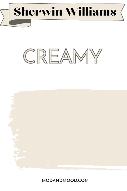
Here is an amazing design featuring Creamy:
I can’t guarantee your home will look that bougie with just a touch of creamy, so here is a regular homey kitchen too:

The island is Sherwin Williams Iron Ore.
Creamy is technically right on the line of white and off-white, but because it is so richly creamy, it doesn’t ever look like a true white. The undertone of Creamy is hard to describe. It is definitely more yellow than a beige cream, but it tends to look beautifully creamy, and not really like any other color.
Sherwin Williams Oyster White
Oyster White is tied with Shoji White as my favorite off-white. It’s pretty neutral and beige, but still reads “cream.”

Oyster White has an LRV of 72.
This is a fabulous example of Oyster White:
It looks creamy and soft on the brick, but not yellow or peach. (If a brick color is what you are looking for, check out my post: Stunning White Paint Colors for Classic Brick Exteriors)

Since it’s a fave, you know there’s a post! Sherwin Williams Oyster White (Review and Dupes!)
Sherwin Williams Shoji White
As I mentioned, Shoji White is my other favorite off-white. When in doubt, I can always seem to squeeze Shoji into a color palette!

Shoji White has an LRV of 74.
In fact, if you’ve scrolled through some posts, there’s a decent chance you’ve seen this next picture before. Oops!

It’s just so pretty! Notice the tone on tone trim keeping Shoji pretty white.
Here is a shot with white trim to give you a better idea:

One more (even though you don’t need it), here is Shoji White compared to Benjamin Moore Simply White, the lightest cream on this list:

You can see all the dirty details here: Sherwin Williams Shoji White Review and Alternatives (It’s not greige!)
If you like Shoji White and Oyster White, you will also love Sherwin Williams White Duck.
Benjamin Moore Dove Wing
Dove Wing is a very neutral off-white paint color. It’s creamy in a soft beige way, and not so much in a bright cream way.

Dove Wing has an LRV of 77.5.
I wanted to include it because I like it, so you might too!

It can look very creamy:

…But it also might look slightly more gray than you anticipated:

In case you weren’t sure, that is Dove Wing on the cabinets.
You can see more here: Dove Wing by Benjamin Moore Review (See Real Homes and Dupes!)
Benjamin Moore Windham Cream
Windham Cream is a bold and saturated cream color:
Windham Cream has an LRV of 79.
Here is Windham Cream trim on an exterior in Benjamin Moore Hancock Gray, which turns out isn’t that gray:
(But maybe we are supposed to know that about Hancocks…)

The cream looks much more mellow than it would on a neutral gray. You should definitely expect this to be a bright and buttery cream.
Benjamin Moore Natural Cream
Natural Cream is exactly like it sounds: A natural creamy color verging on mushroom.
Natural Cream has an LRV of 65.
I didn’t really need more colors for this post, but this kitchen totally sold me the cream dream:
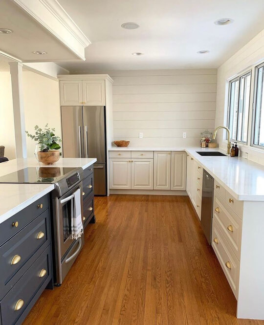
I am loving this color, particularly with the gold hardware!
The island is Benjamin Moore Cheating Heart (which is very similar to Sherwin Williams Cyberspace or Behr Cracked Pepper).
Natural Cream is definitely approaching beige, so I would not use it expecting a white or off-white. In fact, if you like it, you might also really like Sherwin Williams Accessible Beige.
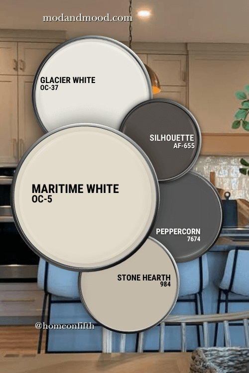
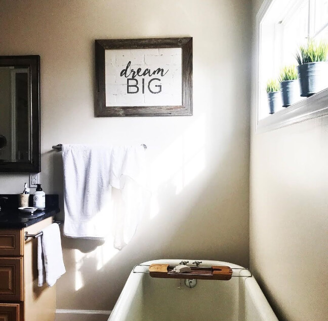
Benjamin Moore Maritime White
I think that Maritime White is almost the perfect stereotypical “cream” color, and I mean that in a good way.

The LRV of Maritime White is 71.6, so it is still light enough to be classed as an off-white.
Here it is looking like the most perfect cream in a bathroom:
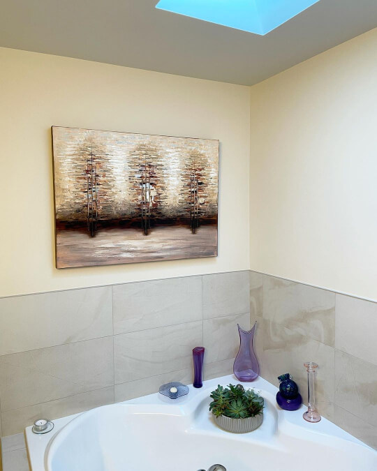
This isn’t a super popular color, so if you want to be original, it’s a great choice!
Benjamin Moore Tapestry Beige
You might think that I have totally lost the plot with this one, but bear with me:

Tapestry Beige has an LRV of 61.
Tapestry Beige is absolutely a light beige paint color, and not even an off-white anymore. However used with dark paint colors, especially on exteriors, it can look like a beautiful cream:

One more for the sake of being right:
This color is surprisingly similar to Benjamin Moore Manchester Tan.
Valspar Cream in my Coffee
Cream in my Coffee is one of the first colors that I ever wrote about!

Cream in my Coffee has an LRV of 72.
Cream in my Coffee is a pretty neutral off-white. This one should be a lot more popular than it is, because it’s such an easy to use color. I just don’t think anyone can take offense to it.
Read more here: Valspar Cream in my Coffee Color Review (and Secret Dupes!)
Benjamin Moore Seapearl
Seapearl is also known as China White. This is a super creamy off white that manages to also be pretty neutral.

Seapearl has an LRV of 76.
I was going to say that it reminds me of Dove Wing, but of course it does! They’re on the same color strip:
Here is Seapearl on kitchen walls and cabinets:

The doors and trim are painted in Simply White. It’s hard to tell, but the ceilings are Simply White as well.

The Best Cream Paint Colors Summarized
I hope you enjoyed this post! Here is a quick recap of all the colors we covered:
I have written a thing or two about white and cream paints before! Here are some other posts that you can dabble in:


This is super helpful. Thank so much!
Comments are closed.