Alabaster and White Dove are both creamy white paint colors with pretty similar neutral undertones. Here we will take a look at the differences so that you can make the best decision for your home!

I do also have a whole post for Alabaster, and the same for White Dove.
This post may contain affiliate links. Should you choose to make a purchase through one of my links, I may receive a small commission at no cost to you. I only recommend products that I use.
Before we hop in, I just want to clarify that we are comparing the uber popular Alabaster from Sherwin Williams to Benjamin Moore White Dove. Benjamin Moore has their own color named Alabaster, but that isn’t what we will be discussing here.
Visual Differences Between Alabaster and White Dove (Let’s Talk Undertones!)
In my opinion, based on countless interiors and exteriors, the main difference between Alabaster and White Dove, is that Alabaster is a bit more gray, and leans ever so slightly more yellow than White Dove.
White Dove in turn reads a little bit “brighter” but not necessarily lighter (although it is), and is slightly more peach in undertone.
Here is a look at each of these colors with a more “true white”, so that you can have a visual of what we’re talking about.

It’s pretty subtle because both colors have what I would call a beige undertone. Warm, but fairly neutral.
We will now get into the difference between these colors “on paper” so to speak, but this is my observation from real life.
Technical Differences Between Alabaster and White Dove
If we look at White Dove and Alabaster side by side without any lighting variables, this is what we get:

These colors do have pretty similar undertones, so completely flat like this it almost looks like Alabaster a slightly darker version of White Dove.
Here are both marked on the color wheel:

I would love to explain based on this, why White Dove in real life looks more peach than Alabaster, but the only possible explanation is that the extra gray in Alabaster cools it down.
LRV of Alabaster vs White Dove
Now let’s talk LRV!
“What’s that?” You ask:
The LRV (Light Reflectance Value) of a color indicates on a scale of 0 – 100 how much light a color reflects (or doesn’t reflect). True black has an LRV of 0 and pure white has an LRV of 100.
In the paint world, we are working in a range of about 3 – 93 because no paint color is purely black or completely white.

Both Alabaster and White Dove are true whites, but with an LRV of 82, Alabaster is right on the line of white and off-white.
Benjamin Moore claims that White Dove’s LRV is 83.16, but they recently changed how they measure LRV, and prior to this it was listed as approximately 85. Their scale is not the same as Sherwin Williams, so for the sake of a true comparison, I think an LRV of 84 for White Dove would be more accurate.
Any way you look at it, White Dove is lighter than Alabaster. I just believe it to be even a little bit lighter than the difference between 83.16 and 82. For example, Snowbound has an LRV of 83, and you can see that it is still darker than White Dove.

See the difference between these two in your home with peel and stick samples from Samplize! Did you know that white colors are difficult to formulate accurately in tester pots? Those little drops of pigment work in gallons, but sometimes they just have to do their best in mini sizes.
Samplize samples are made with two coats of genuine paint, so you know they are color accurate. Get your sample of White Dove and Alabaster, and get to testing without the guessing.
How Alabaster and White Dove Compare Inside Real Homes
Now that’s enough yapping about the difference. Let’s see it in real life!
It’s important to remember that the colors are very similar, and in each room the lighting and other decor will not be 100% the same, so sometimes White Dove may look darker than Alabaster, etc.
Alabaster vs White Dove in the Bathroom

In this first comparison you see a pretty typical look to White Dove and a cooler look to Alabaster. In both rooms it is the same color on walls, trim, ceilings, etc. and that will always make a color look its most white.

Here is a full look at the White Dove bathroom:

…and the Alabaster one:

Now let’s see each color with its strongest warmest look. Here is White Dove:

Of course the light is quite warm there, but in this next picture Alabaster has also been set up:

In this bathroom with the cooler and brighter trim in Extra White, Alabaster looks quite off white.
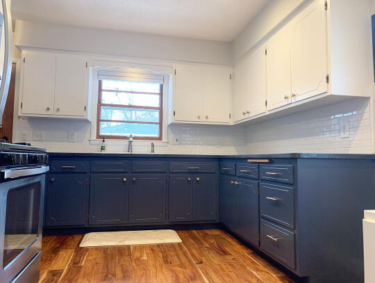
Comparing White Dove and White Dove on Kitchen Cabinets
Probably the most popular place for each of these whites, is on kitchen cabinets!
Here is a look at both:

Did you catch that? It’s Alabaster in one kitchen on the top, and White Dove on different cabinets on the bottom. I was super proud to have found both Alabaster and White Dove in similar lighting from a similar angle!
Honestly, I think they look pretty much the same here. Particularly because it’s artificial lighting.
In nearly all the kitchens I have photos of, White Dove looks very white. This is the creamiest that I have:
The photo I used in the comparison was actually cabinets from a built-in:

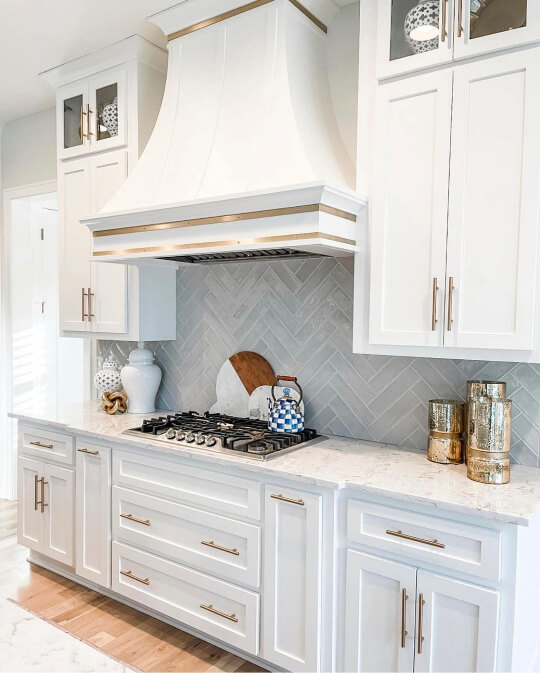
Here is Alabaster looking creamy on kitchen cabinets:

And here is another kitchen with slightly better lighting but the same creamy look:

Both of these colors can look like a true white, but I would say that Alabaster still looks softer. Here are two examples:

Here is White Dove where it looks its most white on cabinets:
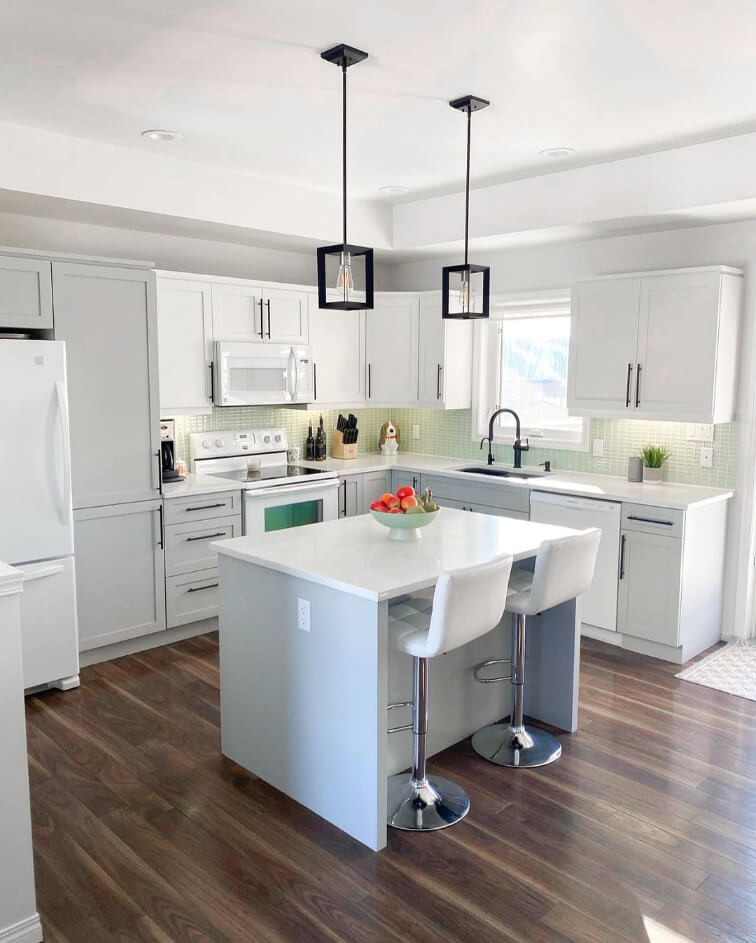
The light gray of Benjamin Moore Silver Satin should really have made White Dove look warm on these upper cabinets, but it’s still very white.
This is all-White-Dove-everything in an office, including cabinets:

It doesn’t look cold, but it doesn’t look warm either.
Alabaster vs White Dove in the Living Room
Here is another look at what I believe to be the true undertones of each of these colors:

You can see that White Dove looks a bit more peach and Alabaster is a little more gray, but also a touch more yellow.
If you were to use only White Dove or only Alabaster, the undertone would be very difficult to pick out. It exists primarily in contrast with other whites.

For more white on white combos, check out my post: White Walls with White Trim? (Alabaster with Pure White & More!)
To illustrate the point more, here are some rooms where the only white is either White Dove or Alabaster. That mean walls, trim, ceilings, the works!
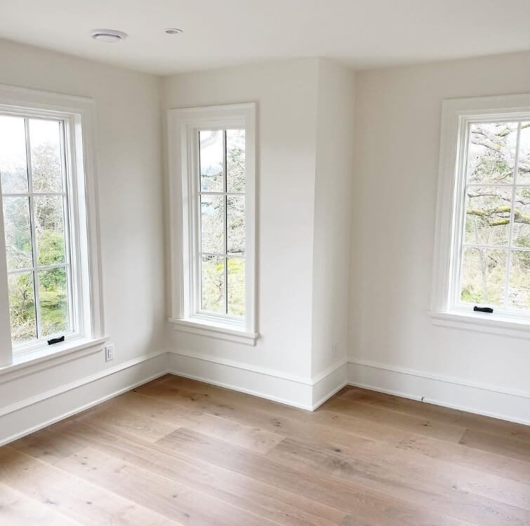
This beautiful room is all White Dove. You can see that it looks quite white, just like it did in the office. It is still warm here, and up near the ceiling you can just pick out the undertone.
This look is all Alabaster:

This again looks very white, but with a little bit of softness. There is nothing stark about it! I feel like the undertone here is very neutral. You can tell it’s not a bright white, but it’s hard to put your finger on any color.
Guess which color this next one is:

I’ll give you a moment to guess this one too:

The first was all White Dove, and the second is Alabaster.
Again, both appear very white. I feel like White Dove was looking a little bit whiter (apart from the warm lights) and you can just barely peep the undertone in the Alabaster photo.
Alabaster vs White Dove on Exteriors
Moving outside, let’s take a look at each of these colors on exteriors:

In both of these pictures the color looks quite warm. White Dove is the top photo and Alabaster is the bottom half.
Here is another combo:

This one is also White Dove top and Alabaster bottom. In this one I can really spot the difference in the undertone. Both look like a fairly neutral creamy color, but White Dove definitey leans more peach-beige, and Alabaster leans more yellow-beige.
Here is Alabaster looking as white as possible outside:
I find this to be uncharacteristically cool, and not something you should really expect. Let’s see the unexpected for White Dove as well:

Here White Dove looks almost green. I have a couple guesses:
- There could be a lot of reflection from the grass
- The yellow of the windows may be making White Dove look cool and green in comparison
- Possibly the purple flowers are tricking the camera into picking up the complementary color green
Here is that same exterior looking more normal:

Now for White Dove’s whitest look:
I’m surprised at this one to be honest. Typically in snow, any white paint color will look quite creamy.
Now for a warm look from the same house:

Followed by a nice warm look from Alabaster:

For both of these colors you should expect them to look pretty white outside. Most colors look lighter and brighter on exteriors. If you want a truly creamy look, try an off-white like Oyster White or Shoji White.
You may also like this post: Stunning White Paint Colors for Classic Brick Exteriors
White Dove or Alabaster for Trim?
Whether Alabaster or White Dove is better for trim depends a lot on your wall color. Personally I like to have a harmonious contrast between walls and trim.
For neutrals, I would choose the white that has the most similar undertone to the wall color you have chosen. For other colors, it mostly comes down to personal preference, since these two are so similar.
I would be more likely to use White Dove with blue or gray walls, because Alabaster may look a little yellow in comparison.
Is Alabaster or White Dove Better?
I hope this helped you understand the difference between these two colors a little bit better.

If you want my opinion: I go back and forth!
I think I prefer the undertone of White Dove, but sometimes the little bit more gray in Alabaster is nice.
- If you want a white more than a cream, go with White Dove
- If you want something super soft, and you don’t mind it veering into off-white territory, go with Alabaster
Not sure yet? Check out these other posts:


