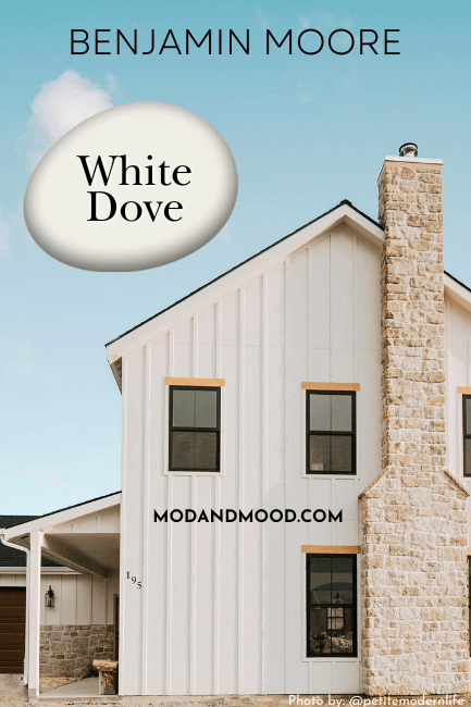
Benjamin Moore White Dove is a creamy (but fairly neutral) white paint color that always seems to take a back seat to favorites like Swiss Coffee or Sherwin Williams Alabaster.
This color is every bit as versatile, and I happen to like it better too!
Let’s take a look at all things White Dove, from color palettes, to undertones, and of course real homes! If you’re looking for dupes for White Dove, I moved them here: Revealing the Sherwin Williams Version of White Dove (Plus Dupes from Other Brands!)
This post may contain affiliate links. Should you choose to make a purchase through one of my links, I may receive a small commission at no cost to you. I only recommend products that I use.
What Color is Benjamin Moore White Dove? (OC-17)
So why is White Dove a designer favorite?
Benjamin Moore White Dove is a soft white paint color that is not an off-white, nor overtly creamy (at least not 100% of the time). It is warm, and it can look creamy, but it’s still a pretty true white.
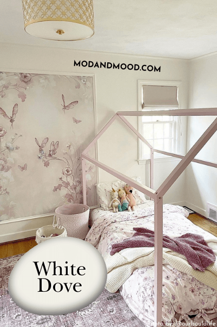
Basically: White Dove is the best of both. It’s white, and you can use it like a regular white, but it is also soft and you can make it look very creamy depending on your coordinating colors and trim choices.
White Dove is sometimes called Benjamin Moore “Dove White,” but there is no such color, it’s just a little mix up.
Of White Dove, Benjamin Moore says:
“Unerring style defines this clean and classic white.”
Tell me Brenda in Marketing got sick of writing color descriptions without telling me…
LRV of Benjamin Moore White Dove
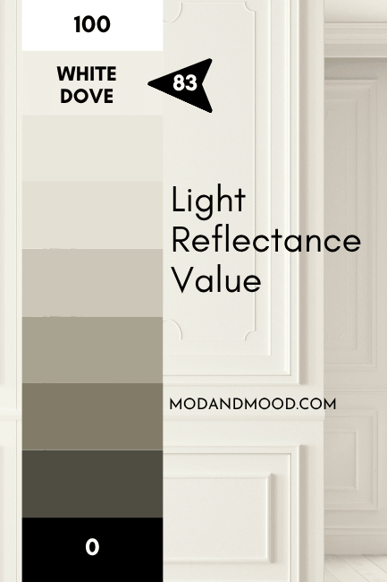
The LRV of White Dove according to Benjamin Moore’s new measuring system is 83. I respectfully disagree and will leave it at 84, between the old value of 85, and the new one.
What is an LRV anyways?
The LRV (Light Reflectance Value) of a color indicates on a scale of 0 – 100 how much light a color reflects (or doesn’t reflect). True black has an LRV of 0 and pure white has an LRV of 100.
In the paint world, we are working in a range of about 3 – 93 because no paint color is purely black or completely white.
True white paint colors have an LRV of about 82+. White Dove isn’t the brightest most reflective white, but it isn’t an off-white.
What Are the Undertones of White Dove?

White Dove is in the yellow color family, but it doesn’t look yellow thanks to a good dose of gray. That keeps it quite neutral.
I want to quickly show you the Benjamin Moore stock photo of White Dove, which is pretty stinking off if you ask me:
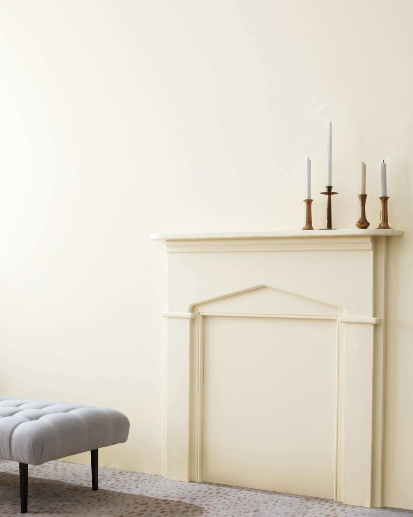
I would not say that it ever looks as buttery as this official photo would have you believe! (You will see in a moment some real-life spaces that have all White Dove walls.)
If it’s going to veer into color-land, I find that White Dove can occasionally lean ever-so-subtly peach. It tends to pick up on the warm orangey tones of artificial light perhaps a little more than your average white.
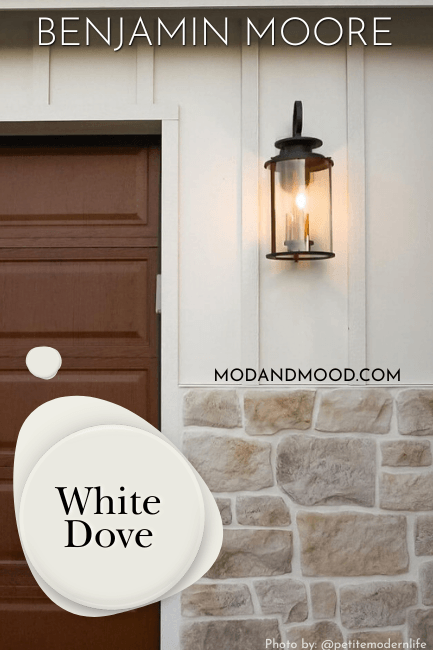
I took the photo above myself, of a completed project done in White Dove and Tricorn Black. It’s just a snippet of the color, but you can see that it’s nothing like the Benjamin Moore photo.
To get the absolute BEST idea of what White Dove will do in your home, get yourself a sample from Samplize!
Samplize is the best way to test white paint colors specifically, because those can be hard to mix accurately in small format sample pots. Samplize makes their samples with two coats of real paint, so you KNOW it’s color accurate.
Does White Dove Look Green?
I have seen literally hundreds of photos of White Dove, AND I have used it in real life, and I had never seen it looking green. You could say I was pretty darn confident that it doesn’t ever look green, until I sat down to write this post…
And whadda-ya-know, here comes White Dove nevering like it never nevered before:

The good news is that this is an unusual situation.
I happen to know that Word of Mouth Painting operates on Vancouver Island, which is very much like the PNW.

And?
It is a very lush green area, and as we know, white is very reflective. I think White Dove can in very green situations, reflect green, much like many whites theoretically could.
Because White Dove has a bit of yellow in it, it also could look green under strong blue reflections. This is probably more of an issue inside. So I would be mindful to test the walls in your home that could put White Dove opposite of any bold blue walls or furniture.

Finally, I think the Honey Harbor trim here being quite yellow is actually tricking our brains into seeing more green in the White Dove.
On this closer photo of the door, it’s not as much of an issue:

In fact if you cover the window, White Dove looks quite white, but if you cover the door it looks a little green again.
Yay brains!
Is White Dove Warm or Cool?
White Dove is a warm white paint color, but you can use it like a neutral. It doesn’t have enough color in it to be worried about clashing, except maybe with other whites.
White Dove in the Benjamin Moore Color Strip
Let’s take a look at the color strip that contains White Dove and several other favorites!
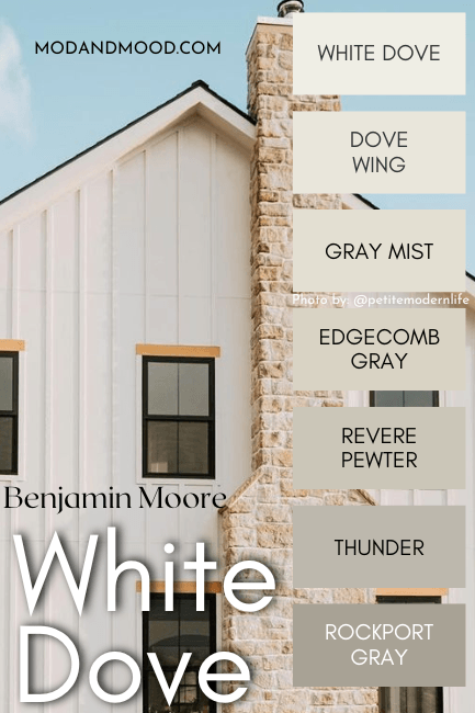
The other colors in this collection are:
- Dove Wing
- Gray Mist
- Edgecomb Gray
- Revere Pewter
- Thunder
- Rockport Gray
Lighter Version of White Dove
If you are looking for a white paint that reads just a little lighter than White Dove, I would recommend Sherwin Williams Pure White.
I would say the same if you are looking for White Dove at 75% strength. Pure White is also a soft white. Technically it isn’t lighter than White Dove, but it’s a little more gray than creamy, so it reads lighter on the wall.

For a lighter brighter white that’s still just as creamy, try Benjamin Moore Simply White.
Darker Version of White Dove
Dove Wing is a great choice if you are looking for a color that is just a little darker than White Dove.
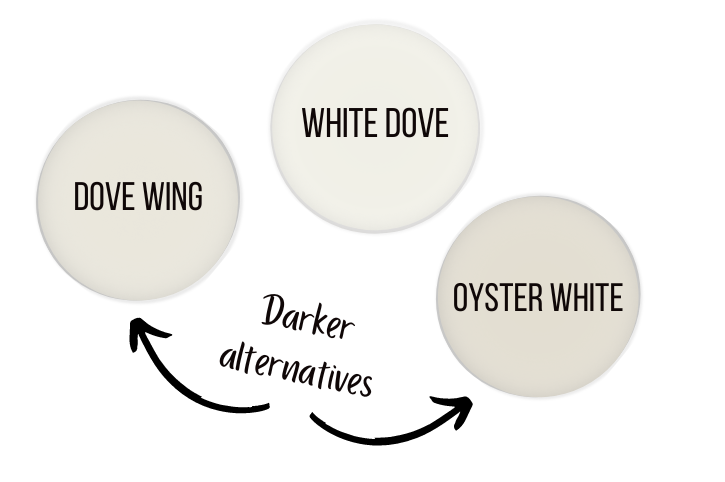
In the same vein of off whites, you might also like Sherwin Williams Oyster White.
Benjamin Moore White Dove in a Color Palette
This palette was easy to make because there are a few favorites that people always like to see with White Dove, so I stuck to the “Best of Benjamin Moore” if you will:
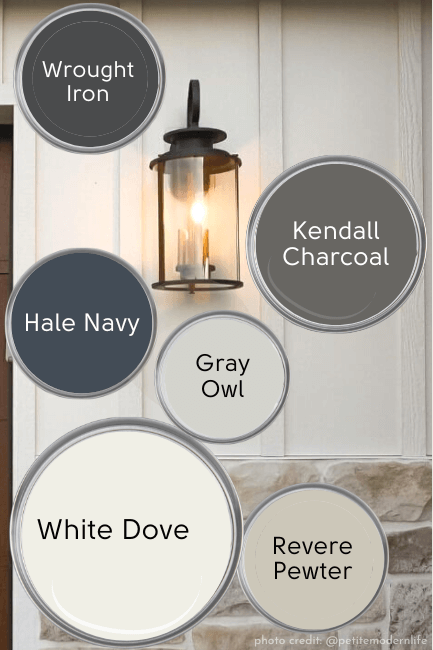
Coordinating Colors for White Dove
Here are all the favorite coordinating colors for White Dove:
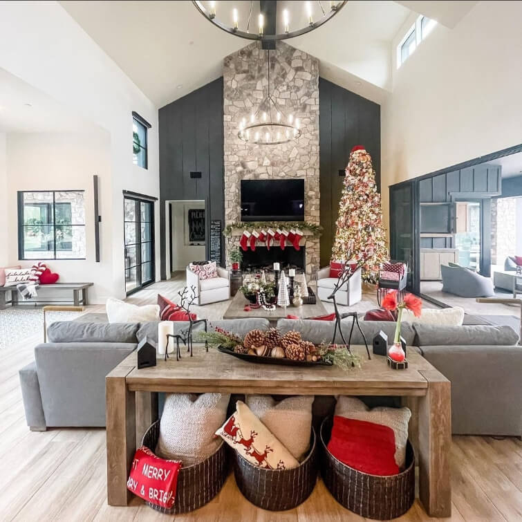
White Dove with Kendall Charcoal or Wrought Iron
This is an “either/or” situation. Both Kendall Charcoal and Wrought Iron are deep charcoal colors that look nice with White Dove.

For less contrast and a bit more warmth, Kendall Charcoal is a great choice for exterior trim or accent walls with White Dove.
Wrought Iron will give you maximum contrast without actually being black, and it has an overall cooler/smokier look than Kendall Charcoal, which is just lighter.
If this is the type of pairing you like, you will also love White Dove with Sherwin Williams Iron Ore:
Behr Cracked Pepper is another versatile charcoal option.
Revere Pewter or Pale Oak with White Dove
When it comes to greiges, White Dove looks great with those too!
Honestly when is the everlasting Revere Pewter a bad choice? (Okay, if you want to be unique then it is…) Either Revere Pewter or Pale Oak look soft and comforting with White Dove.

My personal preference is probably towards Pale Oak, but if you want more contrast between your colors, go for Revere!
If you like these two, you will probably also like Sherwin Williams Jogging Path or Accessible Beige!
White Dove with Hale Navy
Hale Navy is one of Benjamin Moore’s most popular colors ever, and it has a reputation for pairing well with anything, so of course it works with White Dove.
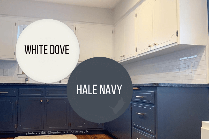
I love this pairing because it is just so luxurious! If I’m choosing a Victorian inspired color scheme, then Hale Navy is definitely in that palette, and White Dove is a perfect white to come along.
Gray Owl and White Dove
Let’s say you want a whole home neutral to pair with White Dove but you want to stick with bird names, (weird, but you do you) Gray Owl would be the perfect choice!
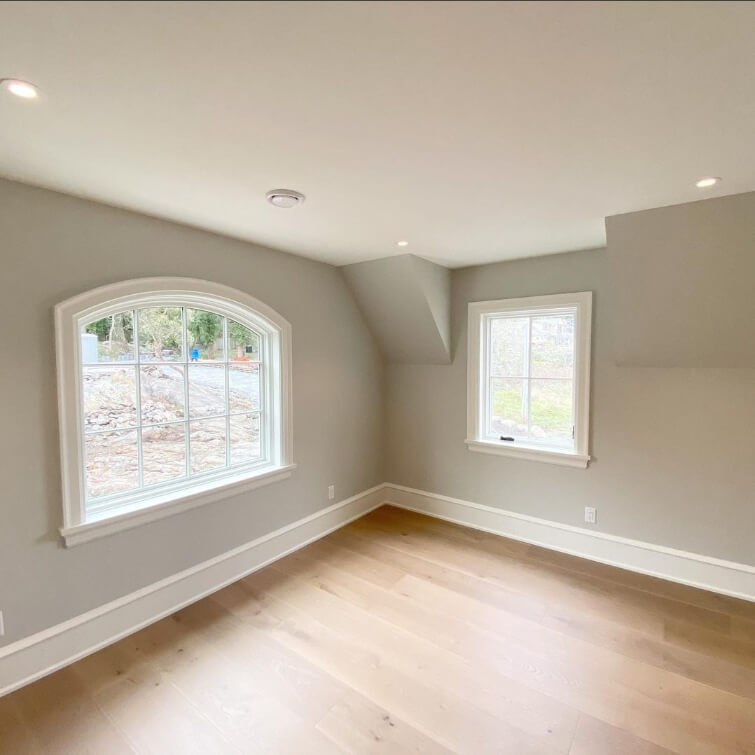
Gray Owl is an interesting greenish grayish neutral (kind of in the same vein as Sherwin Williams Sea Salt). It’s a great option if you are totally over all things beige.
Complementary Color for White Dove
The “official” complementary color (the color directly across the color wheel) for White Dove is a silvery lavender color. Benjamin Moore Whisper Violet is a good match.

Remember that the complementary color is likely to bring out the color in White Dove, so if you want to minimize yellow or peach tones, I would be careful with anything in the purple family.
What Trim Colors Go Best With Benjamin Moore White Dove?
If you are looking to keep existing wood trim, White Dove has enough warmth to look really beautiful with most tones of wood.
When it comes to white paint, simple is often best. If it was my home I would go monochromatic and use White Dove for my trim, ceiling, and doors.
Check out this post for more white-on-white advice: White Walls with White Trim?
If you want some contrast, just choose a different finish. Flat is typically best for ceilings, eggshell for walls, and satin or semi-gloss for trim and doors.
Not the vibe? :
Other White Paint that Goes with White Dove
If you really want to use a different white for your trim, here are the most popular choices:
- Chantilly Lace
- Simply White
- Decorator’s White
- Cloud White
Chantilly Lace Trim with White Dove
Chantilly Lace is my favorite Benjamin Moore white, and often my favorite white for trim, but not in this case.
Chantilly Lace is a good choice if you want to accentuate the creamy tones of White Dove. It will make White Dove look a little more creamy and off white.
For me personally, I would want White Dove to look white, so I wouldn’t choose Chantilly Lace.

Simply White and White Dove
Of the popular choices, I think Simply White is the best. It is pretty creamy but lighter and brighter than White Dove. It will give you some contrast between the trim and walls, without making White Dove look yellowy.
I actually have a few posts about Simply White, and you can find them here: Benjamin Moore Simply White
White Dove with Decorator’s White Trim
Decorator’s White is much cooler than White Dove, so it’s a good choice if you really want to max out the creaminess of White Dove, without making it look darker.
It is also not my first choice, but that’s because I’m not the biggest fan of strong cream colors in the first place, so I like my creamy whites looking more white.
White Dove and Cloud White
Cloud White is an uber popular choice for trim regardless of your wall color. This will give you a monochromatic look, much like using White Dove itself would, so I don’t personally see the point in choosing this one.
Cloud White is actually a little creamier than White Dove, so theoretically it could make your walls look a touch whiter, but I don’t think there’s actually enough difference there.
Can You Use White Dove for the Ceiling?
I mentioned briefly that I would use White Dove for everything including ceilings. It’s totally okay and even a good idea to do so!
If you want White Dove to look it’s crispest, whitest, best on your walls, you slap it up on your ceiling too!
Let me show you the difference between a true white on the ceiling (Chantilly Lace) vs White Dove on everything:

See how creamy White Dove looks?
Compare that to:
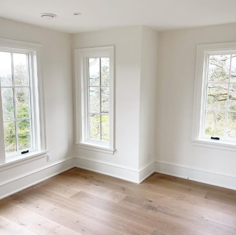
It makes SUCH a big difference.
Of course maybe you want a creamier look, that’s totally valid and completely up to you:
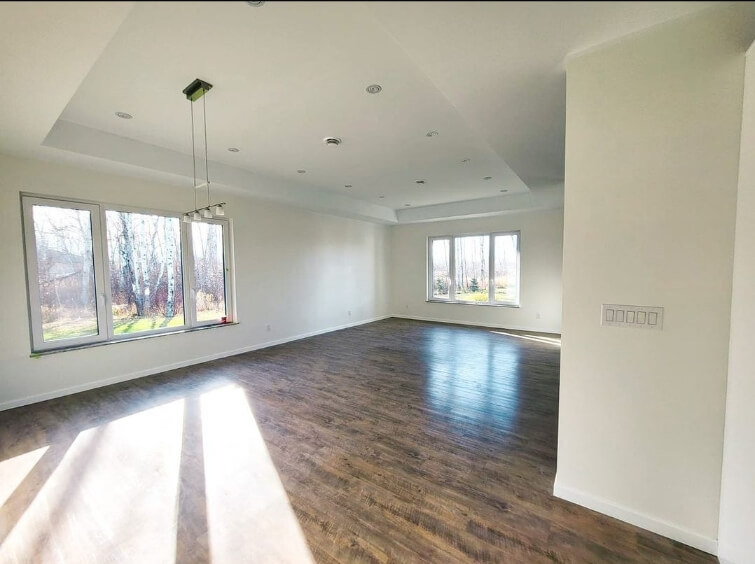
…but if you fear the yellow, go all in:

That upstairs hallway looks bright and breezy in an outfit of all White Dove.
Benjamin Moore White Dove for Your Home’s Interior
As per usual I will try to go through these gorgeous examples in an orderly fashion, and the best way is to organize by room!
That means you might see the same house in a few different places throughout this post.
Benjamin Moore White Dove in a Living Room
Our first photo shows off the creamier side of White Dove. With warm artificial lighting in this lower-light room, you can see that White Dove looks quite soft.
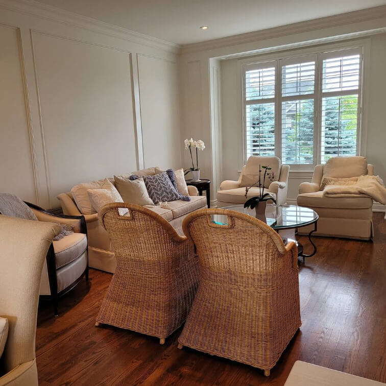
Stef’s Quality Painting (@stefsqualitypainting) did an amazing job giving this whole home a White Dove makeover.
The walls, trim, and ceilings are all White Dove in different sheens.

How is that for luxurious glam?
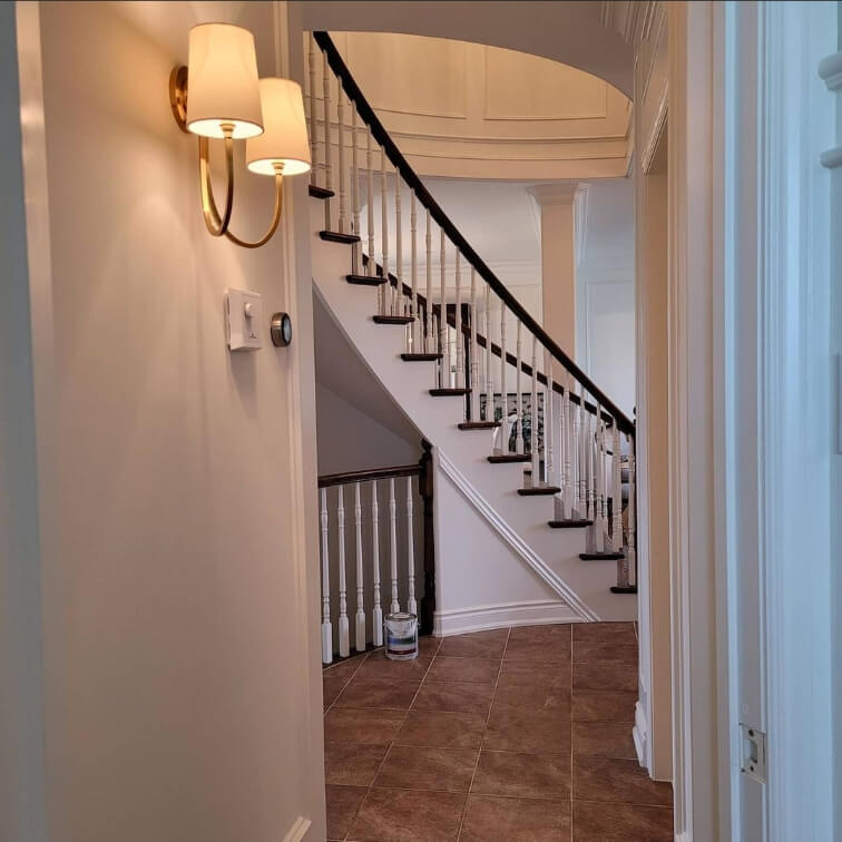
This transition area between the entrance and stairs is naturally one of those darker areas in your home (like a hallway). Here you can see how White Dove looks in an area with less light.
White Dove in a Formal Dining Room
Continuing through this same house by Stef’s team, we can see White Dove looking warm and mellow in the formal dining room as well.
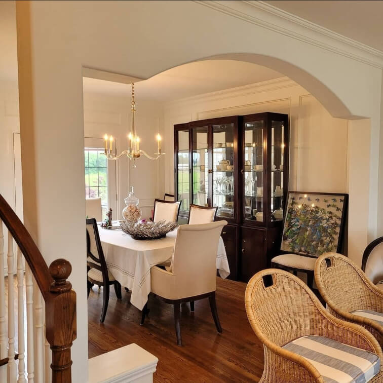
You can see that all of the lights are very warm, so this is much creamier than White Dove will look in either natural light, or with a more neutral artificial light.
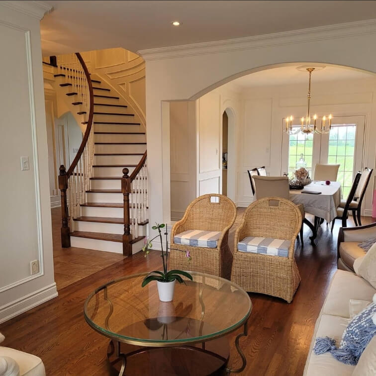
Powder Rooms and Bathrooms in Benjamin Moore White Dove
Finishing up at the gorgeous home by Stef’s Quality Painting, we can see that same woodwork and White Dove in this bougie little powder room.

White Dove looks amazing next to those pops of gold!
Next up let’s take a look at a White Dove bathroom with a little more color!
Christina (@ourbouldlife) is a great big HUGE fan of White Dove. When she was designing her laundry room (which we will see in a minute) she said:
“It was super cute and adorable, really, of me to get these white paint swatches thinking that I was going to pick a color that wasn’t White Dove. ITS JUST SO PERFECT EVERYWHERE.”
If you wanted a testimonial to send you over the edge in favor of White Dove, there you go!
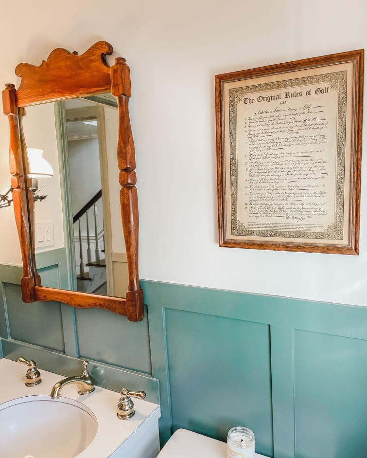
In her bathroom, Christina went with Benjamin Moore Caldwell Green for both the board and batten and the trim.
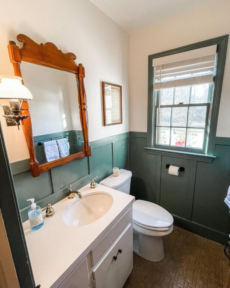
If you like this look you will love my post: Fabulous Sage Green Trim Colors to Uplevel Your Aesthetic (See Real Homes!)
White Dove in a Laundry Room
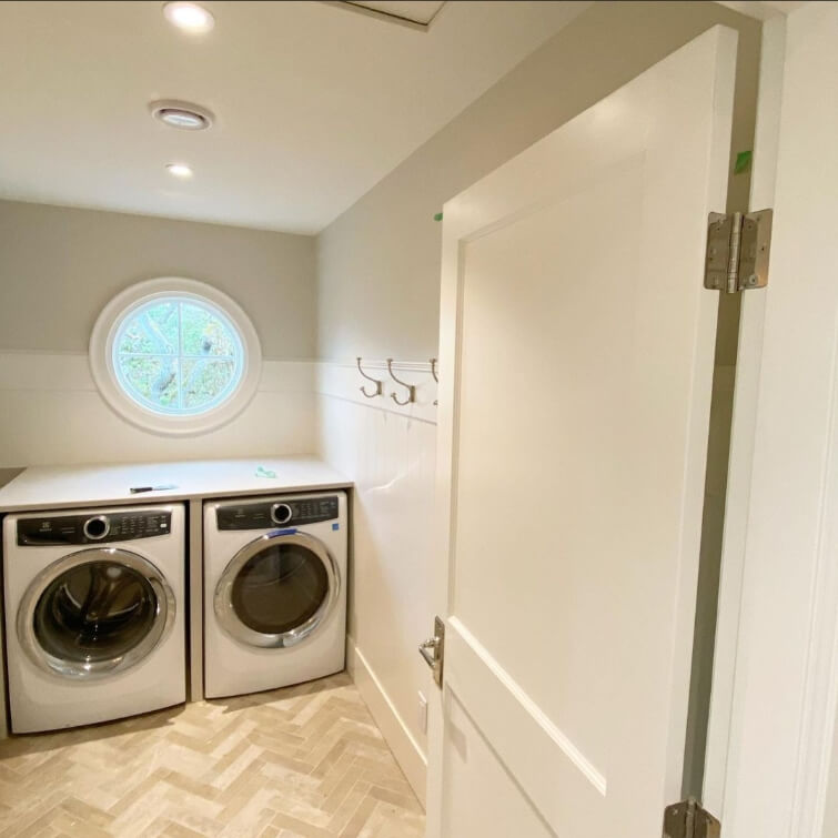
I really think that Christina is a bit of a color expert. She uses White Dove throughout her house as a base, but she isn’t scared to feature pops of less expected colors in each space.
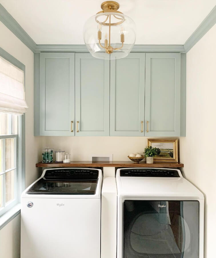
In her laundry room she color matched the trim paint to her cabinets which were the manufacturer’s color “Haze.” For something similar, try Benjamin Moore Gossamer Blue:

I am seeing a bit more peach in these walls, and I am pretty sure that’s partially from a filter, and partly because this blue color is complementary to White Dove, so it’s bringing out the undertone more.

Benjamin Moore White Dove in the Bedroom
I have a few restful bedrooms to show you in Benjamin Moore White Dove.
The first is half White Dove and half Woodlawn Blue, by Adrien at Word of Mouth Painting (@word_of_mouth_painting).

It’s a little hard to pick up in the photo, but the lower half is a shiplap style wainscoting. Word of Mouth uses White Dove quite regularly, and it is also the trim and ceiling color in this home.
Benjamin Moore White Dove in a Nursery
Back to Christina’s for this beautiful little girl’s room/nursery:
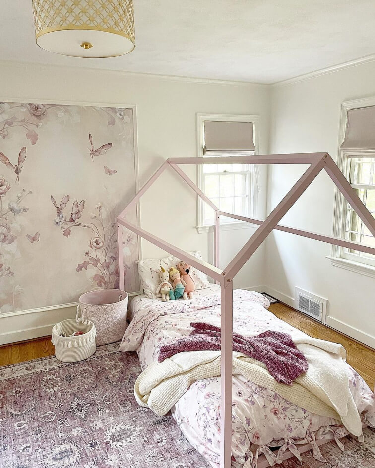
White Dove looks beautiful with little splashes of lavender!
Bear in mind if you are considering this look, that purples will make White Dove look more to the yellow side of cream.

A Home Office in Benjamin Moore White Dove
Of course Christina has more inspo for you! White Dove is her favorite, why would she not?
Here it is looking marvelous on some built ins in her home office:

Yes please!
Side note: I love the texture on her ceilings. I don’t know what it is, but it’s subtle and perfect.
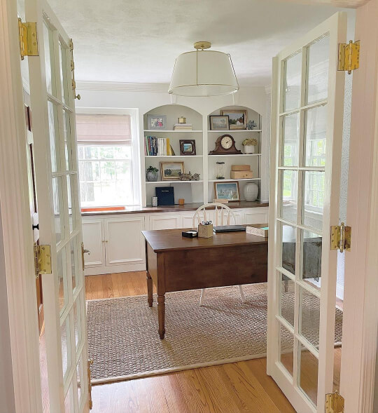
Finally for offices, we have a beautiful and classy space by Thrive All Projects (@thriveallprojects):

This room is another example of all-White-Dove-ere’thing. It’s on the ceiling, walls, cabinetry, and trim. I definitely think this is a north facing room, because you can see that White Dove is looking it’s absolute coolest.

I actually thought it was going to be Chantilly Lace when I first saw this room, because it looks like such a crisp true white.

So beautiful!
Is White Dove a Good Choice for a Fireplace?
I wasn’t sure where else to put this, but with white paint colors people are always curious about using them on a fireplace.
White Dove would be a really nice choice for painted brick. It has a subtle softness that works amazing on textured surfaces.
Here are a couple of other fireplaces in White Dove:
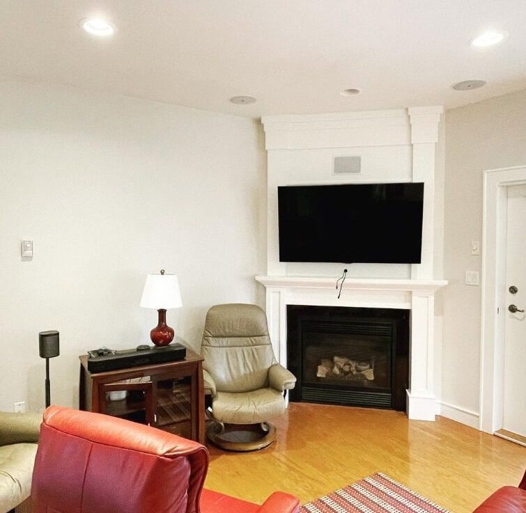
The walls in this first photo are Benjamin Moore Dove Wing.
In this next living room the fireplace is painted out with White Dove, and the inside is Benjamin Moore Escarpment. (Which looks quite gray here, but is normally a little more taupey.)
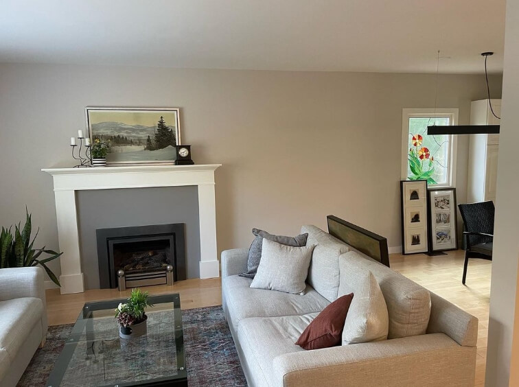
The wall color here is Benjamin Moore Olympic Mountains.
Benjamin Moore White Dove on Kitchen Walls and Cabinets
Kitchen cabinets are one of the odd places that White Dove just isn’t used very much.
There is no good reason besides that maybe people tend to lean towards a crisp bright white in their kitchens rather than a soft one.

This first kitchen by Thrive All Projects shows off how clean White Dove can look with other neutral finishes and white tile backsplash. You can see that there is a subtle softness to White Dove, but it doesn’t look at all yellow against the tile.
Here is another kitchen, this time by the team at Headwaters Painting (@headwaters_painting_llc):

The lower cabinets are painted in Benjamin Moore Hale Navy.
This next kitchen looks much cooler. This is how you can expect White Dove to look in a North-facing room:
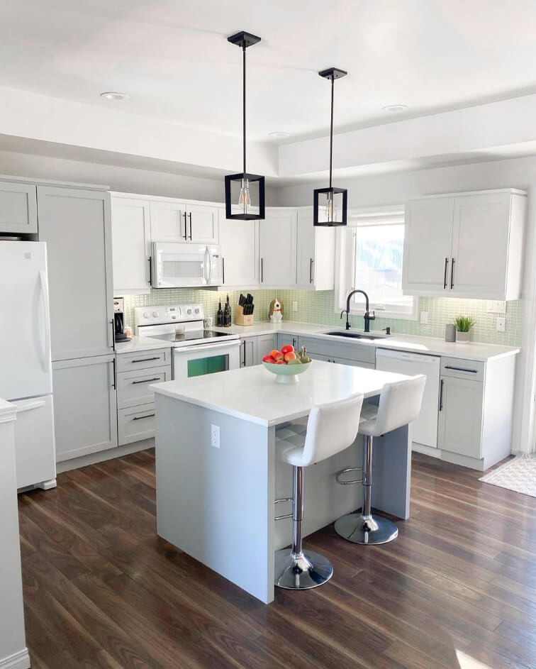
The gray cabinets are Benjamin Moore Silver Satin. (Similar to Behr White Metal.)
For more two toned cabinet inspo, check out this post: 27+ Fresh Two-Tone Kitchen Cabinet Ideas (With Pictures!)
Perhaps the best cabinet photos we have though, are actually in the office we saw earlier:

Just so pretty!
Can You Use White Dove with Carrara Marble?
If you want White Dove to look white, then you can use Carrara marble but you will want to be careful. Carrara marble pieces with a lot of gray veining will make White Dove look more off-white because they are so cool.

Try to get a slab with more white in it, and choose warmer toned hardware to help White Dove look neutral. (Gold, copper, rose gold, or brass.)
How Benjamin Moore White Dove Looks on a Home Exterior
White Dove is a great choice for exteriors because this is one place where the lightest brightest white is often not the best choice. Exterior colors always look lighter and a good exterior white is one that has some creaminess.
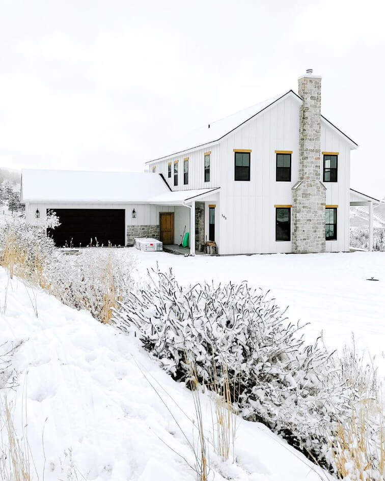
Let’s start with what I think is probably the best example of a White Dove exterior, because we can see it in all different lights.
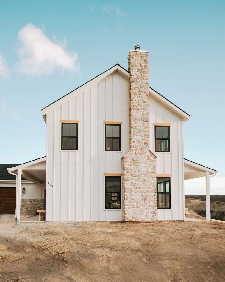
This European-inspired farmhouse belongs to Karissa of @Petitemodernlife.
Probably the best test of how white a color is, is to see it on a snowy day. Here you can see that White Dove really is not an off-white:
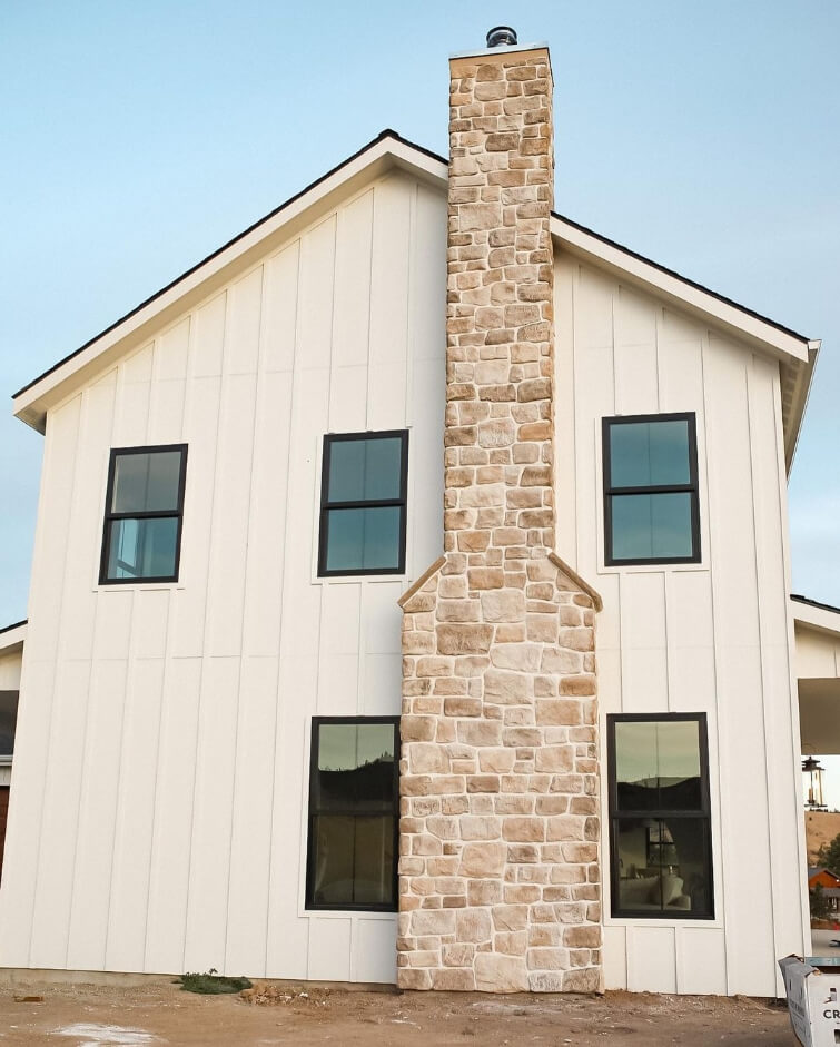
For the warmer side of White Dove, check it out during sunset golden hour:
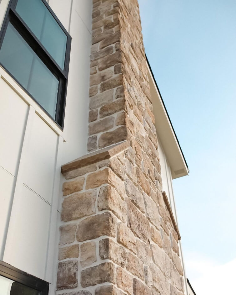
Here is one final picture of it looking quite creamy:

I love how it looks with the wood garage door and bronze lantern.
Exterior Stucco in White Dove
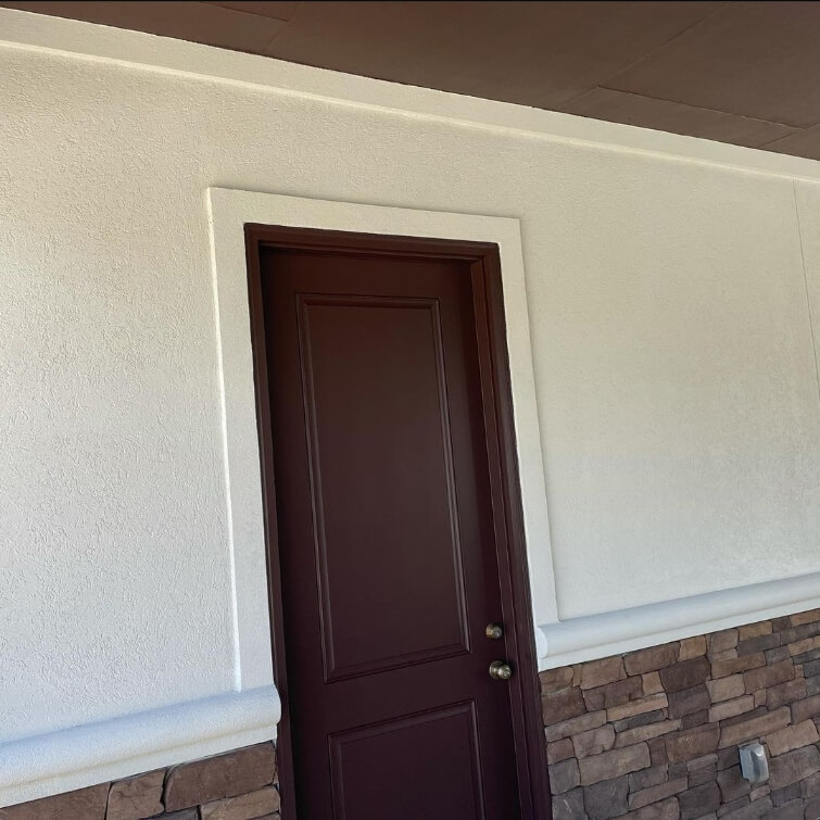
On this stucco home by S & L Painting (@slpaintingsf), White Dove looks like a nice neutral white, without being too bright and washed out.

The dark brown trim and doors are Benjamin Moore Incense Stick.
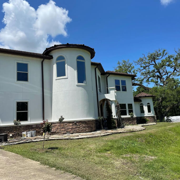
The trim color reminds me a bit of Sherwin Williams Black Fox. If you like this color with White Dove, but find it just a touch too warm or brown, you would probably love it with Urbane Bronze.
Where we are sadly lacking is to see White Dove on a brick exterior. I feel like this is how you know the color really is overlooked. (Well that and how little it is used on cabinets!)
For similar inspiration, or to see other solid choices for white brick, check out my post: Stunning White Paint Colors for Classic Brick Exteriors
White Dove Compared to Other White Paint Colors
When it comes to white paint colors there are just waaay too many to choose from (trust me, I know!) and likewise there are too many to compare here and keep your attention.
Here are just a few popular white paints compared to White Dove, and I will put the rest in a separate post coming real soon!
Benjamin Moore White Dove vs Dove Wing (OC-18)
First up let’s compare the few colors with similar names, just to clear up which is which!

As we saw on the color strip, Dove Wing is similar to White Dove, but it’s a true off white.
Benjamin Moore White Dove vs White Winged Dove (1457)
I mean honestly, Benjamin Moore has White Dove and Dove Wing, did they really also need White-Winged Dove?

White Winged Dove is a taupey soft gray, so it’s not particularly similar to White Dove or Dove Wing. It’s closer to what you think of if someone were to say “dove gray.”
Benjamin Moore White Dove vs Kelly Moore White Dove (32)
Kelly Moore’s version of White Dove is actually pretty close to Dove Wing. It’s an off-white sandy color.

Benjamin Moore White Dove vs Swiss Coffee (OC-45)
Benjamin Moore’s version of Swiss Coffee is actually very VERY similar to White Dove:

So what is the difference?
Swiss Coffee is a little more beige and less gray than White Dove. Is the difference visible? You tell me:

Chrissy from @simplyslade used White Dove on the trim and Swiss Coffee on the walls throughout her home. In some pictures I think I can see it, but many I can’t.
This is far from the only Swiss Coffee color, see them all in this post: Swiss Coffee Paint Colors Reviewed (Are They All the Same?)
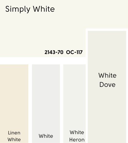
Benjamin Moore White Dove vs Simply White (OC-117)
Simply White, as we discussed earlier, is lighter and brighter than White Dove. It’s one of the lightest whites that Benjamin Moore makes.
Benjamin Moore White Dove vs Chantilly Lace (OC-65)
Chantilly Lace we also saw earlier. It’s a light bright white that is still a little warm.

Chantilly Lace is the white for you if you want a true white with no real undertone that also isn’t stark.
Benjamin Moore White Dove vs Sherwin Williams Alabaster (7008)
Alabaster is a little bit darker and more gray than White Dove.

On paper, Alabaster leans more orange-beige than White Dove does, but in reality I find that Alabaster is the more likely of the two to look yellow.
See the full comparison here: Alabaster vs White Dove (What’s the Right White?)
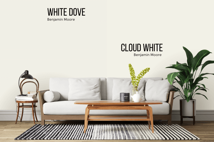
Benjamin Moore White Dove vs Cloud White (OC-130)
Cloud White is a touch lighter and a touch more yellow than White Dove. I find on the wall that the extra hint of yellow is more obvious.
Dupes for Benjamin Moore White Dove
If you want to see color matches for White Dove, check out my post: Revealing the Sherwin Williams Version of White Dove (Plus Dupes from Other Brands!)
Normally I would have them in the review, but this just got way too long!
White Dove Pros & Cons
That’s about it for this review, let’s recap!
Pros
- Soft and Classic
- Goes with everything
- A touch of gray keeps it neutral
- Warm but still a true white
Cons
I have to say I am fighting for these cons. I thought of the pros right away, but now I’m stalling!
- Not obviously creamy all the time, if that’s what you’re going for
- Not the lightest white, which may bother you if you want to use it everywhere
Of course I have used White Dove myself, and if there were obvious cons I would not have, so that’s the best I can do.
Not the one? I have sooo many whites, I promise you can find one here. Check out my dedicated white paint colors page, or take a look at these other great colors:


