At first glance, Blank Canvas is quite a nice white. At second glance, it seems almost unnecessary in a sea of Behr (and other) whites.

Luckily I will take you for a third glance, and you will see what Blank Canvas brings to the table, and perhaps most importantly, how it compares to the Behr OG: Swiss Coffee.
What Color is Behr Blank Canvas? (DC-003)
Blank Canvas is a creamy white with a natural feel:
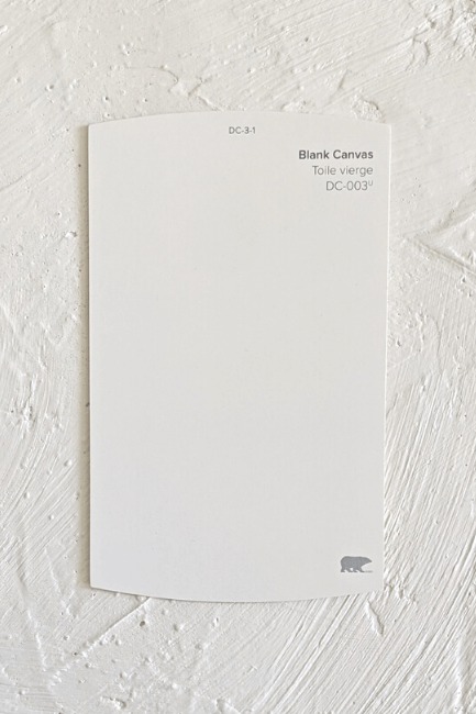
I don’t know how else to describe it. It’s a beige white that would fit right in with shoes, clothes, or home decor items that are the color “natural.”
This color was chosen as the Behr “Color of the Year” in 2023, and what has surprised me the most, is that it didn’t get very popular. A creamy white was very “of the moment” and I would say it still is now, but Blank Canvas is just not the white paint color that people reach for.

I think the lack of popularity for Blank Canvas is less about the color, and more about the fact that there are sooo many similar options, and ones that are a lot more time-tested.
Personally, I do really like the color, and I have recommended it a few times on my blog, so don’t knock it out of the running!
LRV of Behr Blank Canvas
The LRV (Light Reflectance Value) of a color indicates on a scale of 0 – 100 how much light a color reflects (or doesn’t reflect). True black has an LRV of 0 and pure white has an LRV of 100.
In the paint world, we are working in a range of about 3 – 93 because no paint color is purely black or completely white.
Blank Canvas has an LRV of 84.
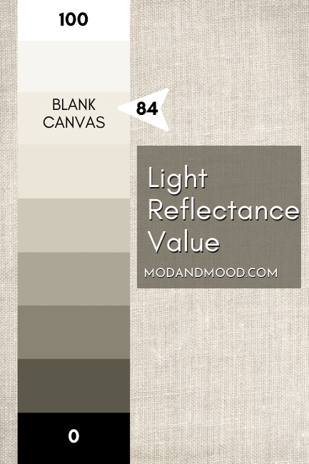
What does that mean?
Blank Canvas is on the mid to dark end of white paint colors. It’s approaching off-white territory, but it’s not quite there. It’s right in the same LRV range as most uber popular white colors.
What Are the Undertones of Blank Canvas?
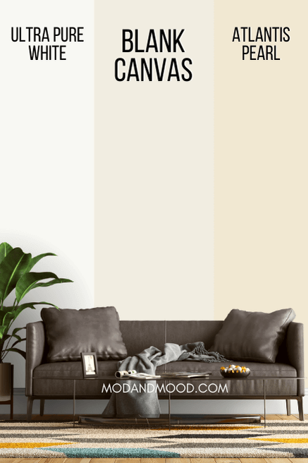
I would describe Blank Canvas as having beige undertones. You can see this particularly well when it is next to bright clean whites.
Occasionally the undertones can veer into peach country, but I wouldn’t say that the color ever looks peach.
Does Blank Canvas Look Yellow?
Blank Canvas is a creamy white, so it will not look like a clean bright white. I wouldn’t say that it looks particularly yellow, but in certain lights it may look that touch of peach.
I will point out the most yellow that it will look when we get to example photos.
Is Blank Canvas Warm or Cool?
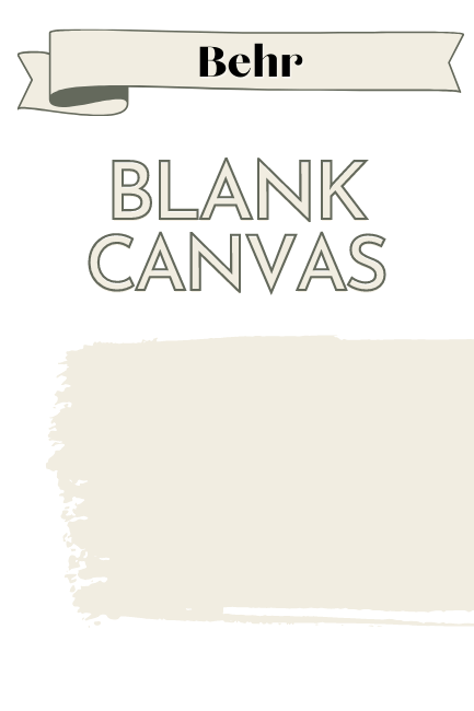
Blank Canvas is definitely a warm white.
White paints are most easily chosen in comparison with one another. Blank Canvas will be more neutral than some reallly creamy options, and it is unmistakably creamy next to the whitest or coolest whites.
How Does Blank Canvas Compare to Swiss Coffee?
I’ll be totally honest and say that I kind of thought Behr was taking us for a ride with Blank Canvas at first. It is sooo close on paper to Swiss Coffee that I can’t even see the difference.
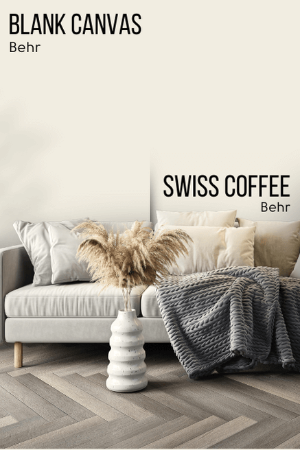
The RGB of Swiss Coffee is R: 241 G: 237 B: 224
For Blank Canvas it is R: 241 G: 237 B: 225
That’s right, it’s a one digit difference.
So do they just want to recreate their most popular white and promote it like it’s a new color? Not so fast, Behr!
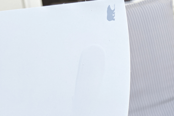
Then I actually picked up the chips, and I can confirm that there is a slight but visible difference between these two colors, and a welcome difference it is!
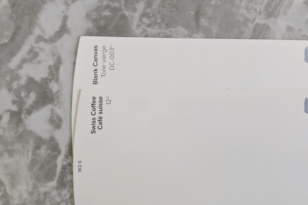
That extra bit of blue does make Blank Canvas slightly more neutral than Swiss Coffee.
That first pic is probably the best photo that I got of the difference, but I felt like doing the most today, so here are some others that I really fought for:
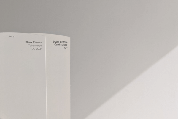
This next one is the Swiss Coffee color card with Blank Canvas swatched over it:

I hope that helps!
If you already have Swiss Coffee on your walls, do NOT paint them in Blank Canvas. I’m still not 100% convinced the difference is much at all once it’s painted, so that would be a waste of your money.
If you aren’t aware, there are actually several different Swiss Coffee paint colors on the market. So the Behr version may not be the one you’ve seen before.
The Blank Canvas Color Strip by Behr
Behr doesn’t have Blank Canvas in a light to dark color strip, instead it is in a white collection:

The other colors on this strip are:
- Whipped Cream (DC-001)
- Statement White (DC-002)
- Winter White (DC-004)
- Natural White (DC-005)
- First Snow (DC-006)
Lighter Version of Blank Canvas
Besides Whipped Cream, which isn’t much like Blank Canvas at all, these whites are all in the same LRV range.
For a lighter alternative to Blank Canvas, try Behr Whisper White. It’s the same tone, just a little lighter.

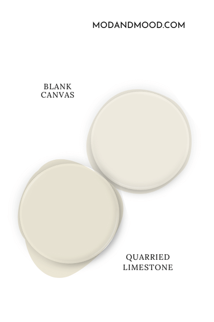
Darker Version of Blank Canvas
For a darker alternative to Blank Canvas, try Behr Quarried Limestone. I put that one on the color strip, and you can see that it’s very similar to Blank Canvas, but it is an off-white.
Behr’s Suggested Color Palette for Blank Canvas
When Behr announced Blank Canvas as their color of the year for 2023, here is the color palette that they recommended:
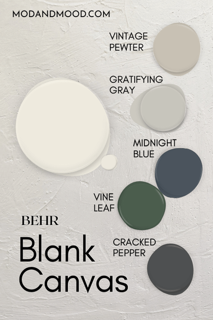
These days their website suggests totally different colors, including a baby blue and baby pink, but I didn’t like any of them, so we will stick with the original choices!
Blank Canvas Coordinating Colors
Vintage Pewter
Vintage Pewter is a greige paint color that looks great with the warmth of Blank Canvas.

If you like this color, you will also like Valspar Warm Putty.
Gratifying Gray
Gratifying Gray is a warm gray, but not quite a greige (in my opinion). It will look like a silvery gray with Blank Canvas. I’m not too sure that I would pair these colors, to be totally honest.
I think that Behr Dolphin Fin would be a similar but better choice.
Vine Leaf
Vine Leaf is a bold dark green. It’s great if you are looking for a rich emerald tone to go with your luxurious warm white (Blank Canvas of course!).
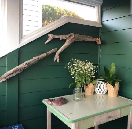
For most people’s taste, Vine Leaf might be a bit too bold, so you may prefer Sherwin Williams Pewter Green or Rosemary better.

You can see a few pictures of Vine Leaf in my post Best Dark Green Paint Colors from Sherwin Williams, Benjamin Moore, and More!
Midnight Blue
Midnight Blue is what it sounds like, a deep navy. Navy blue with the creamy white of Blank Canvas is a pretty traditional combo. This would be perfect for a Victorian restoration.
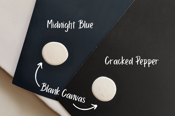
Midnight Blue is similar to Benjamin Moore Hale Navy.
Cracked Pepper
Funny enough, Cracked Pepper ended up being Behr’s choice for “color of the year” in the following year (2024). This color is a deep charcoal rather than a true black.
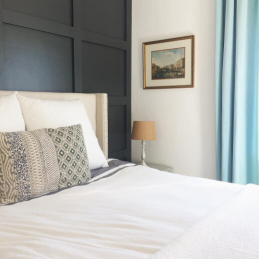
Cracked Pepper has shifting undertones that are most often cool blue, but it can also look like a warmer olive verging on brown. This might be my favorite coordinating color from the list, because it feels the most modern.
(In real life this color is actually not too far off from the 2026 pick from Benjamin Moore: Silhouette. Although that color is definitely more brown than charcoal.)
Better Alternatives to Use with Blank Canvas
Now that we’ve seen Behr’s suggested colors, I would like to propose a slightly modified and toned down version, which is a little more current:

I left in Cracked Pepper and Vintage Pewter, but instead of a bold navy and green, I swapped in a couple of muted options.
Try Blank Canvas and Sherwin Williams Oyster Bay
Oyster Bay is a very calming sage color by Sherwin Williams. It’s fairly light and pairs well with any number of whites, including Blank Canvas!
Here it is pictured with Benjamin Moore Simply White, just for an example:

I replaced Vine Leaf with this shade because it’s a little more versatile, on trend, and decor friendly!
Pair Blank Canvas and Behr Light French Gray
Not to be confused with Light French Gray, Behr Light French Gray is a beautiful muted blue with a subtle green undertone. I happen to have seen it used alongside the creamy white of Valspar Du Jour, and I just fell in love with the combo!
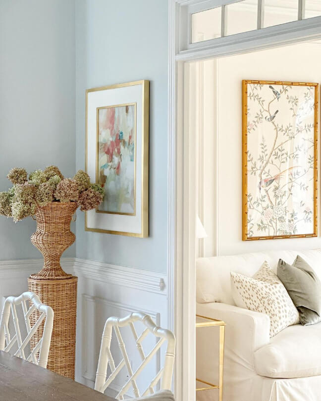
I replaced Midnight Blue with this shade, because Cracked Pepper already has a somewhat blue undertone, so I though a lighter option would be great.
Complementary Color for Blank Canvas
The “official” complementary color for Blank Canvas (the color directly across the wheel) is a powdery violet-blue.
Behr Vaguely Violet is a very close match:
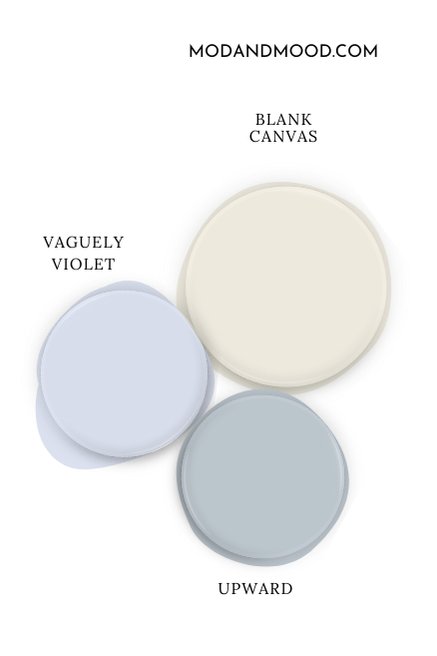
Sherwin Williams Upward would also be a great choice with a more subdued periwinkle undertone.
What Trim Colors Go With Behr Blank Canvas?
On Instagram, Behr offered a customer the following trim suggestions:
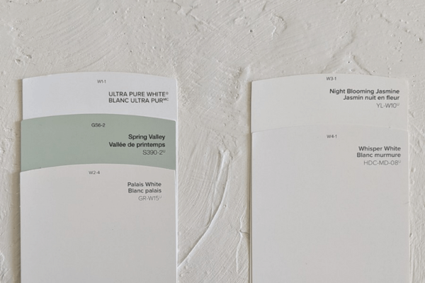
- Palais White
- Ultra Pure White
- Spring Valley
None of these would be my first choice, but let’s take a look:
Palais White Trim with Blank Canvas
Palais White is very similar to Blank Canvas. A little too similar, in my opinion, to be used for trim. You could achieve the same amount of contrast by using Blank Canvas in a different sheen. (Which would be my first choice!)

Try instead:
Blank Canvas with Whisper White Trim
Whisper White is also very similar in tone to Blank Canvas, but it’s light enough to provide a bit more contrast.
Ultra Pure White with Blank Canvas
Ultra Pure White is a nice crisp white, but it will accentuate the creaminess of Blank Canvas. That’s not necessarily a bad thing, but I think Ultra Pure White is a touch too cool, and might emphasize any peach tones.

Try instead:
Night Blooming Jasmine Trim on Blank Canvas Walls
Night Blooming Jasmine is a bright white, but it’s a little warmer than Ultra Pure White. That extra warmth keeps Blank Canvas looking more neutral.

If you are laboring over a color scheme like this, you will love my post White Walls with White Trim? (Alabaster with Pure White & More!)
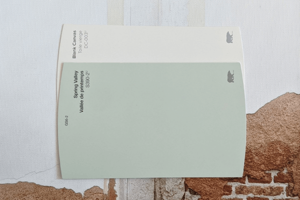
Spring Valley Trim with Blank Canvas
Spring Valley is a bit out of left field for me! I am intrigued by the idea of using a sage green for trim, but I think Spring Valley is quite bright. (Greens almost always looks more green on the wall!)
Try instead:
Sherwin Williams Svelte Sage with Blank Canvas
Svelte Sage is a toned down sage green that is perfect for trim with creamy white. Here it is with Shoji White.

A recap of your choices:
Bonus Trim Idea: Sherwin Williams Oyster White
I spent way too much time fooling around with swatches for this post, so I also had to add Sherwin Williams Oyster White as an unexpected trim choice:

Don’t these colors look amazing together? The soft off-white of Oyster White would be a sophisticated look. (Accessible Beige is another popular choice for contrasting trim.) From Behr, try Behr Light Granite to get the same look.
Blank Canvas with Oak or Dark Wood Trim
Natural creamy whites always look good with wood tones!
Here is an example photo using Benjamin Moore’s Cloud White:

Cloud White is more yellow than Blank Canvas, but in that photo it looks more like Blank Canvas than itself!
Regardless, you can see how nice the warm white looks with dark wood.
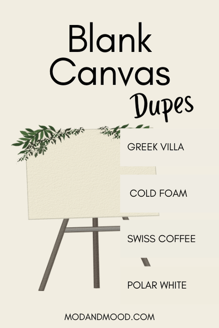
Dupes for Blank Canvas from Other Brands
Not ready to dive into Behr paint? Here are some colors from other brands that will help you get the look:
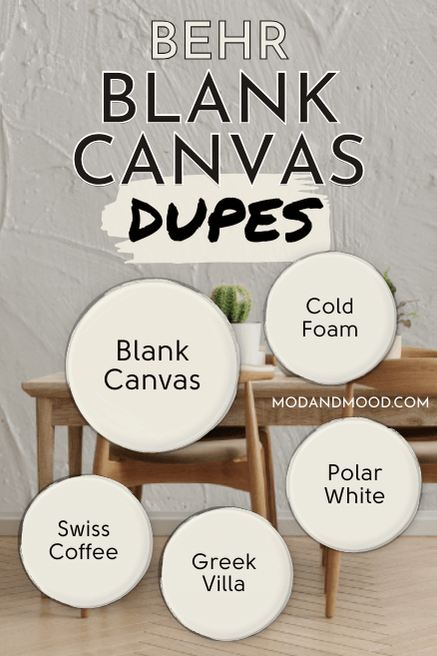
Normally I would get to these at the end, but I wanted to cover these Blank Canvas equivalents before we get to real homes, because I will have to use some of these as examples.
Benjamin Moore Blank Canvas Equivalent
Behr’s own Swiss Coffee isn’t the only Swiss Coffee that matches Blank Canvas pretty closely! Swiss Coffee happens to be the name of Benjamin Moore’s closest alternative to Blank Canvas.
Benjamin Moore Swiss Coffee (OC-45)
If Blank Canvas has an orangey-beige base, Benjamin Moore’s Swiss Coffee has a yellowy base.
This Swiss Coffee is a less saturated color, so it looks closer to Blank Canvas than you might think.

I’m going to use this color in a few of my interior examples to help you picture Blank Canvas where pictures were hard to come by.
Valspar (Lowe’s) Equivalent to Blank Canvas
Valspar has a lot of really amazing creamy white options that tend to be pretty neutral. Definitely check out their color selection if you are stuck!
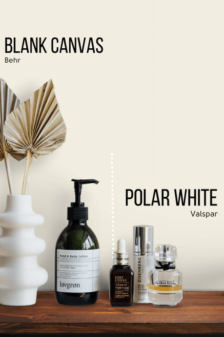
The closest dupe for Blank Canvas that Valspar offers, is their shade Polar White.
Valspar Polar White (7003-16)
Polar White is just a little bit cooler than Blank Canvas.
Blank Canvas Sherwin Williams Equivalent
There are two alternatives to Blank Canvas that Sherwin Williams offers, and I wasn’t able to separate them! The first one is Greek Villa:
Sherwin Williams Greek Villa (7551)
Greek Villa is a near perfect match for Blank Canvas:
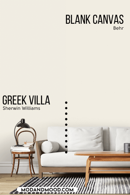
On paper, Greek Villa is a hair darker, warmer, and more gray than Blank Canvas. The incremental difference in warmth and saturation basically cancels out, so we are left with a color that is less than a single LRV value different…and that’s about it!
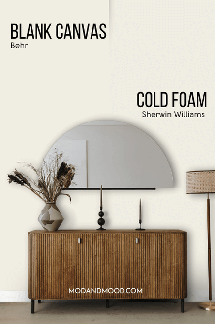
Sherwin Williams Cold Foam (9504)
Cold Foam is just a little lighter than Blank Canvas and maybe a touch more gray. It is also my Sherwin Williams dupe for Benjamin Moore White Dove, which was almost my dupe for Blank Canvas… It’s a dupe loop!
Honorable Mention: Sherwin Williams Alabaster
Alabaster is probably Sherwin Williams most popular whites of all time, and it is very similar to Blank Canvas.
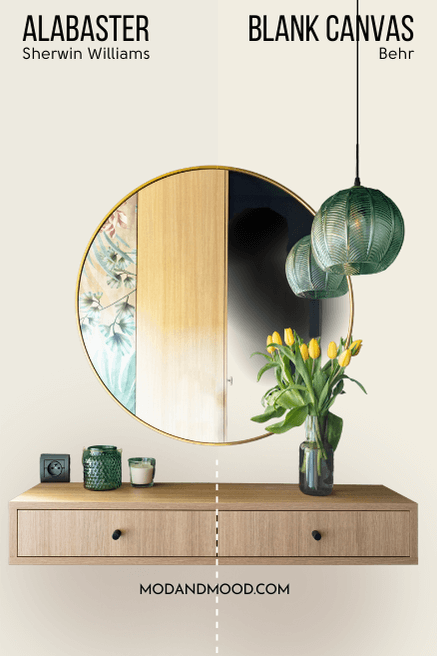
Alabaster is a bit darker and more gray than Blank Canvas, but it’s still a very solid alternative.

Behr Blank Canvas for Your Home’s Interior
Blank Canvas is still a bit hard to find real life photos of. Here is a combination of rooms featuring Blank Canvas dupes, and some that I put together myself with a real photo of Blank Canvas for the background.
Behr Blank Canvas on Living Room Walls
First up we have an example of Blank Canvas in an all-white living room. This is a background that I painted myself, so it is genuine Blank Canvas:

You can see that it may occasionally flash a peachy undertone, but we are generally getting neutral vibes.

Here is Blank Canvas on a cool gallery wall:
Blank Canvas in a Dining Room
In lower light, like in this dining room, Blank Canvas will look more off-white.

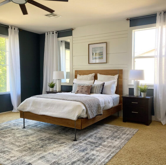
Behr Blank Canvas in the Bedroom
This bedroom is actually Benjamin Moore Swiss Coffee, but in softer light this is very much how Blank Canvas would look:

Blank Canvas would probably look a touch more beige than this.
For another great example, let’s look at Sherwin Williams Greek Villa. Here we see it in a bedroom alongside Gray’s Harbor:

I wouldn’t say that the color looks yellow here exactly, but it is probably the closest that Blank Canvas will get.
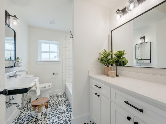
Blank Canvas in a Bathroom
This bathroom is Sherwin Williams Alabaster, but if you recall, Alabaster is darker, so I thought this was a great way to show how white Blank Canvas can look:
Here is Greek Villa again, looking pretty much how Blank Canvas will:

Behr Blank Canvas on Kitchen Cabinets
Here is how Blank Canvas would look in an all-white kitchen:

When it looks creamier, you can expect something like this:

Blank Canvas for Your Home’s Exterior
Outdoors you can expect that Blank Canvas will look lighter than it does in other areas. White is a little bit tricky, because it could look like a totally true white outside:

Or it could look even warmer than it does inside:

It depends a lot on the weather especially.

This next photo is a dead ringer for Blank Canvas. It is Benjamin Moore Swiss Coffee, but it looks more beige than usual (therefore more like Blank Canvas!).

Blank Canvas Compared to Other White Paint Colors
We’ve seen the dupes, but how does Blank Canvas stack up against other popular whites?
Behr Blank Canvas vs Cameo White
The undertone of Cameo White is a little more pink than Blank Canvas:
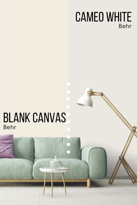
You can see that it is also more gray. Cameo White is darker than Blank Canvas, with an LRV of 81.
Cameo White is a little more similar to Sherwin Williams Snowbound.
Behr Blank Canvas vs Behr Polar Bear (75)
Polar Bear is one of Behr’s more popular whites. It looks like a lighter version of Blank Canvas, but it is actually a bit cooler too.
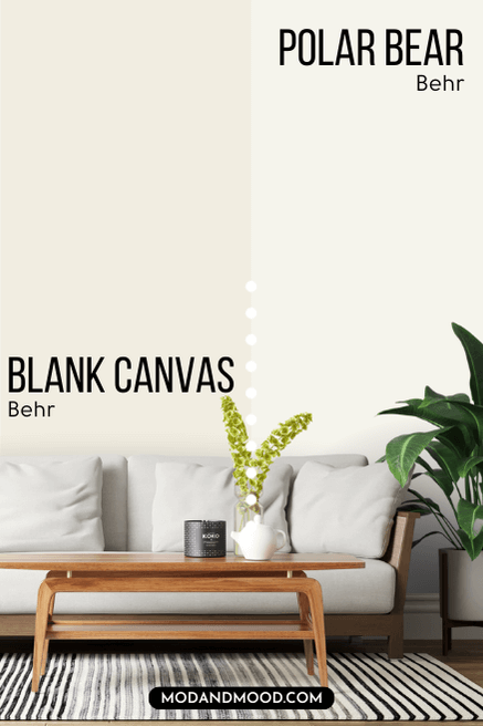

Still very much a soft white.
Behr Blank Canvas vs Natural White
Natural White is quite similar in tone to Blank Canvas, but it is lighter and brighter.
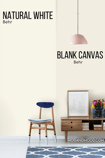
Natural White does still have a strong creamy undertone. It’s quite similar to Benjamin Moore Simply White.
Behr Blank Canvas vs Silky White
Silky White is almost the same color as Blank Canvas, but it’s a little more muted. It is less likely to have any undertones at all, but it is still delightfully soft with a hint of warmth.
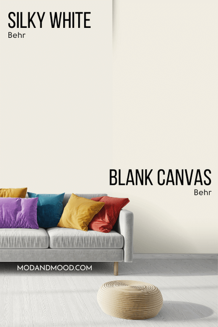
Behr Blank Canvas vs Benjamin Moore White Dove (OC-17 )
While White Dove is another warm creamy white, it is a tiny bit cooler and more gray than Blank Canvas, which makes it a touch more neutral.
Did I take 1001 photos to try and capture the contrast? Absolutely I did.
Here is the best one:
The difference was a bit more obvious in real life, but I did my best.
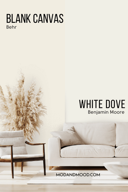
I do think that these two are similar enough that you wouldn’t be able to tell from one house or room to another.
Behr Blank Canvas vs Sherwin Williams Pure White (7005)
Pure White is a soft white, but it reads very much like a true white, where Blank Canvas does not.
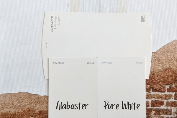
You can see that Pure White looks more gray in comparison.
Blank Canvas Pros & Cons
Allow me to make a quick summary:
Pros
- A soft white that goes with a wide variety of other colors
- Both light enough and colorful enough to use in your whole home
- Great choice for a white exterior
- A pretty good alternative to the infinitely popular Sherwin Williams Alabaster
Cons
- Not a white white
- You will either love or hate the subtle peachy undertone
- So classic that it’s potentially a bit boring
Not sold? I have sooo much more:


