Sherwin Williams Pewter Green is an amazing medium to dark gray green that actually manages to have a metallic (pewtery) quality. This color will “Sher-ly” impress in your home. (I’ll see myself out.)
Actually it will impress outside of your home too, as it is becoming a top pick for exterior paint!

What Color Is Sherwin Williams Pewter Green (SW 6208)
Pewter Green by Sherwin Williams is a deep shade of gray-green that can look anywhere from a dark sage or olive, to a dark gray.
It is absolutely a green, so even if the swatch fools you, it will not look like a straight up gray on your walls.
Technically, it is an olive green, that leans slightly more green than brown.
Here is a look at Pewter Green using the hex code:

Pewter Green Undertones
Pewter Green most often has cool almost metallic undertones, but (and it’s a big but) it can also look warm and olivey.
So Is Pewter Green Warm or Cool?
This is a tricky one! Like I said, it most often leans cool, but it does have more warm yellow tones than lots of other sage greens do. For this reason, I would label Pewter Green as a neutral.
It’s a warm gray green, but it looks cooler than you might think.
Pewter Green RGB and Hex Code
From Sherwin Williams:
- RGB: 94, 98, 89
- Hex Value: #5e6259
LRV of Pewter Green by Sherwin Williams
Pewter Green has an LRV of 12, which means it is a darker color. In my experience truly DARK colors tend to have an LRV of 10 or less, but 12 is right there on the edge.
What’s an LRV anyways?
The LRV (Light Reflectance Value) of a color indicates on a scale of 0 – 100 how much light a color reflects (or doesn’t reflect). True black has an LRV of 0 and pure white has an LRV of 100.
In the paint world, we are working in a range of about 3 – 93 because no paint color is purely black or completely white.

Sherwin Williams Pewter Green Color Palettes
I made a couple of color palettes to inspire you to use this fabulous color! The first one incorporates Pewter Green’s complementary color, and the second is some coordinating colors that I like.
Complementary Color Palette for Pewter Green
Complementary colors are those that are directly across the color wheel from Pewter Green, which in this case is the purple family.
Technically a complementary color would be a bright lilac tone, but I chose a more subtle mauve.

Sherwin Williams Autumn Orchid (9157)
Autumn Orchid is a rich mauvey-gray color that complements Pewter Green beautifully. This would be a soothing color scheme in a bedroom.
Sherwin Williams Snowbound (7004)
Snowbound is a warm white color that isn’t actually purple, but it’s warm enough to achieve the same complementary goal. Snowbound is an exceptionally popular Sherwin Williams white.
This would be a great choice as your “whole home” wall color if you want to feature Pewter Green in accents.
Sherwin Williams Sea Salt (6204)
Sea Salt is another whole-home color that is a much lighter version of Pewter Green. It’s a super liveable green that acts like a neutral.
Pewter Green Coordinating Color Palette
Luckily Pewter Green is a pretty adaptable shade! It coordinates particularly well with warm tones like beige, tan, and terracotta.

If warm colors are not your thing, try Pewter Green with a greige like Agreeable Gray or Accessible Beige.
Benjamin Moore Chantilly Lace (OC-65)
Chantilly Lace by Benjamin Moore is one of my favorite whites at the moment! It is a nice true white, but without the stark “hospital white” vibe.
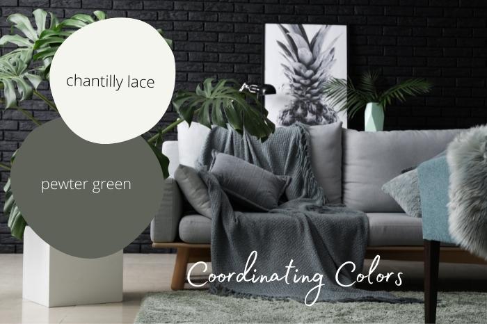
It’s just warm enough to give you a good feeling, but doesn’t read yellow in the least.
Chantilly Lace is actually in the green color family, which is why it would coordinate great with Pewter Green!
Sherwin Williams Cavern Clay (7701)
Another favorite right now, Cavern Clay by Sherwin Williams, just seems to go with every color that is trending.
It’s a muted orange-red tone, but vibrant enough to make a statement.

Even though complementary colors for Pewter Green should be in the purple family, I actually think a shade of terracotta would be the best complement.
(Here are all of my favorite terracotta colors.)
Benjamin Moore Carolina Gull (2138-40)
I recently made a whole post about Carolina Gull by Benjamin Moore!
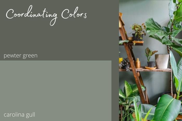
Carolina Gull is a beautiful light to mid toned sage that coordinates well with Pewter Green in a monochromatic moment.
Sea Salt, from the complementary colors palette, would look amazing with Carolina Gull and Pewter Green, if you were to commit to an all-green color scheme.
Sherwin Williams Shoji White (7042)
Shoji White is a white that is the softest shade of tan. It could be described as a farmhouse white.
It isn’t over the top warm – which I like – it’s more neutral.

Sherwin Williams Ripe Olive (6209)
We’ll be revisiting Ripe Olive in just a moment, but here is a quick look:
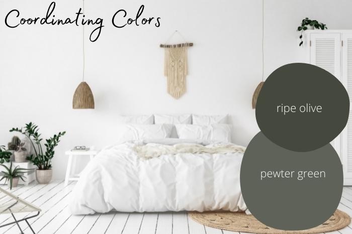
Ripe Olive, Sea Salt, and Pewter Green are actually all on the same color strip:

Benjamin Moore Smokey Taupe (983)
Smokey Taupe by Benjamin Moore is another versatile neutral color. It looks quite beige when it is in a tiny dot on the color palette, but it’s truly an earthy color that is closer to a mushroom.
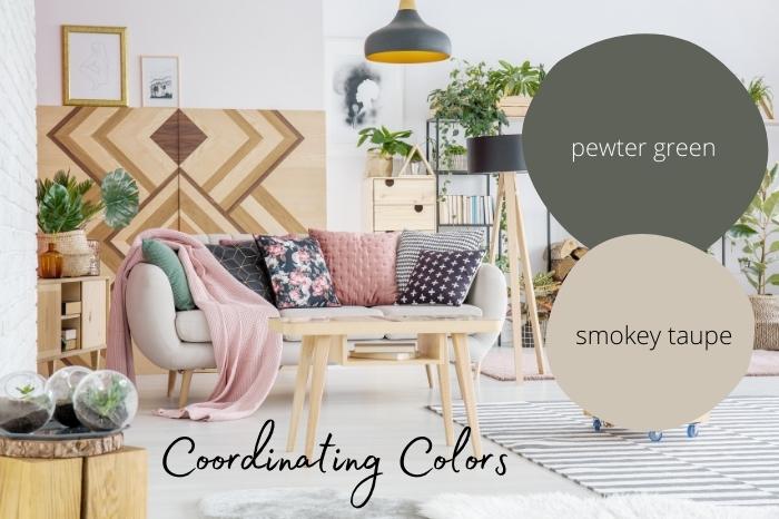
Smokey taupe somewhat mimics the color of natural wood, so of course it looks great with Pewter Green!
If you like the look of this color, you will also like The Best Mushroom Paint Colors for Kitchen Cabinets.
Sherwin Williams Krypton (6247)
Krypton by Sherwin Williams is a light powdery blue color.
Krypton didn’t make the palette, but I thought I would include it as a coordinating color because it looks quite nice with Pewter Green.

If you are looking for a color to go with Pewter Green that isn’t as warm, try Krypton! (You might also like the similar shade: Sherwin Williams Upward.)
Sherwin Williams Pewter Green Inside Your Home
Let’s take a look at some savvy homeowners and designers who have used Pewter Green inside the home!
Pewter Green Kitchen Cabinets
If you’ve been scrolling about here, you know I love me some Green Kitchen Cabinets!
The team at The Finishing Room (@thefinishingroommke) used Pewter Green for an oak cabinet makeover in this kitchen:
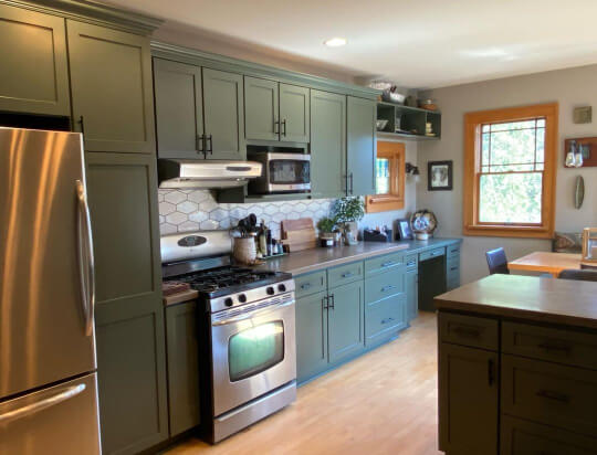
They opted for black hardware in this kitchen, but gold or brass would look amazing too!

If you have a lot of natural wood tones in your house, this is a great color to make those pop. Warm wood is a common thread through all three of the Pewter Green kitchens I have to show you.

They did not share the updated wall color in this kitchen, but if I had to guess, I think it could be Repose Gray, or possibly the lighter shade Acier.
Marjorie (@marjorie_verschueren) also used Pewter Green for the cabinets in her light and airy kitchen.
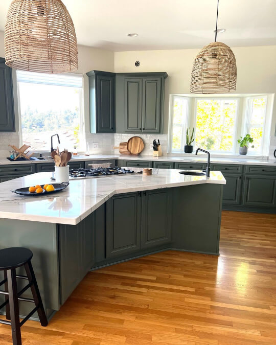
I’m only just realizing how amazing it is that you can call this kitchen light and airy when it has such deep dark cabinets!
Marjorie used Pewter Green on all of her cabinets including the island. If you are concerned about the darkness, you could try it on only your island.
The walls in this kitchen are Sherwin Williams Oyster White and Pure White is on the trim and ceiling.

Finally, an all-star around here, Lindsay (@silo.hill) used Pewter Green for the kitchen cabinets in her previous home:
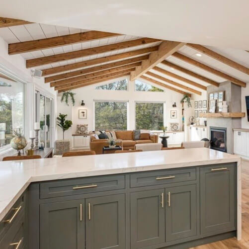
She used plenty of green in her current home too! You can see more from her in my Acacia Haze post.
If you want to see even more, check out my post: The Many Faces of Pewter Green on Kitchen Cabinets (Plus Alternatives!)
Pewter Green in the Bedroom
I LOVE the home of Kelli from Walnut & Pine Design! She has used all kinds of coordinating dark greens including, of course, Pewter Green:

The bedroom is a boho, plant-girl, mid-century modern mashup, and I am here for it!
It’s worth noting that this bedroom has boatloads of natural light, so it can handle the dark moodiness of Pewter Green. Although if there is one place you are going all in, why not the bedroom?

If you want to see more of Kelli’s place, head on over to my Rock Bottom post, it’s another deep and moody gray green that you are sure to love!
Work From Home with Pewter Green in Your Office
Here is more Pewter Green and oak in this office set up:

SW Pewter Green on a Feature/Accent Wall
More than likely you might be considering Pewter Green as an accent color rather than a wall color for your entire space. Here is an inspired design by Wood Visions (@wood_visions), another series regular around here:
Pewter Green on the Walls
In this bar room, Lisa from @deboeverinteriors used Pewter Green on the walls and on the bar cabinets.

The textured peninsula panels are black.
All the moodiness of Pewter Green really sets the vibe for this den:

The wall sconces and barstools are brass, which really seems like the perfect metallic to pop against Pewter Green:

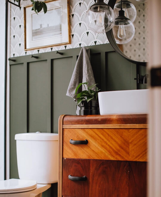
Pewter Green in the Bathroom
Here is Pewter Green on a beautiful little bathroom vanity:

I love how the brass hardware pops!
I thought that I had Pewter Green on bathroom walls, but alas the photo has escaped me. Here is a similar color, Benjamin Moore Vintage Vogue:
Pewter Green will look just a bit cooler than this.
Pewter Green on an Exterior
Grays and navy blues were ruling the exterior color world for a long time, but green is starting to make a huge impression.
Pewter Green is such a versatile gray-green color that it works great for an exterior. Painting the outside of your home is always fun because it doesn’t matter how dark you go!
Louis (@L_Mario) used Pewter Green as an unexpected choice for his brick exterior:

The pop of lime on the door adds a quirky touch!
Louis has white windows, but this color would look just as good with trendy black ones.

The luscious overflowing planter box is painted in Urbane Bronze. Here is another look:

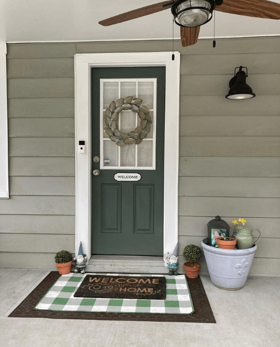
Pewter Green on a Front Door
Of course you might be interested in dipping your toes into Pewter Green, with a smaller project like your front door! I’ve got you covered.
Darcey of @charminggreenhouse, used Pewter Green for her front door:
I believe the exterior siding was already this color when they got the home, but if you are dying for a dupe, it’s very similar to Sherwin Williams Svelte Sage.

Eventually Darcey added a screen door, also in Pewter Green:

I love how the dark sage of Pewter Green pairs with the light sage, but this color on a door would also look amazing on a white, gray, brown, or even blue house.
Pewter Green Dupes from Other Brands
Can’t get to Sherwin Williams? Here are the best dupes for Pewter Green from other popular brands:

Pewter Green Benjamin Moore Equivalent
Finding a color match to Pewter Green in Benjamin Moore was quite the challenge! I found a lot of sage greens that were the right tone, but just way too light. In the end, I think Vintage Vogue is probably the best overall match:
Benjamin Moore Vintage Vogue (462)
Vintage Vogue is one of my favorite dark green paint colors ever. It’s such a warm and complicated hue. Love it!

Vintage Vogue is a touch darker and mossier than Pewter Green.
Here are the other Benjamin Moore options that could work in place of Pewter Green:

Benjamin Moore Enchanted Forest (700)
Enchanted Forest by Benjamin Moore is another shade similar to Pewter Green but not quite on.
I found that a lot of Benjamin Moore colors were just a touch too green, too blue, or too yellow.

These colors may not be an exact match, but they have a similar feel.
Benjamin Moore Backwoods (469)
Backwoods is seriously trending, and is the closest Benjamin Moore color in terms of LRV to Pewter Green, but it’s still more green.

Backwoods lacks a certain smokyness that Pewter Green has mastered.
An honorable mention goes to:
Benjamin Moore Cushing Green (HC125)
Cushing Green is a very popular sage color by Benjamin Moore. It’s a great option if you wanted something a little lighter than Pewter Green.

Pewter Green Behr Equivalent (Home Depot)
If you wanted to get a version of Pewter Green at Home Depot, you’re in luck!
Of all the color matches to Pewter Green, Behr has the closest with their deep green called “Painted Turtle.”
Behr Painted Turtle (710F-6)
Painted Turtle may be the slightest bit darker and more green than Pewter Green, but on a wall I don’t think you would ever know the difference.

Pewter Green Valspar Equivalent (Lowes)
The closest color match that Valspar offers for Pewter Green, is their shade Blackened Pine.
Valspar Blackened Pine (5003-2C)
Blackened Pine is a pretty good match to Pewter Green! It’s a bit darker, but overall has the same cozy and moody feeling.

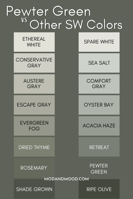
Pewter Green vs Other Sherwin Williams Greens
Pewter Green is often being compared to not only other colors in the same strip, but to several other colors in the Evergreen Fog strip as well.

The rival color strip is just a tiny bit warmer than the strip Pewter Green is on.
Sherwin Williams Retreat (6207) vs Pewter Green
Sherwin Williams Retreat is a lighter version of Pewter Green. It is from the same color strip.
Retreat is more similar to Benjamin Moore’s Carolina Gull than it is to Pewter Green.

Retreat would be a good choice to use with Pewter Green, or instead, if you wanted something a little lighter.
Sherwin Williams Rosemary (6187) vs Pewter Green
Rosemary, as I mentioned, is very similar to Pewter Green, but slightly more olive in color.
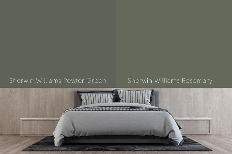
Rosemary would be a good choice if you wanted a deep green like Pewter Green, but don’t want the gray.
Sherwin Williams Ripe Olive and Pewter Green
Ripe Olive and Pewter Green look great together in a monochromatic way.

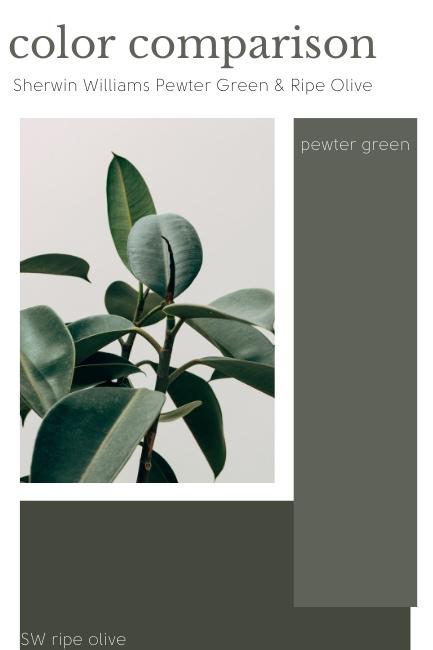
Allow me to illustrate the difference of all these colors over a background of Pewter Green.
That’s about it for my Pewter Green deep dive! Don’t forget to pin a palette for later!
Didn’t find what you were looking for? Check out some other gorgeous hues:


