Sherwin Williams Succulent is one of my favorite gray greens of the moment. It’s dark, but not too dark. It’s green but not too green. It’s cool, but not frosty! Most importantly: If you don’t want to answer a million questions about your paint color, don’t choose Succulent!

Here we will take a look at Succulent in real homes, in a color palette, and in other brands.
Let’s go!
What Color is Sherwin Williams Succulent? (SW 9650)
Succulent is a dark sage green paint color that leans to the cooler side of sage. It works particularly well on cabinets, accent walls, and exteriors.

What Are the Undertones of Succulent?
Succulent is a dark sage green color. It can have cool blue undertones, or deep almost mossy green tones.
Unlike many gray green colors, I don’t find that Succulent does anything too unexpected. It will look significantly more green than the color chip, but once you see it in real life, you should have a good idea of how it will look in your home.

You will see real life photos in just a minute, but I find the color to be pretty consistent.
Is Succulent Warm or Cool
Succulent is a cool paint color due to it’s cool gray-blue undertones. I think that you can use it like a neutral, because it’s a nice natural green color.
LRV of Sherwin Williams Succulent
The LRV (Light Reflectance Value) of a color indicates on a scale of 0 – 100 how much light a color reflects (or doesn’t reflect). True black has an LRV of 0 and pure white has an LRV of 100.
In the paint world, we are working in a range of about 3 – 93 because no paint color is purely black or completely white.
Succulent has an LRV of 14.
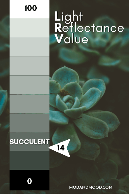
At 14, Succulent is a darker mid-toned paint color. In my opinion, truly deep dark paint colors have an LRV of about 10 or below, but Succulent is getting there. As far as sage green paint colors go, it’s definitely a darker one.
Succulent Color Strip
Succulent is one of those special colors that Sherwin Williams decided to magic out of nowhere, so it doesn’t have a proper color strip. Using the closest color numbers, we can come up with this:
- Sea Spray (SW 9651)
- Hazel Gaze (SW 9652)
- Forever Green (SW 9653)
- Taiga (SW 9654)

OR:
- Create (SW 9646)
- Soft Sage (SW 9647)
- Frosted Fern (SW 9648)
- Willowleaf (SW 9649)
I find the Willowleaf color strip to be a bit warmer than Succulent, but then the colors from Sea Spray to Taiga are all over the place, so what can you do?
Lighter Version of Succulent
Although it might not look like it, the color Taiga is actually 7 LRV points lighter than Succulent, so it could be a good lighter alternative for you.
Sherwin Williams Retreat is lighter than Taiga, and would also be a good alternative to Succulent.
Darker Version of Succulent
In many ways, Succulent looks a lot like Pewter Green (I will compare the two properly in just a minute), so you could go one shade darker than Pewter Green if you are looking for a darker version of Succulent. This would be the color Ripe Olive.
I find Ripe Olive to be a touch warmer than Succulent, so you might find that Sherwin Williams Jasper works better for you.
Sherwin Williams Succulent Color Palette
Here is a color palette that I put together, inspired by Succulent:

Coordinating Colors for Succulent
Sherwin Williams Taupe of the Morning
Taupe of the Morning is a light neutral that looks creamy and mushroomy next to Succulent. It would be a great choice as a whole home color that provides more warmth than a gray.

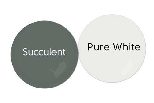
Sherwin Williams Pure White
Pure White is a true white with a touch of warmth that is balanced out with a touch of gray. It’s the perfect go-with-anything white, so of course, it goes with Succulent!
Benjamin Moore Soot
Soot is a nod to the “official” complementary color for Succulent (the color directly across the color wheel) because it has a bit more widespread appeal.
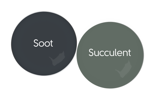
Soot is a deep charcoal navy that really looks great with any and all greens, but especially Succulent.
If you want to stick with Sherwin Williams, their color Cyberspace is very similar.
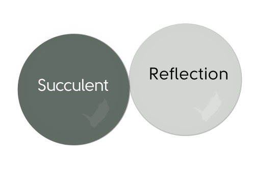
Sherwin Williams Reflection
Reflection is a soft gray blue that is very complementary to Succulent. Just be careful with this one that you don’t go too creamy with your white, or it can come out looking a bit purple!
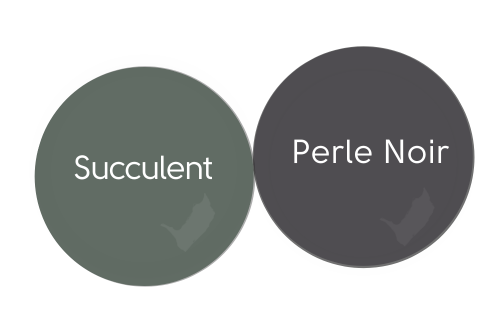
Complementary Color for Succulent
Speaking of purple, technically the complementary color for Succulent is a deep gray-purple. A good color match would be Sherwin Williams Perle Noir:
I used Soot in my color palette, because there isn’t a huge market for purple, but if you want to have a trendy “Dark Academia” moment, go for it!
What Trim Colors Go With Sherwin Williams Succulent?
If you have existing oak or other wood trim and you are looking for a new wall color, sage greens like Succulent are my favorite option! I find this family of green looks amazing with any tone of wood.
White Paint that Goes with Succulent
If wood isn’t in the cards, here are some popular white options for trim:
Benjamin Moore Chantilly Lace
I’m back on the Chantilly Lace bandwagon!
It’s not that I fell off exactly, I just thought you might get tired of hearing about my favorite white everrrrrr! However when we are talking about a green paint color, Chantilly Lace naturally comes up. It’s a green-based white, but has no discernible undertone. The slightest drop of pigment that it does have, manifests as a whiff of warmth, just to keep things from getting too stark.
That was a long way to say, I like Chantilly Lace, and especially with greens like Succulent.

Sherwin Williams Snowbound
Snowbound is another true white with just a touch of warmth. I like Snowbound a lot for trim because it isn’t stark, but it’s more crisp than other popular choices like Pure White or Alabaster.
Snowbound is close to being a red-based white, so it is slightly more complementary to greens like Succulent.
Sherwin Williams Pure White
Pure White is a true white, but a much softer one, thanks to equal hints of gray and beige. It’s a good neutral white that won’t pop against Succulent quite as much as Chantilly Lace or Snowbound.
Sherwin Williams Alabaster
Alabaster is a creamy white but not quite an off-white. This one will provide a lower contrast look to your trim, and will help Succulent look a little lighter. The warmth of Alabaster is more likely to emphasize the cool tones of Succulent.
Sherwin Williams Succulent Home Interior
Now that we’ve gone through the nitty gritty, let’s take a good look at Succulent in real life!
Sherwin Williams Succulent Living Room
Kelli from @Walnutandpinedesign loves alll the deep gray greens, and her aesthetic totally speaks to me. Here is Succulent in a sitting area with white on the upper part of the wall.
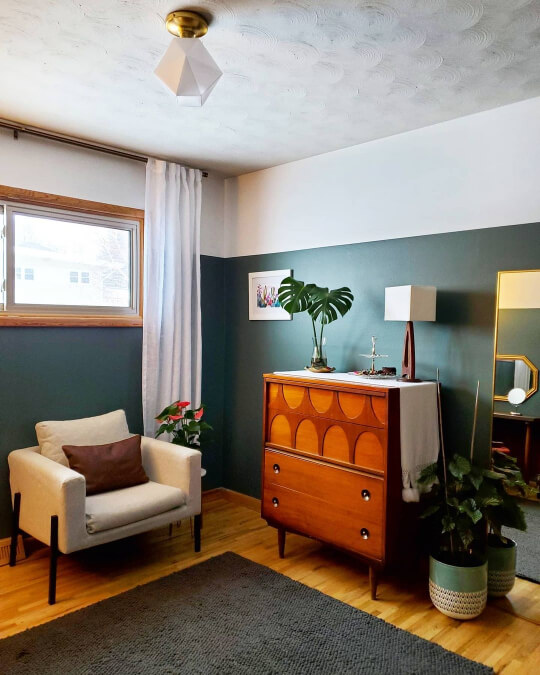
I love the mid-century modern vibe of this space:
Sherwin Williams Succulent Bedroom
Moving into the bedroom, have more great inspo photos of Succulent from Kelli.
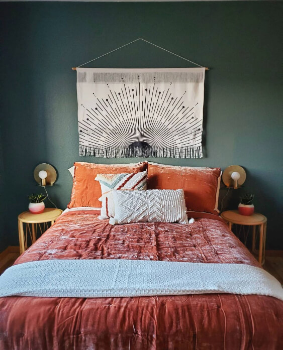
I resisted the urge to toss some terracotta into my color palette earlier, because I always do that with sage greens, but you can see here how it would work.

I love the boho color palette in this space.
In this next photo you can see Succulent looking a bit cooler and more gray:
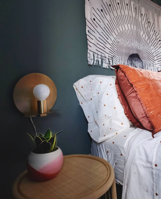
One more for good measure:

From each room that we have seen so far, I really think that Succulent stays pretty consistent in it’s appearance.
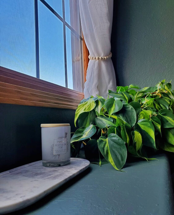
Sherwin Williams Succulent in a Laundry Room
Well aren’t we lucky ducks that we get to see Succulent in a laundry room? That’s probably the hardest space to track down.
The team at The Finishing Room (@thefinishingroommke) used Succulent on these cabinets:

You can see that the color also looks good with the cherry doors.
Sherwin Williams Succulent on Kitchen Cabinets
Moving on to the home of Ashley and Matt (@homesweetiepiehome), we get to see not only Succulent on cabinets, but the coordinating color Taupe of the Morning as well!
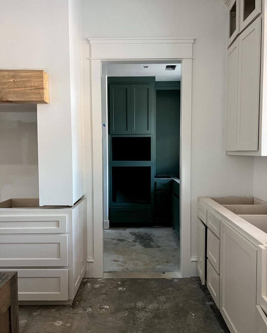
This is actually the space that inspired me to use these two together.

Succulent is boldly used floor to ceiling and even on the trim in this pantry.

Sherwin Williams Succulent Exterior
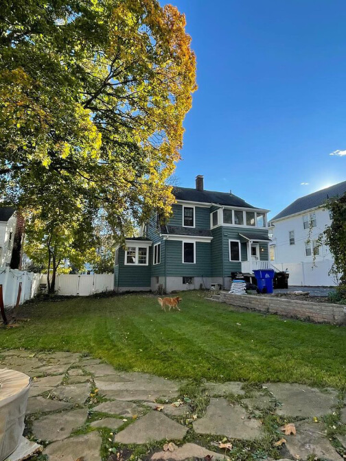
Moving outdoors, let’s take a look at Succulent on exterior siding.
Brianne (@briannebuilds) used SW Succulent on the exterior of her 1927 home:
Here it looks a little lighter in the closeup:

Brianne did all the hard work to strip and expose the original brick here too!
Here’s a cozy winter shot, where obviously Succulent looks darker against the fresh snow.
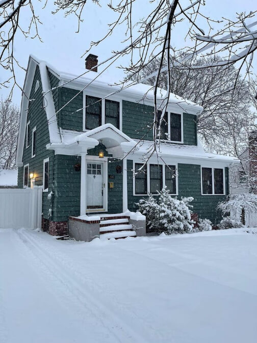
Gray greens are probably my favorite exterior paint colors. They’re perfect for looking natural and not too “out there” while also being a color and making a statement.
Succulent on a Front Door
I couldn’t find a good photo of Succulent on a front door, so here is the similar color Pewter Green:

Succulent would also be a beautiful choice for shutters.
Succulent Compared to Other Gray Green Paint Colors
If there is one thing I know, it’s green paint! Specifically gray green and sage paint colors. Here are a few similar colors that you might be comparing to Succulent in your search for “the one.”
Sherwin Williams Succulent vs Pewter Green
Pewter Green looks really similar to Succulent until the two are side by side. Pewter Green is significantly warmer than Succulent. It’s also a bit darker and a bit more gray.

Read all about it here: Don’t Choose Sherwin Williams Pewter Green Before Reading! (Plus Dupes)
Sherwin Williams Succulent vs Retreat
Retreat is one shade lighter than Pewter Green on the same color strip, so it makes sense that it’s similar to Succulent too, but lighter.

Of course I have a post for this one too: Take a Vacation With Sherwin Williams Retreat (Complete Review & Dupes!)
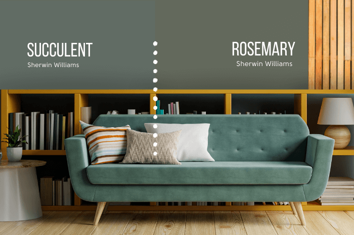
Sherwin Williams Succulent vs Rosemary
Rosemary is much warmer than Succulent. It’s also a touch less gray. The two look more similar on paper, because Rosemary has the same LRV as Succulent.
What was that? You wanted more Rosemary? I’ve got it!: Sherwin Williams Rosemary (The Unofficial Color of the Year?)
Dupes for Sherwin Williams Succulent
Of course you may not want to, or have the ability to, get yourself to a Sherwin Williams store, so I’ve got dupes!

Benjamin Moore Succulent Equivalent
The closest color match for Succulent that I could find from Benjamin Moore, is their shade Caldwell Green.
Benjamin Moore Caldwell Green (HC-124)
Caldwell Green is just a touch lighter, cooler, and less gray than Succulent.

I actually think that because it’s cooler and also less gray, those things balance out to a great tone match for Succulent.
Valspar (Lowe’s) Equivalent to Succulent
From Lowe’s the best alternative to Succulent is the shade Coastal Dusk. (Which is quite a pretty name, if that matters.)
Valspar Coastal Dusk (5002-2B)
Unlike some other Valspar colors, I’ve seen enough photos of Coastal Dusk to say that it absolutely looks like Succulent on the wall. (Or on cabinets.) It reads a tiny bit more gray, which you can see here:

Coastal Dusk is also a little bit lighter.
Succulent Behr Equivalent (Home Depot)
The Best Behr alternative to Succulent, is the color Pinecone Hill.
Behr Pinecone Hill (N410-6)
It’s a bit presumptuous of me to call this one a dupe, because you can clearly see that it’s a good bit warmer than Succulent:
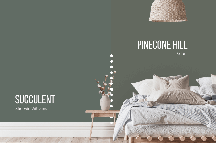
However I was not able to find a cooler sage with lots of gray, so it will have to do.

Succulent Pros & Cons
Thank you so much for reading to the end! If you didn’t know, that really helps my blog!
Let’s run down the Pros and Cons of Succulent real quick:
Pros
- It’s absolutely beautiful!
- Very neutral and goes with almost any other color
- Did I say beautiful?
- An exciting color for cabinets and exteriors without being too wild or specific
Cons
- Succulent is quite gray. It isn’t boldly green.
- It’s cooler than many sage colors
- A bit too dark to use everywhere, or in spaces with limited natural light
You look like someone who wants to see more! Check out these other colorful posts:


