Hogwarts, Cambridge, mysterious mansions… It’s Dark Academia! This very specific moody aesthetic seemed like it might not catch on, but I think the vibe is here for a little while.
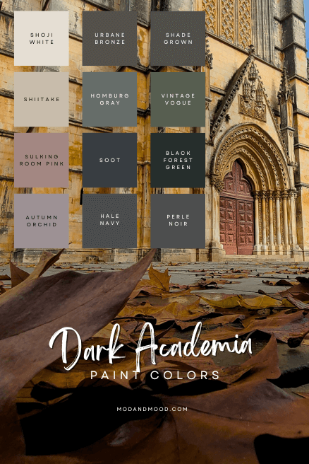
Here we will see my favorite 12 paint colors for achieving a Dark Academia feel in your home, plus a few more colors in inspirational rooms!
Dark Academia… but make it achievable!
What is Dark Academia?
I would describe Dark Academia as a colorful gothic aesthetic, that’s also quite polished. Think modern day Victorian, but just a bit moodier.
I say “colorful gothic” because goth typically entails black, white, and red, but Dark Academia is dominated by jewel tones.
Dark Academia – Where it Started
According to Wikipedia, the trend started on Tumblr in 2015 from a book club, but the Google Trends chart clearly shows it taking off around August of 2020.
Tik Tok definitely gets the credit for helping this one explode in popularity.
Enough of the history lesson though! You’re most likely here because you already like it!
Dark Academia – How It’s Going
If you are new here, you should know that I live, eat, sleep, and breathe paint! Here are some of my favorite Dark Academia looks that I’ve come across (whether intentionally the vibe or not!) where the colors did not make the short list, but still deserve a mention.
Dark Academia Inspired Living Room/Office
I love this space by the team at ML Designs (@mldesignskc):

The color here is Sherwin Williams Cascades, which is not on the palette, but you can read more about it here: Fall in Love with Cascades by Sherwin Williams (Plus Photos of Real Homes!)
The key to success in this room, was to totally commit and take the color onto the ceiling as well. That brings the look from “bold accent wall” to deep and moody “Dark Academia.”
Exploring a Dark Academia Look in the Bedroom
I wanted to show this bedroom because the color is also quite “Dark Academia” but did not make the short list, it is Sherwin Williams Iron Ore:

Dark Academia Kitchen Inspiration
My favorite Dark Academia inspired kitchen is a color that did make the palette, but here are a couple of honorable mentions:
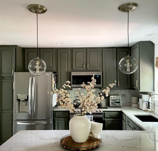
This kitchen isn’t really styled in Dark Academia per se, but I think the feeling is pretty on point. The color here is Sherwin Williams Thunderous.
This is another kitchen where the styling isn’t on point for the aesthetic, but the cabinets are still selling it:

The color here is Sherwin Williams Rock Bottom.
Dark Academia Inspired Bathroom
Can you get darkly academic in a powder room? I say yes! Again with Sherwin Williams Rock Bottom:

To be honest, Rock Bottom should have just made the palette, because it’s totally the right aesthetic, but I was already full up of greens:
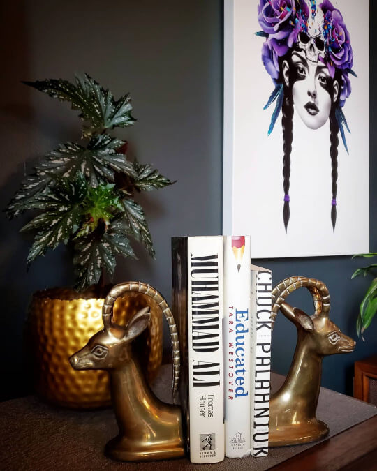
Tres, Tres, “Dark Academia” if you ask me!
Okay, enough of colors that I had to cut. Let’s see the cream of the crop:
The Dark Academia Color Palette

Before we get too deep into this, I picked the colors that immediately sprang to mind in order to achieve this vibe. There is no rhyme or reason to whether I chose a Sherwin Williams or Benjamin Moore color. I simply chose colors that I like and spoke to me.
For any of the colors I have listed here that also have a separate review post, I will link it. Within that post you can find equivalent colors from other brands.
Dark Academia Neutrals
First, here are three neutral paint colors that you can use in your own Dark Academia design:

Of course Shoji White and Shiitake won’t make your home moody enough on their own, but they are a great starting point in your color palette. Perfect for some breathing room when you are working with very dark colors.
I will also say that most of the colors in this palette can be used as neutrals, with the exception of Autumn Orchid, Perle Noir, Homburg Gray, and maybe Black Forest Green. Those 4 shades are a little more specific.
Sherwin Williams Shoji White
Shoji White is actually an off white, and I would say it is one of Sherwin Williams most successful ones.

It’s warm while still being pretty neutral, and while it’s much darker than classic whites, you can still trick your eye.

If the palette is Dark Academia, Shoji White would be Light Academia!
Sherwin Williams Shiitake
I added Sherwin Williams Shiitake to this palette as the second of only two super easy to use “lighter” colors. I think it can fit the Dark Academia aesthetic wherever you don’t want to use a dark color, but if you disagree, we can still be friends:

One more of Shiitake:

Bear in mind that the lighting is super warm in that last photo. Shiitake would normally look a touch more gray.
Sherwin Williams Urbane Bronze
Urbane Bronze is totally on brief for Dark Academia. It’s such a luxurious charcoal brown.

Here it is in the living room of one of my favorite homes everrrr:
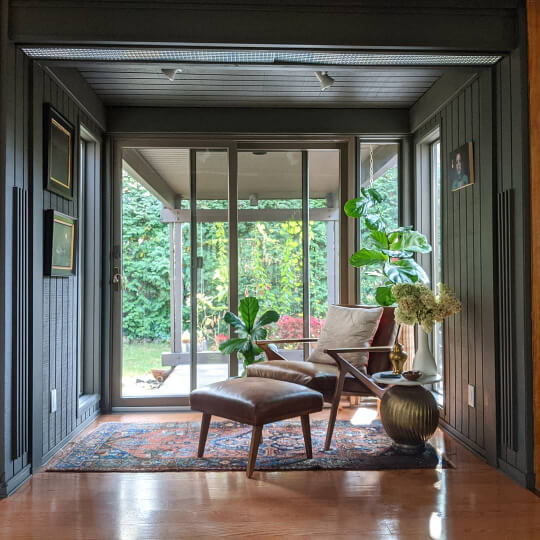
Delicious! One of the best things about Urbane Bronze is that it is generally pretty predictable.
Here is one more living room:
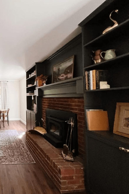
Next here it is in a bedroom:

I’ll resist the urge to show you all of my best photos of this one, for the sake of getting through this post today!
Dark Academia Greens
I think that luscious deep greens go hand-in-hand with Dark Academia:
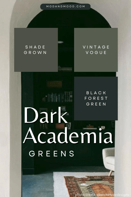
Here are just three of my favorites:
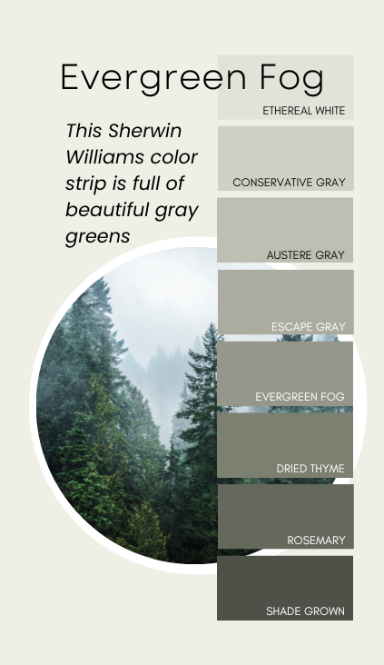
Sherwin Williams Shade Grown
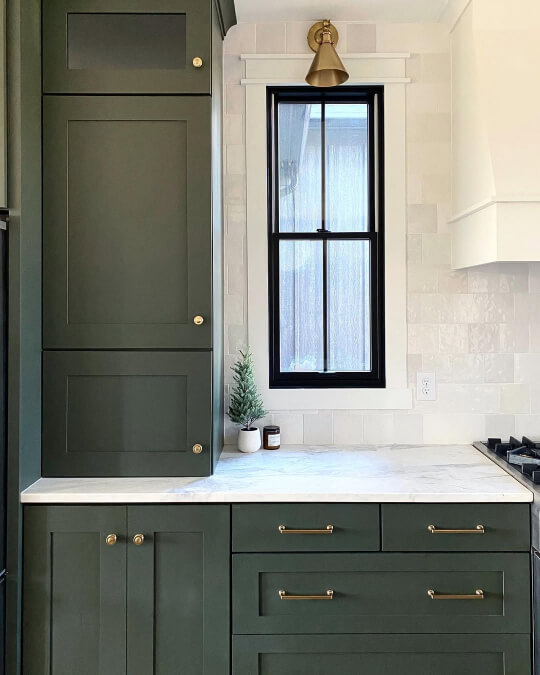
Shade Grown is from the immensely popular Evergreen Fog color strip:
This Shade Grown office is a perfect example of the Dark Academia aesthetic:

Moving on to a dark and moody bedroom, complete with on-theme warm lighting:

Finally, here is Shade Grown in a dining room:

This space is a bit lighter of an aesthetic, but I still think it’s very “Dark Academia” inspired.
Benjamin Moore Vintage Vogue

Benjamin Moore Vintage Vogue is the lightest of these greens, but it’s still pretty dark.
Here is a Dark Academia inspired bathroom featuring Vintage Vogue:
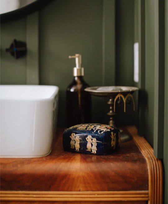
This next living room shows how much color makes a difference, because the space really isn’t themed at all, but Vintage Vogue creates the theme:

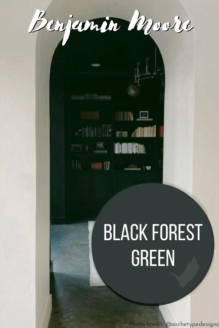
Benjamin Moore Black Forest Green

Benjamin Moore Black Forest Green, and the team at @bespokeredesign, bring us my very favorite Dark Academia inspired kitchen:

I think most people would not have been bold enough to double down with the black tile, but it adds so much to the look!
Here is another successful project, this time by Archetype Developments (@archetypehomes):

The archway into this room makes a huge statement too:
Dark Academia Deep Blues

Sherwin Williams Homburg Gray
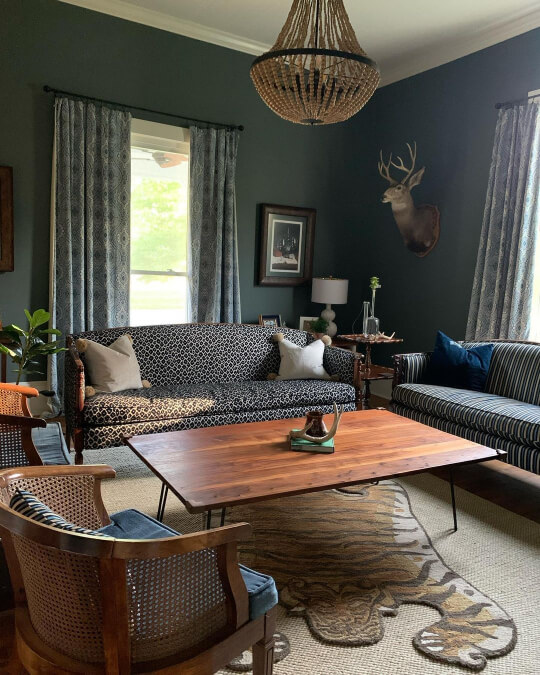
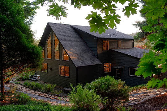
I went back and forth on whether Sherwin Williams Homburg Gray belongs with the greens or the blues, but decided the hint of teal belongs in blue!

Here is an eclectic living room that says “quirky Dark Academia”:
Homburg Gray is also very successful as a Dark Academia exterior color:
Here is one more from the porch:

Benjamin Moore Soot

Soot is a classic Victorian inspired paint color that does Dark Academia sooo well!
Here it is in a living room:

It’s charcoal and navy at the same time! Here it is in a bathroom:

Benjamin Moore Hale Navy
Hale Navy is the most neutral-est navy, and a great place to start with Dark Academia if you’re scared and just want to dabble!

Tell me this living room doesn’t fit the Dark Academia aesthetic!:
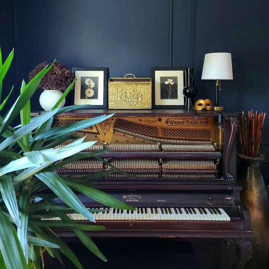
Don’t tell me that actually… Here is one more from the same lovely living room:

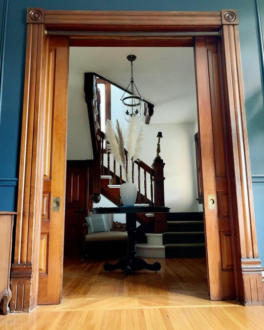
Finally, here is Hale Navy bringing the Dark Academia where you can clearly see a much lighter adjoining room, but it still works:
Dark Academia Pinks & Purples
Finally we have the less traditional colors of Dark Academia. These are luscious roses to deep aubergines:
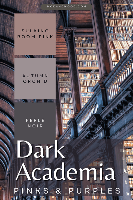
Farrow & Ball Sulking Room Pink
Sulking Room Pink is the only Farrow & Ball color that I have included in the palette. It is a neutral rose-mauve:
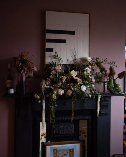
This exterior isn’t particularly dark, but I am feeling the vibe:
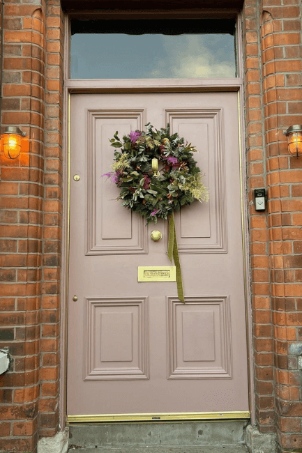
Here is Sulking Room Pink where it is serving dark and moody in the living room:

Sherwin Williams Autumn Orchid

Autumn Orchid is a very smoky purple that can range from almost mauve to completely gray. I like this one because it’s very moody without being super dark.
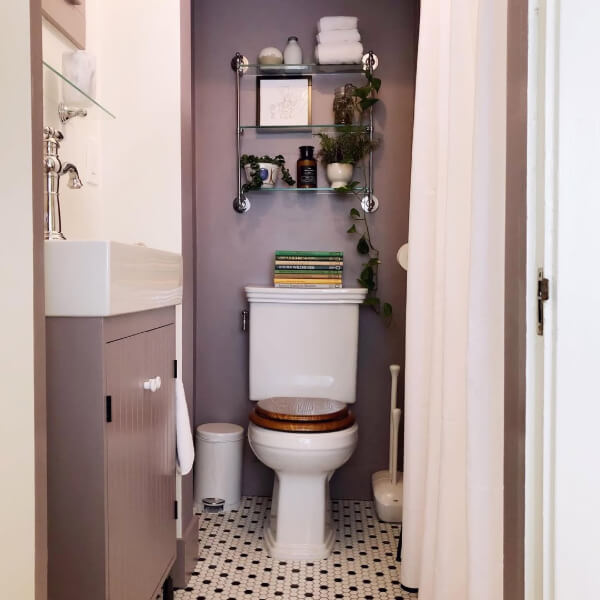
Sherwin Williams Perle Noir
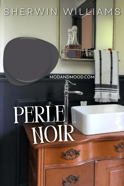
You might not even know from the swatch that Sherwin Williams Perle Noir is deep purple and not navy, until you compare it to some actual blues. In real life it looks like a purple charcoal. It’s a gorgeous hue, and one of the easiest ways to introduce purple to your home.
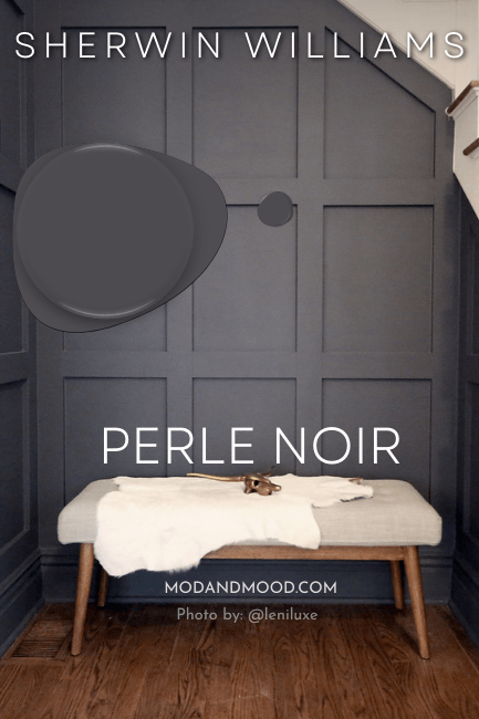
I would loooove to see this one color drenched on walls, trim, and ceiling! If you’re brave enough, let me know after.
Dark Academia Final Moody Musings
Victorian homes lend themselves particularly well to this trend because they are so compartmentalized. You can have a Dark Academia living room, and still have light and bright spaces for breathing room.

I personally really like the Dark Academia aesthetic, but I would like it a whole lot better if I had a summer house! Hats off to someone who throws their whole home into it, but if you live where winter is dark and long, I’m not so sure about this one.
If you want to dabble: A home office, powder room, or exterior would be the best fit.
Thank you so much for reading to the end! That really helps my blog. Please consider pinning this post for later, or sharing with a friend.
If you’ve been putting something off, check out these other posts to continue avoiding it! :
