Hunting for the perfect green? Sage meets earthy with the rich tones of Benjamin Moore Backwoods. This shade has been a long-standing top green for the brand, and today we will see why!
Here we will go over all of the undertones of Backwoods, get coordinating color palette ideas, see it in real homes, compare it to other greens, and finally, grab some dupes!
What Color is Benjamin Moore Backwoods? (469 or CC-620)
Backwoods is a darker green that you can find at the corner of sage green and forest green. It isn’t quite either, but it is a beautiful deep green with heaps of versatility!
The LRV of Backwoods is 12.68. What does that mean?
The LRV (Light Reflectance Value) of a color indicates on a scale of 0 – 100 how much light a color reflects (or doesn’t reflect). True black has an LRV of 0 and pure white has an LRV of 100.
In the paint world, we are working in a range of about 3 – 93 because no paint color is purely black or completely white.
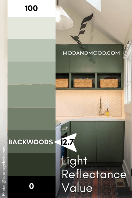
My rule of thumb, is that truly dark paint colors have LRVs of around 10 or less. At 12.68, Backwoods is just a little outside of that range. I find that this color can look dark, but it can also look on the darker end of mid-toned.
What Are the Undertones of Benjamin Moore Backwoods?
Backwoods is a fairly neutral green. It can have warm or cool undertones. While you might think from the swatch that this is an earthy green, I find that face value is deceiving.
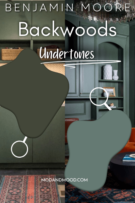
Backwoods is almost equally likely to have jade or olive undertones, but it can also look truly in the middle. I will try to point out all three when we get to real homes.
I hesitate to call it an undertone, but Backwoods is also a slightly subdued green. Meaning it does have some gray in it. That may translate as a gray undertone to your eye, particularly when compared to true, saturated greens.
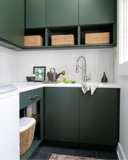
More often, this extra bit of gray makes the color read a little bit darker than you may expect, as you can see on these lower cabinets.
Backwoods in the Benjamin Moore Color Strip
Here is the light to dark color strip that Benjamin Moore has put together for Backwoods:
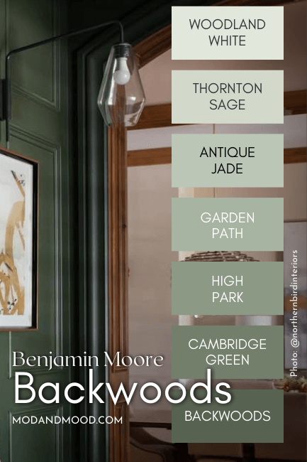
The other colors in this collection are:
- Woodland White (463)
- Thornton Sage (464)
- Antique Jade (465)
- Garden Path (466)
- High Park (467)
- Cambridge Green (468)
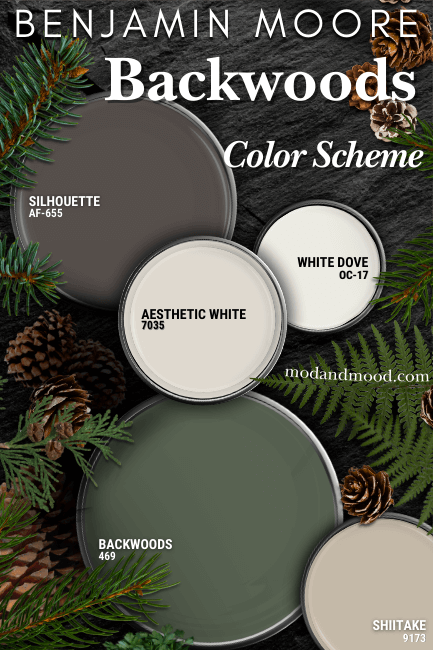
Backwoods in a Color Palette
Here is my woodsy neutral color palette for Benjamin Moore Backwoods:
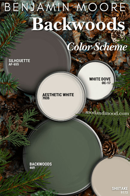
Coordinating White Paint Color for Backwoods
For a white choice, I recommend pairing Backwoods with the tried-and-true Benjamin Moore White Dove.
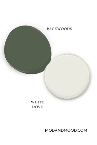
This creamy white goes with everything, but its undertone is also complementary to green.
For a darker white option, I love Sherwin Williams Aesthetic White. This off-white reads creamy, but it has a neutral taupe undertone and never looks yellow!
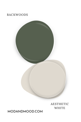
I really like the idea of using mushroom tones with Backwoods, and Aesthetic White fits the bill! For a similar Benjamin Moore color, try Pale Oak.
Neutral Paint Color to Use with Backwoods
Speaking of mushroom, Sherwin Williams Shiitake is one of my favorite mushroom beige colors. It is on the warmer side of mushroom, and I think that works great with the cooler undertone of Backwoods.
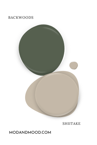
If you want to stick with Benjamin Moore colors, try Pashmina or Stone Hearth.
Try Backwoods with Benjamin Moore Silhouette
Silhouette is one of my favorite browns at the moment! It’s very similar to the eternally popular Sherwin Williams Urbane Bronze, but it has a warmer and more decisive undertone.
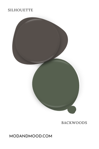
Silhouette not only works perfectly with the foresty theme of Backwoods, it’s also very on trend with the earthier color schemes that we are seeing right now.
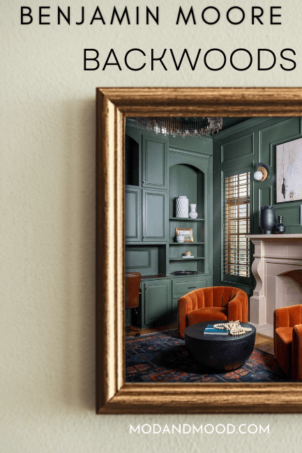
Benjamin Moore Backwoods for Your Home’s Interior
Now that we know what to expect from Backwoods, let’s take a closer look at it inside some homes!
First up we have this incredible project by Karla @northernbirdinteriors:
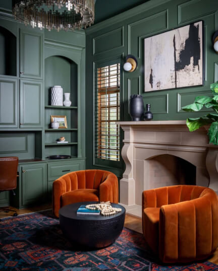
This is definitely a cooler-toned look for Backwoods, I think mostly thanks to the reflection from the sheen. The next picture is something in between:
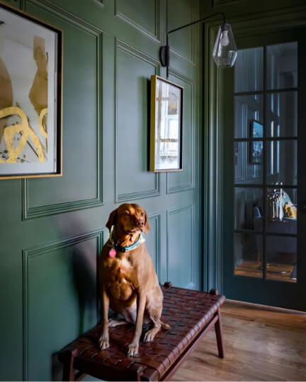
So beautiful!
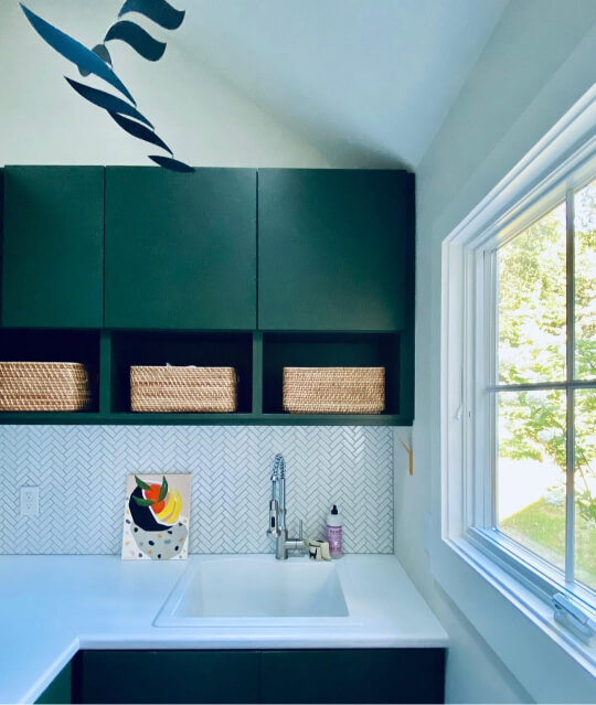
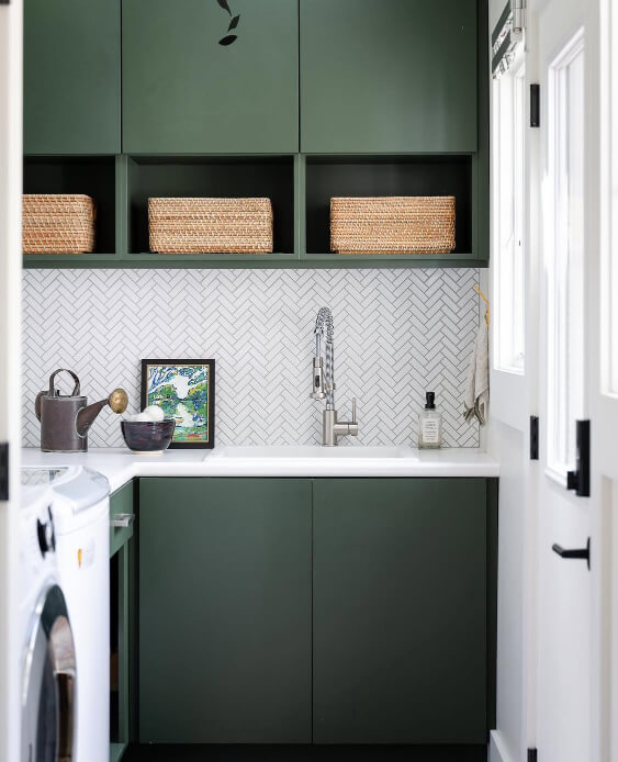
Backwoods on Cabinets
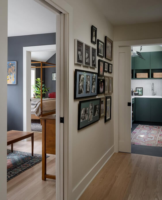
For cabinets we will have to make do with laundry room ones, but if you squint, it’s all the same…right?
Susan (@susanyeleyhomes) helped her clients create a fabulous and functional space, with Benjamin Moore Backwoods as the focal point! Here we see the color looking a little bit warmer:
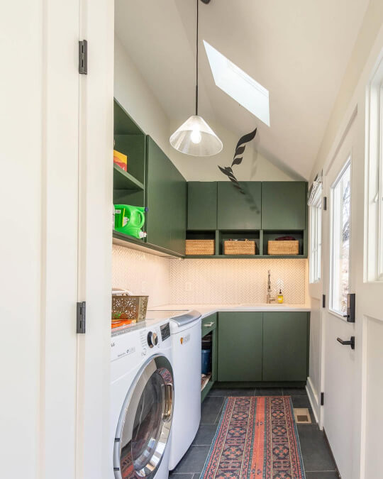
Here is a brighter and more vibrant look from Backwoods:
…And finally a combo of a warmer and more gray version:
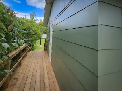
Using Backwoods for Your Exterior
I have a couple examples of Backwoods to show you for exterior inspo. The first one is by the team at ThriveAll Projects (@thriveallprojects).
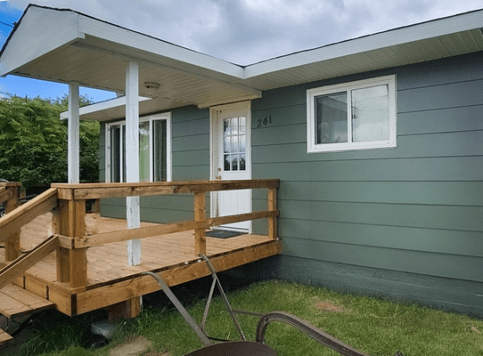
In this first picture the color looks a bit cooler and more gray, but in the next one the color looks warmer, and has a hint of an olive undertone.
I have one more exterior project to show you, this time with red brick!
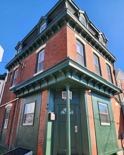
Now this time the team at Heiler Painting (@heilerpainting) didn’t say what the color is, but it is still a very good example of how Backwoods would look.
Benjamin Moore Backwoods Compared to Other Green Paint Colors
I’m willing to bet you have some other deep greens on your short list! Here is how Backwoods stacks up against other favorites:
(Click to open each panel.)
Benjamin Moore Boreal Forest and Backwoods are incredibly similar colors:
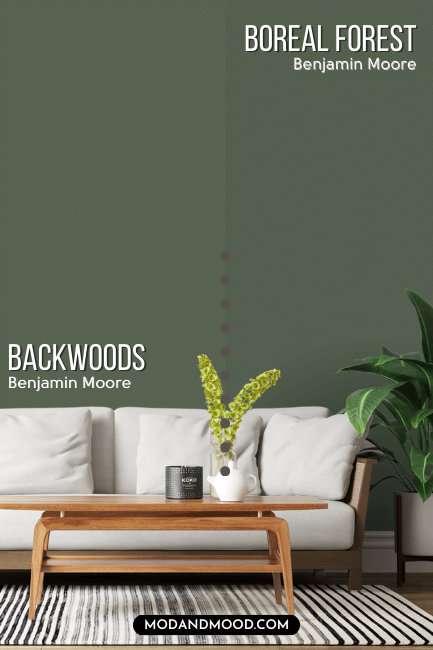
Boreal Forest is just a whisper darker than Backwoods, and not quite as gray. It is also technically a tiny bit cooler, but this is negated somewhat by being less gray. I find that Boreal Forest and Backwoods look quite alike, but Boreal Forest can have a lush summer grass look that Backwoods does not.
Benjamin Moore Chimichurri is like a darker and more saturated version of Backwoods.
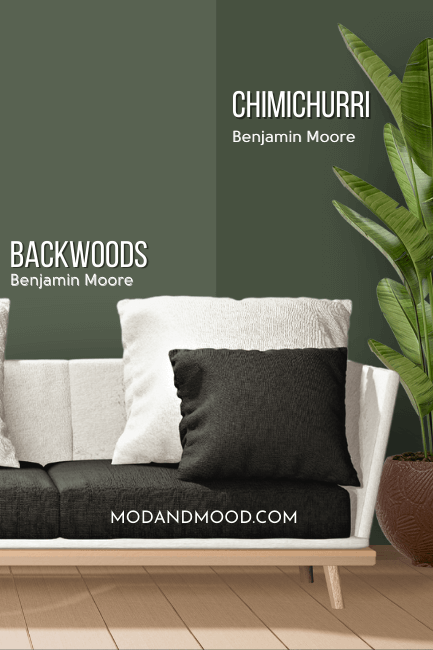
These colors have very similar undertones, but Chimichurri is more intense. It doesn’t have the muted quality of Backwoods.
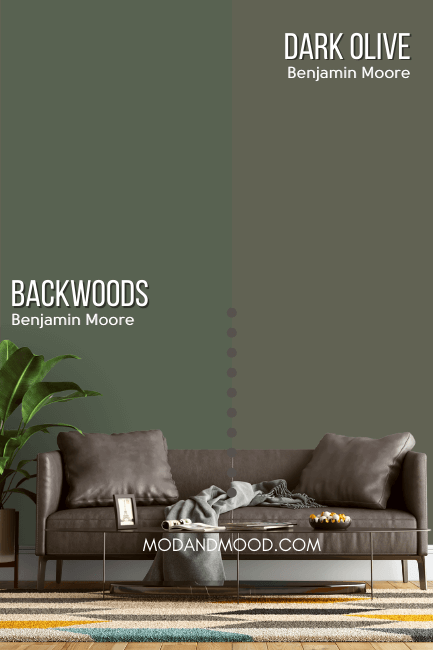
Benjamin Moore Dark Olive is much warmer than Backwoods. It tends to look like an army green, and doesn’t have that cool jade undertone.
Benjamin Moore Essex Green is much darker than Backwoods. It is also a cooler, more jewel-toned green.
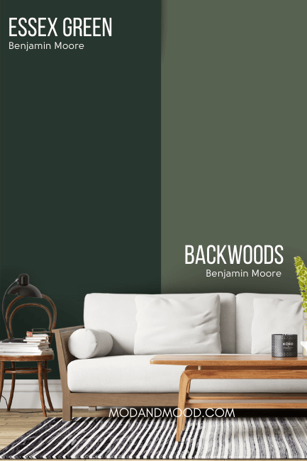
Because it is so dark, Essex Green looks almost black much more often than Backwoods does. You can see more from Essex Green in my post: Trend-Setting Green Kitchen Cabinet Ideas
Sherwin Williams Pewter Green has a similar LRV to Backwoods, but it is quite a bit more gray.
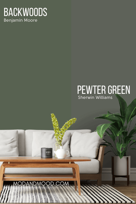
The extra gray in Pewter Green means that it generally reads a little darker than it is. Pewter Green also tends to have a cool to neutral undertone, and not normally warm.
There is a lot of crossover between Benjamin Moore Vintage Vogue and Backwoods. These colors are very similar!
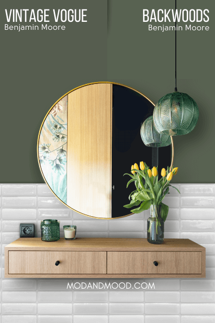
Vintage Vogue is just a tiny bit darker than Backwoods, with an LRV of 11.85. The major difference between these two, is that Vintage Vogue is a bit more muted than Backwoods. I also find that Vintage Vogue has a warmer undertone perhaps a little more often than Backwoods does.
All that being said, these two run the same general range of looks, but Backwoods appears a hair more vibrant.
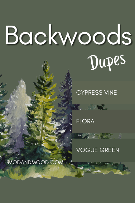
Dupes for Benjamin Moore Backwoods from Other Brands
Can’t make it to Benjamin Moore? I manually sifted through hundreds of colors to bring you the very best copycat colors from the other major paint brands.
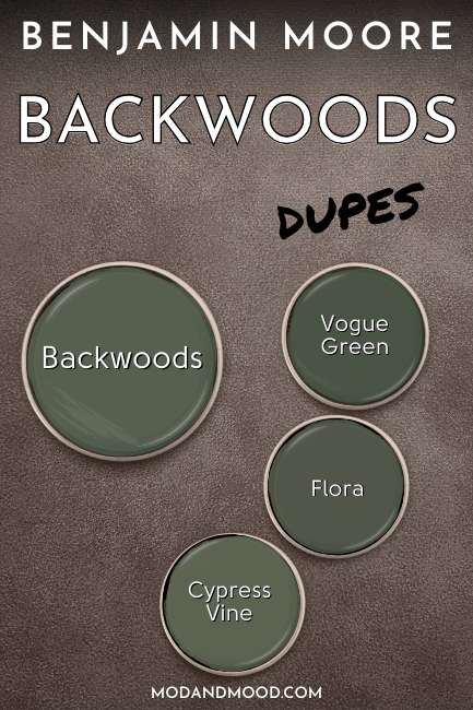
Let’s take a look at these dupes in detail!
Behr (Home Depot) Color Match for Backwoods
Behr has the best dupe for Backwoods with their shade Cypress Vine:
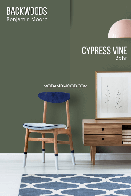
On paper, Cypress Vine is only a hair lighter than Backwoods, but I do find that it tends to skew a little bit lighter in general. These colors have generally the same undertones, ranging from olive to jade, but Cypress Vine at its warmest, does look more olive than Backwoods ever does.
Sherwin Williams Version of Backwoods
I didn’t get as close to a dupe as I normally would like to with Sherwin Williams. Vogue Green ended up being the best overall tone match, as most of the deep greens at Sherwin Williams are a lot more muted.
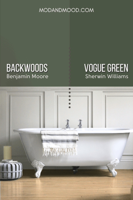
Vogue Green is a more intense version of Backwoods. It has the same range of undertones, but it doesn’t ever get to Backwoods’ most muted look. For this same reason, Vogue Green doesn’t ever look close to black, despite being a little darker than Backwoods.
For a second option, you might like Sherwin Williams Rosemary. At first glance these colors don’t look that alike, but in real life they have a pretty similar vibe:
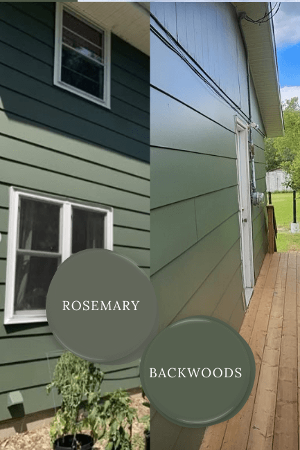
Rosemary tends to stick warmer than Backwoods. It can look like a smoky green, but it doesn’t have the jade undertone.
Valspar (Lowe’s) Equivalent for Backwoods
Over at Lowe’s, most of the green colors were much darker or cooler than Backwoods, but we do alright with Valspar Flora.
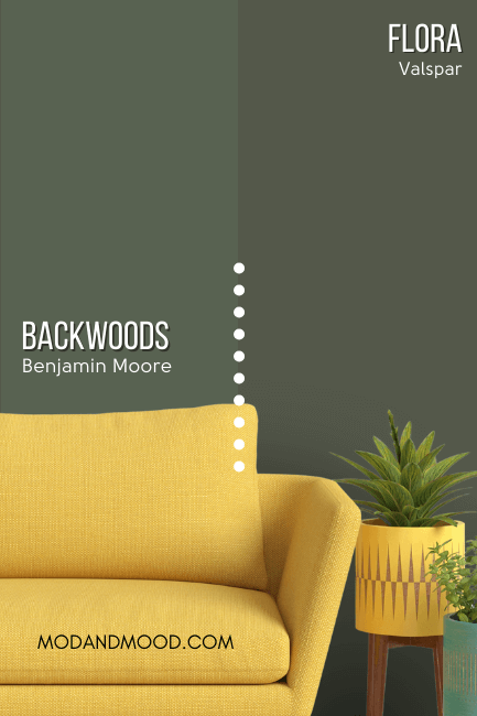
Flora looks more like Backwoods in real life than it does on paper, but unsurprisingly it sticks to the warmer look of Backwoods. Flora is also a bit more gray than Backwoods, so it is slightly more likely to have that muted look that approaches black.
Let’s take on more look at each of these dupes:
Thank you so much for reading until the end, that really helps my blog!
I hope this post helped you decide if Backwoods is the perfect luxurious green for your next project! If not, fear not! I’ve got plenty more: