Vintage Vogue by Benjamin Moore, is a darker sage green with a hint of warmth and a bit of gray for added subtlety. This moody green is a real show-stopper that will have guests asking about your wall color!
Here I will show you Vintage Vogue in real homes, in color palettes, and finally, give you some dupes!
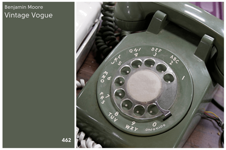
What Color is Benjamin Moore Vintage Vogue? (462)
Even Benjamin Moore pitches Vintage Vogue as a neutral!
“An ultra-dark, smoky green that can be used in the place of black or brown.”
That’s about the size of it! To put it simply: Vintage Vogue is a darker sage green.
Where I disagree with Benjamin Moore, is that I wouldn’t say Vintage Vogue is “ultra-dark.”
Depending on the lighting, it can look pretty dark, but never what I would call “ultra-dark.”
LRV of Benjamin Moore Vintage Vogue
So how dark is Vintage Vogue?
The LRV of Vintage Vogue is 11.85.
Here’s what that means:
The LRV (Light Reflectance Value) of a color indicates on a scale of 0 – 100 how much light a color reflects (or doesn’t reflect). True black has an LRV of 0 and pure white has an LRV of 100.
In the paint world, we are working in a range of about 3 – 93 because no paint color is purely black or completely white.

I typically say that truly dark paint colors have an LRV of about 10 or less.
The interesting thing here, is that the LRV of Vintage Vogue used to be listed as 10, and I even included it in my Dark Green Paint Colors post.
I do agree that 11.85 is probably more accurate, because this color seems a bit lighter than other 10s.
This photo in particular had me feeling this way:
Sure it’s dark-ish…definitely not “ultra dark.”
What Are the Undertones of Vintage Vogue
Vintage Vogue is a gray green that most often has warm olivey undertones. Occasionally you will see more of the gray at play, particularly in low light.
In general though, I would say that Vintage Vogue tends to look almost the same in every setting, which is pretty neutral.
Is Vintage Vogue Warm or Cool
Technically Vintage Vogue is a warm green, because it is much closer to yellow than it is to blue.
It does tend to have a touch of cozy warmth, but it isn’t overtly warm and olivey.
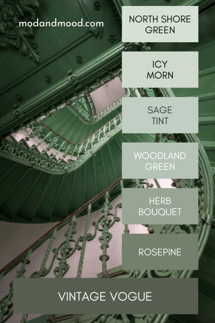
Vintage Vogue Color Strip
If you like sage greens, you will love the Vintage Vogue color strip! :
Lighter Version of Vintage Vogue
With an LRV of 20.82, Benjamin Moore Rosepine is one shade down on the same color strip.
I have actually never seen Rosepine in person, but it looks quite nice!
Darker Version of Vintage Vogue
Vintage Vogue is the last color on this Benjamin Moore color strip, so there technically is no darker shade.
A color that immediately springs to mind as a darker alternative would be Sherwin Williams Ripe Olive.
Contrary to it’s name, it isn’t super olivey:
From Benjamin Moore, Topsoil also looks like it could work, but this is another color I have never seen in real life, so you would want to test it out.
Benjamin Moore Vintage Vogue Color Palette
Vintage Vogue is so neutral that I’ve already used it in a few of my palettes! Here are a couple that feature this versatile green:

Coordinating Colors
Vintage Vogue is on the far right of this palette. The other colors from left to right are:
Sherwin Williams Eider White
SW Eider White is like a super light greige. It is technically an off-white, and it looks great with a variety of other neutral tones, including greens!
Sherwin Williams Agreeable Gray or Accessible Beige
These are two of THE most popular neutrals from Sherwin Williams. Either would look great with Vintage Vogue. Like little mushrooms in the forest! Benjamin Moore Revere Pewter or Balboa Mist would work the same.
Learn more about Agreeable Gray and Accessible Beige here.
Sherwin Williams Urbane Bronze
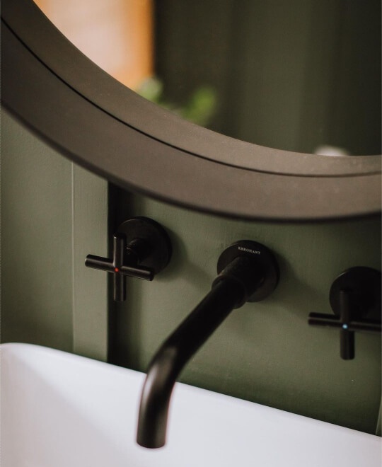
Photo Credit: @jenna.rachelle
Urbane Bronze works great with neutrals, greens, and dark blues. It has an actual bronze quality to it that I really like.
Sherwin Williams Thunderous
Thunderous is a really interesting color! It can at times look almost gray and at other times looks pretty green. It does all the things: warm, dark, gray, green…you get the picture!
These two might not have enough contrast to be used together, but could be interesting in a monochromatic theme.

This is another earthy natural color palette featuring Vintage Vogue. The colors here are:
Sherwin Williams Sea Salt
This might be my favorite whole home paint color right now. It’s such a soft soothing color, but still very light.
Sherwin Williams Cavern Clay
Cavern Clay is one of the best terracotta colors by Sherwin Williams. I love terracotta with all of the greens that are popular right now, and of course, it looks great with warm whites and tan too!
Benjamin Moore Manchester Tan
Manchester Tan is a warm tan color that leans more beige and not greige like the neutrals we looked at earlier.
Sherwin Williams Natural Choice and Alabaster
Natural Choice is a nature inspired off white. Alabaster is a creamy white with fairly neutral undertones. Both of these creamy natural colors would also work great with Vintage Vogue.
You can see these two contrasted here: Alabaster vs Natural Choice.

Complementary Color
Officially, “complementary colors” are those that sit across the color wheel from each other.
In the case of Vintage Vogue, that would be a smoky purple color, but ain’t nobody (for the most part) going to be that brave. Benjamin Moore’s Hale Navy would be a good compromise. It’s a dark gray navy.
I don’t have a photo of these two together, but here is Hale Navy with some poppin’ plants for an example:

If you are brave enough for a smoky purple, I love Sherwin Williams Perle Noir.
Perle Noir and Vintage Vogue wouldn’t be for everyone, but it would be oh-so “Dark Academia!”
What Trim Colors Go With Benjamin Moore Vintage Vogue?
Greens looove natural wood tones, so you can definitely make Vintage Vogue work if you have dark wood or oak trim in your home already.
If you want to go with a traditional white trim, here are some options:
White Paint that Goes with Vintage Vogue
Behr Ultra Pure White
In case you want to be able to run to Home Depot for your white paint, Behr’s Ultra Pure White is one of the brightest (if not THE brightest) and cleanest whites on the market.
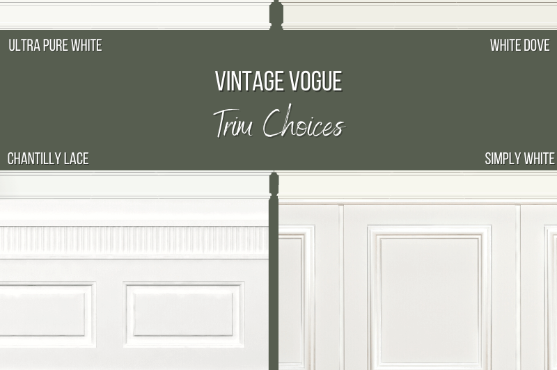
Benjamin Moore Chantilly Lace
A nice clean white! Chantilly Lace appears true white on the walls, with no discernible undertone. (That’s why it goes with everything!)
Because it is technically a green based white, I love pairing it with greens.
Benjamin Moore White Dove
White Dove is a cozier warm white that is one of Benjamin Moore’s most popular colors.
Benjamin Moore Simply White
Simply White is a bright white that somehow manages to have warm and creamy undertones.
Benjamin Moore Vintage Vogue Inspiration for Your Home Interior
I have quite a few great real-life examples of Vintage Vogue for you today!
Let’s take a look:
Benjamin Moore Vintage Vogue Living Room
Here in the living room of Amanda (@thetinpitcher) Vintage Vogue is giving major “get comfy” vibes.

Notice that Amanda chose to also paint her trim in Vintage Vogue, but with semi-gloss. (In fact, sage green trim on it’s own is having a moment.)
Her other wall color is Sherwin Williams Worldly Gray.
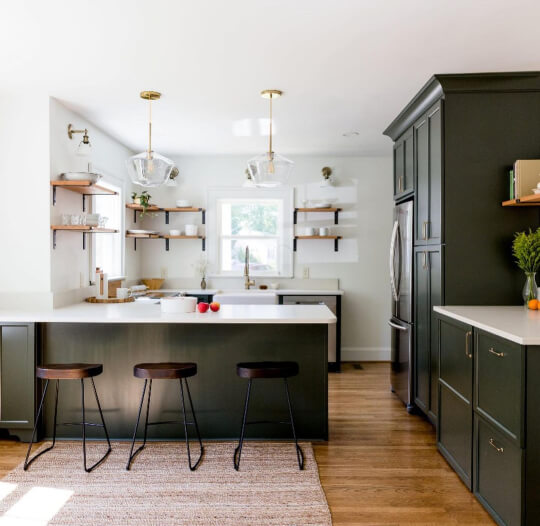
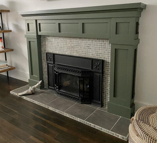
Next we have the home of Karin (@karinwithaneye).
You might recognize some of Karin’s home from my “Trend-Setting Green Kitchen Cabinets“ post, but she has also used Vintage Vogue on her fireplace!
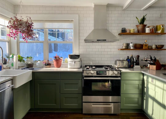
Benjamin Moore Vintage Vogue Kitchen Cabinets
Moving on to Karin’s kitchen, she chose to do all of her cabinets in Vintage Vogue.

Karin chose Benjamin Moore Chantilly Lace for her white paint.

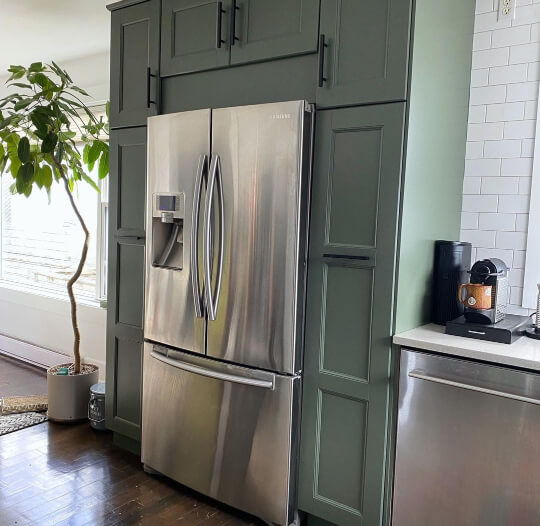
Here is one shot where Vintage Vogue looks a lot warmer and mossier:
The warm yellowy light from outside changed the look briefly, but in general Vintage Vogue looks pretty consistent.
I love that Karin used two different countertop materials in her kitchen!
For the main u-shaped area she went with a light stone, but for this back buffet area she chose a warm butcher block.

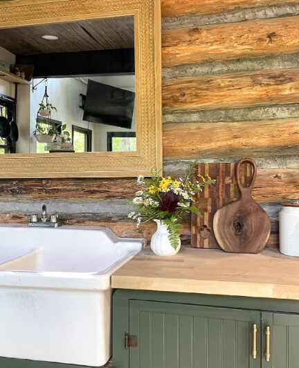
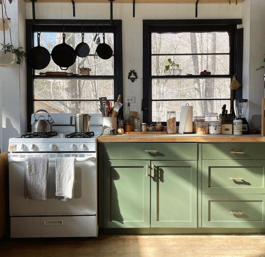
You can get an idea from that last shot, as well as our next kitchen, that Vintage Vogue would also work on the wall with oak cabinets.

This is Allie (@alliejcurtin) in her Vintage Vogue kitchen.
Allie also chose butcher block (a top choice for green cabinets in general) to top off Vintage Vogue cabinets in her off-the-grid cabin.

Gold hardware, white walls, and black trim, top off this look:
If you are here for a cabinet color, you will love my post: The Best Colors for Sage Green Kitchen Cabinets (To Get the Look You Want!)
Benjamin Moore Vintage Vogue Bedroom
Vintage Vogue would be a soothing choice for any bedroom!
Ancey (@ourvarghesehome) paired it with the creamy white of Benjamin Moore White Dove for maximum serene tot vibes.

Again we see lots of natural tones that complement Vintage Vogue so well.
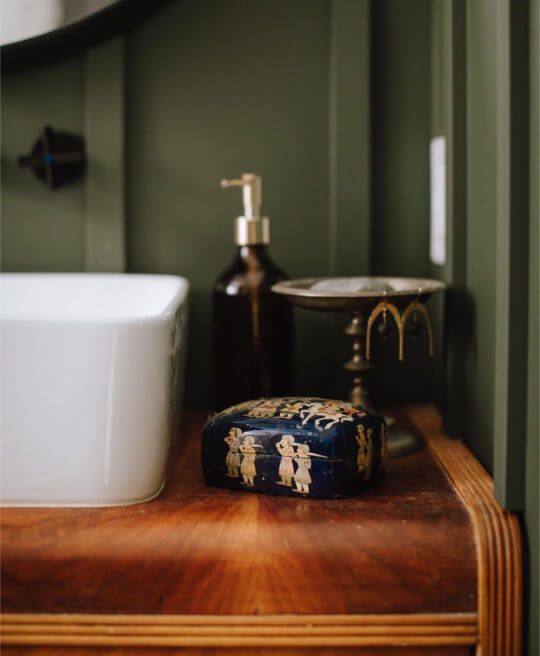
Benjamin Moore Vintage Vogue Bathroom
Jenna (@jenna.rachelle) happens to be a photographer, so who better to show off a picture-perfect Vintage Vogue bathroom?
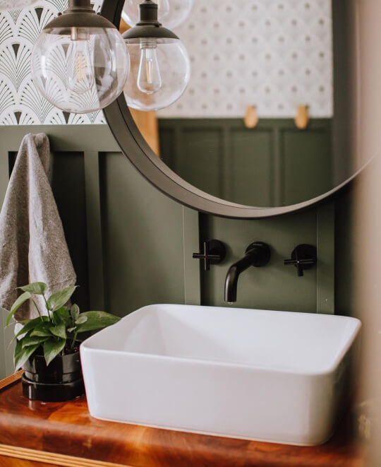
Nobody! That’s who!
Jenna has alllll the right shots:
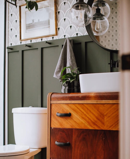
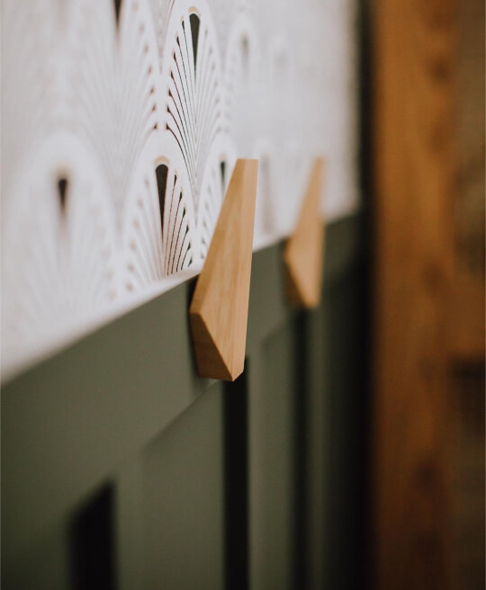
Jenna chose a black and white printed wallpaper to go above her Vintage Vogue board and batten, which keeps things looking nice and open.

The warm wood of the vanity provides an additional pop of color!
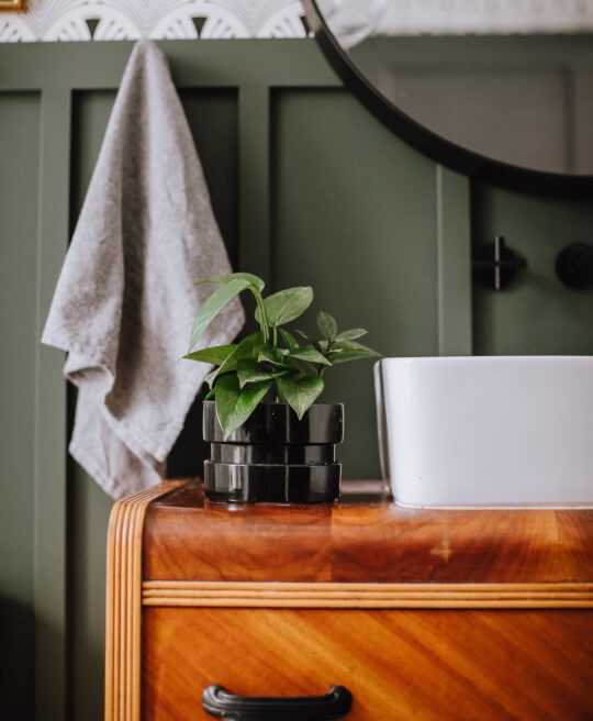
Jenna went with dark bronze for her accents.

I know it’s “just” a bathroom, but I am so here for it!
How Will Vintage Vogue Look on an Exterior?
I really hate to disappoint, but I have not found anybody who has used Vintage Vogue for their exterior yet. It has only become really popular this year, so I will keep an eye out.
Rather than leave you with nothing, I did find a green color similar to Vintage Vogue to help you picture it:

I think Vintage Vogue would be pretty close to this color. Remember that colors always look lighter on exteriors!
Front Door Inspiration for Vintage Vogue
No front doors in Vintage Vogue either! Whomp whomp.
Here is Sherwin Williams Clary Sage, just to give you an idea:

Clary Sage is much lighter than Vintage Vogue, but it’s a similar tone, and this door is shaded so it helps a little with picturing it. Just imagine it a little darker.
Vintage Vogue Compared to Other Benjamin Moore Paint Colors
Greens are big right now, and Benjamin Moore does them well! Here are a couple of similar shades to Vintage Vogue that you may also like:
Benjamin Moore Vintage Vogue vs Backwoods
A lot of people are curious about the difference between Vintage Vogue and the Benjamin Moore shade Backwoods.
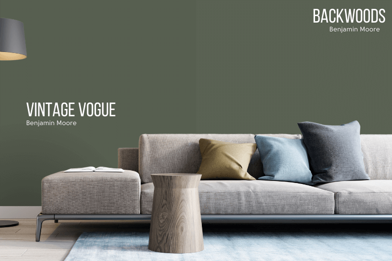
Um, yeah…I can see why.
Backwoods has an LRV of 12.68, so it is a tiny bit lighter than Vintage Vogue. It is also just a teeny bit cooler and less gray.
These two are similar enough that it is often confusing in photos. If you are worried that Vintage Vogue could look too olivey in your space, give Backwoods a shot!
Benjamin Moore Vintage Vogue vs Forest Floor (1498)
Forest Floor is warmer and more olivey than Vintage Vogue. It is also lighter, with an LRV of 13.57.

Vintage Vogue Sherwin Williams Version
I was surprised that there weren’t more close Sherwin Williams color matches to be honest! I usually have to choose between a few colors to pick the best equivalent.
The closest dupe that Sherwin Williams has for Vintage Vogue, is Rookwood Dark Green.
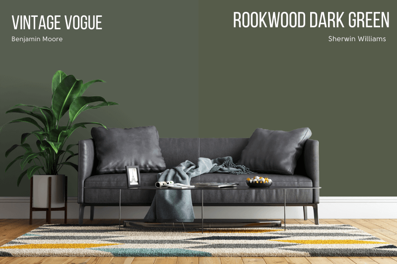
Benjamin Moore Vintage Vogue vs Sherwin Williams Rookwood Dark Green (SW 2816)
Rookwood Dark Green is a little bit darker than Vintage Vogue, with an LRV of 10.
While these colors are similar, it is easy to spot that Rookwood is warmer and less gray than Vintage Vogue. Essentially Rookwood will read a bit more colorful.
Benjamin Moore Vintage Vogue vs Sherwin Williams Vogue Green (SW 0065)
Sherwin Williams Vogue Green not only has a similar name to Vintage Vogue, it is a pretty similar color.
Vogue Green is a more saturated green shade, and it is a little darker than Vintage Vogue, with an LRV of 9.

Here are a few more dark greens by Sherwin Williams with a similar vibe to Vintage Vogue:
Benjamin Moore Vintage Vogue vs Sherwin Williams Forestwood (SW 7730)
SW Forestwood is also darker than Vintage Vogue, with an LRV of 8. These two are pretty darn similar if it weren’t for the lightness difference.
I even looked for the lighter shade of Forestwood, to see if it was a better match, but it is one of Sherwin Williams standalone colors, and not part of a strip.

Benjamin Moore Vintage Vogue vs Rosemary (SW 6187)
I have actually written a whole article about Rosemary, because it is a super popular and versatile neutral green by Sherwin Williams.
Rosemary is lighter than Vintage Vogue, with an LRV of 14. It is also a tiny bit warmer and more gray.

In real life I find that these two look pretty similar, but Rosemary definitely never looks as dark.

I didn’t include it here, but Sherwin Williams Pewter Green is another similar shade that you may like.
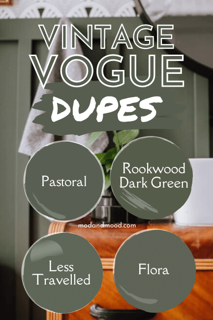
Valspar Equivalent to Vintage Vogue
The closest Valspar dupe for Vintage Vogue (and probably my favorite of the bunch) is the color Flora.
Benjamin Moore Vintage Vogue vs Valspar Flora (5004-2C)
First things first, Valspar’s LRVs tend to be on their own scale. They say that the LRV of Flora is 9, making it darker than Vintage Vogue, which clearly it is not.

My guess is that the LRV of Flora is actually a 12, which would make it just a hair lighter than Vintage Vogue.
Flora is a tiny bit warmer and a tiny bit more gray that VInta Vogue, but all the same, this is a pretty good double!
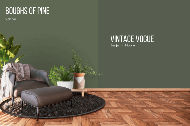
Benjamin Moore Vintage Vogue vs Valspar Boughs of Pine (5007-4C)
Valspar’s Boughs of Pine is a bit warmer and less gray than Vintage Vogue. It is supposed to have an LRV of 10.32, but again it isn’t actually darker than Vintage Vogue.
These look approximately the same in terms of lightness. Vintage Vogue is a little bit darker.
Vintage Vogue Behr Equivalent (Home Depot)
Behr has a pretty perfect dupe for Vintage Vogue, with their shade “Pastoral.”
Benjamin Moore Vintage Vogue vs Behr Pastoral (PPU10-20)
Pastoral has an LRV of 11, so it is right there with Vintage Vogue. Even the line between the two colors is hard to spot!

So what is the difference?
Pastoral is a little less saturated than Vintage Vogue. That’s it, that’s all. These two are pretty much twins!
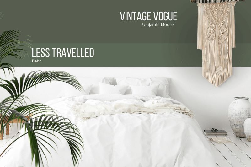
Benjamin Moore Vintage Vogue vs Behr Less Travelled (MQ6-15)
Not to be left out, the Behr shade Less Travelled is also a reasonably good color match for Vintage Vogue.
It is a little lighter, with an LRV of 13, as well as a little cooler and more saturated.
So Why is This Color Benjamin Moore’s Best Kept Secret?
Vintage Vogue is perfectly on trend and poised for an explosion in popularity…but it just hasn’t happened. Maybe it will still come, and you can be a real trend-setter, or maybe it will stay our little secret!
Either way, I hope I have convinced you that you can use Vintage Vogue just about anywhere that you would use a dark neutral color!
Not the green for you? Oh boy do I have options!


