Benjamin Moore Rainy Afternoon is a deep gray green that is perfect for everything from a sultry drench of color, to little accents here and there.
You might already know this color is fab, so today we will look at 8 colors that you can use right alongside Rainy Afternoon, including neutrals and whites!
What Are the Undertones of Benjamin Moore Rainy Afternoon?
Rainy Afternoon is a bit of a chameleon. It is a deep gray green, but it can sometimes look like a true cool charcoal.
Here is a look at its different faces:

All of these photos were taken in the same bedroom at Nicole’s @basicbluehouse. (Which is anything but basic I might add.)

You can see how the color shifts from a dark gray green to a deep mid-toned charcoal with quite a cool undertone. I will say that in other homes that I have seen, Rainy Afternoon tends to stay more green.
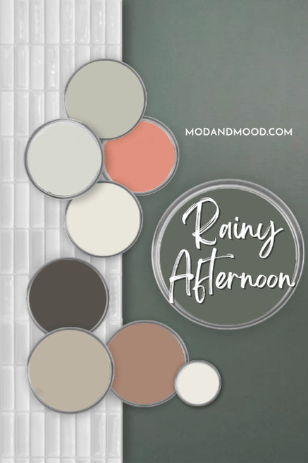
Benjamin Moore Rainy Afternoon in a Color Palette
Now that we know what Rainy Afternoon actually looks like, here are some colors that I think coordinate perfectly:

I didn’t realize that all of these are actually from Benjamin Moore for once, so this is one-stop shopping!
Coordinating White Paint Color for Rainy Afternoon
Like most gray greens, Rainy Afternoon is neutral enough to coordinate with practically any white or off-white. I decided to go with the Benjamin Moore classic: Simply White.

Simply White is as light and bright as white paints come, but it isn’t crisp. This color has a hearty helping of creamy undertones to soften it up.
Try Rainy Afternoon with Benjamin Moore Gaucho Brown
Pink is really coming into fashion, and I looove to mix greens with terracotta, so Gaucho Brown seems like the perfect neutralized brown/coral.

While the combination of Rainy Afternoon and Gaucho Brown is unexpected, it works very well because red is complementary to green.
You could also use one shade lighter: Benjamin Moore Cappuccino, or the rosy brown of Sulking Room Pink.
Neutral Paint Color to Use with Rainy Afternoon
I really like the idea of using a mushroom color with the sultry natural green of Rainy Afternoon.
Here I went with Benjamin Moore Pashmina.

This warm taupe can run the full spectrum from cool (almost green beige) to a true mushroom color, but you should expect it to lean warm against Rainy Afternoon.
Here is an example with SW Rookwood Dark Green:

Looks beautiful together! Rainy Afternoon will just be a little bit more gray.
Pair Rainy Afternoon with Benjamin Moore Dragon’s Breath
Dragon’s Breath is one of my top dupes for Sherwin Williams Iron Ore. This complicated warm charcoal can look almost black, a touch olivey, slightly bronzey, or even a little bit cool.

While there is only very specific situations where you would use two dark colors like this, Rainy Afternoon and Dragon’s Breath would certainly look very good together!
Benjamin Moore Recommends These Coordinating Colors
Now that we’ve seen my favorite coordinating colors for Rainy Afternoon, let’s take a look at what Benjamin Moore suggests. (Fun fact: I actually don’t peek at these in advance. I like to make my own recommendations without being biased.)

I actually really like their coordinating colors this time! They are all colors that I would use with Rainy Afternoon.
Pair Rainy Afternoon and Benjamin Moore Horizon Gray
Horizon Gray is a versatile greige with a sage green undertone.

This color is on the lighter end of mid-toned, so it would be a great whole-home color to use with Rainy Afternoon.
Use Rainy Afternoon with Dove Wing
Benjamin Moore Dove Wing is a neutral off-white that goes with pretty much everything! It is similar to a darker and slightly more gray version of White Dove.

Dove Wing definitely works with Rainy Afternoon, but that’s no surprise since it’s a nice light neutral.
Try Moonshine and Rainy Afternoon
Benjamin Moore Moonshine is almost like a combination of Dove Wing and Horizon Gray. It’s in between both in terms of lightness.

Moonshine can look neutral like Dove Wing with the green undertone of Horizon Gray, but it can also look like a silvery blue gray.
Pair Coral Rock and Rainy Afternoon
I think it’s so funny that Ben and I both went coral with one of our coordinating colors, but mine is better…and that’s a hill I will die on.
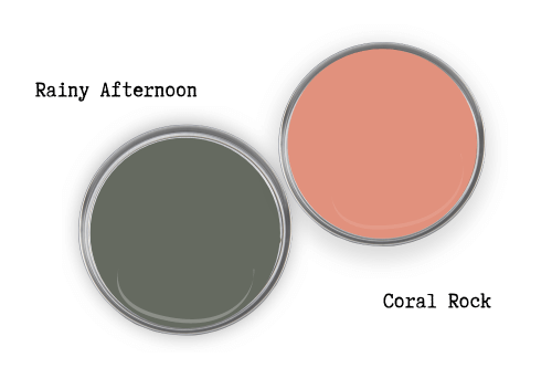
Benjamin Moore Coral Rock is a very bold “sorbet” kind of coral. It definitely works with Rainy Afternoon, but personally I prefer the more subdued Gaucho Brown.
Here’s another look at all of these coordinating colors, before we do a quick Rainy Afternoon comparison:

What is the Difference Between Rainy Afternoon and Vintage Vogue?
Another popular muted deep green from Benjamin Moore is their shade Vintage Vogue.

Vintage Vogue reads warmer and less gray than Rainy Afternoon. I also find that it generally looks lighter, despite having a similar LRV. I think this is because Vintage Vogue has more color, so it looks “brighter.”
What is the Difference Between Rainy Afternoon and Retreat or Pewter Green?
This is the question nobody is asking, but they should be!
On the surface I thought that Rainy Afternoon is quite similar to Pewter Green, but it’s also the closest Benjamin Moore color to SW Retreat. Here is a look at all three:

Rainy Afternoon is lighter than Pewter Green, and a hair cooler. Pewter Green is a little more gray however, which pretty much cancels out any additional warmth it has.

The major difference here, is that Pewter Green never looks blue at all, but Rainy Afternoon gets close.
Retreat is one shade lighter than Pewter Green on the same color strip, and it is similar to a lighter version of Rainy Afternoon on paper. In real life, Retreat always looks sage, and never a cool gray like Rainy Afternoon can.
Well I hope that helped you decide how to use Rainy Afternoon and what to use it with! Not sure yet? Here are some more colors that you will like:


