Sherwin Williams Iron Ore can be an unpredictable paint color, but every one of its faces are attractive and versatile!
Let’s take a look at this Sherwin Williams shade in real homes, work it into a palette, and see what dupes we can find from other brands.
Let’s go!
This post may contain affiliate links. Should you choose to make a purchase through one of my links, I may receive a small commission at no cost to you. I only recommend products that I use.
What Color is Sherwin Williams Iron Ore? (7069)
Iron Ore is an interesting color because technically it’s a deep charcoal in the yellow family. In real life however, Iron Ore most often looks like a deep gray with a hint of blue.

Is Iron Ore Black or Gray?
Iron Ore is sometimes touted as a good black option from Sherwin Williams, but as you will see when we get to homes, it really isn’t black.
If you want a solid inky black paint color, Iron Ore isn’t it. You want something like Tricorn Black.
It can sometimes look close to black, but it will never predictably look black in your space. In good lighting it will always look like some form of charcoal gray.
If you remember nothing else from this post, remember that if you use Iron Ore, your guests and IG followers may all see the color differently than you do!
“Love the navy wall!” “What color green is that?” “Your black doors are gorgeous!”
I promise you it will happen, because color is weird, and so are we.
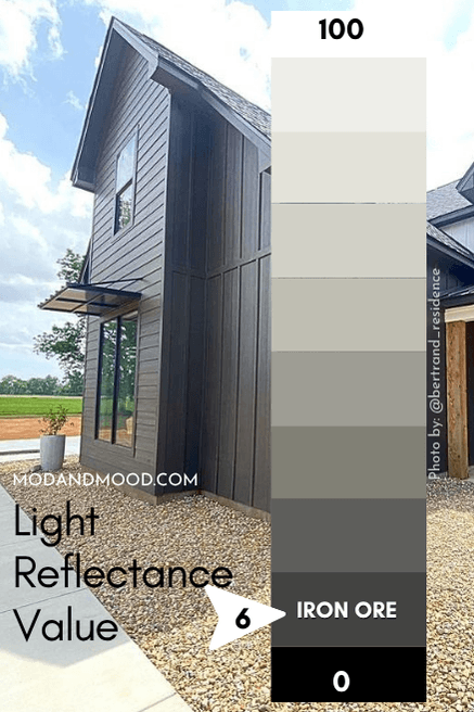
LRV of Sherwin Williams Iron Ore
The LRV of Iron Ore is 6.
What does that mean?
The LRV (Light Reflectance Value) of a color indicates on a scale of 0 – 100 how much light a color reflects (or doesn’t reflect). True black has an LRV of 0 and pure white has an LRV of 100.
In the paint world, we are working in a range of about 3 – 93 because no paint color is purely black or completely white.
With an LRV of 6, Iron Ore is definitely a very dark paint color, but it isn’t black.
What Are the Undertones of Iron Ore?
Iron Ore most often has a blue-ish undertone. It can also have a greenish undertone, but I see this far less often.
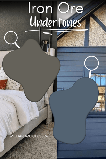
Is Iron Ore Warm or Cool?
This is an interesting one! Iron Ore has both warm and cool elements.
Because Iron Ore is technically in the yellow color family, it should be a warm charcoal, and it may look quite warm next to other grays.
However! Remember how I said that it most often has a blue undertone? In those cases, Iron Ore looks cool:

Perhaps the most important thing to know, is that you can use Iron Ore like a neutral. It goes well with all kinds of other colors.
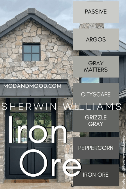
Iron Ore in the Sherwin Williams Color Strip
Sherwin Williams does not technically have a color strip for Iron Ore. They have it grouped into a collection of black and off-black paint colors.
The best fit for Iron Ore is here on the color strip from Passive to Peppercorn:
Lighter Version of Iron Ore
I will talk more about Peppercorn further down, but Grizzle Gray is another lighter alternative to Iron Ore. On paper it is cooler, but it has the same chameleon-esque quality as Iron Ore, and can look warm or cool. (Most often cool.)
Grizzle Gray has an LRV of 13, so it’s between a mid-toned and dark paint color.
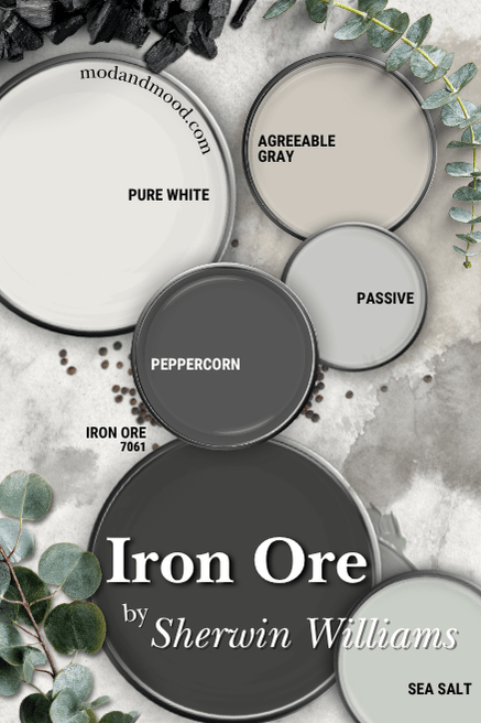
Sherwin Williams Iron Ore in a Color Palette
Here is Iron Ore in a palette of other classic neutrals by Sherwin Williams:
Complementary and Coordinating Colors for Iron Ore
Iron Ore with Peppercorn
You’re going to get sick of me talking about Iron Ore and Peppercorn, but these two are always in the conversation together.
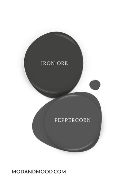
They are like salt and pepper…corn. (I’ll see myself out.)
These two are almost too similar to use together, but they will work great in either a monochromatic moment, or when you want to continue having pops of Iron Ore but some rooms are just too dark!
Agreeable Gray and Iron Ore
Agreeable Gray is greige all day, and it works nicely as a whole-home neutral with Iron Ore.
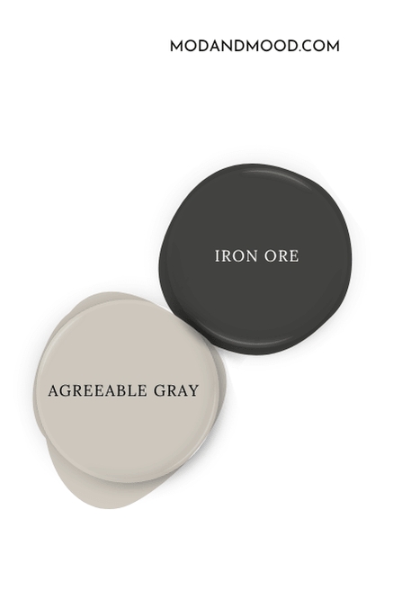
Agreeable is a good choice to warm things up just a touch. I have an example photo below when we look at real homes.
Iron Ore and Passive
Passive is the lightest color from the Iron Ore color strip. It has the same “sometimes warm sometimes cool” effect as Iron Ore, which makes these two an interesting combination.
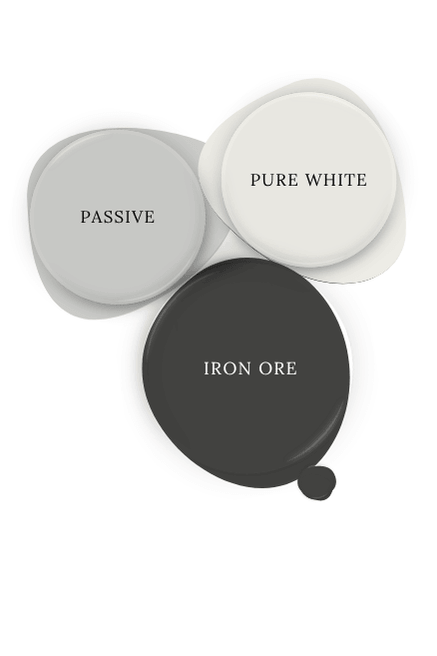
Iron Ore with Pure White
Pure White is a true white that leans just a little grayer and warmer than a bright no-tint white. The softness works great with Iron Ore, while also keeping the contrast.
If you want to use Iron Ore like a black, choose a white like Pure White.
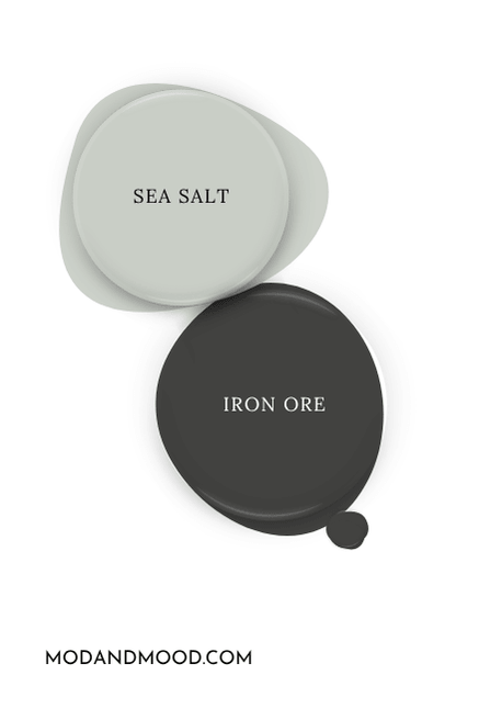
Sea Salt and Iron Ore
Sea Salt is a color that I loooove as an unexpected whole home neutral. It’s a muted gray green that goes with almost anything.
What Trim Colors Go With Sherwin Williams Iron Ore?
If you are looking for a wall color for your classic Victorian home with wood trim, Iron Ore can totally work there!
Dark colors are super traditional, and Iron Ore should look great with almost any shade of woodwork from dark to oak.
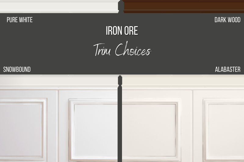
White Paint that Goes with Iron Ore
Assuming you want to go modern-classic and choose a white trim option, here are some popular pairings with Iron Ore:
Iron Ore with Snowbound Trim
Snowbound is one of my favorite warm trim colors because it isn’t overly creamy but it is still soft.
Iron Ore with Pure White Trim
We already talked about Pure White a little bit with the palette, but it is a top trim choice from Sherwin Williams – and not just for Iron Ore! I would say it’s one of their more fool-proof whites.

Iron Ore with Alabaster Trim
Alabaster is probably Sherwin Williams most popular white paint color. Alabaster is a good “farmhouse white” if that is the aesthetic you are going for. It is a lower contrast option.
Let’s get to the good stuff! I have a LOT of real life Iron Ore examples to show you.
Sherwin Williams Iron Ore for Your Home’s Interior (Accent Walls and More!)
Here for exterior ideas? Click here to skip on over there.
Many homeowners have used Iron Ore in multiple places, but for simplicity’s sake I have organized all the pictures by room. It might seem like we are bouncing around a bit between homes, but it’s the best way I could think to do it.
For the most part, Iron Ore is used inside as an accent color here or there, or a feature wall, because it is so dark.
Sherwin Williams Iron Ore in the Living Room
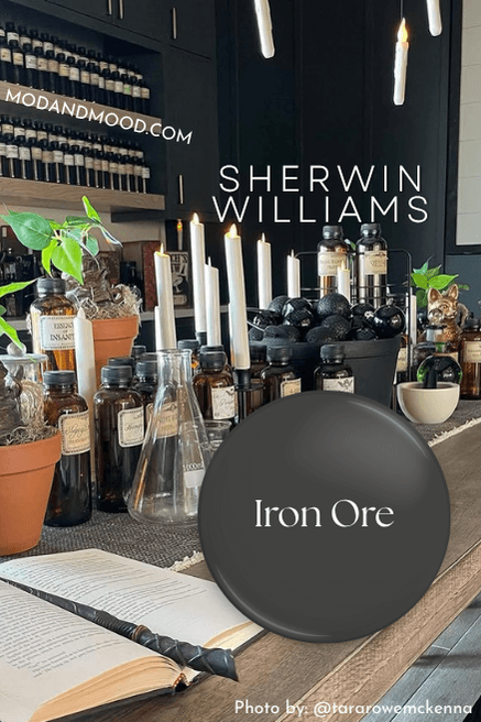
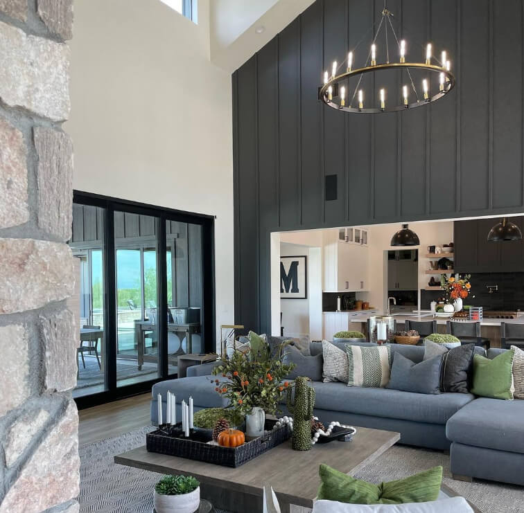
This first home belongs to Arizona Realtor Tara Mckenna (@tararowemckenna). Tara used Iron Ore as an accent in many areas of her home.
Here is her living room:
You can see through to the kitchen where she also used Iron Ore on her hood fan.
This is one of my favorite pictures of Tara’s place, because who doesn’t need a mouse-eye view once in a while?
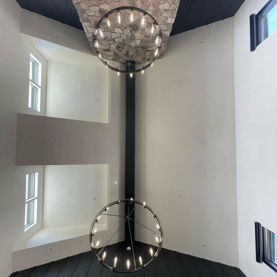
This next photo is the most common face of Iron Ore:
In this living room closeup, Iron Ore looks a little green:

That’s it for Tara’s living room! We will see more from her in just a moment.
This next home belongs to Leah and Matt Bertrand (@bertrand_residence). They used Iron Ore on their fireplace shiplap feature wall:
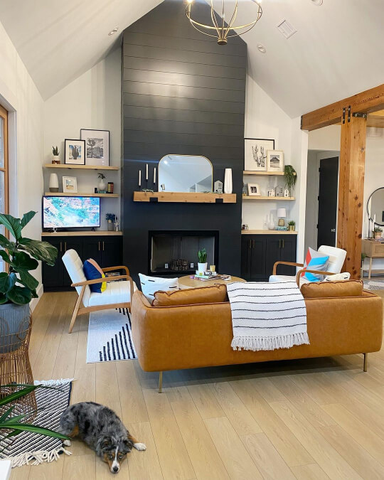
The living room media cabinets are also in Iron Ore. For the walls, they went with Pure White.
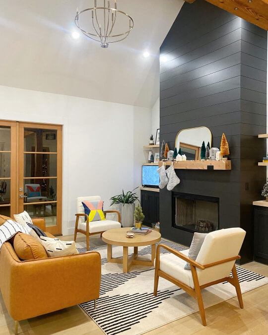
Again this look is pretty typical of Iron Ore.
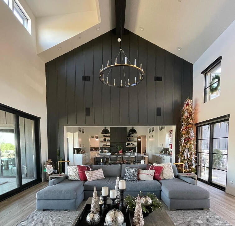
Sherwin Williams Iron Ore in a Media Room
Whether you call it a media room, bonus room, or a den, Iron Ore is the perfect dramatic color for a feature wall in your coziest family room.
At Amanda’s house (@west_and_co), Iron Ore looks more green in their walk out basement, but that may be because the lighting is pretty warm.

Amanda’s wall color is Agreeable Gray, and her trim is Benjamin Moore White Dove.
The team at Wood Visions (@wood_visions) created a shiplap feature wall in Iron Ore for this arcade room:
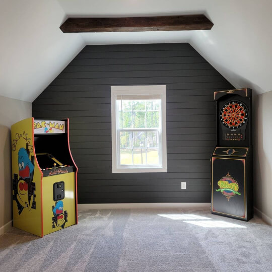
They also added custom cedar beams to the ceiling.
Here is one more Iron Ore accent wall by Wood Visions, this time in vertical shiplap:

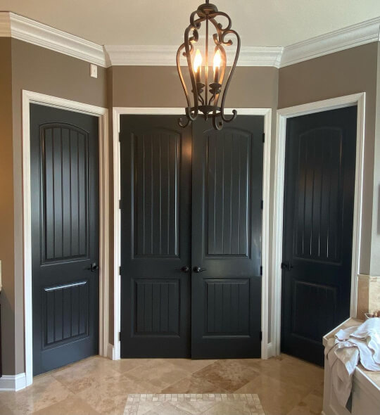
Sherwin Williams Iron Ore on Interior Doors
I already have a post here about Black Interior Doors (How to DIY & Paint Colors to Use!), but how about a special segment for Iron Ore?
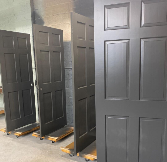
The team at The Finishing Room (@thefinishingroommke) loooves a bit of Iron Ore, and on one of their projects they had all of the interior doors sprayed with it!
Here are the custom creations patiently drying:
Voila! Here is the finished product:
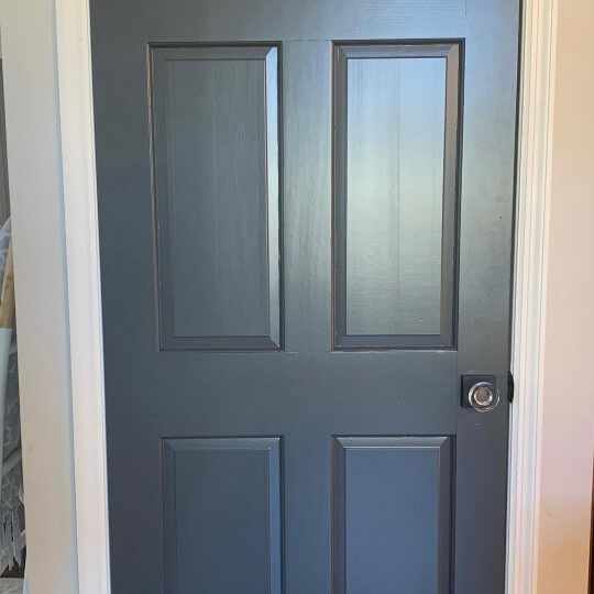
I know I said that Iron Ore isn’t really black, but in small doses with light coordinating colors, it can look the part.
Here is a herringbone slider door by Rebuild Fabrication (@rebui1d) in Iron Ore that does look very black indeed:

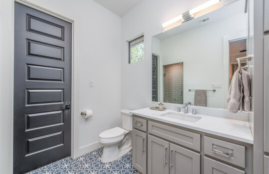
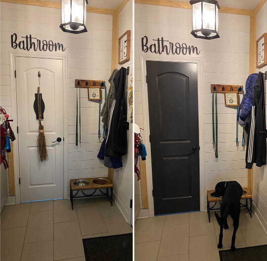
In this next bathroom, Iron Ore matches the tile floor perfectly:

For the vanity, John Askew Custom Homes (@johnaskewcustomhomes) used Sherwin Williams Acier.
The door color so nice, they used it twice! :
Did you get the “Ore on the bathroom door” memo?

Matt and Leah did!
How amazing is this two-tone hex tile idea??
These next few Iron Ore doors are all by MGS Painting (@mgspainting) and they all look pretty black:
Of course the lighting in these first two pictures is darker and artificial.

This picture has more natural light, but Iron Ore still looks pretty dark:
I don’t want to overstate that Iron Ore isn’t black, because there are plenty of people who use it as a black paint and like it. For me personally, when I have wanted to use black, I want it crisp and black.
I once chose Benjamin Moore Wrought Iron because I had read it was a nice black, and I was very disappointed because it is not a true black. If that is going to bother you, don’t choose Iron Ore as a black.
Sherwin Williams Iron Ore in the Dining Room
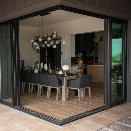
Back we go to Tara’s place! We already saw her amazing vaulted living room, but here is her dining room:
Again the walls are Benjamin Moore White Dove.
Do you love Halloween decor?
I promise you, not as much as Tara does:
I aspire to be a seasonal decorator, but my actual black cat and a pumpkin I will forget outside until March, is the best I’ve done so far.
Here is a view into the dining room from the exterior, which is also Iron Ore:
Sherwin Williams Iron Ore on Bedroom Walls
Tara is the real Iron Ore MVP, so she even used it in the bedroom!
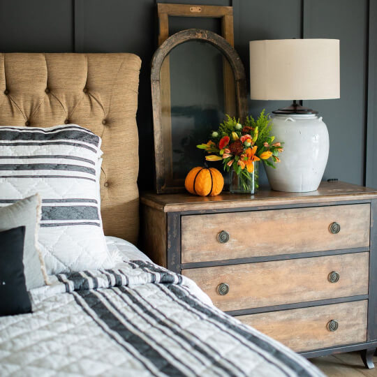
I love how it looks with the vintage furniture and decor! It’s a totally different vibe from the living and dining rooms.
Stephanie from @Frommhouselove isn’t scared of a bold color! She has Benjamin Moore Salamander (similar to Cascades) in her bathroom, Homburg Gray on her cabinets, and Iron Ore in her bedroom!

Isn’t that woodwork stunning?

Iron Ore looks beautiful with all of the other neutrals in her room.
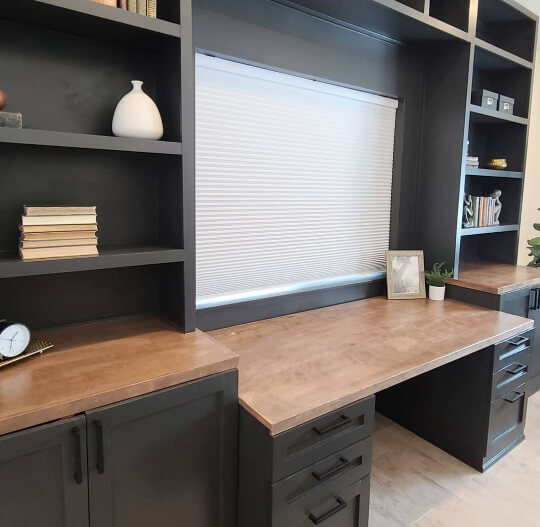
Sherwin Williams Iron Ore in a Home Office
Stephanie spends a lot of her time decorating her home and creating custom pieces.
This Iron Ore home office desk and built-in was made completely by her for a relative :

Sherwin Williams Iron Ore in the Bathroom and Powder Room
You didn’t think we had seen all the shiplap yet, did you?
Here are two bathrooms with Iron Ore shiplap feature walls.

When I first saw this room I thought it was Urbane Bronze for sure, but nope. Just another face of Iron Ore!
I love how it looks with the gold accents and hardware, as well as the plants.
For something a little cooler, here is Iron Ore back in Matt & Leah’s bathroom:

The vanity color is Sherwin Williams Dorian Gray.
(If you like this cabinet color, I have a few other pictures in my Two-Tone Kitchen Cabinet Ideas post.)
Sherwin Williams Iron Ore on Kitchen Walls and Cabinets
I can’t imagine that you haven’t seen enough feature walls, but here is just one more in a kitchen, before we get to cabinets:
Iron Ore manages to look surprisingly bright in this kitchen when paired with white cabinets and open shelves.
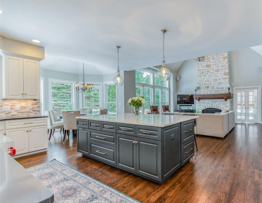
Iron Ore on Kitchen Islands
Most of the time people seem to use Iron Ore as an accent for their kitchen cabinets, on either an island or lowers.

The Finishing Room chose Iron Ore for the island in this spacious kitchen.
The walls are a softer gray, and the perimeter cabinets are Sherwin Williams Creamy.
Bespoke Redesign (@bespokeredesign) also used Iron Ore on the island in one of their designs, but they decided to skip white cabinets altogether:
For the wall cabinets in this design, they chose Sherwin Williams Repose Gray.
Iron ore definitely looks as black as it possibly can here, so I’m thinking it must be all artificial light in these shots.

I’m a big fan of this neutral kitchen. It has the mass appeal of white, without being white.

I showed one other picture of this quirky kitchen at the beginning of this post, but I just love it so much! :
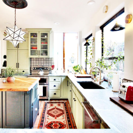
Madison went alllll the way outside of the box, and chose Sherwin Williams Clary Sage for his perimeter cabinets.
I love that the Iron Ore island features a different countertop and hardware too.

Iron Ore on Lower Cabinets
Remember how I said the team at The Finishing Room love Iron Ore?
Here’s more of the Ore! In this design they used it on all of the lower cabinets:

For the upper cabinets they did a mix of open shelving, and Sherwin Williams Skyline Steel.
Wood beams, shelves, and trim, add to the chalet feel.

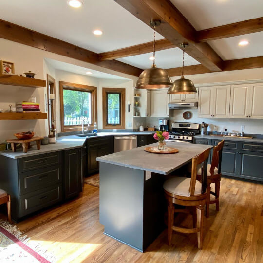
Iron Ore on All Kitchen Cabinets
Back at Leah and Matt’s Bertrand Residence, we find the only kitchen that I’ve seen with both upper and lower cabinets in Iron Ore.

Here is their kitchen before it was completed.

The contrast is subtle, but the island is actually Sherwin Williams Jasper.

Limiting upper cabinets and choosing white countertops were key to creating this light and bright feel with all dark cabinets. (I mean that, and having 100 foot ceilings…)
From this angle we can see through to the matching Iron ore fireplace wall:

I love this kitchen! It has elements of many different styles, but I would describe it as a modern take on mid-century modern. (So like, MMCM?)
Painting Furniture with Iron Ore
You’ve seen Iron Ore on cabinets, islands, and built ins, so you know it will look good on all types of furniture!
Here’s a little bonus anyways, in the form of a gorgeous hutch in Iron Ore:
This is an unexpected take on two-tone, in Ashlea Eubanks’ (@ashalaineeubanks) otherwise all-white kitchen. It begs the question: “Wait…should we all be color blocking?”
The white in Ashlea’s kitchen is Alabaster – both cabinets and walls.
Sherwin Williams Iron Ore for Exteriors
That does it for the interior, but what about Iron Ore outside as nature intended?
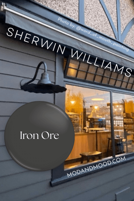
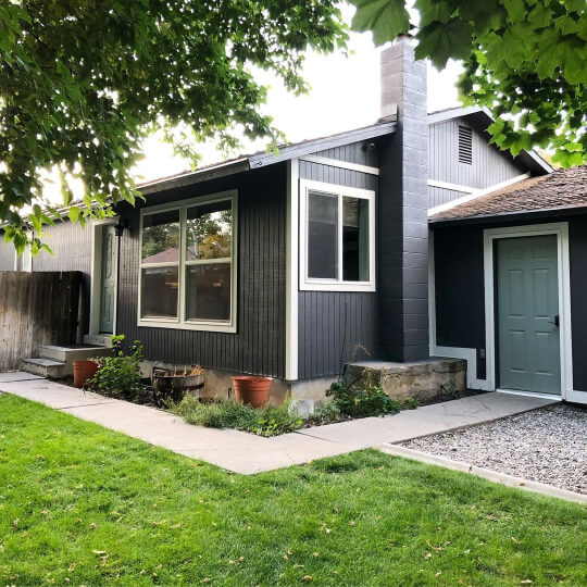
First up is a home by Word of Mouth Painting (@word_of_mouth_painting), which features Iron Ore in a fresh, clean, charcoal and black color scheme, but with a twist!
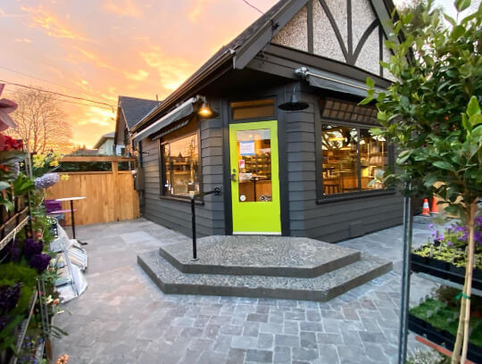
That door color is not for the faint of heart, but man is it fun!
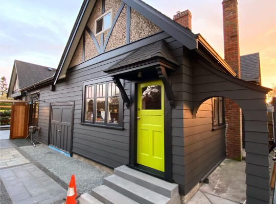
The black trim is literally called “Black” by Benjamin Moore. The door is Dark Lime, also by Benjamin Moore.
Here’s a peek from the garage door side:

I just love siding in this color!

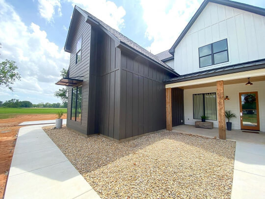
Next up is a newer home with Iron Ore siding. This one belongs to Tara again, the one with the amazing Iron Ore living room, dining room, and bedroom feature walls.
We first see Iron Ore looking as light as possible:
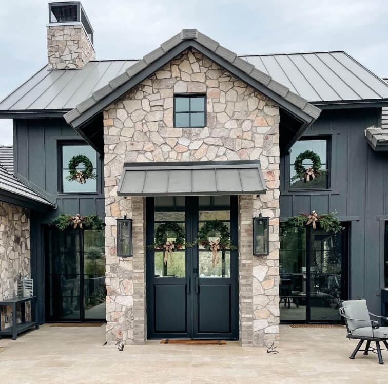
Here is the same home in different lighting, where Iron Ore looks much darker:

Iron Ore takes on a warmer tone in Tara’s backyard at sunset:
Are you ready for the wide shot of this AZ palace?
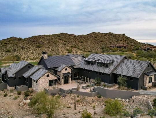
You weren’t ready, were you?
The stone adds some much needed pops of lightness to the exterior of this impressive sprawling home.
The Bertrand’s also used Iron Ore inside and out in their take on the modern farmhouse.
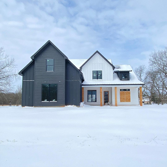
Here is their exterior on a bright sunny day:

And again from the same angle at sunset:

The white on their exterior is also the same as inside: Pure White.
If you aren’t looking to go all in on a color this dark, Iron Ore would also make a fabulous trim and shutter choice.
Not to totally exhaust you, but let’s take a look at Iron Ore on an exterior where it looks totally different!
This home by Headwaters Painting (@headwaters_painting_llc) looks decidedly more blue than any of the other Iron Ore exteriors we have seen.
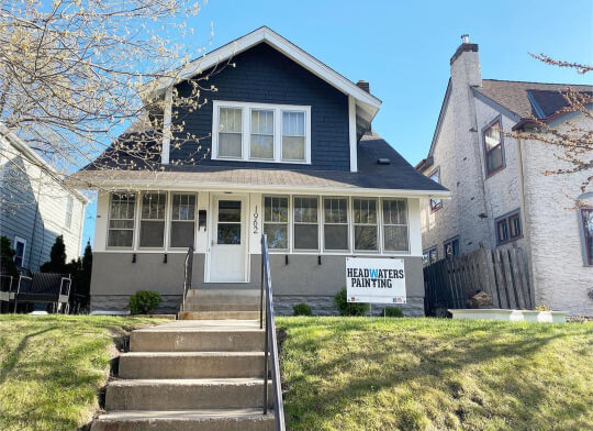
On IG someone even asked what color the “navy” is. Can’t say that I blame them! :

The lower half of the home is Dovetail, which is a greige color. I think the warmth of Dovetail is making Iron Ore look cooler than it normally would.
Here is the color palette that Headwaters Painting used for this exterior:

Again with Iron Ore and Pure White!
Iron Ore Compared to Other Dark, Gray, and Black Paint Colors
The best way to choose your perfect paint, is by comparing it to other hopefuls! Let’s take a look.
(Don’t care about comparisons? Skip to the dupes.)
Sherwin Williams Iron Ore vs Peppercorn (7674)
Iron Ore vs Peppercorn is one of the first posts that I wrote here. Ah memories!
Check that out if you want a thorough comparison!

You can see that Peppercorn is much lighter than Iron Ore. It has an LRV of 10.
Here is Peppercorn looking the most like Iron Ore:
Peppercorn is a great lighter alternative to Iron Ore. You can use it in much the same way.
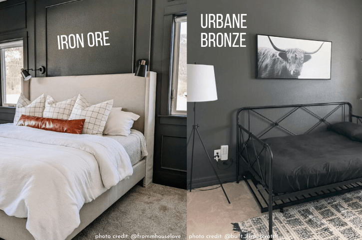
Sherwin Williams Iron Ore vs Urbane Bronze (7048)
I would not have thought that Iron Ore and Urbane Bronze looked much alike, until I did the comparisons for my Urbane Bronze post.
(Urbane Bronze was the 2021 Color of the Year from Sherwin Williams!)
The major difference is that Urbane Bronze most often looks like a brown charcoal, and Iron Ore most often looks like a gray-blue charcoal.

Where these two have a bit of crossover, is that occasionally Urbane Bronze can have a bit of a greenish hue, as can Iron Ore.
Here is Iron Ore looking a little more green, and Urbane Bronze looking its most gray:
Sherwin Williams Iron Ore vs Tricorn Black (6258)
Where Iron Ore is a deep charcoal, Tricorn Black is a true black paint color without any undertone. The LRV of Tricorn Black is a 3 (vs Iron Ore at 6) so it is essentially as dark as paint gets.

You can see lots more from this color (and this home!) in my post: Sherwin Williams Tricorn Black (Is it the Best Black? Plus Dupes)
Sherwin Williams Iron Ore vs Cyberspace (7076)
Cyberspace is probably my favorite alternative to Iron Ore, and these two can often be mistaken for each other.
Cyberspace has the same LRV as Iron Ore at 6, but it is an actual blue gray.

See more of Cyberspace here:

Sherwin Williams Iron Ore vs Greenblack (6994)
Greenblack and Iron Ore look more similar on paper then they ever do in real life. Greenblack is pretty darn black, with just a hint of green.
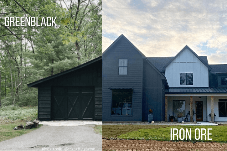
While Iron Ore can have a bit of a green undertone, it will look a touch olivey. Greenblack has a cooler green undertone.
Greenblack has an LRV of 4, which is on par with other black paint colors, and darker than Iron Ore.
Sherwin Williams Iron Ore vs Black Fox (7020)
Black Fox is a deep brown color, and is much more similar to Urbane Bronze than it is to Iron Ore.

The LRV of Black Fox is 7.
Sherwin Williams Iron Ore vs Sealskin (7675)
Sealskin is significantly more brown than Iron Ore, but has the same LRV of 6.

In real life, Sealskin can sometimes look a little gray, but in general it appears as a true chocolate brown.
Sherwin Williams Iron Ore vs Black Magic (6991)
Black Magic is very black. It is only a little softer than Tricorn Black, and never looks gray, brown, or blue, like Iron Ore.

The LRV of Black Magic is 3.
Sherwin Williams Iron Ore vs Caviar (6990)
Caviar is another actual black paint color. It only ever looks black, unlike Iron Ore, and is darker than Iron Ore with an LRV of 3.

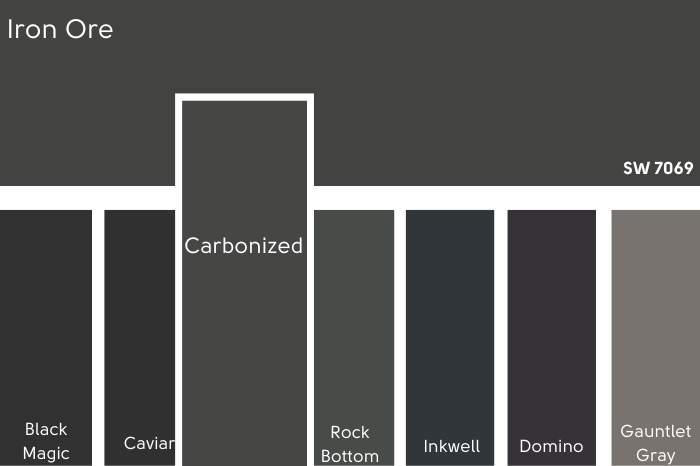
Sherwin Williams Iron Ore vs Carbonized (HGSW1481)
Carbonized is a discontinued color by Sherwin Williams. It was very similar to Iron Ore, but more of a pure gray.
Sherwin Williams Iron Ore vs Rock Bottom (7062)
Rock Bottom is an actual gray green paint color, as opposed to Iron Ore which can sometimes have a green undertone.
When Iron Ore looks green, it can look very similar to Rock Bottom, but Rock Bottom doesn’t ever look blue-gray or brownish like Iron Ore can.

Rock Bottom is slightly lighter than Iron Ore, with an LRV of 7.
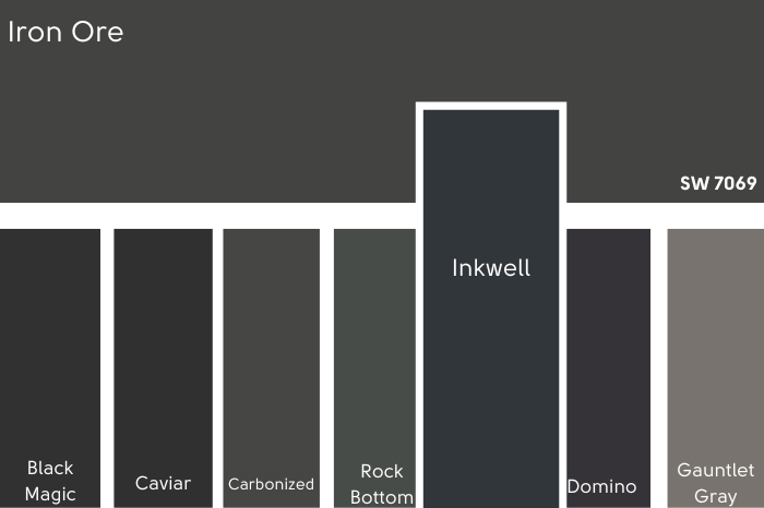
Sherwin Williams Iron Ore vs Inkwell (6992)
Inkwell is a deep blue gray that can sometimes look similar to Iron Ore’s cooler appearance. It is always cool however, and never looks green or brown.
Inkwell is darker, with an LRV of 4, and more likely to look black than Iron Ore.
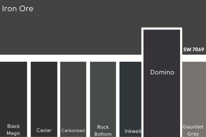
Sherwin Williams Iron Ore vs Domino (6989)
Domino is a purple gray-black, as opposed to Iron Ore’s warm charcoal. It is darker than Iron Ore, with an LRV of 3.
Sherwin Williams Iron Ore vs Gauntlet Gray (7019)
Gauntlet Gray is significantly lighter than Iron Ore, with an LRV of 17. Where Gauntlet is similar, is the fact that it can also range in color from a greige tone, to green, and even blue-gray.

Sherwin Williams Iron Ore vs Benjamin Moore Wrought Iron (2124-10)
As I mentioned earlier, I did my little oopsie with Wrought Iron when I was wanting black, and like Iron Ore, it is NOT black.
Wrought Iron is a blue charcoal, unlike Iron Ore which is technically a yellow charcoal that can sometimes look blue-ish. Wrought Iron can occasionally look a bit green, but it tends to stay cool.

I personally find that Wrought Iron lacks a bit of the depth of Iron Ore.
Benjamin Moore measures the LRV of Wrought Iron as 6.16, but it is apples and oranges, because they don’t measure quite the same way that Sherwin Williams does.
Sherwin Williams Iron Ore vs Benjamin Moore Graphite (1603)
Graphite is a deep charcoal color that is in the blue color family. It does tend to look very much like Iron Ore, but it stays pretty cool-toned. If you like the blue-gray look of Iron Ore, you might like the predictability of Graphite a little better.
Graphite is a little lighter than Iron Ore, but because its cooler, it looks black more often in my opinion.
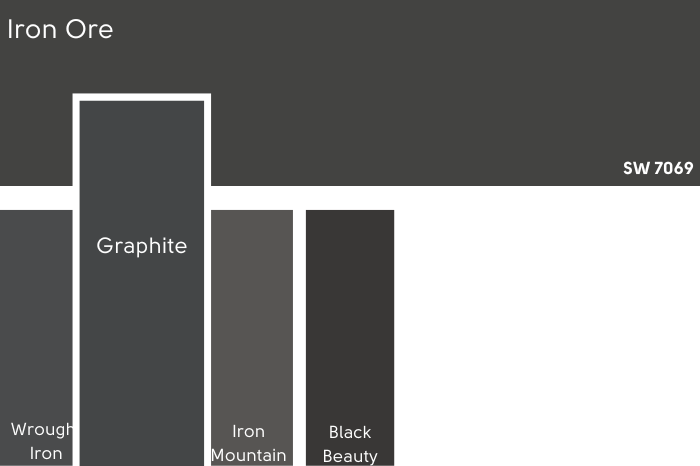
Sherwin Williams Iron Ore vs Benjamin Moore Iron Mountain (2134-30)
Iron Mountain is lighter than Iron Ore, with an LRV of 11. It is also know for being a chameleon, and it can range in color from bronze to blue-gray, and even black, much like Iron Ore.

I would not say that Iron Mountain ever looks green, so it may be a bit of a closer match in looks to Urbane Bronze than it is to Iron Ore. Although Urbane Bronze does not ever look black.
This could be a lighter alternative to Iron Ore, if that’s what you are after.
Sherwin Williams Iron Ore vs Benjamin Moore Black Beauty (2128-10)
Black Beauty is a softened black by Benjamin Moore. It can occasionally have a bit of a blue undertone, like Iron Ore, but that’s the only real similarity.
For the most part Black Beauty looks like a black, or slightly faded black.
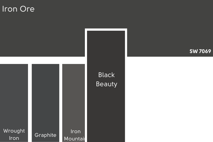
Black Beauty is a little darker than Iron Ore, with an LRV around 5.
Iron Ore Dupes from Benjamin Moore, Valspar, and Behr
Time to find some Iron Ore dupes in your favorite brand! (Assuming that isn’t Sherwin Williams of course.)
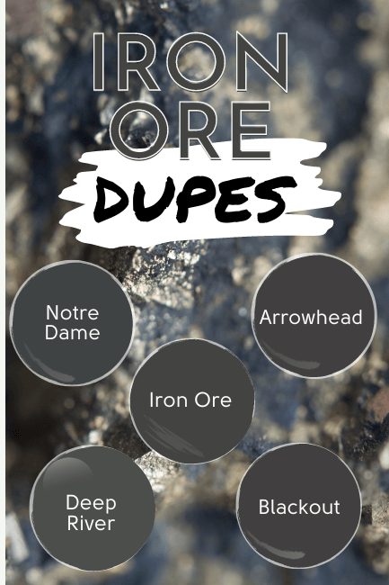
Benjamin Moore Iron Ore Equivalent
If none of the Benjamin Moore shades we just covered were dupes, what colors are?
I do think that Benjamin Moore Graphite was a pretty good alternative to Iron Ore, but on paper these two dupes are a bit closer:
Benjamin Moore Notre Dame (CSP-570)
Notre Dame is the closest color match that Benjamin Moore has for Iron Ore. This color is hard to find in real life, but from what I’ve seen it should be the perfect doppleganger for Iron Ore.

The downside to Notre Dame is that it is not recommended for exterior paint. I think this is because certain pigments are prone to fading.
If you want an Iron Ore dupe for your exterior, you could ask about this at your Benjamin Moore store, consider the shade Graphite, or you might like Deep River.
Benjamin Moore Deep River (1582)
Deep River is another good Benjamin Moore dupe for Iron Ore, but it tends to lean a bit more green than Iron Ore does. If you prefer the warmer side of Iron Ore, you will probably like Deep River.
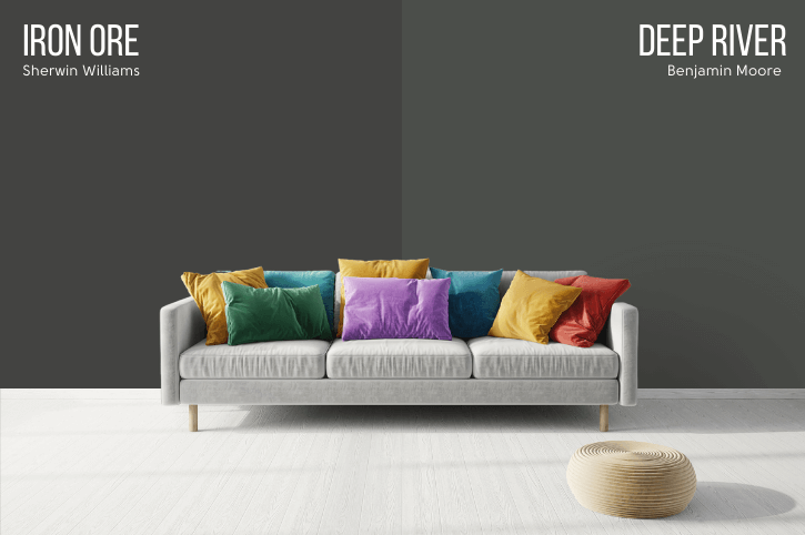
This color can be used for exteriors.
Valspar (Lowe’s) Equivalent to Iron Ore
The Valspar version of Iron Ore is called Arrowhead.
Valspar Arrowhead (8006-11F)
You can see that Arrowhead is a bit darker than Iron Ore. It is slightly more likely to look black than Iron Ore for that reason.
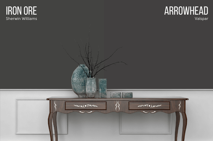
Arrowhead has all of the chameleon-esque qualities of Iron Ore.
Behr Version of Iron Ore (Home Depot)
Need to pick up Iron Ore at your local Home Depot store? Ask for the shade Blackout.
Behr Blackout (N510-7)
Like the Valspar alternative, Blackout is a little darker than Iron Ore, so it may look black more often.
It does have all of the Iron Ore hallmarks however! It can look black, charcoal, bronze, or a little greenish depending on the light and other factors.

Iron Ore Final Moody Musings
Congratulations! You reached the end, and hopefully also reached a conclusion about whether Iron Ore is for you or not.
Allow me to recap:
- Iron Ore is a superb choice for exteriors if you want a rich charcoal color
- I personally think Iron Ore is a great choice for your kitchen island. It is a little less trendy and more neutral than something like navy, but gives the same effect and pop of color
- Iron Ore is not black, but you are free to pretend it is! Don’t choose Iron Ore if you want a crisp solid black
Not a vibe? These colors might be more your style:


Don’t Forget Your Supplies!
This little brush might look funny, but it’s my absolute ride or die!
Rollers like these hold the most paint and make the job faster. Get a metal roller cage for easy on and off.
DryDex is the fastest (and funnest!) way to make chips and dents disappear. (Make sure you get a small spackling tool that actually fits in the container, and a sanding sponge.)
This tool will save your back and limit time on a ladder.