Sherwin Williams Repose Gray is one of my very favorite neutral paint colors! It’s more greige than gray, and some of its undertones feel very luxurious and “expensive” looking. This is a great shade if you want some warmth, but you don’t like colors that have yellowy beige undertones. On the other hand, it’s also a bit of a wildcard!

Here we will take a look at Repose Gray’s undertones, get coordinating color palette ideas, see the color on walls and cabinetry in real homes, walk through some similar shades and of course, dupes!
What Color is Sherwin Williams Repose Gray?
You could describe Repose Gray as a mushroom or putty color. It’s a smooth gray-beige (greige) with just enough warmth. It doesn’t ever look like a true warm beige, but it can look quite gray.
What Are the Undertones of Sherwin Williams Repose Gray?
At its best, Repose Gray looks like a creamy greige color, where the beige is almost like an undertone. It can also have very subtle violet undertones, which I personally like in a taupe color.

At its coolest (or what I would call “its worst”), Repose Gray can look blue. It’s not a difficult situation to avoid, but exactly how blue can be startling:

This is also a phenomenon that we see with Behr Dolphin Fin.
When we get to coordinating colors I will try to help you avoid this look, but if you want an unpredictable silver-blue-greige, more power to you! It’s just not the face-value look that most people are after with a greige like Repose Gray. If you don’t want blue, do NOT choose Repose Gray if you have very warm orangey floors (or other wood) in your home.
Help! I painted Repose Gray and it looks blue!
If you already have Repose Gray and it looks blue:
- Get rid of any daylight bulbs. Switching to warmer lighting might be all it takes to fix the issue. If not,
- Bring greens and blues into your space with your other decor, such as throw pillows and plants. Your eyes need to see some real cool tones in order to reference Repose Gray as beige instead of blue.
Finally, if you don’t want to repaint your walls and nothing else is working…
- Try repainting your trim with a cool white. Sherwin Williams Extra White is a good choice, or Ceiling Bright White.

Repose Gray LRV
The LRV of Repose Gray is 58. What does that mean?
The LRV (Light Reflectance Value) of a color indicates on a scale of 0 – 100 how much light a color reflects (or doesn’t reflect). True black has an LRV of 0 and pure white has an LRV of 100.
In the paint world, we are working in a range of about 3 – 93 because no paint color is purely black or completely white.

At 58, Repose Gray reflects a bit more light than it absorbs. It is right in the perfect LRV range where we find most whole-home colors.
Repose Gray in the Sherwin Williams Color Strip
Here are all of the colors in this color strip from Sherwin Williams. Surprisingly, Repose Gray is actually the lightest!

The other colors in this collection are:
- Mindful Gray
- Dorian Gray
- Acier
- Dovetail
- Gauntlet Gray
- Black Fox
Sherwin Williams Repose Gray in a Color Palette
I mentioned earlier that I would try to help you avoid the cooler blue-gray look that Repose Gray can have, and the key to this, is incorporating some cooler tones intentionally. Stick with blues and greens for coordinating colors, or cooler toned whites.

Repose Gray is also more likely to look blue in north facing rooms, so bear that in mind!
Coordinating White Paint Color for Repose Gray
Sometimes the simplest option is the best, and Sherwin Williams Extra White is the most popular cool toned trim white.

If you want another option, try Ceiling Bright White, as I mentioned earlier.

Do not use Sherwin Williams Alabaster, Snowbound, or any of the popular warm whites with Repose Gray, unless you are okay with the prospect of blue.
Try Repose Gray with Sherwin Williams Pewter Green
Pewter Green is a beautiful deep gray green. It typically has cool sage undertones, but it can also look quite neutral.

I like this color because it is a still-cool alternative to blue that will help Repose Gray stay looking warmer.
Other Cool Paint Colors to Use with Repose Gray
For a true cool option to pair with Repose Gray, I recommend the blue-toned charcoal of Sherwin Williams Web Gray.

You might also like Sherwin Williams Cyberspace.
For something on the lighter end that works with all of the other colors in this palette, I recommend Sherwin Williams Olympus White.

With an LRV of 68, Olympus White is not actually white at all, but it’s cool blue-gray undertone can make it look close to an off-white. I chose this one purely to give you a soft blue option that works with both Repose Gray and Pewter Green. If you aren’t using Pewter Green, virtually any blue will work with Repose Gray, because that is its complementary color.
Sherwin Williams Repose Gray for Your Home’s Interior
My personal favorite place to use Repose Gray is on kitchen cabinets, so let’s take a look at those first!
Kitchen Cabinets in Repose Gray
Here we see Repose Gray looking fairly typical, in this project by the team at Bespoke Redesign.
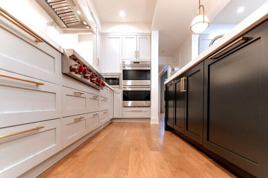
The island color looks black here, but it is actually Sherwin Williams Iron Ore.

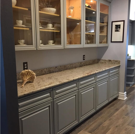
So with this kitchen image in your mind, let’s see an extreme version of Repose Gray.
When I first saw this kitchen and @cabinetgallery let me know the color, I thought “Surely the heck not!”

…But then in this shot, you can see how it could be Repose Gray. This is quite a crazy example, but it exists, and that’s what matters.

Just to get us back on track, here is the color looking more typical:

…and finally here it is on the extreme end of warm. This look is quite unusual.

You can see that the color in the background on the built-ins looks more neutral.
Finally, not to overwhelm you, but we see Repose Gray looking a little green in a project by Bethany (@reclaimed_cottage):

If you know your color wheel, the wall gives you a hint as to what is going on here:
The purple undertone of the wall color is making Repose Gray go opposite (green), which is something it is quite susceptible to.
Repose Gray on the Wall
Let’s move on to seeing Repose Gray in bigger areas. Here at the former @bertrand_residence, it is the wall color in the kitchen.

You can see how on the big wall the color looks like a classic greige, but on the left it looks more silver in the natural daylight. Here are a couple of other examples from around this home:


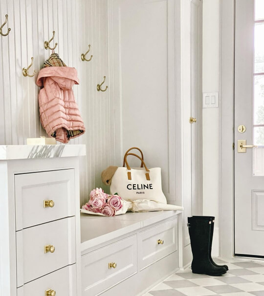
In the glorious front entrance at Holly’s house (@hollybelldesign) we see my favorite version of Repose Gray. It looks greige, but you can also glimpse the purpley-taupe undertone (especially around the door).
In this bathroom at Jessi’s (@jessiburkeathome) house, we get to see both looks of Repose Gray. First up is the warm greige:

…but under the influence of the warm countertop, we also see it looking much more silver:

We really can’t expect Repose Gray to look beige in comparison to an actual warm beige. It just won’t happen, so this hint of blue is to be expected.
Finally, an all-gray look at Kat’s place:

Kat chose Sherwin Williams Shell White for her trim, which is a very warm white with peach undertones, so again, we would expect Repose Gray to go opposite, and it does. It has a blue or green undertone in this space, depending on where you look.

Repose Gray on an Exterior
Repose Gray is much less likely to look blue or green outside, where it is naturally surrounded by those cooler tones (the sky, grass, trees…). I would say it looks like a greige most of the time, and silver the rest. Blue or green is still possible, but it should be situational and short lived.

To help Repose Gray stay looking its warmest, try pairing it with blue shutters like Jo (@jogalbraithathome) did.
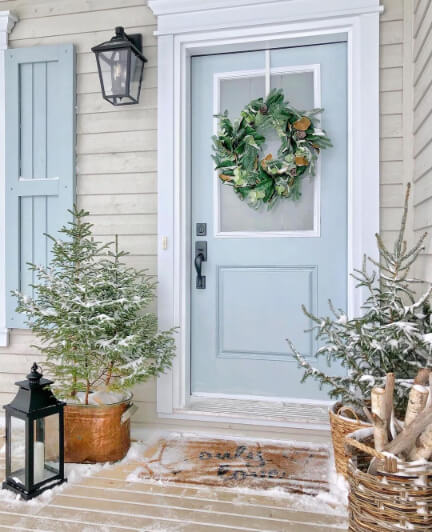
You can see that the white trim is also a cool and bright white. The shutters are Sherwin Williams Languid Blue and the door is Sleepy Blue.

Sherwin Williams Repose Gray Compared to Other Neutral Paint Colors
I know the world of neutral paint colors is confusing! I have already covered Repose Gray vs Light French Gray in depth, but here is how Repose Gray compares to other favorites. (Click to expand.)
Agreeable Gray is more solidly greige than Repose Gray, meaning that it looks about equal parts gray and beige. It is also a hair lighter:

Despite looking quite similar on paper, Agreeable Gray can sometimes look silvery, but rarely blue. When it comes to the more mushroomy taupe look, there is quite a bit of overlap between these two.
Sherwin Williams Crushed Ice is quite close to a lighter version of Repose Gray. It has an LRV of 66, so it isn’t quite an off-white, but it can look like one, where Repose Gray never does.

Crushed Ice has the same range of undertones as Repose Gray, it’s just less drastic. It can look true silvery gray, beige, taupe, or even a little blue, but its undertone is never as pronounced.
If you recall, Mindful Gray is one shade darker than Repose Gray on the same color strip.

For once, this is approximately a darker version of Repose Gray! Mindful Gray can look more beige or blue-ish depending on the circumstances. The major difference is just that it is darker, so at its darkest and most beige it can look almost brown. Mindful Gray can also have a green undertone, and while that is possible with Repose Gray, it is less common.
Sherwin Williams Passive is decidedly more blue than Repose Gray. When Repose Gray looks blue, it can look a lot like Passive. When Passive is used with bright, popping blues, it can almost look like Repose Gray!

At the end of the day, Passive is simply not a greige at all. It might look almost neutral, or a little warm in comparison to very bright cool tones, but it doesn’t ever look like a true beige or taupe.
Benjamin Moore Revere Pewter is warmer than Repose Gray, and although it can be a bit of a chameleon, it is a bit more predictable.

In the wrong circumstances, Revere Pewter can also look blue, but this is much more rare than with Repose Gray. When Repose Gray looks its warmest, it looks a lot like the “standard” look for Revere Pewter.
Dupes for Sherwin Williams Repose Gray from Other Brands
Here are all of the very best dupes and doubles for Repose Gray from Benjamin Moore, Valspar, and Behr!
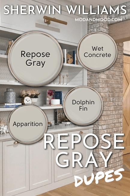
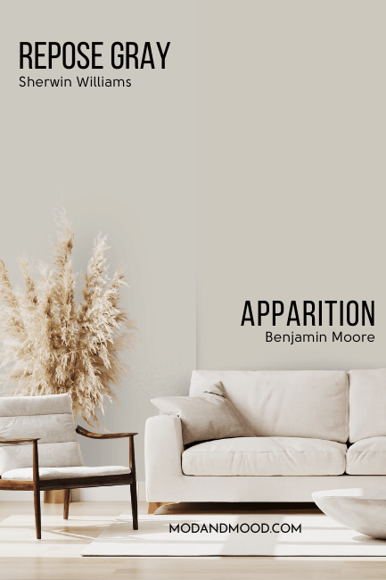
Benjamin Moore Version of Repose Gray
Benjamin Moore Apparition is a near-perfect dupe for Repose Gray:
…So color me shocked, because this color is not popular at all! Isn’t that funny?
From a technical perspective, Apparition is a hair cooler than Repose Gray, but it is also more saturated, so the difference essentially cancels out. You should expect this to run the whole same range of tricky undertones.
Best Behr Color Match for Repose Gray (Home Depot)
Much, much earlier in this post, when we were talking about undertones, I mentioned that Behr Dolphin Fin does the same things that Repose Gray does, and what do you know, it’s a dupe!

Dolphin Fin is a hair more silvery than Repose Gray, but these two are virtually identical. You might be able to tell them apart on the same wall, but from one home (or one wall!) to another, I don’t think you could. Both of these colors are such chameleons, and they both do the same confusing blue-to-beige thing!
Repose Gray Equivalent in Valspar (Lowe’s)
Over at Lowe’s, the best color match for Repose Gray is the shade Valspar Wet Concrete. This one is not quite as close as I would have liked (on paper at least).

Wet Concrete is a little warmer than Repose Gray. It is almost like an option in between Repose Gray and Benjamin Moore Revere Pewter.
You should still see the same range of undertones from Wet Concrete, but probably blue a little less often, and it will be a touch warmer than Repose Gray at its most beige.
Here is another look at each of these dupes!

Thank you so much for reading until the end! That really helps my blog. I hope this helped you decide if Repose Gray is the perfect do-it-all greige for your next project!
Still not settled? I’ve got so much more! :