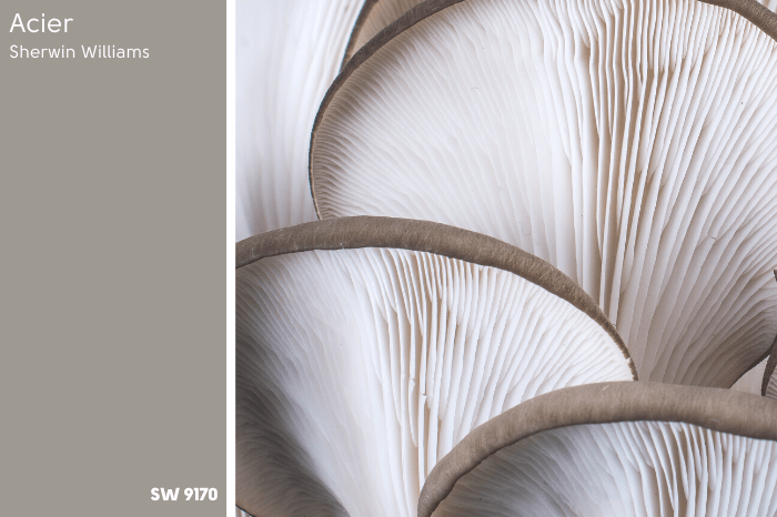
If you asked someone to describe Sherwin Williams Acier, I don’t think any two people would come up with the same description. Stone, mushroom, greige, or concrete, are all words that might work, so maybe it’s best to just take a look!

One thing is for certain: By the end of this article you will know if Acier is a contender for your home.
Let’s hop to it!
This post may contain affiliate links. Should you choose to make a purchase through one of my links, I may receive a small commission at no cost to you. I only recommend products that I use.
What Color is Sherwin Williams Acier (SW 9170)
Acier is a mid-toned taupe that looks like a gray with a bit of extra velvety-ness. I would classify it as a mushroom color.
LRV of Sherwin Williams Acier
The LRV of Acier is 32.
What does this mean? Well, I’ll tell you!
The LRV (Light Reflectance Value) of a color indicates on a scale of 0 – 100 how much light a color reflects (or doesn’t reflect). True black has an LRV of 0 and pure white has an LRV of 100.
In the paint world, we are working in a range of about 3 – 93 because no paint color is purely black or completely white.
At 32, Acier is a middle of the road color. Neither dark nor light.
It is closer to being dark than many favorite neutrals, but I actually think it reads lighter than it is.
What Are the Undertones of Acier

Taupes generally have either green or purple undertones.
Acier has a whisper of violet, and never looks green.
Is Acier Warm or Cool?
This is a tricky question to answer. Technically on the color wheel, Acier would be warm. It’s in the orange-beige family, but with a significant amount of gray.

Because of the purple undertone, Acier can sometimes look quite cool.
You could go ahead and say it’s neutral, but that makes it sound like a color that can be paired with almost anything, and taupes can be a bit finicky.
I guess if you are considering Acier, I would worry more about coordinating colors and the rest of your design, and not make any decisions based off of it being cool or warm.
Acier Color Strip
There are some heavy hitters by Sherwin Williams on the Acier color strip!

Every color on this strip is popular except maybe Black Fox, which I don’t see a whole lot.
Lighter Version of Acier
Dorian Gray is just lighter than Acier with an LRV of 39.
For something more obviously lighter, Mindful Gray is the next color up, with an LRV of 48.
The lightest color on this strip is still nowhere near off-white territory, with an LRV of 58. It is the ever popular Repose Gray.
In my opinion, Repose Gray exits taupe territory somewhat, as it often looks like a true gray or greige, without the rich undertones of a real taupe.

Darker Version of Acier
Dovetail and Gauntlet Gray are the two colors just darker than Acier.
Dovetail has an LRV of 26, and Gauntlet Gray has an LRV of 17. Neither are super dark, but they are getting a bit too dark to use everywhere.
Black Fox is the darkest color on this strip. It is a super deep chocolatey brown, with an LRV of 7.
Sherwin Williams Acier Color Palette
Acier (and taupes in general) can be a bit more temperamental than other neutral paint colors that are just gray or beige.
For that reason I would be careful about choosing coordinating neutrals. I would go with either lighter or darker colors from the same strip, rather than choose completely different neutrals like Accessible Beige.
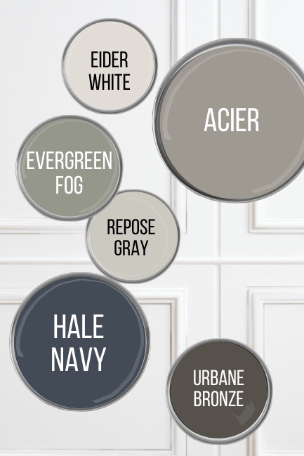
Complementary and Coordinating Colors
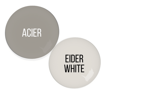
Acier with Eider White
Eider White is actually on off-white from Sherwin Williams, and is one of their recommended coordinating colors. You can see that it has a bit of gray to it that pairs well with Acier.
Evergreen Fog and Acier

Hear me out!
I don’t know that I would normally put a sage green with taupe, but I recently featured this bathroom in my Evergreen Fog post:


Now the color here is actually Benjamin Moore Pashmina, which is a fair shake warmer than Acier, but I think the cooler toned taupe would look amazing here!
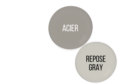
Repose Gray with Acier
Repose Gray is of course the lightest color on the Acier strip, so it’s a natural choice for a lighter neutral.
You can read a bit more about Repose in my post: Sherwin Williams Light French Gray VS Repose Gray (Solved!)
Acier and Benjamin Moore Hale Navy
Hale Navy is pretty close to the official complementary color (color across the wheel) for Acier.
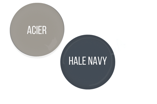
Sherwin Williams themselves recommend their own color Naval, but if I’m choosing a navy, why not go for the OG?
Urbane Bronze with Acier
Urbane Bronze is a former “Color of the Year” by Sherwin Williams (actually Evergreen Fog is too!). It could slot in between Gauntlet Gray and Black Fox on the Acier color strip and you would think it belonged there!

Urbane Bronze is basically a very deep warm charcoal. It is amazingly versatile!
What Trim Colors Go With Sherwin Williams Acier?
Let’s take a look at some trim options for SW Acier.
Wood Trim
If you are shopping for a paint color to go with existing wood trim that you do NOT want to paint white, I don’t personally think Acier is the one.
It’s not that the colors will clash necessarily, I just don’t think they do anything for one another.
The lighter option Repose Gray may be a good solution. I would recommend checking out something warmer like Manchester Tan or Shoji White. Or switch gears and go with a sage color, like Acacia Haze.

White Paint that Goes with Acier
For white trim, here are a few options:
Sherwin Williams High Reflective White
High Reflective White is a crisp white option, that also happens to be the brightest white that Sherwin Williams offers.
Benjamin Moore Chantilly Lace
Chantilly Lace is my favorite white, so I squeeze it in whenever I can. It’s actually very similar to High Reflective. It’s a crisp white without being stark.
Sherwin Williams Snowbound
Snowbound is another favorite white of mine, particularly for trim! In this case I think it could be the front runner, because it’s a white in the same color family as Acier, and the two complement each other well.
Snowbound is a good compromise if you want a warm white, because it is warm but not creamy or yellow.

A creamy white will bring out more of the purple tones in Acier, so if you want it to stay as neutral as possible, stay away from colors like Alabaster or Swiss Coffee.
Sherwin Williams Acier Home Interior
Now for the fun part, let’s take a look at Acier in real homes!
Sherwin Williams Acier Living Room
This first stately room is brought to you by Kristin Brown from KB Designs.

Kristin used Mindful Gray (from the same color strip) on the walls in this living room, and Acier on the trim.
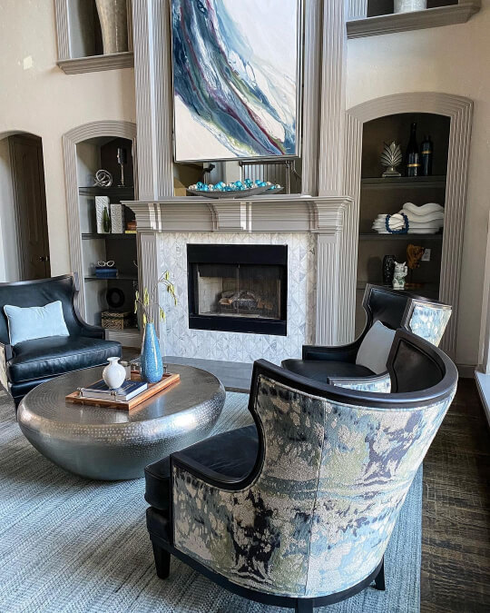
I don’t know how high these ceilings are, but they are something else!

I am a big fan of the contrasting trim look.
You can see that Kristin kept the color scheme very cool, working only with grays, blues, and greens.

Acier is the perfect frame for the tile around the fireplace.

Acier in the Bedroom
I guess it’s not actually in the bedroom…it’s in the bedroom closet, but I didn’t know how else to classify this!
This was the wardrobe in the main bedroom of Allison’s new build (@webbstead), but they have since moved:
Allison did choose Sherwin Williams Alabaster for the walls, and I think Acier pulls a little extra purple due to this.

I actually happen to like how the color looks, but I know a lot of people prefer to avoid the purple undertone of taupe, so I wanted to point it out.
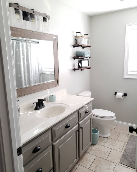
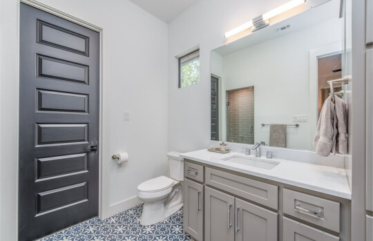
Sherwin Williams Acier Bathroom Cabinets
It’s funny how some colors have a particular spot where people like to use them, like exteriors or cabinets. With Acier, it’s popular use is vanities!
I don’t have all that many real life photos of this color, but I still have no fewer than FOUR bathroom vanities to show you.
The first is still at Allison’s Webbstead:

Acier looks cool, calm, and collected, in this bathroom with sleek marble countertops.
Here is how Acier looks on cabinets in artificial light before the bath was completed:

In this light you definitely see more of the beige.
Here is another shot of the finished product, where the creaminess of SW Alabaster is a bit more obvious:

This is a perfect time to switch over to Cate’s bathroom (@catharinenorelius), where she also used Acier on the bathroom cabinets.
This time the walls are gray, and you can see what a profound effect this has on the color.
The vanity here looks way more brown!
These next two vanities are by John Askew Custom Homes. I believe they are in the same house, because the doors are the same, but it could just be a popular choice.

Both of these bathrooms feature all cool tones.
I love the Acier cabinets with the blue patterned tile!
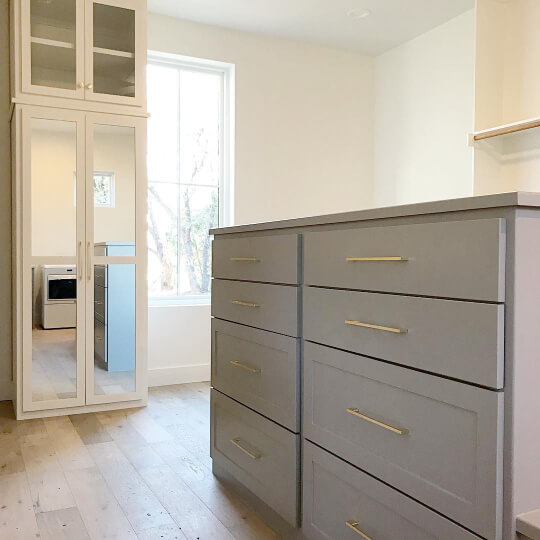
Acier Kitchen Cabinets
Unfortunately we will have to use our imaginations a little when it comes to seeing Acier on kitchen cabinets.
We have seen the cabinets in the wardrobe, and in the bathrooms, which will give us a decent idea of how Acier will look in a kitchen.
I do also have a few pictures of the slightly lighter Dorian Gray, to help you decide:

Dorian Gray less often has the purpley tone of Acier, so that’s the major difference.

Acier with Existing Oak Cabinets
Just like with trim, I am not convinced that Acier is the right color with oak. Here is a graphic that I made to try and illustrate the colors together.
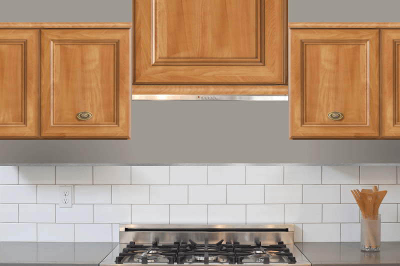
I don’t hate it, but again, I don’t think it does anything special.
If you are open to a green, Benjamin Moore’s Vintage Vogue looks amazing with honey oak.
Sherwin Williams Acier Exterior
On an exterior, Acier becomes a bit of a chameleon. Here is a stucco two storey painted by the team at Heiler Painting (@Heilerpainting).

It could be the lighting, the trim color, or the other colors around, but here Acier looks like a stone color, or a straight gray.
I don’t see a lot of the taupe tones anymore.
This exterior reminds me of fresh concrete.

The trim is a creamy off white. Heiler Painting didn’t list the color, but it looks similar to SW Wool Skein.
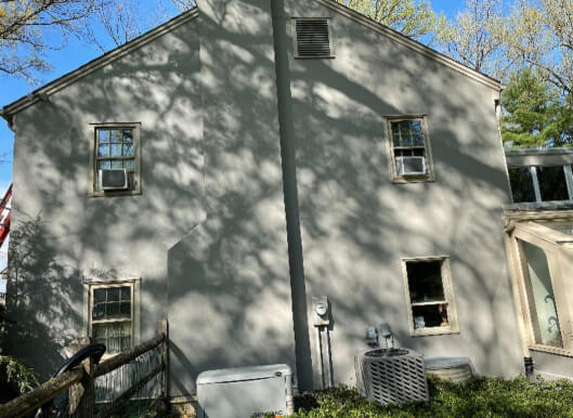
If I was to use Acier on an exterior, I think I would go with a dark trim color, like Urbane Bronze.
Acier Dupes
Today we have some AMAZING dupes for Acier. I am pretty ecstatic about that, because I’ve had several colors in a row where I just couldn’t get it perfect, but not today!
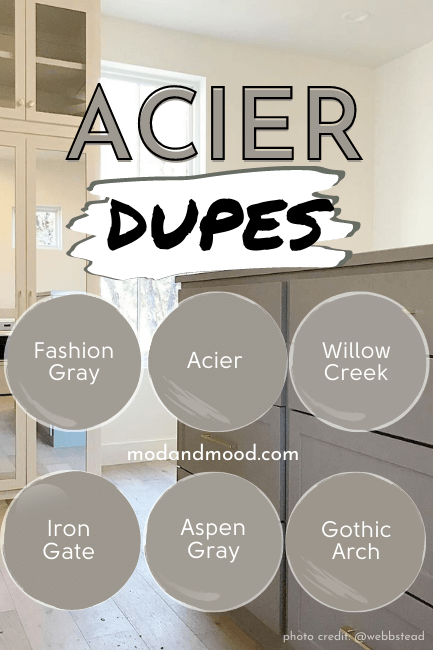
Benjamin Moore Acier Equivalent
I have two equally good dupes from Benjamin Moore for Acier: Willow Creek (aka Escarpment) and Gothic Arch.
They are both so close, it’s a wonder Benjamin Moore even made two colors so similar to each other!
Benjamin Moore Willow Creek/Escarpment (1468 or CC-518)
The first close color match to Acier is Escarpment or Willow Creek.
This color is just a hair lighter and a hair warmer than Acier.

The LRV of Willow Creek/Escarpment is 34.48.
Benjamin Moore Gothic Arch (CSP-580)
Gothic arch is a little bit less gray than Acier, and it’s a whiff darker, with an LRV of 31.08.

It would be easier to choose the right dupe by comparing them to each other.
Scrolling between the two you can see that the slightly more saturated Gothic Arch looks more brown, compared to Willow Creek.
Valspar (Lowe’s) Equivalent to Acier
The closest dupe for Acier from Valspar is the color Aspen Gray.
Valspar Aspen Gray (6004-2A)
Aspen Gray is a little bit cooler than Acier, and a touch lighter.
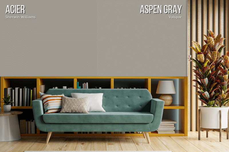
Valspar says the LRV of Aspen Gray is 31, but their LRVs are always different than Benjamin Moore and Sherwin Williams. The color is clearly a little lighter than Acier, so I would guess the LRV is actually 33 or 34.
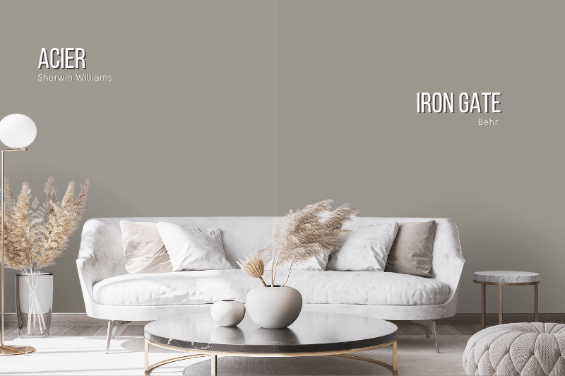
Acier Behr Equivalent (Home Depot)
The closest match to Sherwin Williams Acier from any brand, is Iron Gate by Behr.
Behr Iron Gate (MQ2-60)
Iron Gate is a near perfect copy of Sherwin Williams Acier. It is a tiny bit darker, with an LRV of 31.
Behr Fashion Gray (PPU18-15)
I didn’t really need to include Fashion Gray once we see the side by side between Acier and Iron Gate, but it is also a really close match, so why not?
Fashion Gray is lighter and a bit more purple than Acier.

Fashion Gray has an LRV of 34.
Acier Final Moody Musings
Let’s recap, shall we?
- Acier is a mid-toned taupe that prefers to be paired with very like neutrals, rather than any old gray, beige, or white
- On exteriors, Acier needs thoughtful trim choices or it can look pretty bland
- Acier is a great choice for cabinets, and can be used with any color of hardware (except maybe brass)
Still on the fence? Check out these other posts:


Ready to Paint?
Don’t Forget Your Supplies!
This little brush might look funny, but it’s my absolute ride or die!
Rollers like these hold the most paint and make the job faster. Get a metal roller cage for easy on and off.
DryDex is the fastest (and funnest!) way to make chips and dents disappear. (Make sure you get a small spackling tool that actually fits in the container, and a sanding sponge.)
This tool will save your back and limit time on a ladder.