I love a good color comparison and today we are looking at the subtle differences between Light French Gray, and Repose Gray.
Let’s see which color is the one is for you, shall we?
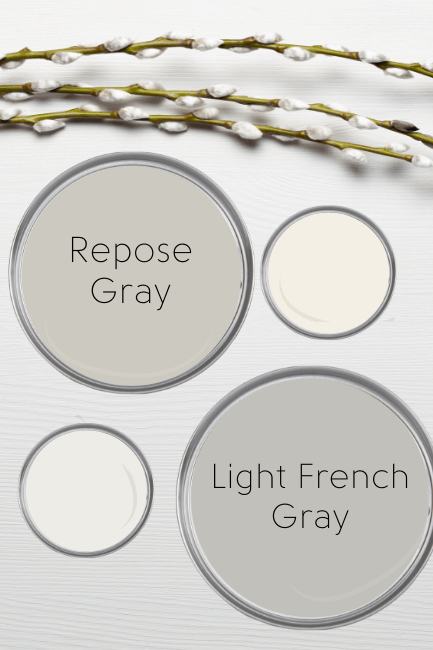
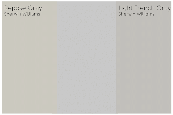
Sherwin Williams Light French Gray and Repose Gray Swatches
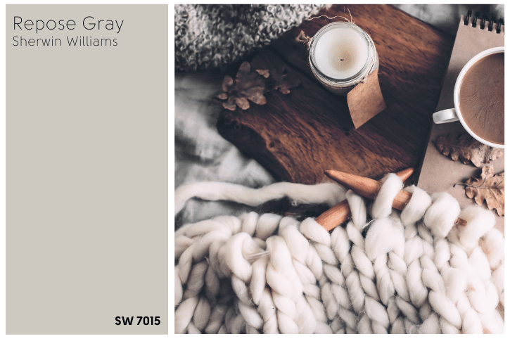
First lets take a look at the colors individually:

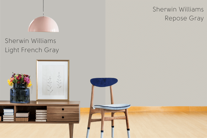
Right away you can see that Light French Gray is closer to a true gray, where Repose Gray is a greige.
Light French Gray vs Repose Gray Properties
Here is a side by side comparison of each color formula:
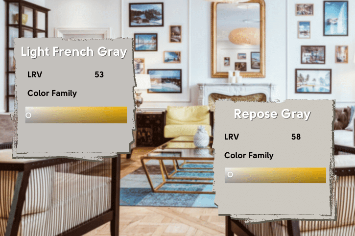
Light French Gray vs Repose Gray LRV
The LRV of a color indicates on a scale of 0 – 100 how much light a color reflects (or doesn’t reflect). True black has an LRV of 0 and pure white has an LRV of 100.
In the paint world, we are working in a range of 3 – 93 because no paint color is purely black or completely white.
True white paint colors range from about 82 – 93.
Light French Gray has an LRV of 53.
Repose Gray has an LRV of 58.
This might sound pretty dark, but anything above 50 still reflects light rather than absorbs it.
Light French Gray vs Repose Gray RGB
Light French Gray consists of: Red 194, Green 192, and Blue 187.
Repose Gray consists of: Red 204, Green 201, and Blue 192.
Colors never cease to amaze me! If I were to just look at the colors I would have thought Light French Gray had more red and blue, because it has just the slightest purpley hue to it.
As it turns out, both are technically in the mustard family, although they are both so desaturated that it hardly matters.
Light French Gray vs Repose Gray Undertones
As I just mentioned, Light French Gray can pull the tiniest bit purple.
Repose Gray on the other hand, can either pull out warm beige tones, or look pretty “classic gray.”

Remember! These pictures have zero light reflecting off of the walls. So the colors appear darker than they will in your house with a light source.
Light French Gray vs Repose Gray – Are They Warm or Cool?
So, are these colors warm or cool?
Light French Gray is definitely closer to a cool toned gray. Even though it’s in the orange-yellow family, I have never seen it look super beige.
Repose Gray is more of a chameleon. It is technically a warm color, but I have seen it look the full range of gray and beige.
Both of these colors are highly influenced by:
- Your other decor
- The natural and artificial lighting
- What’s outside
I say “what’s outside” because it’s not enough to just consider the natural light, if you have big windows, whatever is outside will also reflect off the walls to a certain extent.
Why Does Light French Gray Sometimes Look Purple?
This was driving me crazy!! It’s not enough to just say it has a purple undertone, when I can clearly look at the color on the wheel and on the hex scale, and see that it’s yellowy-orange.
Here are both Repose Gray and Light French Gray compared to an absolute gray:
Against a straight gray, you can really see the warmer yellow tones in both colors. (But especially in Repose Gray!)
So why purple?? (And actually, some say blue.)
I watched more videos than I care to admit to try and figure this out, but basically, our brains are tricking us.
Sometimes the light source and/or other influences in the room, trick us into seeing the opposite color on the wall.
This is the video I watched that made it make sense: Colour Illusion
In the video he explains that he painted a client’s house gray, and the warm orangey floors made everyone’s brain see blue. It’s like the dress conundrum! Remember that?

Anyways, something about the lighting, other items in the room, and reflections of outside, are making your brain see the opposite on the wall: purple.
I’m betting it’s green or yellow, because I did some scrolling around on the color wheel and I think that’s what would be opposite of the purple tone that I personally see. (But I’m no neuroscientist.)
So if you have warm lighting, or a lot of trees outside, those factors may make Light French Gray look purple. If you have warm orangey floors, you may see blue.
This happens with a lot of gray colors, so our brains probably want to see a color they understand, and gray is an easy canvas to change.
Light French Gray and Repose Gray Complementary Colors
Because both of these colors are in the same family, Repose Gray and Light French Gray have the same complementary colors: A nice dark blue!
I paired both with Behr Calligraphy and Benjamin Moore Evening Dove.


Light French Gray and Repose Gray Coordinating Colors
Here is a coordinating palette with some other colors that are all the rage:
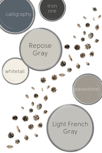
In this palette I stuck to other subtle warm colors.
Behr Calligraphy – A favorite from my Warm Blue Gray colors post. If you like this color, you will also like Benjamin Moore Hale Navy or Sherwin Williams Cyberspace.
Sherwin Williams Iron Ore – A super popular Sherwin Williams “black.” It can actually look quite charcoal. I wouldn’t say that it’s a true black, but it has a nice smoky color and contrasts well with the rest of these colors.
(If you’re looking for a dark gray like Iron Ore, you might also be interested in: Iron Ore vs Peppercorn.)
Sherwin Williams Whitetail – For how popular warm whites are, I really haven’t seen many people using Whitetail. I like it because it’s a creamy white without being yellow, which is sometimes hard to do! Whitetail would look gorgeous with either Repose Gray or Light French Gray.
Sherwin Williams Pavestone – A super nice taupe color. Something about Pavestone is just so comforting! It looks great with either gray as well.
When to Choose Repose Gray or Light French Gray?
If you are looking for greige, choose Repose Gray! Light French Gray is actually a pretty similar color, it just doesn’t look beige very often.
This exterior with light blue, is about as warm as Light French Gray ever looks:
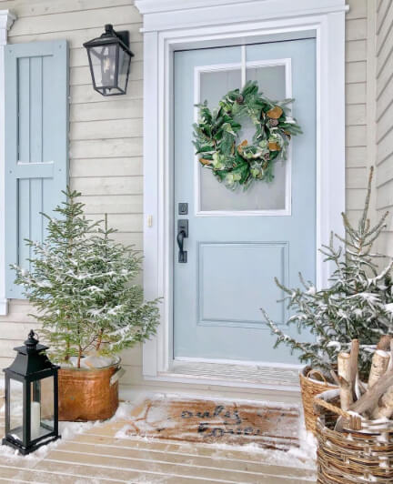
Thanks so much to Jo Galbraith of Jo Galbraith at Home for the photo!
Doesn’t it look soft and pretty with the blue?
If you want a more cool toned gray without having it look stark and dreary, consider Light French Gray.
If you don’t like beige/tan, choose Light French Gray.
I used to always choose a purple gray over a beige gray because I really didn’t want to end up with a tan color.
If you HATE purple, don’t pick Light French Gray.
Of course always try the colors out in different rooms. You really never know what your specific conditions will do with a color.
I once chose a blue-green white to paint my hallway and when I was done it looked baby room mint. Back to the store I went and grabbed more swatches, and when I tacked my favorite on the wall, it was the exact color I had already painted! You would never have guessed from the swatch.
Neither of these grays are for you? I have a LOT of colors for you to peruse:


