It’s generally accepted that both blue and gray are cool toned colors, but what if you want to paint your house a blue-gray AND have it be a cozy welcoming place?
Good news!
Colors, like a lot of things in life, are all relative. First I will explain my logic briefly, and then I’ll share some blue gray colors that I think are warm and inviting.
This post may contain affiliate links. Should you choose to make a purchase through one of my links, I may receive a small commission at no cost to you. I only recommend products that I use.
How Can Blue Gray Paint Colors be Warm?
Universally accepted color principles: Yellow and red are warm.
If you think of blue as being cool on the color wheel, by adding either red or yellow you will get a warmer tone.
To get a warm bluish gray (or grayish blue) you might need to get closer to the purple family, because: Red + blue = purple.
Purple is one area on the color wheel that transitions cool colors to warm ones.
If you hate that idea, yellow is also warm.
Green and blue are generally considered cool colors, but the more yellow that you add to blue, you get green. Therefore, greener blues must be warmer than true blues.
The gray part of this color theory is a mute point (no pun intended), because gray is just the result of less saturation. Warmer blue = warmer blue-gray.
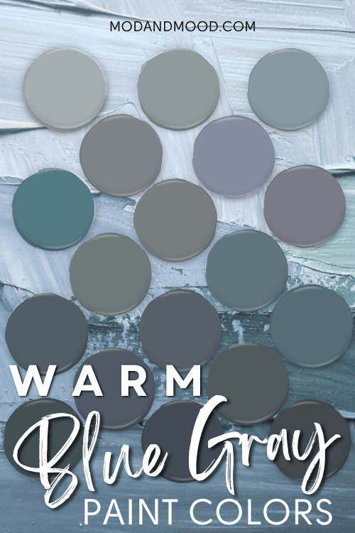
Light Blue Gray Paint Colors That Are Warm
Wow when I started this post I didn’t intend to choose so many colors!
Because warm blue grays can be either more violet or more green, I wanted to show options from either side.
Here are my top picks for lighter warm blue gray paint colors:
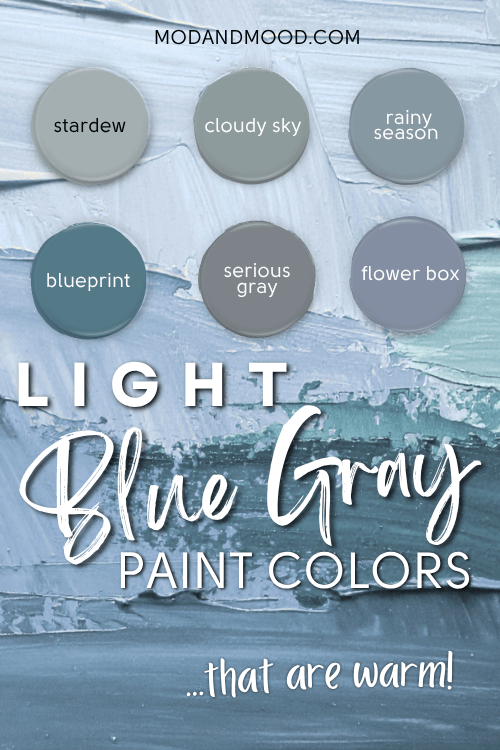
Of this grouping, Sherwin Williams Stardew is the most popular color! If you want to test it out, get yourself a peel and stick sample from Samplize.
Honestly this category was the most challenging! I wanted to provide some lighter color choices because there may be some people like me out there who are afraid of the dark.
Once a warm blue gray gets very light (like off-white), it tends to look either silver or not blue at all, so these light shades might not technically be that light. Rather they are light compared to other choices.
Sherwin Williams Stardew (9138)
Sherwin Williams’ Stardew is such a chameleon color, which is really my favorite genre of color.
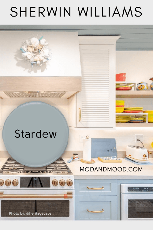
It has the ability to look either very warm or more true blue-gray. I almost didn’t include it because next to some other colors, it didn’t look all that blue, but here amongst it’s fellow blue-gray colors, you can see that it is.
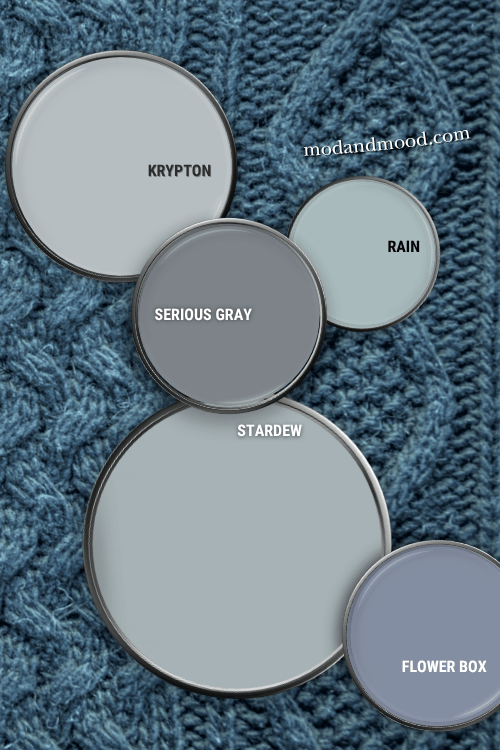
Seeing where it was on the color scale surprised me. It is to the green side of blue, but most definitely a blue. I was expecting something more green! While we are at it, here is how Stardew compares to similar popular colors:
Stardew vs Rain (6219)
Sherwin Williams Rain is incredibly close to Stardew. I would say that Rain reads a little more blue, and Stardew is a little warmer.
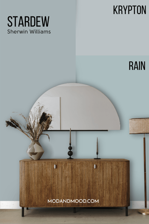
Stardew vs Krypton (6247)
Sherwin Williams Krypton is definitely a more cool blue gray. I’ve seen pictures of it in action and it has a light powder blue quality.
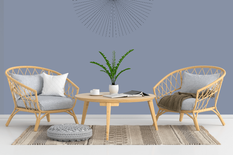
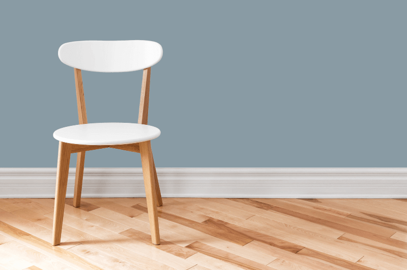
Sherwin Williams Serious Gray (6256)
Serious gray is a gorgeous gray blue color that leans more towards gray.
The color sample looks pretty dark on my favorites palette, but on a wall it doesn’t read that way.

Serious gray is also a more yellow blue, therefore closer to green than purple, but again, it is decidedly a true gray-blue.
Serious Gray vs Sherwin Williams Storm Cloud (6249)
Storm Cloud is very close in color to Serious Gray. It is ever so slightly darker.
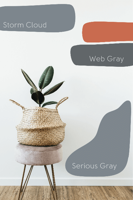
Serious Gray vs Sherwin Williams Web Gray
While Web Gray is still a smoky Blue Gray color, it’s much darker and less blue. Web Gray is a really nice charcoal color.
Serious Gray Exterior
Serious Gray is a popular pick for house exteriors. I painted my house white this summer, so naturally I couldn’t use it as a test subject, but here is a try-on from Sherwin Williams.
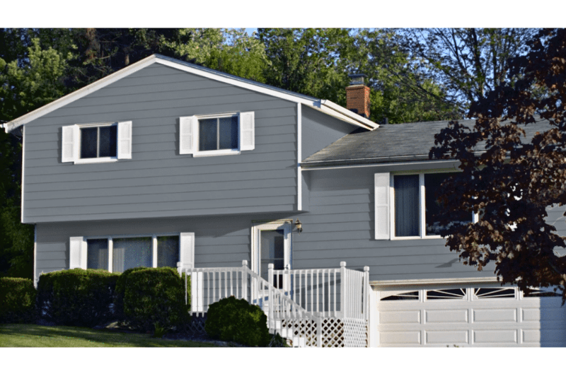
Serious Gray is a really classic smoky blue color for the outside of a house.
Serious Gray Cabinets
Here is what a kitchen looks like with cabinets in a color very close to Serious Gray:
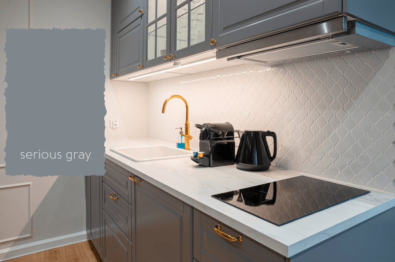
I had painted my cabinets gray once-upon-a-time, but I never considered a blue gray. I actually think this looks great!
The veins in marble are often a blue gray, so that worktop was a nice choice. Ikea has really affordable laminate countertop in a faux marble finish, if a DIY kitchen is in your future!
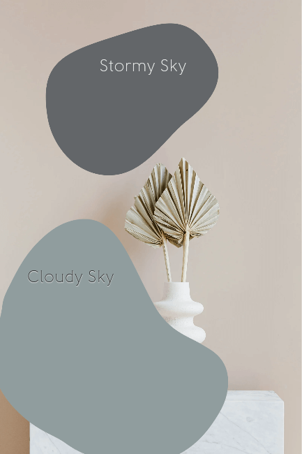
Benjamin Moore Cloudy Sky (2122-30)
Benjamin Moore’s Cloudy Sky is a blue gray color with the slightest hint of green. I think it has a muted earthy quality that is quite nice.

Cloudy Sky vs Benjamin Moore Stormy Sky (1616)
Another popular color, with a similar name, is Stormy Sky.
Cloudy Sky is much lighter and more blue than Stormy Sky, which is closer to a charcoal color. I actually really like Stormy Sky too, but I have similar shades on my “Best Blue Grays” palette already.
Benjamin Moore Flower Box (CSP-530)
Benjamin Moore’s Flower Box is one of my very favorites. It is a more purple blue-gray, so it could be trickier to pull off.
If you want it to stay blue gray and not purple, definitely mix it with bright whites and stay away from creamy whites for trim.
Flower box vs Benjamin Moore Sea Life (2118-40)

Benjamin Moore’s Sea Life is very similar to flower box, just a little darker. Sea Life is also on my “Best of” palette, so we will get there shortly!
Behr Rainy Season (MQ5-27)
Rainy Season by Behr is a great choice if you want a lighter color that is equal parts gray and blue. Sometimes when I look at Rainy Season I think it’s definitely blue, and other times I think it’s gray.
Sounds like the perfect recipe for a blue gray!
Rainy Season is closer to the cyan side of blue, so it has a little more yellow in it, but it’s a pretty true blue.
I feel like it reads quite warm, but that is just my opinion. I definitely wouldn’t class it as a cool or silvery gray.
Rainy Season vs Behr Dolphin Fin (790C-3)

Rainy season and dolphin fin are not really similar at all, but they are often debated between, so that’s why they are here at the same time.
They are both warm options if you are looking for the perfect gray wall color.
I had read somewhere that dolphin fin isn’t greige, but I think it’s definitely getting there, or at least greige adjacent!
If you want a light warm gray, and not necessarily blue, then Dolphin Fin might be perfect for you!
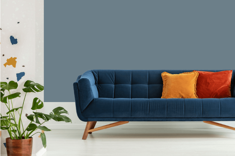
Behr Blueprint (S470-5)
Behr’s Blueprint is a super popular color. To be honest, it’s not even that gray, but it does have a warm smoky quality, so I let it slide.

Doesn’t it look cozy?
Blueprint Benjamin Moore Equivalent
I saw someone asking if Benjamin Moore has a shade like Blueprint, and it got me curious too.
Yes they do!
Fiji by Benjamin Moore (AF-525) is almost identical to Blueprint.

I think Behr’s Blueprint is ever so slightly more green. It has a murky quality that Fiji does not.
Behr Blueprint and Elephant Skin
I’m just going to say it, worst color name of all time. Elephant skin? Really? Why not just “Elephant” or “Baby Elephant”? Even “Young Elephant” would be fine.
No.
Why does it bother me so much?
I don’t know.
Maybe because with the word “skin” it sounds like an elephant hide. If someone told me there was a pig skin over yonder, I would not assume that the skin was still attached to the pig.
Dislike. Zero stars for the name. Moving on.
Here is what the popular color Blueprint looks like with Behr Elephant Skin.
(Say it out loud “bare elephant skin.” I don’t like it.)
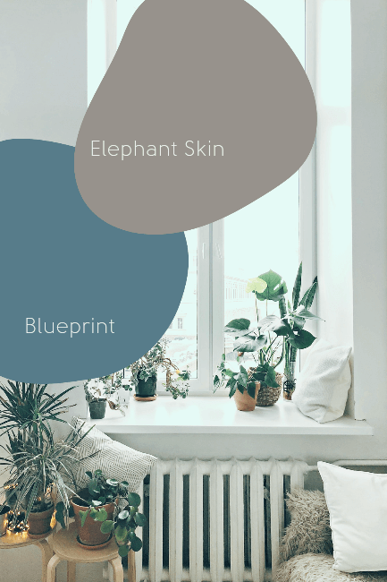
I can see why people like this combination. Elephant Skin has an almost taupe quality that is quite nice with Blueprint.
Still hate the name.
Medium Blue Gray Paint Colors That Are Warm

Of this grouping, Sherwin Williams Smoky Blue is the most popular color. Test it out in your home with a peel and stick sample from Samplize!
Benjamin Moore Stonybrook (1566)
Stonybrook is a nice complex color. It has an ocean-like quality where you can’t quite tell if it’s blue, gray, or green. I hate to use the word “murky” but that’s what springs to mind.
Stonybrook Exterior
Stonybrook is a popular exterior paint color for homes. I can see how it would blend well into nature.

Benjamin Moore Steep Cliff Gray (2122-20)
Steep Cliff Gray is actually pretty similar to stonybrook, but it’s more to the blue.
While this is a darker gray, I don’t find it to be cool toned.

Benjamin Moore Sea Life (2118-40)
I already cheated a little and showed you a sample of Sea Life above when we talked about Flower Box.
Sea Life is such a rich color! If you HATE purple, you probably won’t like Sea Life, but if you like complicated colors, this could be the one for you.
You can see next to something that is actually purple that Sea Life is still blue gray.
The main bedroom in one of our previous homes was similar to Sea Life, and I really liked it! It never looked purple in that room, but it was also only an accent wall.
Benjamin Moore Hamilton Blue (HC-191)
“Hamilton Blue, I choose you!” – I have actually watched very little Pokemon in my life, so I don’t know why that was the first thought that rattled around in my head.
Moving on…
Hamilton Blue was formerly known as PM-6 with Benjamin Moore, but it is now part of the Historical Collection and therefore HC-191.
Hamilton Blue is a great choice if you want more blue than gray, but still a fairly neutral color.
I feel like it has a denim-like quality where it will go with most colors. It looks great here with the mustard and terracotta!
For me personally, I think Hamilton Blue is a little too subtle. If I was to choose a color this dark, I would want it to make more of a statement.
It’s definitely a very serene color, if you want something mellow!
Sherwin Williams Smoky Blue (7604)
Smoky Blue by Sherwin Williams is right on the money when it comes to it’s name. It is truly a rich smoky blue color.

Doesn’t this smoky blue kitchen make a statement?
Here is smoky blue compared to a few similar colors:
Smoky Blue vs SW Waterloo (9141)
Sherwin Williams Waterloo is a more charcoal gray color. It definitely still has a lot of blue in it, but it is a fair bit darker than smoky blue.

Smoky Blue vs SW Distance (6243)
Sherwin Williams Distance is a little lighter than Smoky Blue, and a touch more blue.
(Also, what a great name! Very dramatic.)
I think the dark background is making these colors look a little darker than they actually are. The Smoky Blue cabinet picture looks a lot lighter than the color swatch does here.
Behr Calligraphy (N490-6)
Looking at it now, Behr Calligraphy should maybe be with the dark swatches. It’s a fair bit darker than Smoky Blue, which is the next closest color.
Calligraphy is one of my favorites! I haven’t seen a lot of people using it, but it’s a beautiful rich color.
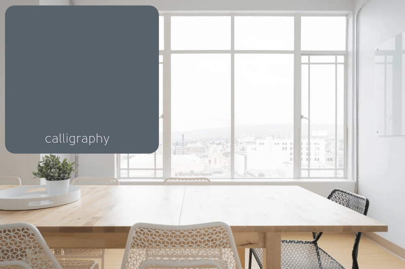
Behr Calligraphy Undertones
Calligraphy is inky and smoky at the same time. It’s more charcoal, but has definite blue undertones.
Technically I don’t think Calligraphy would be a warm color on any scale, but it looks and feels warm to me, so I thought it was worth including.
Calligraphy vs Midnight Blue (N480-7)
Let’s compare Calligraphy to Behr Midnight Blue:

These two colors are pretty similar! Calligraphy is lighter than Midnight Blue, and Midnight Blue doesn’t have quite the same smoky-ness that Calligraphy does.
Dark Blue Gray Paint Colors That Are Warm
This is my favorite category, which is funny because I am not known for putting dark colors on my walls. I just want to be brave!
Maybe I can live vicariously through you?

Of this collection, Benjamin Moore Hale Navy is the most popular color. Test it out mess-free in your home with the peel and stick sample from Samplize!
Behr Whale Gray (N470-6)
Whale Gray is SUCH a beautiful mysterious color! It might be my all-time favorite color from Behr.
(Actually, just wait for Blue Metal.)

Behr Whale Gray Undertones
Behr’s Whale Gray is a smoky blue gray color with definite green undertones. This is because Whale Gray is on the cyan side of blue. That added yellow makes this color so warm!
If you liked Stonybrook from earlier, than you will probably like Whale Gray. I feel like they have a lot of the same qualities.
Whale Gray vs Shipwreck (S470-6)
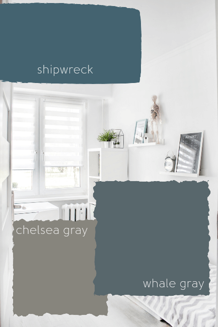
Shipwreck by Behr is more to the blue vs Whale Gray’s gray, and maybe just a sliver darker. If you like Whale Gray, but think it has too much green in it, you might like Shipwreck!
Whale Gray vs Chelsea Gray (HC-168)
I love Whale Gray and Chelsea Gray together! Don’t they make such a moody pair?
Chelsea Gray is a very warm gray. It’s like a very dark shade of greige. Chelsea Gray has no blue whatsoever. Believe it or not, it is a yellow gray!
(Benjamin Moore’s ever popular Kendall Charcoal is also a gray on the yellow scale.)
If you’ve decided by now that blue gray is not for you, maybe try on Chelsea Gray.
Benjamin Moore Evening Dove (2128-30)
Evening Dove is another blue gray color that leans almost to violet. I say almost because it only looks violet against the more green blue-grays, I don’t think it looks violet on it’s own.
Here is Evening Dove with Benjamin Moore Carolina Gull:


It reminds me a lot of the ever popular Hale Navy from Benjamin Moore.
Evening Dove vs Hale Navy (HC-154)
Let’s compare Evening Dove with Hale Navy, in a battle of dark smoky blues!
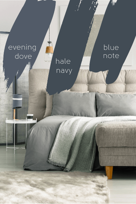
Can I say that I prefer Evening Dove? It’s so hard to choose!
For the purpose of this article, which is to find blue grays, I think Evening Dove has a more smoky look than Hale Navy.
Evening Dove vs Blue Note (2129-30)
Tossing it’s hat into the ring is Benjamin Moore Blue Note.
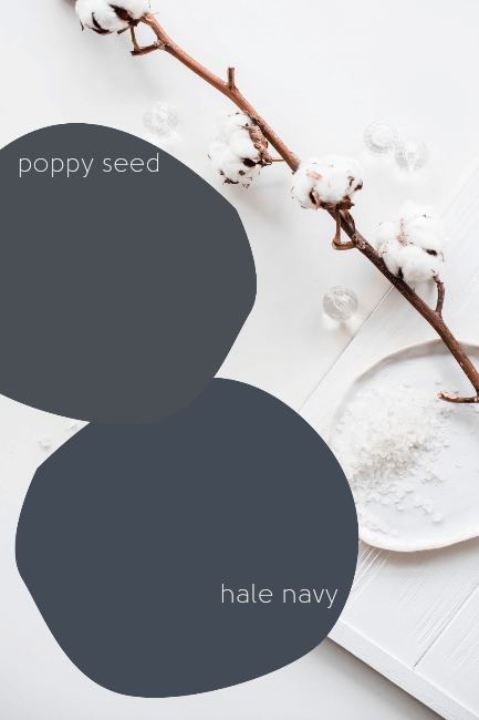
Benjamin Moore Hale Navy (HC-154)
Benjamin Moore Hale Navy is the color that I hate to love!
It’s just sooo popular, and I love choosing different and interesting colors. Yet here we are, I like Hale Navy like the rest of my fellow basic bishes.
(I also love a good Pumpkin Spice Latte, and I have no shame, so…)
Hale Navy is often lauded as the color that goes with absolutely everything, and it’s kind of true! It looks great with terracotta, sage, greige, you name it!
Hale Navy Behr Substitute
As with most ultra-popular colors, there may be people out there who want a color like Hale Navy that they can pick up from Home Depot.
Poppy Seed is one of Behr’s closest comparable color to Hale Navy.
Behr Poppy Seed (PPU15-20)
Side by side I can see that there is a difference, but I didn’t trust my eyes to discern what it was, so I took to hex code to compare.
Poppy Seed is slightly more violet, and slightly more gray, than Hale Navy.
If you love Hale Navy, but you want to pick it up at Home Depot, AND want it to be a touch warmer, than Poppy Seed might be perfect!
For the rest of the dupes and deets, check out my post: Hale, Yes! It’s Hale Navy! (Benjamin Moore’s Go-with-everything Paint Color)
Behr Blue Metal (HDC-AC-25)
I love Blue Metal by Behr! It is such a complex color. It is very similar to Whale Gray, which I also love.

Again, there is something about these oceany blue-gray-green colors that I just love!
(Actually my favorite pair of leggings are this color.)
Benjamin Moore Narragansett Green (HC-157)
Okay, so I know it’s in the name, but Narragansett Green isn’t truly green. That’s not just my opinion, I checked it out and it is squarely in the cyan range. (Making it more teal than green.)

Isn’t it gorgeous?
Narragansett Green would actually be a great neutral for all kinds of other colors, because it’s such an ambiguous gray.
Narragansett Green vs Newburg Green (HC-158)
Newburg Green is another not-actually-green color. It’s basically the same as Narragansett Green, but lighter and slightly less gray. It’s still in the same general cyan range.
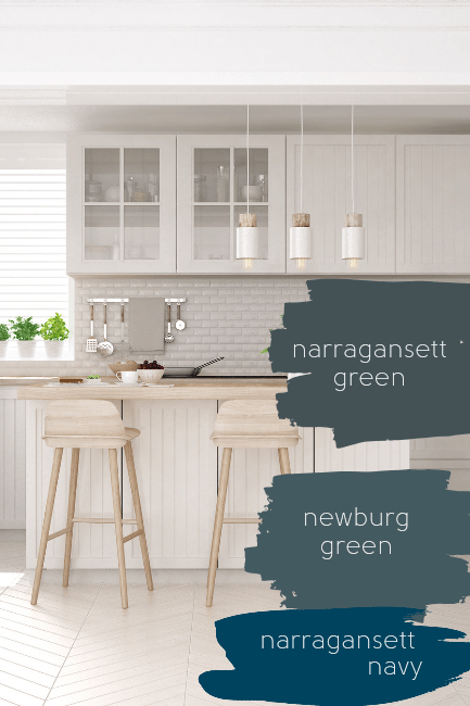
Narragansett Green vs Sherwin Williams Narragansett Navy (HGSW2361)
If you read more from me you will know that I always like to compare colors of the same name when they come up.
It’s usually a battle between Benjamin Moore and Sherwin Williams, and it’s funny, but often the colors aren’t the same at all!
(Actually they each have a “Baked Clay” that are similar to one another. So far, that’s it!)
First of all, I am nothing if not curious: Narragansett is a town in Rhode Island, and a tribe of Native American people.
So the name is not indicative of a particular color.
(Apologies to both but I had never heard the name before.)
Narragansett Navy is a true navy color, with basically no gray and no obvious undertones.
This is why Narragansett Green and Newburg Green suddenly do look green. It’s because they are green, in comparison to a color that is strictly true blue.
Behr Chimney (PPU25-22)
The color Chimney, by Behr, is the very last color on my list of warm blue grays.
I am loving this one! This smoky blue gray charcoal looks amazing with the natural wood tones.
Chimney is very similar to both Hale Navy and Behr’s Hale Navy equivalent: Poppy Seed.
Behr Chimney vs Benjamin Moore Hale Navy
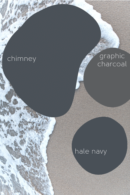
If your eyes are starting to water and it’s hard to really see the difference between Hale Navy and Chimney, (me too) let me help you out.
Chimney is slightly more gray, and Hale Navy is slightly more violet:

Chimney vs Behr Graphic Charcoal (N500-6)
Graphic Charcoal is lighter and more gray than Chimney. It is still in the blues, but so gray that you can’t really tell.
Blue Gray Coordinating Colors

For this palette I put two different blue grays on it, because they are not all the same. I chose colors that I feel coordinate well with both a very blue color, and a more subdued gray blue.
Benjamin Moore Stonybrook (1566)
Sherwin Williams Smoky Blue (7604)
Benjamin Moore Sage Wisdom (CSP-775)
I love Sage Wisdom by Benjamin Moore! It is so incredibly versatile, and it’s a very “pretty” color. I’ve been sliding it into palettes left and right! Sage colors are very popular right now.
Benjamin Moore Baby’s Breath (873 or OR-62)
Baby’s Breath is a white from Benjamin Moore that has subtle green undertones.
Sherwin Williams Sea Salt (6204)
Sea Salt is a gentle sage color that works as a warm gray. It’s another versatile color that is sort of a “new neutral.” It is similar to Benjamin Moore’s October Mist, but a little cooler.
Sherwin Williams White Flour (7102)
White Flour is another series regular in my palettes. I didn’t even realize how often until I was putting this post together. White Flour is a favorite because it’s a warm creamy white without being yellow.
Sherwin Williams Cavern Clay (7701)
I actually just wrote a whole list of my favorite terracotta paint colors, so if you’re looking for a cozy clay pot inspired color to pair with your blue gray, I’ve got you covered!
Cavern Clay is a really nice neutral terracotta color. It goes great with blue-gray, greens, and even greiges. Basically everything trending!
Behr Chelsea Gray (HC-168)
Chelsea Gray came up when I was doing my search for the best blue-grays and I thought it looked nice with most of the colors that I have listed here, so why not include it?
Warm Blue Grays from Benjamin Moore
In case you missed it, here are all the best warm blue grays from Benjamin Moore:
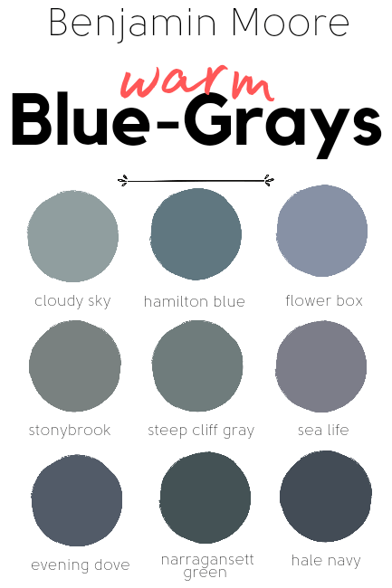
Just click on the color name to be taken to that spot in the article.
Warm Blue Grays from Sherwin Williams
I surprised myself by having way more Benjamin Moore and Behr colors than I thought, and only these three from Sherwin Williams!

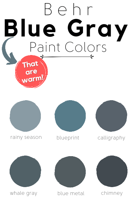
Warm Blue Grays from Behr
It’s funny how the different brands of paint do different things well. Obviously Behr excels at bluish grays!
Well that was so many colors that you are bound to like one of them, right? Which one would be your top choice?
More Colors


