Every major paint brand has now released their “Color of the Year” for 2026, and this year we finally have some good ones! (2025 was…sad.) Let’s go over these top picks, as well as some upcoming trends that I see on the horizon.
We will also review the “Color of the Year” from each brand for the past few years (because trends take time!).
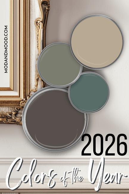
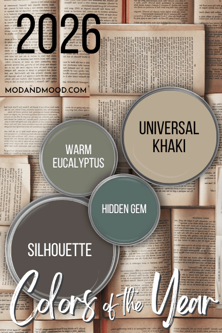
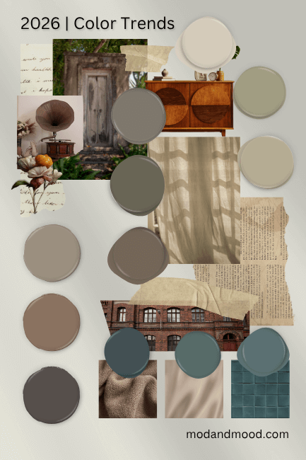
The Official Colors of the Year for 2026
2026 is the first year since 2022 that I’ve been excited about most of the picks for color of the year!
I think the 2026 colors are all very on trend, but not in a quick-moving fad sort of way, and (with the exception of one) they are beautiful colors without being too “specific.”
Before we look at each color, I just wanted to say that typically paint trends take a good 2-3 years to rise, and up to 10 years to die. Using one of these colors in 2026 will have you looking very early to the trend!
Benjamin Moore 2026 Color of the Year – Silhouette
I have to put Silhouette in my top spot for color of the year, because it’s a color that I genuinely really like and have already been chatting about! You can see Silhouette in my posts:
- Benjamin Moore Silhouette (the 2026 Color of the Year We Needed)
- Color Drenching Will Make Any Space Luxurious (And It’s Easy!)
- 9 Modern Brown Paint Colors for 2026 and Beyond (Sherwin Williams, Benjamin Moore, and More!)
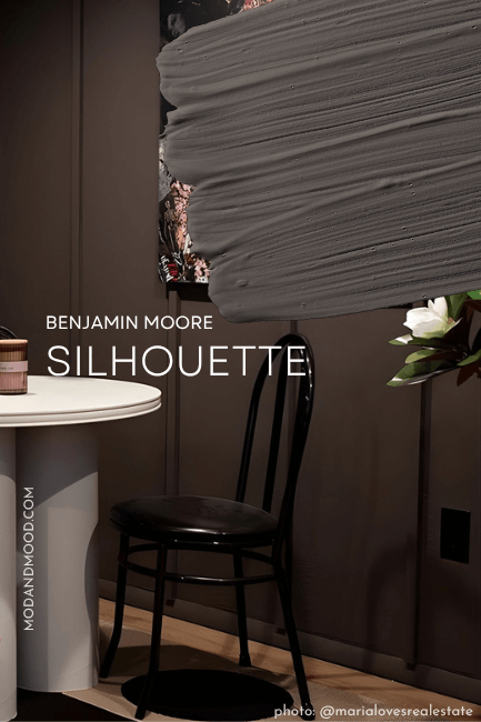
Silhouette is a chocolate-adjacent brown that toes the line of dark and darker mid-toned. It can range in appearance from true chocolate with that warm (almost berry) undertone, to a saddle brown color.
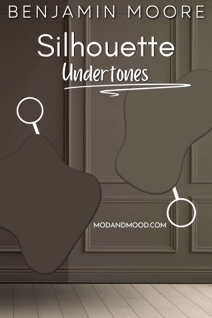
I love this color because it’s moody and on-trend with just the right amount of warmth. It still has a helping of gray, so it stays very neutral. Silhouette is all the drama of black and then some, because it’s a touch more interesting.
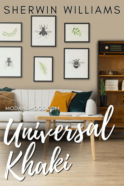
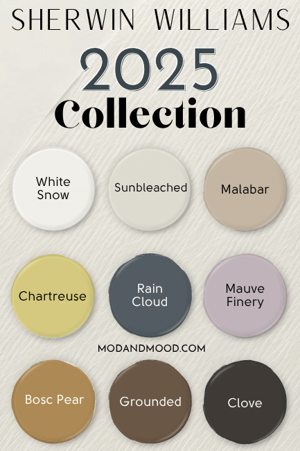
Sherwin Williams 2026 Color of the Year – Universal Khaki (Also HGTV Home)
I am (unfortunately) much less enthused by the Sherwin Williams pick for color of the year. Universal Khaki is certainly a universally…appropriate(?) beige color:
I don’t find it particularly fresh, interesting, or trendy. It’s so close to being a color that I could get excited about, (trust me, a beige never stopped me from getting excited!) but it is just so lukewarm on all fronts.
There are just a lot of neutral colors that I like better. Here are a few, and they are very similar, but they have a bit more character:
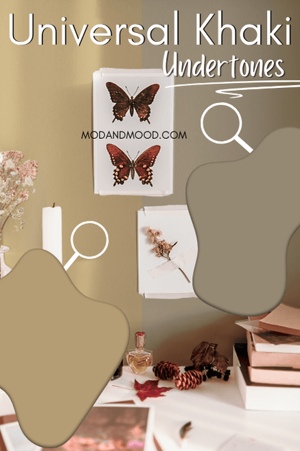
Universal Khaki is a mid-toned neutral beige that can appear anywhere from a true warm beige, to an almost greige, with an almost green undertone. (It approaches, but doesn’t quite land.)
Typically HGTV Home by Sherwin Williams selects their own “Color of the Year” out of the library, but for some reason this year they just stuck with Sherwin Williams’ own pick.
I do think that wheat colors are going to have a hay day (har har) very soon, so it’s not like this color is totally off base. There will be plenty of people who like and use it. I just like other colors better.
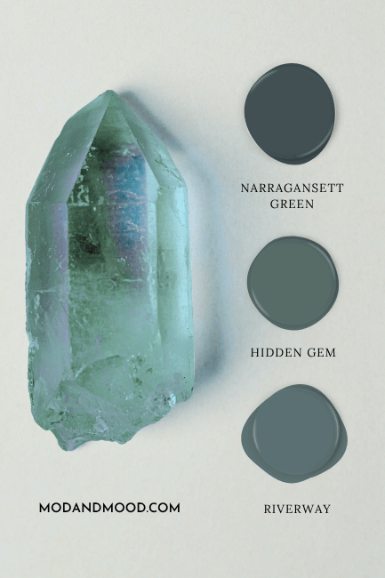
Behr 2026 Color of the Year – Hidden Gem
Speaking of colors that I like better, Behr Hidden Gem is a *chef’s kiss* perfect pick for color of the year!

This color perfectly marries the ongoing sage green trend, with a shift towards bolder teal tones. It’s like a crossover color, and one that I see looking great for years and years.
Hidden Gem is a very luxurious color that feels interesting, moody, and still quite classic.

Valspar 2026 Color of the Year – Warm Eucalyptus (or Sage Slate)
Valspar also selected a great color of the year with their pick: Warm Eucalyptus. I did already do a mini deep dive into this color in my post: Is Valspar Lying About their Color of the Year? (Warm Eucalyptus vs Sage Slate, NOT the Same)
…which is maybe a bit dramatic. Valspar claims that Warm Eucalyptus is the same color as Sage Slate at their independant retailers, but their own information states otherwise:

They said that it’s a difference in the formulas, etc. (If you’re interested, just head over to that post because there’s no need to re-hash it here.) Anyways, we will just speak about Warm Eucalyptus moving forward.
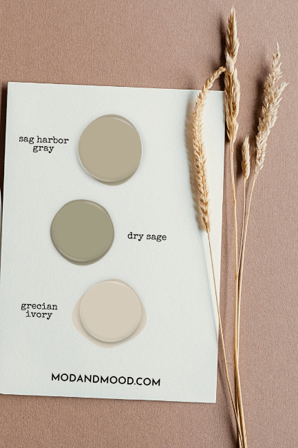
Warm Eucalyptus is a mid-toned sage color that can have a warmer undertone. I wouldn’t say that the undertone is ever super warm, especially not compared to truly warm sage colors like Sherwin Williams Svelte Sage or Benjamin Moore Dry Sage.

It’s something in between a warm muted sage, and a true eucalyptus color. Warm Eucalyptus is actually a dupe for the popular Sherwin Williams color Dried Thyme, which is just one shade darker than Evergreen Fog on the same color strip.
Pantone 2026 Color of the Year – Cloud Dancer
Pantone announces their color of the year a little bit later than everybody else does, so it didn’t make the palette, but I wanted to add it as a little bonus here!

For 2026, Pantone chose Cloud Dancer as their color of the year. Mostly I have seen people complaining that it’s very boring, but in the paint world: That ain’t bad!
If you want to see how Cloud Dancer looks in paint, head over to my post: Paint Color Matches for Pantone Cloud Dancer, Their 2026 Color of the Year (Sherwin Williams, Benjamin Moore, and more!)
2026 (and Beyond) Color Trend Predictions
My predictions are part stats, part community interest, and part hunch, but here are the home decor paint color trends that I see in the very near future!
Warm(er) Brown Paint Colors
True grays have been out for a minute, but we have really been dillying (and dallying!) to get into the world of brown! While I do feel like we have arrived, the shades of brown that I see getting the most love, are still quite neutral.
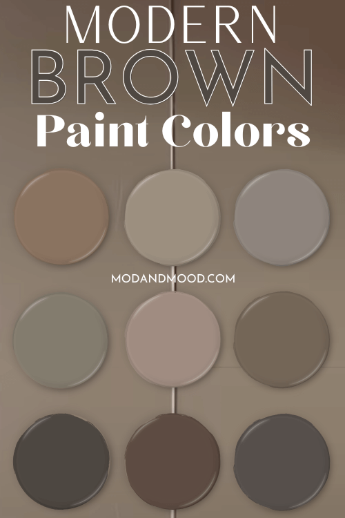
Most up-and-coming brown paint colors are warm, but still tempered by a whisper of gray or an interesting undertone. Think mushroom or mocha, and not rusty or mustard just yet.
Wheat Colors
Beige colors seem to be trending slightly away from pink or orange undertones and into something with a hint of green. It’s like if the greige trend met the sage trend, and then we added a bit of warmth.
You can see a few good examples of these colors in my post about sage green trim choices.
Earthy Greens and Browns
Dark greens are still trendy, but we are getting a little away from cool tones and jewel tones, and inching a little closer to brown, or what I would describe as “earthy green.”
This is an interesting space where the trends kind of meet, because earthy green-leaning browns are also coming into style.
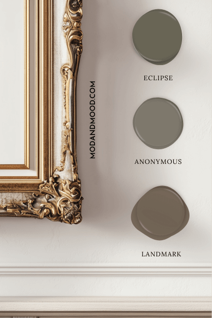
Sherwin Williams Anonymous is a good example for this trend.
Teal Tones
Finally for those of you who aren’t wowed about all of the warmer colors and natural tones, we are seeing a comeback from teal.
This is strictly my own observation on this one! I have seen a lot more interest in teal colors recently, particularly when we are talking about teal colored cabinets.
This is an interesting one, because it is probably the quickest turn around time of all these colors. I feel like teal was popular not that long ago. On cabinets is new, I would say, and the teal tones trending now do tend to lean a little more muted. (Think more “stormy aquatic,” and less “mermaid aquatic.”)
I am actually writing this at the exact same time as the 2026 colors, because quite frankly, I couldn’t be bothered to summarize this at any point in 2025.
It’s very much giving “disjointed.” The colors on the “color of the year” palette haven’t looked this bad together since 2023. There are colors on here that I’m fine with, but nothing that I find fresh or exciting.
Let’s talk about these colors really quickly!
Sherwin Williams 2025 Color of the Year – Nothing
I can’t quite fathom the reasoning behind not choosing a color of the year at all, but that’s what Sherwin Williams did in 2025, and exactly what Valspar did the year before.
They would say that it wasn’t “nothing” because they created a collection of colors for 2025 (also exactly what Valspar did the year prior) but it’s really hard to highlight and speak about an entire collection, so it amounted to no color getting any special attention.
When I say I can’t fathom it, trust me, I’ve tried. I actually would really like to understand the logic? I’ve settled on thinking that maybe they didn’t want to create any shortage for their base colors, or for the particular tint colors?
I also thought maybe they would have abandoned the idea when Valspar announced their Color of the Year (it always comes out first), because it would have shown that the “collection” idea didn’t work particularly well the year before. Perhaps the promotional material was all finalized.
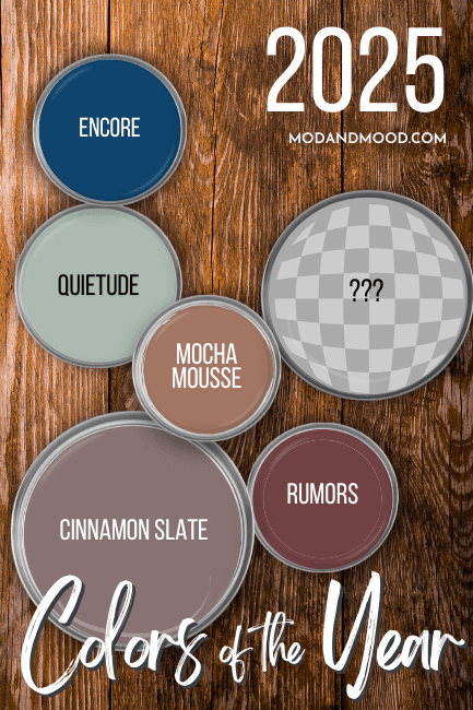
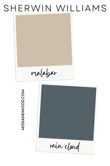
Anyways, no COTY from Sherwin Williams in 2025. The biggest successes from the collection seem to be the shades Malabar and Rain Cloud:
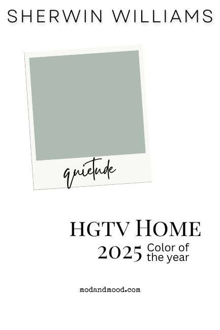
HGTV Home by Sherwin Williams 2025 Color of the Year – Quietude
If you were sure that there was a color of the year for 2025 from Sherwin Williams, you may have seen the HGSW color choice. HGTV Home always selects their own color of the year, and since they are Sherwin Williams colors, it does tend to get confusing.
In 2025 the HGTV Home color of the year was Sherwin Williams Quietude:
Benjamin Moore 2025 Color of the Year – Cinnamon Slate
Better than nothing, was the Benjamin Moore pick for color of the year: Cinnamon Slate.

Cinnamon Slate is a very useable color as far as purples go. It’s a pretty neutral version of a color family that is hard to do well.
I personally like the color, but I do think its appeal is limited.
Valspar 2025 Color of the Year – Encore
Valspar went a little left-field with their choice in 2025, with the bold blue of Encore.
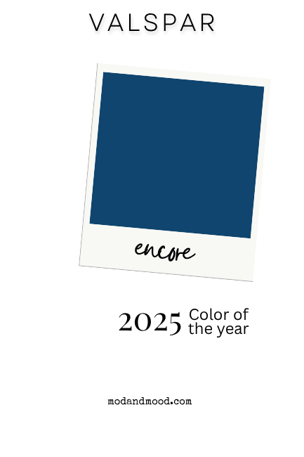
I do like the bold, almost royal blue of Encore. It’s very saturated, and it’s a great choice for built-ins or other woodwork. It’s also a bold, but classic, choice for exteriors.
What I’m not sure about, is how on-trend the color is. There are people who will like it, and a blue like this is never completely out of style, but it’s not a color that I see everywhere in the near future.
Behr 2025 Color of the Year – Rumors
Rumor has it, I hate this color.

You won’t see another color on my whole website that I outright say that I hate. That is mostly because I avoid writing about any colors that I really don’t like. I want to give my real opinion, and I’m not going to ask people to share pictures of their lovingly decorated homes, just so that I can say I hate it. (Awkward!)
Anyway, Rumors is just not it for me. I don’t understand why they thought a burgundy would be on trend. I don’t find it special or interesting. I do find it very “1999 my mom’s dining room.”
I could get behind something a little more wine colored, perhaps in a color drench situation, but personally, this isn’t a color I would even take the swatch for.
Pantone 2025 Color of the Year – Mocha Mousse
I didn’t include the Pantone color of the year for 2026 because 1.) it isn’t paint after all, 2.) it isn’t released until December, and 3.) it’s a little hit-or-miss anyways in terms of decor trends.
In 2025, Pantone did have a moment for the decor girlies, when they selected Mocha Mousse as their color of the year.
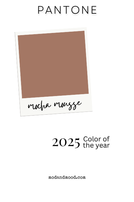
I do think this color was perfectly predicting the future of color trends. Warm browns are just starting to become quite popular a year later. We’re seeing teddy bear browns on everything from clothes, to hair, to nails, and of course, your walls!
*This is the post as it was written for 2024. I’m leaving the trend predictions as a sort of time capsule.
The colors of the year from 2024 fell in two camps: cool blue, or ultra warm.

The big 4: Sherwin Williams, Benjamin Moore, Behr, and Valspar ALL chose shades of blue as their colors of the year.

The coordination isn’t super surprising, as they often seem to have a group chat before they pick. (Not in 2023, as you will see in a moment!) What is surprising, is that they chose blues. I feel like people have only just hung up cool grays in favor of creams and beiges, so it remains to be seen how these colors will do.
Once again, it will probably take a couple of years to catch on, so maybe by then we’ll be ready!
Sherwin Williams Upward
Upward is a soft blue-gray with a whiff of a periwinkle undertone.
“A breezy, blissful blue. The color found when we slow down, take a breath, and allow the mind to clear.” – Sherwin Williams

Full disclosure: I’ve never been much of a blue girly, but this one does feel very neutral!
Benjamin Moore Blue Nova
Blue Nova also has a periwinkle undertone, but it is much more saturated.
“Elevate the everyday and expand horizons through juxtaposed color that is sure to inspire. With Blue Nova leading the way, depth and intrigue are balanced by an undercurrent of reassurance. This alluring mid-tone features an enchanting duality, capturing the spotlight with endlessly classic appeal.” – Benjamin Moore
The marketing team was doing the most with that quote. What a word salad!

I can appreciate the bold solid color of Blue Nova, while also acknowledging that this is more for accents. On the right style of house it would make for a great exterior color!
Behr Cracked Pepper
Cracked Pepper is a deep charcoal with a blue undertone.
“A versatile soft black that accentuates the spaces you create life moments in.” – Behr

I love this color! It is also a great substitute for black.
Valspar Renew Blue
Renew Blue is similar to a Tiffany blue or robin’s egg color.
“A nourishing, green-influenced blue that creates a sense of peace wherever you place it.” – Valspar

This color feels really classic, without being overdone. For something similar, you might also like Benjamin Moore Aegean Teal.
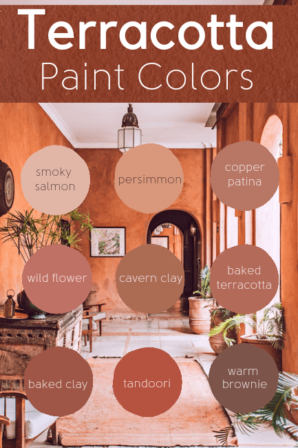
HGTV Home by Sherwin Williams – Persimmon
“Persimmon is a grounded earthy terracotta shade that feels energetic and refreshing. Persimmon’s warm, earthy elements add an uplifting personal touch to the home.” – HGSW
I would describe Persimmon is a zesty sorbet color. As far as terracottas go, I wouldn’t say that this one is especially “earthy.”

I’ve actually included Persimmon in my favorite terracotta paint colors:
PPG Limitless
Limitless is a real puzzler for me. The name certainly didn’t conjure visions of a buttery yellow.
“Limitless instills a warm, sunny vibe that hints at growth and blooming energy. Pairing beautifully with both warm and cool finishes – this hue’s agility across numerous design directions is what makes it a star.” – PPG

In fairness to Limitless, it’s not all butter. There is a hint of a peachy undertone. The hue’s “agility” is a question mark for me. There is definitely a place for a color like this in Victorian designs, but I think pairings might be a bit tricky.
For a slightly more subdued version of this, you might really like Sherwin Williams Casa Blanca.
Pantone Peach Fuzz
Of course Pantone doesn’t make paint colors, but they are widely recognized as color trendsetters, so it’s worth keeping track of their picks!
“Peach Fuzz is a velvety gentle peach whose all-embracing spirit enriches heart, mind, and body.” – Pantone

Predictions for 2024 (Based on Real Life and in Real Time)
Since trends often run a bit behind of announcements, let’s talk about what will actually be big this calendar year!

Sage Greens Will Keep Gaining Popularity
The colors released in 2022 will probably reach a fever pitch in popularity this year. Sage green is the new neutral that still adds a wink of flexible color to your home.

Maybe we’ll be ready to put our sage bundles down in 2025, but I kind of think this trend has more staying power than that.
I have covered a LOT of these colors. You can browse a list on my Greens page, or here are a couple of popular ones:
- The Best Colors for Sage Green Kitchen Cabinets (To Get the Look You Want!)
- 27+ Super Fresh Gray Green Paint Colors for 2024 (See Them in Real Homes!)
- The 22 Best Sage Green Paint Colors for 2024 That Nobody is Talking About
Not to put anyone off of sage, but I have seen people saying that it’s the new “millennial gray” … however they also called it “sad green” instead of sage, so let’s chalk that up to being misinformed.
Creamy Whites are Here to Stay
Soft whites are still the actual modern alternative to millennial gray, and they remain functional favorites into 2024. Off whites and soft beiges also fall into this category.

I’m not saying it won’t happen, but there is no end in site when reaching for white.
See more on my white paint colors page, or visit these favorite posts:
- 22 of the Best Cream Color Paints to Use in 2024 (Creamy Whites & Darker Creams)
- White Walls with White Trim? (Alabaster with Pure White & More!)
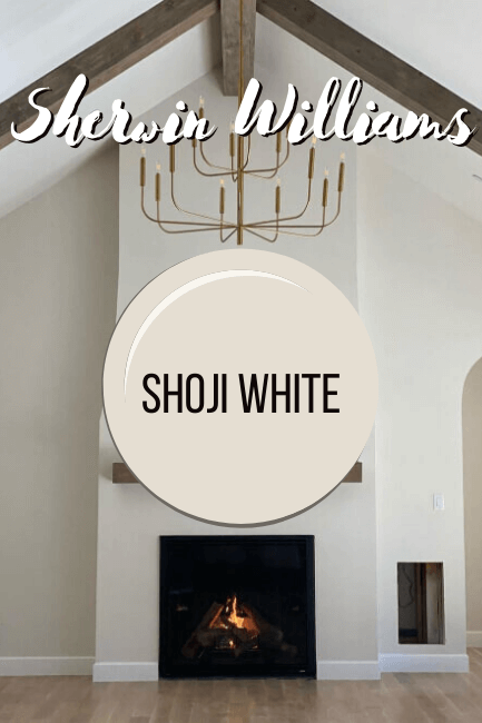
- Sherwin Williams Shoji White Review and Alternatives (It’s not greige!)
- Sherwin Williams Oyster White (Review and Dupes!)
Taupe Over Gray
Can this just be here because I’m a big fan? Whether you call it mushroom, warm greige, putty, or something else, I think taupe will continue to rise in popularity in 2024.
It’s a warmer neutral for people who really can’t stand peachy or yellow undertones.
Here are a couple favorites:
- Taupe of the Morning: Sherwin Williams Coziest Taupe (Review & Dupes) SW 9590
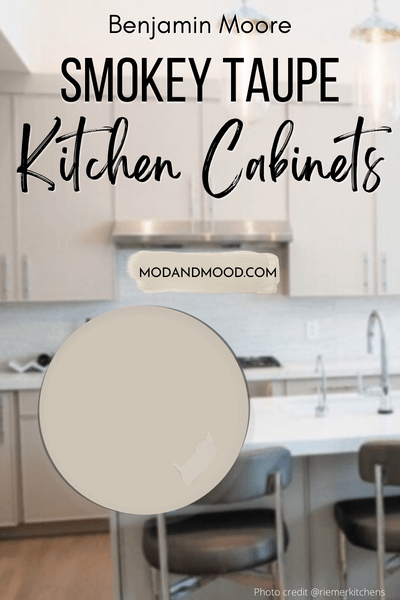
- The 3 Faces of Smokey Taupe on Kitchen Cabinets (Plus Alternatives!) Benjamin Moore 983
- Sherwin Williams Shiitake is the Smooth Beige Wall Color You’ve Been Dreaming of (Plus Dupes!)
Charcoal is the New Black
I’ll be the first to admit that charcoal has no place on any trend list, because it’s as timeless as black!
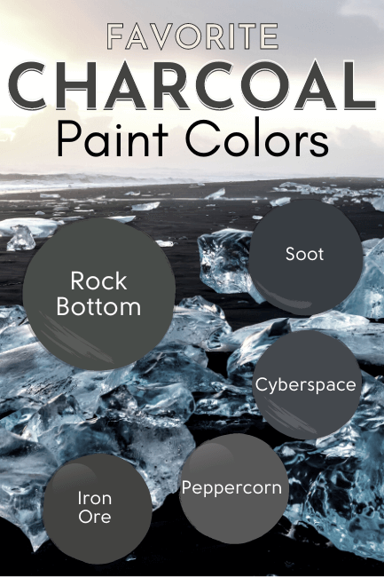
I do think that the solid-inky-black with bright white trend is over, which means linen and charcoal is a fresh alternative.
Mostly I have been flabbergasted by the amount of charcoals I have found lately that work with EV-UH-RY-Thing, and I just wanted to share my faves!
Cabinets That Aren’t White
I don’t see anybody doing a factory white finish on cabinets anymore, and we have only just dipped our toes into all the color possibilites.
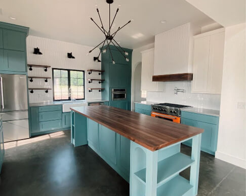
What started several years ago with navy blue islands taught us that color can indeed have staying power on cabinets, and maybe it’s not that serious after all.
Mushroom and sage seem to be the big up and comers in this area, which is no surprise really.

Here are a few popular cabinet posts:
- Trend-Setting Green Kitchen Cabinet Ideas (Plus: 22 Paint Colors to Use!)
- 27+ Fresh Two-Tone Kitchen Cabinet Ideas for 2024 (With Pictures!)
Final Thoughts Looking into 2024
Thanks so much for reading this post until the end! This really helps my blog! I hope you’ve enjoyed this recap and predictions. It’s a bit of a different style of post for me.
I’m entering the decorscape of 2024 with a see-what-happens attitude, but I do think these are pretty safe predictions based on what people look at around here.

Colors of the Year from 2022 & 2023
If 2022 and 2024 were the years when the group chat was popping between the brands, 2023 was the year when nobody was speaking…and it shows.
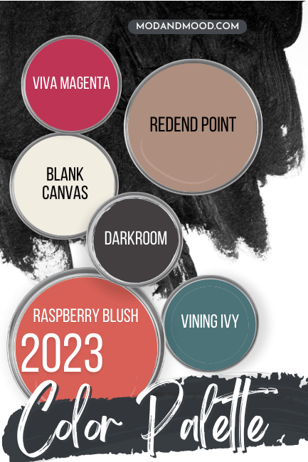
Note! Valspar chose to release color collections for 2022 and 2023, and did not name a single color of the year, so they are hereby excluded.
You know what this is giving? :

Random elementary school palette. At least that’s what I’m getting! We will brush over these quickly. But first:
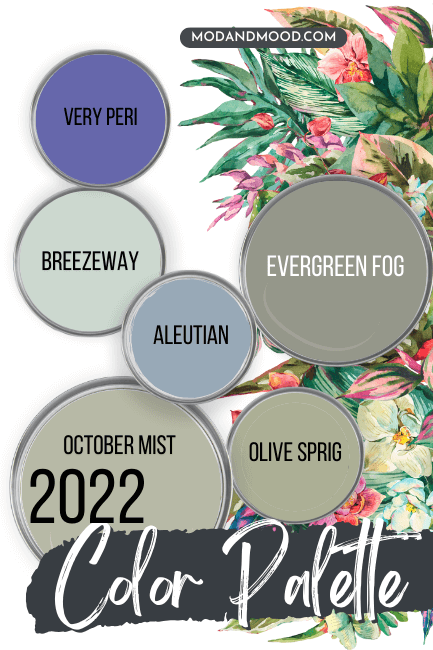
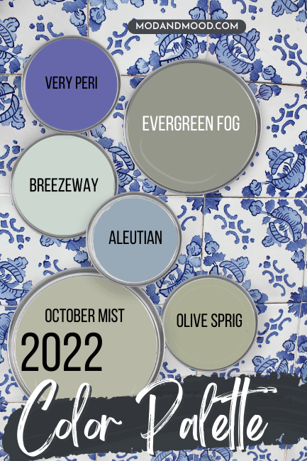
OMG, what a great year 2022 was! The group chat was popping and everyone was friends. You have my permission to pretend this palette carried us for 2 years. (Heck, use it now and make it 3!)
Sherwin Williams Redend Point – 2023
Here’s a look at the Sherwin Williams 2023 Color of the Year Redend Point:

I am most definitely in the minority with this color: I actually don’t hate it at all. I wouldn’t say that I am super pink-averse though.
I think it gives rosy brown, or useable terracotta.
Sherwin Williams Evergreen Fog – 2022
In 2022 Sherwin Williams selected Evergreen Fog as their color of the year.

Love this one! (Although I actually prefer Retreat slightly.)
Benjamin Moore Raspberry Blush – 2023
In 2023, Benjamin Moore took a page out of their wild color description book, and named Raspberry Blush as their color of the year.

Sadly I chose to skip out on reviewing this one because it was just too ultra specific. I always feel like “Would I put this on cabinets?” is a good test, and very very few people are in the market for Raspberry Blush cabinets.
Benjamin Moore October Mist – 2022
In 2022, the subdued sage of October Mist was named as the Benjamin Moore color of the year:
If you like this color, you will also like Fieldstone.
Behr Blank Canvas – 2023
DIY enthusiasts gave Behr a hard time for picking the white shade Blank Canvas as their color of the year for 2023, but we could all do with more options!

This one is pretty similar to the popular Benjamin Moore color White Dove. Personally, I think colors of the year should be very useable.
Behr Breezeway – 2022
Behr had a slightly mintier take on the gray green trend in 2022 with their color of the year Breezeway:

I really like this shade. It reminds me of a mix between Valspar’s pick for 2024 (Renew Blue) and Sherwin Williams Sea Salt.
If you like this color, you would probably really like Sherwin Williams Oyster Bay, or another Behr shade: Light French Gray.
HGTV Sherwin Williams Darkroom – 2023
In 2023, HGTV x SW chose Darkroom as their color of the year. This is an almost-black with a hint of a violet undertone.
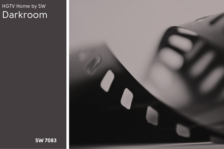
If you like this color, you will also love Sherwin Williams Perle Noir.
HGTV Sherwin Williams Aleutian – 2022
In 2022 the HGTVSW color of the year was Aleutian: A mid-toned shade of denim blue.

Interesting enough, Aleutian is on the same color strip as the Sherwin Williams 2024 color of the year: Upward.

I did actually check to see if HGTV x SW seems to test drive the color of the year for Sherwin Williams a couple years prior, but this one seems to be a coincidence.
PPG Vining Ivy – 2023
The PPG pick of the year for 2023 was Vining Ivy. This color is actually much more teal than you might think from the name “Ivy.”

If you like this color, you might like the slighty darker Sherwin Williams Blue Peacock.
PPG Olive Sprig – 2022
Olive Sprig was very on theme with the other 2022 colors of the year. This warm sagey color would still be perfect in 2024.

This color is actually very similar to Sherwin Williams Clary Sage.
Pantone Viva Magenta – 2023
Of course the Pantone colors again, aren’t paint. The 2023 color of the year was Viva Magenta:

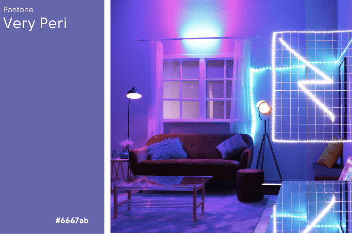
Pantone Very Peri – 2022
In 2022, Pantone selected Very Peri as the color of the year, which seems like maybe it could have influenced some of the 2024 colors:
If you’re here for solid color reviews, check out these other posts: