Cinnamon Slate is a mauvey color with surprising versatility! Here we will take a look at 8 colors that you can use with this previous “Color of the Year” including Benjamin Moore’s own recommendations.

Cinnamon Slate was an interesting choice for color of the year in 2025. It does typically take some time to see if a color catches on, but I suspect this one will go the way of Sherwin Williams Redend Point, which never really found mainstream popularity.
Here’s a summary of other past and present colors of the year!
I happen to like interesting neutrals that lean pink, purple, or terracotta, so let’s take a look at this one!

What Are the Undertones of Benjamin Moore Cinnamon Slate?
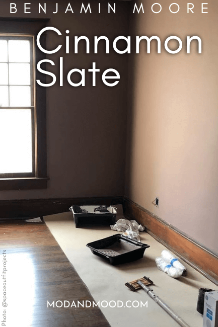
Despite the name, Cinnamon Slate doesn’t always look gray. It ranges in appearance from a mauvey brown to chalky purple. Benjamin Moore themselves, describes it this way:
“This delicate mix of heathered plum and velvety brown offers enduring style and a modern sensibility.” – Benjamin Moore
For once I agree! Cinnamon Slate is a velvety plum color. Here is the most brown that this color ever looks:

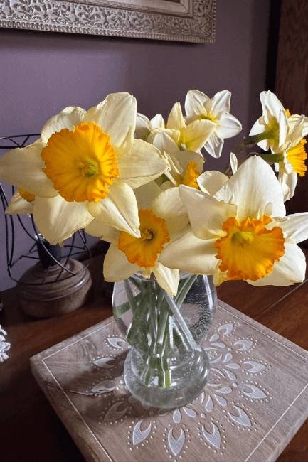
…and here it is looking its most purple:

The LRV of Cinnamon Slate is 19.71 which puts it at the dark end of mid-toned paint colors.

Truly dark paint colors tend to have an LRV of 10 or less.
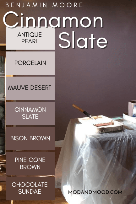
Here is a look at all of the shades on the Cinnamon Slate color strip:

While these shades are all variations of purple, they are almost as neutral as violet can get! (Especially the last three.)
Benjamin Moore Cinnamon Slate in a Color Palette
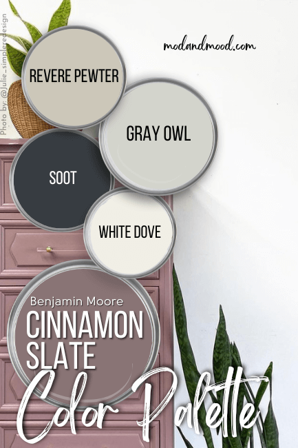
Here are the coordinating colors that I recommend using with Cinnamon Slate.

I went pretty neutral with this color palette, because if you choose a bold and specific shade like Cinnamon Slate, simple is often best.
Coordinating White Paint Color for Cinnamon Slate
I recommend pairing Cinnamon Slate with a warm creamy white like Benjamin Moore White Dove.

This white tends to have neutral beige undertones that keep it warm without looking yellow.
Cinnamon Slate is dark enough that most white paint colors will work with it, but I think a warm white is more complementary.
Try Cinnamon Slate with Benjamin Moore Soot
The beautiful blue charcoal of Soot is a great way to introduce another color with Cinnamon Slate, but in a very subtle way.

This choice might be a bit of a cheat, because I happen to think that Soot looks great with anything!
To help your imagination, here is the rosy-mauve of Sulking Room Pink with an adjoining room in a navy-charcoal:

Not quite the same colors, but you get the idea!
Neutral Paint Color to Use with Cinnamon Slate
I suspect that Cinnamon Slate will actually work well with most warm beiges or mushroom colors. You could also pair it with gray, but that may be a trickier combo.
For a versatile greige, try pairing Cinnamon Slate with the OG favorite neutral: Revere Pewter.

For an interesting alternative to beige, you might like Benjamin Moore Gray Owl.

Gray Owl is an interesting greige color with a subtle green undertone. Green is complementary to purple, so this pair is a match made in color wheel heaven!
Benjamin Moore Recommends These Coordinating Colors
Benjamin Moore went quite monochromatic with their color palette for Cinnamon Slate:

Pair Cinnamon Slate and Benjamin Moore Calm
Calm is an off white paint color that ranges in appearance from silvery gray to a very light creamy beige.

It will work well with most other paint colors…including Cinnamon Slate! If you like this color, you will also love Benjamin Moore Classic Gray!
Use Cinnamon Slate with Cloud Cover
Cloud Cover is an even warmer white than my suggestion of White Dove:

With an LRV of 80, Cloud Cover is technically an off-white, but just barely. Cloud Cover ranges in appearance from a true neutral white, to a creamy off white with a slightly peachy undertone.
Try Cinnamon Slate with Lighter and Darker Mauves
Benjamin Moore suggest pairing Cinnamon Slate with the color Porcelain, which is two shades lighter on the same color strip.

With a color as “specific” as Cinnamon Slate, sometimes using lighter and darker variants of the same thing is a great idea.
The trend continues with the coordinating color Chambourd:

Chambourd is an interesting color that is somewhere between an ultra dark chocolate brown and plum. It works well as a darker version of Cinnamon Slate, despite not being on the same color strip.
Here are all of the coordinating colors again:

Is Cinnamon Slate a Good Color to Use?
I wasn’t 100% sold on Cinnamon Slate at first in terms of versatility. I probably wouldn’t use it on an exterior (unless it’s a Victorian!) and it wouldn’t be my first choice for kitchen cabinets.
I do think that Cinnamon Slate is a surprisingly versatile backdrop for your other decor, particularly if you have a lot of plants. The greens really pop against this luxurious mauve.

I also found that Cinnamon Slate works well with a lot of other paint colors! You could use it with most neutrals and probably most muted greens and blues. Because I prefer the warmer look to Cinnamon Slate, I would personally use it with cooler tones, to try and keep it looking more toasted.
The trouble with Cinnamon Slate, is that it is a bit dark in terms of pairing with other colors. It would be overwhelming to use it in conjunction with other colors of a similar depth. I would keep coordinating colors either very light, or very dark for accents.

This shade is probably best reserved for an accent wall, furniture, or small spaces (like a powder room). It would be an incredible choice for a color drench moment however!
I hope this helped you visualize how you might use Cinnamon Slate in your home! If it’s not quite right, I’ve got lots more:


