Somewhere in the blurred lines between greige, beige, and taupe, is a perfect little intersection that I like to call mushroom. This smooth gray-beige (sometimes with a wink of violet), is one of my favorite color families for kitchen cabinets.

Much like with hair color and clothes, something about neutrals just reads “classy.” So without further ado, here are my favorite classy mushroom colors for kitchen cabinets:
Sherwin Williams Repose Gray
Repose Gray is one of Sherwin Williams most popular gray paint colors of all time, but it is quite underused on cabinets!

This is probably the most gray-leaning color on the list, but I still think that it reads mushroom.
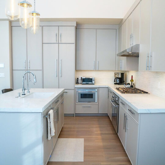
In this kitchen by Lisa of @deboeverinteriors we see the warmest and most beige that Repose Gray looks:

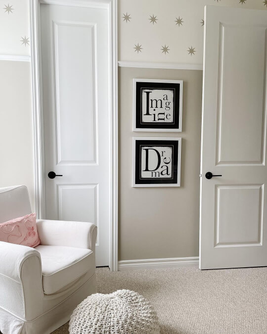
Here is a more standard face of Repose Gray from the living room:

The team at Bespoke Redesign (@bespokeredesign) also used Repose Gray on kitchen cabinets:

How amazing does that look? I think Repose Gray reads “expensive.” It’s worth noting that it looks much more silver on the chip than it does in real life.

Benjamin Moore Smokey Taupe
I actually made a whole post about Smokey Taupe on kitchen cabinets, but let’s take a quick look here anyway.

Smokey Taupe definitely can have a wink of violet in its taupey undertone:

…But it can also look quite neutral, or even beige-leaning:

In this next picture you can see a few different looks of Smokey Taupe all in one!

In the island to the left, Smokey Taupe looks more beige. In the background it looks like a silvery gray. To the right the color looks like a mid-toned taupe with the purpley undertone.
I do think that each of these still reads “mushroom.”
This one is a chameleon so I recommend checking out my post to see more looks from Smokey Taupe.

Benjamin Moore Stone Hearth
When I chose Stone Hearth as one of my favorite mushroom colors for cabinets, I had forgotten that it was on the same color strip as Smokey Taupe!

Where Smokey Taupe can sometimes lean a little silver, Stone Hearth is dark enough that it doesn’t really do that. It is just one shade darker on the color strip.
Here it is looking beautiful mushroomy beige:

In this next picture, it has a slightly purple undertone:

Personally I like the slight purple undertone, because it’s found in natural mushrooms too.
Stone Hearth is dark enough to contrast nicely against any lighter wall color, but not so dark that it sucks the light out of your space.
Sherwin Williams Taupe of the Morning
Taupe of the Morning is a lovely mushroom color on the lighter side of things:

For the wall color, Ashley and Matt (@homesweetiepiehome) went with SW Pure White.

The beautiful dark green pantry cabinets in the background are SW Succulent.
This color is a perfect mushroom tone that never looks completely gray:

If you hate pink, Taupe of the Morning wouldn’t be the right choice, because people have noticed that it can have a slight pink undertone. This is the closest that I can show you:

In general though, Taupe of the morning is a beautiful taupey mushroom:

As I mentioned, this color is quite light. It has an LRV of 65, so it is darker than an off-white, but lighter than most whole-home neutral wall colors. If you have a small kitchen, you might prefer the lightness of a cabinet color like Taupe of the Morning.
Sherwin Williams Shiitake
Shiitake is on the darker end of all these mushroom pant colors. It is however, named after an actual mushroom, so it must be good!

This one tends to lean more beige than gray:

In this kitchen by the team at BT Builders (@btbuilderstx), they paired Shiitake upper cabinets with the dark gray green of SW Cast Iron on the island. (If you like the island, check out SW Thunderous. It is just one shade lighter.)
Shiitake is great if you want a warmer toned mushroom!
Here is a look at an island where Shiitake changes in the light:

It’s crazy how much it can swing between warm beige and cool taupe.
The upper cabinets are in a color similar to Sherwin Williams Eider White.
Magnolia Home Cinnamon Sugar
The first time I laid eyes on Cinnamon Sugar, I was hooked! This beautiful mushroom color is classic and smooth, while also being a little different.

If you’re looking for a very niche mushroom color, this might be it! Unfortunately, it’s pretty hard to find anyone other than Rachael (@firsthouseonfinn) who has used it.

You can see a few more gorgeous photos in her blog post about this room. I have also covered a bit more of Rachael’s home in my post about Sherwin Williams White Flour.
To get the look in Benjamin Moore or Sherwin Williams, try Hazelwood (BM) or Twilight Gray (SW).

Sherwin Williams Accessible Beige
Accessible Beige is one of Sherwin Williams most popular greige paint colors of all time, but it’s still quite underused on cabinets!

This color is almost a stereotype of mushroom! It’s a totally neutral gray beige. This color does not have any purple or pink undertones, so if you hate those colors, Accessible Beige is a safe bet!

Here is one more look, where I would say that Accessible Beige looks very typical:

These cabinets are paired perfectly with the beautiful zellige tiles.
Here is the color on a wall, to give you a bigger sample size:

Here is Accessible Beige contrasted against SW Pure White:

That’s about the darkest that Accessible Beige ever looks. I don’t find that this color has any funky undertones, so this might be the safest mushroom cabinet color that you can find.
How Light and Dark Are These Mushroom Colors?
To help you decide, here is the LRV of each of these mushroom colors:

What’s an LRV anyway?
The LRV (Light Reflectance Value) of a color indicates on a scale of 0 – 100 how much light a color reflects (or doesn’t reflect). True black has an LRV of 0 and pure white has an LRV of 100.
In the paint world, we are working in a range of about 3 – 93 because no paint color is purely black or completely white.
It’s worth noting that Benjamin Moore’s LRVs and Sherwin Williams LRVs are not equivalent. You can kind of see in the graphic that a 49 in Benjamin Moore is about the same as 51 in Sherwin Williams.

I hope you found this helpful! I have a lot of posts about these individual colors and I have linked them throughout the article.
Completely undecided? Here are some other posts you might like:


