2023 was an interesting year for color. It’s one of the rare years where every paint manufacturer went rogue and did their own thing. For Sherwin Williams they at least went with a somewhat neutral choice, with their color Redend Point.
(As did Behr, they chose a white.)

Sometimes the color of the year can miss the mark, but I think this one will catch on eventually! Let’s dive into this unique neutral with color palettes, talk undertones, and see some dupes.
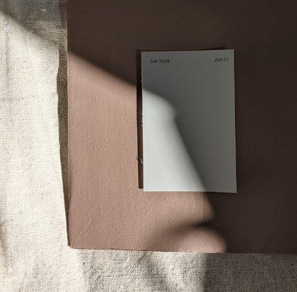
What Color is Sherwin Williams Redend Point (SW 9081)
Redend Point is a mid-toned clay color. It ranges in appearance on the wall from a pinky brown to a more true terracotta. You could describe it as a rosy brown.
“Embrace a spirit of connection with the world around us with this soulful-yet-subtle hue.” – Sherwin Williams
Well that invokes alllll the cozy vibes, doesn’t it?
When Sherwin Williams released their color palettes for 2023 (before they announced their top choice) I actually picked Redend Point as my favorite.

It is pretty similar to their 2019 Color of the Year Cavern Clay.

That one didn’t catch on to the degree that most of their annual picks do, so it’s almost like they are trying again with a more relaxed version.
LRV of Sherwin Williams Redend Point
Redend Point has an LRV of 30.
What’s an LRV?
The LRV (Light Reflectance Value) of a color indicates on a scale of 0 – 100 how much light a color reflects (or doesn’t reflect). True black has an LRV of 0 and pure white has an LRV of 100.
In the paint world, we are working in a range of about 3 – 93 because no paint color is purely black or completely white.

At 30, Redend Point is on the darker end of mid-toned colors. It’s definitely not dark, but not as light as many whole-home neutrals which sit in the 50-70 range.
What Are the Undertones of Redend Point
Redend Point doesn’t do anything unexpected in terms of undertones. It is a red-based brown color, so you will see hints of pink and peach, but they are very up-front.

Does Redend Point Look Pink?
I would not say that Redend Point looks like a straight up pink paint color, but like I said, you will see pink.
If you hate pink and pink-beiges, you will not like Redend Point. You may like Cavern Clay better, because it is more of a true terracotta color.
Is Redend Point Warm or Cool
Redend Point is warm like the Tuscan sun, baby! There is nothing cool about it.
It does have a muted gray quality that keeps it pretty neutral. I happen to think that clay and terracotta are neutral, in the same way that many greens can be used as neutrals.
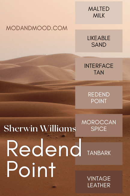
Redend Point Color Strip
Here is the whole Redend Point color strip by Sherwin Williams:
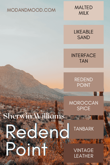
I actually happen to like this whole color strip. The exception might be Vintage Leather, which isn’t a bad color, but I think there are much nicer dark browns to be had.
Lighter Version of Redend Point
Redend Point is a little too dark to use in your whole home. For a lighter alternative from the same strip, you could use SW 6058 Likeable Sand.
For me personally, Likeable Sand is a little too peach. If you feel the same, you might like SW 6093 Familiar Beige a little better.

Darker Version of Redend Point
The colors just darker than Redend Point on the same strip are:
- Moroccan Spice – SW 6060 – LRV 22
- Tanbark – SW 6061 – 15
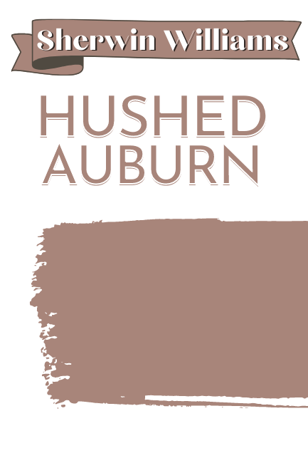
If you want a color that is just a tiny bit darker than Redend Point and still gives off the perfect clay vibes, I happen to love SW 9080 Hushed Auburn (LRV 26).
Sherwin Williams Redend Point Color Palettes
I made two different color palettes for Redend Point. I wanted to make one that spoke to me, but I also know that the most popular Sherwin Williams colors are the ones that people will want to see with their new Color of the Year!
First I present to you, the Redend Point neutral color palette, featuring the best of Sherwin Williams:
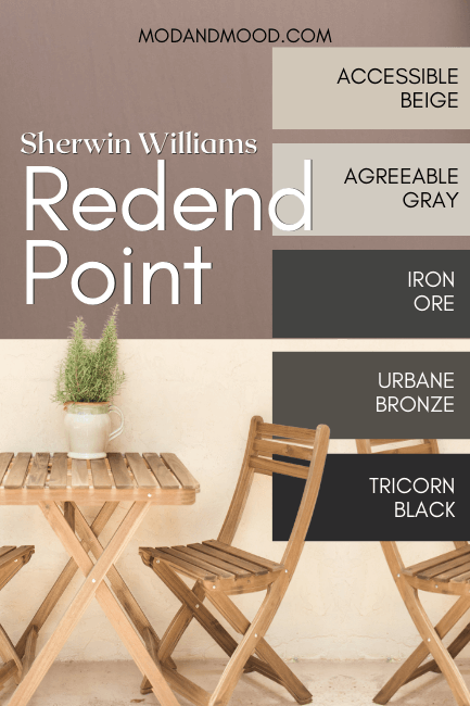
Popular Coordinating Neutrals from Sherwin Williams
Accessible Beige or Agreeable Gray with Redend Point
If I had to choose a foolproof wall color to go with Redent Point, I would probably go with either Accessible Beige or Agreeable Gray.
Agreeable Gray is a little cooler than Accessible Beige, so it will look pretty gray beside Redent Point since it is so warm. If you don’t want a gray, try Accessible Beige.
Redend Point and Iron Ore or Tricorn Black
If you want a black in your color scheme with Redend Point, look no further than Tricorn Black. It’s the OG darkest black.
If you aren’t sure whether you want black or a really dark color, I think Iron Ore would look fabulous with Redend Point. (I mean, it looks fabulous with everything!)

Iron Ore has many faces, but with Redend Point you can expect it to look like a smoky charcoal.
Urbane Bronze and Redend Point
I actually kept Urbane Bronze in for my second palette, because it’s the perfect earthy neutral.
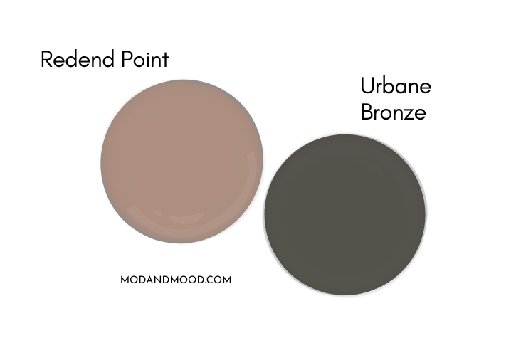
Chocolate brown always looks good with rosy tones, and Urbane Bronze is a sophisticated grayed-out version of that.
Complementary Color
The “official” complementary color for Redend Point (the color directly across the wheel) is a smoky blue. Sherwin Williams Favorite Jeans (SW 9147) is a close match:

Redend Point Color Palette #2
You already know I left Urbane Bronze, but here are my other picks for pairing with Redend Point:

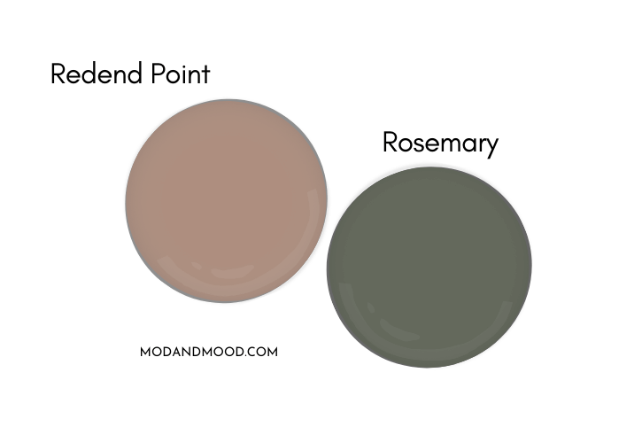
Redend Point with Rosemary
I love how green looks with clay and terracotta colors, and Redend Point is no exception. I chose Rosemary as the perfect coordinating neutral dark green.
Westhighland White and Redend Point
Despite how popular it is, I think this is the first time that I have used Westhighland White in a palette. I find the warmth of Westhighland can sometimes be too much, but with Redend Point it’s just right.

If you like Westhighland White, you will also like Sherwin Williams Dover White.
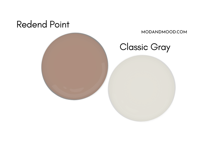
Redend Point with Benjamin Moore Classic Gray
Classic Gray is actually more of a warm off-white than a gray. It would be a beautiful neutral wall color with Redend Point, and a nice compromise between white, and a greige like Accessible Beige or Agreeable Gray.
What Trim Colors Go With Sherwin Williams Redend Point?
Redend Point is pretty close to a traditional Victorian era pink, so it’s a smart choice for any project that has a lot of dark wood trim or other elements.

I also think it looks quite nice with oak, but be mindful that this will be more of a vintage/cozy look, and it will be hard to take it super modern.
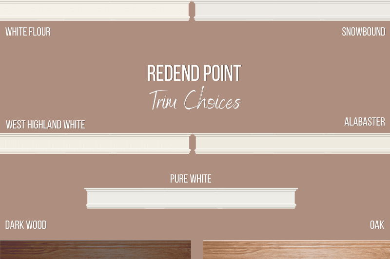
White Paint that Goes with Redend Point
For white paint options I wanted to show as many as possible, and a lot will work!
Redend Point with Creamy White Trim
Redend Point is one of the rare colors where I think a pretty warm white is the way to go. Westhighland White, White Flour, or Alabaster would be perfect creamy options.
Warmer whites will help Redend Point look more neutral, and minimize the pink/mauve tones.
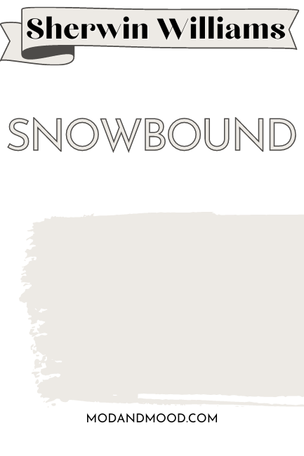
Snowbound Trim with Redend Point Walls
If creamy is not your style, Snowbound is a true white from the same color family as Redend Point, so it should look flawless on your trim.
Redend Point and Pure White
Pure White is still soft, but more neutral than the other options here. You can see that it works well with Redend Point, but does make it look slightly more pink.
I would steer clear of cooler whites such as Extra White.
Sherwin Williams Redend Point Home Interior
While Redend Point is not actually a new color (it was from the 2020 Heart Collection) it hasn’t been used a whole lot up until this point.
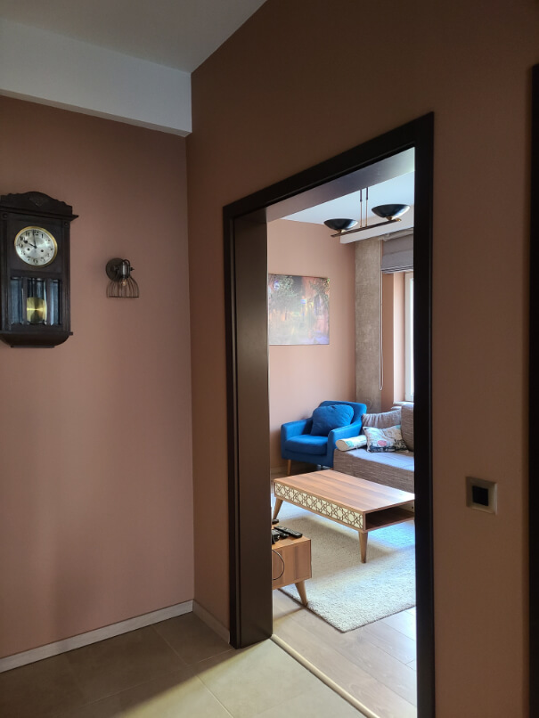
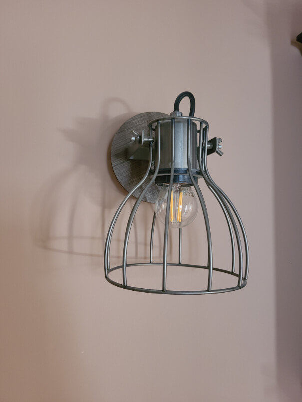
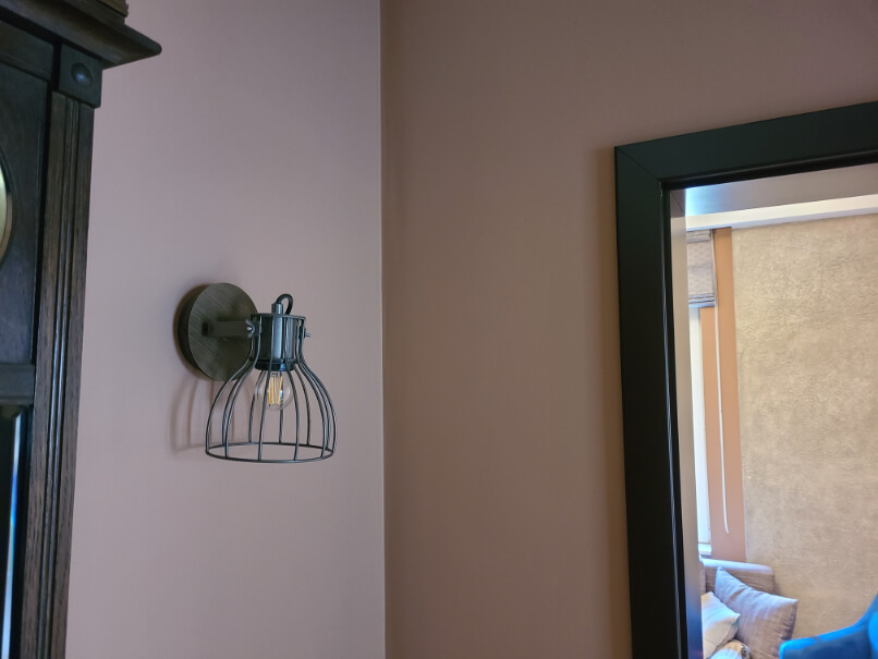
I recently had the opportunity to photograph an apartment that was entirely Redend Point. I found the color to be very cozy, and with lots of natural light it wasn’t too dark.

However in areas without windows, such as the foyer and mud room, I did find that the color was very dark.

I still don’t know that I would say it was too dark, because those areas tend to be darker anyways, and aren’t really designed to spend time in.
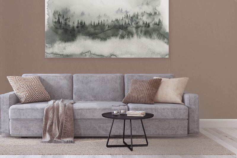
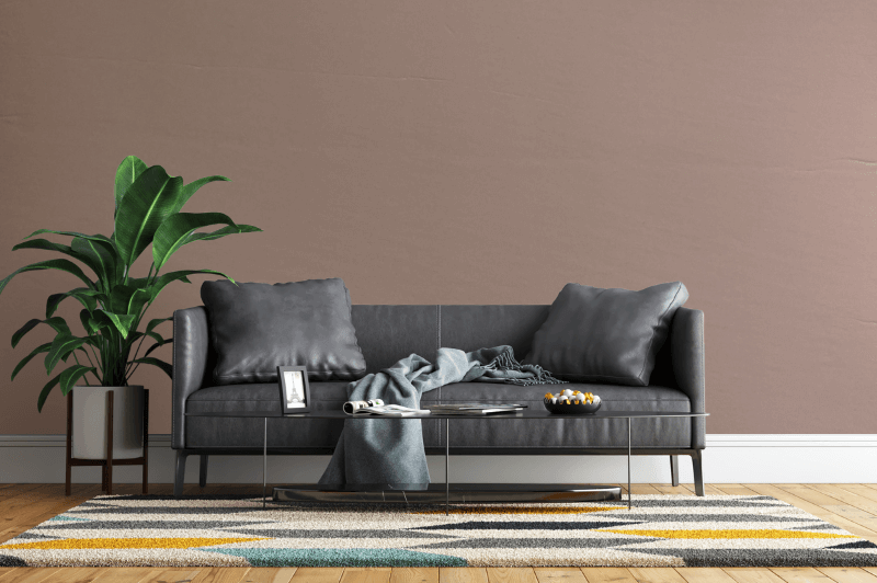
Redend Point in the Living Room
If you are a bit timid about color, Redend Point would make for a great feature wall. It’s dark enough to make a statement, and neutral enough to pair with a lot of other colors.
That last photo is a particularly good representation of how Redend Point looks in real life, most of the time.

This photo shows Redend Point at it’s lightest:

What I found throughout the day, is that Redend Point looks more pink in cool light (North-facing, or overcast) and more terracotta in sunlight, and particularly during the golden hour (no surprise there).
I did find that the color often looked far more orange/brown on camera. I am only showing you the most accurate pictures, and I will point out if there are any funky ones.
For example, here Redend Point looks more orange/brown than it ever did in real life:

Before we move on from the living room, here are a couple more ideas for Redend Point with different decor styles:
Farrow & Ball’s Sulking Room Pink is pretty similar to Redend Point, just a little more mauve.
Here is that color in the home of The Jordans (@thejordansathome) where it looks warmer and very much how Redend Point would look on the wall:

Redend Point in a Dining Room
This clay color is perfect for pairing with natural wood tones, so if you have wood dining furniture, it will look its best with Redend Point.


Sherwin Williams Redend Point Bedroom
In the two Redend Point bedrooms I was riding the struggle bus somewhat to get a good shot. First I will show you the more accurate ones:


With the warm sunlight, the color was photographing very orange, but it did not look it in real life:
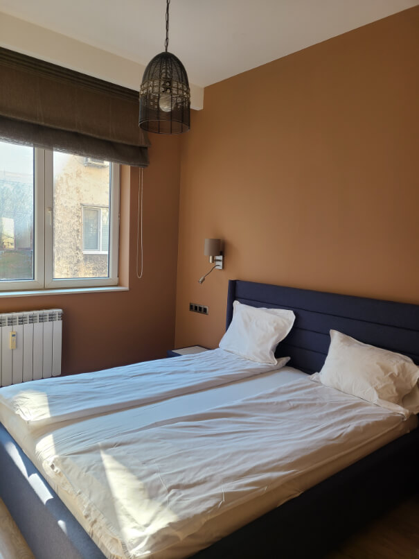
Try to picture these much more pink/neutral than they are.

More accurate:

Less accurate:

Just thought I would share because 1.) Photos in the bedroom were hard to come by, and 2.) If you see Redend Point looking very orange or brown, it’s the camera not the color.

Clay Colored Nursery
This is actually Hushed Auburn on the wall in this nursery, but I wanted to show it because you can totally achieve this look with Redend Point:
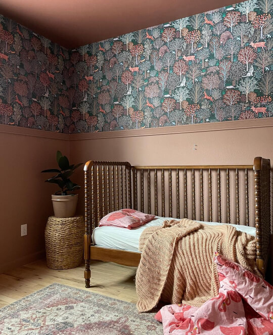
Maria from @marialovesrealestate has a house FULL of color, and she masterfully combined this teal/emerald/clay woodland wallpaper with the neutral brown of Hushed Auburn.
It’s easy to get stuck in neutral-land, but these colors don’t have to be boring!
Redend Point in a Bathroom
Bathrooms are a great place to experiment with deeper colors! They are typically a smaller space, so it’s okay to have a tiny bold room.


I liked how Redend Point paired with the more peachy-beige tile and neutralized it somewhat.

If you are renovating a space with warm fixed elements, Redend Point may just be the perfect color to tone these down.
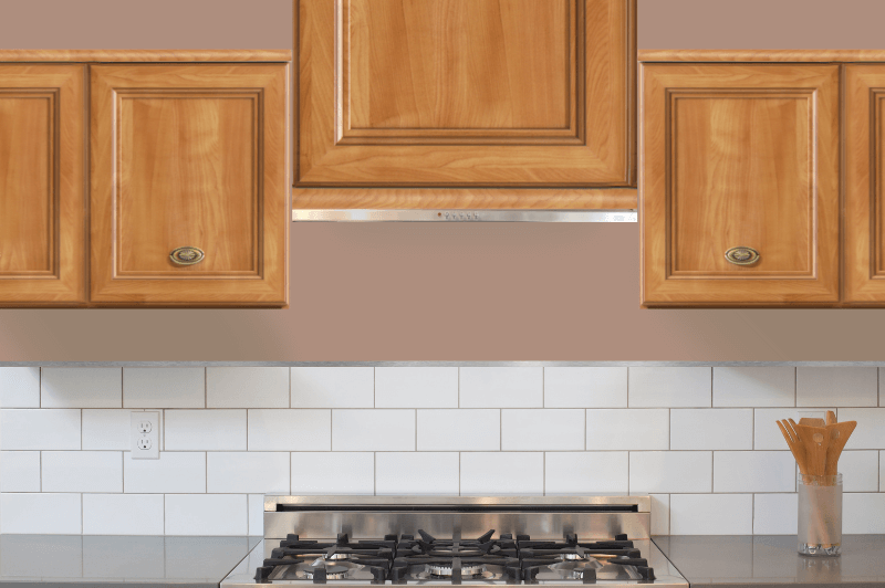
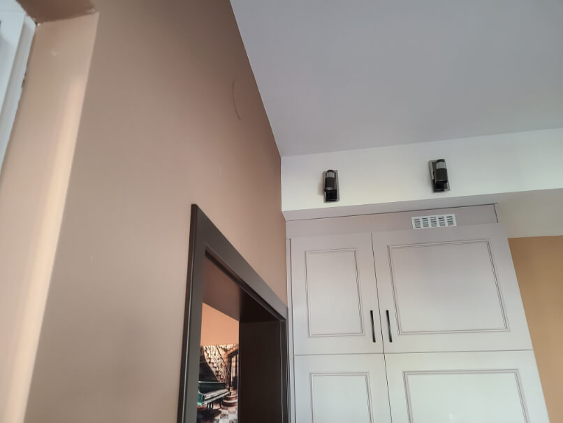
Redend Point on Kitchen Walls and Cabinets
Beige has become more popular for cabinets in recent years, so why not push the envelope and go for a clay color?

You might remember that Redend Point looks good with oak, so here is a mock up of how it would look on kitchen walls with existing oak cabinets:
In the home I visited, they made the unexpected choice to pair Redend Point with taupe cabinets:
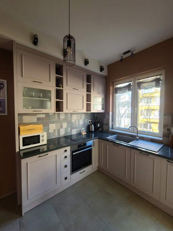
Unfortunately for us, this was another area where the color wasn’t coming across properly in most of the photos. Here is an accurate photo of the pairing:
You will have to use your imagination to copy/paste that color onto the walls over here:

It was getting close to sunset, so I don’t know what-in-the-what was happening here, but I promise you, the walls were not orange.


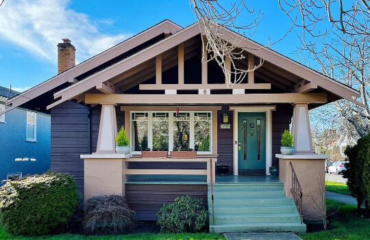
Sherwin Williams Redend Point on an Exterior
I was not able to find Redend Point exactly on a real exterior, but my favorite exterior Instagram account @peanutbuttertoast came through for us!
Here is a Victorian home in a color similar to Redend Point:

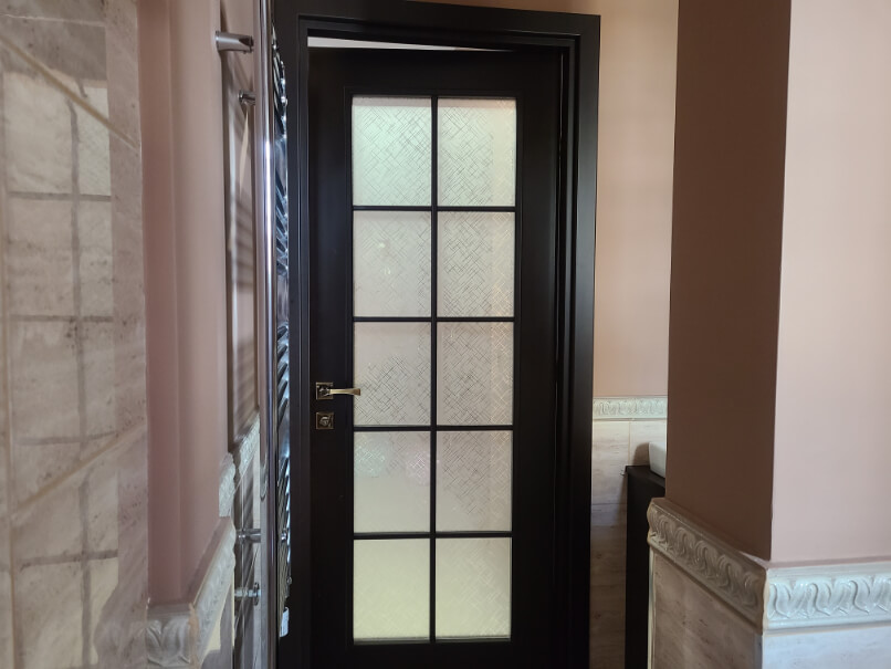
Front Door
To help you visualize Redend Point on a front door, here is Sulking Room Pink again:
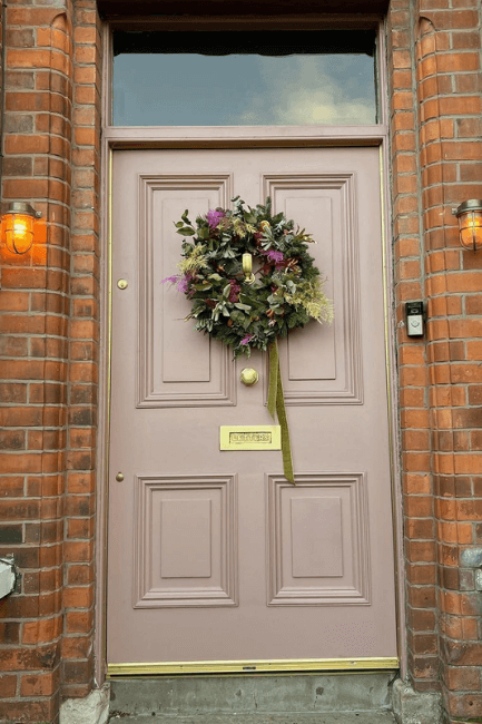
Redend Point will look just a little warmer than this. Remember that colors will always look lighter outside!
Redend Point on Exterior Trim
I would not have thought Redend Point would make a good exterior trim color, but I would have been wrong.
Here is a navy blue house with a trim color very similar to Redend Point:
This color scheme looks very similar to the nursery earlier! Do I smell a color palette?
If you like the blue, check out Benjamin Moore Hale Navy. For a similar teal, you might like Benjamin Moore Aegean Teal.
Redend Point Compared to Other Clay Paint Colors
There aren’t a ton of popular colors like Redend Point, but let’s take a look at the ones we talked about here.
Sherwin Williams Redend Point vs Cavern Clay (SW 7701)
It’s the battle of the Color of the Year’s! 2023 vs 2019:

You can see that Cavern Clay is boldly terracotta, where Redend Point is a softer true clay color.
I will say that Cavern Clay is still extremely versatile, and more subtle on the wall.
Sherwin Williams Redend Point vs Hushed Auburn (SW 9080)
You can see that in comparison, Hushed Auburn is a little rosier than Redend Point.

These two are pretty similar, but Hushed Auburn is also that little bit darker.
Sherwin Williams Redend Point vs Farrow & Ball Sulking Room Pink
I love Sulking Room Pink for all the same reasons that I am loving Redend Point: It’s a totally unexpected neutral, but it does act like a neutral.
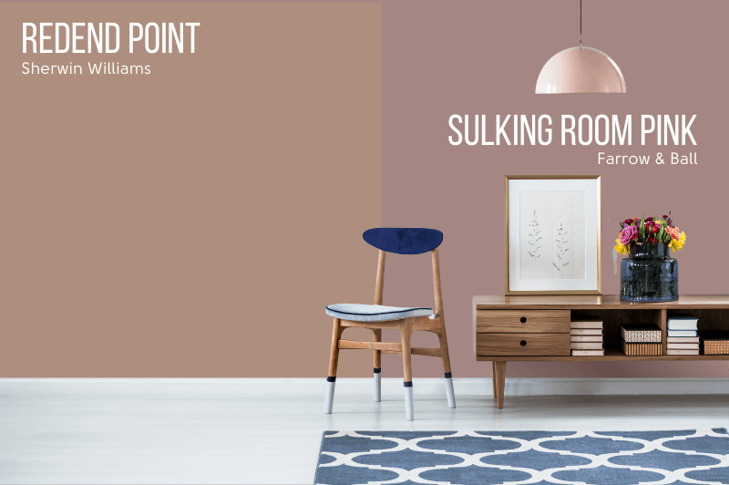
You can see that Sulking Room Pink is similar, but a little more powdery and mauve than Redend Point.
Redend Point Dupes
Let’s take a look at Redend Point Substitutes you can pick up from other brands!
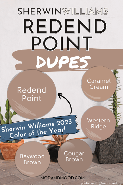
Valspar (Lowe’s) Equivalent to Redend Point
Valspar not only had the best dupe for Redend Point, they had the most variety of similar colors too!
There was a clear winner however, in the shade Western Ridge.
Valspar Western Ridge (1008-9C)

Benjamin Moore Redend Point Equivalent
Benjamin Moore was a struggle to come up with the perfect dupe for Redend Point. They have a not bad variety of clay colors, but almost none in the right LRV range.
In the end I chose two Redend Point substitutes, one lighter and one darker, but both with the same feel.
Benjamin Moore Cougar Brown (2106-40)
Cougar Brown is a little darker than Redend Point, but it has the right tone.
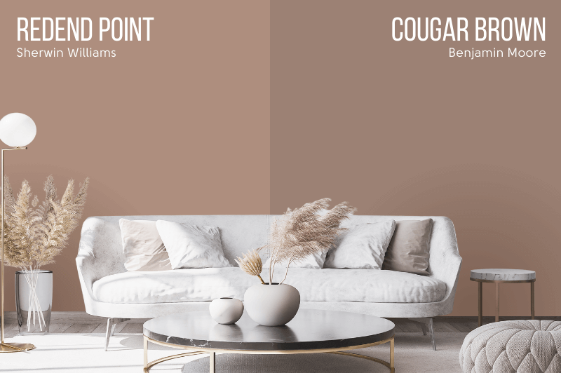
I think if you like Redend Point, you will like Cougar Brown, and you can definitely use it the same way.
Benjamin Moore Baywood Brown (1234)
Baywood Brown is the lighter dupe for Redend Point by Benjamin Moore.
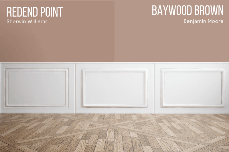
Baywood is perfect if you were a little timid about committing to Redend Point.
Redend Point Behr Equivalent (Home Depot)
The best dupe from Behr for Redend Point, is the color Caramel Cream.
Overall, I felt like Behr had the worst selection of rosy neutrals to choose from. Many were too light and either much too orange or much too pink.
Behr Caramel Cream (MQ1-59)

You can see that Caramel Cream is more orange than Redend Point.
Redend Point Pros & Cons
Now that we’ve covered all things Redend Point, here are the best bits:
Redend Point Pros
- It’s an unexpected neutral, and combines well with a huge variety of colors
- It’s a moody earthy shade without being too dark
- Perfectly on point for a vintage, Victorian, or boho inspired color palette
Redend Point Cons
- Pink is polarizing, and Redend Point has some definite pink tones
- It is darker than you might expect, and too dark to use everywhere
That’s it for now on the Color of the Year from 2023, Redend Point. (Woohoo!) For the new colors of the year and a recap of other recent years, head over to my post: New Paint Colors to Use Now (From Every Brand!)
While you’re here, take a look at some past and present colors of the year:


