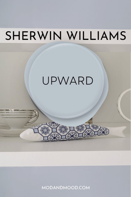
Sherwin Williams Upward is a versatile french blue that has a subdued dose of gray and a popping peri undertone.
Let’s take a good look at this former “Color of the Year” in real life, work it into a color palette, see some dupes, and finally, compare it to some other popular light blue colors.
What Color is Sherwin Williams Upward (6239)
Upward is a light blue-gray that can have a slight purpley undertone. It most often looks like a slightly more subdued version of baby blue.
I find that this color does range quite a bit in appearance, from mostly gray with a hint of blue, to a saturated light periwinkle color.
I personally find this color to be a lot more versatile and useable than the Benjamin Moore color of the year from 2024 (Blue Nova) – which was also a peri blue – and it seems the people agree! I was really scraping around to find anyone using a color even similar to that one, but Upward is a different story.
Is Upward a gray?
Upward is definitely blue-forward, so it isn’t a gray paint color, despite it’s muted look.
Here is a great example of what I find to be the most common look for Upward:
LRV and RBG of Sherwin Williams Upward
The LRV of Upward is 57.
What does that mean?
The LRV (Light Reflectance Value) of a color indicates on a scale of 0 – 100 how much light a color reflects (or doesn’t reflect). True black has an LRV of 0 and pure white has an LRV of 100.
In the paint world, we are working in a range of about 3 – 93 because no paint color is purely black or completely white.

At 57, Upward still reflects more light than it absorbs, so I would consider it to be a lighter paint color.
The RGB of Upward is Red 191, Green 201, Blue 208.
Sherwin Williams provides the hex codes as: #BFC9D0
What Are the Undertones of Upward
Upward has soft gray-periwinkle undertones. It leans more purple than green, but I would say that it’s a fairly true blue.

Is Upward Warm or Cool
Upward is a cool blue paint color. Nothing warm about it! Cool tones are best known for giving peace and calming vibes, so this would be a great choice for a bedroom.
The Sherwin Williams Upward Color Strip
Here are all of the colors from the Upward color strip:
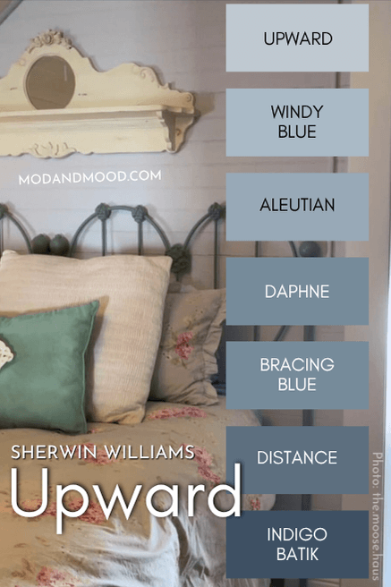
There are actually a lot of popular colors here! The only one that I have never heard of is Daphne.
- Upward (6239)
- Windy Blue (6240)
- Aleutian (6241)
- Daphne (9151)
- Bracing Blue (6242)
- Distance (6243)
- Indigo Batik (7602)
Lighter Version of Upward
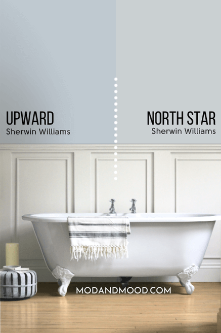
Upward is already the lightest color on this strip, but you might like Sherwin Williams North Star as a lighter alternative.
Darker Version of Upward
Personally, I would skip Windy Blue and go straight to Aleutian for a visibly darker alternative to Upward. For a very dark coordinating gray-blue, you will probably love Cyberspace.
Sherwin Williams Upward in a Color Palette
Here is Upward with some coordinating Sherwin Williams colors:
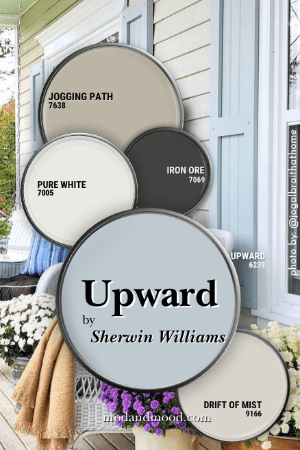
I went all neutral with this one! Here are all of the coordinating colors:
Coordinating Colors for Upward
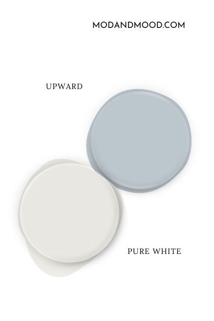
Upward with Pure White
Pure White is a tried and true white from Sherwin Williams that not only coordinates well with Upward, it’s also from a very complementary beige color family.
Upward with Drift of Mist
Drift of Mist is a light, almost off-white neutral that would be a smooth and creamy wall color to pair with Upward.
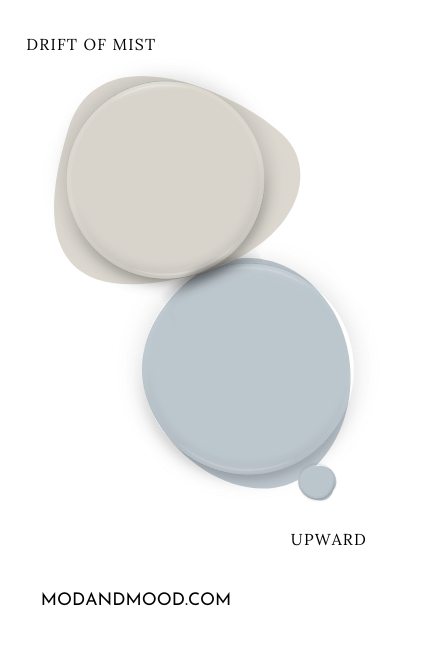
Whether you want Upward as the accent or the star, these two are super easy to put together.
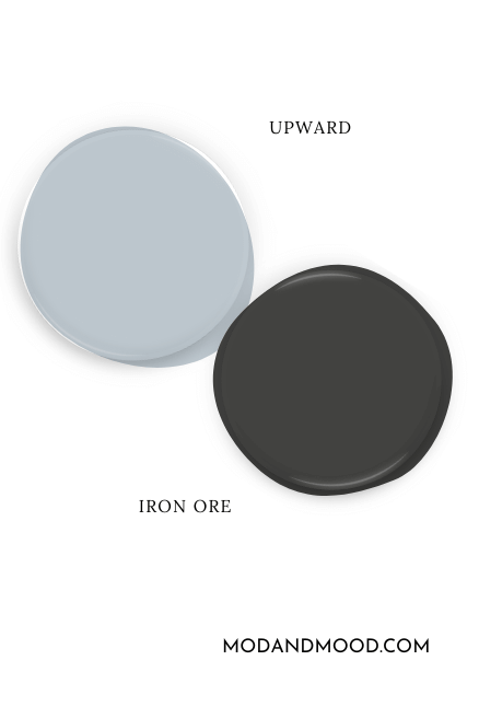
Upward with Iron Ore
Iron Ore is a deep charcoal that actually looks quite cool. The cool blue tones in both of these colors will pair well together.
Compementary Color for Upward
The “official” complement for any color, is the shade directly across the color wheel. For Upward, that shade is a light to mid-toned beige.
Upward with Jogging Path
Jogging Path is a neutral greigey paint color that isn’t super popular…yet! This one pairs beautifully with Upward as a complementary color.
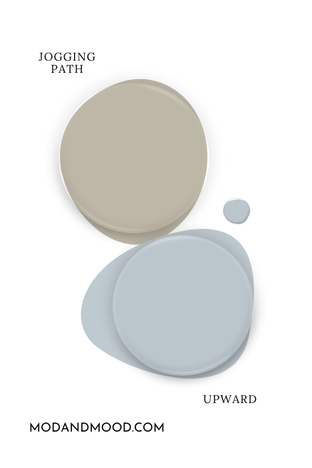
Read more about this color in my post: Sherwin Williams Jogging Path (You Will Want to Run for This One!)
What Trim Colors Go With Sherwin Williams Upward?
Here are a few popular trim choices with Upward:

White Paint that Goes with Upward
Any overly creamy white will make Upward look more purple, so bear that in mind when choosing a trim color!
Upward with Snowbound
Snowbound would be my first choice for a trim color with Upward. It’s soft but still neutral, and the slightly warm undertone is very complementary.
Upward with Alabaster
You can see from the trim graphic that Alabaster definitely brings out the periwinkle in Upward more than the neutral whites.

Upward with Pure White
Pure White is an equally good choice for trim as Snowbound is. It is softer than a super bright white, but still neutral.
Upward with Benjamin Moore Simply White
If you do want a warm white, try the bright and warm Simply White by Benjamin Moore. This one is visibly creamy, without going muddy.
You should expect that Upward will look its darkest and most perwinkle with a warm, bright white, like Simply White.
Sherwin Williams Upward for Your Home’s Interior
I don’t have as many photos as I normally would, because the color wasn’t that popular prior to being named the color of the year! What I have done, is paint Upward myself, photograph it in different lights, and add it to some rooms to give you an idea.
I was also able to find some pretty good examples of very similar colors.
Sherwin Williams Upward in the Living Room
Here is a good example of Upward in both direct and indirect lights:

Here Upward looks more blue:

But here is the absolute most blue-periwinkle that the color ever looks:
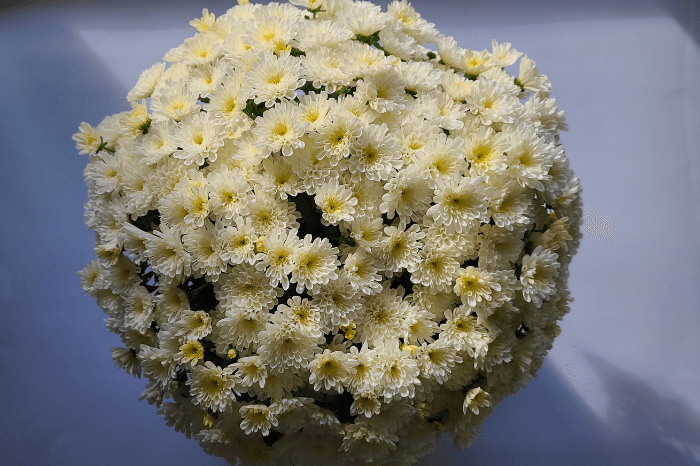
I think the contrast from the flowers made it look especially bright.
Now for a look at the more gray face of Upward:

I would say this is pretty accurate for how it looks at its most gray.
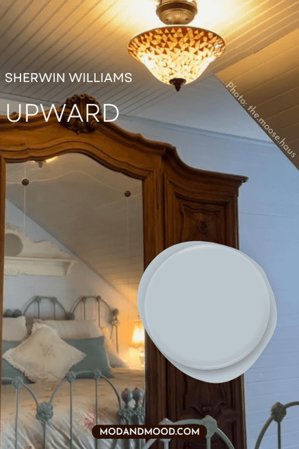
Sherwin Williams Upward in the Bedroom
How about even more gray?
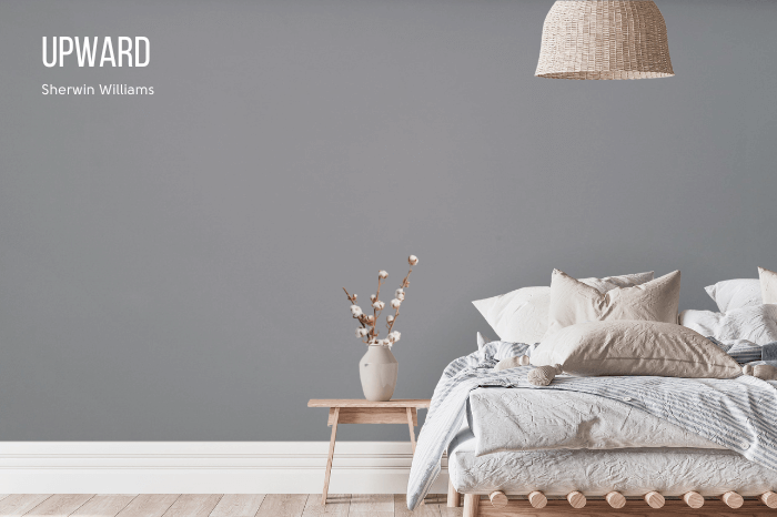
Here the camera didn’t pick up the blue as much. I would say that the color can look quite gray, but typically it will look more blue than this. You can see that the lighting here was a bit darker than the other shots.
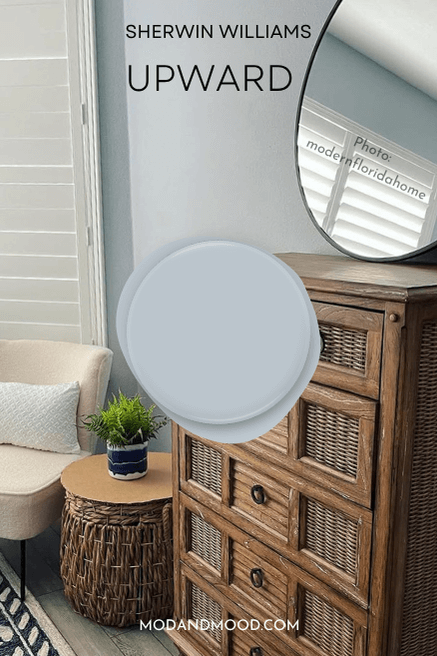
Here is also a picture of Upward in a bedroom, where it again does look very muted:
This next bedroom the color looks much more saturated, and you get a better idea of that periwinkle undertone:
This is the look that I would expect if you pair Upward with a bright white that has a warm undertone.
Sherwin Williams Upward in a Bathroom
Here is Upward in a bathroom:

This dusty blue would be beautiful in a bathroom with marble. I find the color to be very much like the blue-gray veins in carrara.
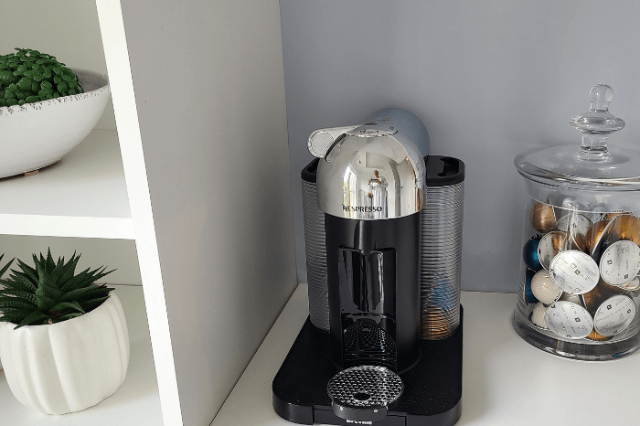
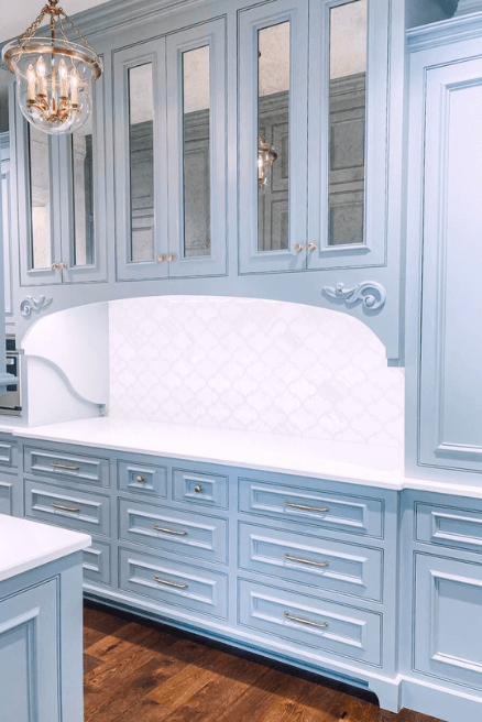
Sherwin Williams Upward in a Kitchen
Upward should work well with almost any color of white on cabinets. Bear in mind that the creamier whites will make the color look brighter and more blue.
These coffee bar cabinets are a stock white:
This next one looks slghtly more gray, but still a nice dusty blue:

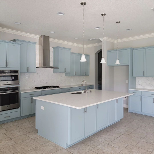
Upward on Kitchen Cabinets
These cabinets are a custom blue tint that reads similar to Upward, but a touch warmer (leaning more green rather than blue):

It’s not too hard to picture the slightly different tone. (Also there seems to be a slightly warm filter on the photo.)
Here is another kitchen that isn’t exactly Upward, but it’s another very close custom tint:
Again this reads a bit more true blue, rather than periwinkle leaning. However, the gray on the walls has a slight purple undertone, so some of it is down to that.
Here I have color adjusted some cabinets in Benjamin Moore Boothbay Gray to look like Upward:
Sherwin Williams Upward for Your Home’s Exterior
It was a little bit tricky to find the right shade of blue for an example exterior, but here is one that looks close:
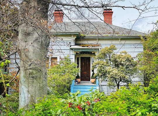
(Not the stairs, but the siding…)
I think that Upward is more likely to look blue than gray outside, particularly on a clear day. This house is still probably a hair brighter than how Upward would look. Colors do tend to look lighter outside.
Just like her slightly warmer cabinets, Jo Galbraith also used a color similar to Upward on her shutters:

Again, try to picture a slightly more periwinkle tone to Upward.
Upward Compared to Other Blue Gray Paint Colors
Here are some other popular Sherwin Williams colors that you may be considering alongside Upward:
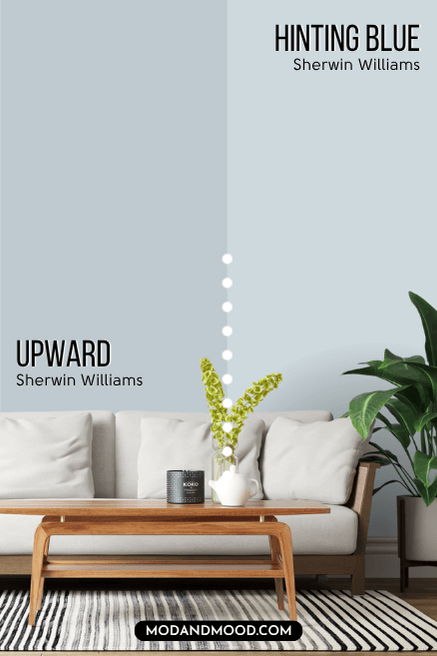
Hinting Blue is much lighter than Upward. It has an LRV of 68 which is close to off white. Its undertone tends to lean more robin’s egg blue than periwinkle, but there is some crossover here.
Upward is lighter and a little less gray than Krypton. It also leans slightly more purple.
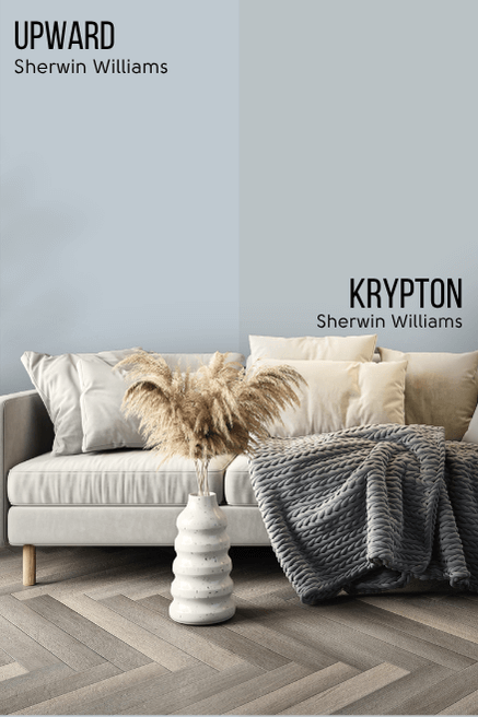
Krypton tends to be more of a chameleon. It always presents with obvious gray tones, but it can range in appearance from quite blue, to mostly gray, or even have a hint of a stormy green undertone.
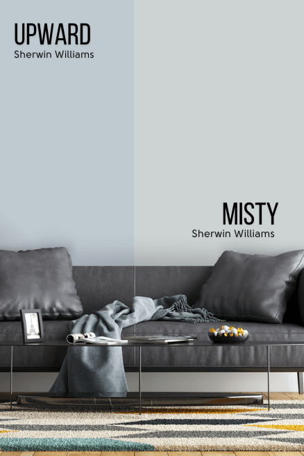
Misty is a little bit lighter and more gray than Upward. It’s actually a lot more green than Upward, in terms of color family.
Moonmist presents much less subdued than Upward does. It’s a baby blue with quite a bright quality.
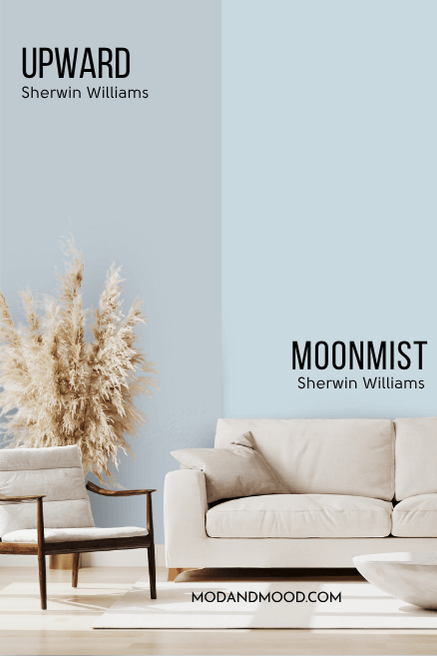
Personally, I find this to be a bit too “nursery” blue for my taste. It lacks the sophistication of Upward.
Niebla Azul looks more similar to Upward in real life than it does on paper:
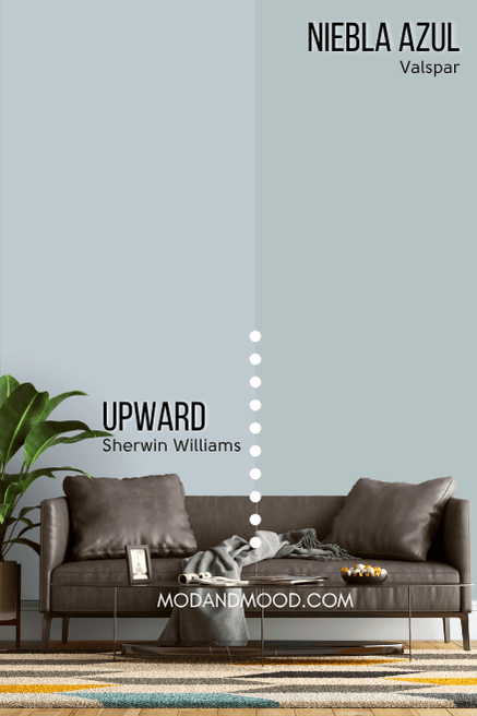
Next to each other you can see that Niebla Azul is much more green than Upward. I find that Niebla Azul presents with a bit more subtlety than Upward. Its like a chill mix of blue and gray, where the periwinkle undertone of Upward does pop a little more.
As I mentioned earlier, North Star is a pretty good lighter alternative to Upward. It has an LRV of 62, so it’s technically only a tiny bit lighter, but it is more gray (neutral) which reads lighter.
Sea Salt and Upward are not really the same at all, but people do ask the question, so here we are:
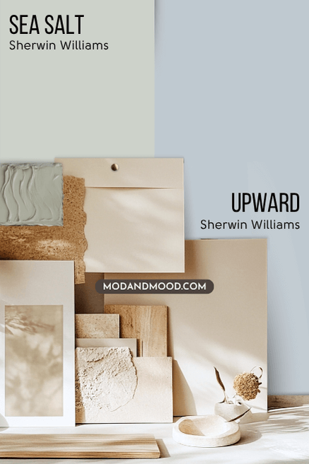
Sea Salt is a very light gray green and not a gray blue like Upward. The most blue that Sea Salt ever looks, is something a little bit seafoam, but Upward never looks green.
Sleepy Blue and Upward are very very similar:
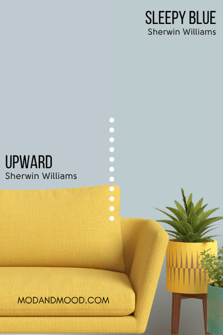
Sleepy Blue’s undertone is more of a sky blue and not quite periwinkle like Upward. There is however, a lot of overlap here in the range of undertones. I would just say that Upward has a wink of purple a bit more often than Sleepy Blue does.
Stardew is on the color strip between Niebla Azul and Debonair:

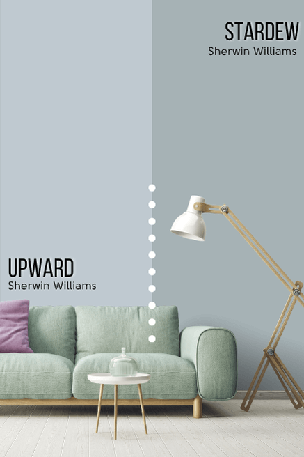
Stardew is darker, more green, and more gray than Upward. It is more of a smoky gray blue, and not a french blue. There is also nothing clean and bright about it.
Windy Blue is the shade darker than Upward on the same color strip:
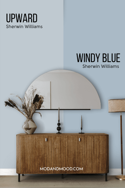
The major difference here is just the LRV. Windy Blue is also a lot more popular than Upward.
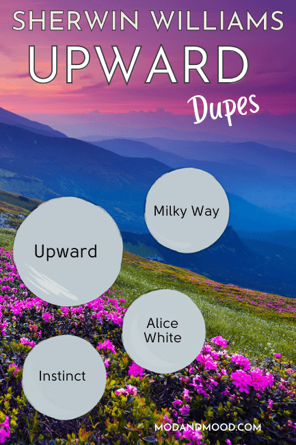
Dupes for Sherwin Williams Upward
Let’s look at some colors that will get you the same look as Upward, from different brands!
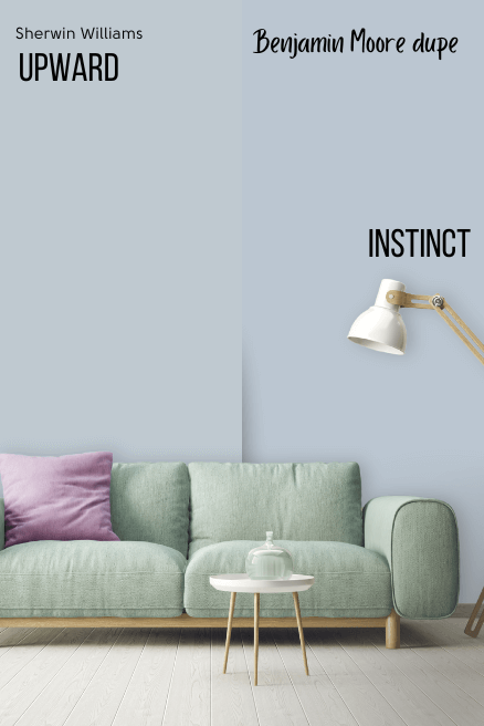
Benjamin Moore Upward Equivalent
From Benjamin Moore, the best dupe for Upward is the color Instinct.
Benjamin Moore Instinct (AF-575)
Instinct is a little bit less gray and slightly more purple than Upward:
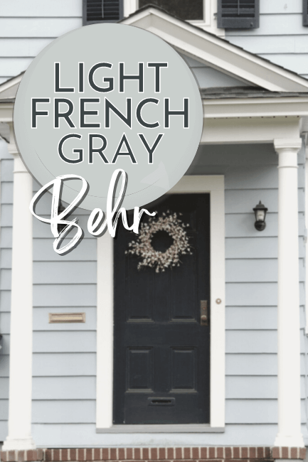
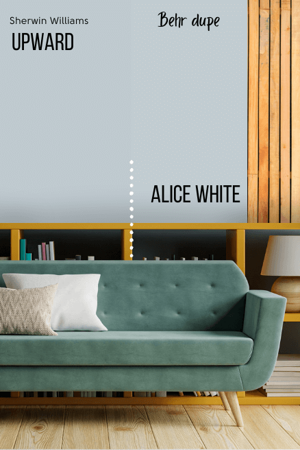
Upward Behr Equivalent (Home Depot)
From Home Depot, the best color match for Upward is the shade Alice White.
Behr Alice White (MQ3-58)
Alice White is the tiniest bit lighter, more gray, and less purple than Upward.
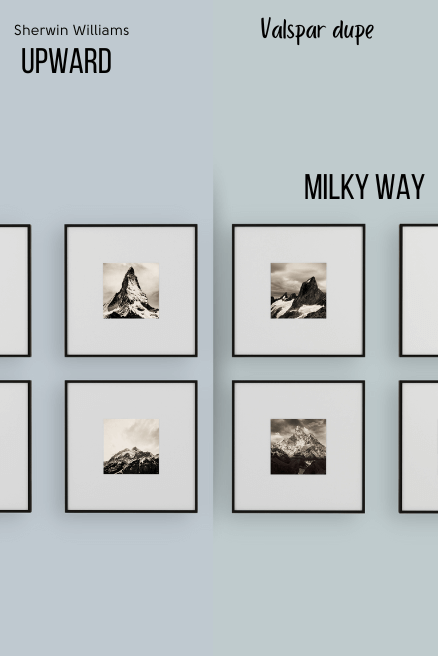
Valspar (Lowe’s) Equivalent to Upward
If you’re headed to Lowe’s, the closest match that I could find was Milky Way.
Valspar Milky Way (8004-37B)
Milky Way is a little bit less gray and less purple (more green) than Upward.
Here’s a look at all the dupes together:

Thoughts on Upward – The 2024 Color of the Year
I personally love this color…and I’m not even a blue girly! Upward is infinitely useful as either an accent color, or the main event. I also think it’s great with the beige/cream trend that shows no signs of stopping.
You might also like: