Jogging Path is my newest favorite neutral from Sherwin Williams! It is a beautiful greige color that works flawlessly into any decor style and any color scheme. (Bonus: It hasn’t been overused yet!)

Let’s take a look at Jogging Path in real homes, slide it into a color palette, and dupe the look with different brands.
What Color is Sherwin Williams Jogging Path (SW 7638)?
Jogging Path is a neutral greige paint color by Sherwin Williams that can run the full range in appearance from quite beige to quite gray. It is best described as a mushroom or putty color. It does not ever look like a cool gray or an overly warm beige.
LRV and RBG of Sherwin Williams Jogging Path
The LRV of Jogging Path is 49.
What does this mean?
The LRV (Light Reflectance Value) of a color indicates on a scale of 0 – 100 how much light a color reflects (or doesn’t reflect). True black has an LRV of 0 and pure white has an LRV of 100.
In the paint world, we are working in a range of about 3 – 93 because no paint color is purely black or completely white.
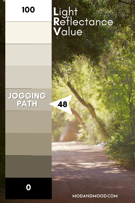
At 49, Jogging Path reflects about as much light as it absorbs. It is in the LRV range that you will find most whole home paint colors. (Approx 45 to 65.)
The RGB of Jogging Path is Red: 192, Green: 185, Blue: 169
Hex #C0B9A9
What Are the Undertones of Jogging Path?
For the most part, Jogging Path is a predictable greige. When it does have an undertones it tends to be ever so slightly green.

It doesn’t ever lean purple like many taupey mushroom colors do.
Is Jogging Path Warm or Cool?
Jogging Path is a neutral paint color. I would say that it is neither warm nor cool. It is warm compared to many other gray colors, but it’s much cooler than orangey or pink beiges.
The Sherwin Williams Jogging Path Color Strip
Sherwin Williams doesn’t really give us a proper light-to-dark color strip for Jogging Path:
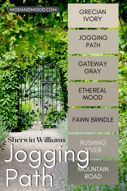
You can see that the shade Grecian Ivory is significantly lighter and Mountain Road is significantly darker, but there isn’t a lot of LRV range otherwise.
The other shades on this strip are:
- Grecian Ivory
- Jogging Path
- Gateway Gray
- Ethereal Mood
- Fawn Brindle
- Rushing River
- Mountain Road
Lighter Version of Jogging Path
We will compare Jogging Path to other gray-beige colors in a few minutes, but the ever popular Agreeable Gray is a pretty good lighter alternative to Jogging Path.
Darker Version of Jogging Path
From the same strip, Ethereal Mood is a pretty good darker version of Jogging Path.
Sherwin Williams Jogging Path in a Color Palette
Here is an idea of what colors you could use with Jogging Path:
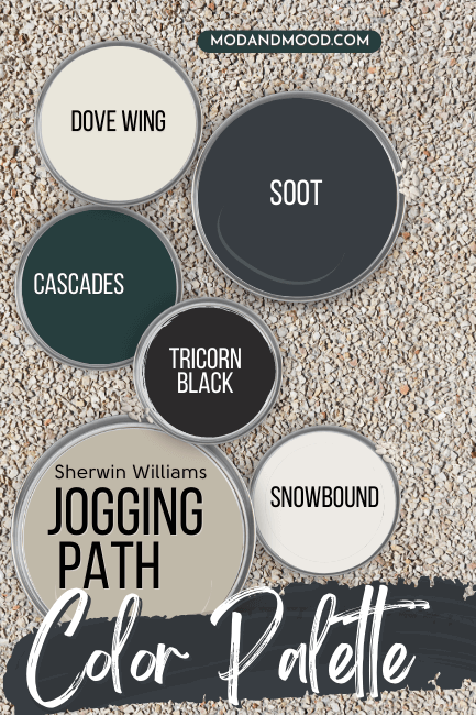
My ideas aside, Jogging Path is one of my favorite foolproof neutrals, so it can rock almost any coordinating color!
Coordinating Colors for Jogging Path
From the top!
Jogging Path and Benjamin Moore Dove Wing
Dove Wing is a really nice neutral off-white that you can use wherever Jogging Path is a bit too dark, or where you don’t want to go bright white.
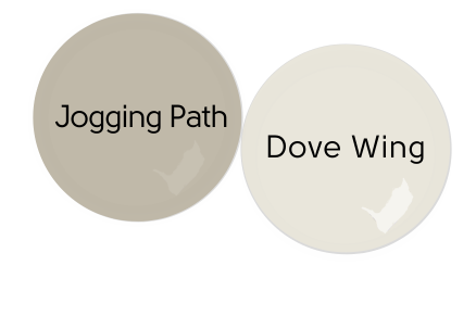
An off-white like this will help Jogging Path feel lighter.
Check out my post: Dove Wing by Benjamin Moore Review (See Real Homes and Dupes!)
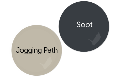
Jogging Path and Benjamin Moore Soot
I just cannot help myself with this color lately! Benjamin Moore Soot is the perfect deep gray blue for any scenario, so of course it looks great with Jogging Path!
Jogging Path and Sherwin Williams Cascades
This palette needed some color! Why not complement the green undertones in Jogging Path, with the jewel green of Sherwin Williams Cascades?
(This will actually make Jogging Path look warmer and more beige.)

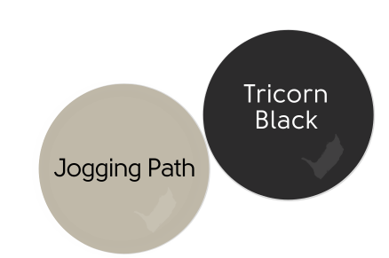
Jogging Path and Tricorn Black
I really like the idea of using Jogging Path with a solid black and soft whites.
Of course the most solid of all blacks is Sherwin Williams Tricorn Black.
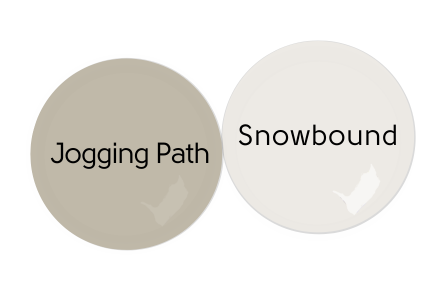
Jogging Path and Sherwin Williams Snowbound
I played around with a few different whites for this palette, but I feel like SW Snowbound looks the best with Jogging Path.
It’s a simple true white with just enough warmth and softness.
Complementary Color for Jogging Path
The “official” complementary color for Jogging Path (the color directly across the wheel) is a dusty blue.
I feel like you can get away with the deep gray blue of Soot, but if you want to be proper, try something like Sherwin Williams Aleutian:

For a lighter version, Sherwin Williams Upward (their color of the year for 2024!) would also work well.
What Trim Colors Go With Sherwin Williams Jogging Path?
Here is a selection of popular trim whites from Sherwin Williams, and how they would look with Jogging Path:

White Paint that Goes with Jogging Path
- Sherwin Williams Snowbound – I mentioned in the color palette that I personally like Snowbound the best with Jogging Path. I think it doesn’t influence the color too much, which I like.
- Sherwin Williams Alabaster – Alabaster is a slightly darker and creamier white, so it will allow Jogging Path to look a little bit lighter, but also more gray.
- Sherwin Williams Greek Villa – Greek Villa is a creamy white that still reads like a soft true white. The creamy beige undertone will look great with Jogging Path.
- Sherwin Williams Pure White – Pure White is a soft, slightly gray, white that reads like a bright true white. It would be a classic white and greige combo with Jogging Path.
Sherwin Williams Jogging Path for Your Home’s Interior
Now for the fun part: Let’s see Jogging Path in real homes!
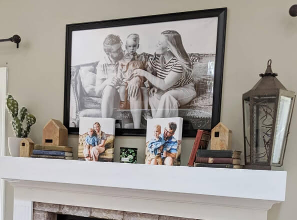
Sherwin Williams Jogging Path in the Living Room
Here in Rach’s living room (@rachcaron), Jogging Path looks its most gray.

You can see that there is still a good amount of beige in the color, even when it looks coolest.
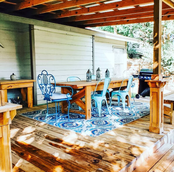
Sherwin Williams Jogging Path in the Dining Room
We lucked out today with a bunch of Jogging Path photos from a dining room, thanks to Kela! (@athomewithkela)

These pictures also show a cooler side of Jogging Path, but I believe they are filtered to be a little cooler and brighter. (Just judging off the rest of the decor.)
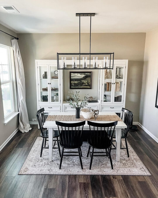
This one looks a little bit warmer and true to tone.

I like how Kela accented the decor with pops of black.

Sherwin Williams Jogging Path in a Bedroom
Kela also used Jogging Path in her bedroom:

The color coordinates surprisingly well with the deeper taupe that Kela chose for the dresser.

What a restful space!
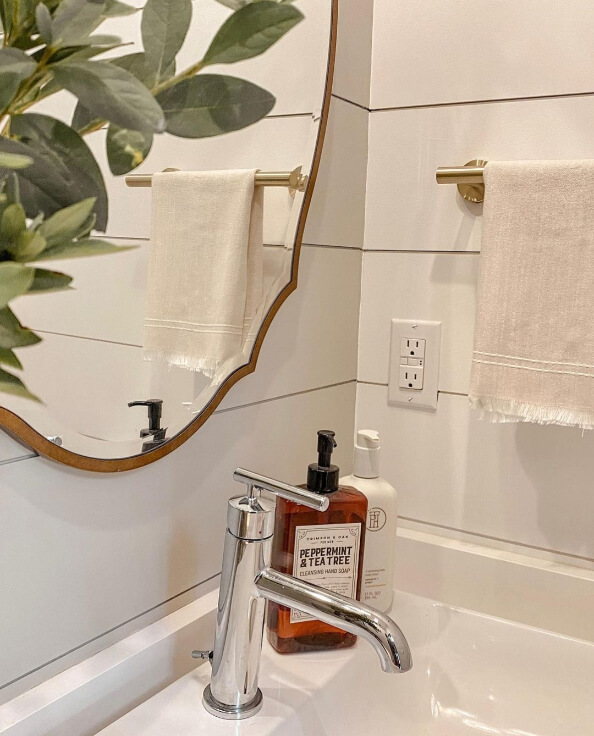
Sherwin Williams Jogging Path in the Bathroom
I have two surprisingly similar bathrooms where Jogging Path has been used for both vertical and horizontal shiplap.
Hannah from @southgadesign used Jogging Path on this wide horizontal shiplap in her bathroom:

Doesn’t that just look smooth and sexy?
Here is another one:

The color looks totally creamy and neutral here. Note how light it looks when it is the main wall color, compared to the next bathroom where it is used alongside white.

In this bathroom by Morgan (@mydivinehome), she used Jogging Path on vertical shiplap as well as the trim.
Not only does the color look darker when used with white, in this space it is also showing it’s slight green undertone.
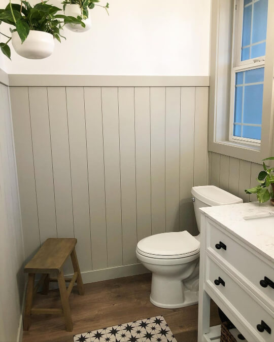
Morgan didn’t say what the white was here, but it looks very close to Sherwin Williams White Flour.
It’s interesting how much darker and more contrasting the trim and shiplap look in here compared to Hannah’s bathroom.
Here’s a shot where you don’t see the white, and the color looks much more similar to the last bath:
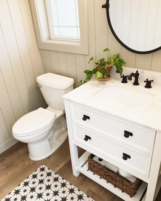
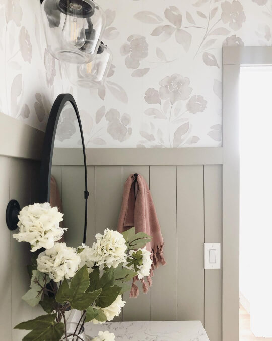
Eventually Morgan added wallpaper, which is a gorgeous additional upgrade in this space!
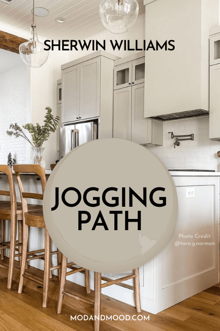
Sherwin Williams Jogging Path on Kitchen Cabinets
If there’s something you should know about me, it’s that I looove a beige cabinet. Maybe not forever, only time will tell, but I am feeling this vibe!
In this kitchen by Tara (@tara.g.norman), all of the cabinets are painted in Jogging Path. The island looks lighter but it is just the lighting.
If you visit Tara’s Instagram, you can see the kitchen in video form as well!
The first photo looked light and beige. This next one is the darker and more gray side to Jogging Path:

Tara describes these cabinets as a mushroom color, and it’s totally accurate.
If you like the feel of these cabinets, you might like my post The 3 Faces of Smokey Taupe on Kitchen Cabinets (Plus Alternatives!)
Sherwin Williams Jogging Path For Your Exterior
These neutral greigey shades are often surprisingly hard to find on exteriors, but today we have two!
This first shot by Heiler Painting (@Heilerpainting) shows us the most buttery beige that Jogging Path will ever look:
I think it’s down to the sunshine mostly, because the other pictures don’t look this yellow. If this is the look you want, you might prefer Manchester Tan (although it is lighter).
Here is Jogging Path as it went on over a muddy brown:

The finished product!

I think this color works surprisingly well with the brick sides of this home.

The black shutters complete the look.
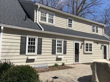
This next Jogging Path exterior is all siding:

The trim is a slightly darker shade. It looks pretty similar to Sherwin Williams Acier.
You can see that on exteriors, Jogging Path is a nice neutral base for your trim, shutters, and gardening.
Is it going to stop traffic? No, but it’s a classic choice.
Jogging Path Compared to Other Greige Paint Colors
Let’s take a look at how Jogging Path compares to the ultra popular greige colors you are likely also considering:
Sherwin Williams Jogging Path vs Accessible Beige
Accessible Beige is much warmer and lighter than Jogging Path. It almost looks pink in comparison to the green undertone. (It’s not though.)
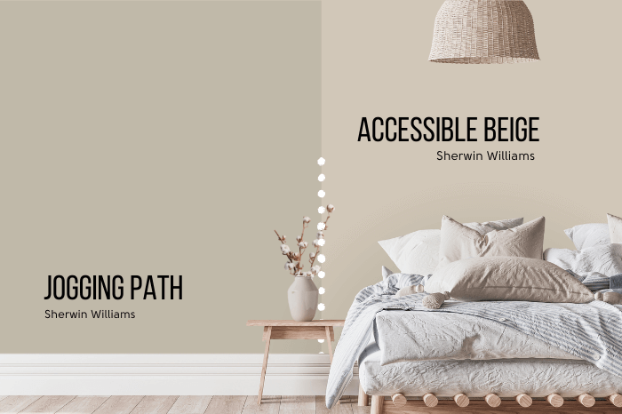
See more of this color here: The Ultimate Sherwin Williams Accessible Beige Review (Plus Dupes!)
Sherwin Williams Jogging Path vs Agreeable Gray
Agreeable Gray and Accessible Beige are the tippity top Sherwin Williams neutral paint colors.
Here you can see that Agreeable Gray is also lighter than Jogging Path, but it has a more similar tone.

Agreeable Gray is technically a little bit warmer than Jogging Path, but it is also a bit more gray, so it cancels out.
Compare Accessible and Agreeable here: Accessible Beige vs Agreeable Gray (How to Choose!)
Sherwin Williams Jogging Path vs Benjamin Moore Revere Pewter
Revere Pewter is the OG classic greige by Benjamin Moore. Again you can see that the tone is very similar:

The big difference is that occasionally people find Revere Pewter to have a purple undertone, and Jogging Path would never lean that way.
You can see that Jogging Path is darker than Revere Pewter. On the color wheel, Jogging Path is also a little warmer, but it doesn’t really come across.
Sherwin Williams Jogging Path vs Anew Gray
Anew Gray is more taupe than Jogging Path, and can have a slightly purple undertone.
Jogging Path is a little bit cooler and less gray.

Dupes for Sherwin Williams Jogging Path
Care to see this one in another brand? I’ve got options!
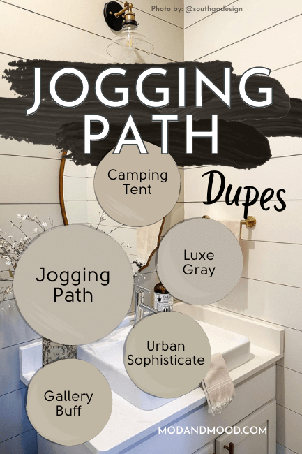
Benjamin Moore Jogging Path Equivalent
There were two shades from Benjamin Moore that made for equally good dupes for Jogging Path. They are: Gallery Buff and Urban Sophisticate.
Benjamin Moore Gallery Buff (CSP-225)
Gallery Buff is a tiny bit warmer and less gray than Jogging Path. You can see in the side by side that it looks slightly more beige:

Benjamin Moore Urban Sophisticate (CSP-160)
Urban Sophisticate is a little bit cooler and less gray than Jogging Path:

It also looks slightly more beige than Jogging Path, but it’s more yellow beige than taupe-leaning Gallery Buff.
Valspar (Lowe’s) Equivalent to Jogging Path
From Lowe’s, the best color match for Jogging Path is the shade Luxe Gray.
Valspar Luxe Gray (8005-4C)
Luxe Gray is slightly more taupe than Jogging Path, meaning it’s a mushroom that is slightly more likely to have a purple undertone.

Jogging Path Behr Equivalent (Home Depot)
I wasn’t able to get the closest match in Behr paint, but the best Home Depot dupe for Jogging Path is the shade Camping Tent.
Behr Camping Tent (N320-4)
Camping Tent is warmer, darker, and actually a bit less gray than Jogging Path.

Here is another look at all of the dupes swatched against Jogging Path:

Jogging Path Pros & Cons
That’s all I had planned for today and Jogging Path. I think we are going to see this color become a favorite Sherwin Williams neutral over the next few years.
Let’s run down some pros and cons:
Pros
- Perfectly neutral – neither too warm or cool
- Perfectly greige – neither too gray or too beige
- A really nice neutral for cabinets where beige is still a less expected choice
- Works with almost any other color or coordinating white
Cons
- Slightly darker than most whole home neutrals
- Slight green undertone on occasion
Not the one? Allow me!


