Sherwin Williams Accessible Beige and Agreeable Gray are two of the most popular “greiges” on the market, and have been for quite some time.
So how does someone go about choosing one or the other?

By the end of this article, you will know which one is right for you!
The main difference between Accessible Beige and Agreeable Gray, is that Agreeable Gray is lighter, and cooler. Accessible Beige is beige, and Agreeable Gray is greige.
That’s it in a nutshell, but I have a lot of great examples and photos here.
This post may contain affiliate links. Should you choose to make a purchase through one of my links, I may receive a small commission at no cost to you. I only recommend products that I use.
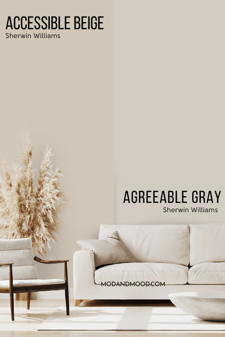
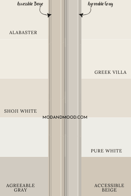
Sherwin Williams Accessible Beige vs Agreeable Gray Swatches
First lets take a look at the colors individually!
Here is a swatch of Accessible Beige:
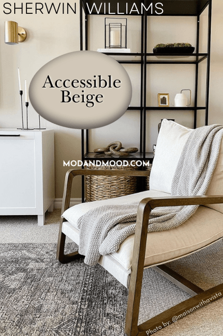
Looks pretty cozy!
Here is a swatch of Agreeable Gray:
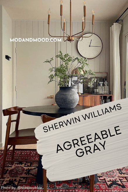
Honestly when the colors aren’t directly beside each other, the difference is pretty subtle.
I saw this picture of Notre Dame, and I noticed that the color near the bottom was like Accessible Beige, and the color on top was like Agreeable Gray! :
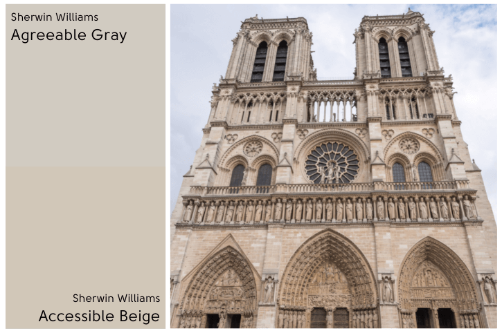
Isn’t that funny?
It’s a pretty good illustration of the difference in color. These two are like siblings: They look similar, and might be seen at a tourist attraction together, but you can still tell them apart!
(Obscure example, but you get the point! I could actually go on and on, they were raised by the same parents so they are both pleasant to be around, etc.)
Remember that the true white of your screen isn’t achievable in paint, so neither of these colors are quite as dark as they may appear against digital true white.
Accessible Beige vs Agreeable Gray Properties
Here is a handy dandy graphic that I whipped up to help you visualize the differences that we are going to talk about:
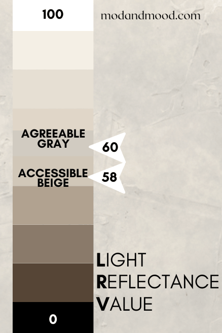
Accessible Beige vs Agreeable Gray LRV
The LRV of a color indicates on a scale of 0 – 100 how much light a color reflects (or doesn’t reflect). True black has an LRV of 0 and pure white has an LRV of 100.
In the paint world, we are working in a range of about 3 – 93 because no paint color is purely black or completely white.
True white paint colors range from about 82 – 93.
- Agreeable Gray has an LRV of 60.
- Accessible Beige has an LRV of 58.
Sometimes a difference of that little can be hard to tell when the colors are very different, but in a side-by-side picture you can see that Agreeable Gray is lighter than Accessible Beige.
An LRV of more than 50 indicates that a color reflects more light than it absorbs, so while 58 and 60 sound dark, they still reflect light, and they are on the lighter end of neutrals.
Accessible Beige vs Agreeable Gray Undertones

Accessible Beige and Agreeable Gray are pretty similar colors in the orange family.
In the larger square you can see that the dot for Agreeable Gray is further off into gray territory.
It’s a little hard to tell because it’s subtle, but Agreeable Gray is just a touch more yellow than Accessible Beige.
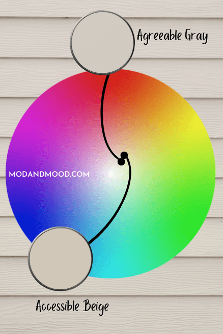
I mentioned earlier that both of these colors are often regarded as “greige,” but I really don’t think Accessible Beige reads gray at all, it’s just a sandy beige.
Agreeable Gray on the other hand is squarely in greige territory. Here is Agreeable Gray looking beige in one room and quite gray in a kitchen.

To get the very best idea of undertones, take a look at both paint colors in your unique conditions.
Samplize makes it easy to test paint without the mess! They make their peel and stick samples with two coats of real paint, so you know you’re deciding with all the facts. Get your sample of Accessible Beige and Agreeable Gray, and you’ll be ready to test everything from cabinets to corners!
Accessible Beige vs Agreeable Gray – Are They Warm or Cool?
Accessible Beige and Agreeable Gray are both pretty neutral.
After having looked at a lot of real life photos, I would say that Agreeable Gray can look either neutral or cool (depending on the lighting and other factors) and Accessible Beige can look neutral or a little warm.
Of course a lot about color is subjective. Next to colors that are actually gray, Agreeable Gray will look considerably warmer.
Accessible Beige vs Agreeable Gray on Trim
I am usually a white trim kind of gal, so I’m not sure what’s happening to me! I have been seeing colored trim with white walls and I…don’t hate it. I might even (gasp) love it!

Kudos to people like Samantha from @oliveandoakhome who have vision! She used Accessible Beige on her trim and doors, and Sherwin Williams Pure White on the walls.
If you’re considering one of these colors for trim, here is a comparison for all the visual learners (like me!).
When both are against the white paint colors, you can really see the extra hint of warmth with Accessible Beige!
(I have actually since wrote a post entirely about White Walls with Sherwin Williams Accessible Beige Trim)
What Color Trim Goes With Accessible Beige or Agreeable Gray on the Walls?
Sherwin Williams Alabaster is a super popular soft white that a lot of people choose to pair with Accessible Beige and Agreeable Gray. Alabaster is a good choice if you want something a little lower contrast.
For a crisper white option, I would go with something that is closer to a true white for more contrast. Sherwin Williams Pure White or even something like Behr Diamonds Therapy would make your trim pop.
Accessible Beige or Agreeable Gray With an Accent Wall
I wouldn’t personally use Accessible Beige or Agreeable Gray as a plain accent wall, because I don’t think they are quite dark or bold enough.
Here is Accessible Beige in a hallway with Sherwin Williams Peppercorn as an accent color:

If you want to create an accent wall with either of these colors, consider doing board and batten or something similar to help kick up the contrast.
Accessible Beige and Agreeable Gray both make for a nice accent when they are on half of a wall with wainscotting. Being next to white helps highlight the color.
Lindsay and Dustin of @silo.hill have actually used both of these colors in their home! They have Agreeable Gray in the main living areas on the trim, doors, and wainscoting.
In their bathroom they switched things up and went with Accessible Beige:

Both look gorgeous in their home!
If you want to paint a flat wall with a neutral accent color, try something in a medium or dark shade instead. Urbane Bronze is a dark neutral gray-brown color that looks beautiful as an accent.
There are also many amazing sage green colors that read very neutral.
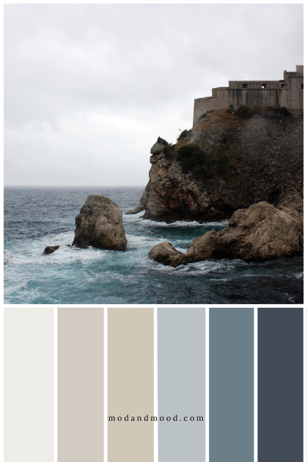
Accessible Beige vs Agreeable Gray Complementary Colors
The complementary colors for Agreeable Gray and Accessible Beige are basically the same, because they are in the same general color family.
A light powder blue would be the official complement to these neutrals, and I found some close options in Benjamin Moore Misty Memories and Sherwin Williams Krypton.
Benjamin Moore Misty Memories
Misty Memories is a super soft powder blue that can sometimes have the slightest lilac tone. It’s not actually purple, as it’s smack dab in the middle of indigo, but it is closer to purple than a lot of the popular blue grays that tend to lean aqua.

Sherwin Williams Krypton (6247)
Krypton is a pale gray-blue that is closer to the green side of blue. It has a chameleon like quality and it look very different in all kinds of light. It can range from being a cool pale blue to a cozy green-blue.

Krypton is extremely popular for it’s versatility, and it looks great with either Accessible Beige or Agreeable Gray. You could also use Sherwin Williams Upward or Stardew.
(I talk more about Krypton and other chameleon blues in my post: Warm Blue Gray Paint Colors)
Accessible Beige vs Agreeable Gray Coordinating Colors
What’s the best thing about neutrals? They go with everything!
You could throw a dart at a palette of popular colors and these two would probably work, so it’s hard to know what to put in a palette for you.
I decided just to go with popular colors for this year and some classics:
Agreeable Gray and Accessible Beige – Greige Palette
For this palette I thought I would do a monochromatic white and greige color scheme.

Colors from left to right are:
Benjamin Moore Chantilly Lace
A nice clean white! Chantilly Lace appears true white on the walls, with no discernible undertone. (That’s why it goes with everything!)
Sherwin Williams Pure White
Pure White is also a fairly true white, but a little softer without being cream.
Sherwin Williams Eider White
Eider White is like a super light greige. It looks great with Accessible Beige, Agreeable Gray, and a host of other colors!
Sherwin Williams Agreeable Gray
Sherwin Williams Accessible Beige
Benjamin Moore Kendall Charcoal
Kendall Charcoal is actually not all that charcoal and is more like a dark greige. It’s warmth works great with these other neutrals.
Green and Greige Palette
How about an earthy palette to go with these light neutrals? I went with some greens that are pretty neutral themselves, and threw in a rich brown.

Colors from left to right are:
Sherwin Williams Eider White
Sherwin Williams Agreeable Gray
Sherwin Williams Accessible Beige
Sherwin Williams Urbane Bronze
Urbane Bronze works great with neutrals like Accessible Beige and Agreeable Gray. It has an actual bronze quality to it that I really like.
Sherwin Williams Thunderous
Thunderous is a really interesting color! It can at times look almost gray and at other times looks pretty green. It does all the things: warm, dark, gray, green…you get the picture! Any way you slice it, it works great with light neutrals.
Benjamin Moore Vintage Vogue
Vintage Vogue has some of the same chameleon-like qualities of thunderous, but instead of ever looking gray, it tends to lean more warm. It looks quite green with other neutrals, but looks more neutral when it’s with other greens.
Blue and Greige Palette
The coolness of blue tends to bring out the warmer tones in both Accessible Beige and Agreeable Gray, so if you want your home to look more beige and not gray, then blue is the way to go!
You can really see in this palette how much warmer Accessible Beige looks when it’s with blue!
I’ve actually talked about a lot of these colors in this post already, so I’ll spare you the details on the first four:
Sherwin Williams Pure White
Sherwin Williams Agreeable Gray
Sherwin Williams Accessible Beige
Sherwin Williams Krypton
The two blues in the palette that I have not already talked about are actually both from Benjamin Moore:
Benjamin Moore Hamilton Blue
Hamilton Blue is actually a pretty warm blue. It has a bit more yellow in it, which gives it a cozy quality. I think it works so well with both Accessible Beige and Agreeable Gray, mostly because it isn’t stark and cold.
Benjamin Moore Hale Navy
I haven’t used Hale Navy in a palette for a little while because I felt like I was overusing it. Hale Navy is known for going with basically anything, and so far I have found that to be true. It’s definitely a nice dark blue to pair with either Agreeable Gray or Accessible Beige!
When to Choose Agreeable Gray or Accessible Beige?
I hope that I gave you enough information and inspiration here that you immediately know now which is right for you!
If not, let’s summarize:
- If you want an actual gray beige (greige), or a sandy color to coordinate with blues, then choose Agreeable Gray.
- If you want a warmer toned light neutral, that doesn’t ever look gray, choose Accessible Beige.
Either color looks great with greens, browns, or other neutrals, so at that point it is down to your personal preference.
If you’re looking for a whole home color, Agreeable Gray is that tiny bit lighter. If you can’t decide, remembering that fact might help.
- In a home with loads of natural light, you may want the extra warmth and richness of Accessible Beige.
- If you are addicted to white and nervous about choosing a color, the lightness of Agreeable Gray might be better for you.

Always keep in mind when looking at inspiration photos:
- The color could be credited wrong
- It could be an inaccurate color match
- Photos could be filtered and brightened
- Their lighting is not your lighting
So be sure to move a sample around your home before you commit!
Neither of these are the one for you?