On paper, Sherwin Williams Peppercorn is a plain jane gray. It has equal parts red, green, and blue, which should make it the perfect neural gray. The reality is quite different!

Here we will talk about Peppercorn’s actual undertones, see it in real homes, check out a color palette, and go over some solid alternatives.
What Color is Sherwin Williams Peppercorn (SW 7674)?
Peppercorn is a mid-toned to dark charcoal paint color. Most often when we think of charcoal we will picture a dark gray with a touch of a cool blue cast, and Peppercorn fits the bill!

What Are the Undertones of Peppercorn?
Technically Peppercorn is a “perfect” gray, using equal parts of red, green, and blue.
Most often, Peppercorn looks like a nice true charcoal, but you might find that it has a slight blue undertone. I’ll point that out when we look at real homes in just a minute!
On the rare occasion, Peppercorn can also look ever so slightly green:

But this hint of green is far less common.
I don’t find that Peppercorn ever looks purple, but it might when swatched next to more blue-green colors. I wouldn’t recommend using it with teal if you are worried about a purple undertone.
Is Peppercorn Warm or Cool?
If I had to choose, I would say that Peppercorn is a cool-toned gray paint color. It can look neutral, but if it does have an undertone, it will most likely be cool.
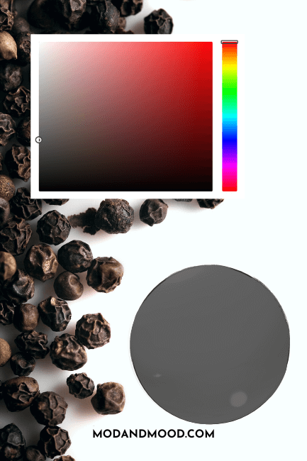
LRV and RBG of Sherwin Williams Peppercorn
The LRV of Peppercorn is 10.
At 10, Peppercorn is right on the line where darker mid-toned colors meet with truly dark colors. You will see when we get to real homes, that it toes this line in real life.

The RGB of Peppercorn is: Red 88, Green 88, and Blue 88.
Sherwin Williams provides the hex value for Peppercorn as: #585858
The Peppercorn Color Strip
Here is the full color strip from Sherwin Williams that contains Peppercorn:
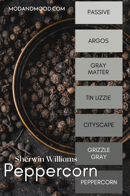
Lighter Version of Peppercorn
One shade lighter than Peppercorn is the color Grizzle Gray. You can see that Grizzle Gray is only marginally lighter, with an LRV of 13. For a visibly lighter alternative, consider Cityscape.
I will say that Cityscape is not quite a perfect gray on paper though, and is slightly more likely to have a green undertone. (Same goes for Grizzle Gray.)
Darker Version of Peppercorn
Sherwin Williams Iron Ore is often compared to Peppercorn, and it is a great darker alternative. (We will talk about Iron Ore some more in just a minute.)
Sherwin Williams Peppercorn in a Color Palette
For this color palette, I just chose some of the most popular Peppercorn pairings:

Coordinating Colors for Peppercorn
Accessible Beige
Lucky for us, I have a few examples of Peppercorn with Accessible Beige, courtesy of Shal from @maisonwithavista:
You should expect that a beige color, or any color with a warm beige undertone, will emphasize the blue in Peppercorn. This is because blue and orange are complementary colors.
Here is one more picture (for now) :
I really like the contrast of Peppercorn with Accessible Beige! I think it’s very balanced. Peppercorn also works well as a statement, without being too dark.
We will see more from Shal’s home in just a minute.
Light French Gray
Light French Gray is another popular color to pair with Peppercorn, that keeps things on the cooler side:
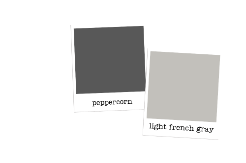
I’m going to be honest here: Although I personally like the combo, it isn’t super on trend with the warmer tones that are currently in favor. However the great thing about trends is that they always come back around!
While it may not look like it here, Light French Gray can have a taupey undertone, and it is more likely to do so when paired with a cool color like Peppercorn.
Pure White
Pure White is my top pick for a white to pair with Peppercorn. It’s perfectly neutral and won’t influence the color too much.

Complementary Color for Peppercorn
A complementary color is the color directly across the color wheel. Peppercorn is a pure gray, so technically it does not have a complementary color.
If we choose a complementary color based on how Peppercorn looks in real life, a gray beige like Agreeable Gray or Accessible Beige is the perfect choice:


What Trim Colors Go With Sherwin Williams Peppercorn?
Here are some of the most popular whites from Sherwin Williams and how they will look with Peppercorn:

White Paint that Goes with Peppercorn
Greek Villa
Greek Villa is a creamy white with a warm beige undertone. This looks really nice with Peppercorn, but bear in mind that it might emphasize the blue undertones.
Alabaster
Alabaster is also a creamy white, but it’s a bit more gray than Greek Villa. Again it might emphasize the blue undertones in Peppercorn, but it’s a good soft white if you don’t want a harsh contrast with your trim.

Snowbound
Snowbound is a true white with just a whiff of softness, as opposed to being a true creamy white. It will give more contrast against your Peppercorn walls, and it shouldn’t emphasize the blue tones.
Pure White
Pure White is another true-but-soft white, and is my favorite pairing for Peppercorn. (But we already talked about that in the color palette.)
Sherwin Williams Peppercorn in Real Home Interiors
Time to see this spicy little Peppercorn in real homes!
Sherwin Williams Peppercorn in the Living Room
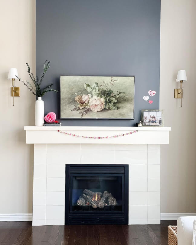
Let’s start with a home we saw a little bit of already: Shal’s Maison with a Vista!
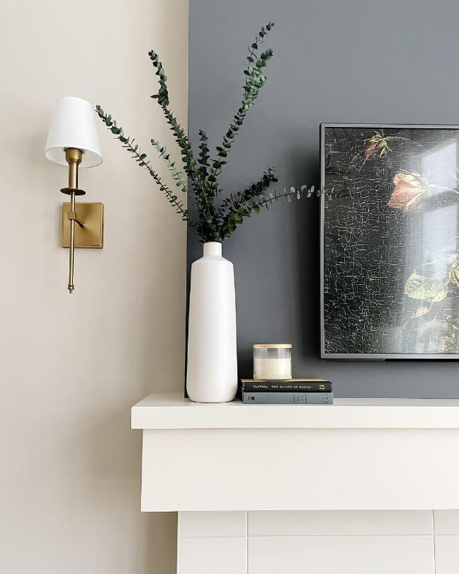
Here we have a closeup of Peppercorn with Accessible Beige on that fireplace wall.
Now for a far away glimpse of the same:

The cabinets here are similar to Sherwin Williams Dover White.
And here is a shot of the living room fireplace before it had the brass sconces:
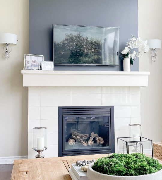
Directly against Accessible Beige, you can see how the blue undertone of Peppercorn shows up more.
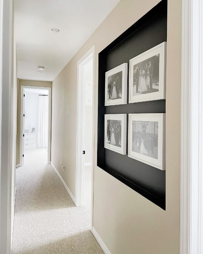
Here in the hallway alcove, Peppercorn is at its max darkest:

(Take that one with a grain of salt, because it looks like the photo has a cool filter on it.)
Sherwin Williams Peppercorn Accent Wall
Shal also used Peppercorn for an accent wall in this reading nook:

Here is one more, where Peppercorn looks more neutral gray:

Sherwin Williams Peppercorn in a Bedroom
Moving on to another home, Martina (@livedinlook) used Peppercorn in a subtly sports themed bedroom:
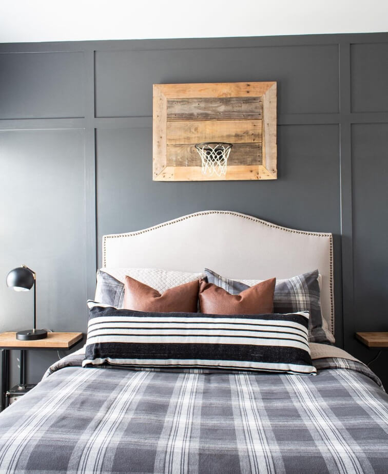
In this first shot, there is not much by way of undertone, just a nice true gray.
Here is a closeup of the board and batten:
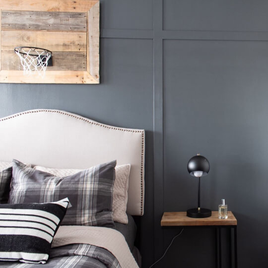
You can see that Peppercorn is really adaptable to any style. This accent wall would suit all kinds of decor!
Peppercorn in a Bathroom
Mary & Kenny Ellis of @averyellishome, used Peppercorn on a funky herringbone accent in their main bathroom:
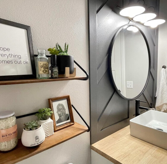
The wall color is Sherwin Willams On the Rocks, which is a really soft gray.

I find in this bathroom, that Peppercorn looks the most like a true gray.
Sherwin Williams Peppercorn in an Office
Marissa from @in_vest_homes used Peppercorn in several places in her amazing flip house, including this fun hide-away office:

Matching Peppercorn sliding doors frame the space, in an otherwise very simple living room.

Just off the living room, Marissa used Peppercorn on the stairway and front door to really make a statement in the entrance.

In the bright daylight, Peppercorn has that blue undertone.
Sherwin Williams Peppercorn in a Kitchen and on Cabinets
Marissa continued with the pops of Peppercorn leading into the kitchen:

The cabinets here are Accessible Beige.
In this next kitchen, the team at The Finishing Room (@thefinishingroommke) opted to use Peppercorn on an island, with white perimeter cabinets:

Here I am finding that Peppercorn looks a bit darker.
After having gone through all of these inside photos however, I think Peppercorn generally looks pretty consistent.
Let’s take it outside!
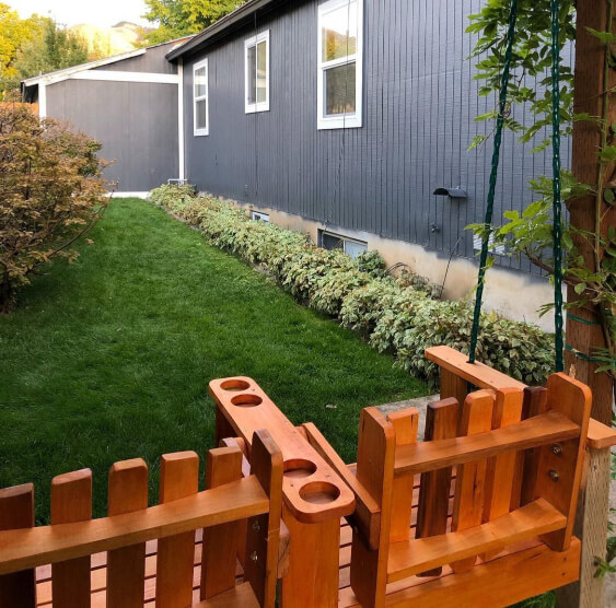
Sherwin Williams Peppercorn on Real Home Exteriors
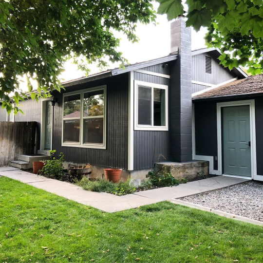
Kelly (@thetatteredpew) has Peppercorn on the exterior of her home:

Here it is definitely giving a bold blue undertone!
On a snowy day in low light, Peppercorn looks closer to black, but this is not typical:
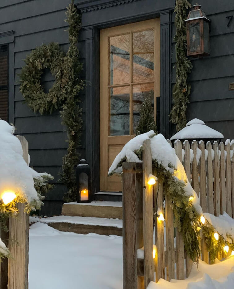
What a beautiful scene!
Barbara (@barbaraanne.art) is also the proud owner of a Peppercorn exterior:
Barbara paired Peppercorn with the lovely gray-green of Sherwin Williams Acacia Haze on the doors.
Again, I find the blue undertone fairly strong here, but that’s sort of what you expect from charcoal.
I’ve got one more, this time on stucco:

Stoeck Interiors (@stoeckinteriors) had the stucco painted in Sherwin Williams Snowbound, the bump outs in Peppercorn, and the garage doors in SW Sea Serpent. I love the contrast of this color scheme!
If you also liked the look of these exteriors, you will love these 8 Dark and Moody Exterior Colors From Sherwin Williams.
Peppercorn Compared to Other Charcoal Paint Colors
If I know anything, it’s that you are laboring over your color choices right now! Here is how Peppercorn stacks up compared to colors in the same arena:
Sherwin Williams Peppercorn vs Black Fox
Black Fox is a gray-brown paint color, as opposed to the plain gray of Peppercorn.
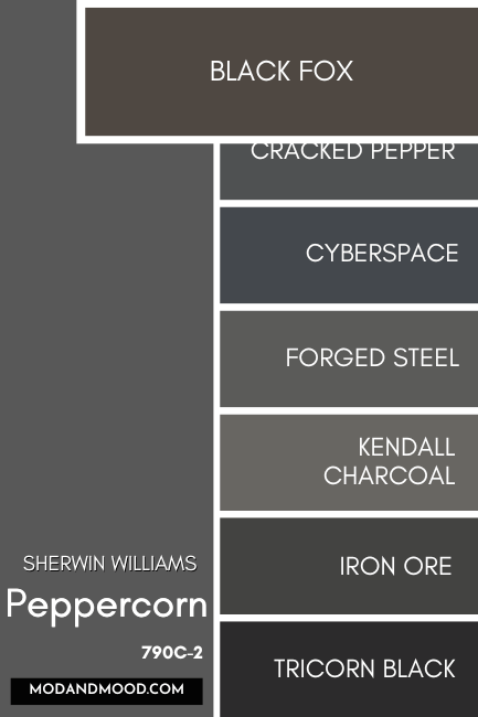
It is also darker, with an LRV of 7.
I will say that Black Fox most often looks like a chocolate brown, and not so much a charcoal or black.
Sherwin Williams Peppercorn vs Behr Cracked Pepper
Cracked Pepper is very similar to Peppercorn, but it actually has a touch of blue in it. It is also a little bit darker, with an LRV of 8.
Cracked Pepper was actually Behr’s pick for “Color of the Year” in 2024.
Sherwin Williams Peppercorn vs Cyberspace
Cyberspace is a deep charcoal blue. It is much more blue and more saturated looking than Peppercorn.
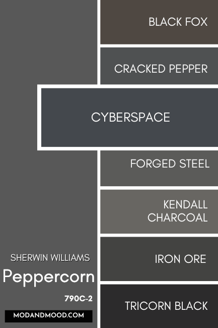
I loooove this color. You can see it in real life here: Sherwin Williams Cyberspace (The Moodiest Charcoal Blue!)
Sherwin Williams Peppercorn vs Forged Steel
Forged Steel is very nearly a “perfect” gray like Peppercorn, but it is ever so slightly warmer. It also has an LRV of 10.
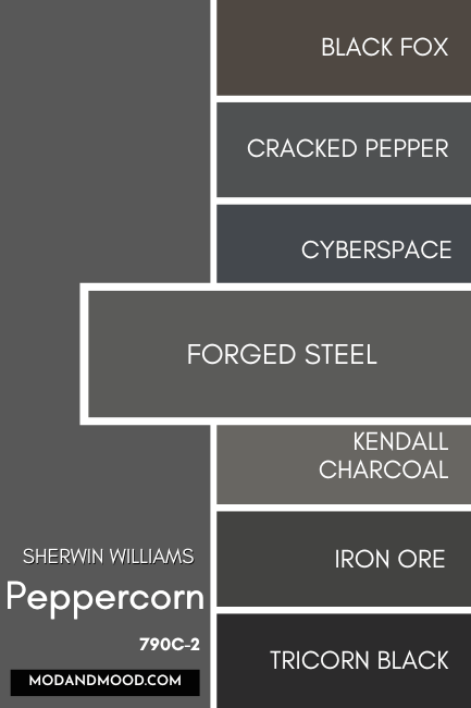
To be perfectly honest, Forged Steel and Peppercorn are very nearly twins. I don’t know that anyone would be able to tell from one photo to another, which was which.
I believe that Forged Steel looks neutral gray a little more often than Peppercorn, which does typically look cool. Forged Steel can still have quite a blue undertone however, just like Peppercorn. TL:DR – Try both!
Sherwin Williams Peppercorn vs Benjamin Moore Kendall Charcoal
Kendall Charcoal is a bit lighter than Peppercorn. It can look similar, but Kendall Charcoal is equally likely to have a greenish or blue undertone, where Peppercorn is more often blue.

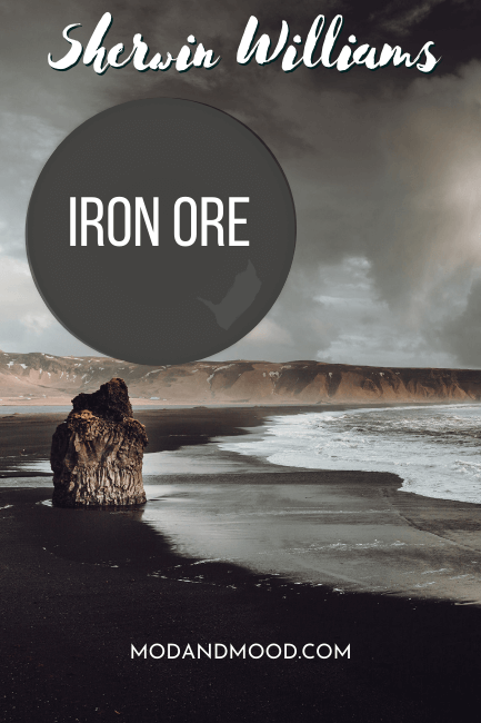
Sherwin Williams Peppercorn vs Iron Ore
Technically Iron Ore is a near perfect gray with just a hint of warmth, but in real life it has a blue-ish undertone very similar to Peppercorn.
Iron Ore is darker, with an LRV of 6. This means that it can sometimes look black, or close to it, where Peppercorn never does.
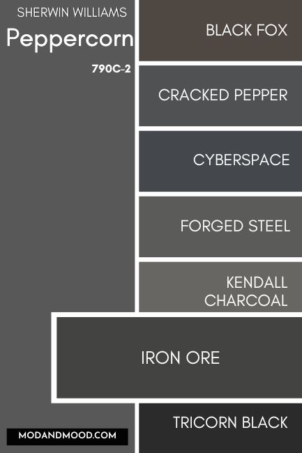
If you’re having trouble deciding, I have a whole post comparing these two: Sherwin Williams Iron Ore vs Peppercorn (Full Comparison!)
Sherwin Williams Peppercorn vs Tricorn Black
Sherwin Williams Tricorn Black is a true black paint color, and not a gray like Peppercorn.

This is actually the blackest black that Sherwin Williams offers, and it has no discernible undertone. Basically, these two aren’t really alike at all.
Sherwin Williams Peppercorn vs Urbane Bronze
Urbane Bronze is a deep charcoal brown. It can look almost metallic or a touch olivey, but never blueish like Peppercorn.
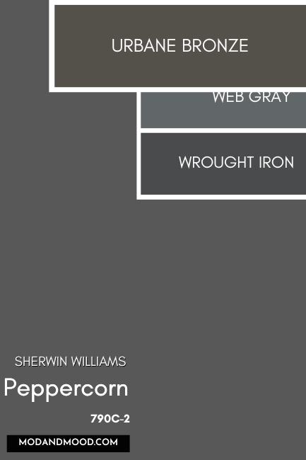
Urbane Bronze is darker than Peppercorn, with an LRV of 8.
Sherwin Williams Peppercorn vs Web Gray
Sherwin Williams Web Gray is an actual blue gray, as opposed to a gray that happens to have a blue undertone. It is lighter than Peppercorn, with an LRV of 13.
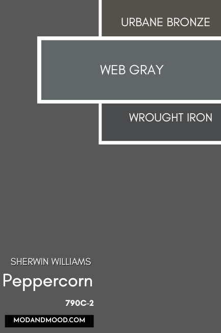
Web Gray is actually on the same color strip as Cyberspace, it is just one shade lighter.

Sherwin Williams Peppercorn vs Benjamin Moore Wrought Iron
Wrought Iron is a smokey off-black that is darker than Peppercorn. It also tends to be a chameleon and can range from having an almost brownish undertone, to green or blue.

Peppercorn Dupes from Other Brands
Now let’s take a look at other colors that can get you the same look as SW Peppercorn!

Benjamin Moore Peppercorn Equivalent
The closest match that Benjamin Moore offers to Peppercorn, is their shade simply called “Gray.”
Benjamin Moore Gray (2121-10)
Gray actually has the exact same color composition as Peppercorn: R 88, G 88, B 88.
On paper these two are identical, so here is a real life comparison:

The kitchen on the right in Benjamin Moore Gray, almost looks more like Peppercorn than Peppercorn does on the left.
I will say that “Gray” might look a bit flatter than Peppercorn does.
Valspar (Lowe’s) Equivalent to Peppercorn
Next up we have the Lowe’s option: High Speed Steel.
Valspar High-Speed Steel (4005-2B)
High-Speed Steel is a touch lighter and more blue than Peppercorn:

I had a hunt for real life photos of High-Speed Steel, and while there weren’t a lot, I think it looks very similar to how Peppercorn actually looks on the wall.
Peppercorn Behr Equivalent (Home Depot)
From Behr, the equivalent to Peppercorn is the shade Shadow Mountain.
Behr Shadow Mountain (PPU24-22)
Like Benjamin Moore Gray, Shadow Mountain has the exact same hex value and RGB as Peppercorn, so on paper it will be identical:
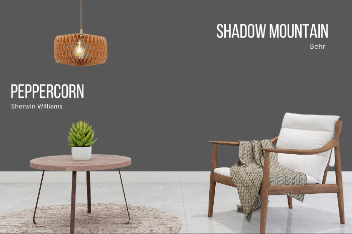
From what I have seen of Shadow Mountain, it looks very much like Peppercorn. Of course each brand will have a slightly different formula, so it might not be exact, but this is definitely as good as it gets!
Here’s a comparison of all the dupes over top of Peppercorn:

Peppercorn Pros & Cons
Peppercorn is a really safe choice when it comes to dark paint colors. It’s deep and moody but it doesn’t ever look bad or pull strange undertones.
Pros
- Gorgeous on exteriors
- Doesn’t read black
- Not flat like other “plain” gray paint colors can look
Cons
- Fairly strong blue undertone (A con if you were hoping for no undertone)
Not the one? I’ve got you!