Exteriors colors are a big commitment, and something that many of us may only choose once. A dark exterior is both bold and classic, and will almost always be my personal recommendation.
Here are my very favorite Sherwin Williams colors for dark and moody exteriors. I’m pretty sure you’ll find the winner for your makeover here!
This post may contain affiliate links. Should you choose to make a purchase through one of my links, I may receive a small commission at no cost to you. I only recommend products that I use.
Without further ado, and in no particular order:
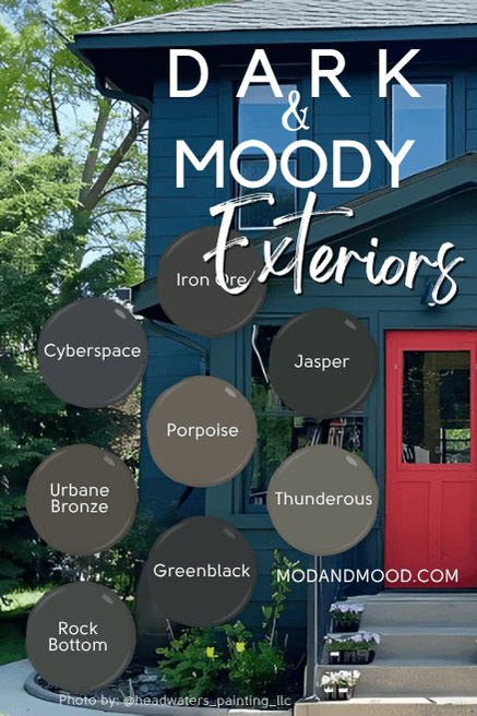
Cyberspace
Sherwin Williams Cyberspace is a deep charcoal with blue undertones. It can look almost navy outside, as you can see here:

You will see a few photos from Headwaters Painting (@headwaters_painting_llc) here, so be sure to check out their IG for even more beautiful exteriors!
Here it looks a little more gray, but not as much as it can.
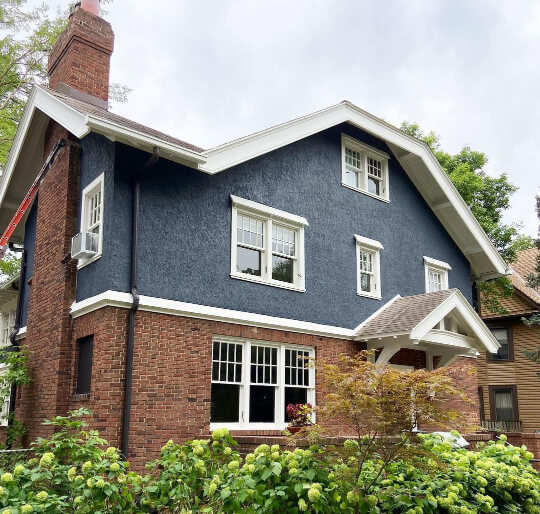
Bear in mind that the orange of the brick is very complementary to Cyberspace, so that also is making the color look more blue.
Here is a picture of it inside, so you can see how it looks more charcoal:
Cyberspace is perfect if you are torn between a dark gray or blue. It really is the best of both!

Iron Ore
Sherwin Williams Iron Ore is probably the most popular of all the exterior colors on this list.

This deep charcoal is usually chosen as a slightly softer alternative to black:
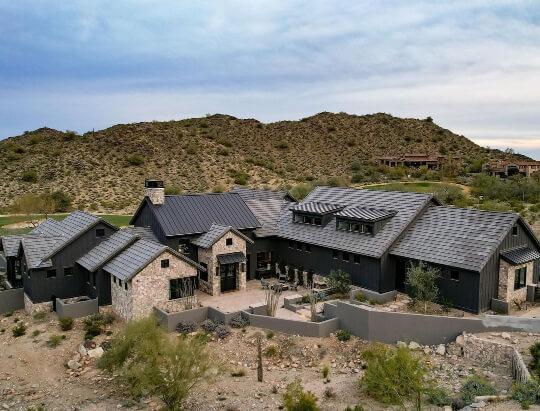
If you do a deep dive on Iron Ore, you will quickly learn that this color is a chameleon. It can look anywhere from almost black, to blue-charcoal, or even a little greenish.
Here it looks pretty neutral:
Here it looks a bit cooler:

Here is that same house, but where the color whispers ever so slightly of olive or brown:
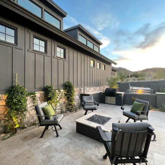
Here is a pretty typical look for Iron Ore:

Iron Ore is a gorgeous choice for a moody exterior, but it is a little unpredictable as you can see! Personally I like every look that Iron Ore has, so the fact that it’s a chameleon is a plus!
Psst! Iron Ore is actually the most popular paint color in this post. To get a great idea of how this color would look on your exterior, try a large format peel and stick sample from Samplize! There isn’t really a better way to test paint outside, and the sample is made with two coats of real paint, so you know it’s accurate!
If you really want to get crazy, grab a sample of Urbane Bronze too, which is the second most popular color here.
Jasper
Sherwin Williams Jasper looks its very best outside the home. This sultry forest green has so much personality!

Jasper is super deep and saturated.

Don’t let the almost-black look in these photos fool you:

In direct bright light you will see Jasper for the deep green that it is!

I’m a huge fan of this color, if only because a deep green like this is actually pretty traditional. It might feel like a bold choice, but it’s actually pretty safe. It is very similar to the green that you see trimming many an old white house.
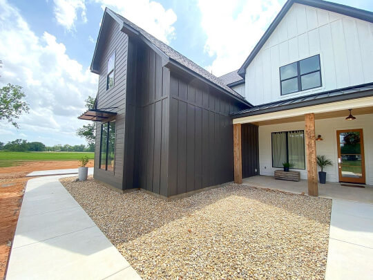
Urbane Bronze
Sherwin Williams Urbane Bronze is another deep chameleon charcoal, but much warmer than its colleague Iron Ore.

Urbane Bronze is about equal parts gray and brown. It’s a perfect choice if you were torn between a neutral beige or a dark gray:

Urbane Bronze is a particularly good choice for exteriors because it is deep and moody but very neutral, without being overused! As much as Urbane Bronze is a semi popular color, it isn’t use outside a whole lot.

The surprise undertone of Urbane Bronze is the occasional whisper of olive:

Just like with Iron Ore, I like Urbane Bronze no matter how it is showing up on any given day, so that’s why it is one of my top picks for exteriors! For an in depth comparison, you might like my post: Sherwin Williams Iron Ore vs Urbane Bronze, is it as Confusing as it Seems?
Thunderous
Sherwin Williams Thunderous is the lightest, and probably the most underrated color on this list!

Thunderous is a bit of a puzzle. It is almost equal parts gray and green, but with a hint of beige. The result is a muted sage green that can lean either warm or cool.

Thunderous is one of those colors that people will definitely ask you about! It’s such an interesting choice, but with broad appeal.

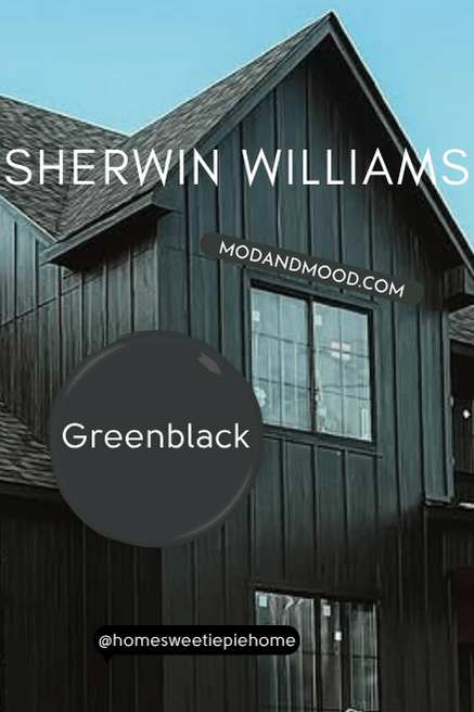
Greenblack
Sherwin Williams Greenblack is the only color on this list that actually reads pretty black.

Think of it as a black with a green undertone, rather than a dark green.


I love Greenblack because it’s like black without the harshness. It’s perfect for exteriors because green belongs in the great outdoors!

Rock Bottom
Sherwin Williams Rock Bottom is one of my favorite kitchen cabinet colors, but it also looks amazing outside!
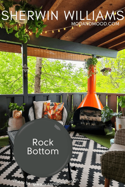
Rock Bottom is a dark gray green that can have a slightly olive undertone.
Here it is looking a little on the warm side:

Rock Bottom is fabulous because it works so well with any style of home. Here it is on a retro bungalow:
And on a fresh new build:

If a paint color can be sexy and mysterious, I think Rock Bottom is.
Porpoise
Sherwin Williams Porpoise is one of only two colors on this list with a truly warmer undertone (Urbane Bronze is the other one).

This charcoal is like a deep greige:

There’s something very comforting about this color. It is a charcoal that reads almost totally gray, but with just a bit of warmth.
Like most charcoal colors, it can sometimes pick up a greenish undertone but I haven’t seen it super often.

Of all the places you could use this neutral, I really think an exterior is best. It’s a showstopper outdoors, where inside it could be a little boring. This is a very underrated and underused Sherwin Williams color, with all the hallmarks of a fan favorite!
I hope this post gave you some amazing exterior design inspo for what could be the biggest project your home sees during your reign!
Still browsing? Here are some other colors that I LOVE for exteriors: