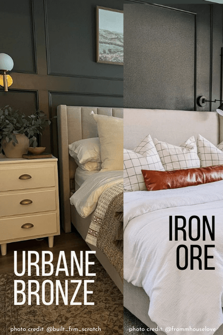
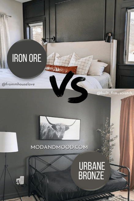
Sherwin Williams Iron Ore and Urbane Bronze are both very popular paint colors. These two are both moody charcoals, and there is a pretty big range of undertones that they cover. So what is the difference between these colors, and which one is the one for you?
In this post we will look at each of the different looks that these colors can have, show you where they overlap, and where they are different.
Technical Difference Between Iron Ore and Urbane Bronze
The easiest and fastest way to understand the difference between Iron Ore and Urbane Bronze is on paper:
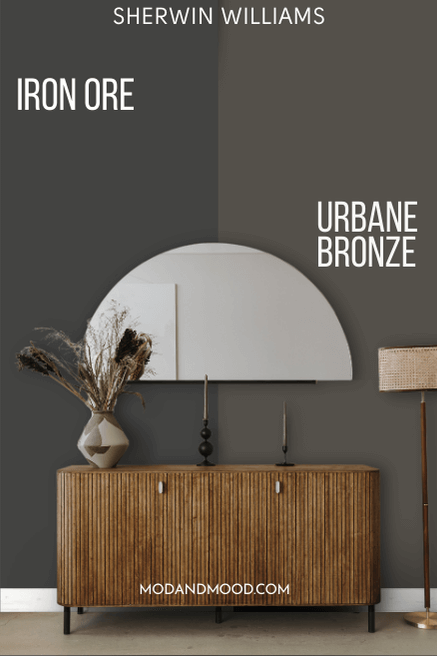
Both of these colors are dark charcoals, but Iron Ore is a true charcoal and Urbane Bronze is about 50% brown, and 50% charcoal.
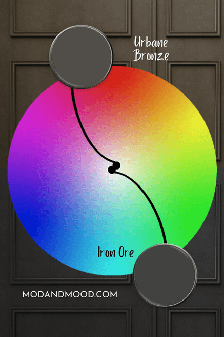
Let’s see each of these colors on the color wheel:
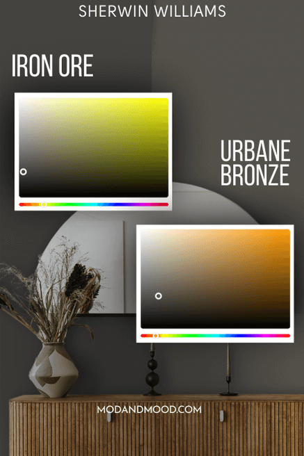
Iron Ore has an LRV of 6, so it is darker than Urbane Bronze, with an LRV of 8.
The LRV (Light Reflectance Value) of a color indicates on a scale of 0 – 100 how much light a color reflects (or doesn’t reflect). True black has an LRV of 0 and pure white has an LRV of 100.
In the paint world, we are working in a range of about 3 – 93 because no paint color is purely black or completely white.
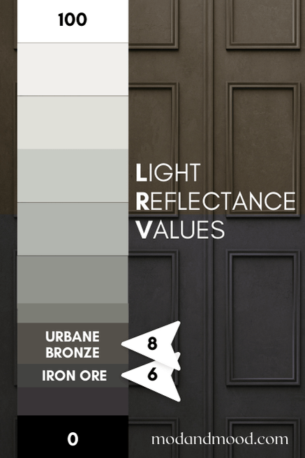
This is where we find another key difference between these two colors. Either color can look black on occasion, but for Urbane Bronze this happens less often.
Visual Differences Between Iron Ore and Urbane Bronze (Let’s Talk Undertones!)
Now that we understand the theoretical differences between these two colors, we can look at how that translates into reality.
Despite being a true gray and having some warmth in its formula, Iron Ore most often has a slightly blue undertone. Here is a very typical look for Iron Ore:
Urbane Bronze on the other hand, typically looks like a chocolatey charcoal:

This is the major difference between Iron Ore and Urbane Bronze. Iron Ore tends to have a blue undertone, and Urbane Bronze typically has a brown one.
Iron Ore can sometimes look like Urbane Bronze, but Urbane Bronze almost never looks like the “classic” face of Iron Ore. Very rarely (if ever) does it have a blue undertone.
That being said, both colors are chameleons. There is a TON of overlap in the various looks that each color can have. (I’ll go through each variation in just one minute.)
That is the main point here: Sometimes I’m surprised because I see a color that I assume is Urbane Bronze, but it’s actually Iron Ore:
…but I would never see a cool blue charcoal that I assume is Iron Ore, and find out it’s actually Urbane Bronze.
Urbane Bronze and Iron Ore Where they Look Almost Black
First let’s take a look at the rare occasion that each of these colors look black.
Here is Urbane Bronze on a front door with Sherwin Williams White Duck:

And again on a garage door, this time with Sherwin Williams Extra White.
Funny enough, Iron Ore also tends to be outside when it looks black:

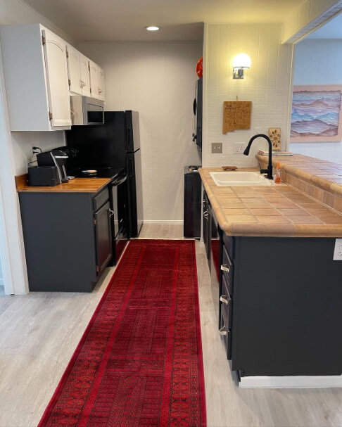
Here is Iron Ore looking close to black on kitchen cabinets:
I wouldn’t choose either color if you are shopping for a black paint specifically, because both will look charcoal most of the time. However, it is a good idea to be okay with the possibility.
Iron Ore and Urbane Bronze can Both Look Green
Both Urbane Bronze and Iron Ore can have a green, almost olivey, undertone. This is probably where the colors look the most alike!
Here is Urbane Bronze looking its most green in a bedroom:

…and a nearly identical look from Iron Ore, in a nearly identical bedroom! :

How about a little side by side? :
Here is another look at Iron Ore with a green undertone, this time in a living room:

And the same from Urbane Bronze, this time on built-ins in a living room:
Urbane Bronze and Iron Ore can Both Look Brown
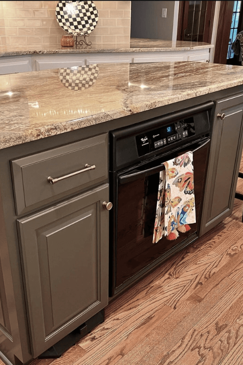
I already showed you Iron Ore in that kitchen where it looked quite brown, but here is another look:
The island is Sherwin Williams Snowbound, but it looks uncharacteristically greige here. It is a true white paint color.
Here is the same living room that looked green earlier, but in this picture it looks brown:
It is quite rare for Iron Ore to look this brown. Here is one more example where the cabinets in the background look somewhere between charcoal, green, and brown:
Here is Urbane Bronze where it looks brown:
This is easy to find examples of, because it is Urbane Bronze’s most common look! :
Again this is a rare look for Iron Ore, and a common look for Urbane Bronze.
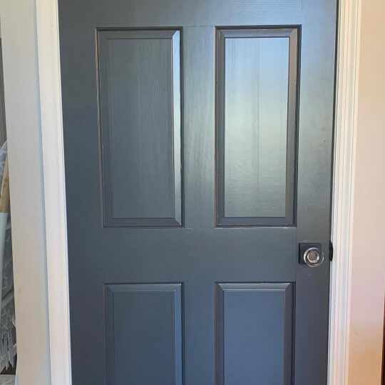
Iron Ore and Urbane Bronze at their Most Blue
Iron Ore most commonly has a blue undertone. Sometimes people even think it looks navy!
Here is a good look at Iron Ore where it looks more blue on an island:

…and a similar look on an interior door:
…and again on lower cabinets:
The upper cabinets are Sherwin Williams Drift of Mist.
I didn’t actually think that Urbane Bronze ever has a blue undertone, but then I found this kitchen, and it ruined my whole script!
I’m not 100% sure if this is something that would happen normally, or if the pale blue walls are reflecting off the glossier cabinets and door. The upper cabinets are Sherwin Williams White Heron.
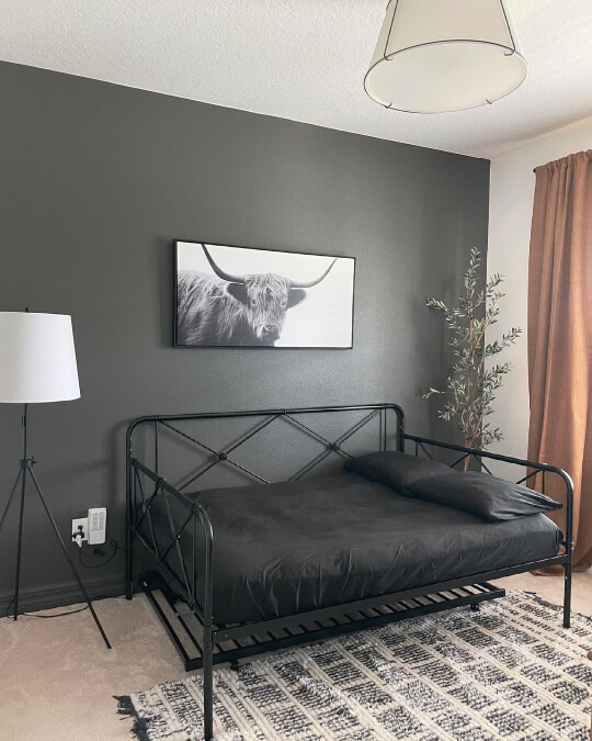
Urbane Bronze at its Most Gray
While Urbane Bronze might not ever look blue, it can look like a true gray. Here we see it looking quite plain jane, with pretty limited undertones:

In this bedroom, Urbane Bronze looks like a nice true charcoal. There might be a hint of a brown or green undertone, but it is hard to put your finger on.
On the porch floor of this exterior, we see another true charcoal look for Urbane Bronze:

The siding color is Benjamin Moore Dark Teal.
I didn’t feel the need to include a whole bunch of pictures of Iron Ore looking gray, because that is pretty common. Here is one of a typical Iron Ore gray look:
How Iron Ore and Urbane Bronze Compare Inside Real Homes
We’ve already gone over all the different undertones that these two colors can have, but let’s quickly look at a few more specific rooms.
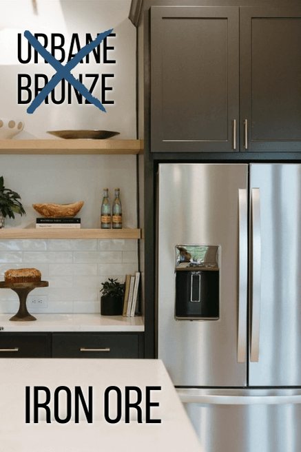
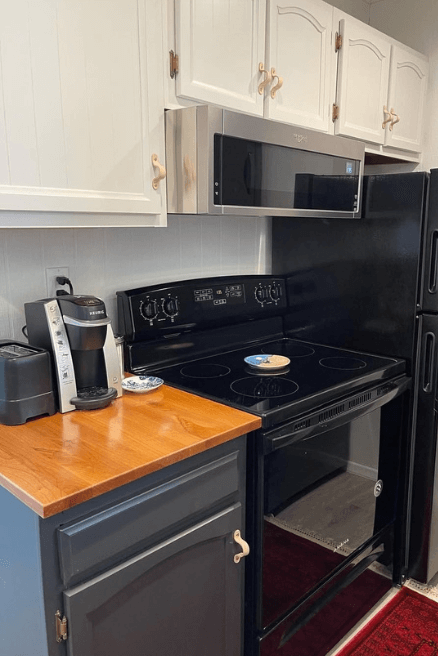
Iron Ore vs Urbane Bronze on Cabinets
Urbane Bronze is not nearly as popular on cabinets as Iron Ore is. I think it is maybe a tiny bit more difficult to get right.

I wouldn’t personally use this color with very warm wood floors, because it loses some richness in contrast.
These next two photos were taken in very warm artificial light so I toned them down a little in order to more accurately represent the color:
So if you see these photos in the wild and they look a bit different…no, you didn’t.
Here is another kitchen that looks pretty close to Urbane Bronze, since I’m having a hard time finding a very accurate example:
(The color here is actually Benjamin Moore Night Horizon)
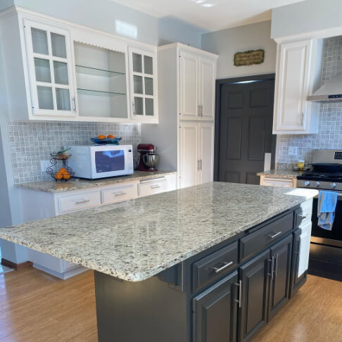
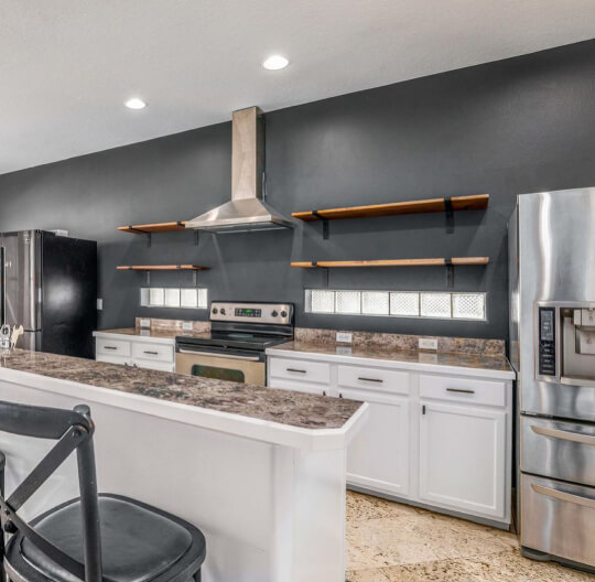
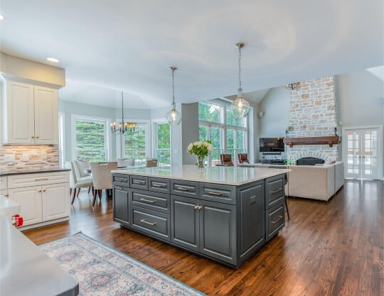
Now let’s take a look at Iron Ore in the kitchen:

In this kitchen, Iron Ore looks a little darker than normal, but you can see the range of undertones.
Here is another kitchen where Iron Ore looks much lighter:

…and back to dark:
I would say that on kitchen cabinets, Iron Ore tends to look charcoal with a blue undertone, or almost black. Urbane Bronze looks brown or warm charcoal, occasionally with a slightly green undertone.
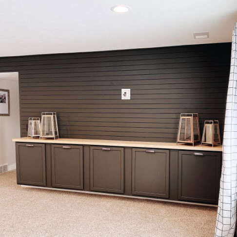
Iron Ore vs Urbane Bronze in the Living Room
Now let’s take a look at each of these colors in the living room, starting with the fireplace:
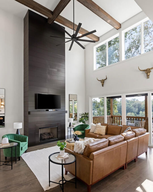
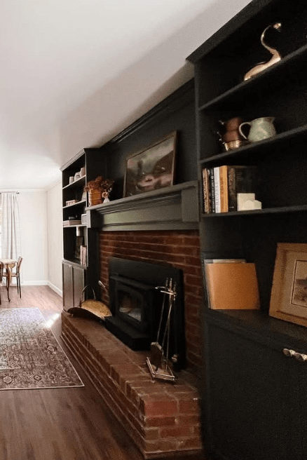
In this room, Designer Piper Stromatt used Urbane Bronze on this amazing fireplace wall. The color looks pretty typical here, or maybe a hair less charcoal than normal.
For the exact same thing from Iron Ore, we head over to the @bertrand_residence:
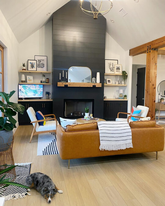
I would say that Iron Ore also looks pretty typical here.
Urbane Bronze isn’t on as many feature walls as Iron Ore is, but we do have this beautiful color drench at Brandi’s (@itsbrandeye) house:

Over at Maranda’s (@marandapenner) remodel, Iron Ore is the accent on a very big living room wall:
I love the color here because it’s very hard to pin down. Is it gray? Green? Navy? Who knows! But it is pretty!
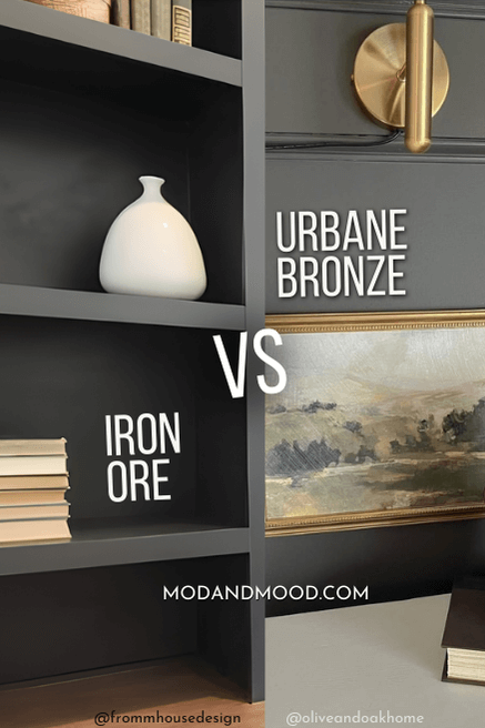
I also have a great example of both Iron Ore and Urbane Bronze on bookshelves:

This is a great look at how these colors compare in their most typical state.
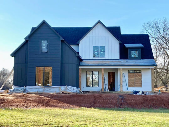
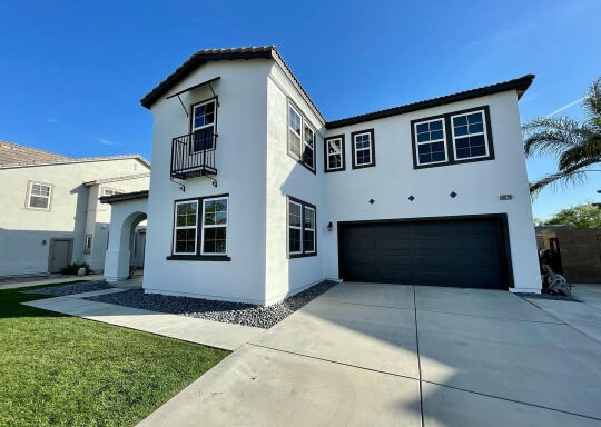
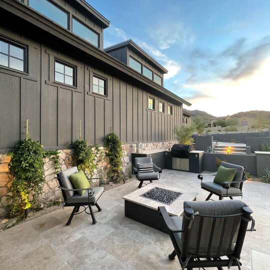
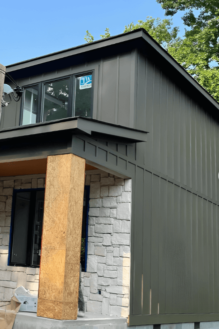
Iron Ore vs Urbane Bronze on Exteriors
Moving on outside, Urbane Bronze and Iron Ore can look quite alike in the great outdoors, so let’s start with that!
Any guesses? :
The first picture was Iron Ore, and the next was Urbane Bronze. Both look pretty green here.
Here is a more typical look for Iron Ore:
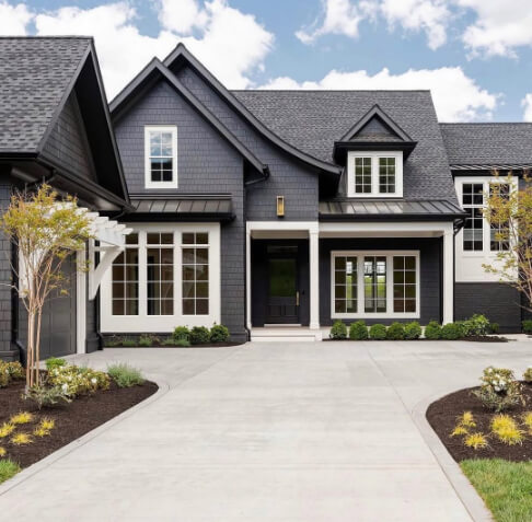
And something more typical from Urbane Bronze:

So, is Iron Ore or Urbane Bronze Better?
While these colors are very similar, they do achieve different goals.
Both are deep moody charcoals, but Urbane Bronze brings warmth and depth, while Iron Ore brings a more classic look that is still sophisticated.
At the moment, Urbane Bronze would be a more stylish choice. It is very similar to the Benjamin Moore 2026 Color of the Year: Silhouette, and brown paint colors are really coming into fashion at the moment. Personally, I love the trend, so I would probably lean this way.
That being said, the chameleon charcoal of Iron Ore is truly never going to go out of style, so it is a timeless foolproof choice. It’s a statement color without being too “specific.”
Thank you so much for reading until the end! That really helps my blog. I hope this post helped you get a clear picture on the ins and outs of Urbane Bronze vs Iron Ore. Still not sure? Check these out:


