Color drenching is the hot new trend that has roots in classic Victorian style. If you love a particular color, why not put it everywhere?
Today we will see several color drenched spaces in real life, look at a couple variations on the trend, and see a host of amazing colors to use in your home!
What is Color Drenching?
The idea behind color drenching is typically to use a single color on the walls, trim, and ceilings.

You could use the same color in different sheens, or keep it all exactly the same. Sometimes a room is drenched in two colors that are only slightly different. (Think monochromatic.)
When it comes to color drenching, the moodier the better! Most color-drenched rooms are painted in medium to dark colors that look very rich, but the look can successfully be done in any shade you like!
Finally, color drenching is usually done in small to medium spaces that are contained or separated from the rest of the home in some way. This isn’t really the right look for an open concept main floor, for example.
The best part? : You don’t even have to be careful when you’re painting!
Color Drenched Living Spaces
If we can crown a queen of color drenching, it would surely be Maria Friström of @marialovesrealestate.

A scroll through her instagram will have you dreaming of all the spaces that you can soak in sumptuous colors!
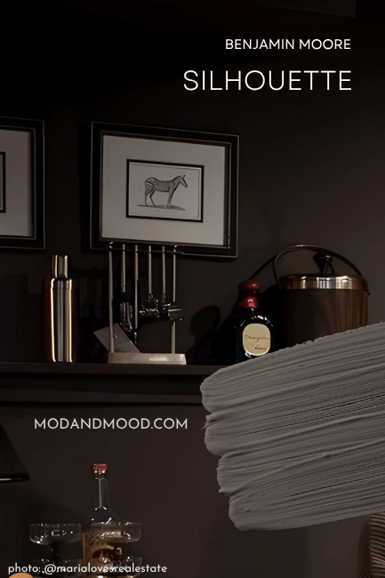
Benjamin Moore Silhouette
This first space is doused in Benjamin Moore Silhouette, of which Benjamin Moore says:
“An alluring cross between charcoal and chocolate that breathes luxury into any room.” – Benjamin Moore
Well what do you know, that’s exactly what we’re trying to do here! This color is deep and moody, but still neutral.

I love this color because it is rich and brown, but with a hint of neutralizing charcoal. It’s also nice because it’s a little more predictable in terms of undertone than a lot of other neutral colors.
Benjamin Moore selected Silhouette as their 2026 Color of the Year.
Jotun Daydream & Tikkurila Maiden
In a living room, Maria used another unexpected color scheme:

Maybe you’re smarter than me, but I had to really look to see how this was two different colors at first!

Maria used the shade “Daydream” from Norwegian paint brand Jotun for the darker color, and “Maiden” from Finnish paint company Tikkurila for the lighter color:

Jotun describes Daydream as:
“A soft plum color…Compared to other purple colors, this is far more golden and almost brownish. It is something completely different to an ordinary purple color.” – Jotun
I would argue that it’s quite brown.
To get this look in your home, try Sherwin Williams Dutch Cocoa, Sherwin Williams Velvety Chestnut, or Benjamin Moore Wood Grain Brown for your darker shade.

Tikkurila says of their color Maiden:
“Dried roses recall memories of past parties. A pink with a brown undertone. This timeless dusty rose tone makes your home feel calm.” – Tikkurila
For this lighter shade, try Sherwin Williams Abalone Shell or Benjamin Moore Meadow Pink.
Benjamin Moore Hale Navy
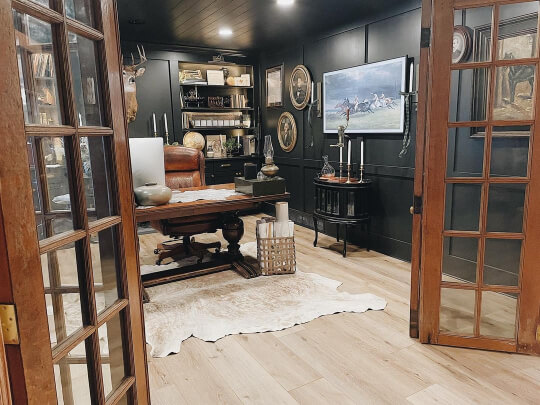
In this next room, @mldesignskc drenched a beautiful home office in the timeless blue of Benjamin Moore Hale Navy.

“We love a dark and moody office space. We were so excited when the clients were on board with taking this office dark.” – ML Designs

This is one of those colors that truly goes with everything! If you want to color drench a room but you are worried about the adjacent wall colors, Hale Navy might be perfect!

Comfort Painting also drenched an entire room in Hale Navy, this time it’s in a dining room:
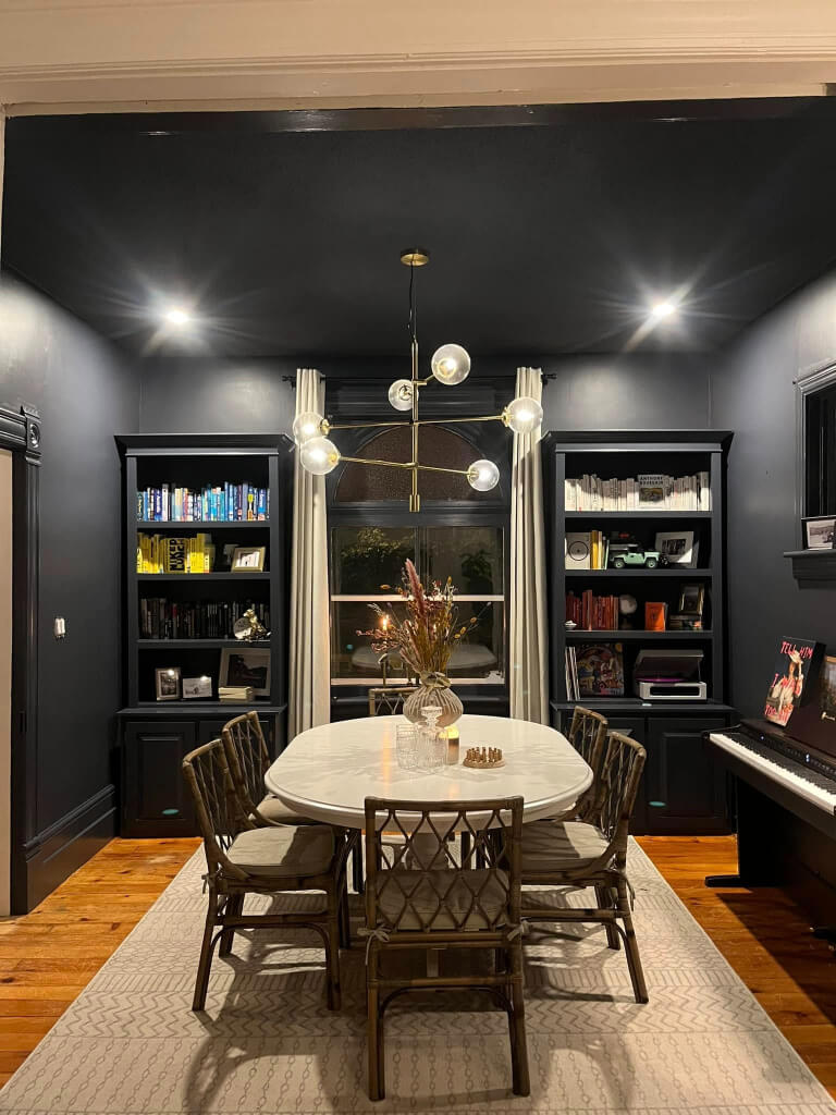
I love that the color makes the bookshelves look like built ins:
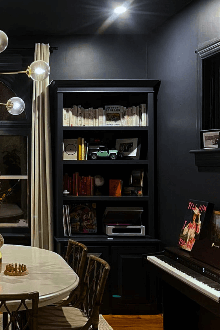
What a beautiful space!
Sherwin Williams Cascades
In another design by the team at ML Designs, we see the decadent teal of Sherwin Williams Cascades:

This color drenches the room in a cascade of deep teal. (See what I did there?)
Here is one more picture, but please note the undertone is not usually so emerald:

Cascades is actually as dark as some black colors, but it rarely (if ever) looks close to black because it is so saturated.

To get this look, you could also try Benjamin Moore Dark Harbor. If you love teal in general, you will love my post: 9 Tantalizing Teal Paint Colors for Kitchen Cabinets
Farrow & Ball De Nimes
The first time I ever bumped into Xin (@athomewithxin), she was actually color drenching a bedroom. (I’ll show you that one in just a minute!) She is no stranger to color, and uses many moody hues throughout her Pinterest worthy home.

The unusual blue of her music room might take the cake as her best color choice. At the very least, the chef do be kissing!

Of De Nimes, Farrow & Ball say:
“This quietly elegant blue feels wonderfully down to earth, so could be used on anything from a kitchen island to an airy drawing room.” – F & B

This color ranges in appearance from a warm-leaning dusty blue, to a medium gray blue with a slight green undertone.

Get this look from Sherwin Williams with the shade Delft, or try Benjamin Moore Montpelier.

You will probably also loves Sherwin Williams Debonair, which gives off a very similar vibe.
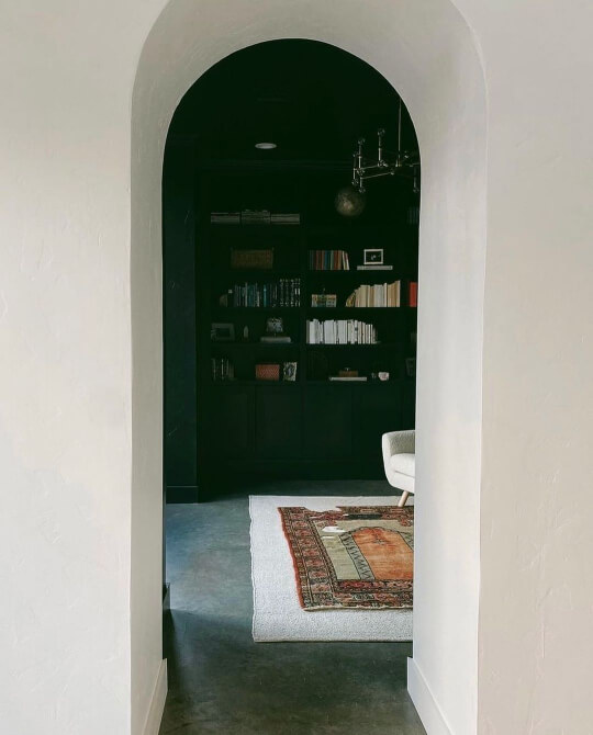
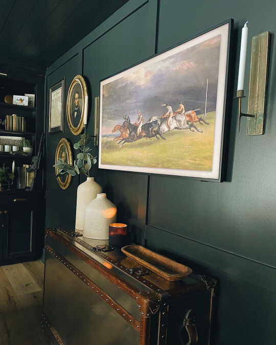
Benjamin Moore Black Forest Green
Black is a bold choice for color drenching, but bold we are! Here is a beautiful sitting room in Benjamin Moore Black Forest Green.

This color looks very inky and black in this room, but it does have a subtle teal undertone.

“A blackened shade of green that permeates any space with a sense of reassurance.” – Benjamin Moore

Sherwin Williams Greenblack
Not to be outdone by a green that is nearly black, Sherwin Williams has their own drenchable shade called the obvious: Greenblack.
Allie of @thenottinghome, used Greenblack to drench the walls in their den, arguably well before this trend had truly started.
The undertone of Greenblack is more forest than teal, so that differentiates it from Black Forest Green.
Greenblack is a beautiful shade because it’s like a black, but a little softer and more dimensional.


Benjamin Moore Army Green
Green is super popular for color drenching! I’m not sure if it’s because green just happens to be trending at the same time as drenching, but no matter the reason: I am here for it!

The team at @true_colors_painting refinished this character home with a wash of Benjamin Moore Army Green.

This olive-leaning hue is quite specific, but it certainly makes a statement!

If you like this shade, you might also like the slightly cooler Sherwin Williams Ripe Olive.
Sherwin Williams Acacia Haze
Sherwin Williams Acacia Haze is one of those colors that is unique, and totally classic looking at the same time. This medium sage green is a perfect choice for a bath of color.

The team at @verygoodpaintingllc drenched this delightful little mudroom, including the brick wall:

I’ll be honest, I wasn’t able to verify that this was Acacia Haze before I finished this post, and I went back and forth on whether it was Acacia Haze, Retreat, or Pewter Green. (They are all on the same color strip.)

…but any of these colors would be beautiful for drenching your room!
Magnolia Home Summer Hay
One of the classiest homes I’ve come across on Instagram, is that of Michelle and her @littlelattihouse.

Her whole home gives the vibe of “new Victorian.” She uses really simple cohesive colors, and isn’t afraid to drench!
In one of her bedrooms, she went with the interesting neutral of Magnolia Summer Hay:

This is one of those colors that you can study for a while and not really know what it is! I suppose you could say green-beige.

Get the look by using Sherwin Williams Acanthus, or Benjamin Moore Harbor Town.

If you like these colors, you will also love Benjamin Moore Sag Harbor Gray, which you can find covered in my post: Fabulous Sage Green Trim Colors to Uplevel Your Aesthetic (See Real Homes!)
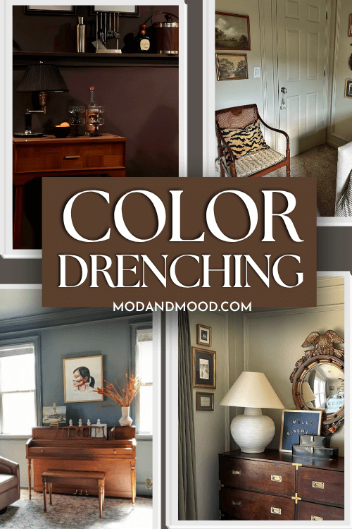
The Best of Color Drenched Kitchens
Color drenching isn’t nearly as popular in kitchens as it is in small contained rooms, but it can still be done successfully! While some of these examples may be more of a shower than a drench, they still give the spirit of the trend!
Sherwin Williams Dockside Blue
Heading back over to ML Designs, we see what might be the most photogenic kitchen of all time:

In this space they chose Sherwin Williams Dockside Blue and used it on all of the cabinets as well as the trim. They carried the color through the backsplash by using a bold floral print that matches gloriously.

While the ceiling here wasn’t actually painted to match, it definitely would have worked.
Sherwin Williams Thunderous
Revisiting Maria now, we get to peek into her own home, and see the beautiful gray green of Sherwin Williams Thunderous drenching her kitchen.

Thunderous is quite a dark color, so it is a choice better left to spaces with good light, but boy oh boy does it make a statement!

Again in this particular case the color wasn’t brought to the ceiling, but it could have been, and it still would have looked spectacular.
Cover Story Paint Volter
Leave it to Maria to choose the colors you’ve never heard of! This next kitchen is truly drenched, and in the very niche brown of Volter by (I believe?) a Finnish brand, called Cover Story Paint.

This shade is very warm and cozy! I can see making soup on a cold day in this kitchen. To be perfectly honest, I probably would have thought this color was hideous from the swatch, but the room sold me the dream!


I didn’t know a thing about them, but I really like Cover Story’s whole ethos:
“It’s unremarkable that these days cars run on electricity, milk is made from oats and everyday grocery shopping is ordered at home…Yet one of the home’s most important interior design products is still perceived as a building material…We founded Cover Story to offer people an alternative – for those who see painting not as renovation but as interior design.” – Cover Story Paint
Unfortunately for us, they only ship within Europe, so I do still have to tell you how to get the look another way.

Try the shade Umber Rust from Sherwin Williams, or Hidden Valley by Benjamin Moore, to get the same vibe as Volter. If you’re just really feeling the browns, check out my post: 9 Modern Brown Paint Colors for this year and Beyond
Color Drenching with Wallpaper
An adjacent trend to color drenching (if we can’t quite call it the same thing), is color drenching featuring wallpaper. This is where the walls, trim, and ceilings are all painted the same color, but parts of the wall – or a feature wall – are decorated in a coordinating wallpaper.
Behr Heritage Park
Remember how I mentioned a bedroom by Xin? This is her color drenched and wallpapered dreamland, featuring the Behr color Heritage Park.
I just love how this color looks! This gray green is a little more saturated than most, which gives it a bit more oomph.

The walls, trim, and ceilings being drenched in this color feels…expensive, and oh-so fahncy!
Sherwin Williams Naval
In this powder room, friend of the blog Piper (@piper_thebuildingblonde) used the saturated navy of Sherwin Williams Naval to drench most of the room:

You can see in the mirror that the color goes all the way up and includes the ceiling. For the vanity wall, Piper chose a coordinating wallpaper that brings a fun pattern and the illusion of texture into the space.

Just for fun, I have another navy blue space to show you, that is very compact indeed!
ML Designs redid this elevator in a fun but timeless navy and floral color scheme.

The room is drenched, but the panels bring a little extra fun! (I believe the color here is Hale Navy again.)
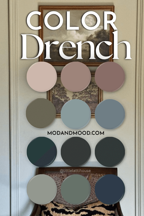
All of the Best Colors for Drenching Your Space
Here is another look at all of the main colors we covered here:

Thank you so much for reading until the end! That really helps my site. I hope you found a color that sparks your creativity. The second best thing about color drenching, is that you don’t need to worry about coordinating colors at all!
Want to see more ideas? Check these out:


