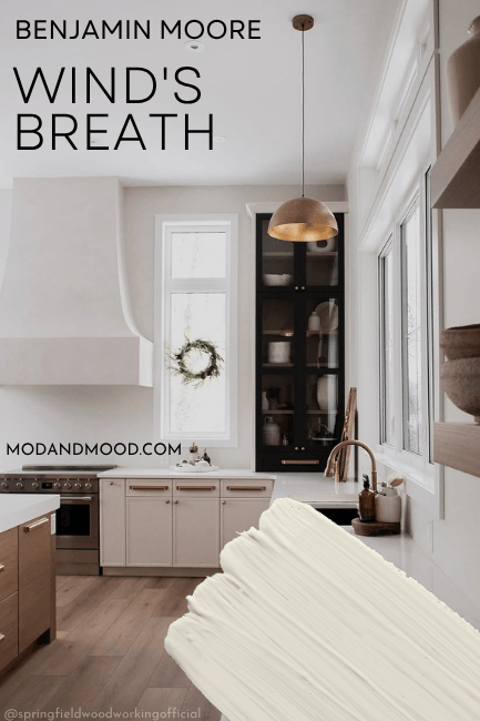
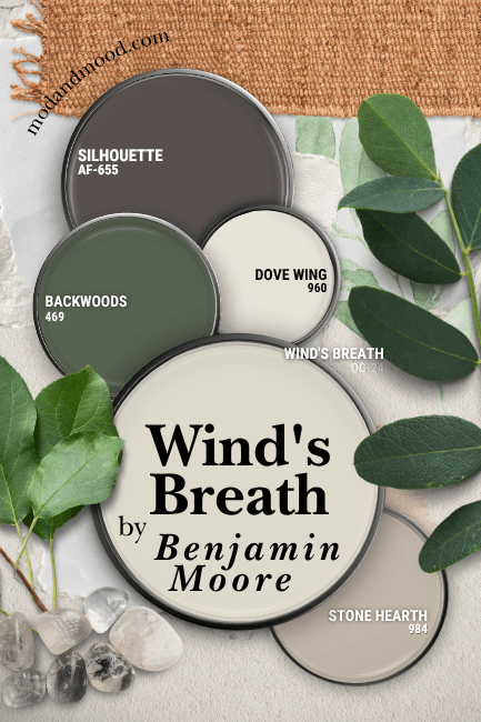
Benjamin Moore Wind’s Breath is one of those colors that is always around, but never really gets it’s flowers. This neutral is a little creamy, a little taupe, and a little something-hard-to-place! Luckily it is always beautiful.
Here we will talk about what to expect from Wind’s Breath, see it in real homes, get coordinating color ideas, and see some dupes and similar shades.
What Color is Benjamin Moore Wind’s Breath?
Wind’s Breath is a creamy neutral paint color that is on the warm side of greige/taupe. Arguments can be made on both sides of whether it is an off-white or a “color.”
What Are the Undertones of Benjamin Moore Wind’s Breath?
Like many self-respecting taupe paint colors, Wind’s Breath’s undertones can lean either pink/purple or green.
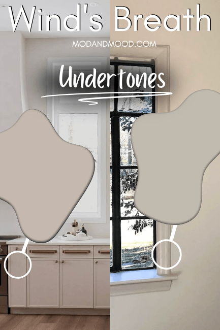
Despite looking creamy on the swatch, Wind’s Breath is not yellow at all. It can look cooler-toned on occasion, and almost all the way gray.
Wind’s Breath LRV
The LRV of Wind’s Breath is 69.6, so let’s just round that up to 70.
The LRV (Light Reflectance Value) of a color indicates on a scale of 0 – 100 how much light a color reflects (or doesn’t reflect). True black has an LRV of 0 and pure white has an LRV of 100.
In the paint world, we are working in a range of about 3 – 93 because no paint color is purely black or completely white.
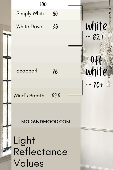
At 70, Wind’s Breath is riiight on the line of off-white and light neutrals. Benjamin Moore has it classified as a white on their website, but the description refers to it as a neutral.
So is Wind’s Breath an off-white, or a neutral?…Yes.
Wind’s Breath in the Benjamin Moore Color Strip
Lucky for us, Benjamin Moore does have a complete light to dark color strip for Wind’s Breath:
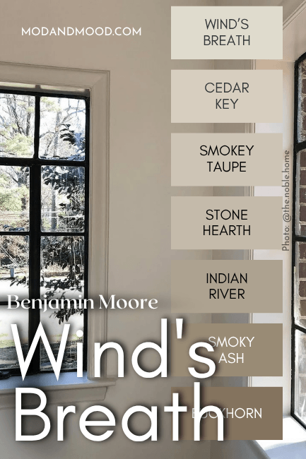
Wind’s Breath is the lightest shade in this collection. The other colors are:
- Cedar Key
- Smokey Taupe
- Stone Hearth
- Indian River (aka Ranchwood)
- Smoky Ash
- Buckhorn
Benjamin Moore Wind’s Breath in a Color Palette
Here are all of the coordinating colors that I recommend with Wind’s Breath, but it is very neutral so there are many other options.
Coordinating White Paint Color for Wind’s Breath
In this color palette I used Benjamin Moore Dove Wing with Wind’s Breath, because I was inspired by the pairing in this home:
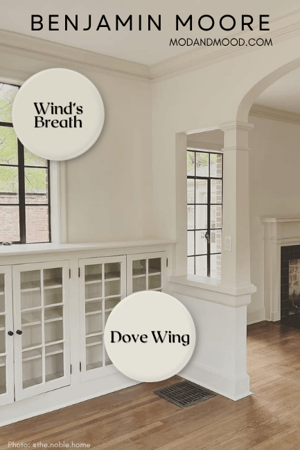
This is a lower contrast option because Dove Wing is also an off-white. For a true white, try Benjamin Moore White Dove.
Avoid using Wind’s Breath with any creamy white trim color that has a more yellow undertone. This will make your walls look purple in comparison.
Try Wind’s Breath with Benjamin Moore Backwoods
Backwoods is a beautiful deep green that usually lands somewhere between warm sage and muted emerald.
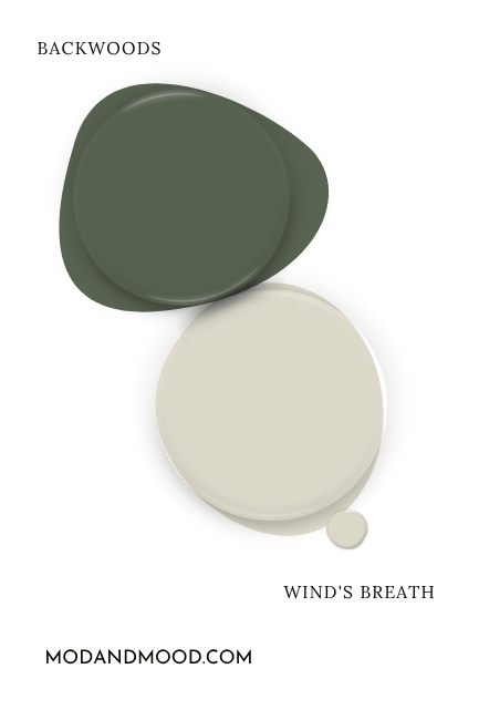
Green is complementary to the more pink undertone of Wind’s Breath.
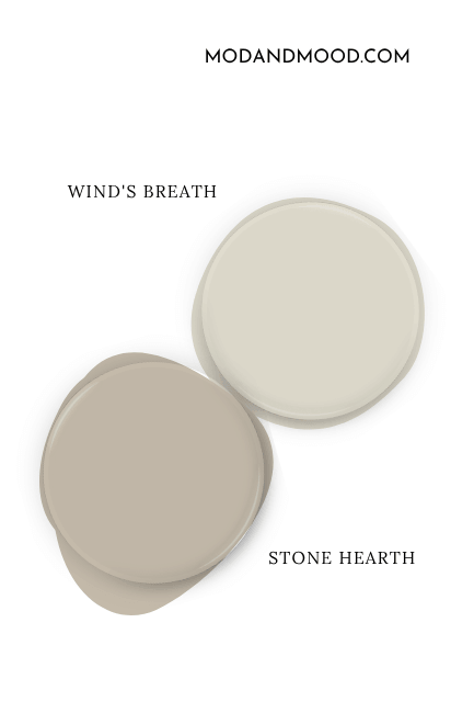
Neutral Paint Color to Use with Wind’s Breath
For a coordinating neutral to pair with Wind’s Breath, I recommend choosing one of the darker shades from the same color strip. For this palette I went with Benjamin Moore Stone Hearth, but anything from Smokey Taupe and darker will work!
For a neutral option that makes a statement, pair Wind’s Breath with the Benjamin Moore 2026 Color of the Year: Silhouette.
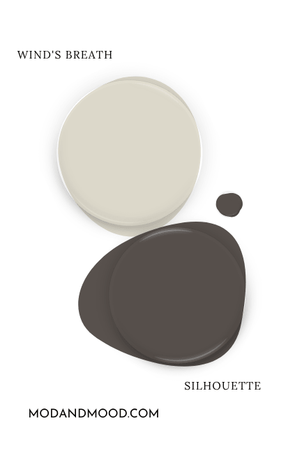
Silhouette is a beautiful dark brown that has undertones ranging from earthy to berry. It’s amost like a very dark version of Wind’s Breath, so these two work beautifully together! You might also like Benjamin Moore Dragon’s Breath.
Benjamin Moore Wind’s Breath for Your Home’s Interior
Now on to the good stuff: Wind’s Breath in real homes!
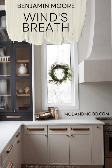
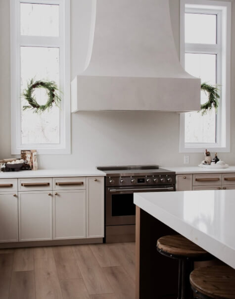
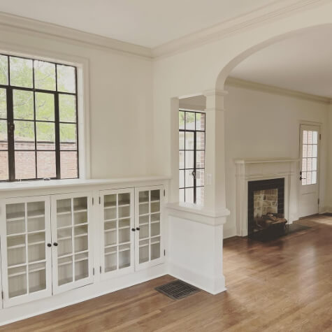
Wind’s Breath on Kitchen Cabinets
Let’s start with Wind’s Breath in a glamorous and gorgeous kitchen:
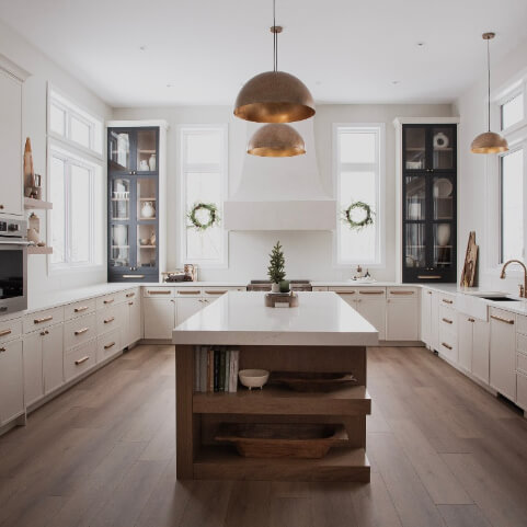
In most of the photos of this home the color definitely looks beige with a subtle pink undertone.
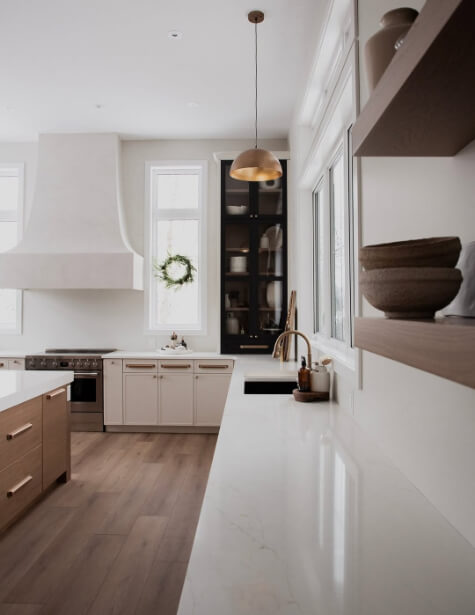
In a couple of photos the color looks like an off-white, but with a taupe undertone.
And finally we have Wind’s Breath looking a little more gray, but stopping jussst short of green:
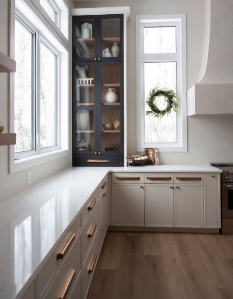
Moving on to Wind’s Breath in much smaller amounts, let’s revisit the home with the Dove Wing and Wind’s Breath combo:
I really love this combo! I’m a big fan of contrasting trim and doors though, and I have a few posts about the trend:
That first picture seems pretty accurate, but here is a cooler and more contrasty shot of the same room:
…and then a warmer version of the same combination:
If you were to color drench your room in Wind’s Breath (use the same color on walls, trim, ceiling, and doors) you will find that the color looks its brightest and most white.
If you were to use a bright white trim with Wind’s Breath, it would look darker and more like a neutral.
Benjamin Moore Wind’s Breath Compared to Other Light Neutral Paint Colors
Let’s see how Wind’s Breath compares to a few other colors that may be on your shortlist!
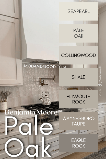
Benjamin Moore Wind’s Breath vs Pale Oak
I was honestly shocked at how similar Pale Oak and Wind’s Breath are:
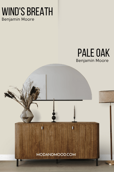
Once I thought about it, these colors are very similar in real life, and not just on paper, so I guess I should not have been shocked.
The major difference between these two, is that Pale Oak is a bit more gray. It is also a hair darker. In my opinion, Pale Oak has just a drop less depth than Wind’s Breath does.
Benjamin Moore Wind’s Breath vs Classic Gray
Classic Gray and Wind’s Breath are both off-white paint colors from Benjamin Moore that most often read like neutral creams:
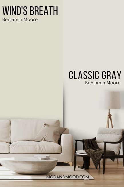
While “Gray” is in the name, the major difference here is actually that Classic Gray is lighter, and tends to look more white.
Benjamin Moore Wind’s Breath vs Feather Down
Feather Down and Wind’s Breath are both off-white paint colors, but Feather Down is more overtly cream than Wind’s Breath is:
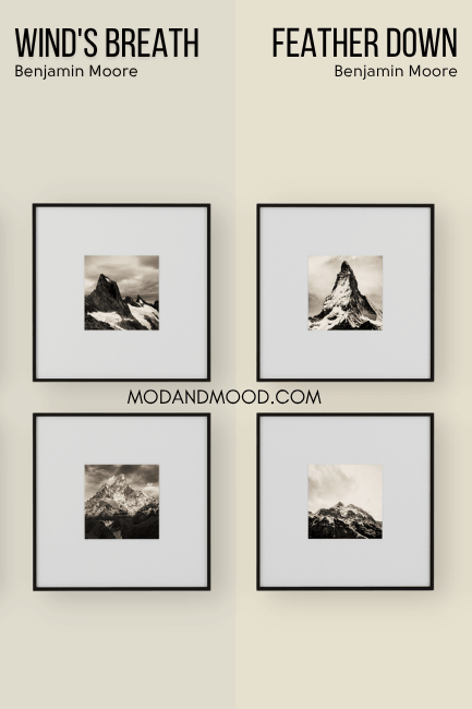
You can see that Feather Down is cleaner and less gray than Wind’s Breath. The major difference here is in terms of undertone. Feather Down doesn’t tend to look taupe, and sticks instead to a true cream or beige look.
Dupes for Benjamin Moore Wind’s Breath from Other Brands
I recently put together dupes for Pale Oak and I almost used the same ones because they were very close to Wind’s Breath too. In the end I was able to find all new colors that are even closer to Wind’s Breath!
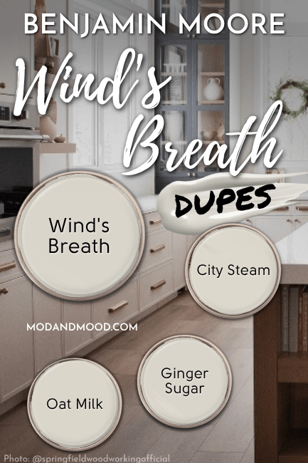
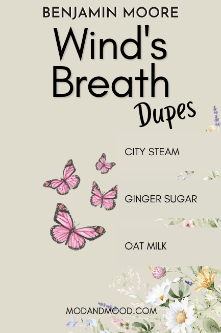
Sherwin Williams Version of Wind’s Breath
The closest Sherwin Williams color to Wind’s Breath is their shade Oat Milk.
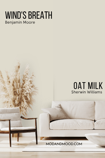
Oat Milk’s color family is just a hair warmer than Wind’s Breath, but the difference is nearly imperceptible. If it wasn’t for Oat Milk, Sherwin Williams City Loft is another very close option, but it is a bit more gray.
Wind’s Breath Equivalent in Valspar (Lowe’s)
Over at Lowe’s, the best dupe for Wind’s Breath is Valspar City Steam.
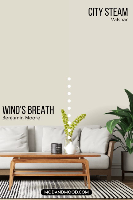
City Steam is a little bit lighter and a little bit warmer than Wind’s Breath, but it is another great dupe!
Best Behr Color Match for Wind’s Breath (Home Depot)
Behr also has a great dupe for Wind’s Breath with their shade Ginger Sugar.
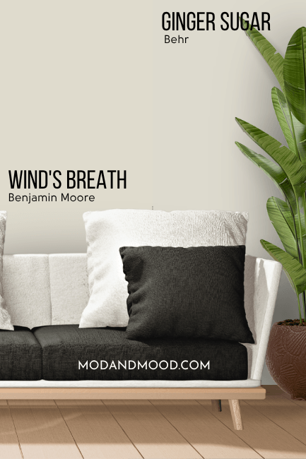
Ginger Sugar is just the tiniest bit more gray than Wind’s Breath, but the actual color is the exact same.
Let’s take another look at all of the dupes:
Thank you so much for reading until the end! That really helps my blog. I hope this post helped you decide if Wind’s Breath is the one!
Still not sure? I’ve got you boo!