Classic Gray has some nerve calling itself a gray! This neutral off-white is far more likely to read soft and creamy than it is a true gray.
Here we will see Classic Gray in real homes, get some coordinating colors, and of course, find some dupes!
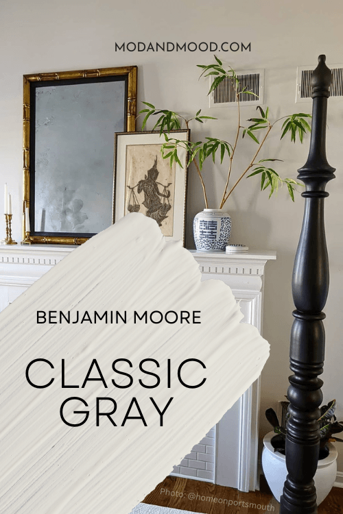
What Color is Benjamin Moore Classic Gray? (OC-23 aka 1548)
We can’t talk about what color Classic Gray is, without answering one common question: Is Classic Gray a greige?
I would describe Classic Gray as a gream (gray-cream) but that doesn’t sound very pretty!
On the wall it reads very similar to some popular creamy off-whites that have slight gray undertones.
LRV and RBG of Benjamin Moore Classic Gray
The LRV of Classic Gray is 73.67.
What’s an LRV anyways?
The LRV (Light Reflectance Value) of a color indicates on a scale of 0 – 100 how much light a color reflects (or doesn’t reflect). True black has an LRV of 0 and pure white has an LRV of 100.
In the paint world, we are working in a range of about 3 – 93 because no paint color is purely black or completely white.

At 74, Classic Gray is still very much in off-white territory. Off-whites tend to have an LRV from about 70 to 82.
The RGB of Classic Gray is: Red 228, Green 225, Blue 216.
What Are the Undertones of Classic Gray?
Let’s go through a few FAQ’s about the undertones on this one!
Does Classic Gray look white?
I am actually a victim of the tricks of Classic Gray. On more than one occasion I have seen it and thought it was a white paint color of some description. This is particularly easy to do when there is no true white to compare it to.
If you have a lot of bright white trim in your home that isn’t hidden by furniture, it is less likely to look almost white, but remember that it is an off-white.
Does Classic Gray look beige?
Classic Gray can look quite beige. I find it looks creamy or beige more often than it looks gray.
Does Classic Gray look pink?
I don’t personally find that Classic Gray ever looks pink, but beige tones can lean a little peach. If you were expecting a cool gray, you will notice that Classic Gray looks closer to peach than it does blue.

Does Classic Gray look yellow?
If you are very anti-yellow, you might not love Classic Gray. It doesn’t really look yellow, but it certainly can look creamy.
Does Classic Gray look dingy?
I don’t find that Classic Gray looks dingy, but it is a grayed out creamy beige. If you are after a bright or clean neutral, this probably isn’t it.
Is Classic Gray Warm or Cool?
Classic Gray is a warm to neutral paint color. Despite being “gray” it doesn’t ever have cool undertones.
The Benjamin Moore Classic Gray Color Strip
Here are all of the colors from the same Benjamin Moore color strip as Classic Gray:
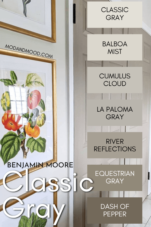
- Classic Gray (1548)
- Balboa Mist (1549)
- Cumulus Cloud (1550)
- La Paloma Gray (1551)
- River Reflections (1552)
- Equestrian Gray (1553)
- Dash of Pepper (1554)
Lighter Version of Classic Gray
Like the vibe of Classic Gray but want something lighter? White Dove is a pretty good white option that is like a lighter alternative to Classic Gray.

Darker Version of Classic Gray – Classic Gray vs Balboa Mist
For something like Classic Gray that isn’t an off white, try one shade darker: Balboa Mist.
Benjamin Moore Classic Gray in a Color Palette
For this color palette, I used primarily colors that people like to pair with Classic Gray:
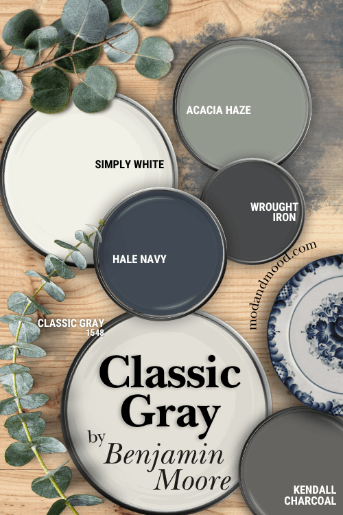
Coordinating Colors for Classic Gray
Here is a closer look at each of the coordinating colors:
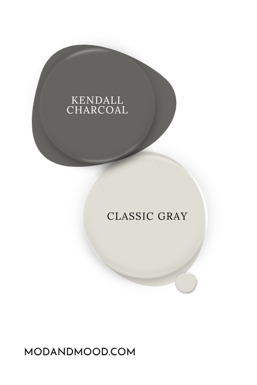
Kendall Charcoal with Classic Gray
Kendall Charcoal is also a warm gray, but it’s much darker. These two look great together!
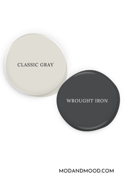
Wrought Iron and Classic Gray
Wrought Iron is a cooler charcoal color that is approaching black. This would be a nice alternative to a stark black and white color scheme.
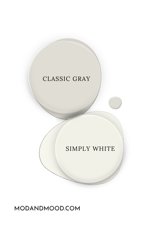
Classic Gray with Simply White
Simply White would be my white of choice for trim and accents with Classic Gray. It’s a nice bright white, but still creamy.
Classic Gray with a Sage Green
I love the grayed out sage quality of Acacia Haze, and I think it looks fabulous with Classic Gray.
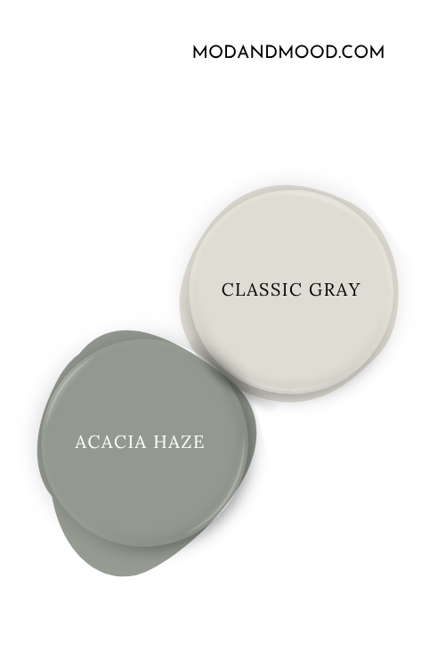
Another option might be Benjamin Moore Carolina Gull, but it’s a touch brighter and more green than Acacia Haze.
Hale Navy with Classic Gray
Hale Navy is sort of known for coordinating well with anything, so of course it works with Classic Gray!
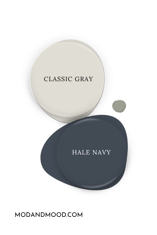
You can see more of this color here: Hale, Yes! It’s Hale Navy! (Benjamin Moore’s Go-with-everything Paint Color)
More Popular Colors that People Like to Use with Classic Gray
Pairing Classic Gray and Gray Owl
Personally, I think that these two look fine together:
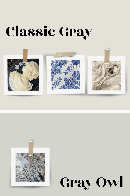
…but just fine. Both are subtle, very light neutrals.
Benjamin Moore Gray Owl is a green-leaning gray, but not green enough to serve a different purpose than Classic Gray. I would go with a darker gray-green like Acacia Haze, or another color entirely. I don’t think there is enough contrast here.
Can You Pair Classic Gray with Neutrals Like Revere Pewter, Balboa Mist, Pale Oak, Edgecomb Gray, or Repose Gray?
Let’s take a look shall we?
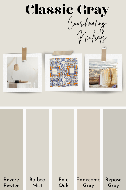
I would not recommend using Classic Gray with either Balboa Mist or Pale Oak. Both are too similar in tone and LRV to provide much contrast.
Revere Pewter and Repose Gray are both darker neutrals that would work with Classic Gray. I would probably lean towards Repose Gray because I like its taupey undertone, but either is a good choice.
I could take or leave Edgecomb Gray with Classic Gray. I don’t think their undertones do anything for one another, but you might like the combination.
Complementary Color for Classic Gray
For any beigey or greigey color, the opposite of the color wheel will be a gray-blue. The Sherwin Williams “2024 Color of the Year” Upward, happens to be a very good option for a complement to Classic Gray:

What White Trim Colors Go With Benjamin Moore Classic Gray?
It can be hard to find trim colors for an off-white like Classic Gray, so let’s go over all of the most popular choices. (Click to expand.)

Benjamin Moore Classic Gray for Your Home’s Interior
Let’s get to the fun of real homes!
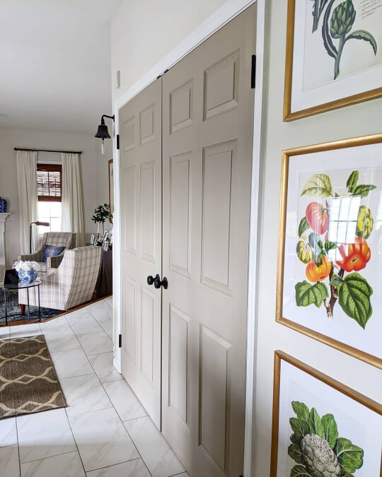
Benjamin Moore Classic Gray in the Living Room
Mara (@homeonportsmouth) used Classic Gray on the walls in her whole home:

You can see that the walls are more beige than the white of her fireplace and trim, but still very light.
Here is Classic Gray again looking towards the living room from the kitchen:
Here you can see Classic Gray looking probably the creamiest that it ever does:

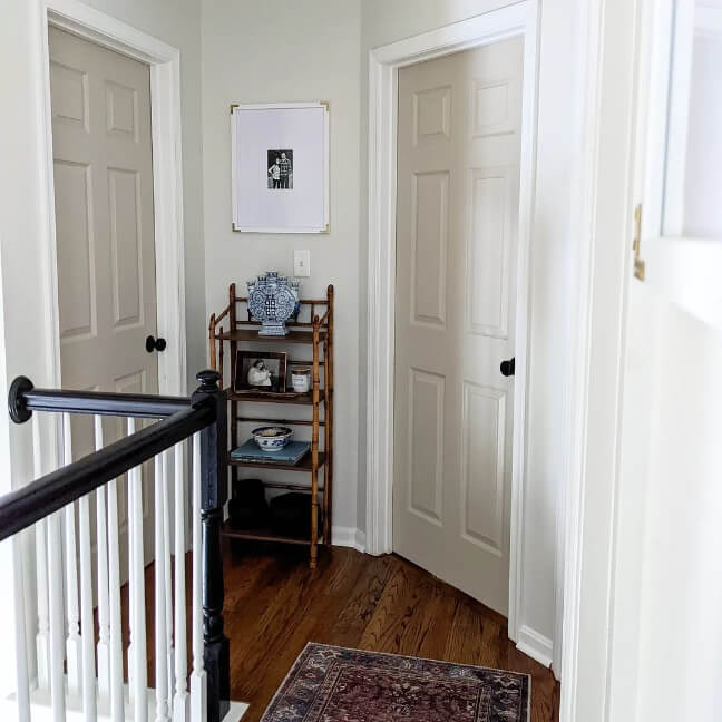
Mara also used Classic Gray in the upstairs hall with Sherwin Williams Shiitake doors:
Benjamin Moore Classic Gray in the Laundry Room
Mara joined the One Room Challenge in a previous year, and used Classic Gray for the walls in her laundry room:
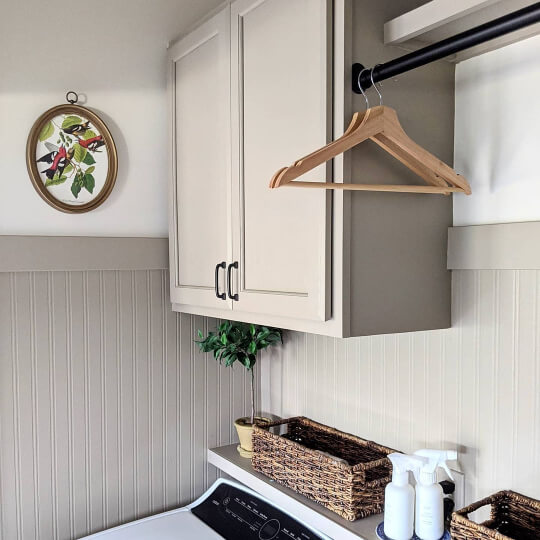
You can see that with the absence of an actual white, Classic Gray reads very creamy-white and not at all gray. The cabinets are Sherwin Williams Taupe Tone, a truly gorgeous color!

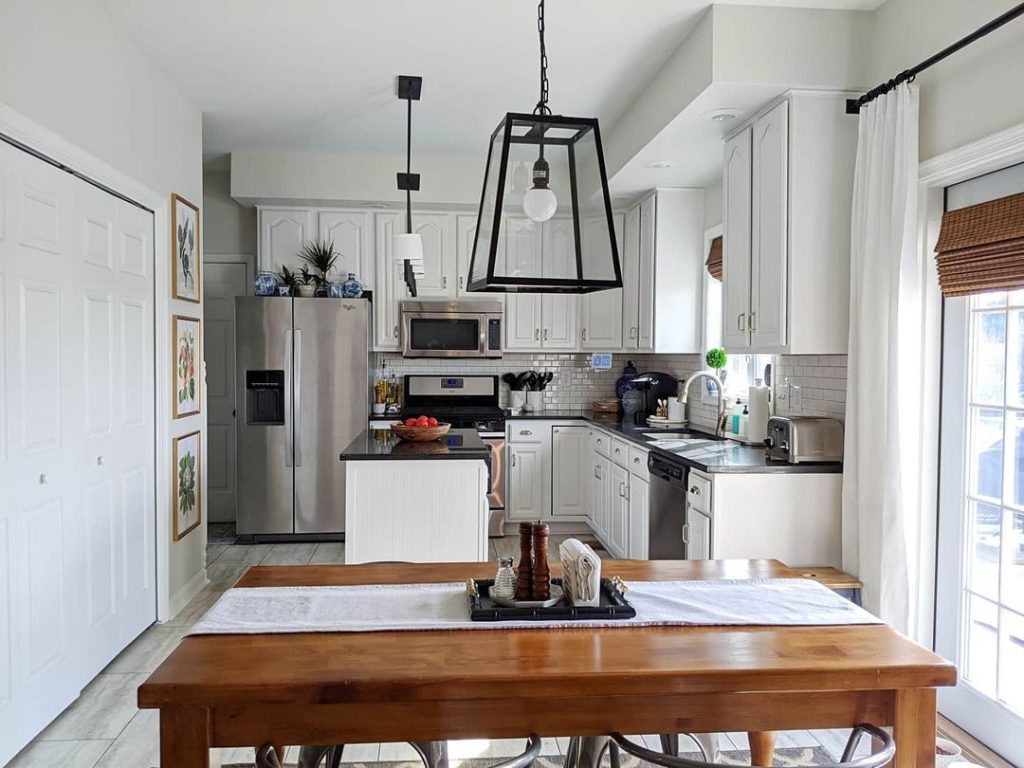
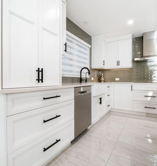
Benjamin Moore Classic Gray in the Kitchen
In the most recent photo of Mara’s kitchen, we see Classic Gray walls with more pops of Shiitake:

Here is a shot from earlier in the project when the kitchen was first refinished:
Again you can see that next to a true white, Classic Gray does not look white. Here Classic Gray does look cooler and more gray, so it’s a good example of how it would look in a north-facing room.
Surprisingly I couldn’t find Classic Gray on cabinets, so we will have to use our imagination with these ones in Benjamin Moore Dove Wing:


Dove Wing is a little bit lighter than Classic Gray, so picture these just a touch darker:
Honestly with darker tile like in this kitchen, Classic Gray would also read pretty white.
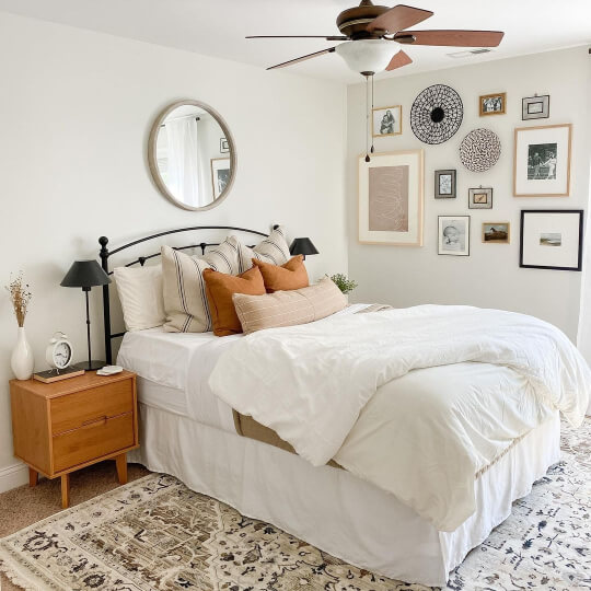
Benjamin Moore Classic Gray in the Bedroom
Here’s a reminder of Classic Gray looking creamy and white in the bedroom from earlier:

This next bedroom is a very similar vibe, but with white decor:
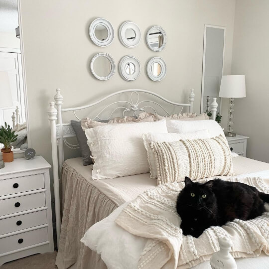
In both rooms, Classic Gray looks fairly creamy and off white.
Benjamin Moore Classic Gray in the Bathroom
I just have one bathroom to show you today, by the team at GMDPainting (@gmdpainting).

Classic Gray looks both classic and gray in this space, but still very much a warm gray.
Benjamin Moore Classic Gray on an Exterior
For an exterior we will just have to use our imaginations a little bit. This one is Sherwin Williams White Duck, which is pretty close to Classic Gray:
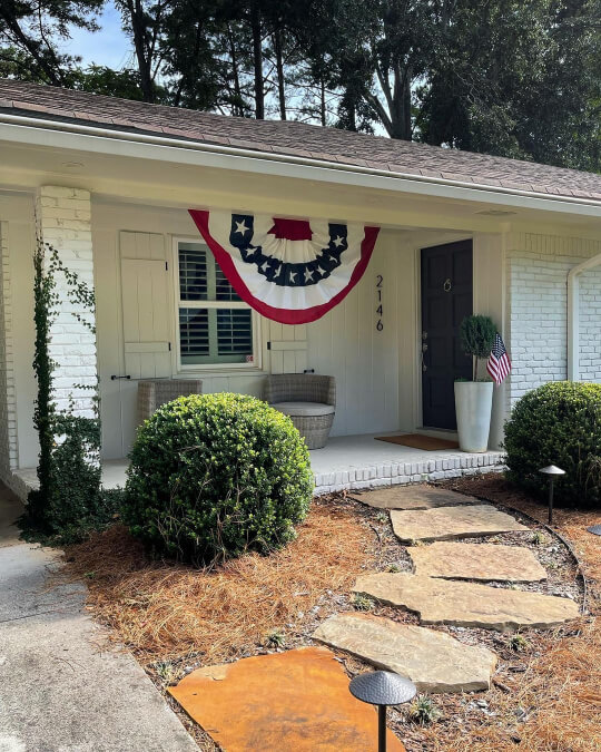
Classic Gray will be just a hair more gray than this.

I actually think how the color looks with the extra gray shading from the brick is pretty accurate.
The door is Sherwin Williams Urbane Bronze.
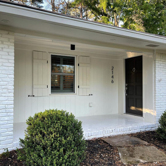
Here is one more example using White Duck:
Again this is just a little warmer than Classic Gray would look. You can expect it to look fairly white like this. Every color reads lighter when it’s outside in bright natural light.
Classic Gray Compared to Other White and Neutral Paint Colors
Let’s take a look at the colors that Classic Gray is most commonly compared to.
For a complete comparison list, check out my post: Classic Gray VS 60+ Other Popular Light Paint Colors (See it Compared to Agreeable Gray, White Dove, and More!)
There were just waaay too many colors to list them all here. (Click to expand the most popular comparisons.)
Agreeable Gray is darker, warmer, and a bit more gray than Classic Gray.
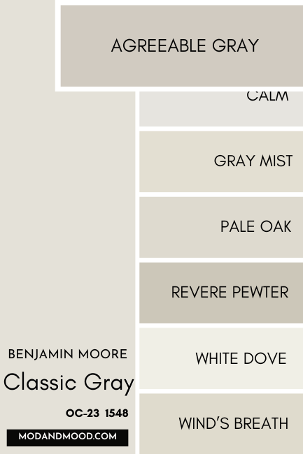
The major difference between these two, is that Agreeable Gray is a lighter neutral, but Classic Gray is an off-white. Both are useable greiges! Agreeable Gray can have a taupey violet undertone, but Classic Gray does not.
Calm is lighter and a bit more gray than Classic Gray.

Gray Mist is just a hint darker than Classic Gray, and a bit less gray.
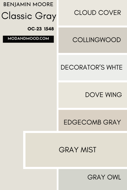
Pale Oak is almost the exact same color as Classic Gray, but a bit darker. It isn’t quite as dark as Balboa Mist.

Revere Pewter is quite a similar color to Classic Gray, but a lot darker:
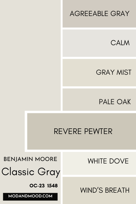
It is more beige than the equivalent color on the Classic Gray color strip, which would be Cumulus Cloud.
White Dove is a true white paint color, and not an off white like Classic Gray, but the tone is very similar.

The major difference here, is that White Dove looks white to creamy with a neutral undertone, and it never looks gray.
Benjamin Moore Wind’s Breath is a little bit darker and ever-so-slightly more beige than Classic Gray.

Behr Silver Drop is a little bit darker and a tiny bit cooler than Classic Gray. If you wanted a paint color that can read cool on occasion, it might be a better choice:

See more from this color in my post: Behr Silver Drop Will Keep You Guessing! (Complete Review & Dupes)
Dupes for Benjamin Moore Classic Gray from Other Brands
Here are a few colors that can get you the same look as Classic Gray, but from Sherwin Williams, Behr, and Valspar:
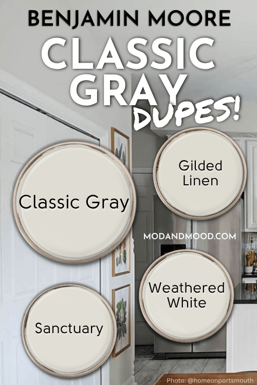
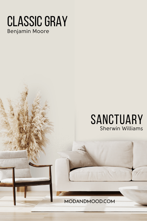
Sherwin Williams Classic Gray Equivalent
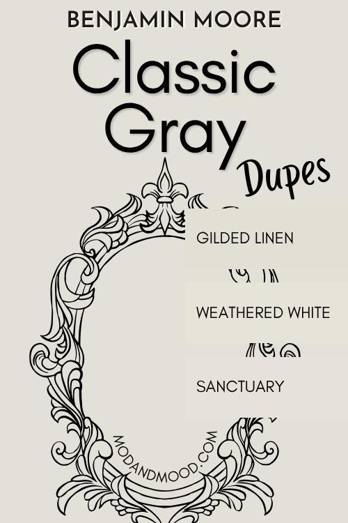
Because it is just so neutral, there are a lot of Sherwin Williams off-whites that could work in place of Classic Gray. I chose Sanctuary as the best match:
Sherwin Williams Sanctuary (SW 9583)
Sanctuary is just a tiny bit warmer than Classic Gray, and a hair lighter:
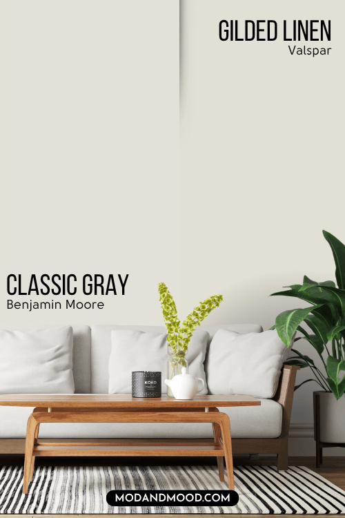
Valspar (Lowe’s) Equivalent to Classic Gray
At Lowe’s, Valspar’s Gilded Linen is the best color match for Classic Gray.
Valspar Gilded Linen (6002-1A)
Gilded Linen is the tiniest bit darker and warmer than Classic Gray.
For some reason this color is listed on the US Valspar site but the link to the color page doesn’t work. You can still take a look at it on the Canada site, and the store should be able to look it up to make it for you.
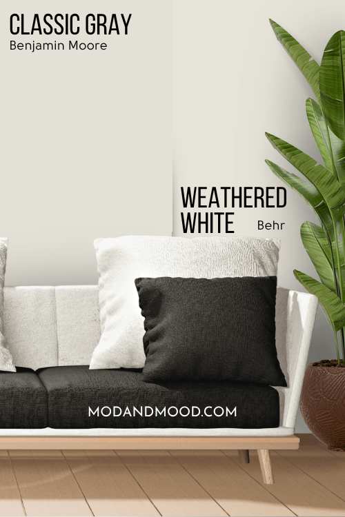
Classic Gray Behr Equivalent (Home Depot)
From Behr, the best color match that I could find for Classic Gray is Weathered White.
Behr Weathered White (HDC-NT-21)
Weathered White is a little bit lighter and a touch more beige than Classic Gray.
Here’s another look at each of the dupes for Classic Gray:
Classic Gray Pros & Cons
Thank you so much for reading to the end, that really helps out my blog!
To summarize, here are a few pros and cons for Classic Gray:
Pros
- Light and neutral
- Reads soft and creamy without being yellow
- Perfect backdrop for other colors and decor
Cons
- Could be mistaken for a white
- Not the most exciting color
Not the one? I have so many colors for you to browse: