Sherwin Williams Aesthetic White is the “cool girl” of creamy off-white paint colors. This chic little number gets its warmth from a surprising undertone (and it’s not yellow!).
Here we will take a look at Aesthetic White’s undertones, get coordinating color ideas, see it in real homes, make a few comparisons, and finally, dupe the look in other brands!
What Color is Sherwin Williams Aesthetic White?
I would describe Aesthetic White as a beige off-white with a frosty pink to purple cast. You could also say that it is a very light taupe or greige.
What Are the Undertones of Sherwin Williams Aesthetic White?
Aesthetic White is an off-white with primarily gray and taupe undertones. It has the typical violet to pink undertone that many taupe paint colors do.
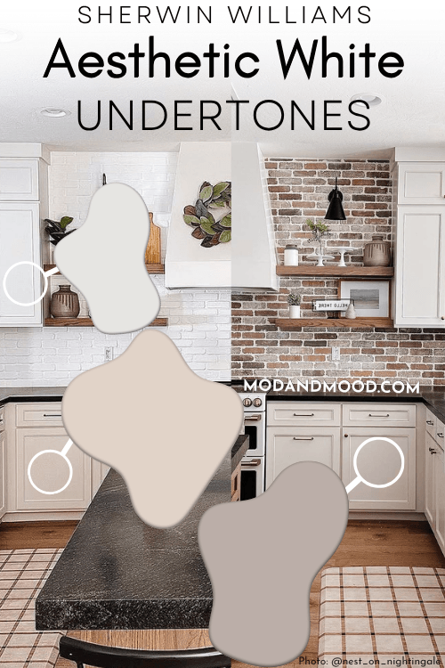
I happen to like the more “specific” undertone of Aesthetic White, but I am not offended by either pink or purple. This color can also look like a soft and creamy light beige.
The best way to minimize the undertones of Aesthetic White, is to use it as your only white paint color. Without the contrast of a true white, your eyes will tell you that Aesthetic White is a neutral white.
We can see that in action here, where Aesthetic White is the color on the walls and ceilings.
You can see the contrast around the trim still, but the overall impression is very neutral and white.
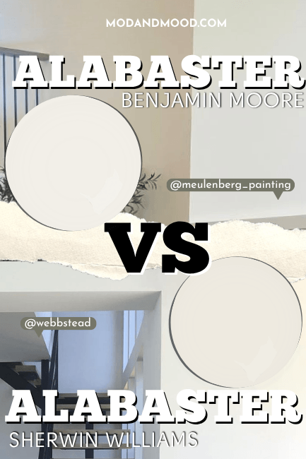
Unlike many taupes or greiges, Aesthetic White does not ever look green. It is pretty solidly on the red/violet end of things. It also does not look yellow like many creamy off-whites do. (For example, you can take a look at Sherwin Williams Alabaster vs Aesthetic White here.)
Aesthetic White LRV
The LRV of Aesthetic White is 73.
What does that mean?
The LRV (Light Reflectance Value) of a color indicates on a scale of 0 – 100 how much light a color reflects (or doesn’t reflect). True black has an LRV of 0 and pure white has an LRV of 100.
In the paint world, we are working in a range of about 3 – 93 because no paint color is purely black or completely white.
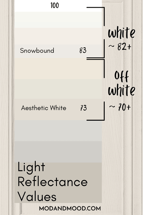
At 73, Aesthetic White is right in the LRV range of most off-white paint colors, which typically have LRVs between 70 and 81 (most commonly 72 – 76).
Aesthetic White in the Sherwin Williams Color Strip
Sherwin Williams has Aesthetic White in a collection of other off-white paint colors, rather than in a light to dark color strip.
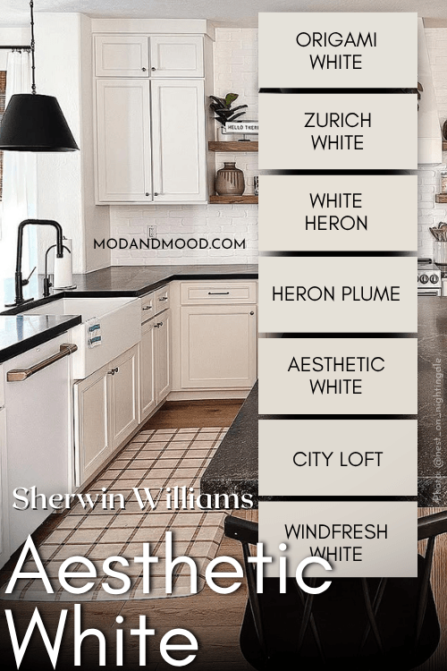
So I have cobbled together my own color strip for Aesthetic White:
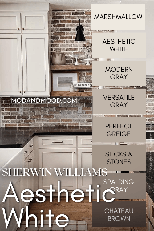
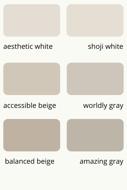
The other colors that are similar to light and dark versions of Aesthetic White are:
- Marshmallow
- Modern Gray
- Versatile Gray
- Perfect Greige
- Sticks & Stones
- Spalding Gray
- Chateau Brown
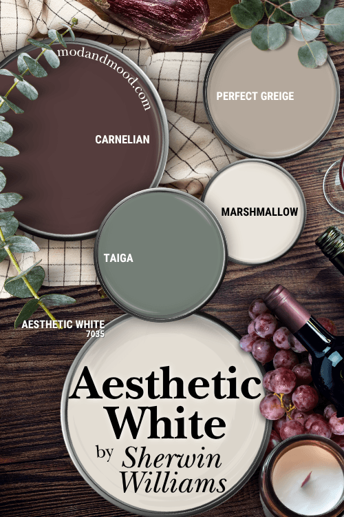
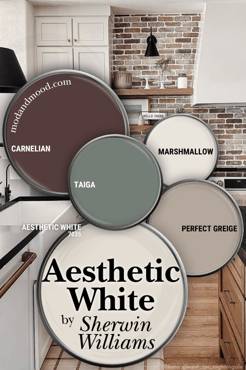
Sherwin Williams Aesthetic White in a Color Palette
Here are the coordinating colors that I recommend for Aesthetic White:
Coordinating White Paint Color for Aesthetic White
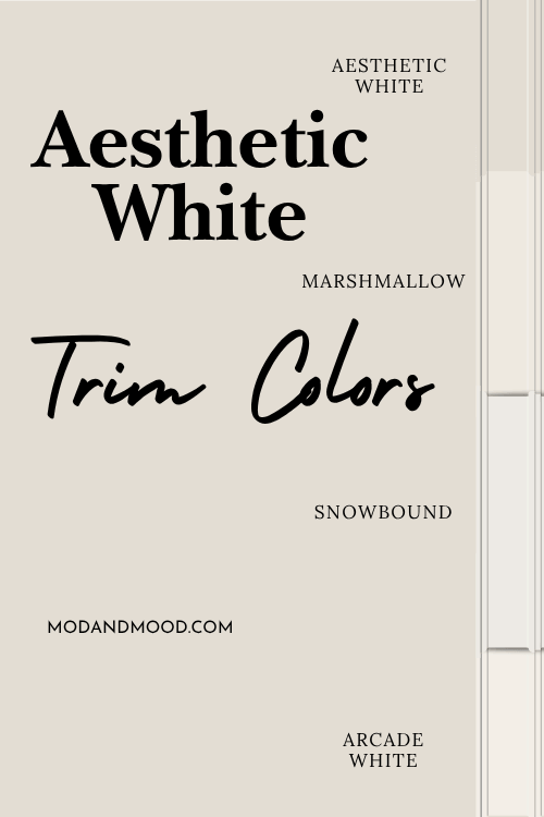
As mentioned earlier, if you want to keep Aesthetic White looking as close to white as possible, use it as your only white paint color. (Trim, doors, ceilings, etc.)
For some contrast, I recommend Sherwin Williams Marshmallow.
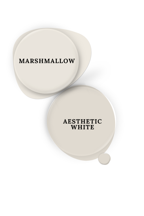
Marshmallow is a true white with an LRV of 82, but it isn’t a crisp or bright white. It is like a sliiightly lighter version of Aesthetic White.
Because it has a similar undertone, Marshmallow is not going to emphasize Aesthetic White’s pink tones like a cool white would.
For a crisper contrast, you might like Snowbound or Arcade White. Snowbound is only a little lighter than Marshmallow, but it is not as overtly warm which provides more contrast against Aesthetic White.
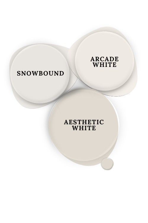
Arcade White is a brighter white, but it maintains the pinky undertone of Aesthetic White, which will help cancel it out somewhat on your walls. I flippity-flopped between Marshmallow or Arcade White for the palette, so both are equally good options!
Try Aesthetic White with Sherwin Williams Carnelian
Sherwin Williams Carnelian is a deep and moody color somewhere between burgundy, aubergine, and brown.
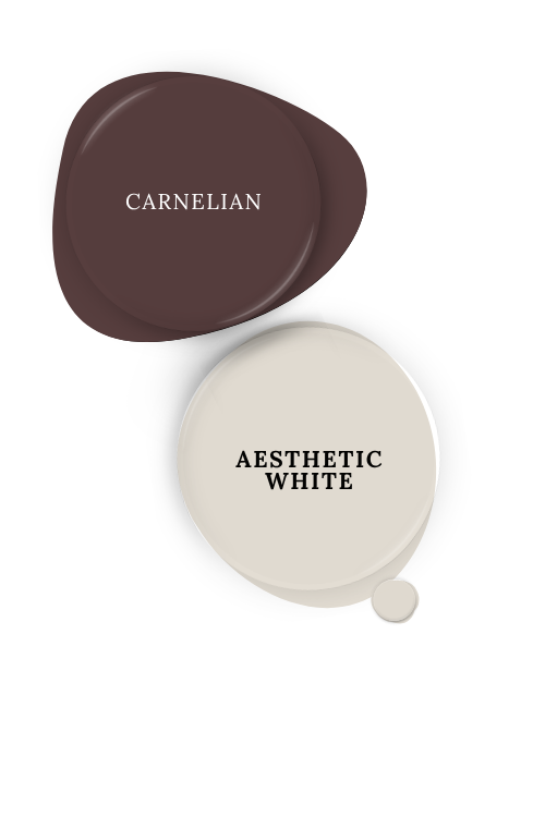
I like this as a coordinating color for Aesthetic White because it is almost like a super intense version of its undertone.
Neutral Paint Color to Use with Aesthetic White
For a true neutral color to use alongside Aesthetic White, I recommend the darker shade Perfect Greige.
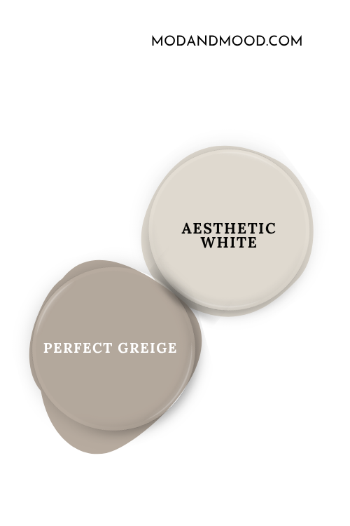
You may recall that Perfect Greige is on my color strip for Aesthetic White, so it makes sense that these work well together! If you are using Aesthetic White for your walls, Perfect Greige would be a great choice for cabinets or for the beige trim and doors trend.
Complementary Color for Aesthetic White
Sherwin Williams Taiga is like a lighter version of the popular color Succulent.
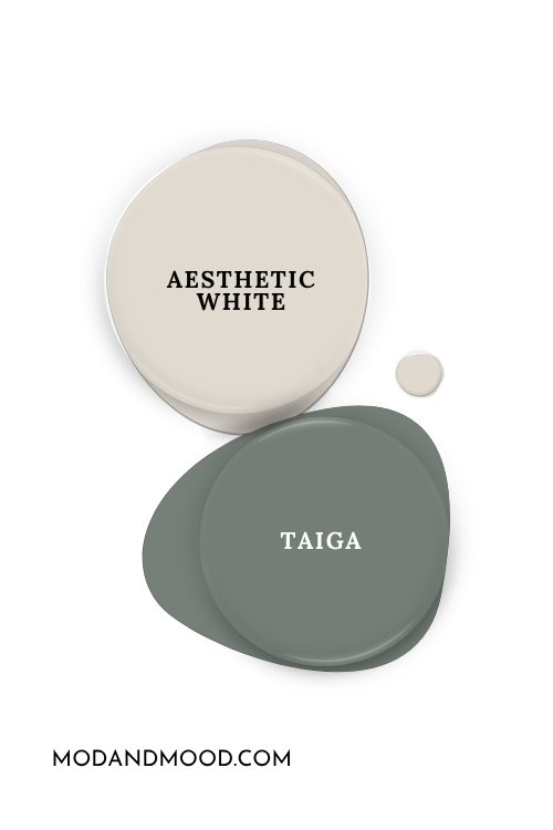
Taiga is complementary to the underlying pink/purple in Aesthetic White, and it also doubles as a complementary color for Carnelian.
Sherwin Williams Aesthetic White for Your Home’s Interior
Let’s get to the fun part, and take a look at Aesthetic White in real life!
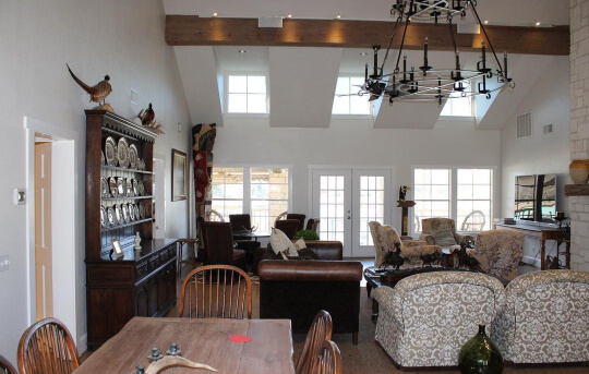
As mentioned earlier, Aesthetic White looks the most white when there is no other white for reference. In this living room the color looks quite white, but you can peep the undertone against Snowbound in this closeup:
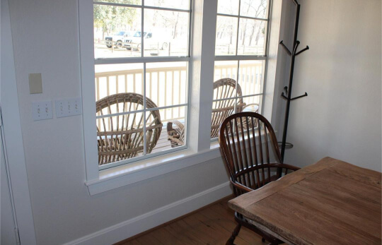
Snowbound is quite similar to Aesthetic White, so this contrast would be a lot higher if you were to use a cool-toned or yellow-based white paint color for trim.
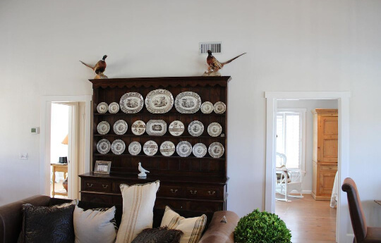
In this picture of primarily the ceiling, you can see the beige color more, as well as the gentle taupe undertone.
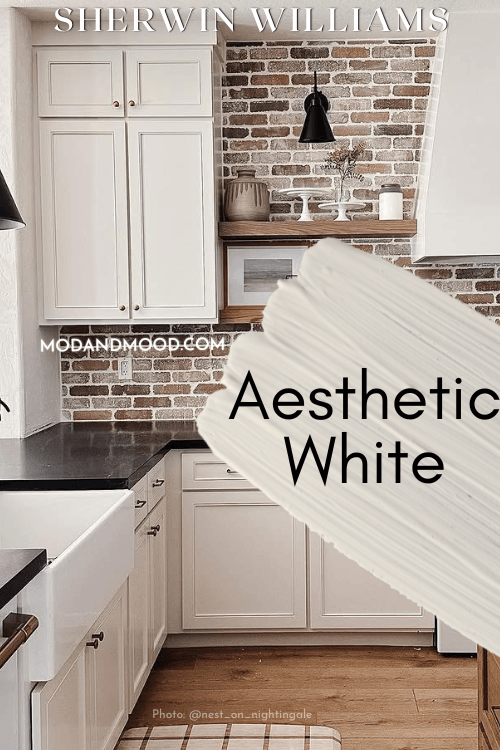
How Does Aesthetic White Look on Kitchen Cabinets?
You already have a pretty good idea of Aesthetic White on cabinets because you saw sneak peeks throughout this post, but all the same, here it is!

Friend of the blog Lara (@nest_on_nightingale) used Aesthetic White on the cabinets in her new kitchen. Originally she had this red brick backsplash, but decided it was a bit too “farmhouse” for her aesthetic, so in the end she painted it white too:
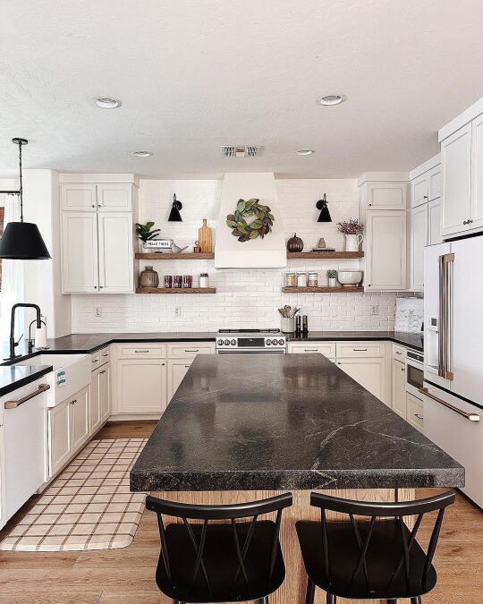
I love it both ways!
Aesthetic White on an Exterior
Moving outside, you should expect Aesthetic White to look its lightest. All colors tend to look lighter outside in the bright light of day, and most off white colors will look quite white.
Here is an example of what you can expect from Aesthetic White on an exterior:
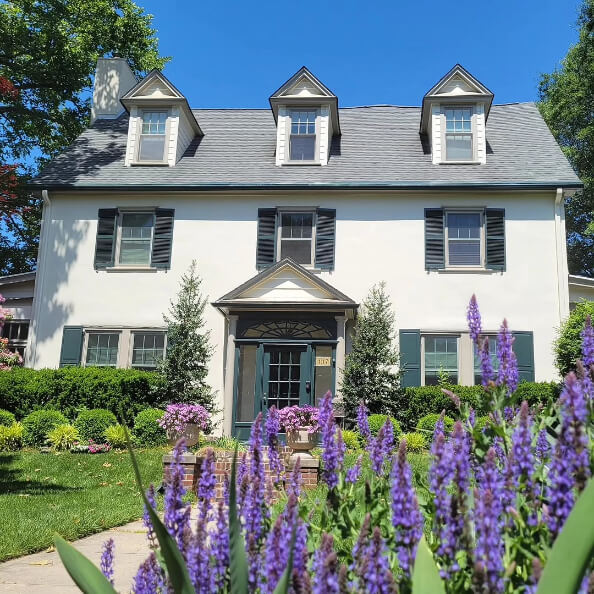
The color here is Benjamin Moore Prentiss Cream, which is actually darker than Aesthetic White, but it looks very much like it in this photo.
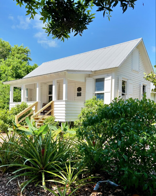
Here is one more example of just a white house in the wild that has the same look and undertone as Aesthetic White:
Sherwin Williams Aesthetic White Compared to Other White and Neutral Paint Colors
Here is how Aesthetic White stacks up against some other paint colors that you may be considering!
Sherwin Williams Aesthetic White vs Accessible Beige
Sherwin Williams Accessible Beige is a true neutral paint color and not an off-white like Aesthetic White is.
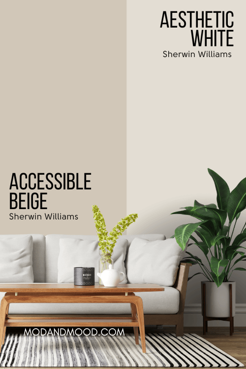
Both colors do have a taupey mushroom undertone and the ability to look beige, however Accessible Beige looks overtly warm more often than Aesthetic White does. It is also a little less gray.
Why these two colors are often compared, is because they used to be on a color card together:
I honestly don’t know if this still exists, and I have always argued that Shoji White works better when swapped with Aesthetic White.
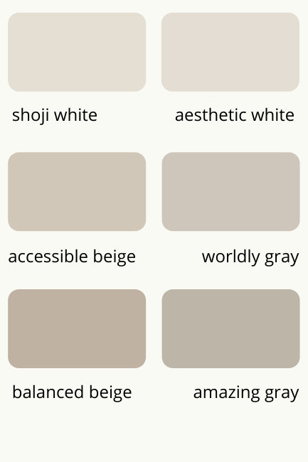
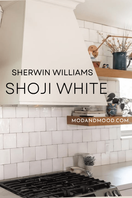
Sherwin Williams Aesthetic White vs Shoji White
Sherwin Williams Shoji White and Aesthetic White are very very similar on paper:
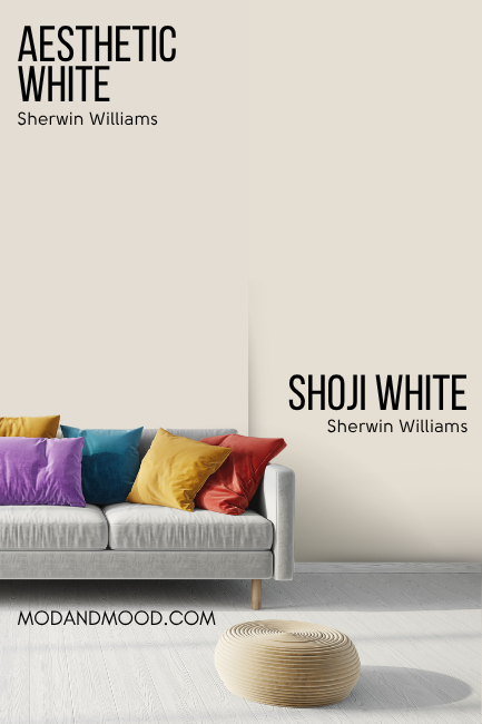
…but much less so in real life. They are both off-white paint colors and they have similar LRVs, but Shoji White doesn’t look as gray as Aesthetic White can.
Shoji White’s undertone is also a traditional beige color that leans towards peach, but it doesn’t ever look like a frosty pink/purple the way that Aesthetic White can.
(I do also have posts for Shoji White vs Alabaster and also Shoji White vs Greek Villa.)
Sherwin Williams Aesthetic White vs White Duck
Aesthetic White and Sherwin Williams White Duck are both neutral off-white paint colors, and they do have similar undertones.
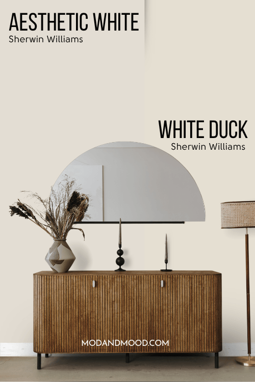
White Duck can look a little bit pink, but it does so in a cleaner, brighter package. White Duck can also have a more yellow leaning undertone, but Aesthetic White does not.
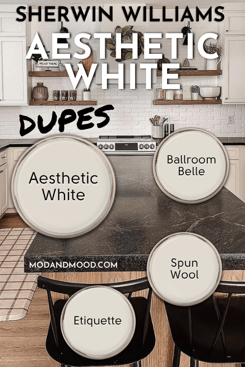
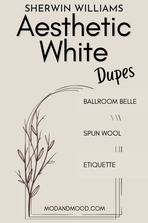
Dupes for Sherwin Williams Aesthetic White from Other Brands
Here are all the colors that will get you the same look as Aesthetic White from the other big paint players!
Benjamin Moore Version of Aesthetic White
Over at Benjamin Moore, the closest match to Aesthetic White is the shade Etiquette.
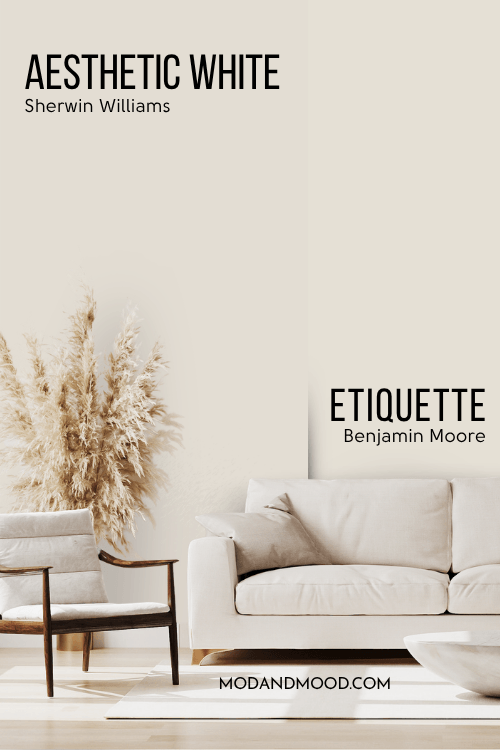
Despite being a hair lighter, Etiquette is an almost perfect dupe for Aesthetic White. It is actually pretty hard to get the perfect amount of gray and cream and also the same taupe undertone, but Etiquette does it!
Best Behr Color Match for Aesthetic White (Home Depot)
Behr actually gives us the very best dupe for Aesthetic White from any of the other brands, with their shade Spun Wool:
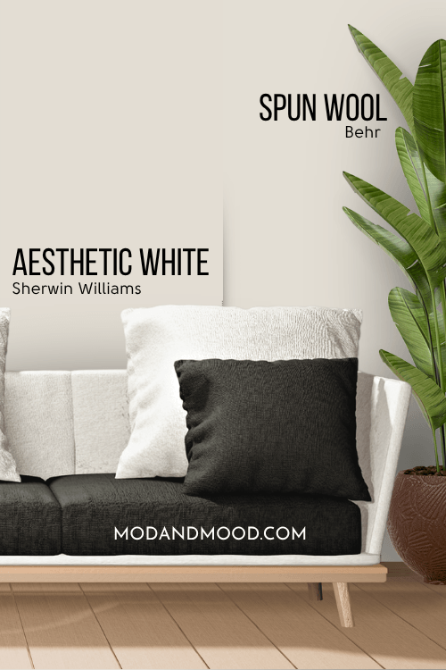
Spun Wool has the same LRV as Aesthetic White and the exact same amount of gray, the only difference is that the color family is just a hair less pink.
It still has the exact same undertones as Aesthetic White, because it’s not really different enough to matter.
Aesthetic White Equivalent in Valspar (Lowe’s)
Over at Lowe’s, the best color match for Aesthetic White is the shade Valspar Ballroom Belle:
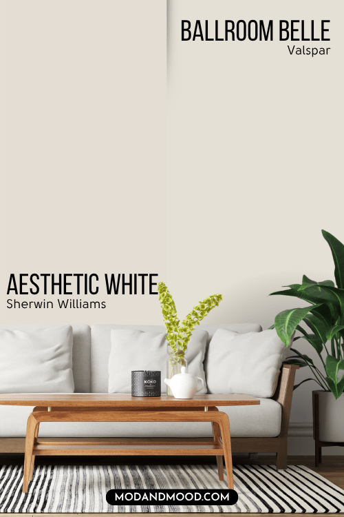
Ballroom Belle is just a hair lighter and less gray than Aesthetic White, but it is a very good overall tone match. You may find that it looks a hair warmer than Aesthetic White.
Here is another look at each of these dupes:
Thank you so much for reading until the end! That really helps my blog. I hope this post helped you decide if Aesthetic White is the perfect creamy off white for you! Not sure? No problem!