Sherwin Williams Alabaster is a classic favorite, but up-and-comer Aesthetic White is quickly rising in the “recommended” category of white paints. Here we will take a look at each color, talk about the differences, and compare them in real homes!

What are the Main Differences Between Sherwin Williams Alabaster and Aesthetic White?
There are two major differences between Alabaster and Aesthetic White, so let’s get those out of the way before we talk in more detail:
- Both Alabaster and Aesthetic White have beige undertones, but Alabaster leans to the yellow side of beige, and Aesthetic White leans to the pink side
- Alabaster is right on the line of white and off-white, but Aesthetic White is a true off-white
Visual Differences Between Sherwin Williams Alabaster and Aesthetic White (Let’s Talk Undertones!)
The closest that Alabaster and Aesthetic White’s undertones ever look, is probably on paper!

In person, I find the difference to be more obvious. (We will take a look at real life examples in just a moment.)
As I mentioned, both do have beige undertones, but think of beige as a spectrum from yellow to pink.

Aesthetic White will never look yellow, and Alabaster never looks pink.
Here we can see both on the color wheel:

Here is a look at Alabaster’s strongest undertone:

Here you can see it very clearly against the cooler white of Sherwin Williams Extra White. (I do also have a post about all possible Alabaster undertones.)
Here is a good look at Aesthetic White’s undertone, where it is on the wall with the true white of SW Snowbound on the trim.
Important! This is just the best example that I have. Snowbound actually has a similar undertone to Aesthetic White, and it isn’t the brightest white with an LRV around 83 – meaning that the contrast here isn’t at maximum.
If you were to use Aesthetic White with Extra White or another bright white with a cool undertone, Aesthetic White would look darker and a little more pink than this.
LRV Difference Between Alabaster and Aesthetic White
One of those major differences between Alabaster and Aesthetic White that I mentioned earlier, was the LRV.
Most true white paint colors have LRV’s of approx 82+. At exactly 82, the LRV of Alabaster is right on that line, but it can definitely still look white.

Aesthetic White has an LRV of 73, so it is definitely an off-white, and not close to being a true white. (Although if you did use it as your only white, you could still trick the eye.)
Here is Alabaster looking very white:

Aesthetic White is pretty neutral, so it can look quite white as well, but you will see the difference where there is trim in a true white.
How Alabaster and Aesthetic White Compare Inside Real Homes
Let’s take a look at some real life project using each of these colors.
First we have Alabaster looking very typically “Alabaster.”

The color is subtley creamy with a fairly neutral undertone.
Here is a typical look for Aesthetic White:
Again a very neutral undertone, although it does look a touch more gray perhaps than Alabaster.
Alabaster vs Aesthetic White on Cabinets
In my opinion, kitchen cabinets are probably the place where Alabaster and Aesthetic White look the most different.

I find that Alabaster normally looks pretty true white on cabinets with just a whiff of cream, and Aesthetic White looks like a super light mushroom beige.
Here is Alabaster looking pretty typical:

The hutch is Sherwin Williams Peppercorn.
Here is another pretty typical look for Alabaster:

Here is a typical look for Aesthetic White on cabinets:

This is a very classy light stone color. It’s kind of the perfect mix between white and neutral.
Here is another typical look for Aesthetic White on cabinets:

If you like how Aesthetic White looks in these photos, you will probably also really like these Mushroom Kitchen Cabinet Colors.
In this next kitchen, we see Alabaster on cabinets where it looks like Aesthetic White:

This is a very a-typical look for Alabaster. It looks a lot more beige than normal, and I actually thought that it was Aesthetic White at first! If I had to guess I think it is due to the bright cool-white tile and ceiling.
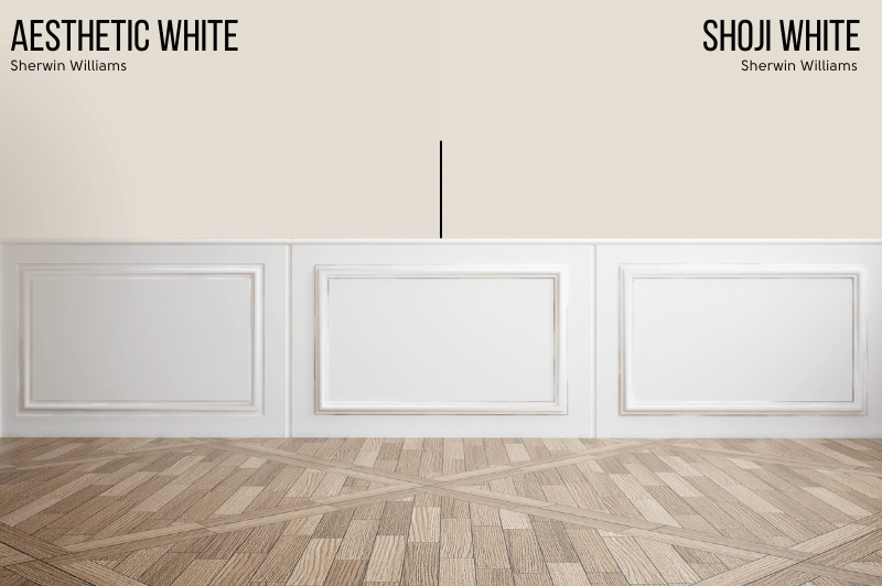
Alabaster vs Aesthetic White on Walls
Here is a side by side comparison of both of these colors on walls:

I would say that each of these colors look their brightest and most neutral in both of these comparisons.

Alabaster vs Aesthetic White on Exteriors
Moving outside, let’s see these colors on an exterior!
Unfortunately I only have a look alike for Aesthetic White on an exterior, so that will have to do:

All colors look lighter and brighter outside, so you can expect Aesthetic White and Alabaster to not only look quite white, but also to look pretty similar.
For another idea of how Aesthetic White will look outdoors, we can look at the very similar color SW Shoji White.
Here is Shoji White on a brick exterior.

This is close enough to how Aesthetic White will look. Its undertone is slightly deeper, but on an exterior like this and with camera variables, I don’t think the difference would be enough to point out.
If you are looking to paint brick, you might also like my post: Stunning White Paint Colors for Classic Brick Exteriors
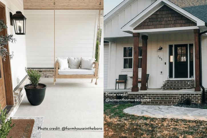
Here is another typical look for an Alabaster exterior:

Alabaster can range in appearance outside from very white to having an obvious creamy undertone.
Here is a side by side of Alabaster and Shoji White to give you another idea:
You can see that the difference is pretty subtle, despite the fact that both look very typical for their respective shades.
Is Alabaster or Aesthetic White Better?
I hope all of this helped you decide, but to truly answer the question of which color is best, it truly depends on what look you are going for.
If you want a classic creamy white that still reads pretty “white,” you can’t go too wrong with Alabaster! If you are looking for a white or off-white that reads creamy without ever looking yellow, you will probably like Aesthetic White.
Need to see more white paints? I’ve got you!


