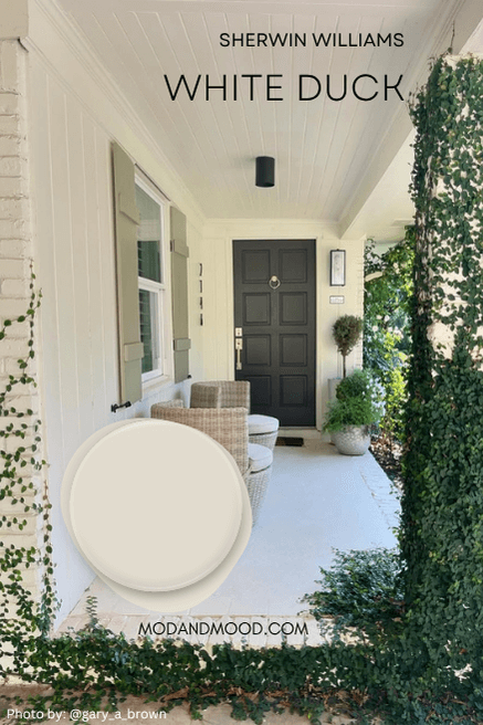
Sherwin Williams Alabaster is a favorite white paint color for interiors, and probably the most popular creamy white on the market, but what about for exteriors?
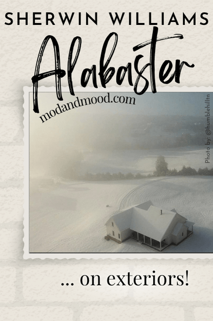
Painting your exterior is a big, expensive project, so it’s important to get it right! Here we will take a look at Alabaster on a few different house exteriors, seeing everything from lightest to creamiest, so that you can decide if it is the perfect white for your home.
About Sherwin Williams Alabaster (Undertones and More!)
Really quickly before we get into the homes, we should talk about what to expect with Alabaster.
Alabaster is a creamy white paint color with an undertone that most often looks fairly beige. In Alabaster’s case, the beige is more on the yellow side and not peach/orange like some other colors. This means that the undertone does look yellow on occasion.
How you perceive color is a major factor with Alabaster. There are a LOT of people out there who swear by Alabaster, and will always say that there is “NO yellow!”
Sure, some of it is down to lighting, trim choices, direction, etc. Most of the time though, it depends on your sensitivity to yellow and how much you dislike it.
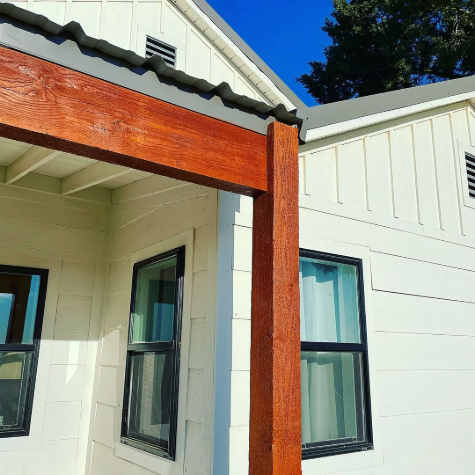
Here is a picture of Alabaster that your brain may tell you is quite cool-toned:
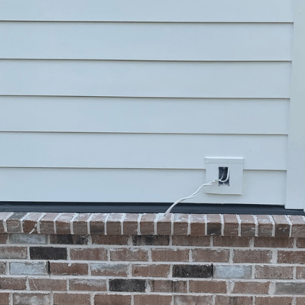
…but take a look at the whole photo:
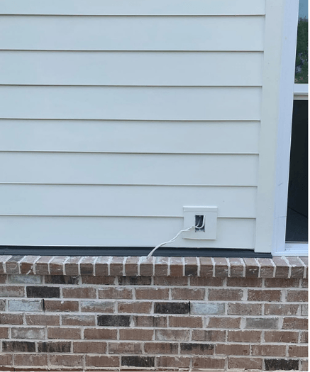
All of a sudden in contrast with the window the color looks a bit yellow. There’s no other adjustment to the photo besides the cropping.
In short, you need to decide for yourself visually if you like the look of Alabaster, because you really can’t take other people’s opinions as fact regarding “too white” “too yellow” “no yellow” “perfect cream” etc.
But of course, that’s why you’re here!
If you want to learn more about all of Alabaster’s undertones, head over here: Sherwin Williams Alabaster Undertones Explained!
How Bright is Alabaster Outside?
The LRV of Alabaster is 82.

The LRV (Light Reflectance Value) of a color indicates on a scale of 0 – 100 how much light a color reflects (or doesn’t reflect). True black has an LRV of 0 and pure white has an LRV of 100.
In the paint world, we are working in a range of about 3 – 93 because no paint color is purely black or completely white.
At 82, Alabaster is still technically a true white paint color. It is right on that line between white and off-white.

All colors tend to look lighter outside, so definitely think of Alabaster as “white” and not cream when you are debating exterior colors.
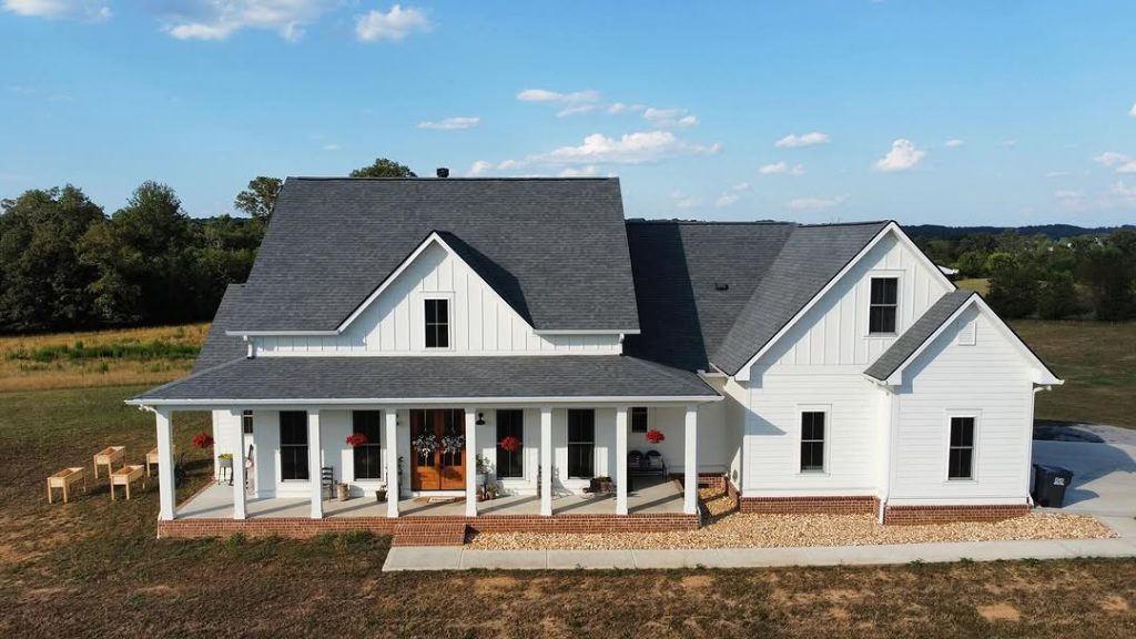
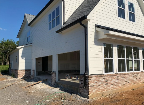
Typical Look for Sherwin Williams Alabaster on an Exterior
Before we get into the highs and lows of Alabaster in the great outdoors, let’s take a look at what color you can reasonably expect.
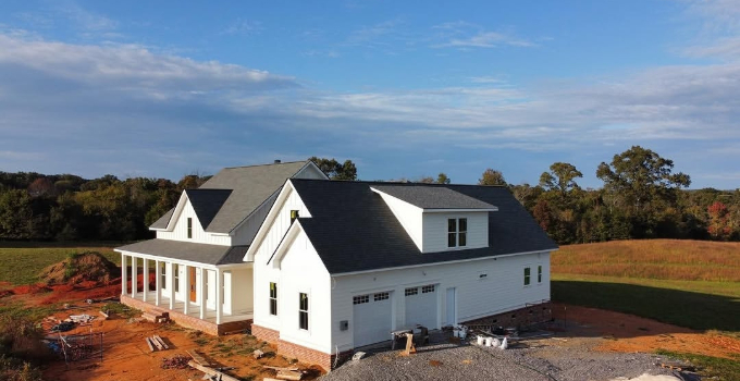
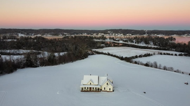
I have about a thousand* (*exaggeration) images of Alabaster on exteriors, and it doesn’t shift all that much. The majority of the photos show Alabaster exactly like I’m about to show you!
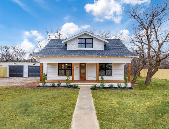
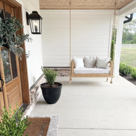
This exterior is a great example of a true Alabaster look on an exterior. It looks white, but there is definitely a softness and creaminess to it.

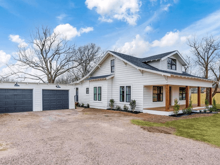
In most of the shots of this particular house on this particular day, the color looks exactly the same: Soft and subtley creamy, but definitely white.
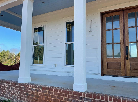
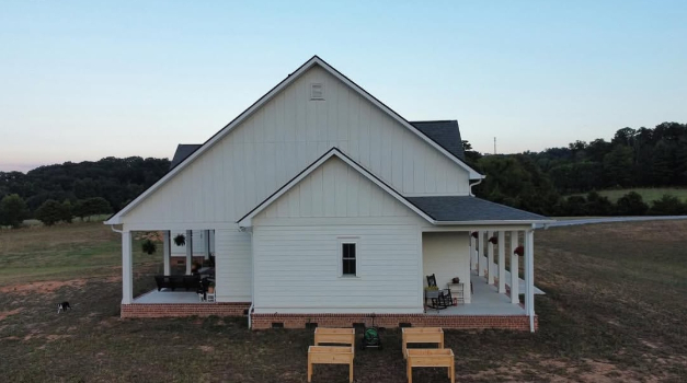
This is the same look that we see here in a closer shot of another house:
Here is a wide shot of the same house:
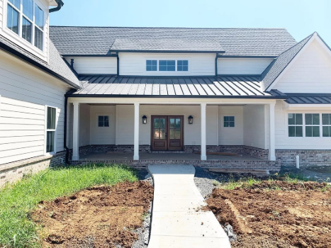
We see the same look at yet another house:
Again a little bit soft, a little bit creamy, but mostly white. Here is a wide shot from this home:
In this picture you can see a few different tones, but the overall look is pretty standard.
As we go through all of the possibilities, bear in mind that there are many more photos where Alabaster looks exactly like it does in these examples.
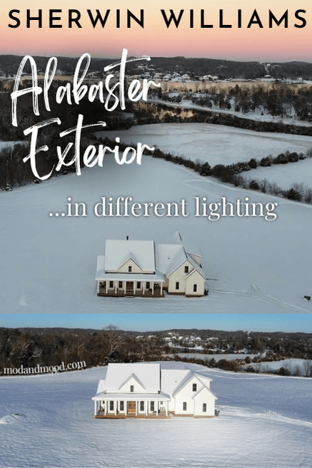
Sherwin Williams Alabaster at Its Lightest and Brightest on Exteriors
If you aren’t expecting a true white in Alabaster, you may end up being one of the people who find it “blinding.” I have gathered some examples here where Alabaster looks its absolute lightest, brightest, and whitest!
Again, these are not typical looks for Alabaster, but it is a white paint color, and by nature white is reflective.
These first pictures are in bright sunlight, but Alabaster can also look really white at other times.
Here it almost looks cool or gray:
If I had to guess, this last example is probably north facing. Even so, I don’t think it would look this cool all the time. The other color here is Sherwin Williams Porpoise, and it is also looking uncharacteristically cool-toned.
Alabaster with Its Strongest Undertone on Exteriors
Now that we have seen Alabaster with almost no warm undertone, let’s see it at max!
Here Alabaster looks the warmest and most yellow that it ever does. Next we see a similar look on one of the houses from earlier:

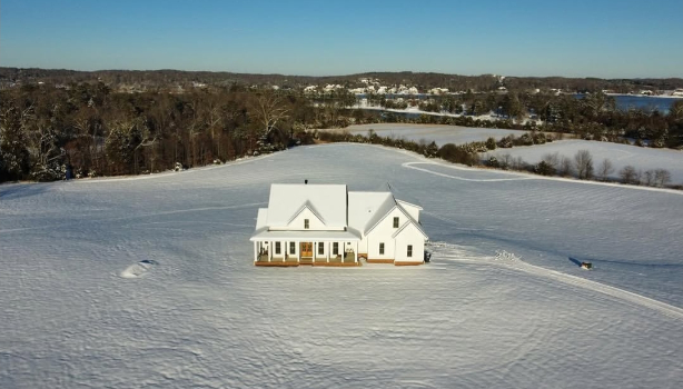
No surprise that Alabaster looks a little warm in the fresh white snow:
Most often these max undertone situations are at sunset (including golden hour) or dusk.
This next picture is something in between standard and maximum undertone:
…you can also file this under “medium undertone” :
I hope this helped with visualizing your tolerance!
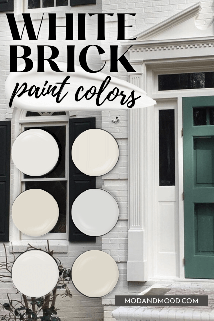
Sherwin Williams Alabaster on Brick
Because Brick exteriors have more texture, Alabaster typically does look a little darker and creamier than it does on siding.

The shutters are Sherwin Williams Rock Bottom and the door was said to be Rookwood Dark Green, but it looks a bit more like Sherwin Williams Succulent here.
Here is one more home where the two sides are brick:

I really can’t believe that is all I have for Alabaster on brick! Here is the very very similar color Greek Villa, just for another idea:

If you’re interested you can see a proper comparison of these two here: Greek Villa vs Alabaster (Sherwin Williams Favorite White Paints!)
If you are looking for a brick exterior color specifically, there are other white colors that I also like for that purpose! Check them out here: Stunning White Paint Colors for Classic Brick Exteriors
Stucco Exterior in Sherwin Williams Alabaster
I very unfortunately have only one stucco exterior in Alabaster, and it is one I already showed you! Here is the only other photo of that Porpoise and Alabaster number we saw earlier:

The colors definitely look warmer here! While Alabaster still looks pretty white, it is closer to standard than the cool look we saw before.
What Trim Colors to Use With Sherwin Williams Alabaster on Siding?
You may have noticed that everybody in this post used Alabaster for both the body and trim of their exterior. If you are planning to use Alabaster for your home, I definitely recommend keeping the trim color the same.
If you were to use a crisp white paint color for trim with Alabaster, you will make the color look quite yellow.
If you want a contrasting trim shade, I would go darker, and consider something like Sherwin Williams Urbane Bronze, or a taupey color like Sherwin Williams Shiitake.
Thank you so much for reading until the end! That really helps my blog.
Still hung up on this great big HUGE decision? (No pressure!) Here are some other white colors that I love for exteriors: