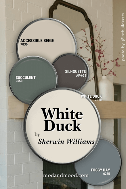
Sherwin Williams White Duck might look like any other off white paint color, but it’s in a special small group of perfect off whites in my opinion! This creamy white color doesn’t have strong yellow undertones, relying instead on neutral beige to bring the warmth.
In this post we will talk about White Duck’s undertones, check out some coordinating color ideas, see the color in real homes, go over some dupes, and look at how White Duck compares to other popular white paint colors.
What Color is Sherwin Williams White Duck?
White Duck is a creamy off white with a classic neutral beige undertones. With clever styling you can have it reading like a cozy true white, or emphasize its warm undertones.
A moment of silence for how Sherwin Williams describes this color:
“This cool white is creamy and bright.” – sherwinwilliams.com
Cool where? Bright? I’ll give them creamy, but that description seems like an oxymoron to me.
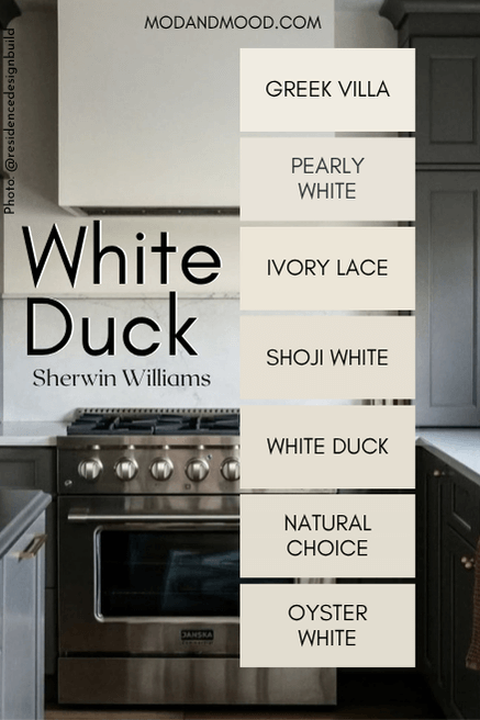
Like many white paint colors, we don’t get the pleasure of a light to dark color strip for this one. It is instead slotted into a creamy white collection:
Maybe it’s more helpful to illustrate the difference in this way:
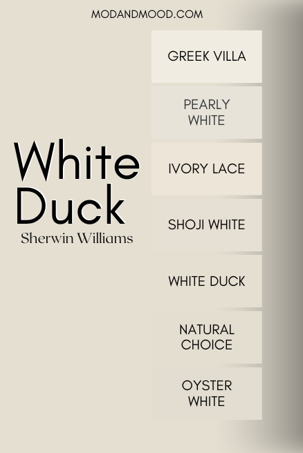
We will get to comparisons later, but the four colors that are all very difficult to tell apart, happen to be my personal favorite off whites from Sherwin Williams!
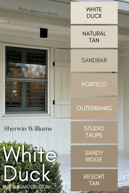
Sherwin Williams does recommend pairing White Duck with the shades Portico and Resort Tan, so it seems like this is the color strip that they have in mind:
White Duck is most definitely an off-white and not a true white due to its LRV.
The LRV (Light Reflectance Value) of a color indicates on a scale of 0 – 100 how much light a color reflects (or doesn’t reflect). True black has an LRV of 0 and pure white has an LRV of 100.
In the paint world, we are working in a range of about 3 – 93 because no paint color is purely black or completely white.
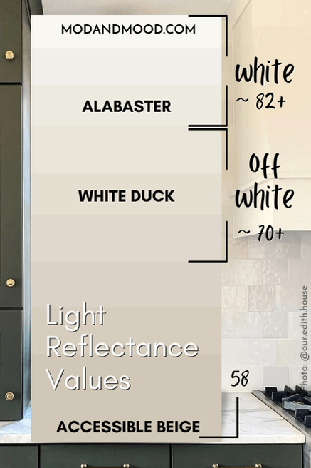
With an LRV of 74, White Duck is squarely in off-white territory.
What are the Undertones of Sherwin Williams White Duck?
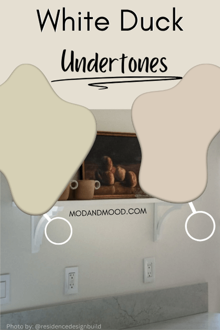
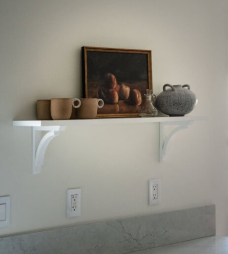
I was having a really hard time finding the perfect examples to show the undertones of White Duck. I didn’t want to make it seem scary by saying “yellow” or “peach” without having photos.
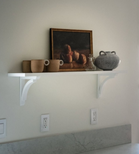
Whether or not it is in fact White Duck (they didn’t state the color), this picture shows the exact range of undertones that White Duck has:
Let’s talk about it!
The important thing is that the overall look is creamy, neutral, off-white.
- Against the very stark and cool white of switch plates and that shelf, you can see how White Duck looks very cream in comparison
- On theleft side of the photo, I would say that the undertone looks a little more yellow, and the most yellow that White Duck ever looks (still not really yellow)
- On the right side of the photo the undertone leans more peach, and also looks exactly like White Duck at its most peach
This photo also helps drive home a very important point: You can minimize any unwanted undertone, but not using White Duck with any other White paint color.
When we switch out the white shelf for a wood one and remove the white switch plates, you can see that the color looks totally neutral.

I just wanted to note that I did see one person complaining that White Duck was looking green to them. I didn’t see it personally and haven’t seen it since, but it’s something to store in the back of your brain. I do tend to be quite green sensitive, so I don’t *think* it’s a huge risk.
If you do really want a true white for your trim, ceilings, etc. be sure to pick one that is creamy in a similar way. My recommendation would be Greek Villa or Benjamin Moore White Dove.
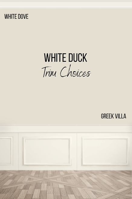
Both of these whites look very similar to White Duck, but they are true whites at the end of the day, and not off-white.
Sherwin Williams White Duck in a Color Palette
Here are some coordinating colors that I think work beautifully with White Duck. These colors are both on trend, and classic.
Coordinating Neutral Paint Color for White Duck
Originally I was going to pair White Duck with Sherwin Williams Universal Khaki because it is the 2026 Color of the Year, but honestly, I’m just not the biggest fan.
Instead I went with the foolproof neutral of Sherwin Williams Accessible Beige:
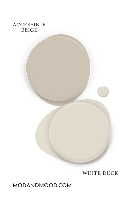
I find the undertone of Accessible Beige to be very similar to White Duck’s. It’s a creamy neutral that doesn’t lean too warm.
Try White Duck with Benjamin Moore Silhouette
Speaking of “Color of the Year,” Silhouette was the Benjamin Moore pick for 2026. This deep neutral brown has similar qualities to White Duck, it’s warm, but without a strong undertone.
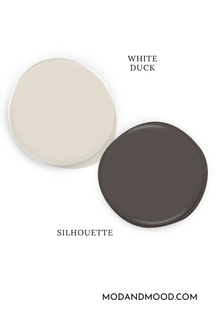
The deep brown of Silhouette is super on trend, as warm neutrals – and brown paint colors specifically – are seeing an uptick in interest.
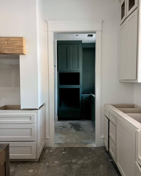
Use White Duck with Sherwin Williams Succulent
On the cooler side of things, I love the color Succulent, and I love the idea of using it with the off white of White Duck.
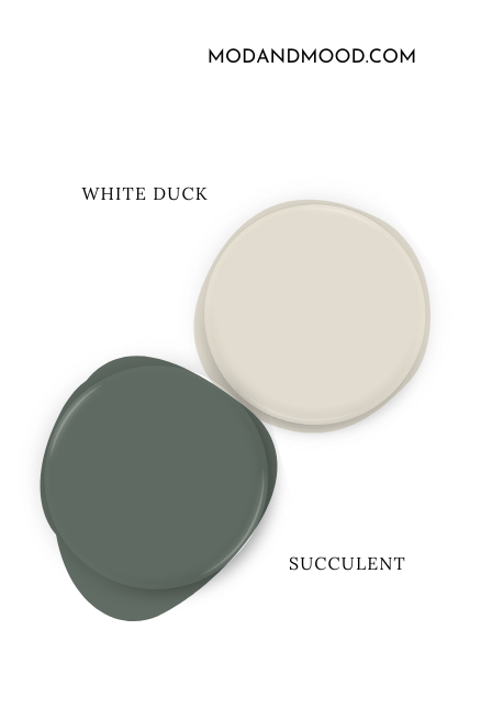
Succulent is somewhere between a deep sage and a gemstone green. It’s a super moody, luxurious color, but you can pair it with almost anything!
Here it is with Taupe of the Morning, which gives you an idea of how it would look with White Duck:
If you like this color, you might also like the similar color, Behr Hidden Gem, which is a bit more teal.
Pair White Duck and Sherwin Williams Foggy Day
Finally for coordinating colors, you might like White Duck with the shapeshifting blue-gray-green of Foggy Day.
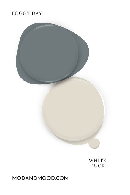
Foggy Day is mostly blue forward, but it does have a moody marine undertone on occasion.

This is a great complementary color for White Duck, because blue and beige are opposites on the color wheel. You might also like the shade darker: Sherwin Williams Gray’s Harbor.
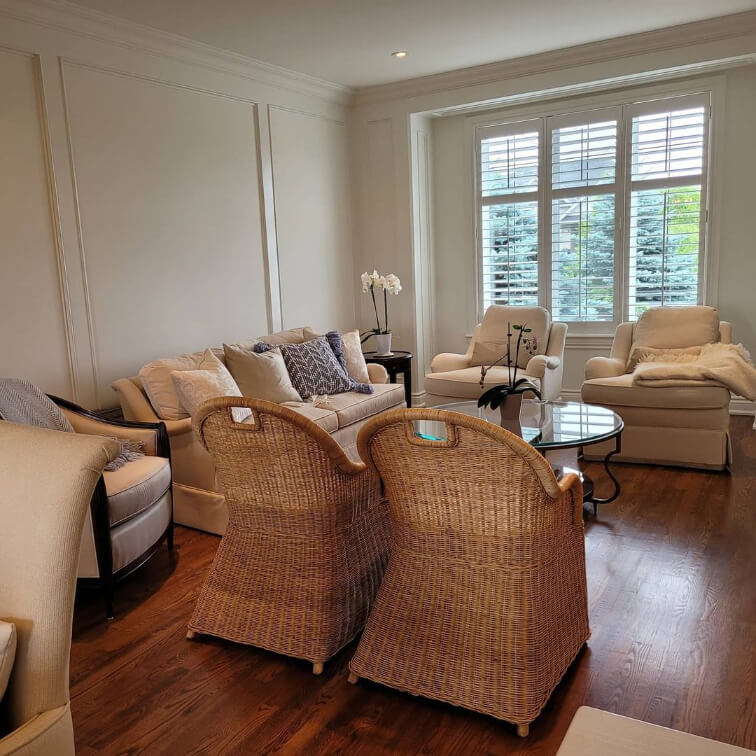
Sherwin Williams White Duck in Real Homes
I actually didn’t have nearly as many photos as I expected for White Duck. It’s a pretty popular off-white, so I was surprised by that. I have a couple of exact photos, and then I have a few where the color looks like White Duck, which is the point I suppose.
White Duck on Living Room Walls
Let’s start by seeing how White Duck normally looks:
About White Duck, Jen says:
“If anyone is looking for the perfect white walls that are soft, dreamy and still neutral (not yellow) Sherwin Williams White Duck is the most incredible I have found. It simply looks beautiful in every light.“
Jen used a darker contrasting trim with White Duck, in the shade Anew Gray (also by Sherwin Williams).
If you like this look, you will love my post: White Walls with Sherwin Williams Accessible Beige Trim
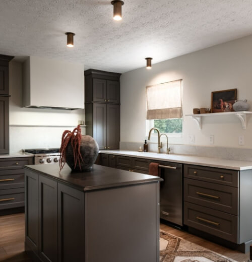
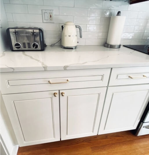
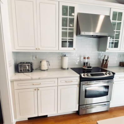
White Duck on Kitchen Cabinets
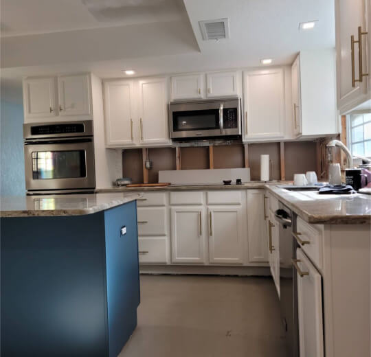
Next let’s take a look at White Duck in the kitchen. Here is the real deal White Duck on kitchen cabinets where it looks its brightest and most white:
I wouldn’t say that this is a typical look for White Duck, because it does look very bright here, and not like an off white. On the side of the island is a little more true to tone.
On the flip side, here are some true white cabinets by the team at Heritage Cabinetry and Design (@heritagecabs) where they happen in this one picture to look like White Duck:
This creamy neutral look is pretty standard for White Duck.
This next custom color by Bethany from @reclaimed_cottage ended up looking like White Duck:
The key here is that the walls in this kitchen are actually white. If your walls are a color, you should expect that White Duck will look more white.
On cabinets specifically, I find that White Duck almost looks like a darker version of Sherwin Williams Snowbound. So check out that color if you want a true white for cabinets that has just a touch of a warm undertone.
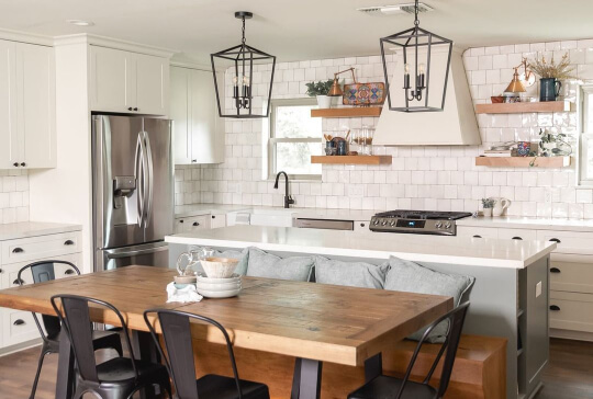
Kitchen Walls in White Duck
In this project by the team at Residence Design (@residencedesignbuild) which you saw a sneak peek of when we were talking coordinating colors, the wall color wasn’t listed, but it is a dead ringer for White Duck:
Whether or not it is in fact White Duck, this picture shows the exact range of undertones that White Duck has:
White Duck in the Bathroom
When I was perusing photos of White Duck, it struck me that it looks a lot like Sherwin Williams Greek Villa. So here is that color in a bathroom to give you an idea:

I will go over the differences between these colors in just a minute, but for now, just picture this color, but with the brightness turned down a touch.
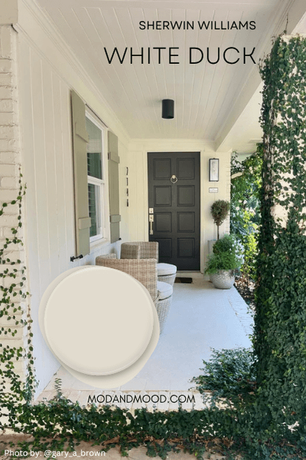
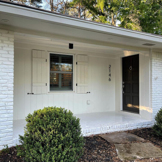
White Duck for Your Home’s Exterior
Outdoors is hands down the most popular place to use Sherwin Williams White Duck. This creamy choice should be a top contender for your exterior project!
Gary (@gary_a_brown) chose White Duck for his exterior, and painted the front door in Sherwin Williams Urbane Bronze.

I understand why this is a top choice to use outside! It’s really difficult to get the creamy white look outside without a color looking yellow. Most of the top whites for inside, appear lighter and more stark once they are outside.
Here is one more exterior in White Duck:

So creamy and beautiful!
If you are after something a little lighter for your exterior, I recommend Sherwin Williams Whitetail. It reads pretty similar to White Duck outside, but brighter.
If it’s a white for brick you are after, check out my post: Stunning White Paint Colors for Classic Brick Exteriors
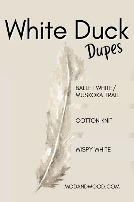
White Duck Dupes from Other Brands
Whether you can’t get your hands on Sherwin Williams paint, or you just prefer another brand, let’s go over some creamy white doubles from Benjamin Moore, Valspar, and Behr.
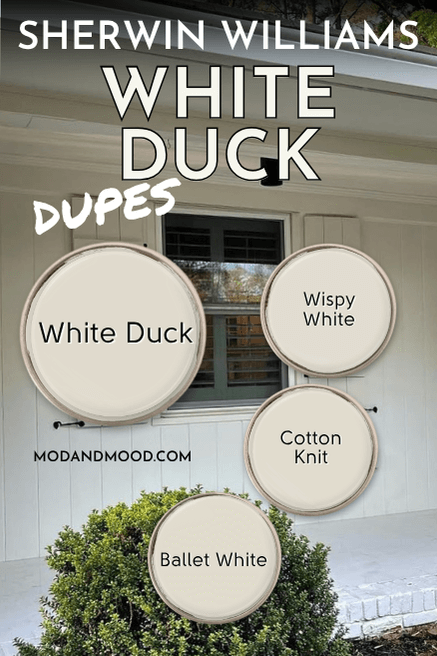
Benjamin Moore Equivalent for White Duck
Benjamin Moore offers a hundred and one creamy white paint colors, but the closest match that I could find for White Duck, is their shade Ballet White (also known as Muskoka Trail).
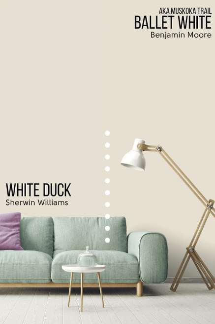
Technically Ballet White is a little more saturated than White Duck, but it is also a little bit cooler, which helps balance things out. I find that these two definitely look very alike. Creamy but still neutral.
Here is Ballet White on cabinets:
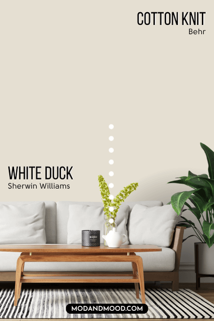
White Duck in Behr (Home Depot)
The closest dupe for White Duck at Home Depot is the shade Cotton Knit:
On paper, Cotton Knit and White Duck are the exact same color. They have the same hex value and everything! So you won’t see a difference in the graphic.
Here is Cotton Knit on an exterior, and it does look very much like White Duck.
There may be slight variations because of each brand’s specific paint formula, but from one home to another (or even one wall to another) I don’t think you could tell these two apart.
Valspar Version of White Duck (Lowe’s)
The best Valspar color match for White Duck is the shade Wispy White (available at Lowe’s).
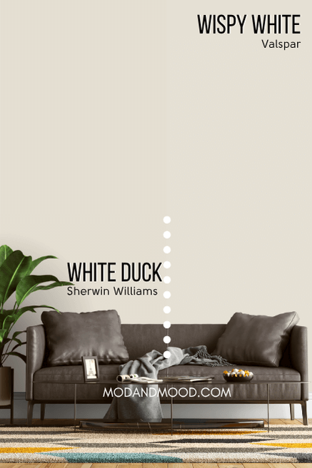
Wispy White is a little bit less saturated than White Duck. This means it is a little more gray, and therefore is a little less creamy.
This makes perfect sense to me, because it does tend to look a touch more “true white” than White Duck does.
Here is another look at each of these dupes:
Sherwin Williams White Duck Compared to Other White and Off White Paint Colors
I really had to limit how many comparisons I could include here, or these white posts really get away from me! For this post, I have kept it down to the colors where I can understand the confusion.
The major difference between White Duck and Alabaster, is that Alabaster has a fairly neutral undertone that leans more yellow than White Duck’s does. Alternatively, White Duck sometimes has a peach-leaning beige undertone, but Alabaster rarely (maybe never?) looks peach.
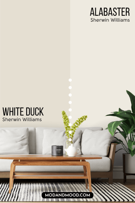
The next biggest difference between these two, is that Alabaster is right on the line of white and off-white, with an LRV of 82, but White Duck is a true off white.
All that being said, here is Alabaster where it looks the most like White Duck.

Greek Villa is quite like a lighter version of White Duck. It runs the same range of undertones, but it is a true white, so it’s a good bit brighter.
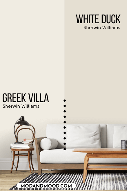
Greek Villa is technically just a hair cooler than White Duck. Here it is on walls and cabinets where it looks the most like White Duck.

Oyster White is a hair darker and more gray than White Duck:
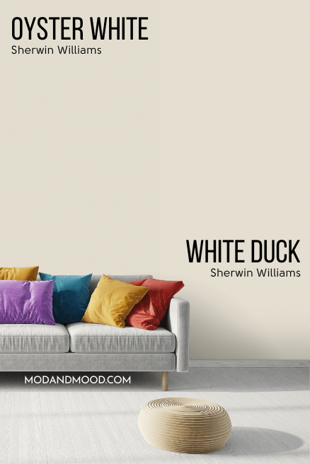
These colors are very difficult to tell apart in real life, but I do feel like Oyster White leans slightly more to a “putty” color and not so much peach.
Here is a look at Oyster White with its strongest undertone:

Either of these shades are beautiful neutral cream colors.
Shoji White and White Duck are two very similar neutral off white colors with creamy undertones.

Where these two differ, is that Shoji White has a stronger peach-leaning beige undertone, and it doesn’t ever look yellow, where White Duck can have a slightly yellow undertone.
Neither of these colors look truly yellow or peach toned, but this is the only difference. Shoji White and White Duck have the exact same LRVs.
Here is Shoji White with its strongest undertone:
Same color, different font? The hood fan and lower cabinets on the far wall are where you can pick up the stronger undertone.
While I do think that Snowbound and White Duck can sometimes look alike, Snowbound doesn’t technically have a beige undertone at all. It can sometimes look the slightest wink pink, which is when it looks similar to White Duck’s peachier look.
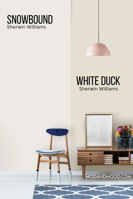
Snowbound is a true white with an LRV of 83, and not an off white like White Duck.
Here is Snowbound where it does look the most like White Duck:
Benjamin Moore White Dove is pretty similar to White Duck, but it is a true white and not technically dark enough to be an off-white (even if it isn’t a bright white).
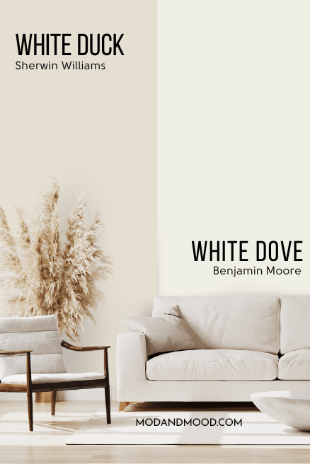
White Dove typically looks a lot deeper and creamier in real life than it does on paper. It also should be more yellow-leaning, but I find that it has a very beige undertone that looks more peach than yellow.
Here is White Dove where it looks the most like White Duck:
All this being said, White Dove can also look truly white:

Thank you so much for reading until the end! That really helps my blog. I hope this post helped you decide if White Duck is the right white for you. (I know it’s a minefield out there!)
Not quite there yet? Trust me, I’ve got lots more where this came from, both on my white paint colors page, and these lovely posts:


