Looking for a darker color that strikes the perfect balance between gray and blue? Look no further than Sherwin Williams Grays Harbor!

Don’t take my word for it though, let’s see Grays Harbor in real homes, get to know it in a color palette, and look at alternatives from other brands.
This post may contain affiliate links. Should you choose to make a purchase through one of my links, I may receive a small commission at no cost to you. I only recommend products that I use.
What Color is Sherwin Williams Grays Harbor (SW 6236)
Grays Harbor is a deep blue gray. Reminiscent of a stormy sea, this color tends to stay very much a blue gray, but it can have the slightest green undertone.

LRV and RBG of Sherwin Williams Grays Harbor
The LRV of Grays Harbor is 12.
What does that mean?
The LRV (Light Reflectance Value) of a color indicates on a scale of 0 – 100 how much light a color reflects (or doesn’t reflect). True black has an LRV of 0 and pure white has an LRV of 100.
In the paint world, we are working in a range of about 3 – 93 because no paint color is purely black or completely white.
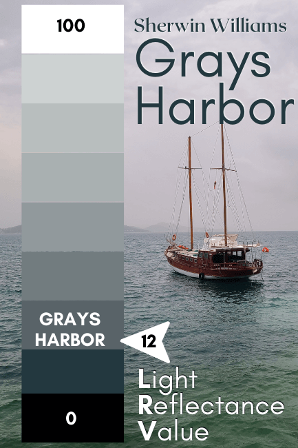
At 12, Grays Harbor is right at the dark end of mid-toned colors. I consider colors with LRV’s around 10 or lower to be truly dark.
The RBG of Grays Harbor is Red 89, Green 99, Blue 104.
Sherwin Williams provides the hex code for Grays Harbor as: #596368
What Are the Undertones of Grays Harbor
In general, I would say that you can take Grays Harbor almost at face value. It can on occasion have the slightest green undertone. It really does remind me of the ocean. It’s usually a calm deep blue, but can have that slight aquatic murky-ness to it.
You don’t need to worry about Grays Harbor looking purple like some blue grays do. It is definitely on the green side of blue.
Is Grays Harbor Warm or Cool
Grays Harbor is a cool paint color. If you were to place it side by side with more royally blue tones, it will look a little warmer, but it’s pretty squarely in the blue color family. (Cool tones all the way, baby!)

Grays Harbor Color Strip
Lucky for us, this one actually has a light to dark color strip, so we don’t need to guess:
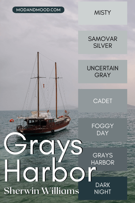
The other shades from this Sherwin Williams color strip are:
- Misty (SW 6232)
- Samovar Silver (SW 6233)
- Uncertain Gray (SW 6234)
- Cadet (SW 9143)
- Foggy Day (SW 6235)
- Dark Night (SW 6237)
Lighter Version of Grays Harbor
One shade lighter than Gray’s Harbor on the same color strip, is the color Foggy Day.
I do actually have a post for that color, and you can read it here: Sherwin Williams Foggy Day (Review and Dupes!)

Darker Version of Grays Harbor
Dark Night is one shade darker than Grays Harbor on the same color strip. It’s a bit difficult to truly get a darker version of this color because any color that’s darker will start to read navy or black.
Sherwin Williams Grays Harbor Color Palette
Let’s take a look at some colors that you can use with the deep blue of Grays Harbor:
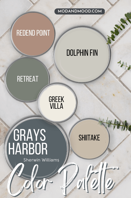
Coordinating Colors to Use with Grays Harbor
Sherwin Williams Retreat
To be honest, I feel like Retreat goes with almost anything, but sage greens always looks so good with deep blues.

See my post about this color here: Take a Vacation With Sherwin Williams Retreat (Complete Review & Dupes!)
Sherwin Williams Greek Villa
Greek Villa is a nice warm-but-neutral white from Sherwin Williams. This would be a great trim choice to bring out the blue of Grays Harbor.
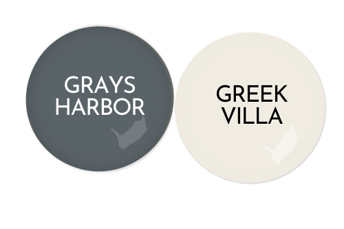
We will see these two together in real life in just a few minutes!
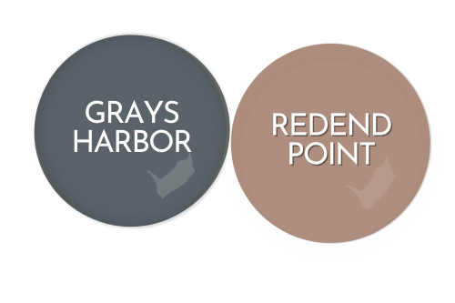
Sherwin Williams Redend Point
Redend Point was the Sherwin Williams Color of the Year for 2023.
This muted clay color looks amazing with all kinds of greens, as well as blues like Grays Harbor.
Behr Dolphin Fin
On paper, Behr Dolphin Fin looks greigey, but in real life it is a chameleon that stretches from soft greige to a blue-ish gray. Whichever look it serves, Dolphin Fin would be a great choice for a whole home neutral with Grays Harbor.

Complementary Color for Grays Harbor
The “official” complementary color for Grays Harbor is a deep gray brown. Sherwin Williams Urbane Bronze is a great option:
Sherwin Williams Urbane Bronze with Grays Harbor
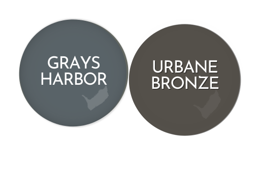
This combo would be really nice on an exterior!
What Trim Colors Go With Sherwin Williams Grays Harbor?
White Paint that Goes with Grays Harbor
I already mentioned that Sherwin Williams Greek Villa would be a really nice trim color with Grays Harbor, but what about other whites?
Chantilly Lace is actually a Benjamin Moore color, but I just had to slide it in here because it’s my favorite true white. This one is pretty crisp and undertone-less for pairing with Grays Harbor.
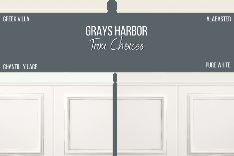
Sherwin Williams Alabaster is a darker creamier white without actually being an off-white. This is one of Sherwin Williams most popular choices for trim (or even white in general!).
Sherwin Williams Pure White is a totally safe and neutral white choice for trim. It’s a soft white, so not super crisp or bright, but it isn’t as creamy as something like Alabaster.
Don’t Forget Your Supplies!
This little brush might look funny, but it’s my absolute ride or die!
Rollers like these hold the most paint and make the job faster. Get a metal roller cage for easy on and off.
DryDex is the fastest (and funnest!) way to make chips and dents disappear. (Make sure you get a small spackling tool that actually fits in the container, and a sanding sponge.)
This tool will save your back and limit time on a ladder.
Can You Use Grays Harbor with Oak Trim?
Grays Harbor looks beautiful with oak trim, but it will definitely look more blue:

This is because the orange in the oak emphasizes the blue tones which are opposite on the color wheel.
Sherwin Williams Grays Harbor for Your Home’s Interior
Now for the moment of truth: Time to see what Grays Harbor really looks like!
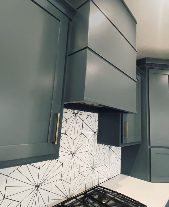
Sherwin Williams Grays Harbor on Kitchen Cabinets
Let’s get straight to the good stuff, shall we? Let’s take a look at Grays Harbor on kitchen cabinets!
Lucky for us, I have the perfect example kitchen to show you. Thanks to the team at Revive Home Furnishings (@revivehome_kc) for these lovely photos:

Grays Harbor is the perfect moody blue for cabinets. It’s such an unexpected color, without being too “out there.”
Here it looks its deepest, darkest, best:

It was smart to keep the backsplash and countertops light in here, particularly when they went with Grays Harbor on all of the cabinets and island.
The crisp white is nice breathing room for your eyes.

If you have a lot of cabinets and are worried that Grays Harbor will make your kitchen too dark, you could always do a two-toned look.
I’ve got lots of examples in this post: 27+ Fresh Two-Tone Kitchen Cabinet Ideas (With Pictures!)
Grays Harbor with Existing Oak Cabinets
You might be here because you want to know how Grays Harbor will look if you already have oak cabinets.
Here is an example I put together so that you can get an idea of how the colors work together:
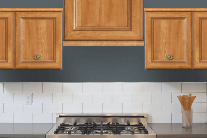
I personally like the combination. I think the super warm orangey tones of the oak are complementary of the blue in Grays Harbor. For that same reason, you should expect this color to look its most blue in this scenario.
Here is a real life example from Walnut and Pine Design (@walnutandpinedesign) with oak built ins:
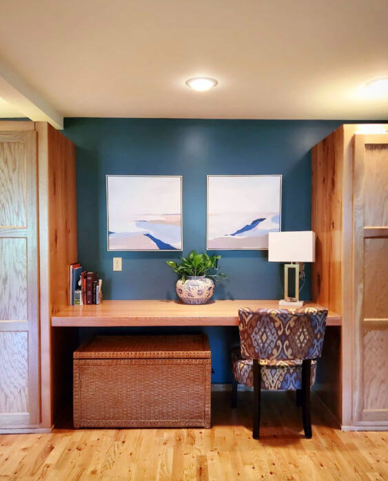
You can see that the blue looks a bit more vivid with the oak around it. (Just like we talked about with trim.)
Grays Harbor in the Living Room
Here is another photo by Walnut and Pine Design, this time with Grays Harbor in a living room.

It looks perfect with this black and oak doggo!

Grays Harbor on an Accent Wall
If you are curious about using Grays Harbor for an accent wall, here we can see exactly that, with a board and batten fireplace feature wall by Heiler Painting (@heilerpainting):

Sherwin Williams Grays Harbor in a Bedroom
This next room is a lovely example of Grays Harbor. It was also used as an accent in this space, framing out the wall of windows.

This main bedroom by Interior Scout Co (@interiorscoutco) is a very large space, but Grays Harbor helps it look cozy and comfortable.
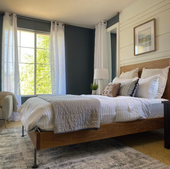
The creamy white on the rest of the walls, is Sherwin Williams Greek Villa.

One more for good measure:

What a beautiful space! In Europe they would toss a mini fridge in there and call it a studio apartment.
Sherwin Williams Grays Harbor in a Bathroom
I wasn’t able to find Grays Harbor on bathroom walls, but here it is on a vanity:

I am getting major coastal vibes from this bath.
Sherwin Williams Grays Harbor on an Exterior
Now that we have seen Grays Harbor all over inside the home, let’s move outside and see it on an exterior!
This home was repainted by Headwaters Painting (@headwaters_painting_llc):
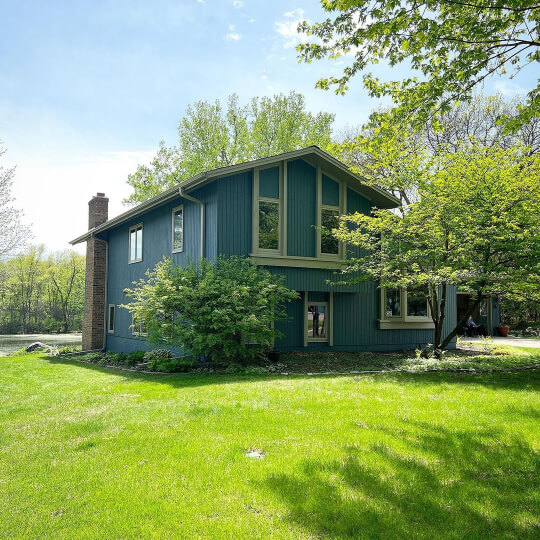
In this first picture it looks more blue, and in the next one it looks a little more blue-green-gray:
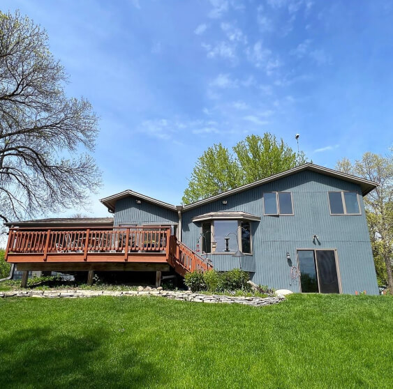
Grays Harbor would also look great with white trim, or even a dark trim, like Urbane Bronze.
Grays Harbor Compared to Other Blue Gray Paint Colors
There is really only one commonly compared blue gray from Sherwin Williams, and that is Waterloo.
Sherwin Williams Grays Harbor vs Waterloo
Waterloo and Grays Harbor are actually more similar than you might think from this picture:

Gray Harbor is just a lot more gray, but both are in pretty much the exact same area on the color wheel.
If you were considering Waterloo but it’s just a bit too bright, Grays Harbor would be perfect.
Dupes for Grays Harbor
Want to use a different brand of paint? Here are some dupes for Grays Harbor from Benjamin Moore, Behr, and Valspar.

Benjamin Moore Grays Harbor Equivalent
The best dupe from Benjamin Moore for Grays Harbor is the color Powell Gray:
Benjamin Moore Powell Gray (CW-665)
Powell Gray is a little bit lighter and more saturated (less gray) than Grays Harbor. It is also the tiniest bit warmer (more green).

Valspar (Lowe’s) Equivalent to Grays Harbor
From Lowe’s, the best color match for Grays Harbor, is the color Iron Frost.
Valspar Iron Frost (4007-2B)
I actually just realized that Iron Frost was my Valspar dupe for Foggy Day as well. You can see why, because it is a good bit lighter than Grays Harbor.

It is still the best tone match, so that’s why I went with this one.
Grays Harbor Behr Equivalent (Home Depot)
From Home Depot, the best match that I could find for Grays Harbor, is the Behr color City Rain.
Behr City Rain (PPU25-21)
City Rain is just a little darker and more saturated (less gray) than Grays Harbor.

This looks like a really beautiful color!
Here’s a quick recap of all the dupes. You can see that Powell Gray is definitely the closest:

Grays Harbor Pros & Cons
Let’s wrap this up and put a bow on it, shall we?
Grays Harbor is a perfect deep moody blue, that isn’t super dark. It’s ideal for cabinets, exteriors, or feature walls.
I would not suggest using Grays Harbor on all of the walls in a room unless you have adequate lighting or you’re okay with a very cozy space.


